6 Outdated Tile Choices That Interior Designers Aren't Using Anymore — And What They Say to Try Instead
Swap overused trends for these fresh tile ideas instead — the ideal update for your kitchen or bathroom
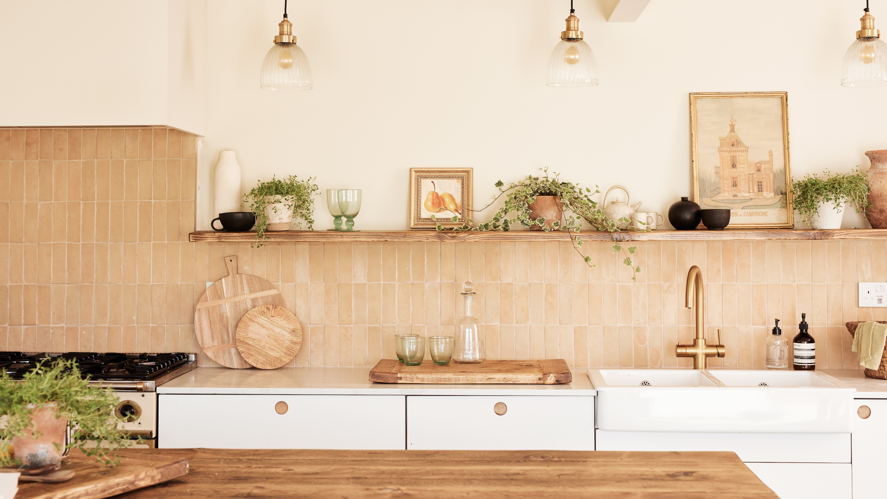

Whatever you think about trends, you can clearly trace the rise and fall of certain moments in interiors – take the slow fade of the navy blue kitchen, once on everyone's wishlist, or the retro rebirth of the glass brick.
So it goes for kitchen and bathroom tile trends, and from mosaics to subway, vertical to herringbone, we've seen it all. And while we're all for homes that reflect their owners' personal tastes, there are definitely some tile trends that can date a space.
So which trends are they? We asked interior designers to share the tile ideas they're tiring off – and what they're doing in their projects instead.
1. Uniform tiles in a flat finish
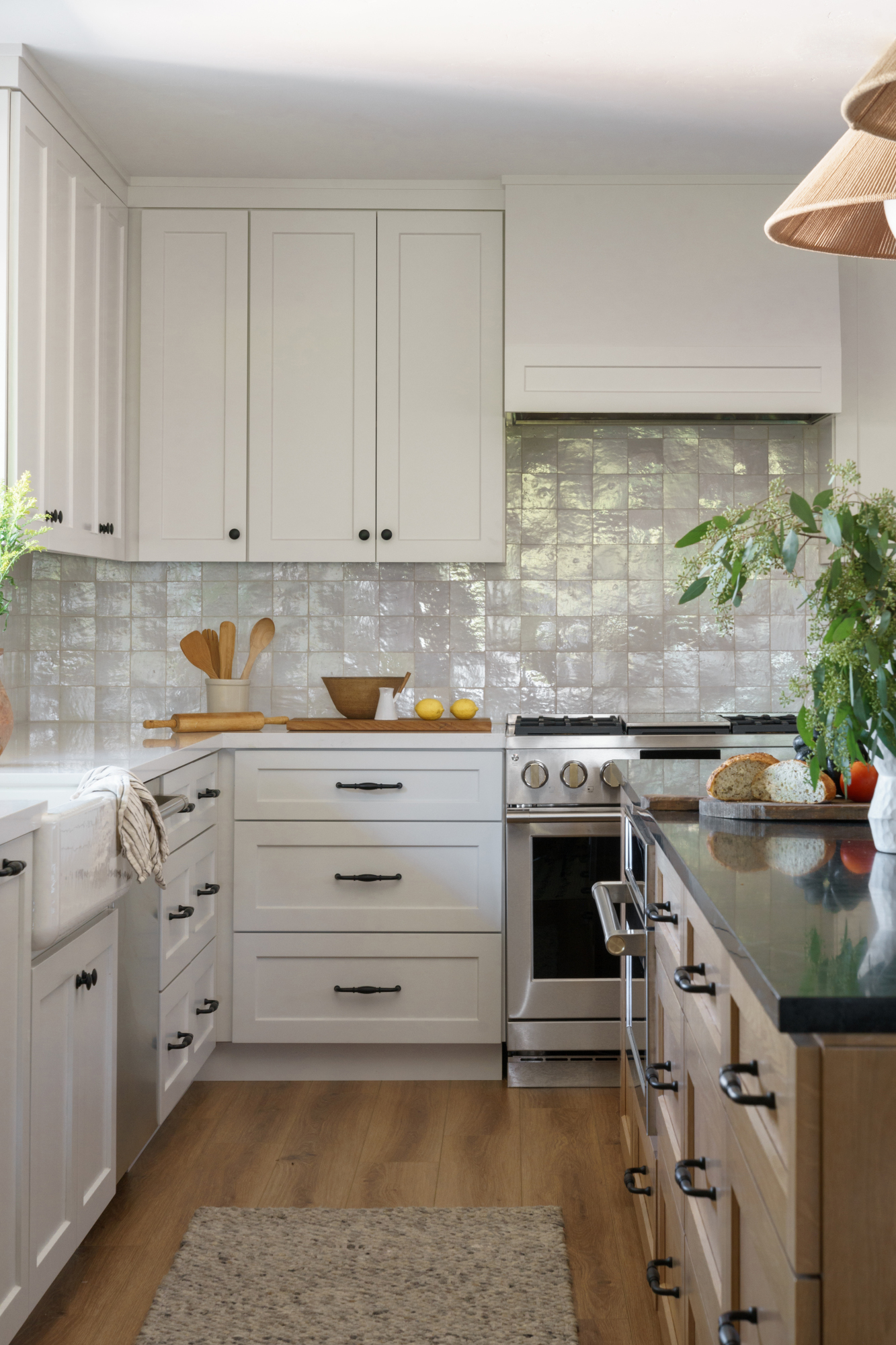
We love a clean, streamlined finish, but tiles in a pattern and texture that’s too uniform feels a bit passe – and doesn’t exactly exude the warmth we’re looking for in our kitchens and bathroom tiles. ‘Today more than ever people want their space to feel unique and less uniform,’ says Alexis Vitale of Hermosa Beach, CA firm Vitale Design Group. ‘Flat and uniform offer no excitement and can make the space feel dull and uninviting.’
Instead, look for tiles with a bit of movement to them: handcrafted tiles, or glazed decorative tiles like zellige, feel far more modern and inviting. You can see the effect in the kitchen above by Encinitas practice Makehouse Design Studio.
‘The trend is toward handcrafted tiles featuring movement or patterns, which add another layer of emphasis to a space through color, texture, and dynamism,’ says Atlanta, GA-based interior designer Theresa Butler. ‘For those aiming to create a statement kitchen, bathroom, mudroom, or any tiled area, the unique appeal of handcrafted tiles from companies like Clay Imports or Fireclay Tile is ideal. If the goal is to break the monotony of a space, consider using zellige or matte tiles.’
‘Anything with an organic, natural, artisan feel is definitely where I have been going in tile selections,’ adds Nureed Saeed of Nu Interiors in Berkeley, CA. ‘Perfection is overrated and I think people want to feel like it's okay if something splatters on their tile, or if life just happens. Tiles with movement offer a feeling of bringing nature inside, which people are longing for.’
2. Cookie-cutter subway tiles
Controversial though it may be, ordinary subway or metro tiles have been hugely overused in kitchen and bathroom design – and as a result, they’re starting to look a little tired. ‘White subway tiles are classic, but using them in traditional soldier or brick patterns is becoming less popular,’ says Theresa Butler. ‘Consider using [them] in a herringbone pattern or mixing them with small square tiles to create a design that elevates the classic look.’
If you are looking for an alternative to subway tile layouts, consider experimenting with other shapes. ‘Introducing a unique shape through your tile selection is a fun way to add subtle interest to your space,’ says Laura Tribbett, principal and founder of Chicago design firm Outline Interiors. ‘We opted for a custom glazed Ann Sacks swiss cross in this schoolhouse style kitchen and it really makes a difference. You get a similar rhythm / repeat that a typical subway tile would yield, but you're totally mixing it up with that unique cross form.’
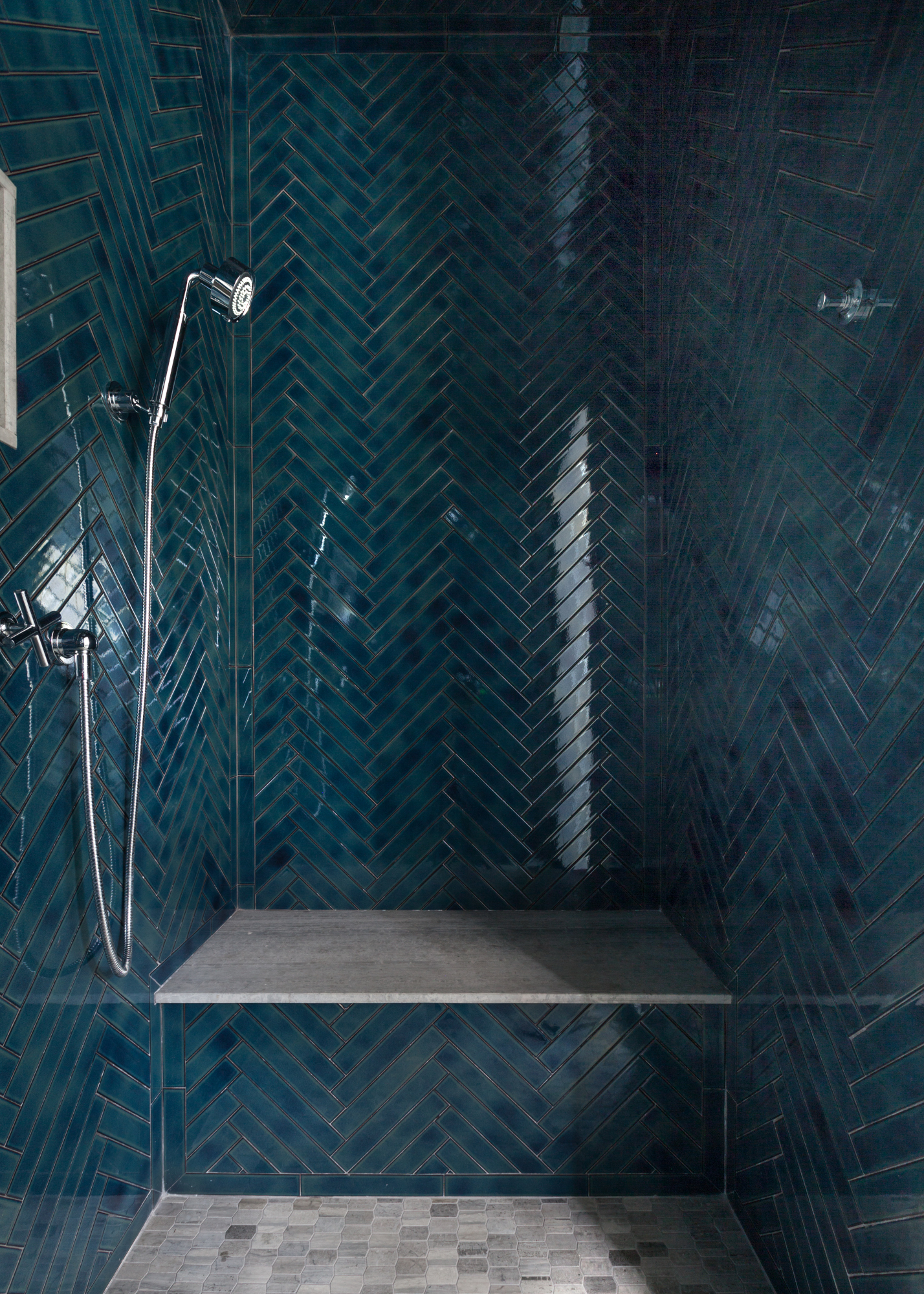
And as Theresa mentioned, subway tiles can still feel fresh – you just need a new approach. We love the herringbone layout and inky blue hue of the tiles in this walk-in shower idea by Melinda Kelson O'Connor Architecture & Interiors, above. ‘The world is your oyster with installation patterns – vertical stack, herringbone, and basketweave are a few of our favorites,’ says Hannah Goldberg of DC-based Hannah Charlotte Interiors. ‘If you’re feeling bold, try stripes of different colors.’
3. Mosaic accent bands
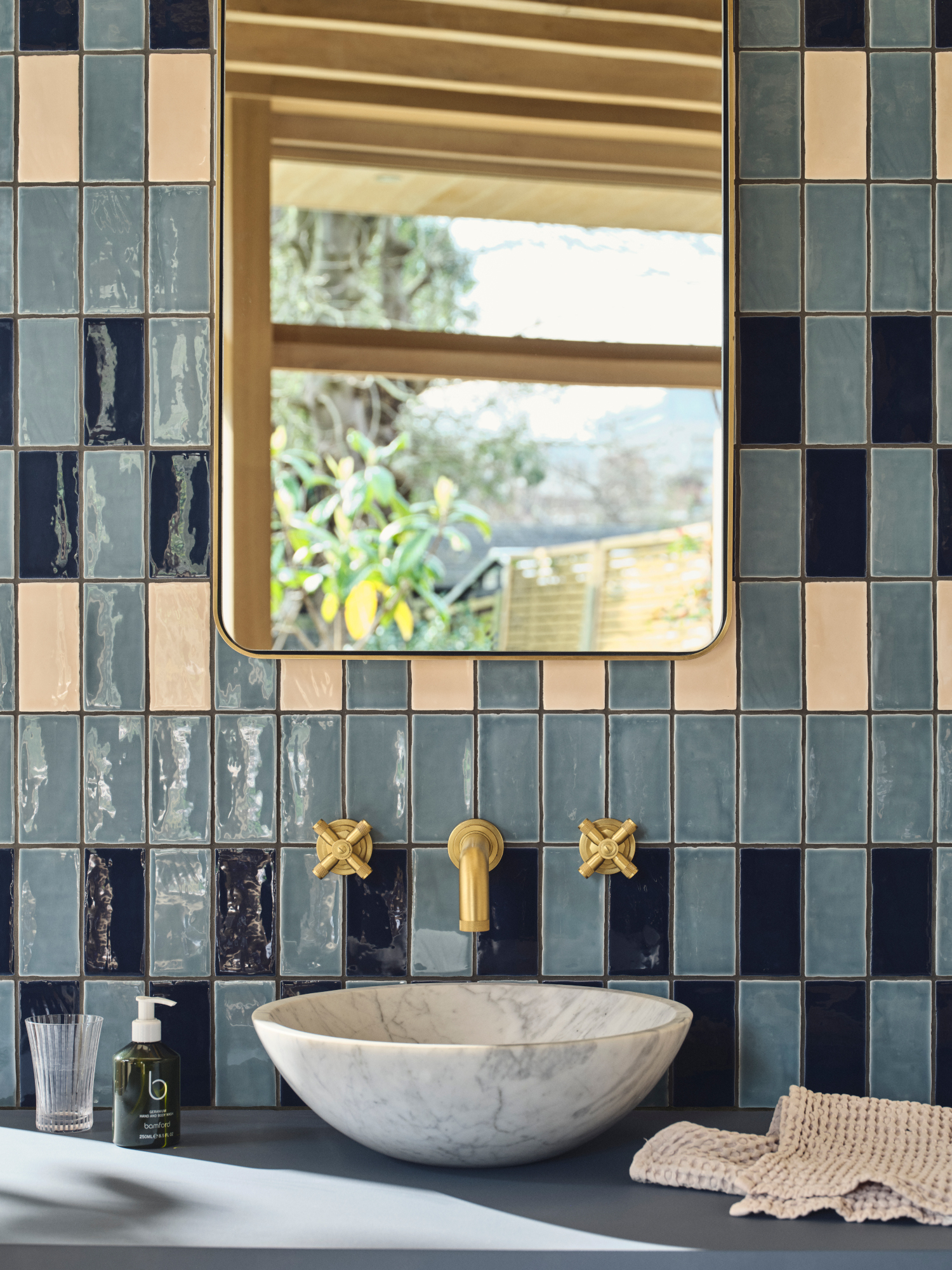
A relic of the 1990s and early 2000s, mosaic accent bands can feel somewhat retro – and not in a good way. ‘Visually, a mosaic band cuts the space, gives you a cluttered feeling, and your eye goes directly to that band,’ explains Alexis Vitale. ‘This can already make a space that is small feel even smaller.’
‘Mosaic accent bands are still used sparingly, like in a small. tucked-in wet bar,’ says Theresa Butler. ‘However, for bathrooms, large, eye-catching tiles are the trend. These tiles are incredibly modern. Using bright, large tiles in a small bathroom can make the space feel more expansive, transforming the look without requiring structural changes. Large tiles and marble slabs can achieve a seamless, clean, and timeless aesthetic.’
If you’re looking to introduce an accent detail into your tiling scheme, turn to natural stone like marble. ‘Avoid a band of accent tiles or niches filled with contrasting tiles and instead opt to either carry the main tile into the niche or add a beautiful, natural marble for either a bench, niche, or both,’ suggests Hannah Goldberg.
Alternatively, turn to grouting to create breaks in your tile pattern: ‘We have been loving creating interest with various grout line sizing,’ says Lauren Lerner, CEO and founder of Scottsdale, AZ studio Living with Lolo. And if you’re still keen on mosaics, there are still ways to introduce them to a contemporary scheme. ‘Using small-scale marble mosaic tiles in innovative patterns or textures across an entire wall allows for an updated take on mosaic accents and creates visual intrigue,’ adds Carly Allison, head of product design at Fired Earth.
4. Muted grayscale
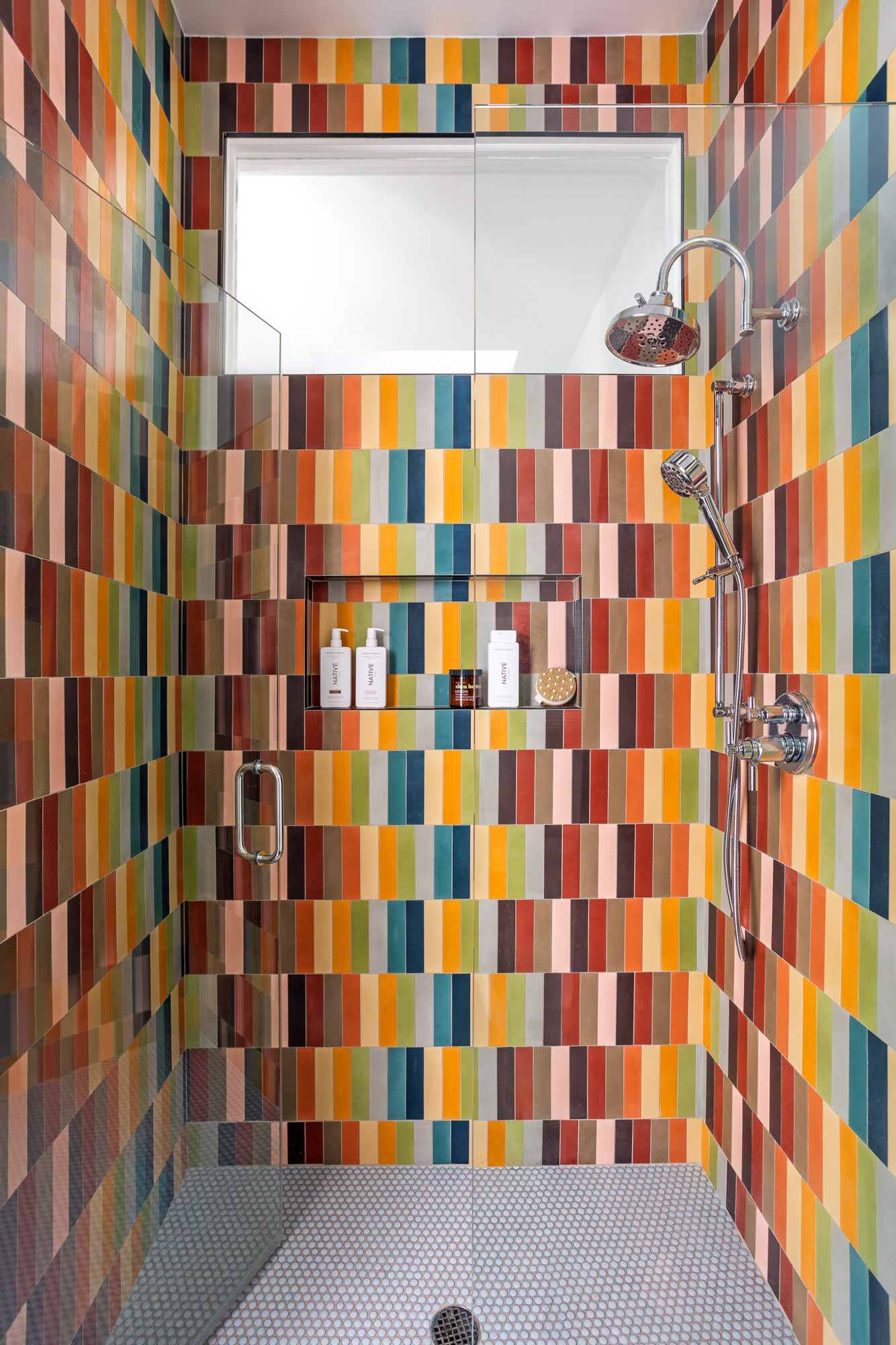
Gray as a color trend has fallen out of favor, and in kitchen and bathroom design – particularly when paired with other dated trends on this list, like flat texture – it feels a little cool and impersonal. ‘The gray trend started about 10 years ago and it's lost its lustre,’ says Alexis Vitale. ‘People want more dimension, more personality and are feeling bolder in using color in their home. What makes color interesting in tile is how we optimize it in a space. It's pretty incredible when a bathroom or space can take us to a place, evoke a feeling, and allow us to just feel pure enjoyment.’
Naturally, the alternative to gray is to turn to color, from jewel tones (‘they add color and energy while also providing a neutral backdrop,’ says Lee Thornley, founder of Bert & May) to pastels and earthy hues. ‘Colors like deep teal, burnt orange, and emerald green are gaining popularity,’ says Lauren Lerner. ‘They add richness and depth, making spaces feel vibrant and current.’
‘Maybe it's because I'm the parent of two young girls, but I am currently very much into multicolor everything,’ says Laura Tribbett. ‘When my team and I saw this “rainbow” concrete tile collection online [above], we put it in our back pocket and knew we would one day present it to a client with an open mind. That day came sooner than we expected and thus, the “rainbow shower” was born!’
5. Predictable backsplash tile treatments
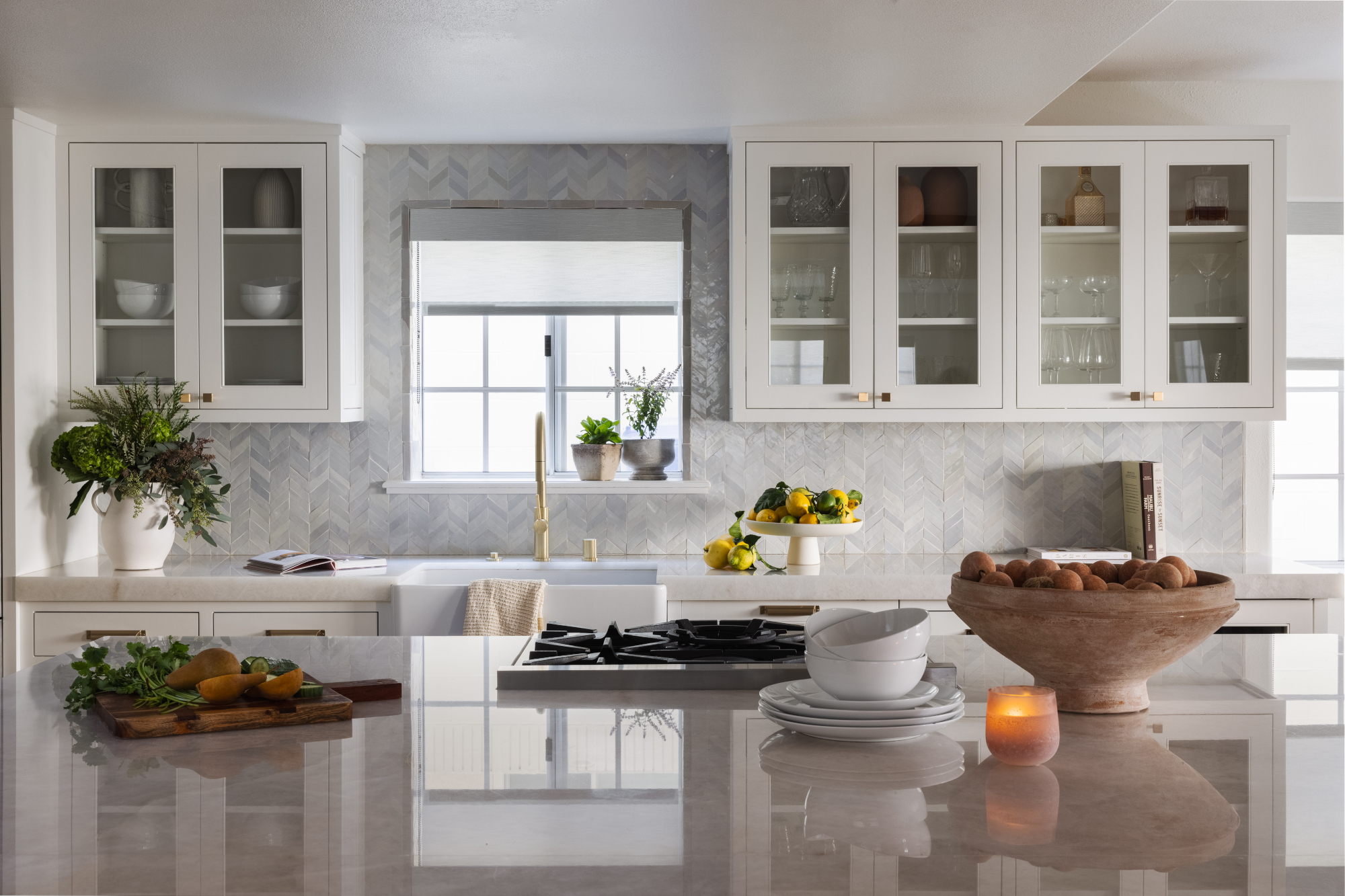
Backsplashes are a surprisingly tricky thing to get right in a kitchen design – partly because we’ve seen so many trends come and go in this small space, from patterned tiles to, yes, those classic subway tiles again
‘For years we’ve been seeing the same kitchen backsplash over and over again – so much horizontal zellige and subway tiles,’ says Jason Hoffman of Boston-based design and build firm J.P. Hoffman. ‘Doing a mosaic herringbone pattern gives a kitchen an instant refresh. And here’s the super fresh update: Take it all the way to the ceiling. It’s dramatic, elevated and visually interesting.’ See the kitchen scheme above by Vitale Design Group as an example of how to make this work.
Of course, with smaller tiles comes more grouting – and therefore cleaning. A larger slab of grout-free tile around the main splatter-prone areas of your kitchen, i.e. the oven and the sink, can help make upkeep simpler – and provide a good-looking point of contrast to the rest of the tile scheme.
6. Faux marble
Fear not, this one comes with a very important caveat: marble is still very much in style (in fact, it’s a design classic). Instead, we’re talking about the naff-looking replicas that can fall a little flat. We recently visited a series of new suites by French designer Laura Gonzalez at Hotel Byblos in Saint-Tropez, and were impressed by the bathroom flooring – fragments of marble that had been smashed up and then assembled in a fresh take on a mosaic. It was evidence that there are interesting and contemporary ways to use the stone without resorting to cookie-cutter large-format tiles.
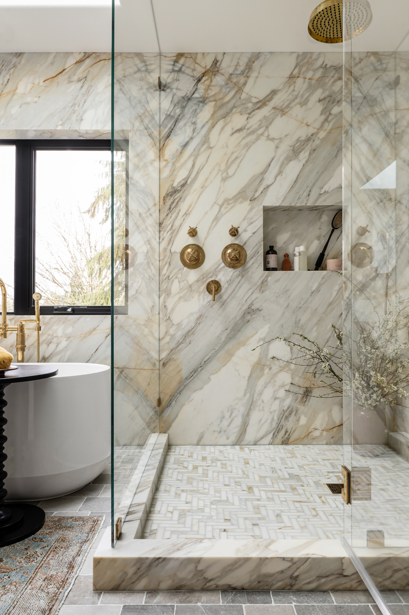
‘Marble-look porcelain tiles used to instantly date a home – their uniform 12x12 size and repeated print was a dead giveaway that they were an imitation and not real marble,’ says Hannah Goldberg. ‘But with advances in printing and tile production, there are now absolutely gorgeous natural stone-look tiles on the market.' She recommends opting for a large slab for a shower wall, as shown in this scheme by Seattle's Cohesively Curated Interiors: 'This has the added benefit of avoiding grout lines entirely and creates a beautiful, all-encompassing look for a shower.’
Be The First To Know
The Livingetc newsletters are your inside source for what’s shaping interiors now - and what’s next. Discover trend forecasts, smart style ideas, and curated shopping inspiration that brings design to life. Subscribe today and stay ahead of the curve.

Ellen is deputy editor of Livingetc magazine. She works with our fabulous art and production teams to publish the monthly print title, which features the most inspiring homes around the globe, interviews with leading designers, reporting on the hottest trends, and shopping edits of the best new pieces to refresh your space. Before Livingetc she was deputy editor at Real Homes, and has also written for titles including Homes & Gardens and Gardeningetc. Being surrounded by so much inspiration makes it tricky to decide what to do first in her own flat – a pretty nice problem to have, really. In her spare time, Ellen can be found pottering around in her balcony garden, reading her way through her overstacked bookshelf or planning her next holiday.
-
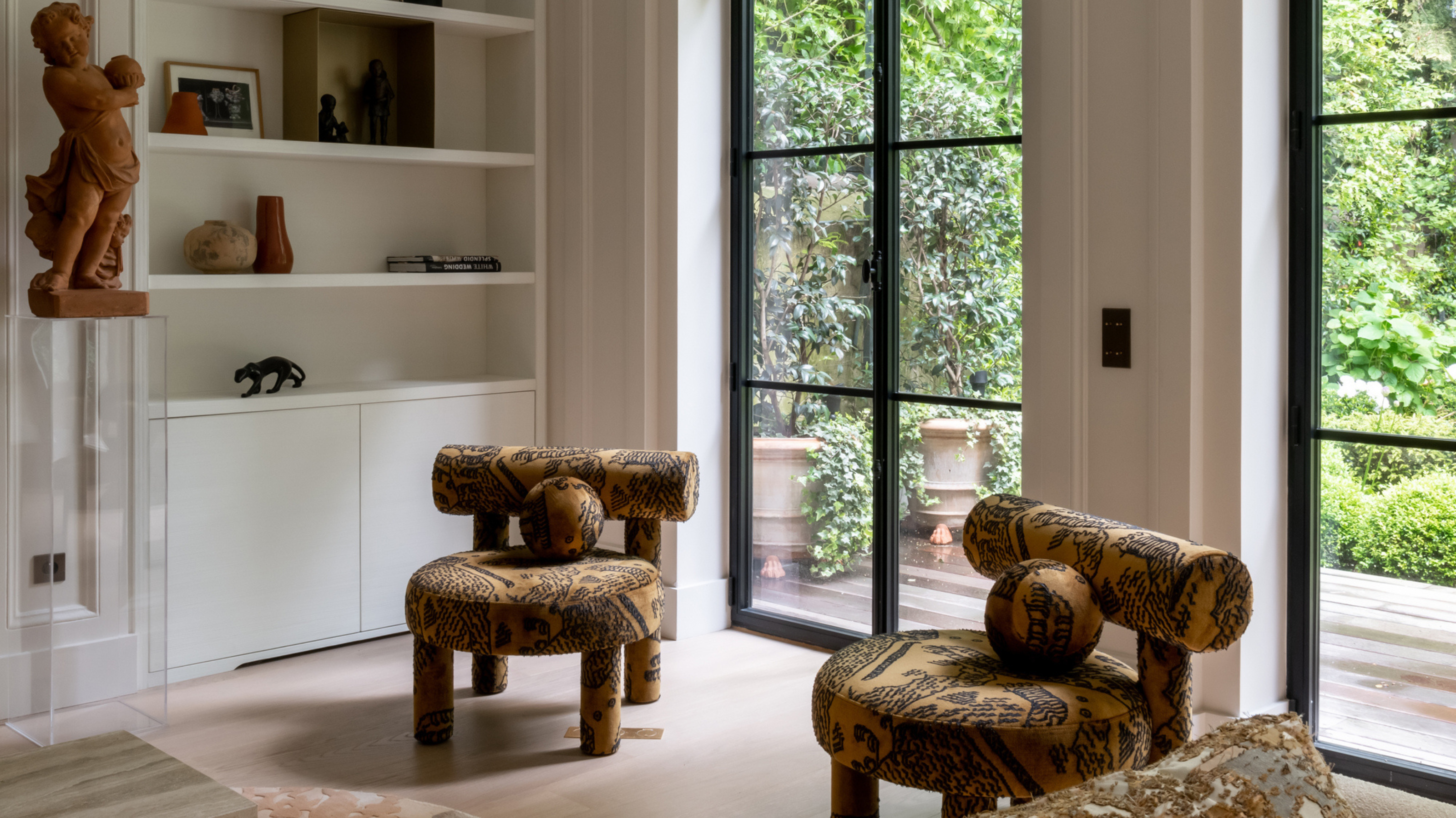 This Specific Fabric Print Is Literally Everywhere Right Now — Here's Why
It's whimsical, artistic, and full of character. We've called it already: Dedar's 'Tiger Mountain' is the fabric that will define 2025
By Devin Toolen
-
 These Are the Dos and Don'ts of Bamboo Plant Placement — Follow This to Avoid Bad Feng Shui
By following the experts' guidance on where to place this houseplant you can usher luck, wealth, and prosperity into your home
By Lilith Hudson