'We Are Done With These Trends,' Say Designers — 5 Outdated Looks To Leave Behind in 2023
As we move into 2024, experts share trends that no longer add value to interiors and need to be shunned
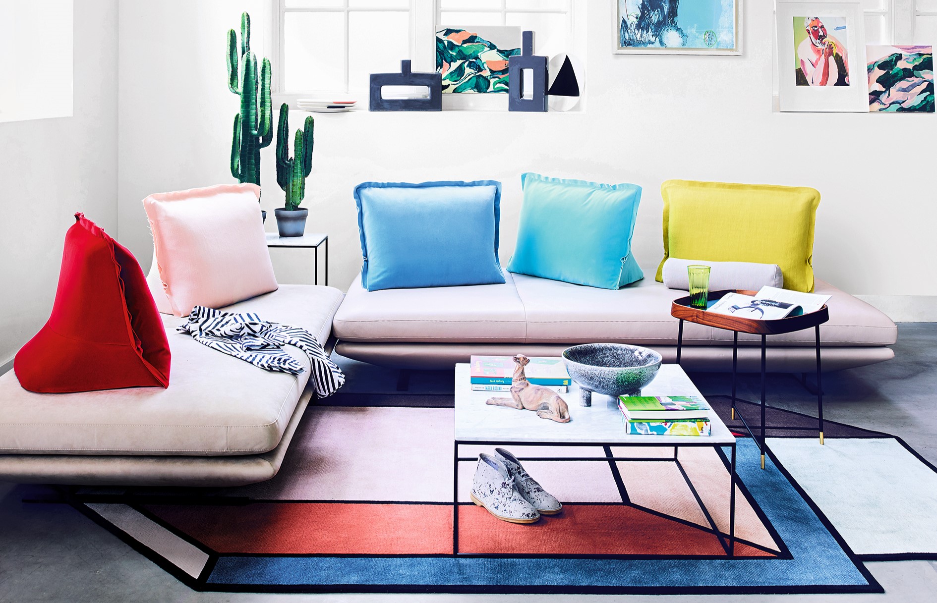

Sure, trends come and go, and tastes are personal but over time, with the digital boom, certain design elements become overly done, and at times hyper-obsessions that very quickly reach a peak, become oversaturated, and pass their prime. This is why designers suggest creating interiors that are livable, smart yet relatively timeless.
To this end, we asked top designers to elucidate interior design trends that are on their way out (that we’re hoping will stay there!). Here are 5 elements or ideas that have passed their expiry date and are best left in 2023.
1. Wall-to-wall carpeting
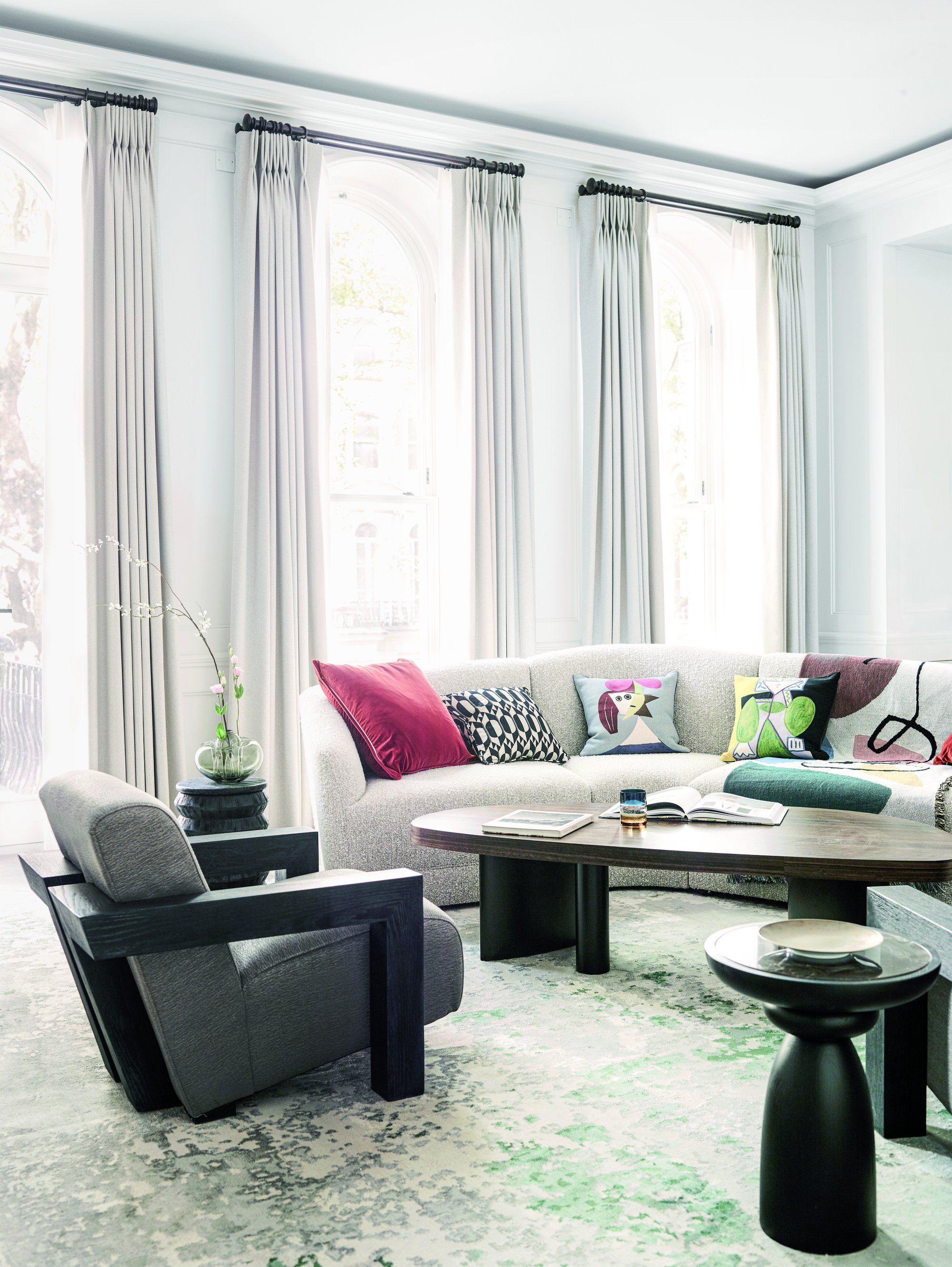
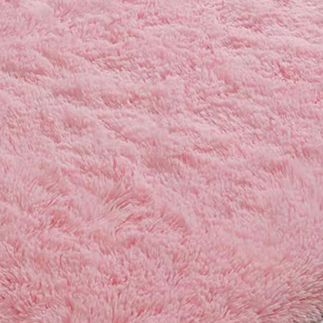
Gone are the days of homes fully furnished with carpets that added permanence in terms of color and texture. Over time, these have lost relevance, with area rugs taking over the scene.
'Plush living room carpet in a wall-to-wall format is outdated,' says Jane Lockhart, founder of Jane Lockhart Design. 'This style was popular in the 1980s through the late '90s but it is difficult to maintain over time. Today, most carpets are area rugs on top of solid surfaces that form the flooring in homes.'
Carpets, especially in high-traffic areas posed cleanliness and maintenance issues. Homes with children and pets create inevitable messes, destroying carpeted flooring with discoloration and odors. Living room carpets especially required regular deep cleaning, costing extra money that could’ve been saved with other flooring selections.
2. Exposed bulbs
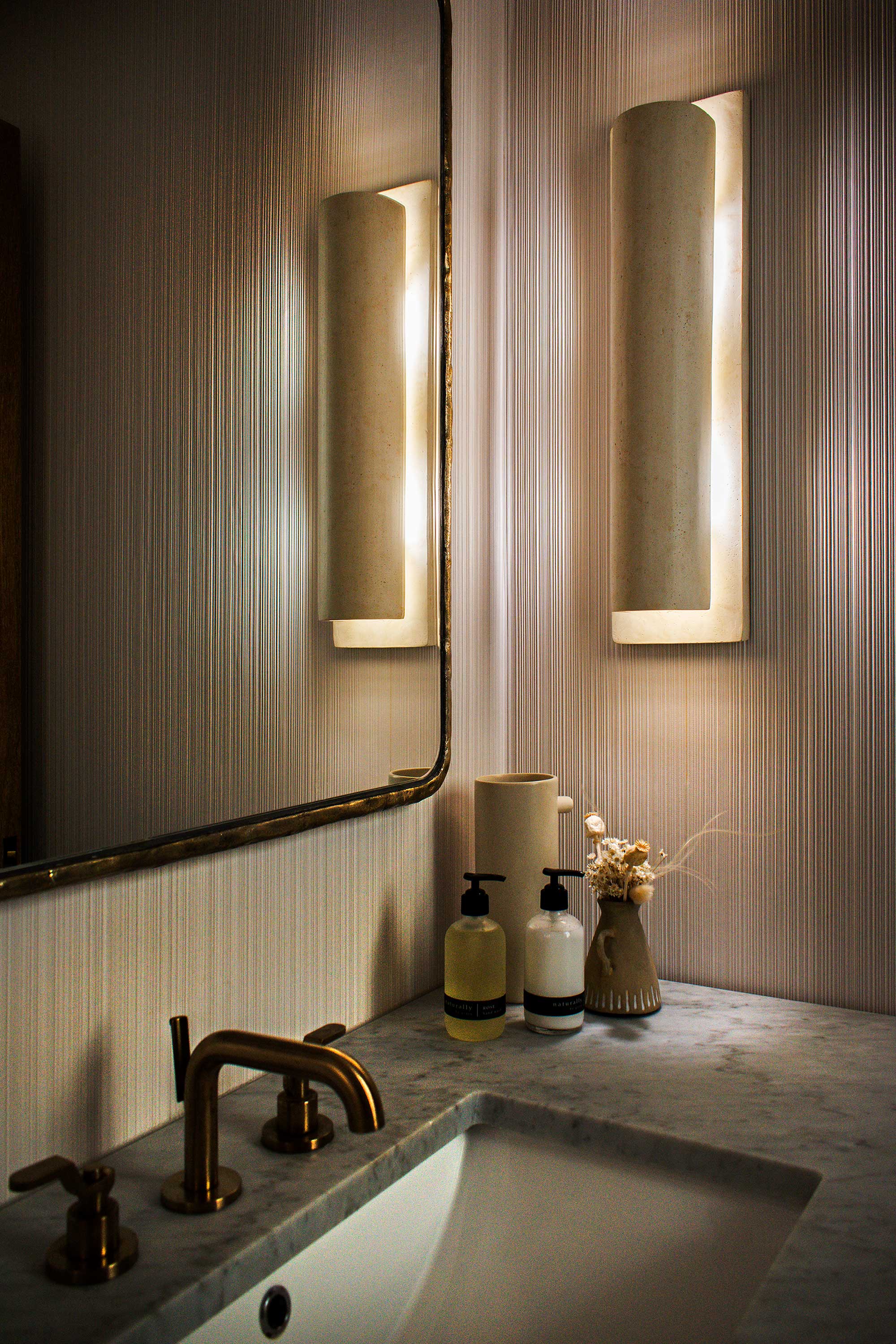
Exposed materials and even lighting had its charm...till some time ago. With homes becoming more and more modern, this staple has been losing relevance.
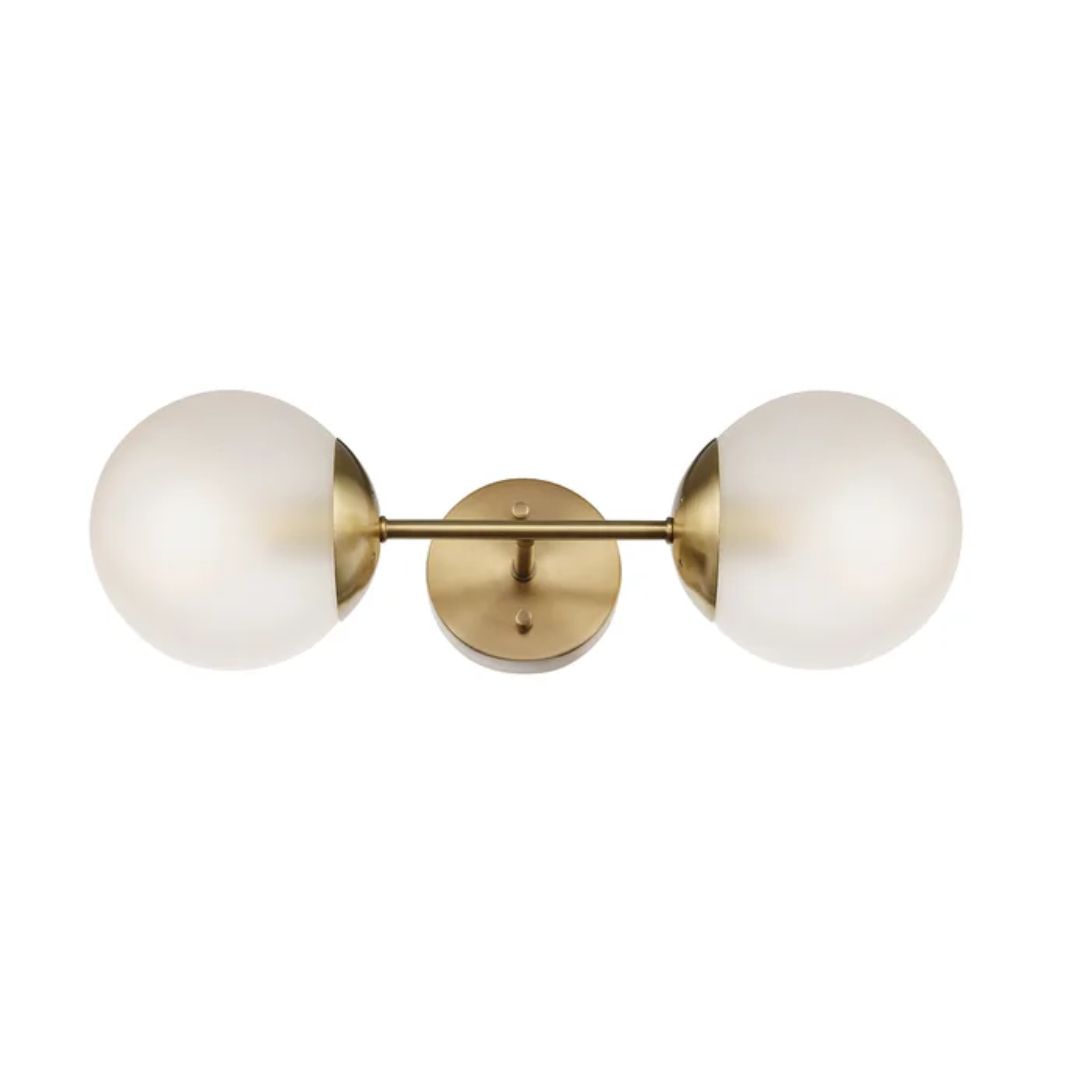
‘No more exposed bulb wall sconces,' says Los Angeles-based Brooke Spreckman, founder and principal designer of Design Hutch. 'Bathroom lighting especially needs to be even and smooth, and a fixture without a filter around the bulb is going to be too bright.'
Plus in a room where there's constant moisture, it's best to have elements that are safe and accident-free.
3. Too many bold colors
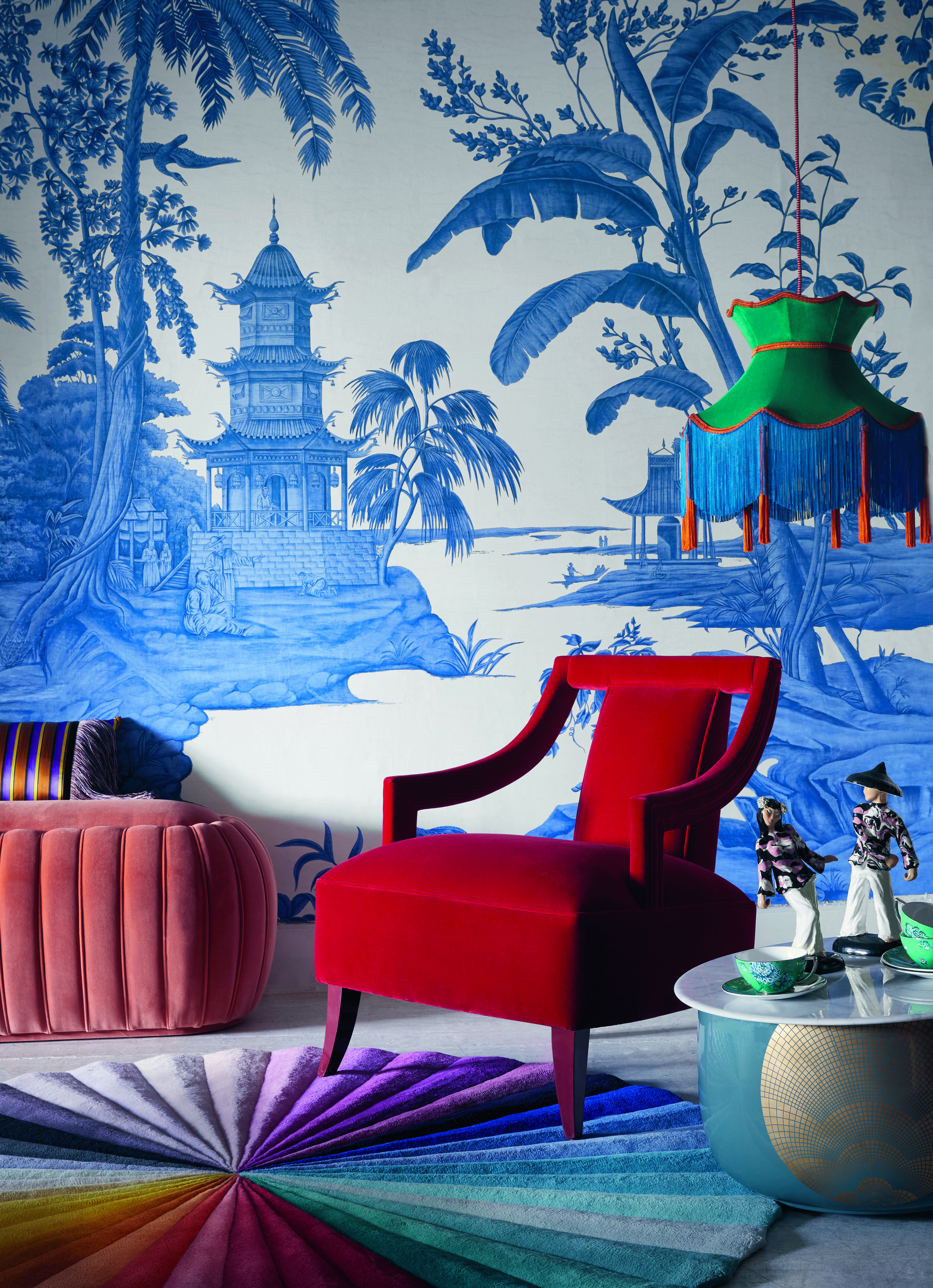
When it comes to living room colors along with other spaces, there's been a movement toward using bolder tones. But when it comes to balancing them, designers warn against using too many statement-making colors.
‘It's not uncommon to see rooms fully saturated in a single color but to see a strongly colored room highlighted by equally intensely colored drapery or furnishings is a bit more unusual,’ says Louisville, Kentucky interior designer Bethany Adams. ‘I like the challenge of pairing bold colors and making the rooms look cohesive – not crazy.’
4. Tropical patterns
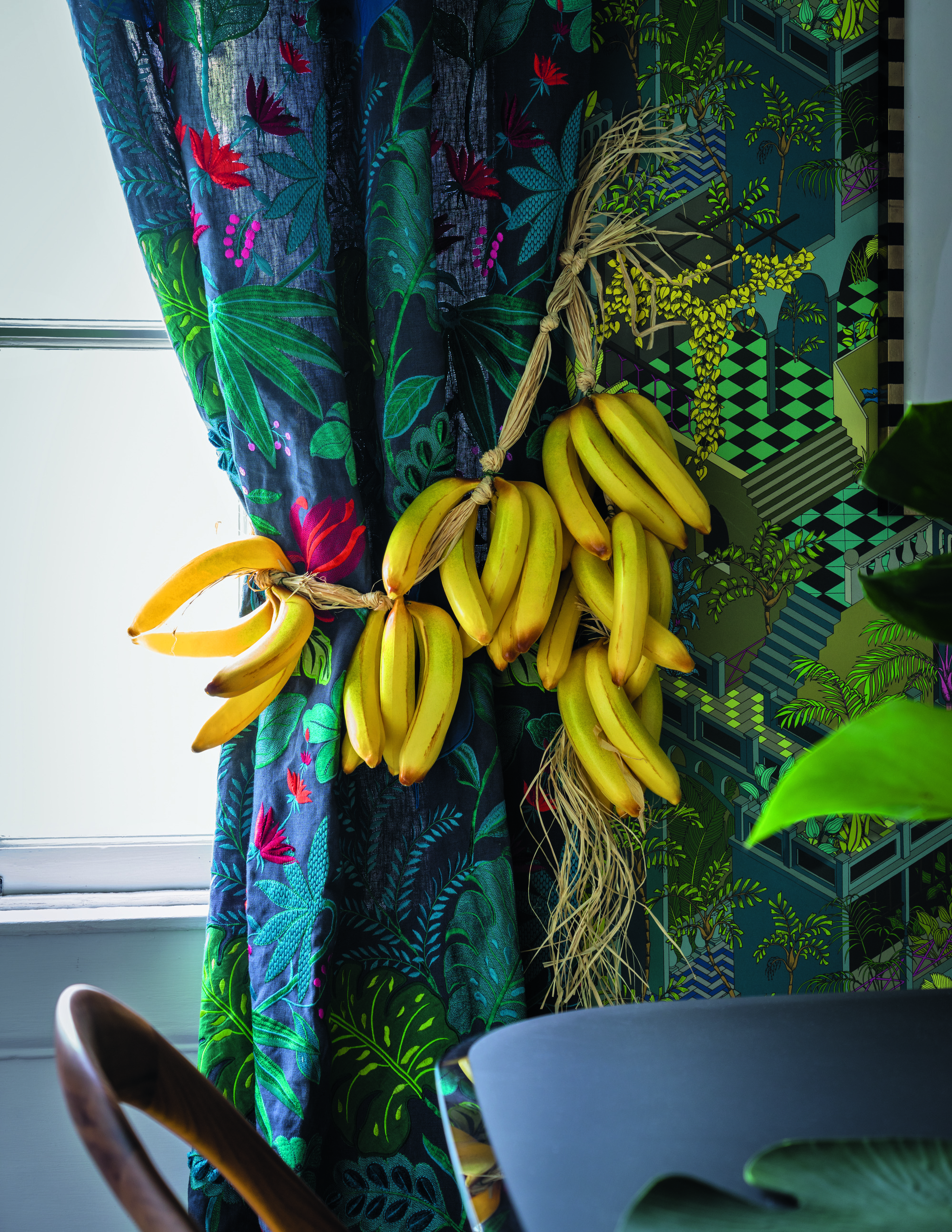
Tropical patterns have been everyday...for decades. These especially have have gone in and out of favor over the years but presently, may not be ideal for interiors. ‘Personally, I think the patterns that date your home are ones that were selected to follow trends and not because they work contextually in a space,’ says Nick Spain, founder of multidisciplinary design studio Arthur's.
Banana leaf print is his example. ‘Banana leaf prints were being used all over the place in a way that instantly dates a space to me, mainly because oftentimes they don’t feel like they really belong there,' he says. 'If you’ve got an oceanfront home in Palm Beach, then maybe a banana leaf print isn’t half bad, but I’m not sure it belongs in a suburban home in Connecticut.’
With minimaluxe taking over the scene, the decor trend for more subtle prints and patterns is ruling the roost.
5. Gallery walls

There was a time when every home had a gallery wall, whether in the living room, hallway or kitchen. But over time, a cleaner, sleeker and neater design aesthetic has emerged, where single, statement pieces of art have taken over walls.
'A sad little tree or a too-small piece of art can hurt the look rather than help it,' says Los-Angeles-based designer Peter Dunham. 'Get the big tree, hang the fabulous art. This is a "go big or go home" occasion.'
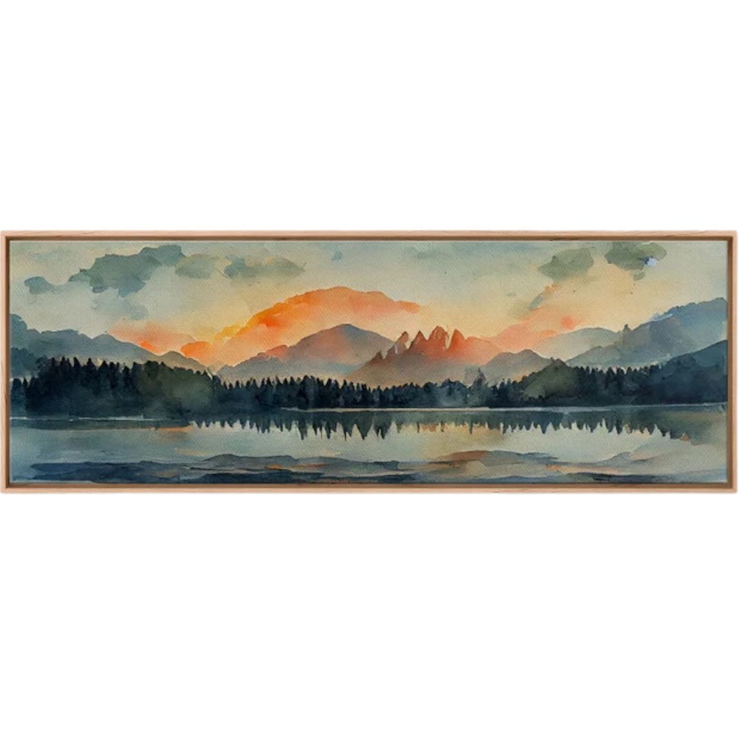
Large, single artworks can play with the proportions of a wall and bring the room to life. Mounting artwork is a clever trick for taking up more wall space and it also allows the artwork to truly stand out.
3 products that are on-trend and perfect for 2024
Be The First To Know
The Livingetc newsletters are your inside source for what’s shaping interiors now - and what’s next. Discover trend forecasts, smart style ideas, and curated shopping inspiration that brings design to life. Subscribe today and stay ahead of the curve.

Aditi Sharma Maheshwari started her career at The Address (The Times of India), a tabloid on interiors and art. She wrote profiles of Indian artists, designers, and architects, and covered inspiring houses and commercial properties. After four years, she moved to ELLE DECOR as a senior features writer, where she contributed to the magazine and website, and also worked alongside the events team on India Design ID — the brand’s 10-day, annual design show. She wrote across topics: from designer interviews, and house tours, to new product launches, shopping pages, and reviews. After three years, she was hired as the senior editor at Houzz. The website content focused on practical advice on decorating the home and making design feel more approachable. She created fresh series on budget buys, design hacks, and DIYs, all backed with expert advice. Equipped with sizable knowledge of the industry and with a good network, she moved to Architectural Digest (Conde Nast) as the digital editor. The publication's focus was on high-end design, and her content highlighted A-listers, starchitects, and high-concept products, all customized for an audience that loves and invests in luxury. After a two-year stint, she moved to the UK and was hired at Livingetc as a design editor. She now freelances for a variety of interiors publications.
-
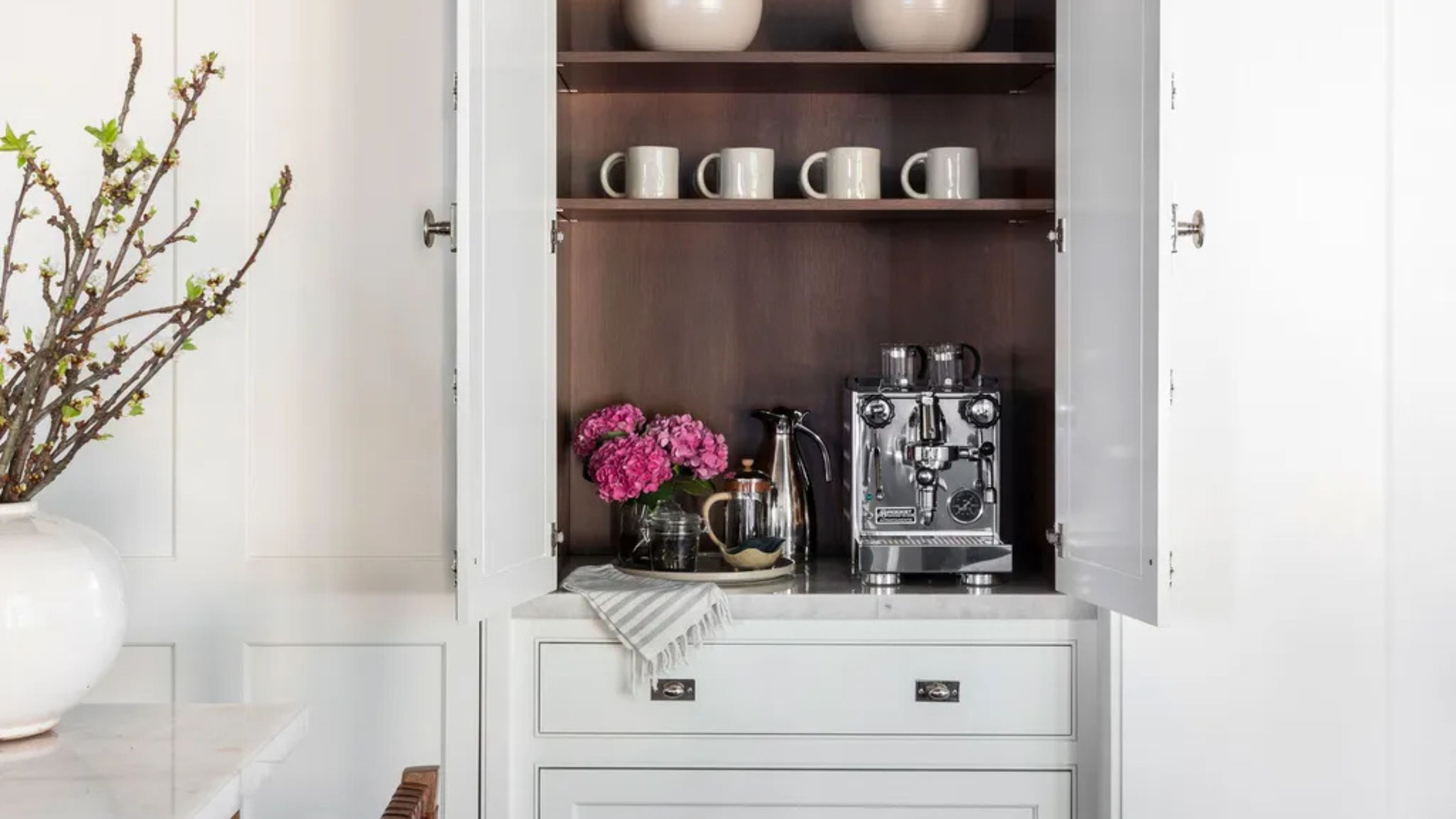 Turns Out the Coolest New Café is Actually In Your Kitchen — Here's How to Steal the Style of TikTok's Latest Trend
Goodbye, over-priced lattes. Hello, home-brewed coffee with friends. TikTok's 'Home Cafe' trend brings stylish cafe culture into the comfort of your own home
By Devin Toolen Published
-
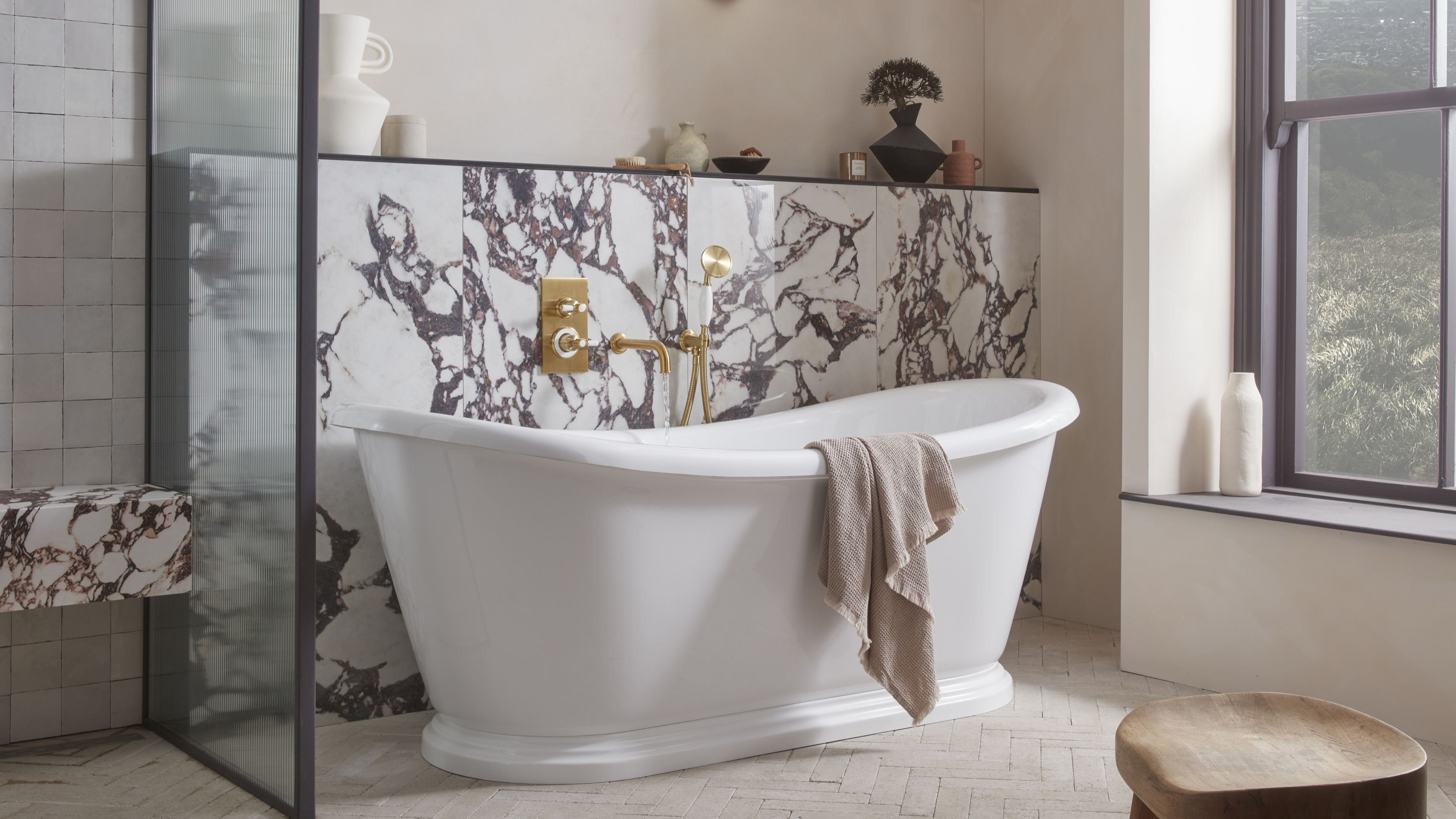 5 Bathroom Layouts That Look Dated in 2025 — Plus the Alternatives Designers Use Instead for a More Contemporary Space
For a bathroom that feels in line with the times, avoid these layouts and be more intentional with the placement and positioning of your features and fixtures
By Lilith Hudson Published
