4 outdated wall decor trends designers are leaving behind – and the one that they're choosing instead
These are the ways to decorate your walls that interior designers have been 'quiet quitting' for some time
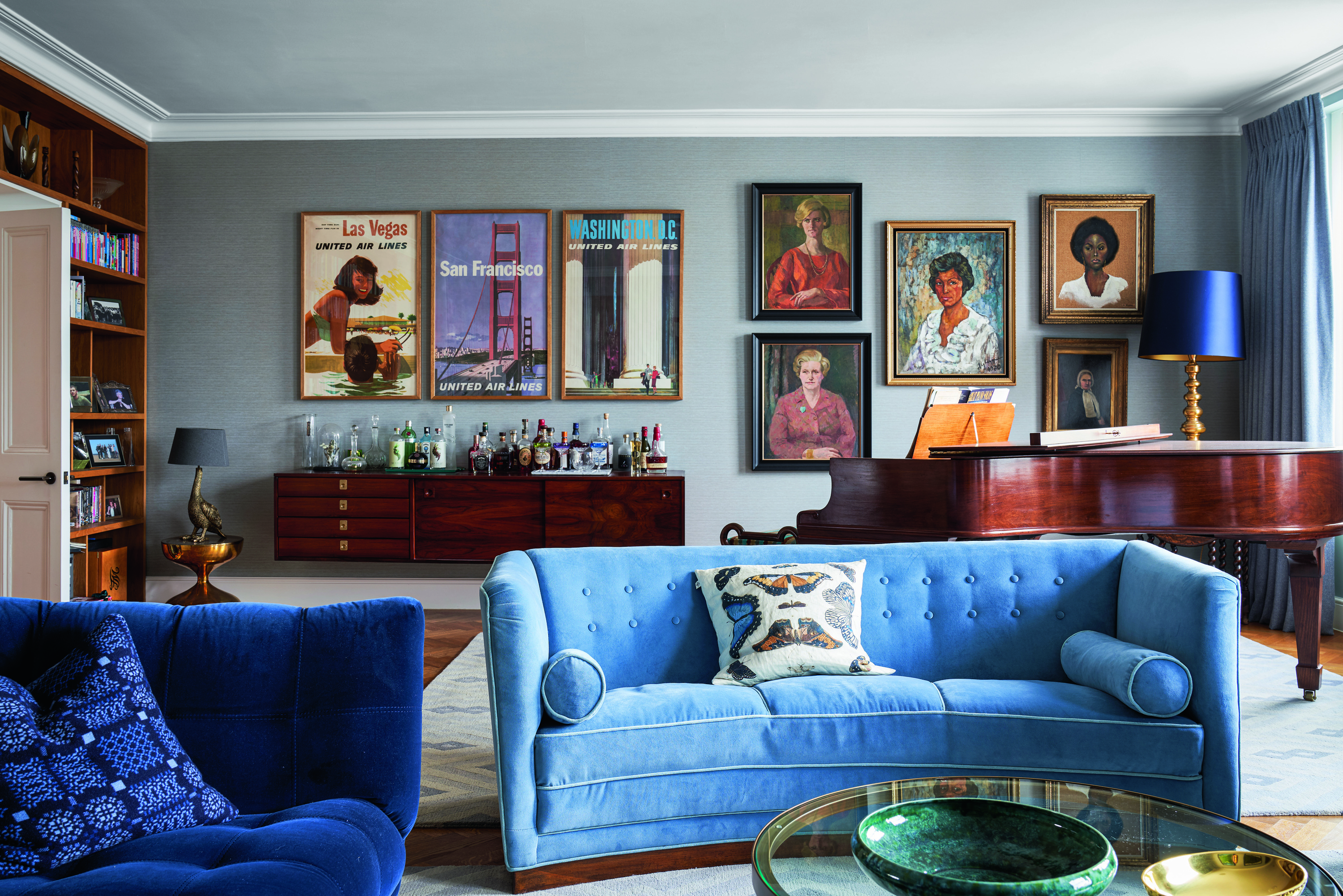

Wall decor trends have changed quite a bit in the last few years. As interiors have become more considered, clutter-free, and in some cases, even minimalist, gone are the days of crowding walls with photographs, hanging multiple frames, and creating symmetrical interiors.
'In the ever-changing world of interior design, what was once trendy for decorating our walls has quickly become outdated,' says Nitin Kohli, founder and principal designer of Nitin Kohli Home. 'Design experts are now encouraging us to say goodbye to old-fashioned styles that were all about filling up walls.'
If you are in the middle of doing up your living room wall decor and want to change up the space's vibe, then these are some ideas you should stay away from, and some you should consider.
1. Macrame wall hangings
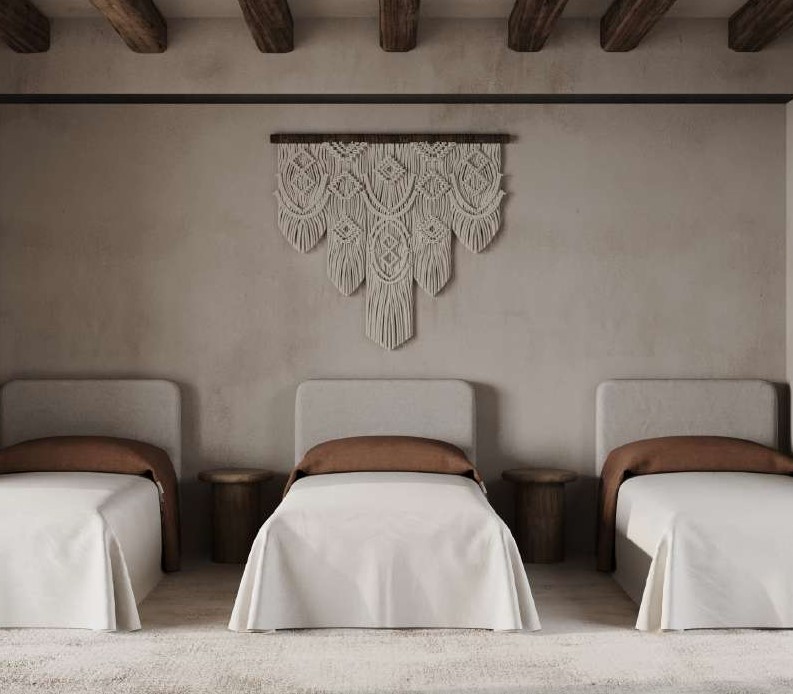
Macrame wall hangings were everywhere for a little while, but they've definitely become less popular as they've become more readily available. These whimsical additions were a staple of cozy living rooms and bedrooms, but over time have lost their charm and staying power as homes are moving towards a more modern, crisp, and curated look.
'Macrame wall hangings had a stronghold for so long because they added an element of the handmade and a casual, bohemian feel that was so popular,' says Candace Shure, founder of Shure Design Studio. 'But after seeing so many mass-produced renditions of them everywhere, I think we’ve all finally moved on.'
Designers suggest choosing one, single piece of art, or a photograph to decorate the wall instead. A design that coordinates well with the modern look of your home.
2. Oversized wall clocks
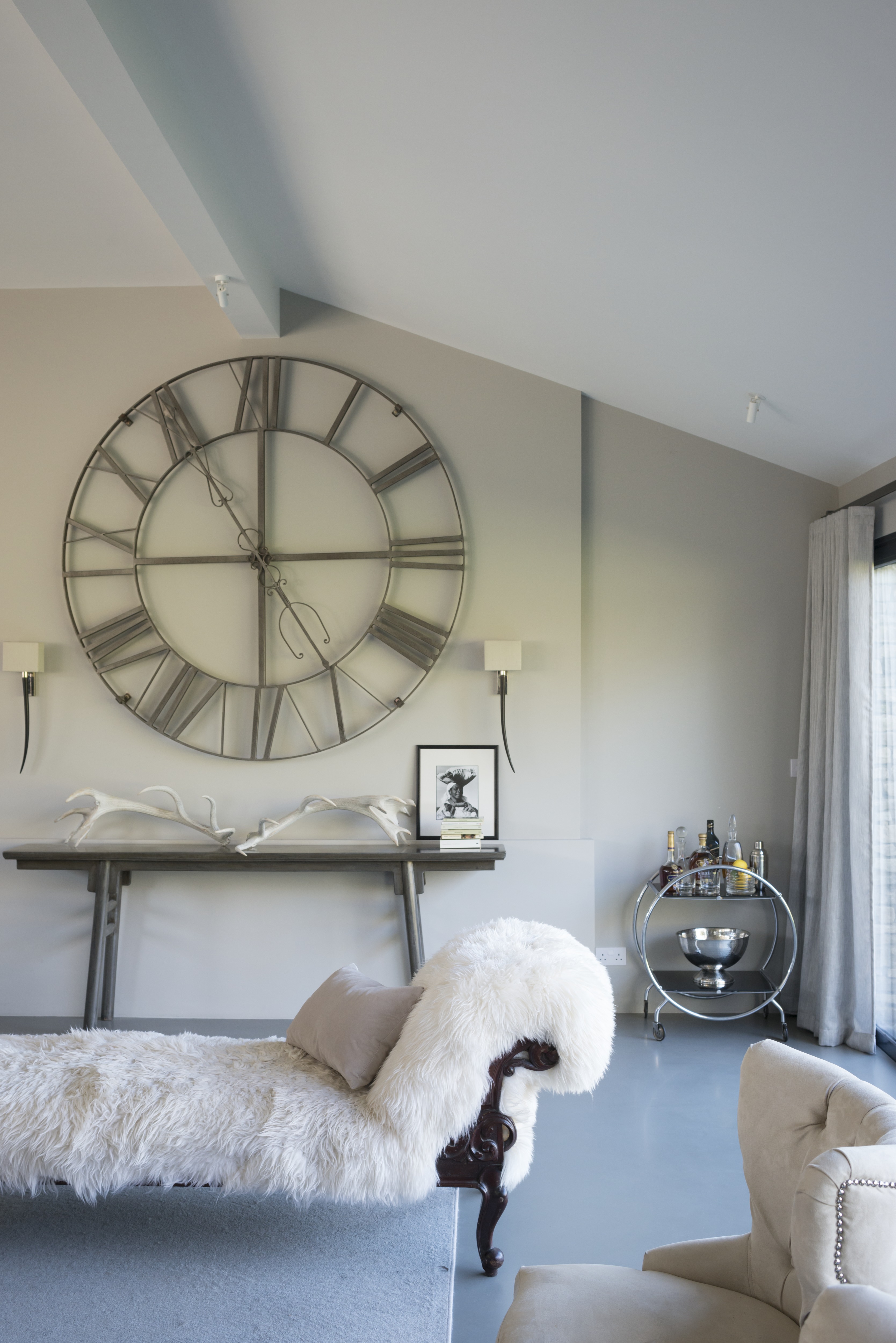
With limited space comes limited decorating options. With that in mind, we’re likely to see a shift away from those oversized wall clocks that were once a loved addition but now feel a little jarring inside a more sophisticated home. In small spaces especially, a large wall clock can take up precious wall square footage which could be taken up by more elegant living room wall decor, whether that's smaller decor, or even left blank to create more breathing room.
'Oversized wall clocks, which were once popular for their unique and dramatic effect, have also become somewhat passé,' says Nitin. 'Instead, if you want to create an impact, you could go in for wall paneling options to infuse a fresh and personalized touch into your living space.'
3. Mass-produced art
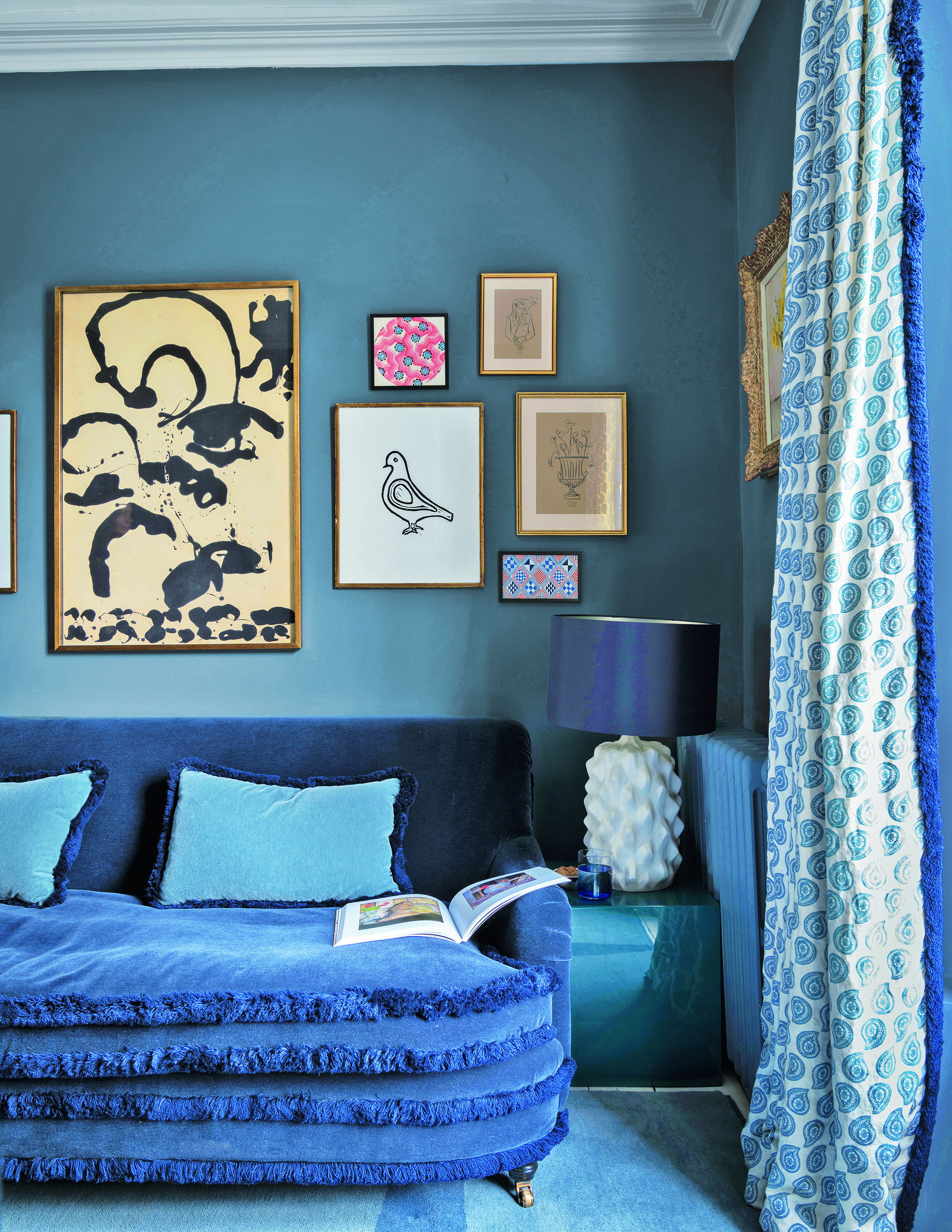
Another big pet peeve of designers is living room art, prints, or canvases that are mass-produced.
'I think the era of manufactured art is on the decline,' says Mary Patton, founder of Mary Patton Design. 'Buying wall decor that is made in bulk is a trend that needs to go. You can find so many cool, unique, one-of-a-kind and even customizable pieces in so many places. For instance, Chairish is a great online option. Art should be something unique and something that evokes meaning when you look at it.'
4. Busy gallery walls
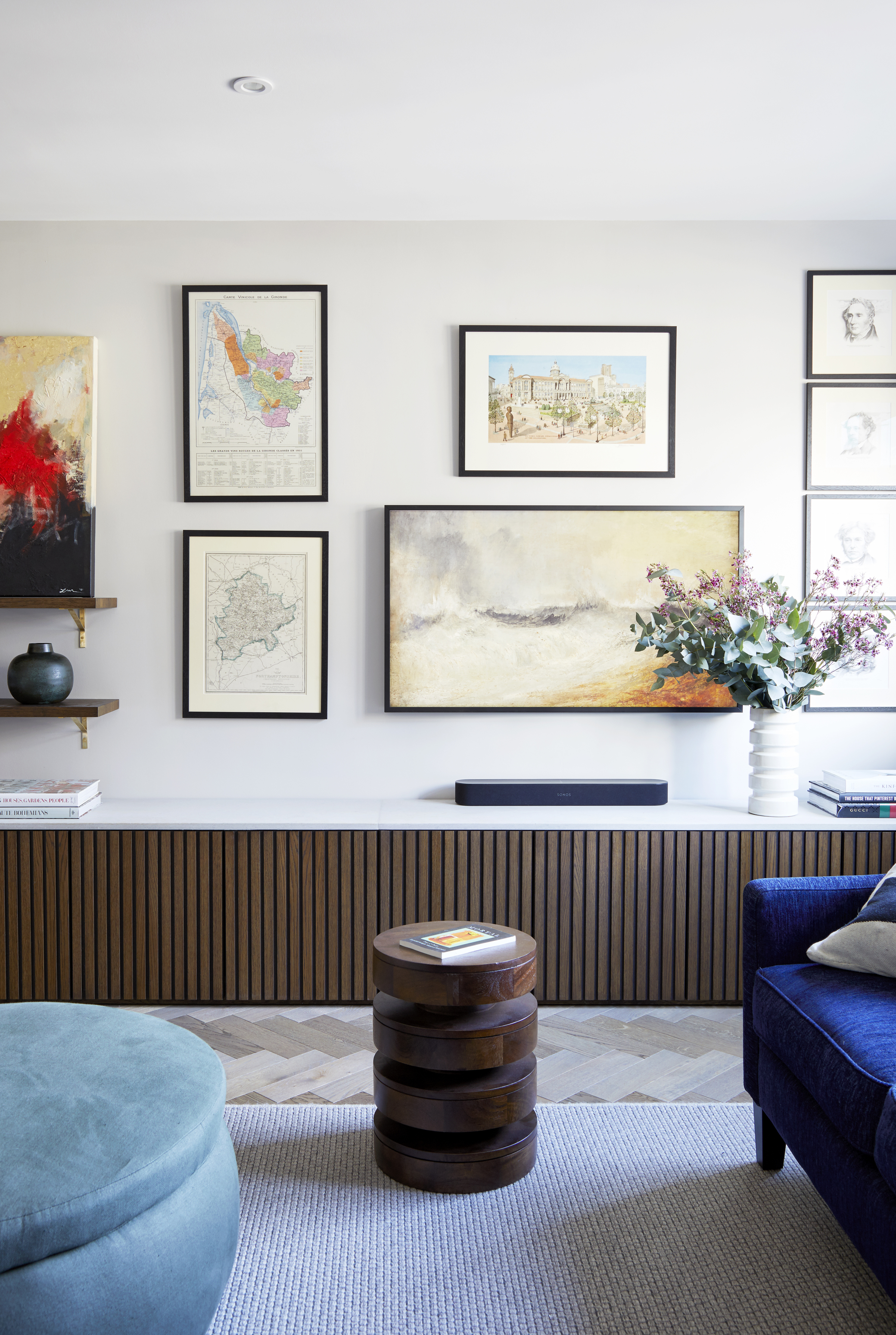
Living room gallery walls are a canvas to display varied pieces of art, photography, and more together - and there was once one in almost every home. The idea was to fill the wall such that it became the most eye-catching element in the room, and gave a sense of your personality. But as more minimalist living rooms have fallen into fashion, gallery walls have fallen out of it.
'Excessive gallery walls, once praised for their eclectic charm, are giving way to a simpler approach,' says Nitin. 'Designers now suggest using fewer, larger pieces of art to create a more impactful focal point without overwhelming the room. Similarly, the trend of oversized typography on walls, which once made a bold statement, is now seen as a bit overused. Instead, choose more personalized and subtle art to add unique character to your space.'
'Instead of artworks, think of moody blues and dark green wall paints to give a room a cozy and elegant feel, especially when combined with warm lighting,' says Nitin. 'These colors create a sense of calm and sophistication, which is a departure from the previously popular light and neutral colors that aimed for a more understated look. To create a modern and inviting living space, forget old wall decor trends, and embrace paints instead.'
What wall decor is on-trend now?
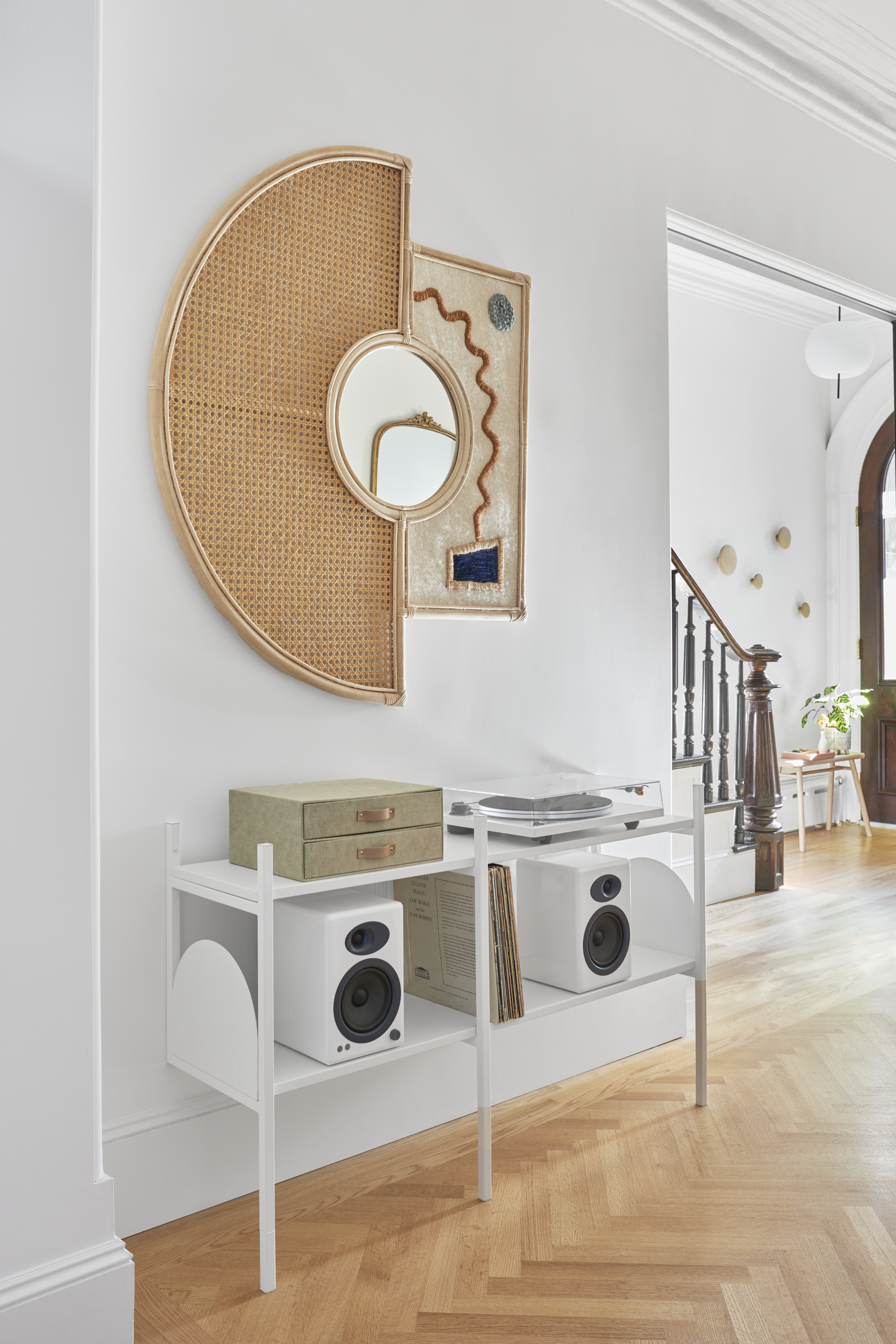
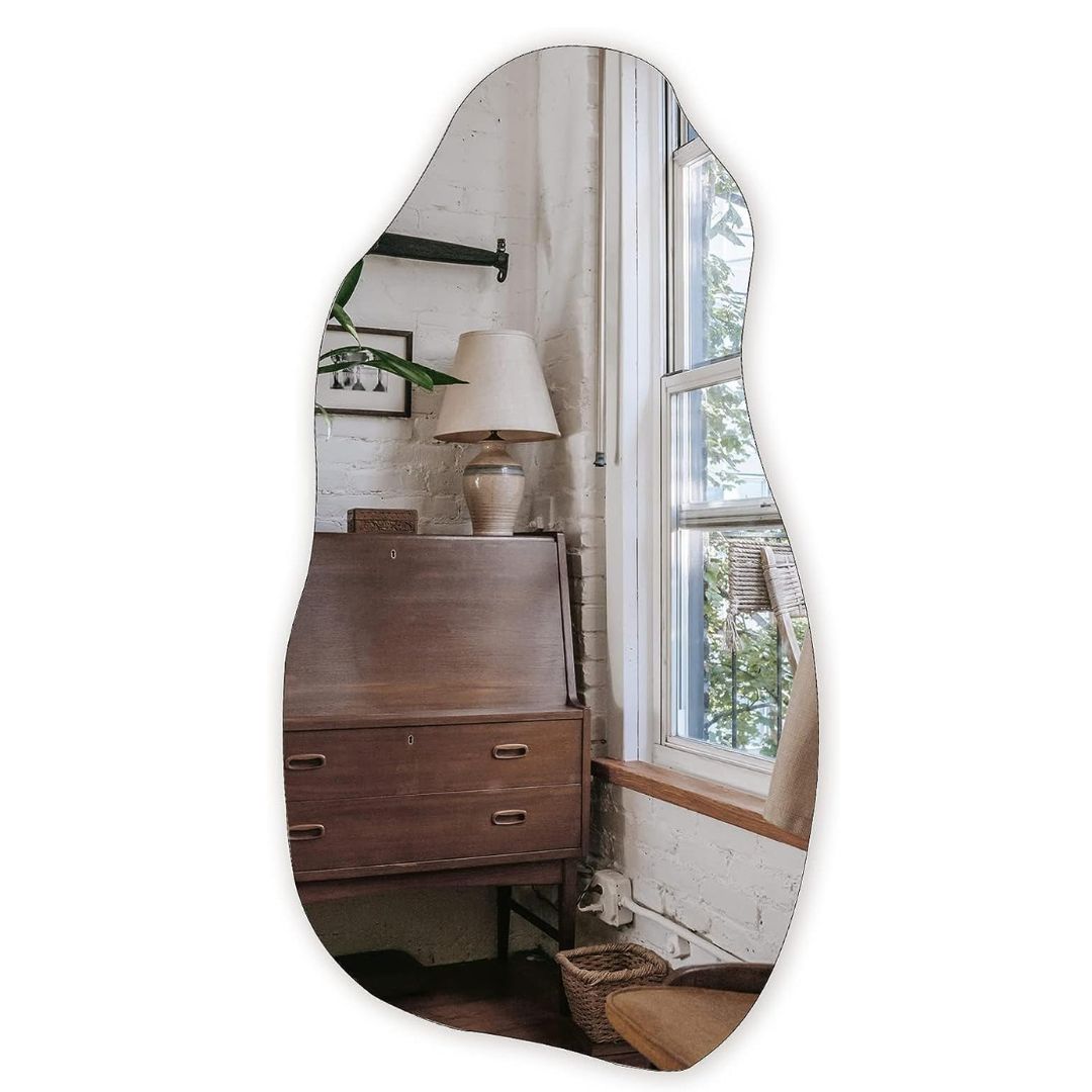
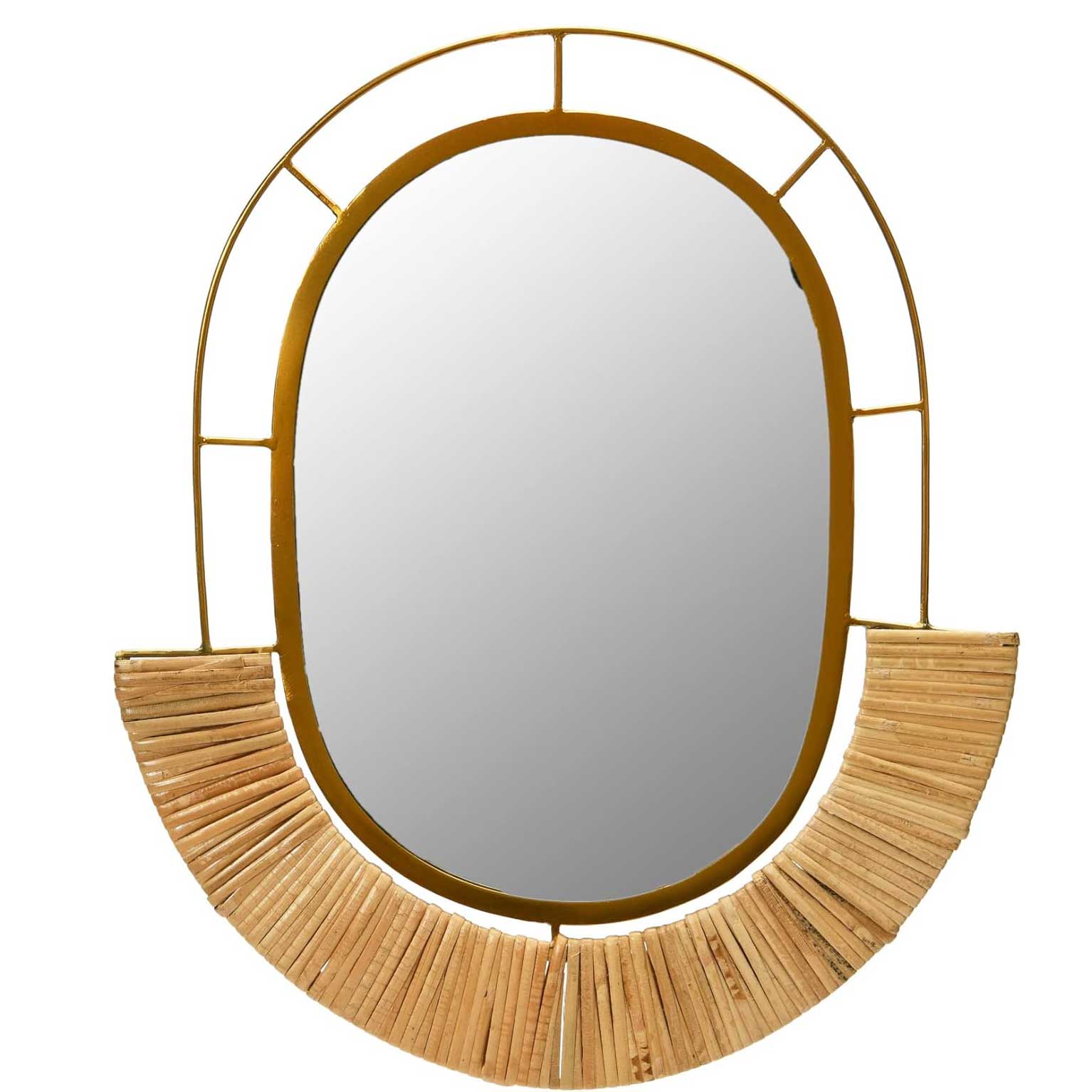
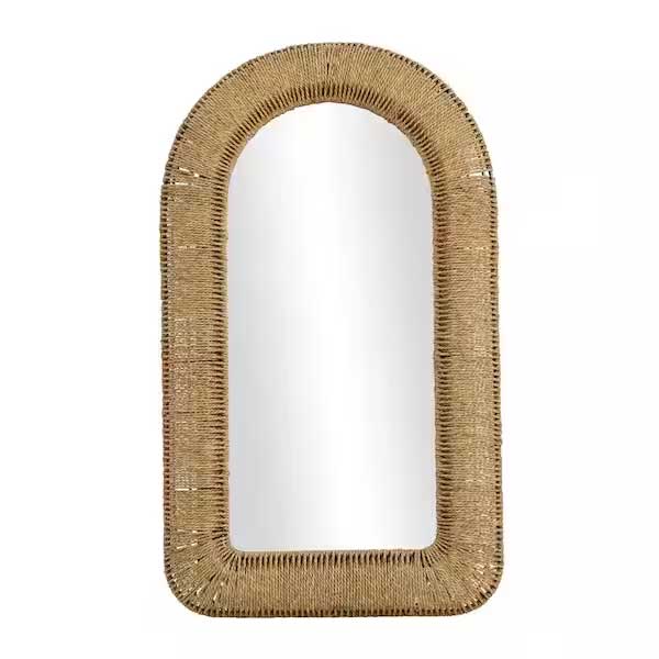
Living room mirrors may perhaps not be an altogether new idea, but new, emerging designs in these are defining interiors.
'The ubiquitous organic-shaped mirror is on trend,' says Candace. 'Our collective penchant for curves and flowing lines in furniture and decor objects are at an all-time high right now and mirrors that feature sinuous or squiggly frames are easy to incorporate into spaces while being impactful. I love that we’ve moved away from symmetrical and predictable shapes and are exploring more dynamic forms instead.'
Be The First To Know
The Livingetc newsletters are your inside source for what’s shaping interiors now - and what’s next. Discover trend forecasts, smart style ideas, and curated shopping inspiration that brings design to life. Subscribe today and stay ahead of the curve.

Aditi Sharma Maheshwari started her career at The Address (The Times of India), a tabloid on interiors and art. She wrote profiles of Indian artists, designers, and architects, and covered inspiring houses and commercial properties. After four years, she moved to ELLE DECOR as a senior features writer, where she contributed to the magazine and website, and also worked alongside the events team on India Design ID — the brand’s 10-day, annual design show. She wrote across topics: from designer interviews, and house tours, to new product launches, shopping pages, and reviews. After three years, she was hired as the senior editor at Houzz. The website content focused on practical advice on decorating the home and making design feel more approachable. She created fresh series on budget buys, design hacks, and DIYs, all backed with expert advice. Equipped with sizable knowledge of the industry and with a good network, she moved to Architectural Digest (Conde Nast) as the digital editor. The publication's focus was on high-end design, and her content highlighted A-listers, starchitects, and high-concept products, all customized for an audience that loves and invests in luxury. After a two-year stint, she moved to the UK and was hired at Livingetc as a design editor. She now freelances for a variety of interiors publications.
-
 The 'New British' Style? This Victorian London Home Embraces Its Owners' Global Background
Warm timber details, confident color pops, and an uninterrupted connection to the garden are the hallmarks of this relaxed yet design-forward family home
By Emma J Page
-
 Muji Living Room Ideas — 5 Ways to Harness The Calming Qualities of This Japanese Design Style
Inspired by Japanese "zen" principles, Muji living rooms are all about cultivating a calming, tranquil space that nourishes the soul
By Lilith Hudson
