
Oxblood is going to the color of 2025. A bold statement, but then it's a bold shade — rich, sophisticated, and warm; a red with brown tones that envelops you.
Call it a move on from the cherry shades seen as part of this year's Unexpected Red Theory, or a subtle shift from burgundy that the design industry has been drawing on in recent years, but whichever way you frame it, oxblood has become the beating heart of some of the most soulful and elevated new schemes from some of the world's best designers.
Top of that list is Anne McDonald, founder of the Minnesota-based studio Anne McDonald. Oxblood is a shade she's long been using, as both an accent and to wrap around rooms. In conversation with Livingetc's executive editor Pip Rich, she explains why this color trend has burgeoning appeal.

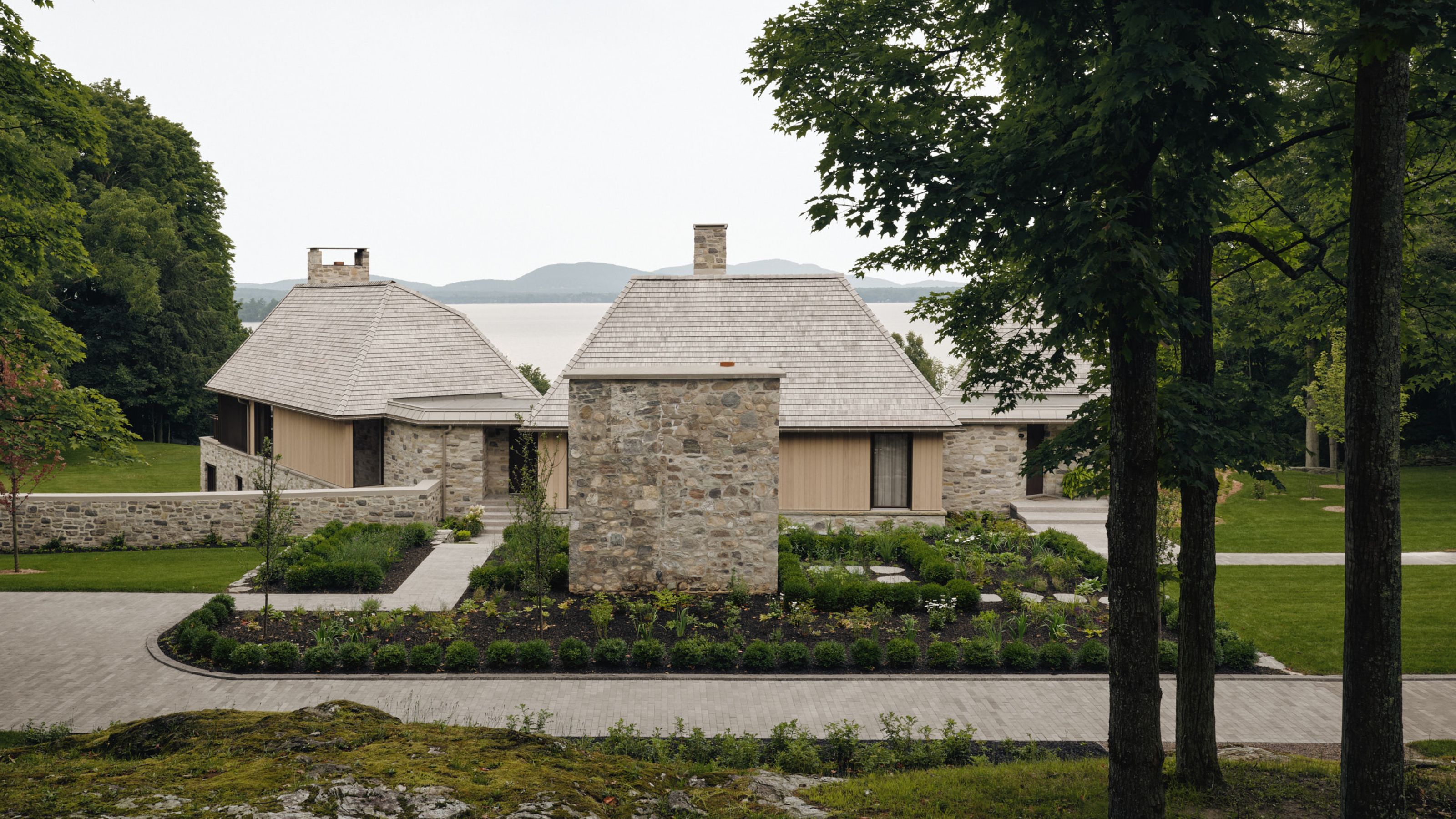
Based in Minnesota, interior designer Anne McDonald specializes in bringing together classic design references with modern, luxurious materials. The studio's use of color is both fresh and timeless.

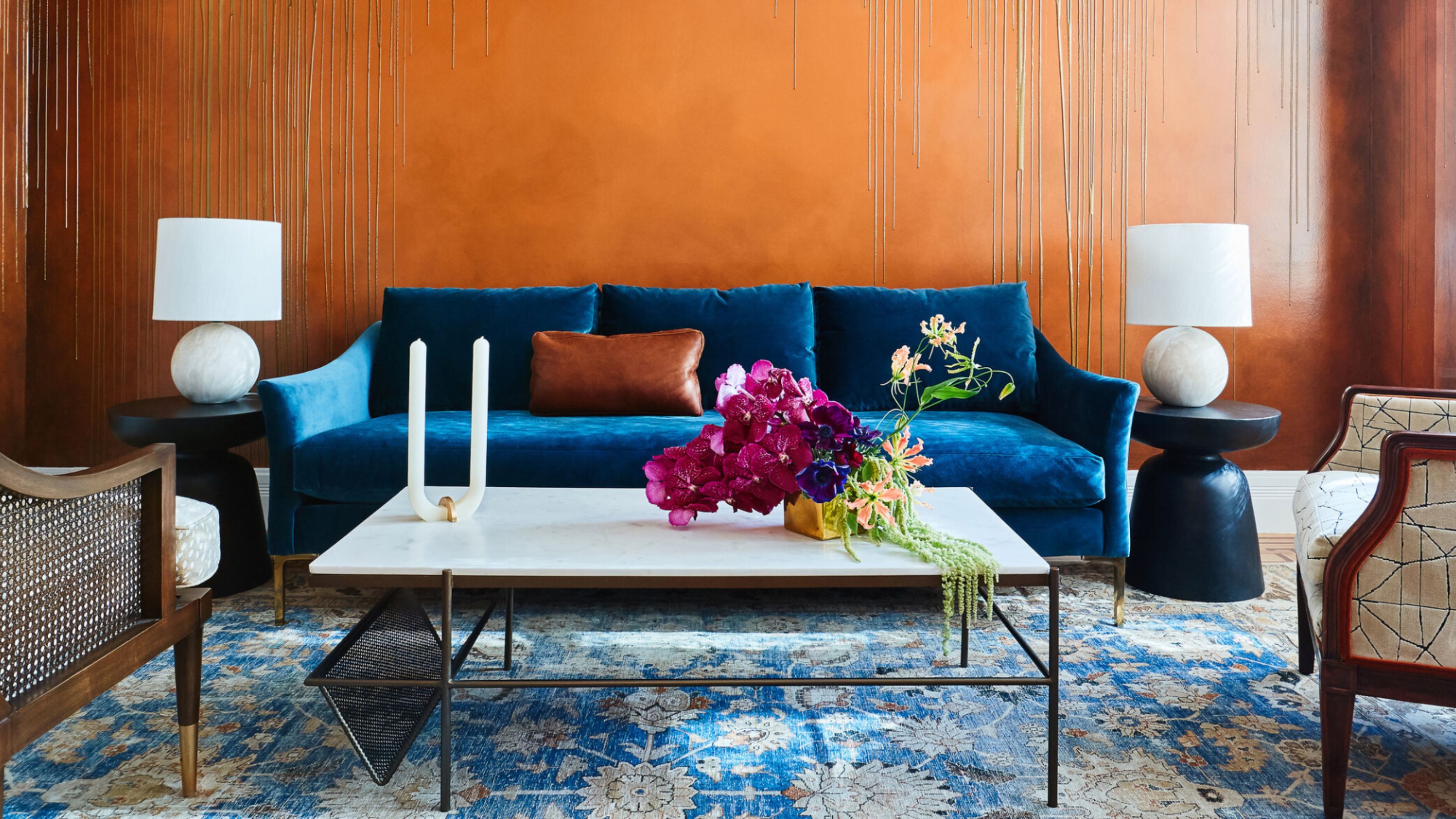
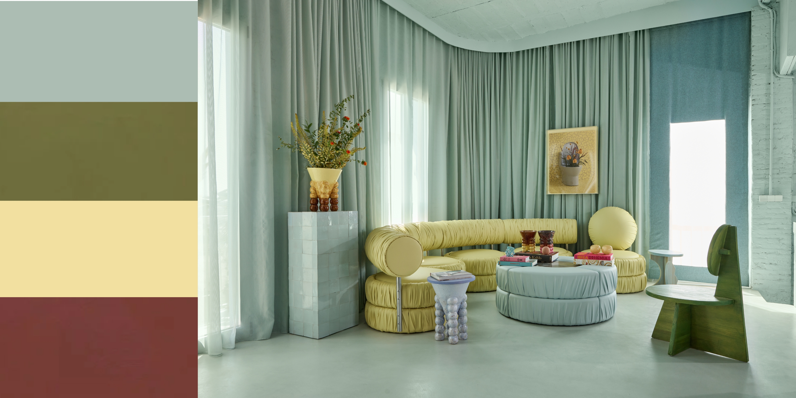
Anne recommends oxblood as a color that goes with green or blue, in shades found in nature.
Pip Rich: Oxblood is a color that appears relatively often in your work, in statement applications. Why are you drawn to this shade?
Anne McDonald: You know, I've always loved oxblood, so I'm glad other people are now liking it too. It cocoons you. It’s not a color that feels harsh, because of the brown tones in it. It's a sexy dark color that is just so comfortable to live with.
PR: We've been seeing burgundy as a big color trend, and to me, oxblood is a very natural and subtle way for it to evolve. Obviously they're pretty similar! What do you think differentiate them?
AD: Well burgundy has blue tones in it and oxblood has brown. So it's a bit warmer while burgundy reads as a touch cooler. I think burgundy was a safe way for people to get used to this color family, and oxblood is the mature iteration of it. There's something about it that is so grounded that I actually think of oxblood as neutral, the same way I'd approach blush tones.
"It's so grounded that I actually think of oxblood as neutral."
Anne McDonald, interior designer
PR: That makes sense, because blush tones are easy to pair, and I'd say oxblood probably is, too?
AD: Yes! It's so timeless, so classic, and pairs with so many different things. Ceruleans, blues, greens. Lighter, brighter colors are where I instinctually go. Think of oxblood as the earth color with its brown tones that ground you, and then you complement that with light blues like the sky or greens like the grass. It's all so dynamic and fresh.

Brass accents are a way to up the elegance when decorating with reds in this darker hue.
PR: I particularly like way the brass hardware in your bathroom project seems to pick out the sparkle in the oxblood vanity.
AD: Brass accents definitely take oxblood in a very equestrian way, they help you to see its cognac richness. Leathers, suedes; these are all very handsome tones, but the red in oxblood adds a bit of sexiness to it. So for bathrooms or dining rooms, wherever the lights are low, oxblood feels really good on the skin.
PR: Do you subscribe to the Unexpected Red Theory? I have to say that I think there is something in it, and I'm wondering if the rise oxblood is a part of all that?
AD: Hmm. I do believe in the Unexpected Red Theory, but I'm always cautious of things that are having a hot trend. I don't think you can just insert a red accent pillow and be done with it: that's too contrived. What works for me in that theory is that it asks you to look at your room and decide if it gives you a current of excitement or not. And if it doesn't, it may well be that you're missing an unexpected tone, which could easily be a red. In design we talk about repetition a lot, and how that is used to create cohesive schemes, but you can have too much repetition, and you also need tension - another design theory - to break that up. That's what red, or oxblood, can do. A disruptor that brings a surprise element. Perhaps oxblood is the ultimate in red theory!

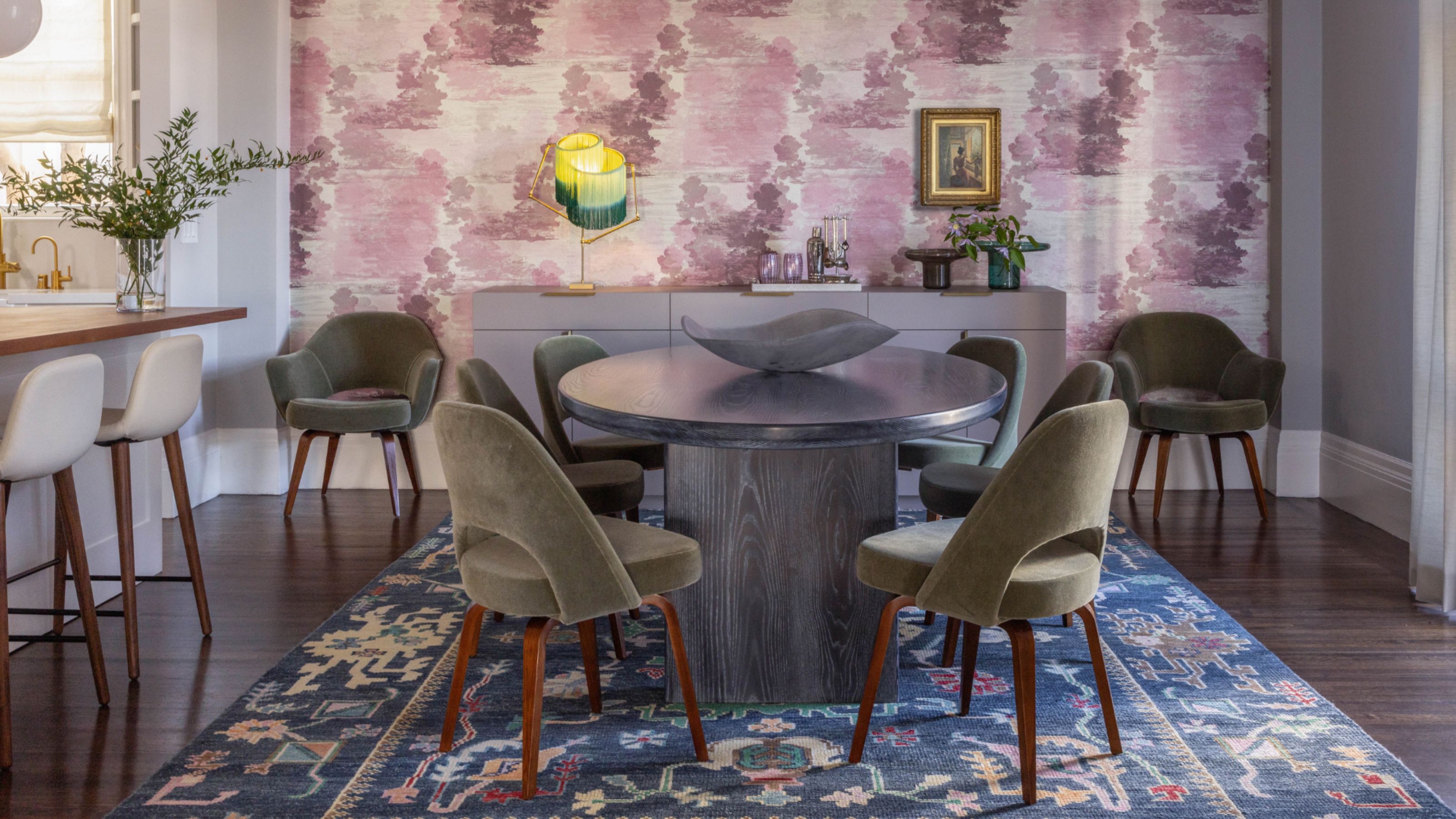
This dining room has been color drenched in an oxblood paint color from Benjamin Moore.
PR: Are there any oxblood paints you've used recently that you think are particularly good examples of the color?
AD: Townsend Harbor Brown by Benjamin Moore. That's the color I used in the dining room we were talking about. It's having a moment, as I'm seeing other designers reference it too.
PR: I know the shade. I love how it's possible to dress it up, and make it quite formal, or dress it down and allow it to be casual.
AD: Yes, it can be both smart and informal. It works in the dining room because of the the contrast of the light colors in the travertine table. The whole scheme errs towards contemporary, and is quite playful element. Whereas in the bathroom, with that wood panelling, it's a bit more buttoned up, taking itself a bit more seriously. And that's the the thing with oxblood, there are just endless options for how to use it. It can be fancy or grounded. Just like me!
PR: And like me, too! Are there any other colors you're drawn to at the moment?
AD: I’m really feeling a love of yellow-based greens. You know, mossy greens, olives... In fact, I'm looking at a fabric swatch in front of me right now, from Pierre Frey. It's an olive, and you know what it would go really well with? Oxblood!
Shop the edit

Price: $270
The perfect purple-red-brown for the oxblood trend, this vase is a showstopper accent piece.

Price: $249
This domed table lamp reads as a deep red/brown that looks a little more saturated when switched on.

Price: From $746
Beige makes a perfect companion for oxblood, and this patterned rug brings the pairing to life in a sophisticated way.

Price: $916
This deep, rich red brings a new dimension to modern silhouettes such as this armchair —while brass accents elevate the look.

Price: $68
A classic velvet pillow that can be used to add this trending color to a couch or bed.

Price: $5.99 per sample
Anne's pick of the perfect oxblood paint color from Benjamin Moore has a strong brown leaning.
-
 10 Sustainable Homes That Prove Interior Design Can Be Just as Easy on the Eye as It Is on the Earth
From salvaged wood to circular design thinking, these interiors show that sustainability isn’t a compromise, but a creative opportunity
-
 I'm Sorry, But You Need to Know About 'Advancing and Receding Colors' If You Want to Get Your Home's Decorating Scheme Right
While some colors tend to pop and reach forward in a room, others draw back. Here, a color expert helps define these palettes and how to use them


-
 Amethyst, Heather, Pansy, Plum — Turns Out Decorating With Purple Opens You Up to a World of Possibilities
Purple certainly isn't a color for the faint hearted, it's a shade that can smell your fear. Here's how to conquer it through your interiors
-
 I'm Calling It — Chrome Decor Is the Most Influential Design Trend of 2025 for Rooms That Feel Effortlessly Cool
Have you been eyeing a chrome candle holder or side table to complete your room's look? This is your sign to embrace the shiny, chic material
-
 The Combination You Weren't Expecting to Love — 8 Blue And Orange Living Room Ideas That Feel Surprisingly Elevated
A blue and orange scheme for living rooms may sound jarring, but these spaces prove they're striking, vibrant, and certainly unforgettable
-
 Smeg Says Teal, and We’re Listening — The Kitchen Shade of the Year Is Here
Designers are already using the soft, sea-glass green everywhere from cabinetry to countertops
-
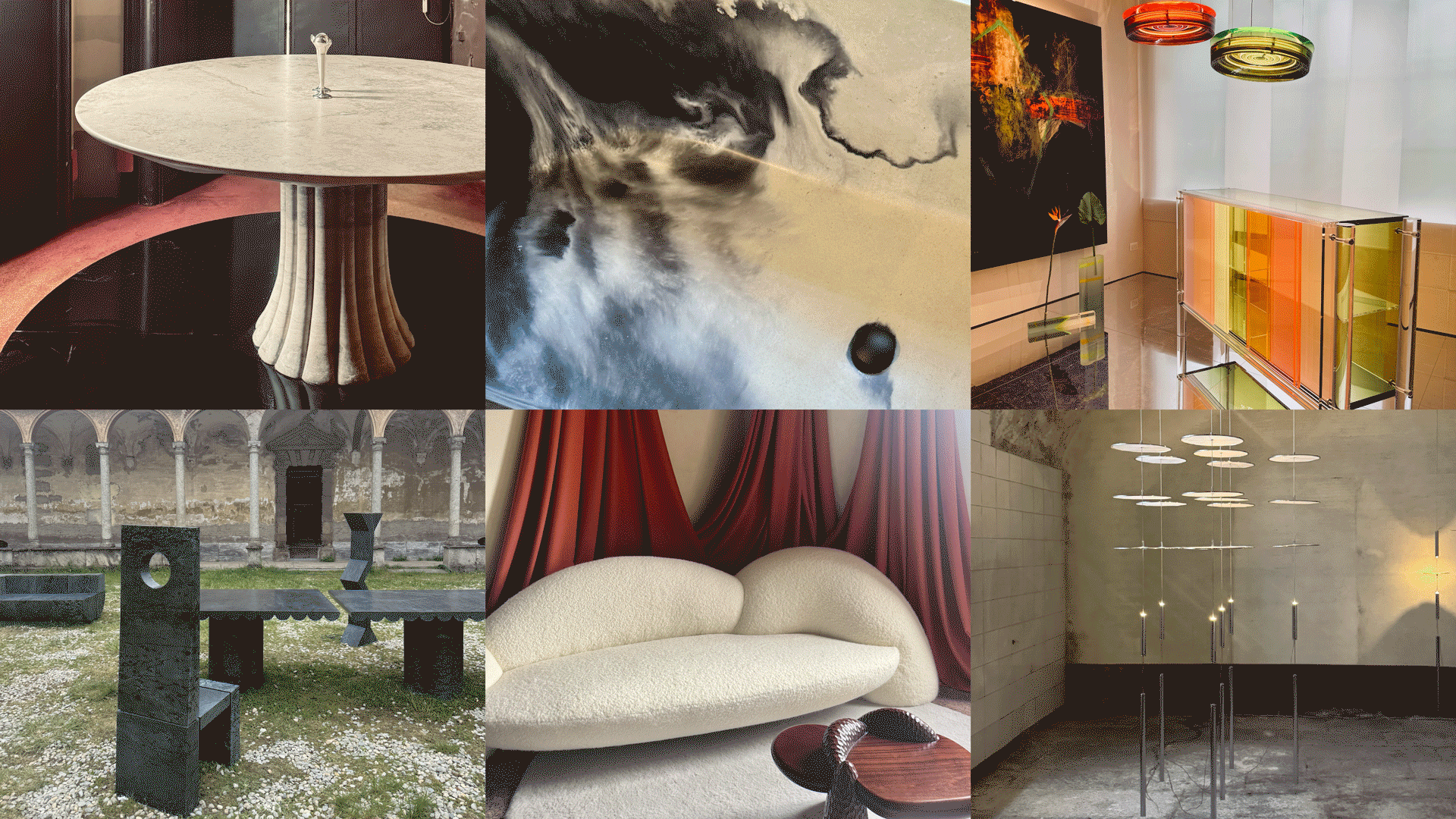 Straight from Salone: 5 Emerging Trends I Found in Milan That'll Shape Interiors for the Year Ahead
From reflective silver to fluidity, here's my perspective on the key themes and new moods coming through from Milan Design Week
-
 Do Yellow and Purple Go Together? Designers Reveal How to Make This Unexpected Pairing Feel "Totally Intentional"
In an era where unexpected combinations have become cool, we've done a deep-dive to discover how to pair yellow and purple in a space
-
 5 Unexpected but Seriously Stylish Spring Color Palettes to Shake Up the Season — "It's Pastel, but Punchy"
Spring color palettes are notorious for their use of pretty pastels, but that doesn't mean they have to lack variation
-
 The 'Red Table Trick' Is the Easiest and Most Expensive-Looking Trend to Hit 2025 So Far
A red dining table makes a seriously stylish statement; the beloved pop of red trend just got an bold and expensive-looking upgrade


