5 paint shades designers are choosing for their 2024 projects to make a living room feel super cozy
If you're looking to bring added coziness to your living room this fall, consider painting the walls one of these five sumptuous shades
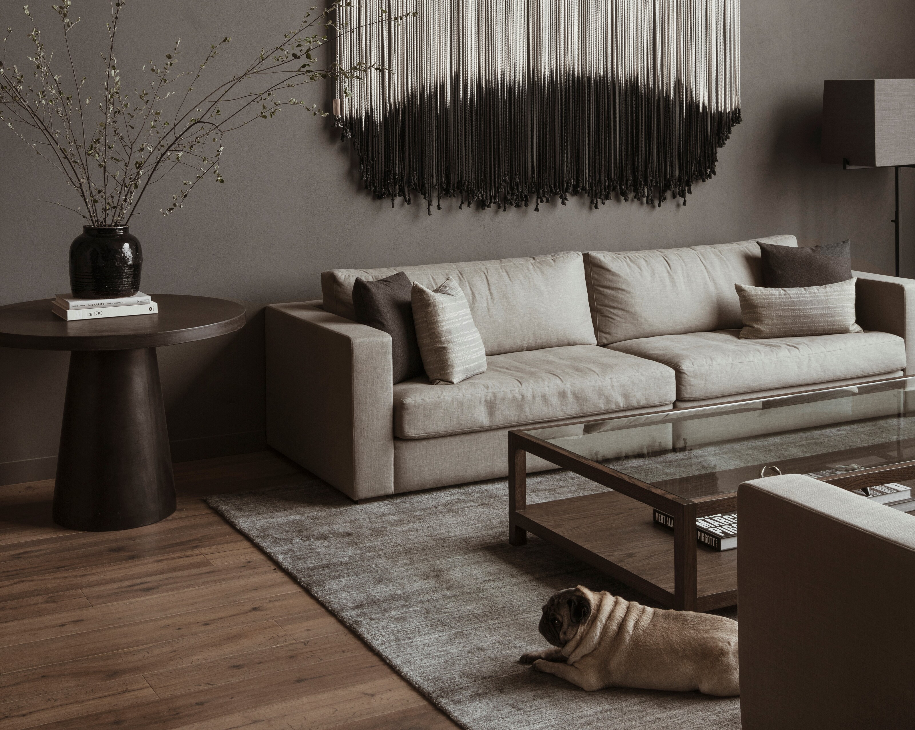

Time and time again, we see designers approach coziness in the home by introducing texture and a layered lighting scheme, but most importantly, they rely on color.
Instead of lamenting the limited daylight hours and cold weather that fall brings, why not flip the narrative by using cozy paint colors? Creating a scheme of dark yet warming shades will encourage us to think positively about the season ahead and get excited about hunkering down in front of an open fire with a good book and hot drink while outside it's raining and gloomy. Color is the key to helping us feel cocooned and safe. 'Fall is one of the best times to decorate your home, especially as being snuggled up indoors is about to become the nicest place to be for the next few months,' says creative director of Dulux, Marianne Shillingford.
If you're looking to make some key changes to your living room this fall to ramp up the coziness, we've spoken to the designers to help you pick the perfect paint for your walls.
1. A mushroom brown
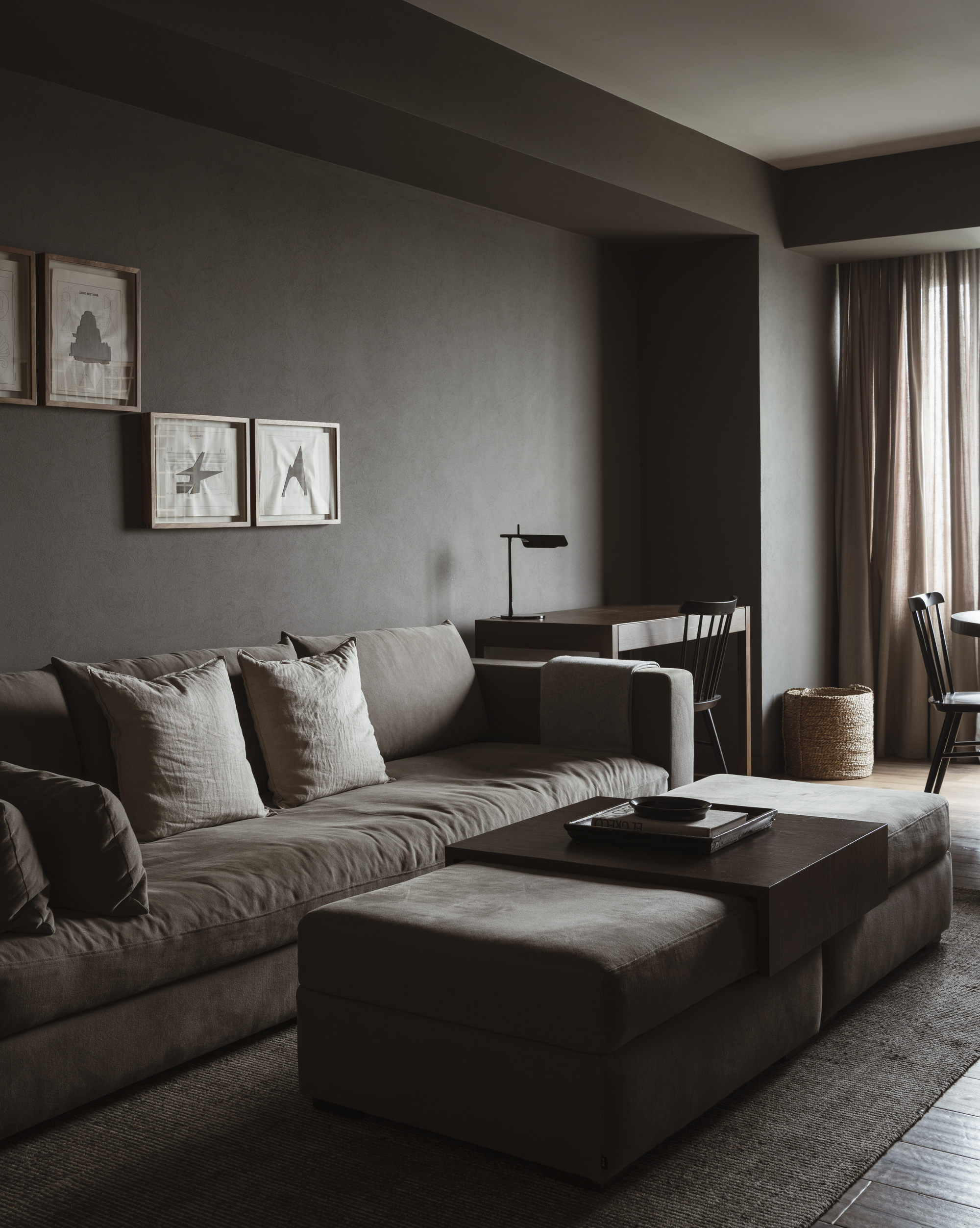
For the perfect cozy but neutral living room, instead of going for a pale hue, be brave and go dark. We love this mushroom tone that marries grey and brown, bringing warmth to grey that keeps things cozy and works as a cozy color for minimalists. Sherwin Williams' Gauntlet G 7019, as seen on the walls of this Mexico City home, stops this grey from being too gloomy.
'The use of a darker palette of materials and colors accentuates this home's newfound cozy and intimate charm,' says Mariana Morales de Murga, architect and designer at Mexico City-based firm, direction, who designed this space.
'The paint helped the scale of the space become more introspective. The overall atmosphere became welcoming with a balanced sense of spaciousness and restraint.'
To match the wall paint European oak flooring and Holm oak doors and shelving were installed in the home. Every material and texture was carefully chosen for its natural feel - wood, stone, linen, and neutral colors sit in peaceful harmony with the wall paint.
2. A moody blue
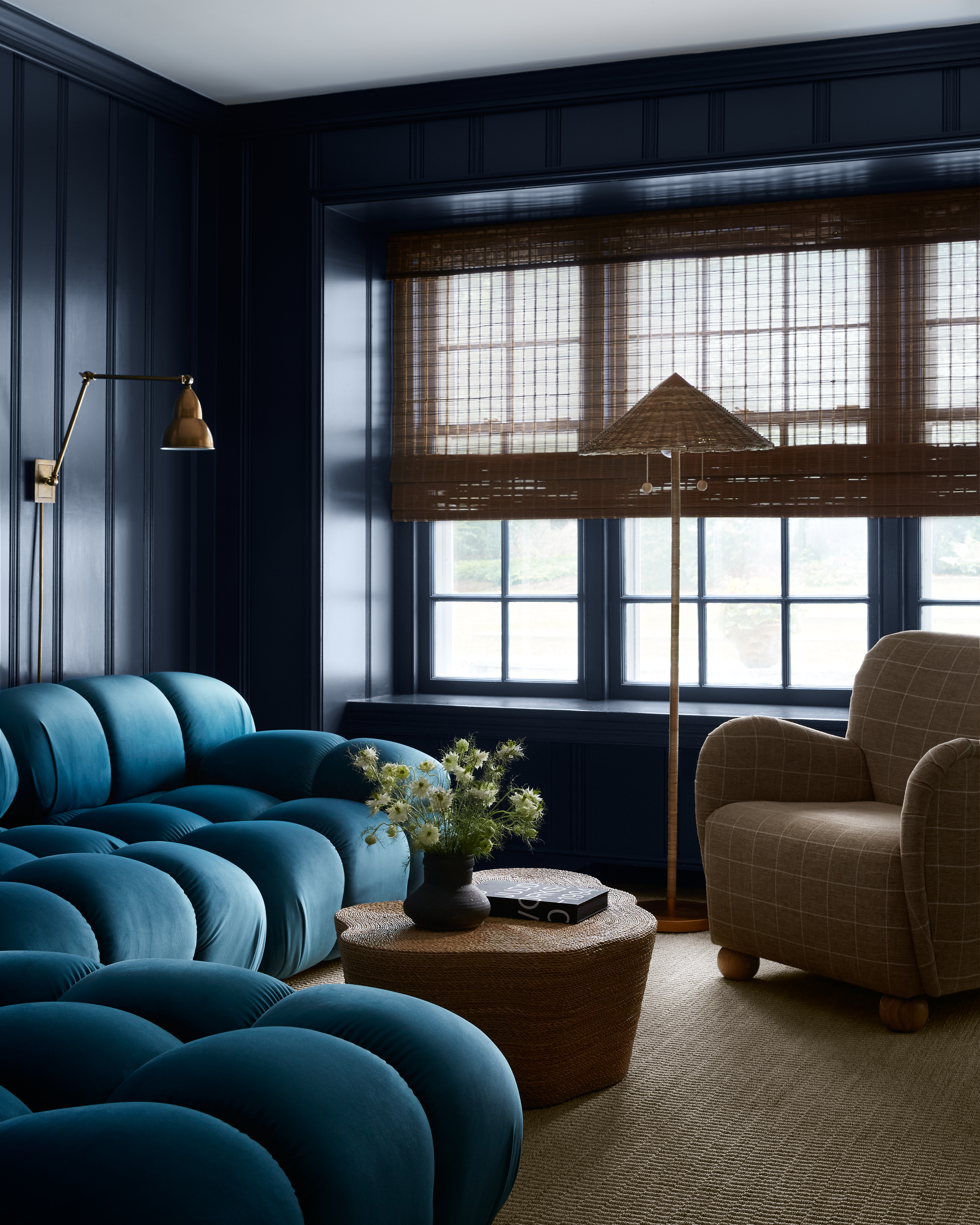
'As the days get shorter, I begin dreaming of palettes inspired by the nighttime sky,' says Ashley Macuga of Collected Interiors. To get this effect in your living room, go for a moody, inky tone of blue for something dark and captivating.
'For a bolder choice, we like Benjamin Moore's Mysterious,' says Matthew Rauch of New York-based Rauch Architecture. 'It's a deep, complex blue. It's not for everyone but it does create a very moody, intimate, and calm interior space by absorbing light and making spaces feel more calm,' says Matthew.
Another trick that we have been seeing a lot of is to paint the ceiling the same as the walls for a monochromatic color scheme. 'The lack of contrast can create a more subtle, muted space, and make the ceiling feel a bit lower and less intimidating,' says Matthew.
3. An earthy green
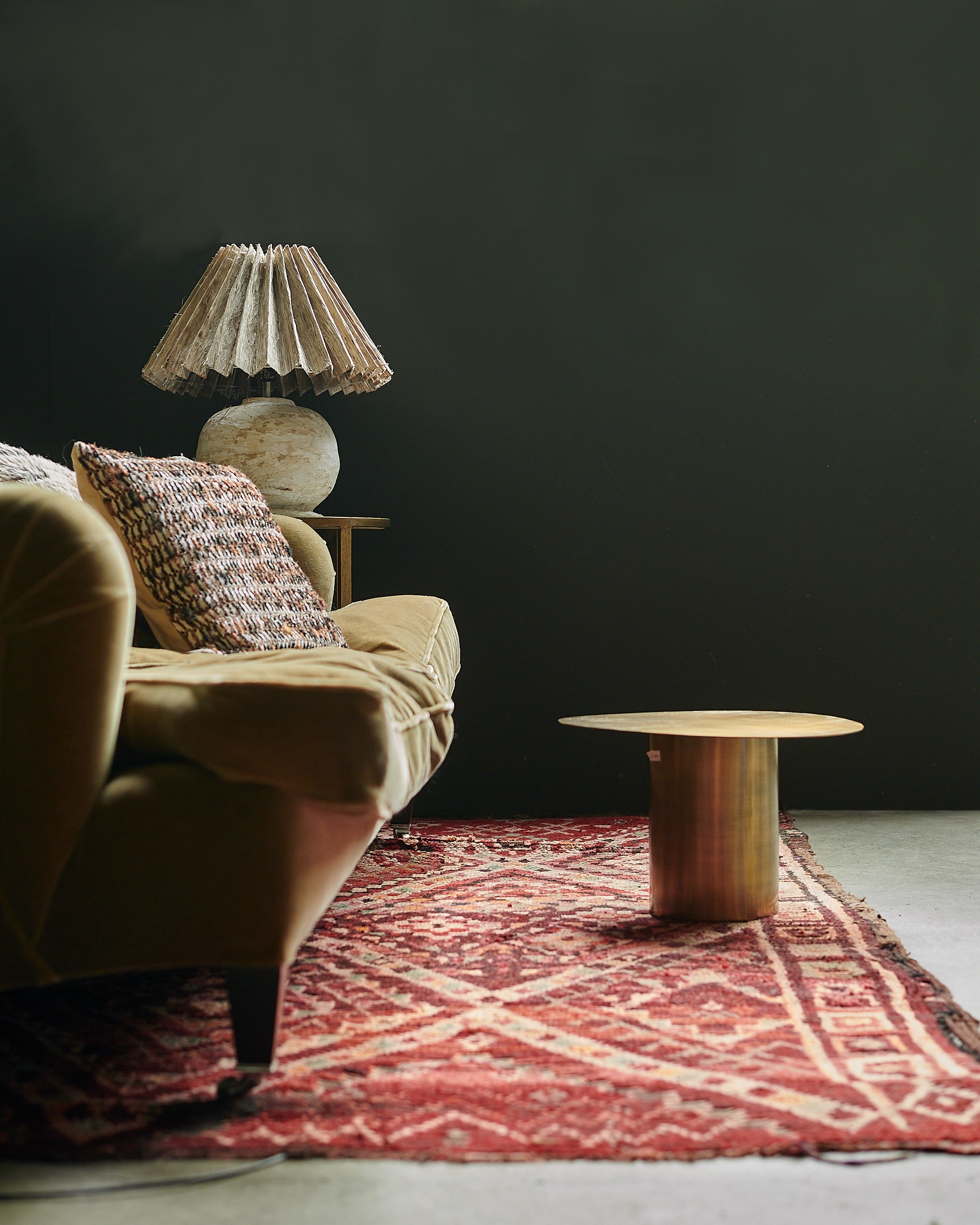
While green belongs on the cooler side of the color wheel, meaning it has colder properties and connotations than colors like reds and browns, if you go dark with the color then it can feel super cozy, reflecting nature and perfect for a snug.
Dark colors envelop a room and make it feel comforting, explains interior designer and paint expert, Abigail Ahern. 'They wrap you up in the biggest blanket.'
'Saturated dark living rooms may force you out of your comfort zone but you become infatuated with their ever-changing tones and what they do to the pieces in your room. Moody hues make any room instantly cozy. Everything looks cooler, taller, smarter and edgier,' she says.
'My main living area is a deep sophisticated hue with undertones of green. A perfect color for living rooms as it captures the light beautifully in the daytime but the dark tones come into their own in the evening when you want to hunker down after a long day.'
4. Deep red tones
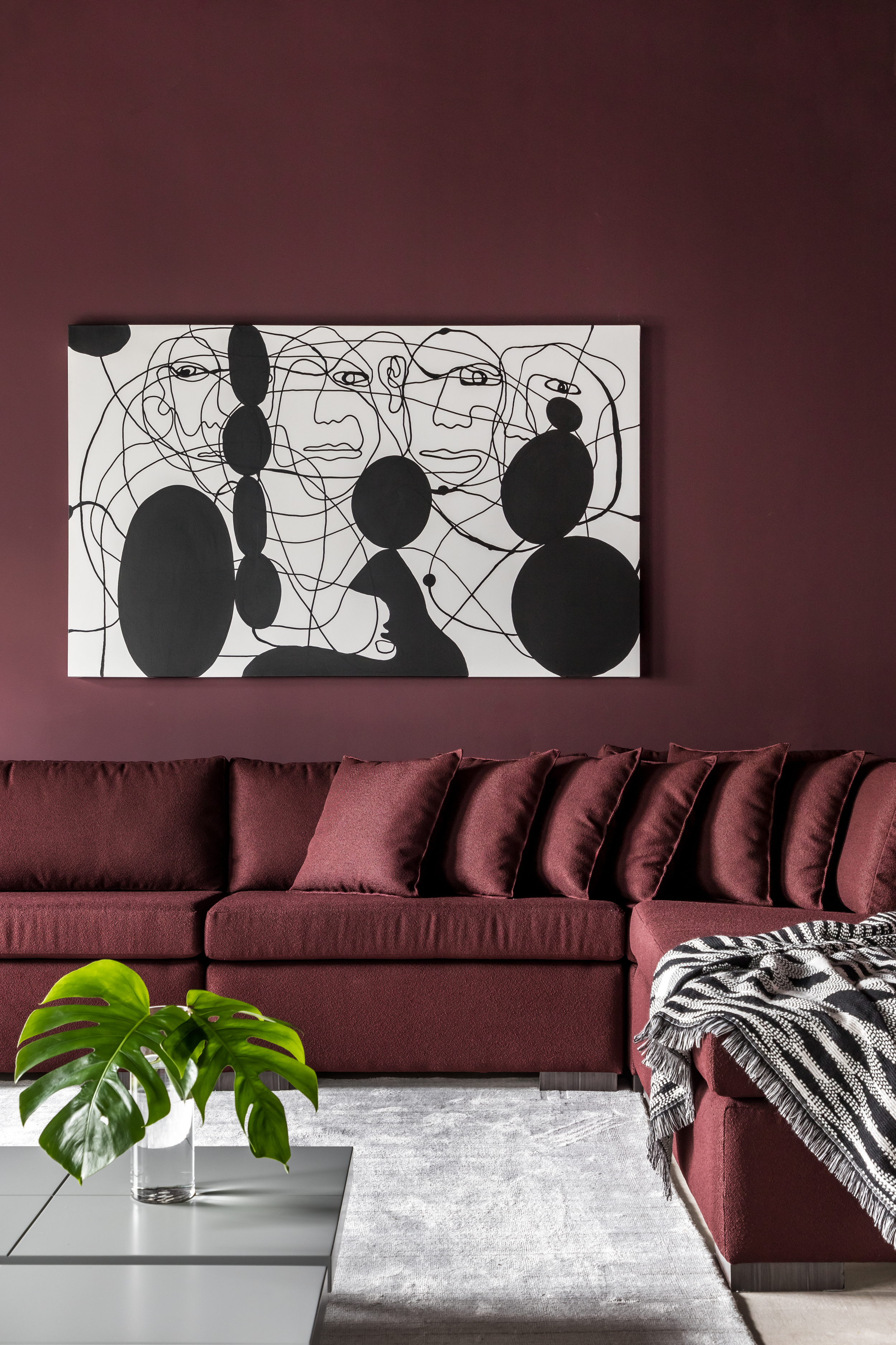
If you're looking to bring real warmth to your living room, go for a dark red tone. Keeping the shade dark will make sure it doesn't carry too much energy, and will certainly turn the space into a cozy living room.
'I'm loving moody, dark hues lately—but especially in the fall and winter as the days grow shorter and cozier,' says designer Lauren Sullivan of Well x Design. 'Deep reds and muddy shades of browns, burgundies have become my go-tos and work beautifully across the seasons.'
'Dark purples for that moment in between dusk and nightfall are perfect for fall,' says Ashley. 'At the moment, I am currently obsessing on the richness of aubergine - purple’s far more elegant cousin.'
'It evokes a sense of formality that when used in touches immediately elevates any space, creating a foundation for the eye that draws your attention to an object or area of importance. When using aubergine, I love pairing them alongside pale blushes, soft blues, and muted emerald greens.'
5. A charcoal grey
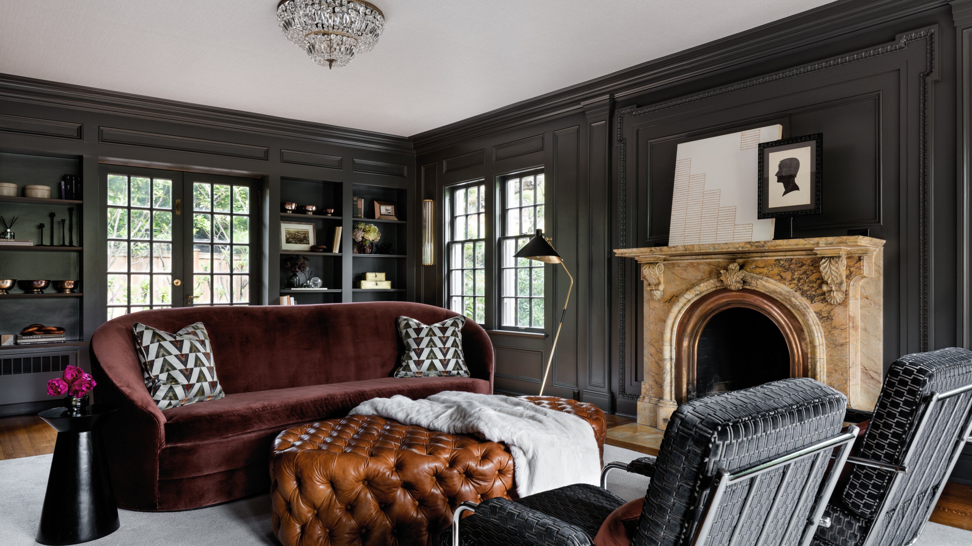
Finally, if you're looking for the perfect grey, this steely grey from Sherwin Williams is another winner. Iron Ore is a charcoal shade that adds sophistication and with its sheen really allows the historic crown molding of this Seattle home to really shine. 'The paint's satin finish highlights the undulations of the crown molding in a subtle way, showing them off without creating busyness,' explains designer, Shannon Adamson of the eponymous Washington-based interior design firm.
The furniture and fabrics needed to complement the coloring. Cognac leather, sienna velvet, a bit of pattern and dark metals were chosen to keep the palette from becoming too cold or oppressive, and instead introduces luxurious coziness.
Be The First To Know
The Livingetc newsletters are your inside source for what’s shaping interiors now - and what’s next. Discover trend forecasts, smart style ideas, and curated shopping inspiration that brings design to life. Subscribe today and stay ahead of the curve.

Former content editor at Livingetc.com, Oonagh is an expert at spotting the interior trends that are making waves in the design world. She has written a mix of everything from home tours to news, long-form features to design idea pieces, as well as having frequently been featured in the monthly print magazine. She is the go-to for design advice in the home. Previously, she worked on a London property title, producing long-read interiors features, style pages and conducting interviews with a range of famous faces from the UK interiors scene, from Kit Kemp to Robert Kime. In doing so, she has developed a keen interest in London's historical architecture and the city's distinct tastemakers paving the way in the world of interiors.
-
 I Just Found a Stylish Wireless Pendant Light That Makes Your Garden Look (and Feel) Like a Living Room
This rattan-like pendant light is wireless and rechargeable — making it a functional and stylish choice for your outdoor space
-
 Icy Blue, Stripes, and the Design Equivalent of Shoulder Pads — 2025's Best Met Gala Looks as Interior Trends
The Met Gala carpet was alive with fashion trends that translate into the schemes designers are creating for the most exciting homes right now, too


