10 paint tricks for low ceilings that will make your room's "fifth wall" feel higher and more impressive
These paint tricks for low ceilings suggested by top experts show how color and lighting can be used to create an illusion of height

Paint tricks for low ceilings can help make a room feel larger and more open, or more cozy and intimate, without feeling claustrophobic. Just by smartly using color, you can create the illusion of more height.
Sometimes the simplest ideas are the best. 'A low ceiling can be painted a white color that has a tiny undertone of yellow in it, to add brightness and freshness,' says Jane Lockhart, founder of Jane Lockhart Design. 'A flat paint for the ceiling too could work as it makes it disappear, allowing the room to feel taller.' However, we're seeing fewer designers take the common path when it comes to ceilings, instead making bolder statements with these spaces.
If you are feeling limited with a low ceiling, then these creative paint ideas could help.
1. Use reflective paint on the ceiling

Ceilings act as light reflectors, so understanding the way different paint colors, finishes, and lighting interact in a room will help you achieve a spacious feel in a low ceiling space. Reflective paints like gloss paint add more than just aesthetic value. These help bounce the light around, making a room feel brighter and larger.
'High gloss paint is also easier to maintain as distracts from all flaws, so in a living room you want to opt for this welcoming paint solution,' says Juliette Thomas, founder and director of Juliettes Interiors. 'A matt paint also acts as the perfect backdrop.'

Recommended Primer & Undercoat: Red and Warm Tones
Price: $40 for 3 liters
Consider this rich, deep glossy red to add a classic and glamorous touch to the interior. It can be used to sumptuous effect in halls when offset with woodwork and concrete.
2. Or consider gold leafing

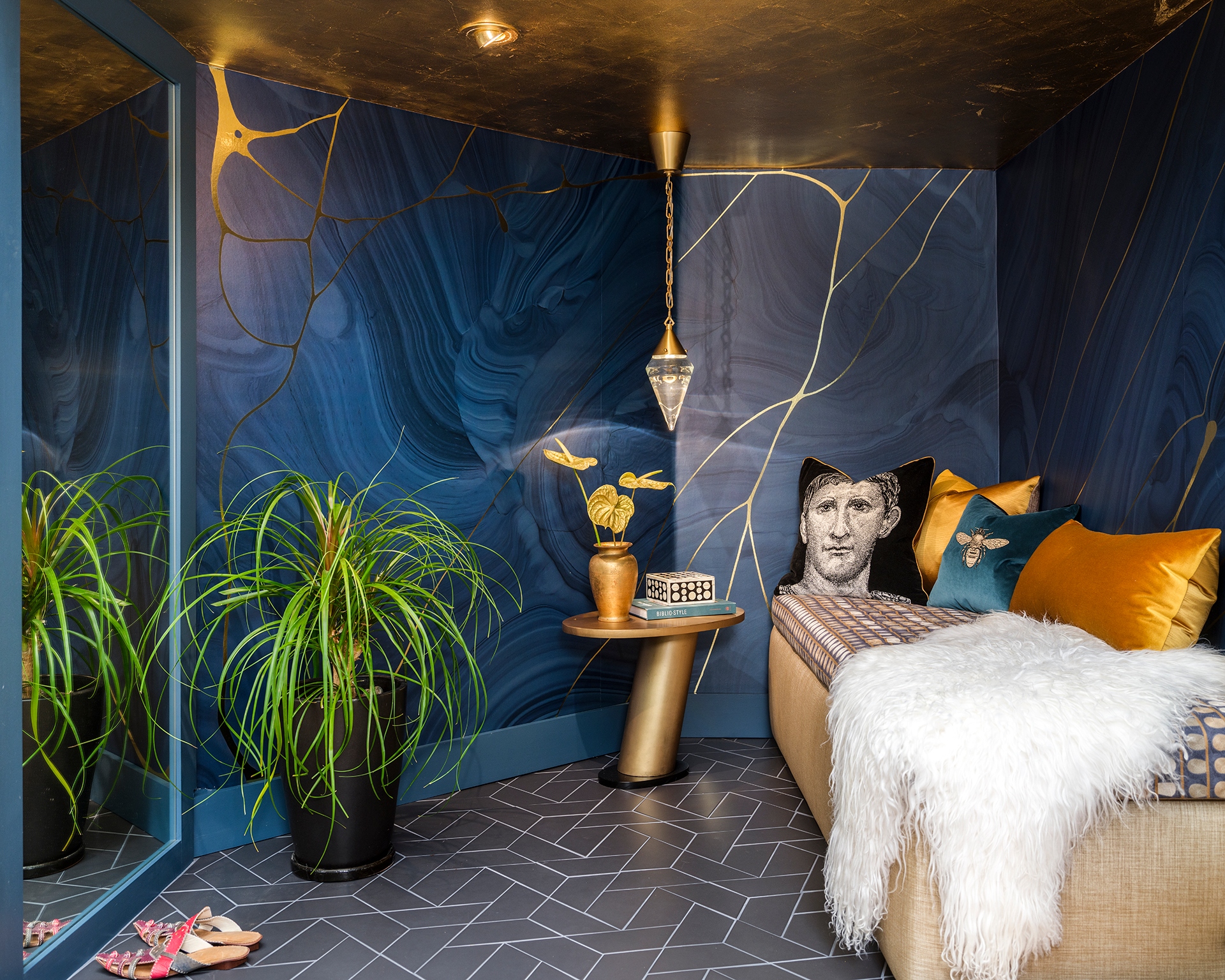
Refined and timeless, gold leafing is perfectly suited to modern interiors and is a much-loved paint technique for walls, as it infuses the room with brighter light and creates an elegant and unique reflection. Plus it gives the space a more decorated feel.
'This was such a small space with such a low ceiling that we chose gold leafing to add an element of luxury,' says Barbra Bright of San Rafael, founder of Barbra Bright Interior Design. 'The gold surface reflects light, creating a warm glow that radiates throughout the room.'
3. Make the ceiling an accent
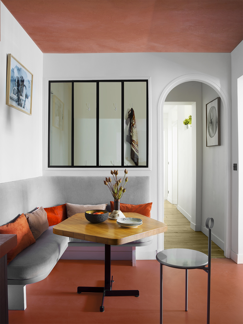
A low ceiling doesn't always have to be a bane in interiors – make it a feature with the best ceiling colors and create an eye-catching interior along the way. For an impactful look choose darker tones that will give the ceiling a canopy effect, almost making the room feel like it's enveloped and cocooned.
'Another way to look at dealing with low ceilings is to embrace it,' says Jane Lockhart, founder of Jane Lockhart Design. 'We have wallpapered and even painted them in dark tones, to emphasize the ceiling, so it becomes a feature and not a negative.'

Type: Water-based
Price: $70 for 3 liters
Choose this burnt red tone to create a warm and earthy feeling in the interiors. Its crisp, imperfection-masking matt finish will imbue a sophisticated vibe in the home.
4. Create a striking color block on the walls and ceiling
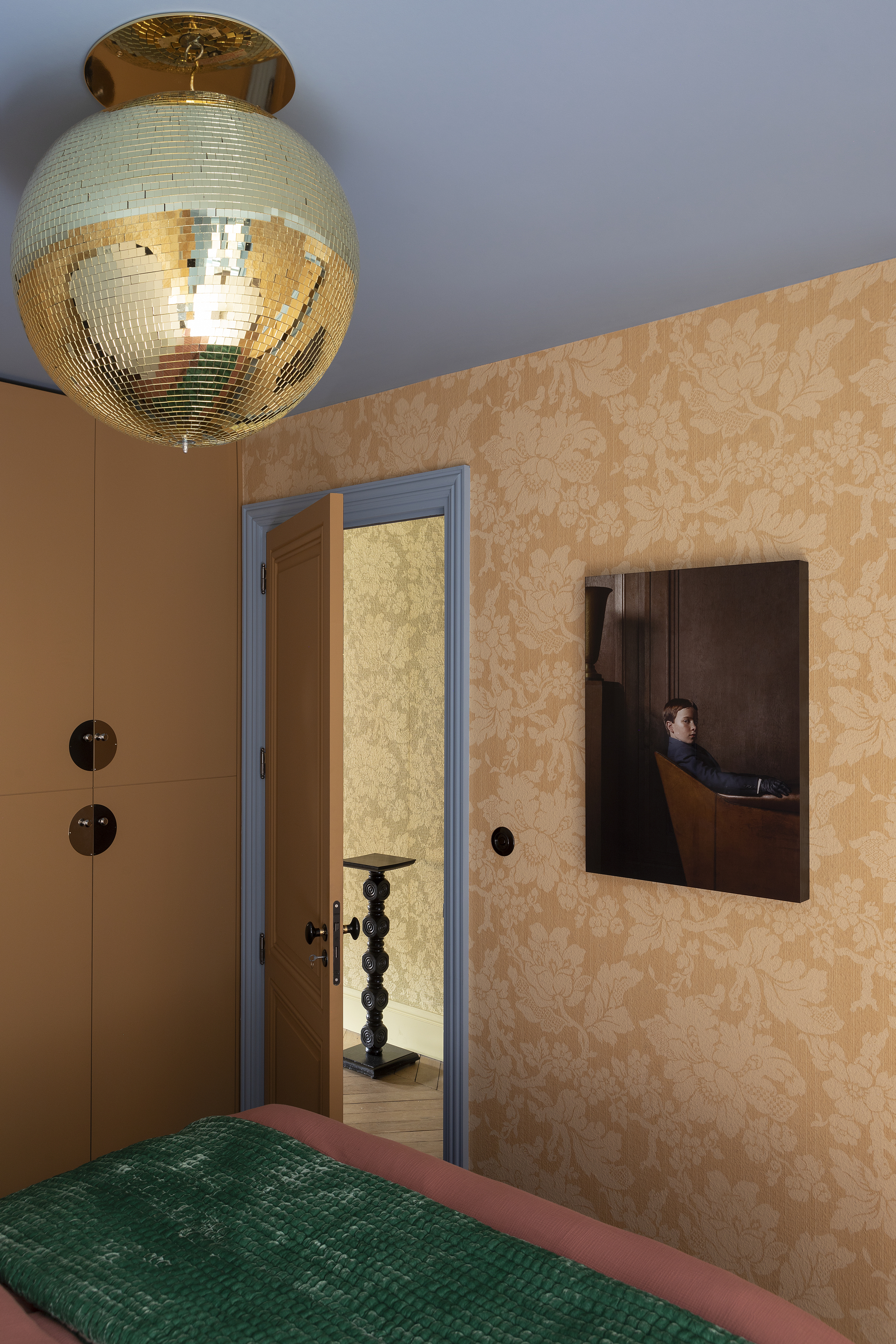
Color blocking walls and ceilings have been a big interior design tool for decades. Clashing colors when juxtaposed against each other can create an unexpected interior scheme – one that diminishes any focus on the dimensions or flaws of a space. It attracts attention and fills a room with energy.
'There are a few ways to create an eye-catching color block,' says Juliette. 'Embrace neutral-toned walls in beige, off-white, or taupe for a crisp and sophisticated look, and pair with natural, rustic textures and earthy tones of red and brown on the ceiling. Monochrome is also a classic color block and looks especially elegant when complemented with interesting detailing in a brass or gold finish.'
5. Add stripes on the ceiling

The interesting thing about painting stripes on walls or ceilings is that the paint creates the illusion of more height or width. This is especially helpful in narrow living rooms or bedrooms that are compromised in dimensions. Plus, stripes can give a smart, modern, and even quirky look to interiors, boosting personality in a small space.
'You could also go ahead with bold black and white stripes,' says Jeff Andrews, founder of Jeff Andrews Design. 'Usually wide, horizontal stripes offer a dramatic effect. Going too narrow with stripes can end up looking like a circus.'
6. Color drench the walls and ceiling

Painting ceilings and walls the same color can work effectively in small spaces, where you want to create the feeling of depth and height. The paint blurs the lines between the walls and ceiling, creating seamless sightlines.
'We'd suggest extending the paint color from the walls right up onto the ceiling as well so that you have one continuous paint color,' says Athina Bluff, designer at Topology. 'In doing this, there is no obvious break or distinction as to where the ceiling starts and the wall ends. This will allow for a room to feel slightly more opened up, lofty, and spacious.'

Type: Water-based
Price: $90 for 1 can
Color drench a room in this soothing tone and fill up the space with a sense of calm and relaxation.
7. Add an interesting pattern on the ceiling to distract from its low height
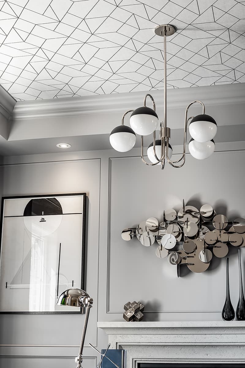
If you're wondering how to paint a ceiling to make it the feature in a home, a good way is to look for patterns and designs that do not overwhelm the space but add a touch of sophistication to the room. Think of light geometric designs, thin lines, criss-cross, or polka dots. With a low ceiling, these designs will imbue the room with style, and make it feel like a tiny little jewel box.
'For the design, use bold pops of color in a small space, as it will make the room feel larger,' say interior designers Jenna Choate-James and Mariana Ugarte of Interior Fox. 'The colors will add depth to your walls when oftentimes our clients think the opposite.'
8. Use textured paint

Textured paints like limewash paints and others that are created by mixing tones can give a room depth and movement. If you are open to taking the paint from walls to ceiling, take it a step further and choose a finish that adds more than just color to the room. Textured paint will also give exclusivity to the room from the rest of the house.
'We partnered with our favorite decorative painter, Caroline Lizzaraga, on this room to create an ethereal, moody yet cozy primary retreat for the parents of four children,' says Kristen Pena, founder of K Interiors. 'We used Benjamin Moore Silver Half Dollar as our base color and added lighter and darker shades into the space to create the feeling of being in the clouds. The idea was to create a feeling like that of clouds moving, and I think we were successful!'
9. Take the paint slightly below the ceiling
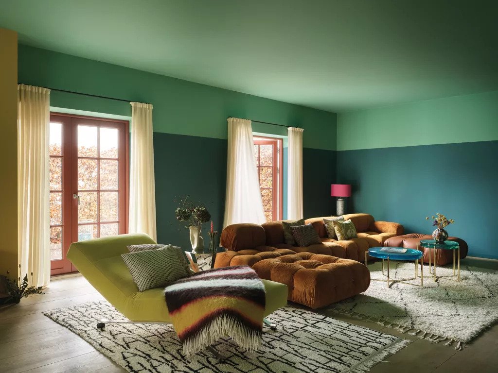
On how to make a narrow room look wider with paint, consider taking the paint a little lower than the ceiling. This will give the impression that the ceiling is longer, and wider and the room's dimensions are proportionate.
Also, remember that darker colors recede 'so they are often the perfect solution to widen a space,' says interior designer Melissa Frederiksen, director at Atmosphere 360. 'By adding a contrast, it guides the eye to the end of the paint's boundaries to help emphasize the space.'
10. Paint the ceiling borders
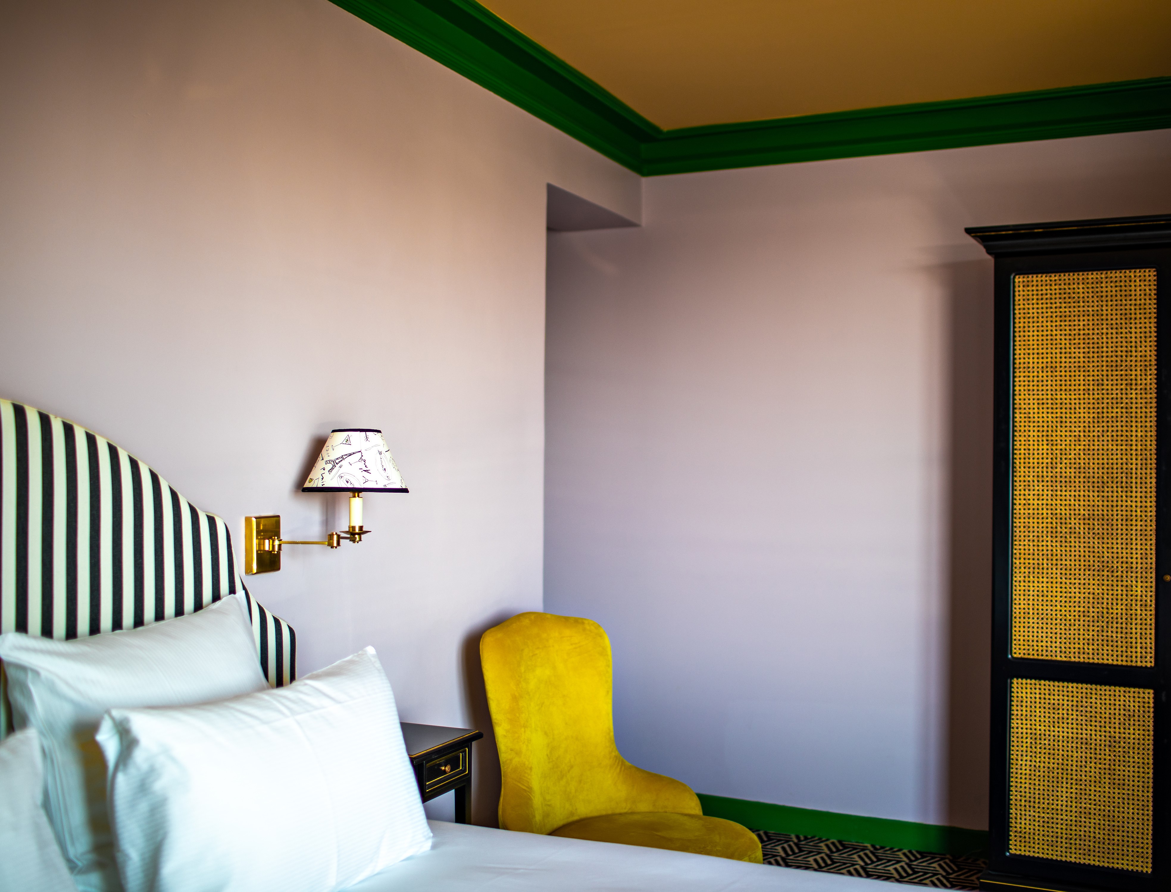
Painting the borders or trims of the ceiling will allow the ceiling to emerge as the focal point of the room. This way you can create an umbrella effect that gives the room a boost of energy.
'I wanted the room to have a mix of bright and playful colors,' says artist and designer, Luke Edward Hall. 'In this particular room, I painted the walls a soft lilac and the woodwork in bold kelly green. To stop the scheme from feeling too sugary, I painted the ceiling warm butterscotch, and introduced a stark element such as the black and white striped headboard and ebonized bedside tables, which take their inspiration from French antiques.'

Type: Water-based
Price: $70 for 3 liters
Choose this paint for ceiling borders hat have blue and yellow undertones. The color will help you feel optimistic and happy.
What color should I paint a room with low ceilings?
If you have a room that's narrow or has low ceilings, consider painting the entire room a radiant white, or a soft cream. Even a pastel tone might work as these colors will help open up the space reflect the light better, and make the ceiling appear further away.
How do you brighten a room with a low ceiling?
Paint tricks aside, you could use effective lighting ideas to open up a room with a low ceiling. Flushmounts and recessed spots are a great source of ambient lighting, that will contribute to the overall illumination of the room and open it up visually. That apart, ensure your curtains are drawn back during the day so the room is always flooded with natural light.
Be The First To Know
The Livingetc newsletters are your inside source for what’s shaping interiors now - and what’s next. Discover trend forecasts, smart style ideas, and curated shopping inspiration that brings design to life. Subscribe today and stay ahead of the curve.

Aditi Sharma Maheshwari started her career at The Address (The Times of India), a tabloid on interiors and art. She wrote profiles of Indian artists, designers, and architects, and covered inspiring houses and commercial properties. After four years, she moved to ELLE DECOR as a senior features writer, where she contributed to the magazine and website, and also worked alongside the events team on India Design ID — the brand’s 10-day, annual design show. She wrote across topics: from designer interviews, and house tours, to new product launches, shopping pages, and reviews. After three years, she was hired as the senior editor at Houzz. The website content focused on practical advice on decorating the home and making design feel more approachable. She created fresh series on budget buys, design hacks, and DIYs, all backed with expert advice. Equipped with sizable knowledge of the industry and with a good network, she moved to Architectural Digest (Conde Nast) as the digital editor. The publication's focus was on high-end design, and her content highlighted A-listers, starchitects, and high-concept products, all customized for an audience that loves and invests in luxury. After a two-year stint, she moved to the UK and was hired at Livingetc as a design editor. She now freelances for a variety of interiors publications.
-
 My 10 Favorite Designs at Milan Design Week 2025 — Out of the Hundreds of Pieces I Saw
There is a new elegance, color, and shape being shown in Milan this week, and these are the pieces that caught my eye
By Pip Rich
-
 Iridescence Is Chrome’s More Playful, Hard-to-Define Cousin — And You're About to See It Everywhere
This kinetic finish signals a broader shift toward surfaces that move, shimmer, and surprise. Here's where to find it now
By Julia Demer