5 fresh takes on the painted arch trend that will convince you to try out the look
The painted arch trend is going nowhere – and we love these ideas for getting the look in a sophisticated scheme

If you’ve been following the painted arch trend, you’ll know it’s one of a handful of creative paint ideas that have taken off over the last couple of years. From top interior designers to DIY influencers, people across the industry have tried the trend out in their own homes and projects. Thanks to its ability to add interest to a plain wall, it’s become a firm favourite amongst those who need quick, simple decor updates for their homes – the result being that the trend now feels a little overused.
That’s not to say that painted arches are over, though. ‘Circles, curves and arches are so appealing because they often appear in nature,’ says Jordan Cluroe, one half of interior design studio 2LG Studio with Russell Whitehead and co-author of their book, Making Living Lovely: Free Your Home with Creative Design. ‘I think this is why they have become so popular in interiors. We’ve been using them to zone spaces and create architectural interest for a while now.’
Think the trend might still be for you? We’ve rounded up our favourite fresh new ways to use the painted arch trend, from layering the look to adding architectural interest to window frames and doorways.
1. Highlight the curve of an arched doorway
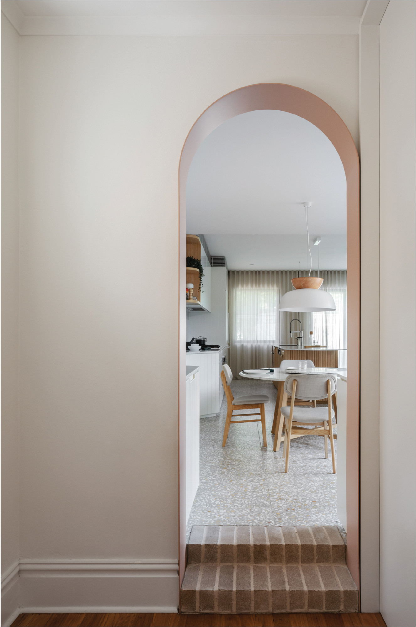
Taking the trend literally, this project by Carter Williamson Architects uses paint to draw attention to the shape of an arched door leading through to the newly renovated kitchen.
'For us, this arch was always going to be a significant moment, a portal between the old and new parts of the home,' they explain. 'Painting it white and letting it blend in was never really on the cards because we wanted it to act as a marker of transition, so we chose to include some color and have the arch stand out as a real character in the design.' The project uses a warm, earthy palette, and painting the arch in a darker shade – Dulux's Kangaroo Pouch – achieves a look that’s subtle but effective.
2. Use pattern for a bold, design-forward look
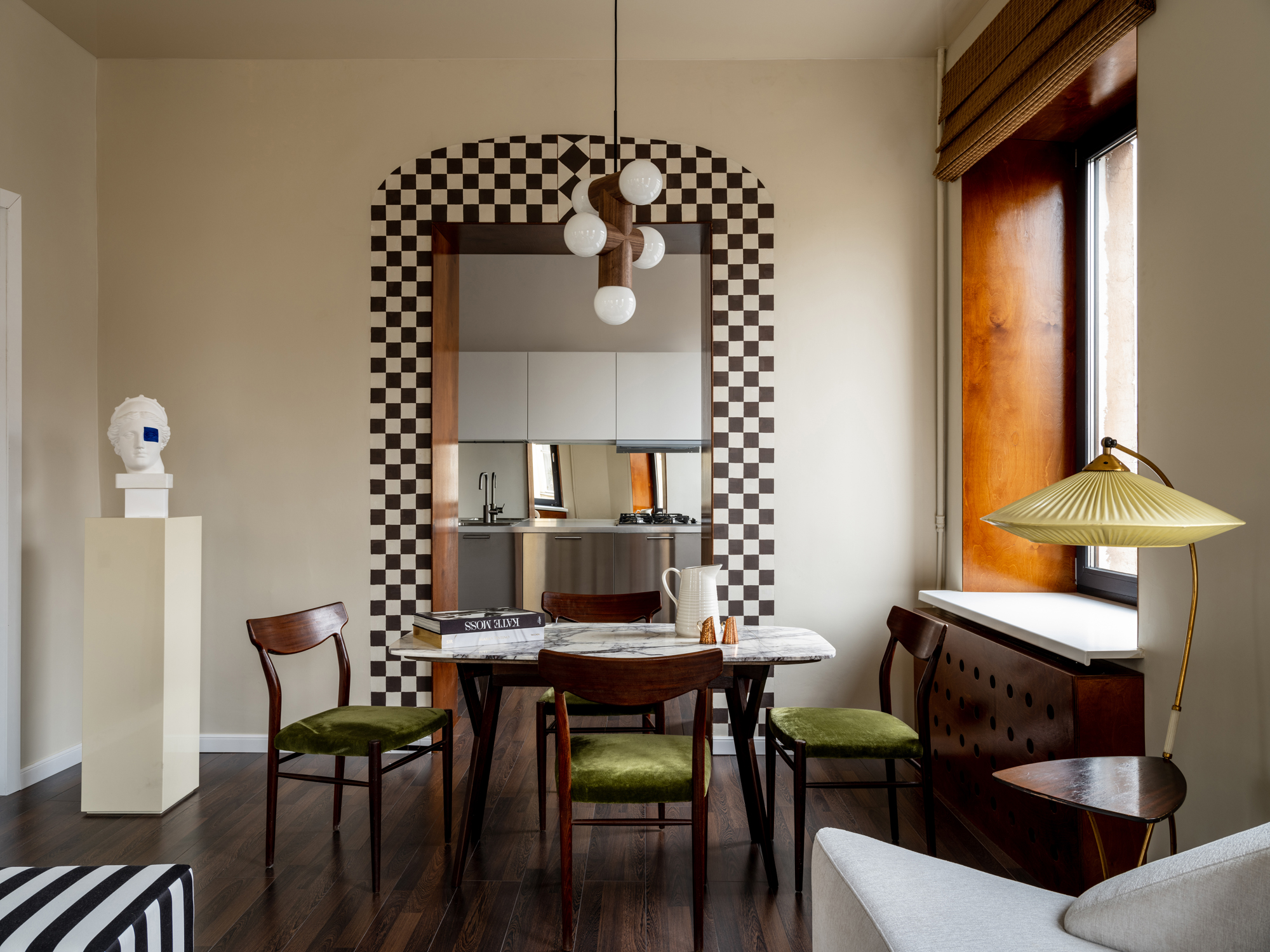
Where the Carter Williamson project highlights the shape of an archway, this clever freehand checkerboard effect by interior interior designer Tim Veresnovsky acts as a frame, adding a curve to a rectangular doorway and drawing on the black-and-white accents in the room.
As an interior design trend of the moment, checkerboard adds a dramatic edge to a scheme when used in this way – but this look would work just as well with stripes or block color. Or follow Luke Arthur Wells’ suggestion and use leftover paint to recreate the look behind a picture frame or mirror.
3. Add architectural interest to ordinary windows
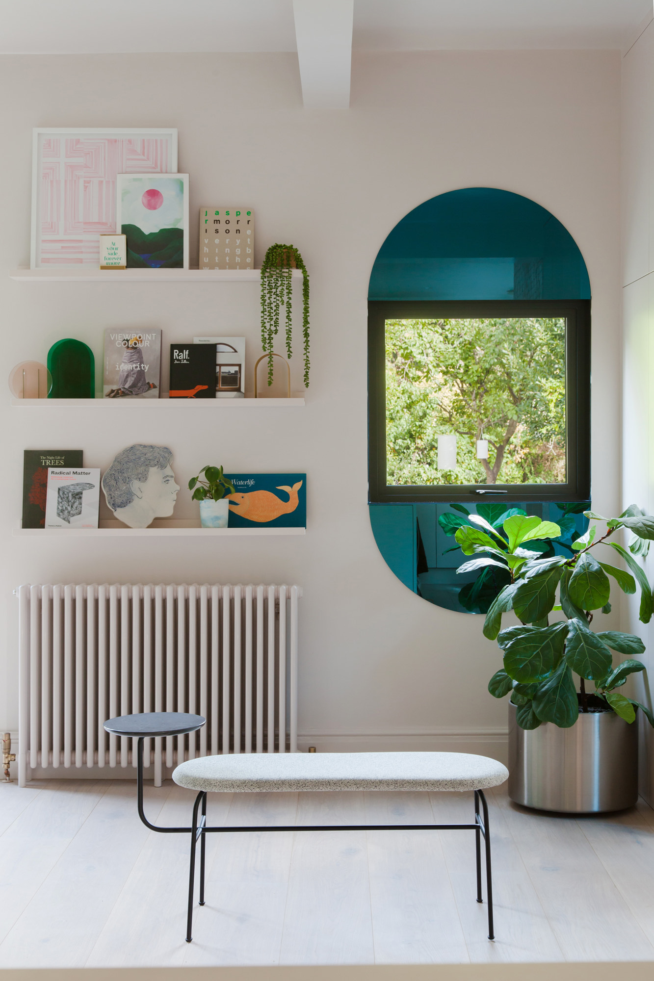
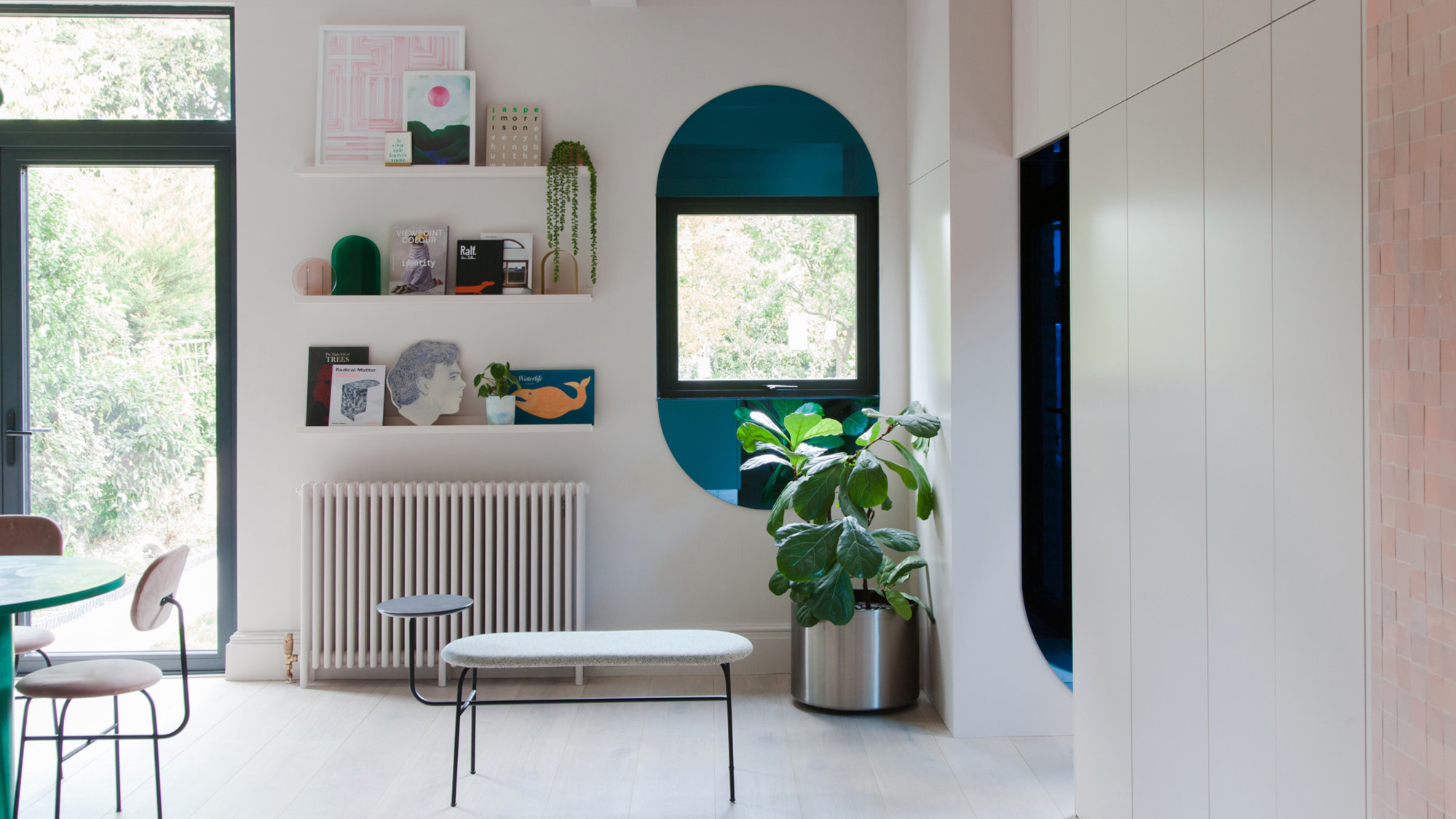
In this project by 2LG Studio, arches on the top and bottom of the window frame the view and add visual interest. They created the look with blue mirrors – but a similar look can be achieved with paint. ‘We created a lozenge shape to make the window appear larger,’ says Jordan. ‘It feels like an art piece surrounding the window and offers beautiful reflections throughout the day.’
Similarly, adding an arch above a rectangular door frame is a visual trick to add height to a room. It’s something that interior stylist and muralist Liz Kamarul uses often in her projects. ‘Arches are a great feature, helping draw the eye up and adding character to any space as well as softening the look of a room,’ she says. ‘Creating them with paint gives a similar impact if you don't have the budget or time to add them architecturally.’
This guide for how to paint stripes on a wall can work for this look, too.
4. Add depth to curved alcoves
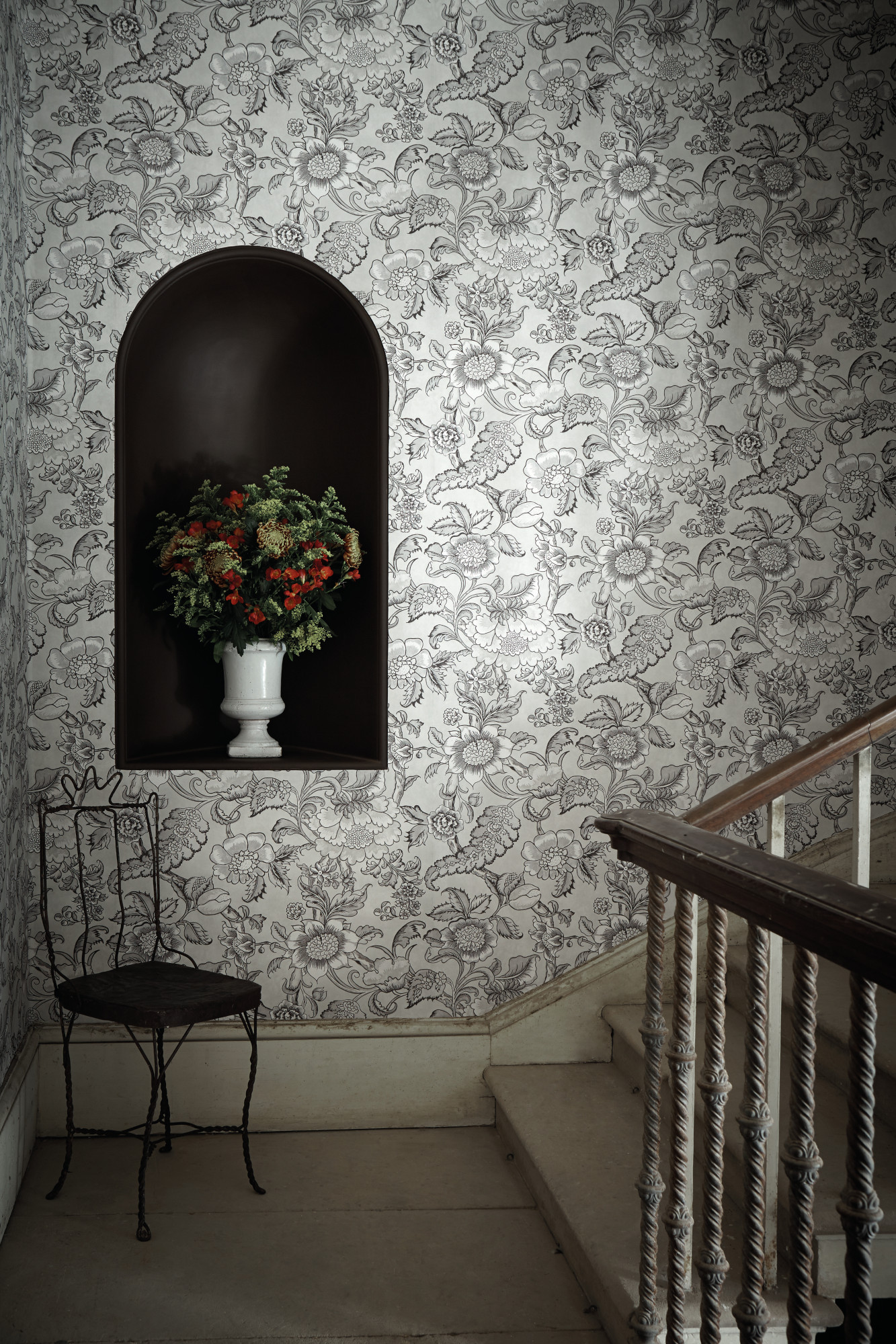
Architectural curves are going nowhere, and so if you’re including arched alcoves in your project – or are lucky enough to have inherited them in the staircase of a period property – you can add depth and interest with a splash of paint.
The nook in this image from Little Greene feels like a piece of art in its own right, and makes for the perfect frame for a vase or objet d’art.
5. Layer up the look – but keep the palette simple
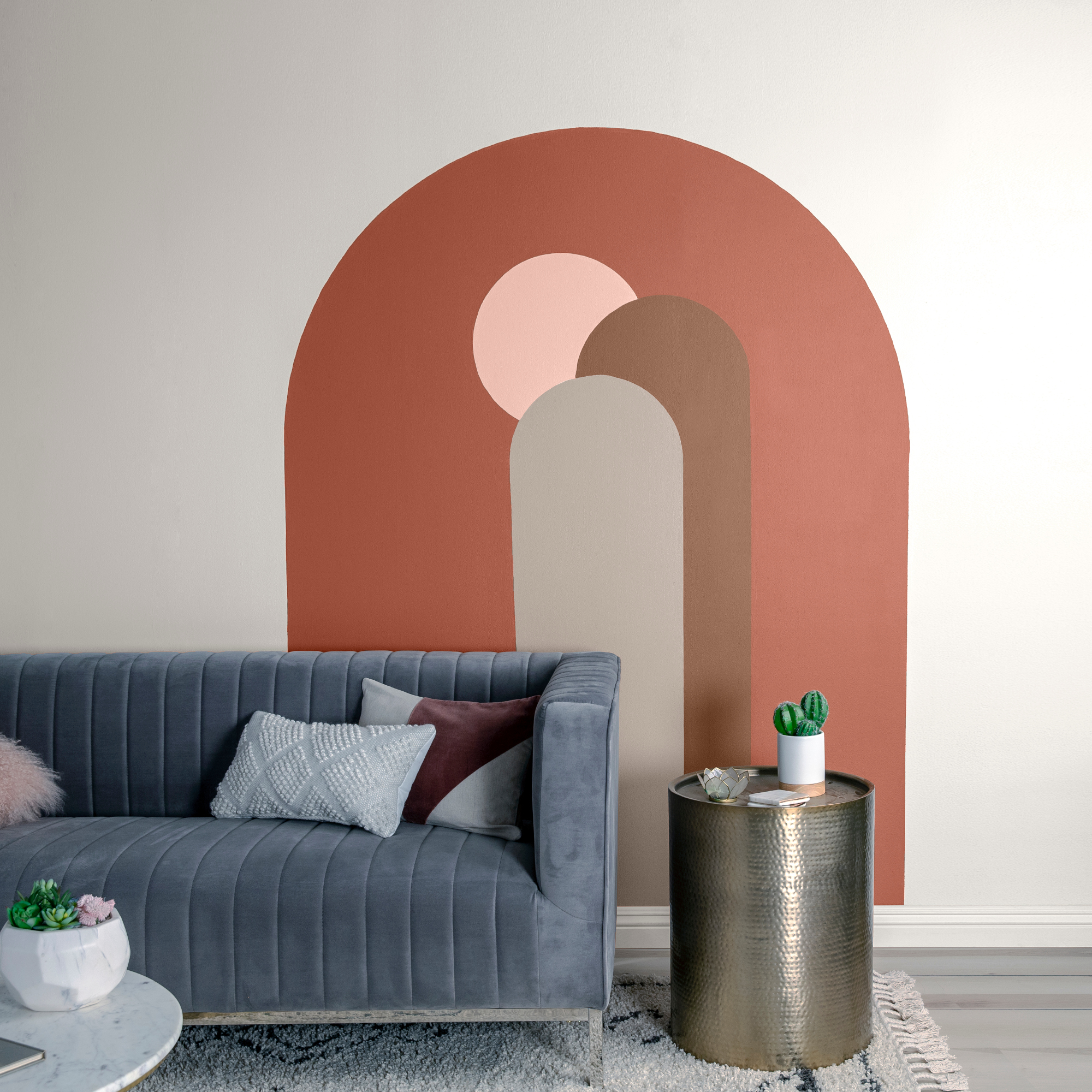
This project by Behr Paint Company uses a painted arch in a more traditional way, as a statement feature in its own right – but adds a twist by layering the look using a complementary color palette, creating a mural-esque finish.
'Painted arches are versatile and can be used as a focal point in any room which is why I love the trend,' says Erika Woelfel, VP of color & creative services at Behr Paint Company. 'They can be used to help a space feel relaxed, bring visual interest, and they catch everyone’s eyes when they walk into the room. For a new spin on the trend, I’d suggest leveraging contrasting colors, such as Behr’s Even Better Beige and Adirondack Blue, to create engaging arches.'
Can I create the painted arch look myself?
Painting an arch is a simple DIY job you can do yourself, so long as you prep properly – and have a fairly steady hand. All you'll need are paint samples or leftover paint, masking tape and a paint brush.
Map out your design on a piece of paper before you start, particularly if you're opting for a layered look or want to paint your arch across multiple walls. Draw your design lightly on the wall with pencil, using a spirit level to get the straight lines perfectly straight. For the arch, attach a piece of string between a pencil and a wall tack, making the length of the string half the distance between the two straight edges. Push the tack into the wall between the two straight edges, then draw with the pencil, keeping the string taut to make sure the arch is even all the way around.
All that's left then is to paint – use masking tape for the straight edges and freehand the arch itself. A flat brush will make the job easier – but patience and a steady hand is all that's needed. Use a paint roller to fill in the middle. Add a second coat if needed, and remove the masking tape while the paint is still wet for a smooth finish.
Our editor swears by this particular masking tape from Amazon.
This guide for how to paint a wall is generally useful here, too.
Be The First To Know
The Livingetc newsletters are your inside source for what’s shaping interiors now - and what’s next. Discover trend forecasts, smart style ideas, and curated shopping inspiration that brings design to life. Subscribe today and stay ahead of the curve.

Ellen is deputy editor of Livingetc magazine. She works with our fabulous art and production teams to publish the monthly print title, which features the most inspiring homes around the globe, interviews with leading designers, reporting on the hottest trends, and shopping edits of the best new pieces to refresh your space. Before Livingetc she was deputy editor at Real Homes, and has also written for titles including Homes & Gardens and Gardeningetc. Being surrounded by so much inspiration makes it tricky to decide what to do first in her own flat – a pretty nice problem to have, really. In her spare time, Ellen can be found pottering around in her balcony garden, reading her way through her overstacked bookshelf or planning her next holiday.
-
 12 Essentials Every Cool, Collected Spring Host Needs — And You’ll Never Guess Where They’re From
Guests will think you thought of everything, you just knew where to shop
By Julia Demer Published
-
 Smeg Says Teal, and We’re Listening — The Kitchen Shade of the Year Is Here
Designers are already using the soft, sea-glass green everywhere from cabinetry to countertops
By Julia Demer Published