

If you're looking to repaint your interiors to bring a bit more color to the home, but don't want to go all out with an overwhelmingly bright accent wall - this design trick might just be for you. Instead of painting your whole wall, why not highlight the doorways with a simple lick of paint that adds that extra jolt of energy?
‘I love the trend of colorfully painted door trim,’ says Laura Williams, designer at ATX Interior Design. ‘It adds personality and sophistication in such a simple way.’ Going bright with your door frame color choice also helps to really bring a joyous feel to the room, and can really lift the room. I've spoken to the designers who are all for this paint idea to find out how to achieve the look.
What kind of room does this paint trend suit?

There aren't really any hard and fast rules as to where in the home to use this paint trick, and it actually works quite well all over the home. Busy family zones might benefit from a playful lick of paint, and areas of transition are a great place to try it out to lead you through the home. I like a door frame between the living room and dining room painted in a bright shade, connecting the two but also bringing that distinction. The look might also work in a child's bedroom, where you want to bring a pop of color but don't want to commit to a shade that your child might decide they no longer like in a few months.
It's the perfect addition to this rustic kitchen, designed by Hendricks Churchill. Without the yellow trim and door frame, the space would lack energy and interest. The small amount of yellow paint does so much to lift the room and nod to the kitchen's traditional style.
'This “new old house” deftly adheres to the pared-down design of a classic New England farmhouse inspired by the early-20th-century vernacular buildings of the Hancock Shaker Village,' explain Heide Hendricks and Rafe Churchill, founders of Hendricks Churchill.
'The trim is painted in bold contrasting colors against burnished lime plaster walls as a powerful and playful decorative convention to harmoniously link the rooms,' Heidi and Rafe add. 'These graphic accents instill a quiet drama and allow the rooms to skew more minimal - a subtle nod to the Shaker way of life.'
What bright colors work best for the look?

In terms of the perfect colors to pick for your door frame, go for something that is bright but has a connection to the wall color. For example, this Farrow & Ball Raw Tomatillo green from the Carte Blanche collection is paired with a stark white on the entryway walls, working together as an elegant combination. Really consider the relationship between the two shades, you might even want to go a shade up or down from the wall paint if you don't want anything too dramatic. Take note of what other colors you use in the space and the accents and color pops around the room.
'Door and window casings are such a great way to layer in color and add depth to a room,' says Kathryn Murphy of Chicago-based design company, Kathryn Murphy Interiors. 'I like to either have them match a colorful space or color drenching or use the contrast to build the color scheme and add detail. It can also be a great compromise for partners with different tastes - keep the walls neutral for one and add color on the trim for the other.'

There is also the option to go for a pale or muted color instead of something too vibrant. If paired against a white background, as per this example, it will still look colorful without being too overwhelming. 'We opted for a painted timber frame rather than the obvious Crittal to create a joyful softness throughout the ground floor,' says Katie Glaister of K&H Design.
'Tabernacle by Little Greene injects a wonderful energy and connects the entrance hall to the garden beyond.'
‘This color trend is definitely interesting! With smaller spaces, we see people moving away from statement walls towards statement features, such as doors, where they can choose a vibrant color and pair it with the adjacent wood trim, or treat the whole door and trim monochromatically, using color,' says Kelly Cray, creative principal at U31. 'Statement doors also offer the opportunity to highlight architectural profiles, rather than a wall’s smooth finish. The exterior front door of a home is the element where people are more apt to use bold paint colors.
'That being said, we see a more muted version of this trend with a variety of earth tones, or natural wood frames and baseboards, paired with a colored painted door.’
How to get creative with shapes

Finally, it's not just about paint color, and the door frame gives you an opportunity to get creative with shapes too. I love this wavy look from designer Pierre Yovanovitch, in sunshine yellow.
The color is already so joyous, but the pattern brings even more energy and playfulness to the doorway. In this example, Pierre used bold color, combined with pattern to create architectural interest and beckoning guests through to the next room, creating a visual storyline as they pass through the spaces.
3 paints to pick for your brightly colored door frames

Price: $140
Size: One gallon

Price: $70
Size: One gallon

Price: From $85.49

-
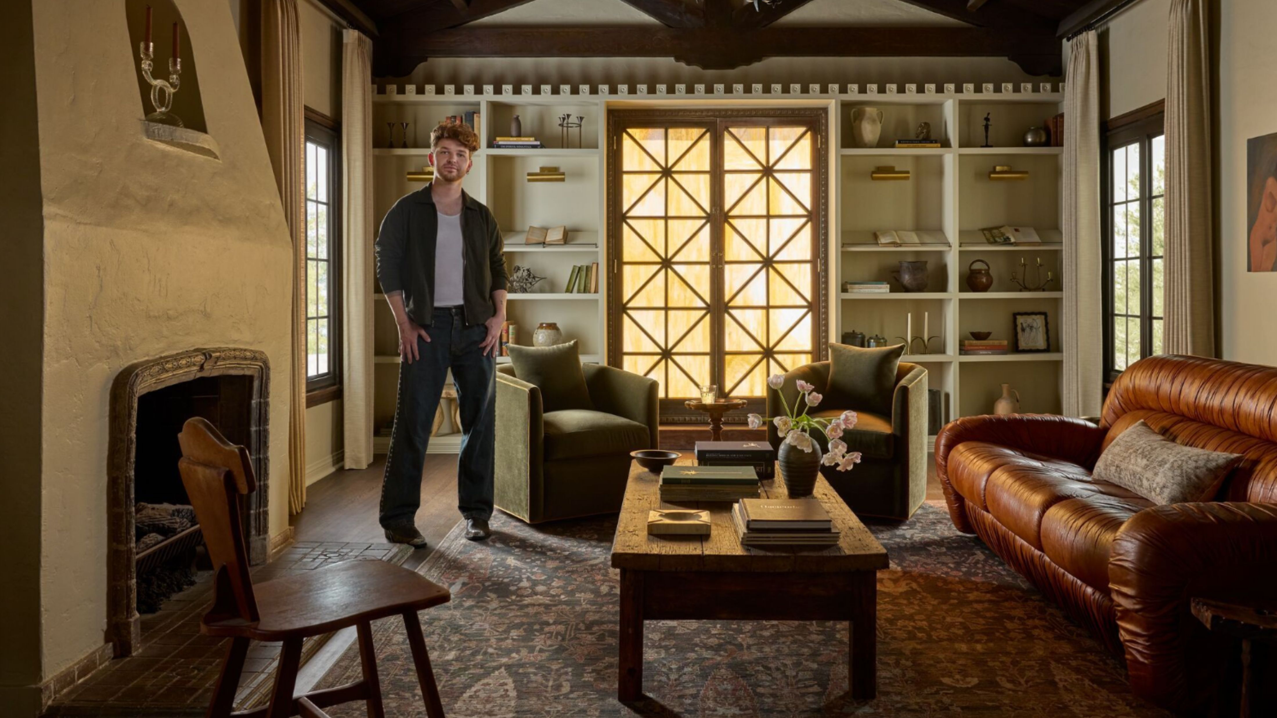 Lone Fox's Drew Michael Scott Drops a Vintage Capsule with Joon Loloi (And Some Seriously Good Tips For Thrifting Antiques)
Sourced straight from one of the world's biggest antique shows, Drew shares how to stay sane, cut through the noise, and score what you actually want
-
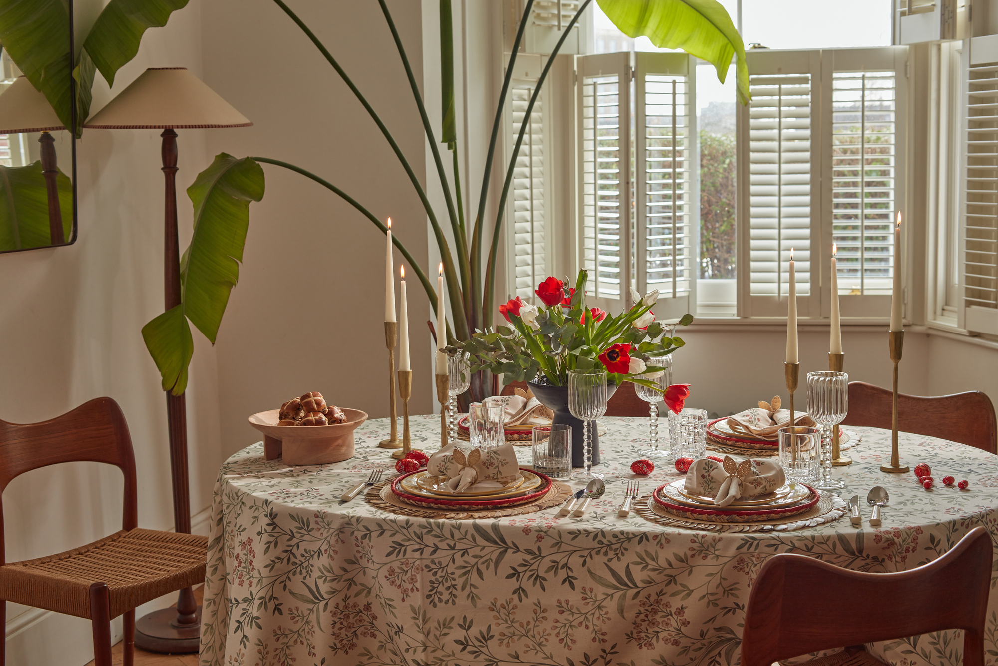 9 Easter Table Decor Ideas to Plan Now for Perfect Tablescapes This Season
From centerpieces and color schemes to tablecloths and seasonal themes, let these designer-approved ideas inspire your table styling this Easter


-
 The 'Red Table Trick' Is the Easiest and Most Expensive-Looking Trend to Hit 2025 So Far
A red dining table makes a seriously stylish statement; the beloved pop of red trend just got an bold and expensive-looking upgrade
-
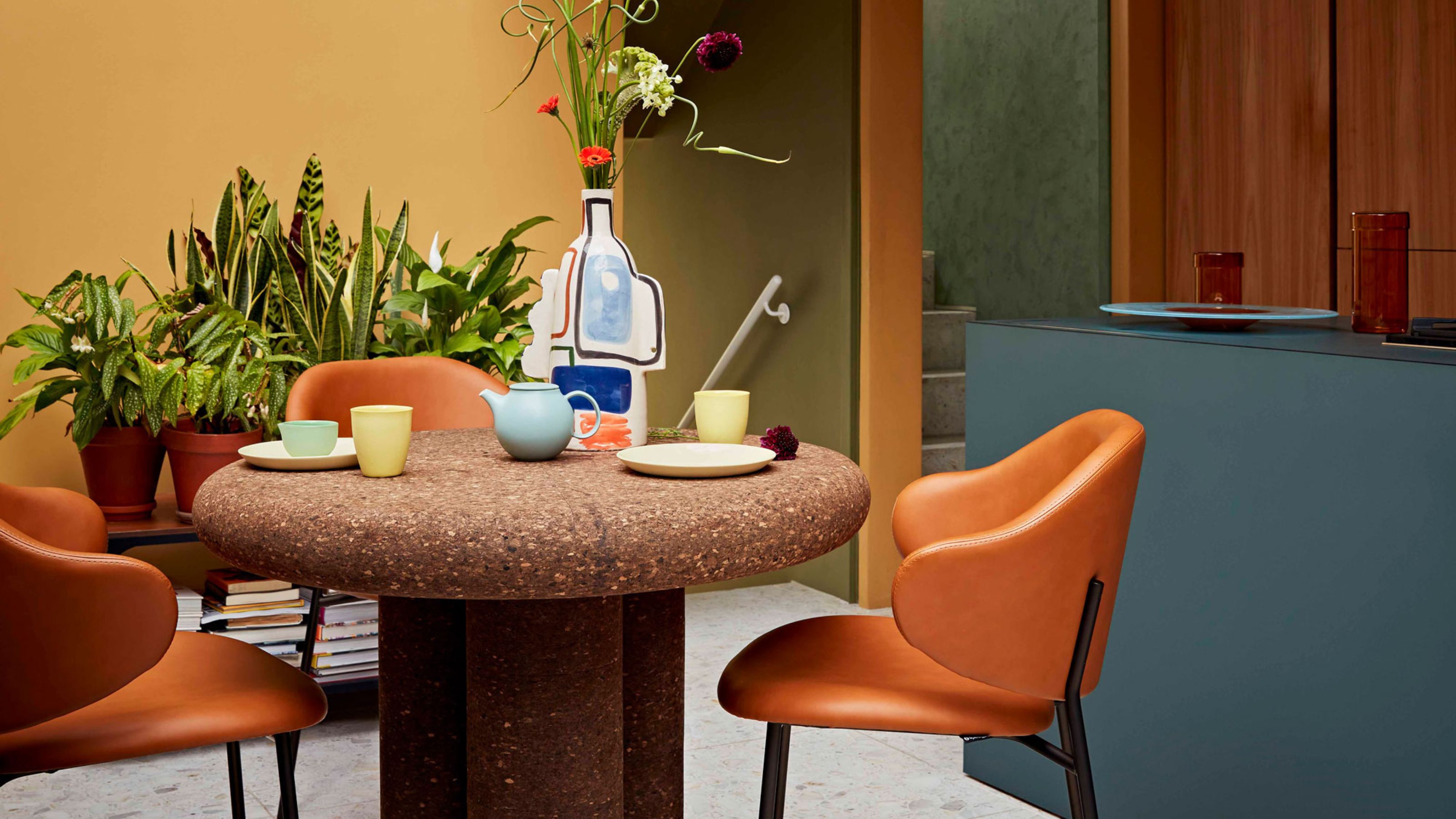 Cork Is the Cool, Sustainable, and Surprisingly Chic Material We Can't Stop Furnishing With Right Now
In honor of Earth Month, we’re toasting to cork... furniture, that is
-
 The Coquette Aesthetic Is Still Going Strong in Homes in 2025 — But Now It's Charming, Whimsical, and Has Modern Flair
A designer weighs in on how you can make the classic coquette trend feel modern while still retaining its whimsical elegance
-
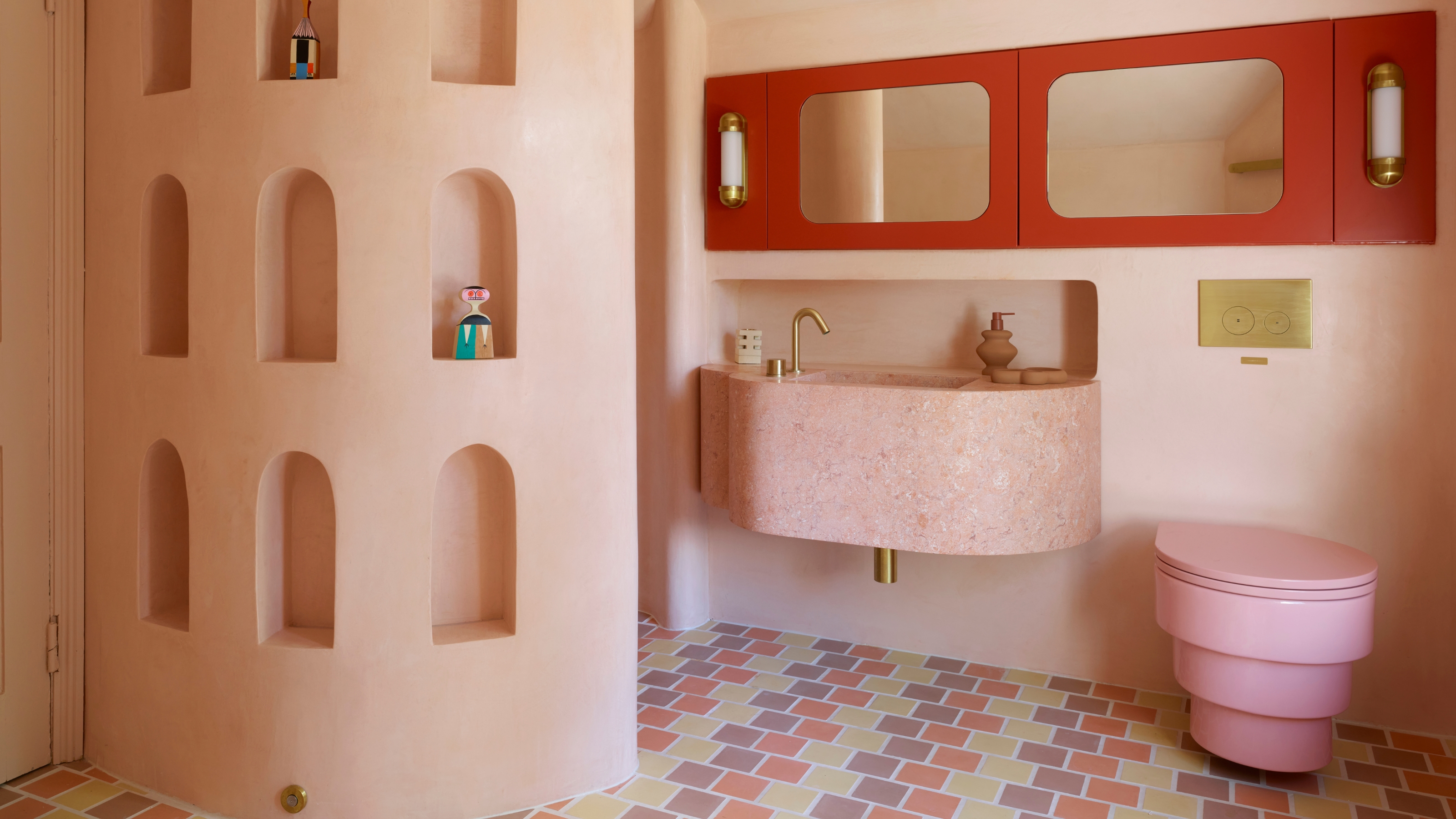 Spotted in the Coolest Bathrooms of the Moment — This Colorful-but-Divisive Trend Is the Idea You'll Either Love or Hate
See you later, sterile white. This playful plumbing trend is bringing color back to our bathrooms in an utterly unexpected way
-
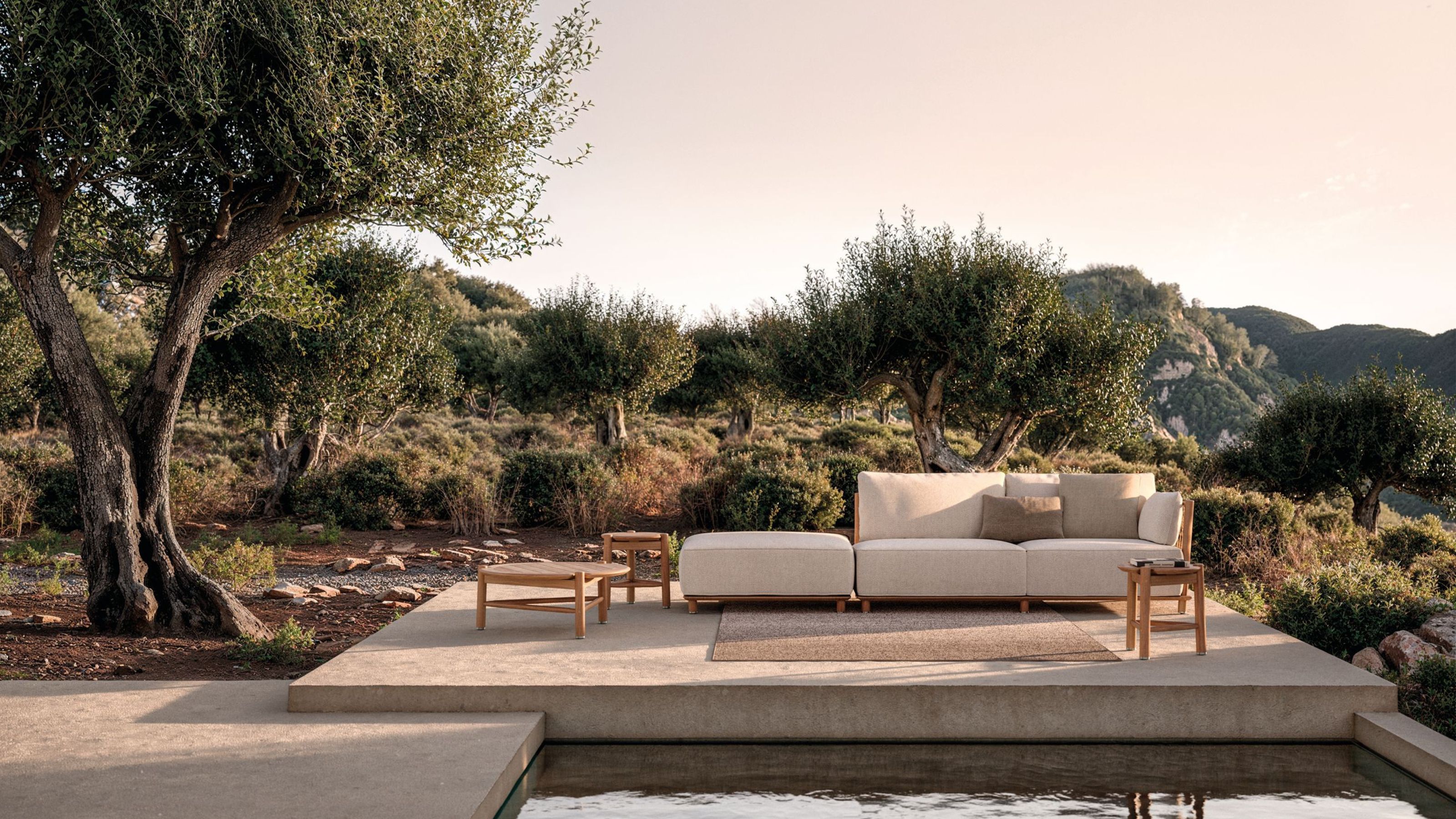 The Biggest Outdoor Furniture Trends for 2025 Embrace the Natural World, White Lotus, and a Touch of Whimsy
Sofas as plush as your living room’s, tables fit for a five-star resort, and materials straight from nature — here’s how outdoor living is evolving this year
-
 The "One Amazing Thing" Theory Could Just Be the Secret to Making Your Decorating Budget Go Further (While Making More Impact)
What if we told you designers had found a way to control a project's spend even while elevating the final result? This new trend does just that
-
 Carpets Used to Give Me the Ick, but This Bold New Style Makes Me Think They're the Next 70s Design Detail Due for a Revival
I've always had visions of ripping up wall-to-wall carpets, but now I'm thinking about actually installing them — what gives?
-
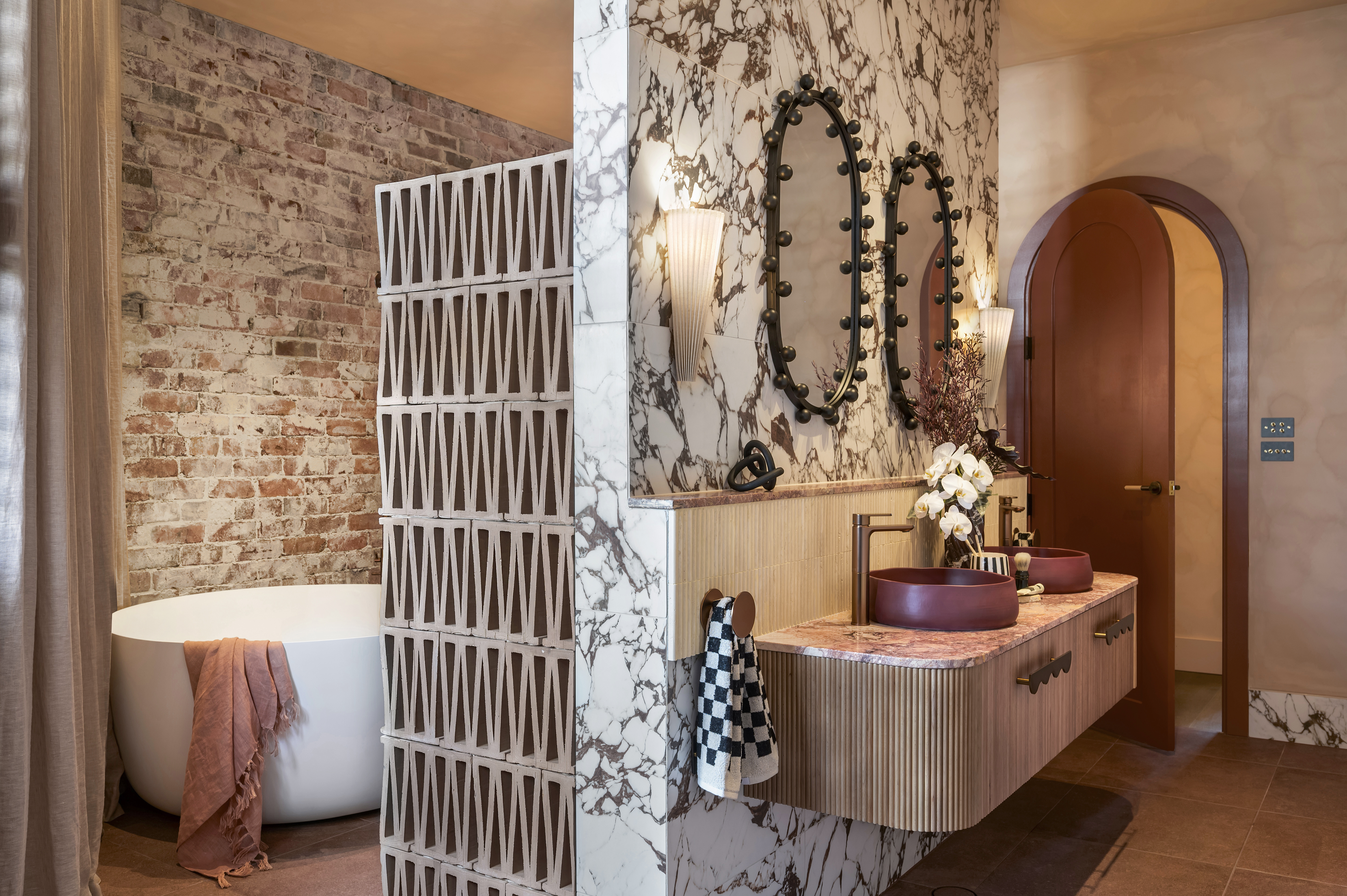 This 'Modern Breeze Block' Trend Is Everywhere Right Now — From Kitchen Islands to Room Dividers
I've spotted this V-shaped breeze block popping up as the cool finish in kitchens, living rooms, and even bathrooms right now. Here's what you need to know


