
Pastel color palettes are no longer the preserve of a kid's bedroom, but a tool designers are using to create soothing schemes all throughout the home.
The latest color trend sees pastels paired with a mix of bolder shades to build layered spaces that look grown up, even sophisticated. It's achieved by picking out the gray and blue tones of the pastels rather than the pigments in them, that can make them seem sugary.
'When we’re out in the world, we're busy, we're running around, we're doing our thing,' said the designer Brigette Romanek, talking about her love of pastels, most notably lavender. 'When you come home, and particularly into the bedroom, you want to exhale. You want your space to let you just take it easy.'
And that's what pastels - when used right - can do. They create a moment of calm, a soothing scheme that inspires you to take a breath. So, go on, take a big breath and discover what pastel colors go together best, and what 'adult' schemes designers are loving right now.
1. Pastel pinks and blues with off-white

The joy of decorating with pastels is how easy they are on the eye - their very nature is unchallenging, instantly relaxing anyone who enters a pastel-skewed room.
In order to celebrate that, Nina Magon Studio chose to complement the pastel furniture in this living space with a creamy off-white color on the walls. Nothing jars, and the result is a totally soothing scheme.
'It is actually plaster on the walls,' the studio's founder Nina Magon says. 'We opted for plaster as a texture for the walls to infuse warmth and inviting allure into the space, effectively balancing the colors of the furniture and textiles.'
2. Pastel pink with dark green and wood tones

A different approach by Houston-based studio Mary Patton Design can be seen here. Highlighting the pastel pink on the walls, the dark and vivid greens in the curtain colors truly stand out. It might read as too dramatic if what you were going for was a peaceful pastel color scheme, but the two are bridged by the softness of the wood.
There is a design sleight of hand here, though, and one that is worth remembering when decorating with pastel tones. 'The trick to it is the blush color is not a true pastel - it doesn’t have blue in it, it really is more of a creamy blush,' says the studio founder Mary Patton. 'Since that reads slightly warm, it’s a good foundation to hold against bolder primary colors and makes sense with the wood floor color that could lean yellow if put next to a cool tone.'
3. Pastel blue and red

It seems that right now, in the summer of 2024, every color goes with red and can be given an elevated boost with a dash of crimson. So runs TikTok's favorite design theory, that of the 'unexpected red,' that says the bold hue can work as a finishing touch, much like a slick of red lipstick always does to an outfit.
The theory is upheld by this bedroom, created by Los Angeles-based studio LALA Reimagined. 'We love red,' says Azar Fattahi, one of the studio's two co-founders. 'It's really interesting, and almost feels like a neutral.' By pairing it with pale blue you get a pastel color scheme that looks totally right for now.

Price: $17.99
Materials: 55% Linen, 45% Cotton
Size: 20x20
4. Pastel blue and yellow with orange

To help make a pastel color scheme feel contemporary, one approach is to split the pastels with what Dagny Thurmann-Moe, creative director of Koi Color Studio, calls a 'mediator'. For this dynamic living room color palette, she separated the pastel blue and pastel yellow with a vibrant hit of orange, to arresting effect.
'Yellow and blue is a combination I usually have difficulties with, it often reminds me of a Swedish flag, or the IKEA logo,' Dagny says. 'However, if you use a color as a mediator, you can achieve a really sophisticated palette. To find the perfect mediator, try to find a nuance that is split complimentary to your yellow or blue.' Halfway between the two shades is this bold orange, so it works with both while uplifting them, too.
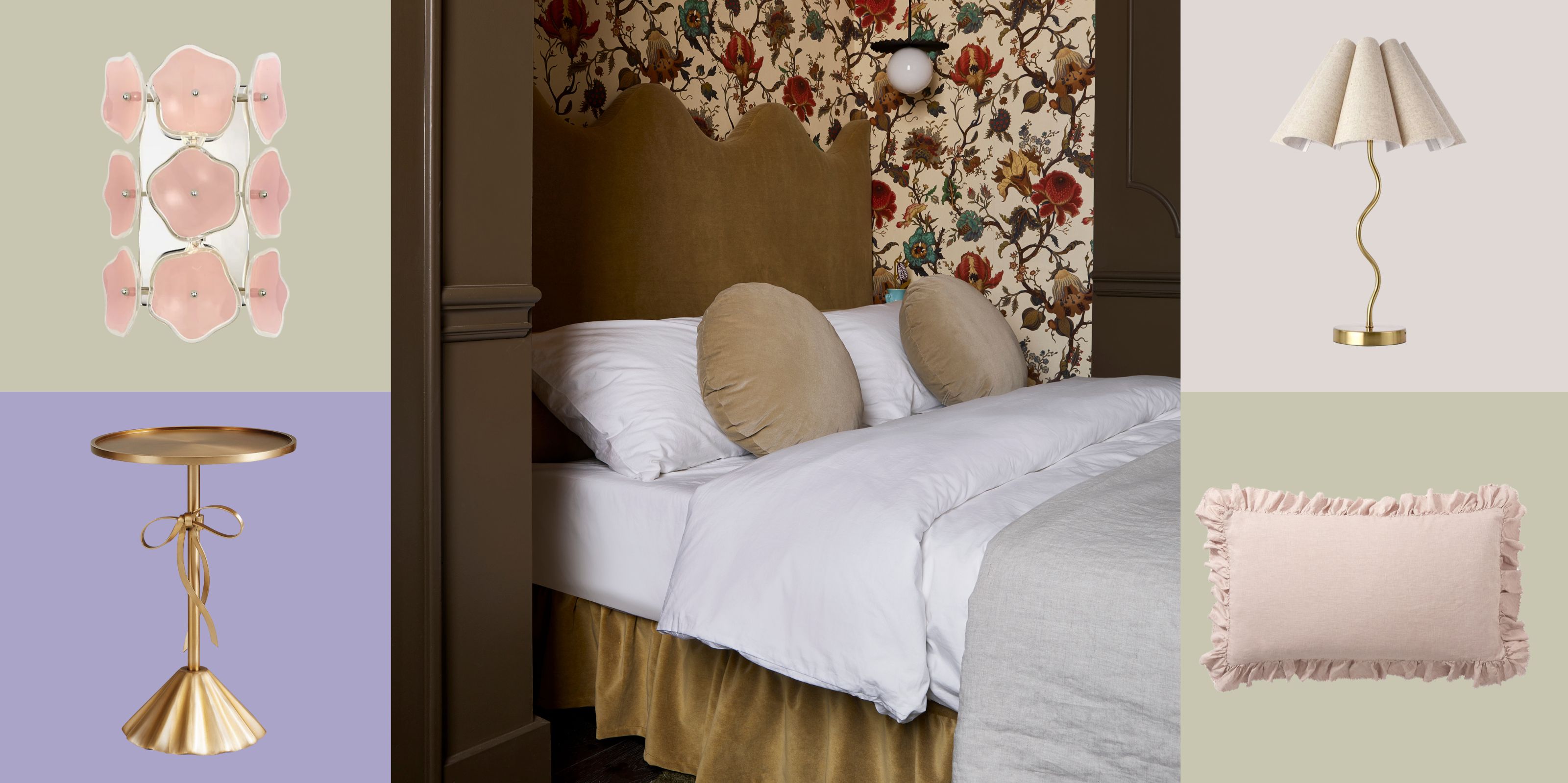
5. Pastel lilac with oak tones

For this reading corner, LA-based interior designer Jake Arnold chose a lilac color to cover the bookshelves and paneling. It is prevented from seeming sugary or too sweet by the use of oak furniture and the lighter wood floor color that has warmer tones than the cool-tinged lilac.
As to where to find such a perfect shade of lilac, New York-based designer Robert Stilin has some ideas. 'There’s a light lavender, WC-09 by Fine Paints of Europe, that is one of my very favorite colors,' Robert said. 'It’s subtle, but it still catches your eye, and it is unexpected and playful. Farrow and Ball's Calluna is a light gray-lavender that's cozy and a bit moody.'
An ideal way to do grown-up pastels.

Price: $49.00 for 750ml
6. Pastel green and blue

It used to be that blue and green should never be seen - the old color adage passed down as generational wisdom to seem like it had become a truth. But contemporary designers have subverted this, and blue has certainly become a color that goes with green. To pleasing effect in fact, as seen in this pastel green living area with a pastel blue Camaleonda sofa, decorated by Parisian design studio Uchronia.
The gemstone malachite was the inspiration for a scheme that seems to glow, despite its pastel-toned delicacy. ‘The table, the walls, all began with this wildly patterned and colored gem, so unique and vibrant, but calming and grounding, the perfect setting to eat and share,’ explains the studio's founder Julien Sebban.
7. Pastel pink with blue

Pastel pinks are often used as a neutral - a more uplifting version of gray and a less dazzling version of white, but they can be given extra warmth if paired with darker pinks and royal blues, a hue starting to be used in this year's summer color palettes.
The secret to the success of this home office by Veresnovsky Design Studio is in the sandwiching of the brighter shades by the pastel pink, which appears on both the sofa and the wall as a backdrop. 'I placed a long, liner table that fit snugly by the window and played with curving forms in the furniture to break the straight lines of the room,' says studio founder Tim Veresnovsky, explaining how the layout works so well.
8. Pastel pink with bolder pink and gray

Texas-based designer Nina Magon used pastel pink for the carpet color as a grounding base for the richer pinks layered on the walls and in the light fitting. And yet despite the limited color palette, the room still manages to not look like a Barbie-themed play palace.
This is because, here, the pastel pink acts as a neutral, its grayed tones working alongside the gray stone bed base to ground the rest of the scheme. For a similar look, try pairing pastel pink walls with a gray couch and then layer bolder pink pillows on top of it.

Price: $92.65
Materials: 100% Turkish cotton
Size: 40” x 65”
-
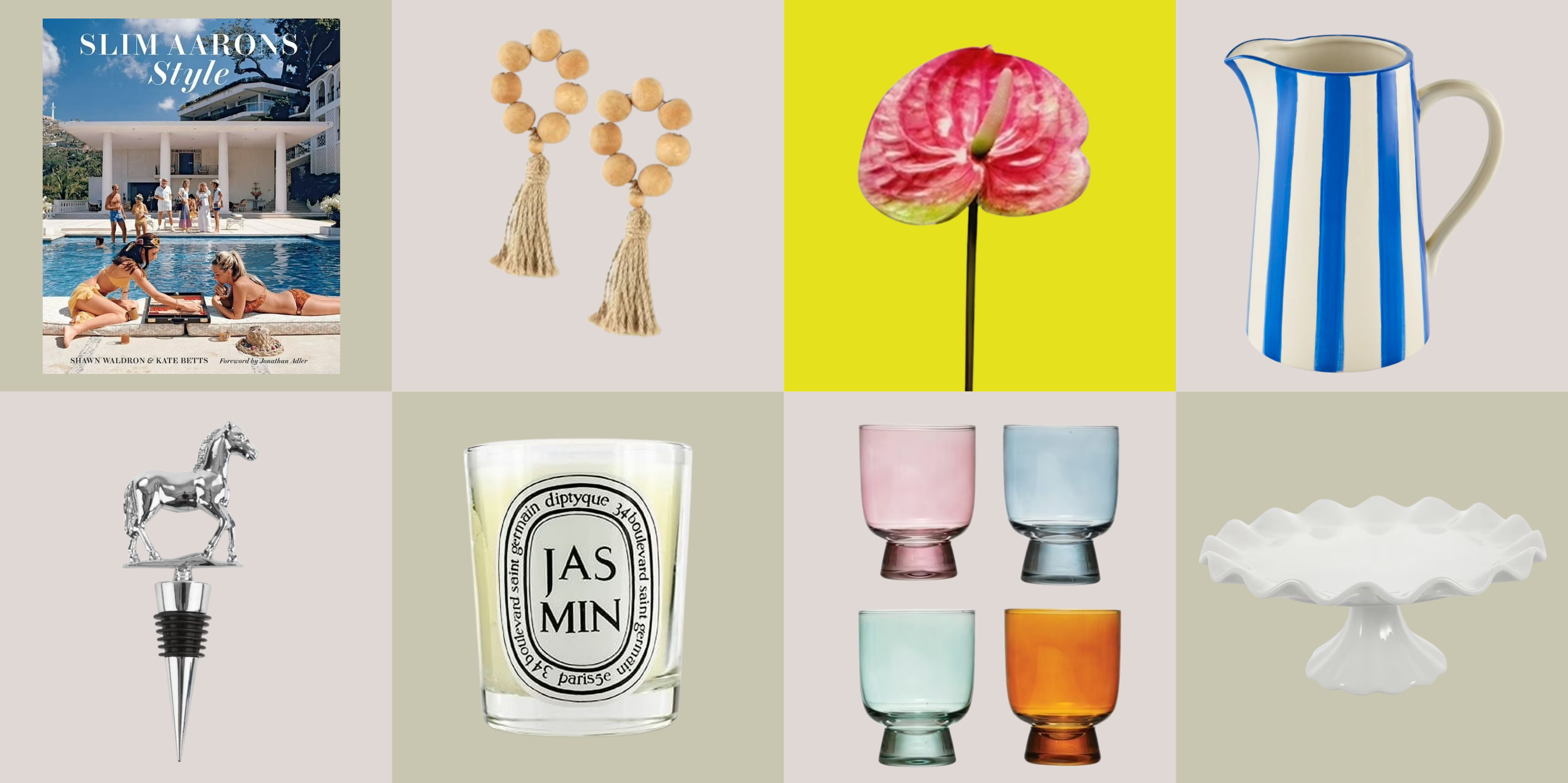 12 Essentials Every Cool, Collected Spring Host Needs — And You’ll Never Guess Where They’re From
Guests will think you thought of everything, you just knew where to shop
-
 Smeg Says Teal, and We’re Listening — The Kitchen Shade of the Year Is Here
Designers are already using the soft, sea-glass green everywhere from cabinetry to countertops


-
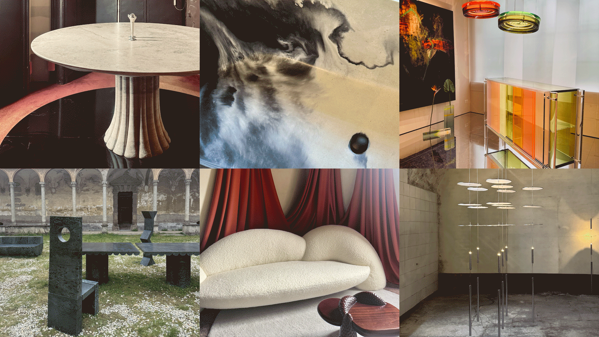 Straight from Salone: 5 Emerging Trends I Found in Milan That'll Shape Interiors For the Year Ahead
From reflective silver to fluidity, here's my perspective on the key themes and new moods coming through from Milan Design Week
-
 The 'Red Table Trick' Is the Easiest and Most Expensive-Looking Trend to Hit 2025 So Far
A red dining table makes a seriously stylish statement; the beloved pop of red trend just got an bold and expensive-looking upgrade
-
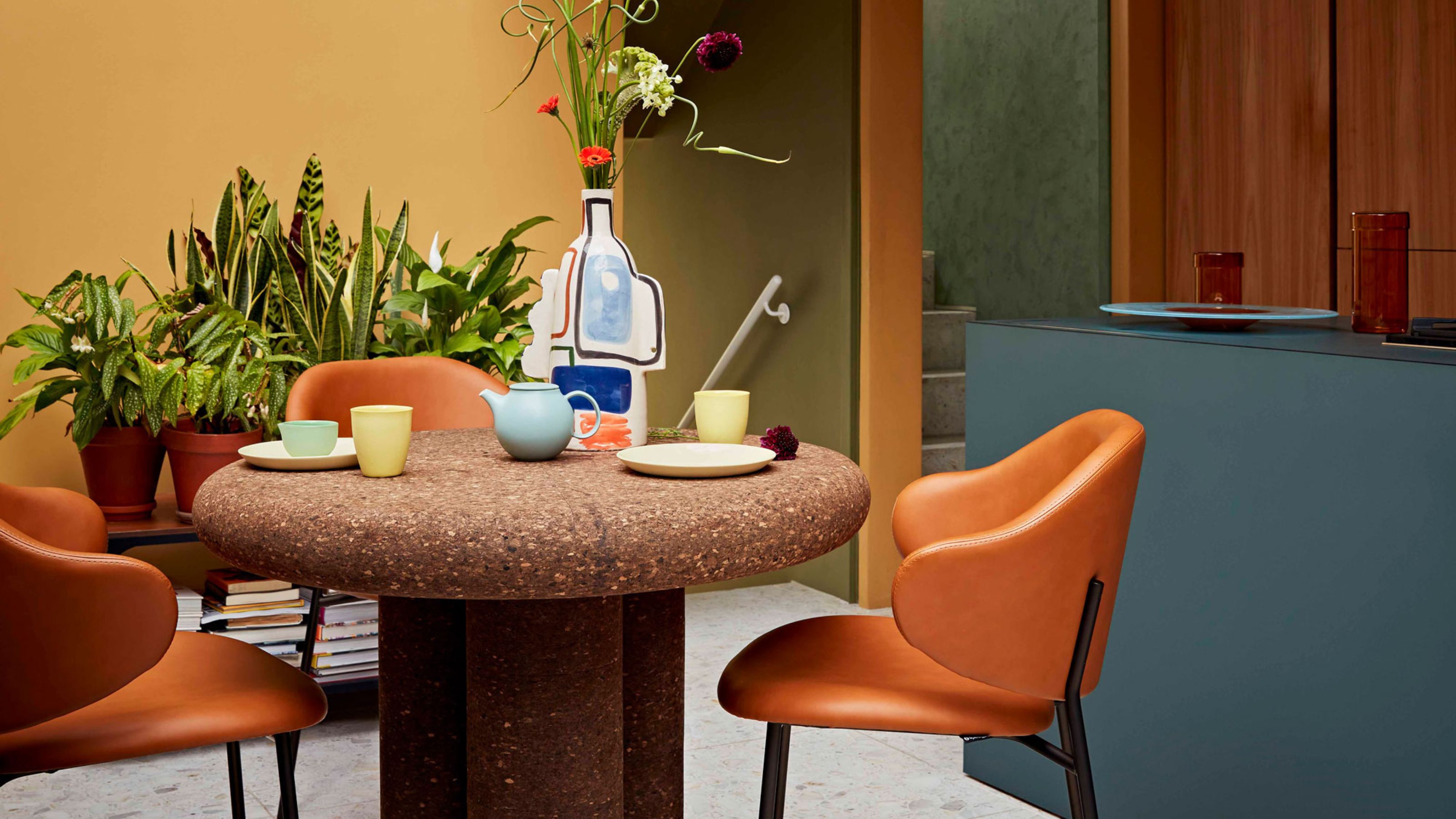 Cork Is the Cool, Sustainable, and Surprisingly Chic Material We Can't Stop Furnishing With Right Now
In honor of Earth Month, we’re toasting to cork... furniture, that is
-
 The Coquette Aesthetic Is Still Going Strong in Homes in 2025 — But Now It's Charming, Whimsical, and Has Modern Flair
A designer weighs in on how you can make the classic coquette trend feel modern while still retaining its whimsical elegance
-
 Spotted in the Coolest Bathrooms of the Moment — This Colorful-but-Divisive Trend Is the Idea You'll Either Love or Hate
See you later, sterile white. This playful plumbing trend is bringing color back to our bathrooms in an utterly unexpected way
-
 The Biggest Outdoor Furniture Trends for 2025 Embrace the Natural World, White Lotus, and a Touch of Whimsy
Sofas as plush as your living room’s, tables fit for a five-star resort, and materials straight from nature — here’s how outdoor living is evolving this year
-
 The "One Amazing Thing" Theory Could Just Be the Secret to Making Your Decorating Budget Go Further (While Making More Impact)
What if we told you designers had found a way to control a project's spend even while elevating the final result? This new trend does just that
-
 Carpets Used to Give Me the Ick, but This Bold New Style Makes Me Think They're the Next 70s Design Detail Due for a Revival
I've always had visions of ripping up wall-to-wall carpets, but now I'm thinking about actually installing them — what gives?


