Pastel kitchens are a big new design trend - minimalist, soothing, uplifting. Here's why
9 pastel kitchen ideas from interior designers which show how to use these candy-sweet colors to perfection
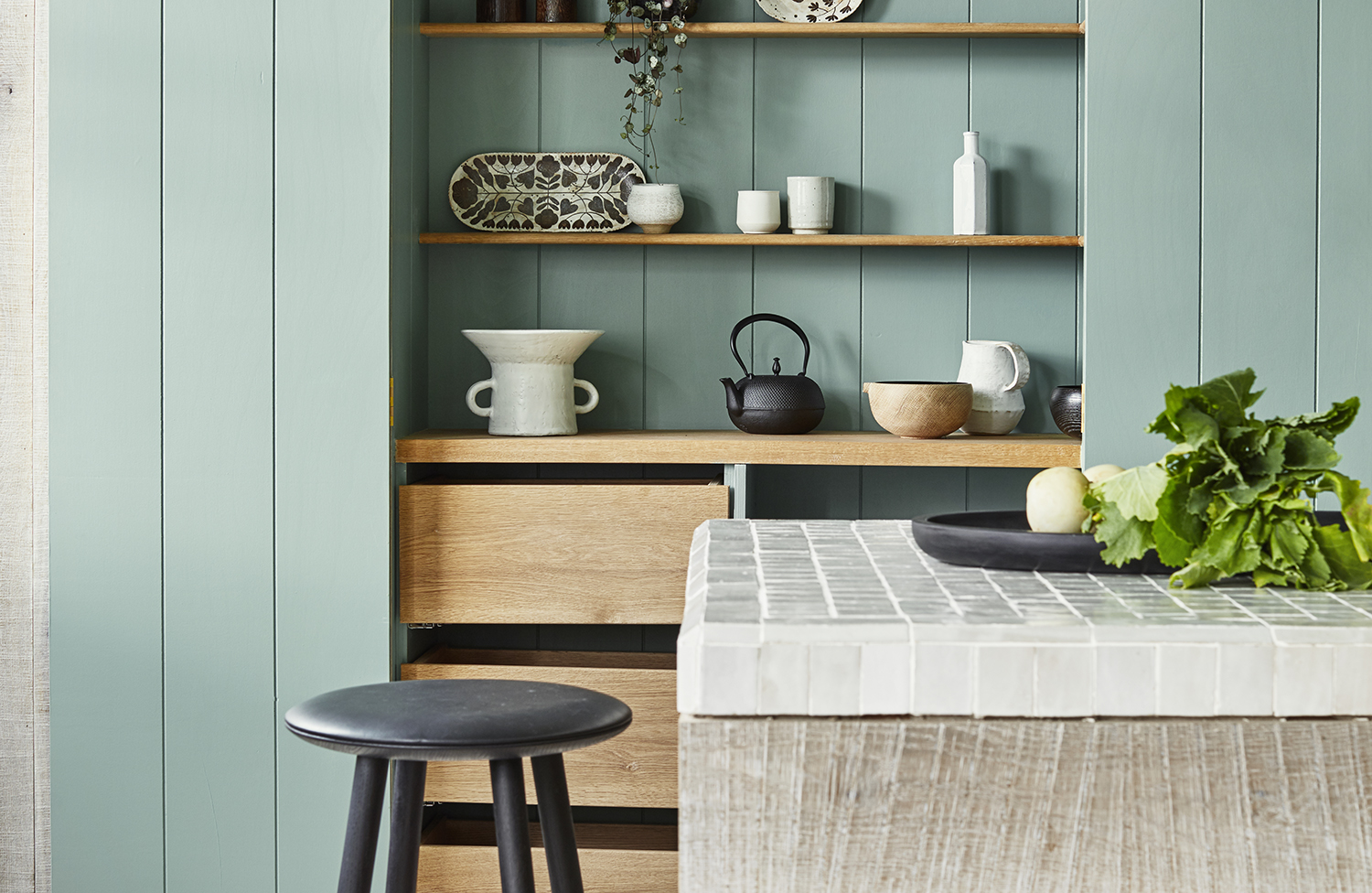
After years of the sameness of the white cabinet and counters, the recent design trend for pastel kitchens is a welcome breath of fresh air. And there are so many ways of interpreting the look - from going all in, to painting a wall here or there, to simply adding some pastel bar stools. If you’re unsure, the France/USA-based interior designer Penny Drue Baird advises erring on the side of caution: "You could even just do it with changeable accessories, for example, pastel dishes on open shelving."
However hard or soft you go for pastels as your kitchen colors, what’s key is ensuring your palette works with the rest of your space - the flooring, the ceiling, the counter tops etc. The New York City-based designer Brian J. McCarthy recommends moodboarding your swatches to get those colors perfect: "I have cork boards put on easels, where I start laying things out, layering color on color. You start to see what creates an interesting dynamic."
pastel kitchens
1. Pair pastel pink with deep grey
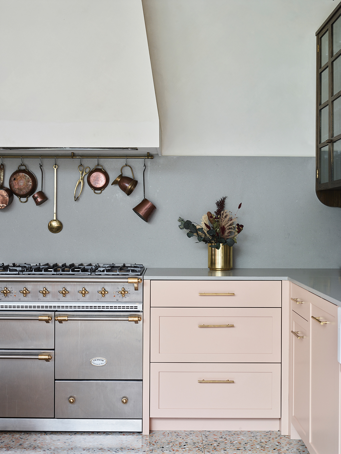
Design by Studio Duggan
There's nothing quite like making a strong statement with color, but there are ways of getting it right, and many more of getting it wrong. "Selecting the right pink is not an easy task," says Cathleen Davidson of Leicht Kitchens. "Too light a pink would have felt fragile, too bold and it would overwhelm. A medium pastel pink is sweet enough to delight our senses, but strong enough to hold its own.
What's more, adds Cathleen, "The playful pink is grounded through the use of grey stone countertops, stainless-steel appliances, and large steel hardware." There's an interesting juxtaposition of the streamlined grey kitchen counter with the sentimental nostalgia of the pink: "It evokes a connection between vintage and modernity, and brings a lot of personality into this kitchen," she says.
2. Put pistachio alongside pale wood
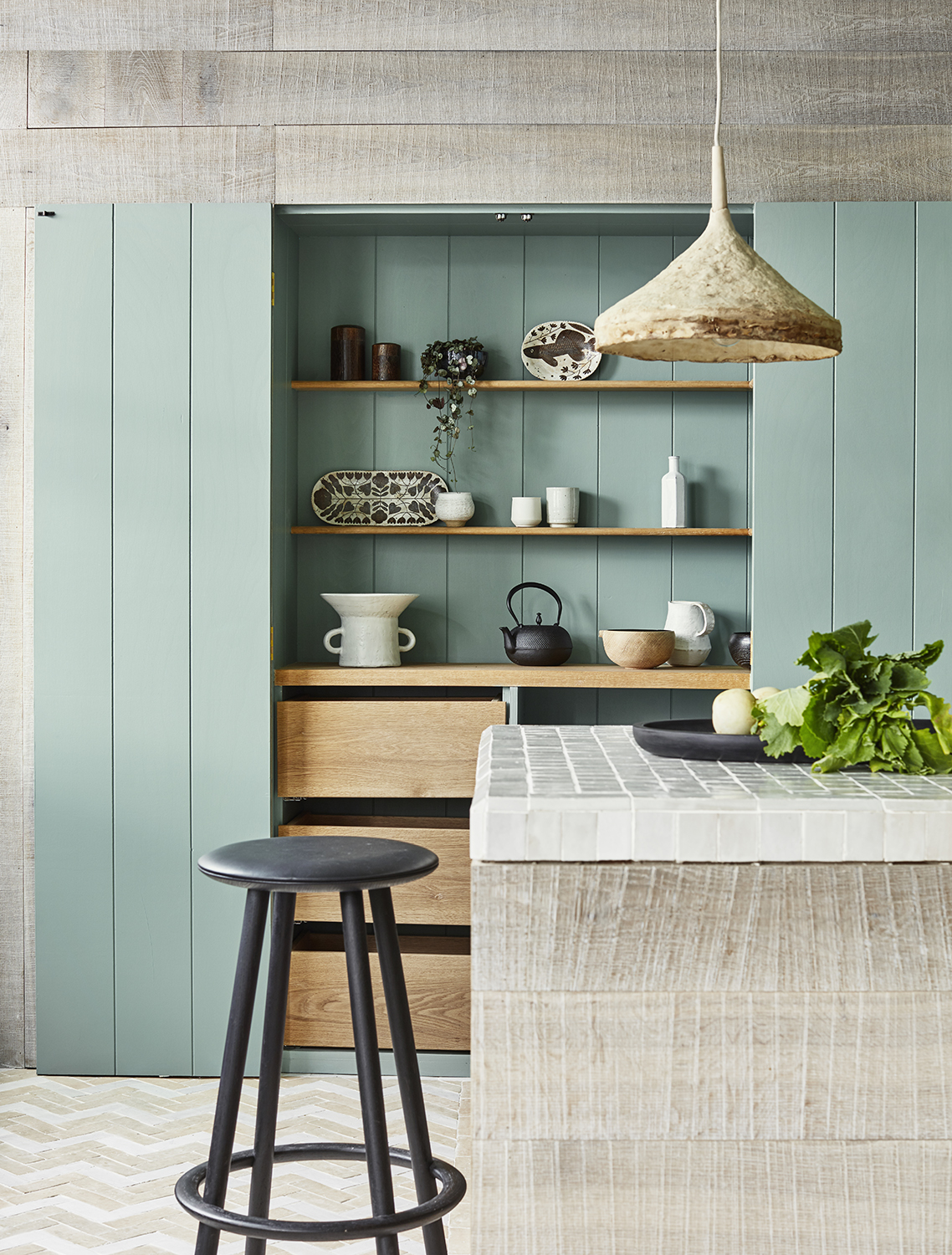
"I’m very wary of interior design trends," says Penny Drue Baird, interior designer and owner of the high-end design studio Dessins LLC, based in France and New York City. "I don’t like to have my clients in the position where they're investing a lot in a [trend-led] kitchen that they'll then have forever."
So while pistachio hues are a big color trend right now we feel confident that pairing it with wood in this way will create a timeless kitchen. It has a simplicity to it that has longevity, and pairing the pistachio with such muted tones makes it seem integral to the space.
3. Choose pastel appliances
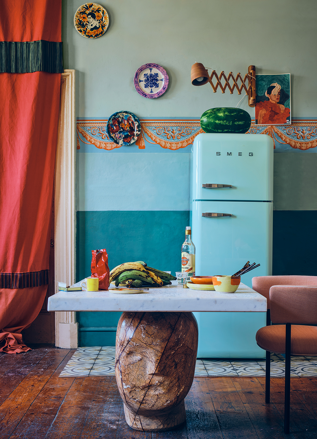
The OG pastel kitchen of course harks back to the good ol' American diner of the 1950s. The good news is that you can buy appliances featuring that retro styling and in those classic kitsch tones, but with modern technology included.
The pastel kitchen is one in which you can have fun: "Elements such as vintage tile patterns on floors or walls, chrome hardware, or mid-century modern furniture create a nostalgic and playful atmosphere for those who want to lean further into an era-inspired aesthetic," says Michael O'Neil of appliance brand Big Chill. You could also consider an updated take on the black-and-white checkered floor, but to avoid your kitchen tipping into pastiche, stick to clean white cabinetry and countertops for a modern, spacious feel.
4. Utilize the ceiling
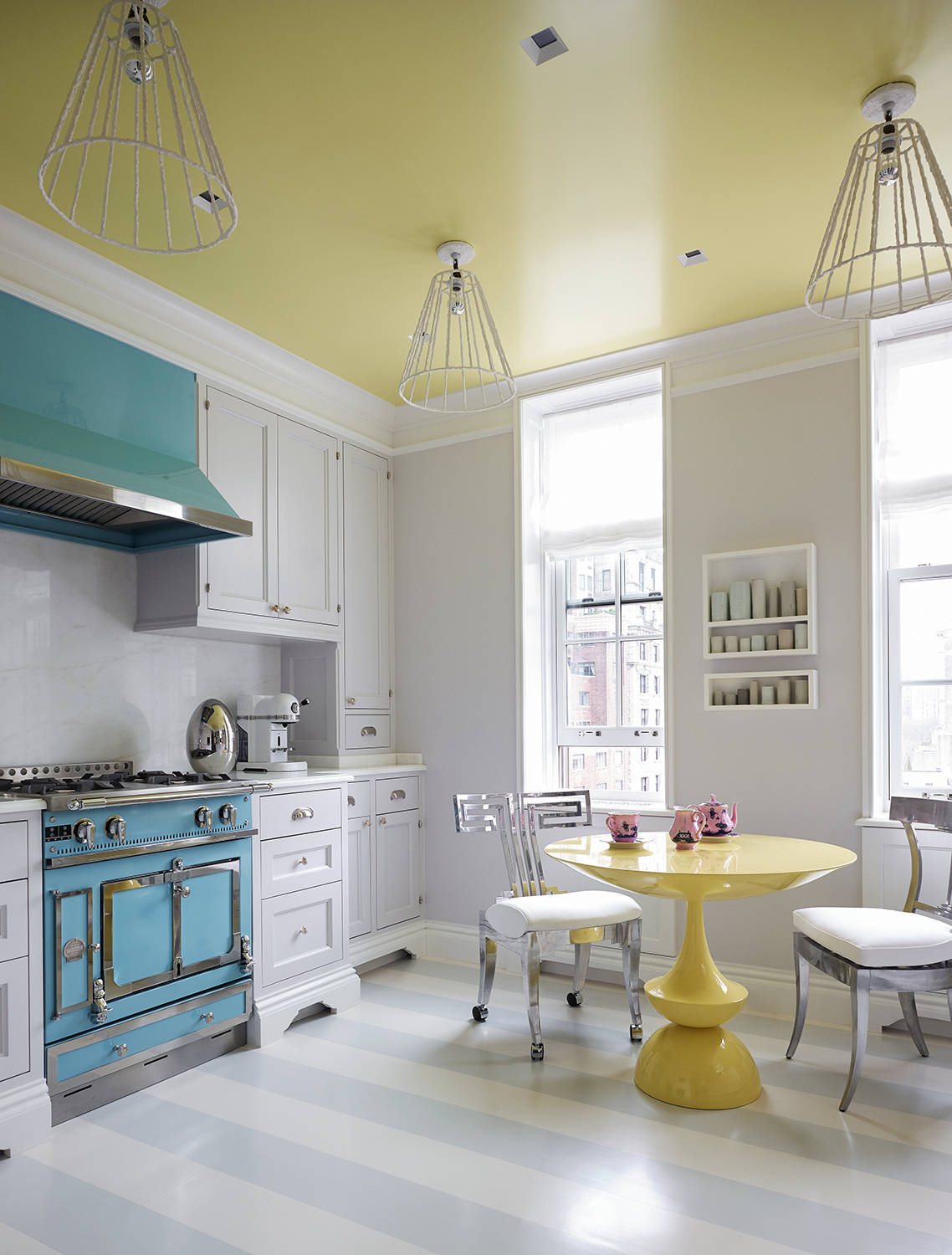
“I am a huge fan of ceilings,” says the renowned American interior designer Brian J. McCarthy. “Because it’s on the ceiling, you can introduce a block of color in a way that doesn’t work against anything else in the room.” A painted ceiling, he adds, “is like a veil above you; it reinforces the architecture and the shape of the room. It has a huge impact on the space.” For his art-loving Californian clients’ refurb of their Upper East Side pied-à-terre, painting the ceiling in a custom yellow gloss served as a kind of “upside-down foundation for the room,” says Brian. “I wanted it to be reflective of the light and the view outside.”
The pastel-blue La Cornue stove was another cornerstone of the kitchen color scheme. “The clients were all about color and art, so the idea was to insert two blocks of color into the kitchen.” The range, says Brian, gave balance to the room: “We were almost creating a puzzle.” The effect, when combined with the custom-made yellow table, is that the kitchen is like a piece of abstract art - with a joyous sense of fun.
5. GO ALL OUT WITH THE PASTELS
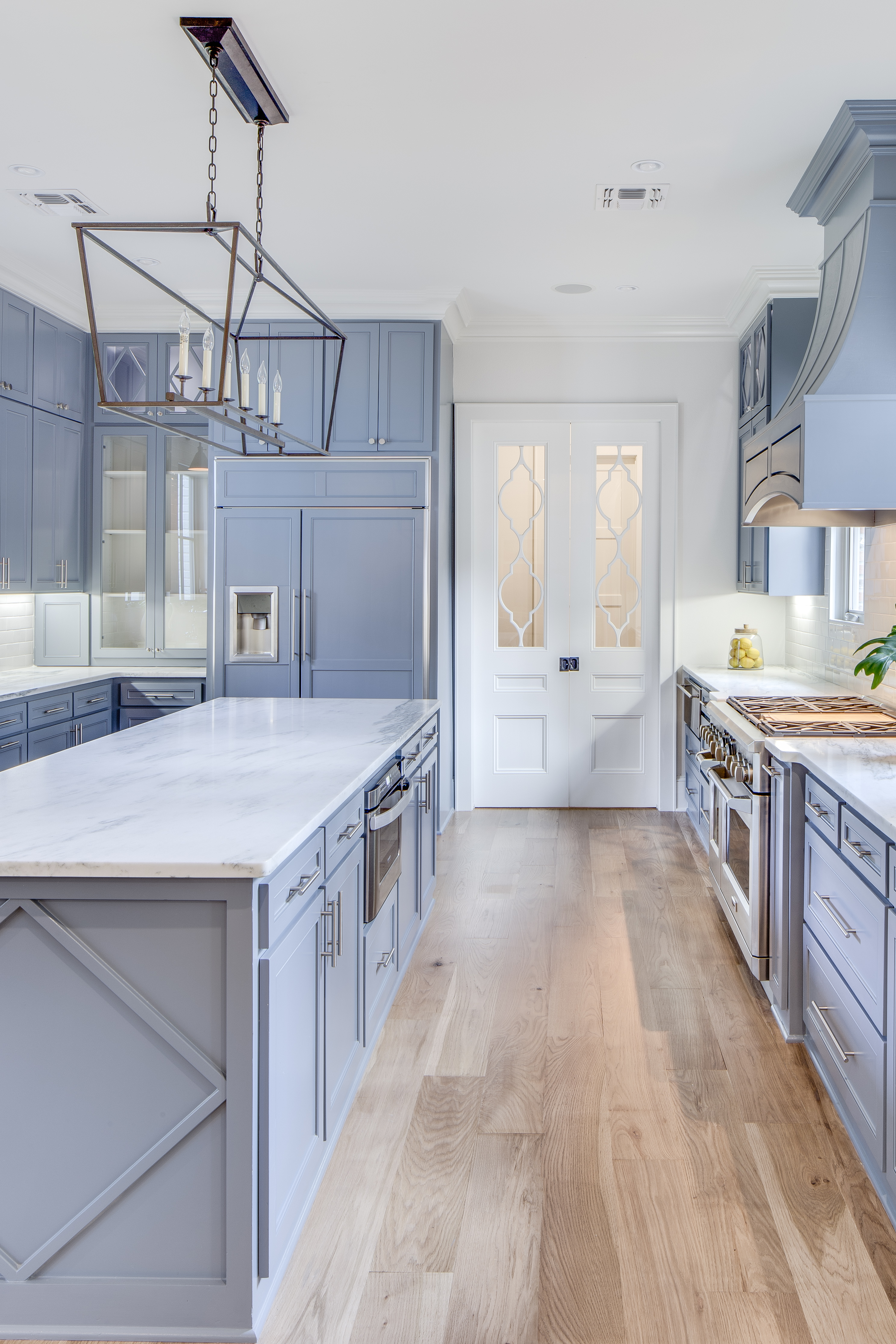
You may feel understandably nervous about introducing a pastel color scheme into your kitchen, but, as this work by boutique architecture firm Farmer Payne Architects illustrates, going all out with a pastel palette can actually have a calming effect, and lend a cohesive look.
In this Louisiana cottage, the Shaker kitchen cabinetry - made by Custom Bilt - is painted a delicate lavender. "In many circumstances I believe less is more," explains Elizabeth Lopeman of FPA. "Sticking to one color throughout helps not to outdate a space or pull your eye in too many directions." The ultimate effect is that of relaxation, and is perhaps not what you'd expect with such a lot of pastel paintwork.
6. COLOR BLOCK THOSE PASTELS
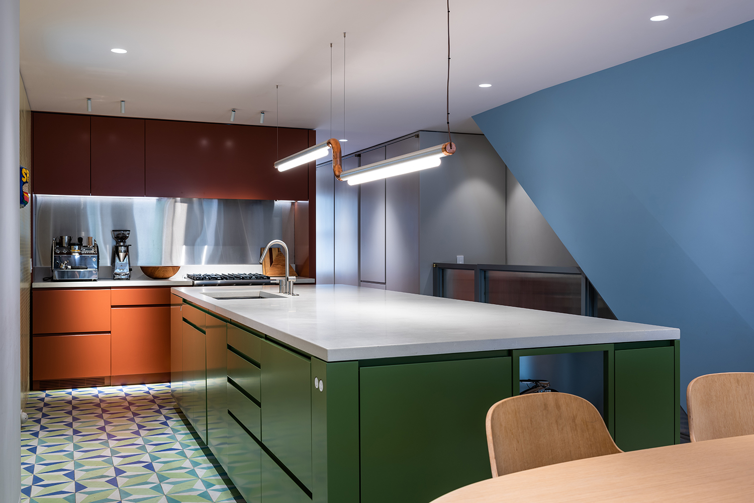
Historically, we used to be much braver with color. When the New York City-based architect Michael K. Chen, founder of MKCA, was renovating a 3,600-square-foot brownstone built in 1895, he discovered the home's original color palette: "deep raspberry, turquoise, celadon, primary green, and moody blues". That discovery - combined with the clients` quirky collection of art and design - informed the vivid color-blocked scheme you see here, which, says Michael, "served to soften the environment and create a deeply immersive and experiential quality. You don’t look at the color, you inhabit it - it surrounds you."
Putting color at the center of the project meant "epic color palette meetings", says Michael, "looking at deck after deck for paint colors that spoke to us or provoked a particular sensation.” In the kitchen, blocks of monochromatic color "introduced different senses of scale and delineated individual volumes," he explains, elevating the classic two-tone kitchen to one of many tones. The effect, he says, is that "a contemporary sensibility reigns".
7. TEMPER THE PASTELS WITH OTHER COLORS
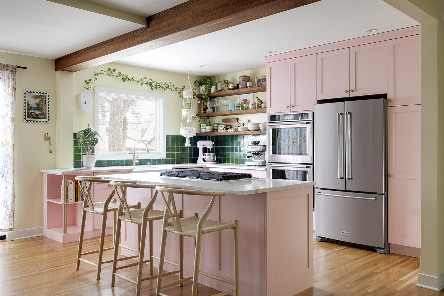
“Pink is not a difficult color to work with,” assures the home remodeler and designer Philip Hide, founder of the award-winning Minneapolis-based practice Wise Design & Remodel. “It’s just a matter of honing in on the perfect tone, and finding ways to balance it. “People come to us with bold choices of colors - like a favorite pink - so we’ll get three or so similar tones made up, and see how that works: how it reflects and refracts and works with a sheen.” Sometimes, he adds, it’s a question of bringing in harmonizing colors in supporting roles (here, emerald glazed terracotta tiles and white quartz countertops) to the lead color (here, Sherwin-Williams’ Bella Pink), in order to balance it and ensure it doesn't “overpower the room”. All of a sudden, Phil says, “the pink looks more gentle.”
The finishing touch to this pink kitchen was to add champagne-bronze cupboard handles, which cut through the sweetness of the pink: “It really pops against pastel pink, and is a bit softer than the option of black hardware.”
8. USE PASTELS TO UPDATE PERIOD STYLES
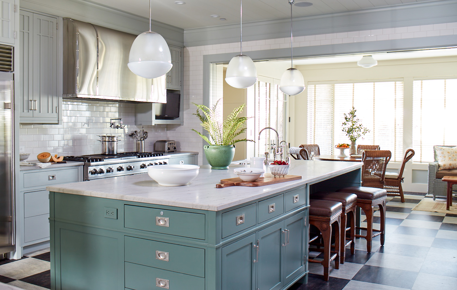
The nostalgic character of pastel tones can be handy when grappling with classical designs. When Madeline Stuart, the prestigious LA-based interior designer and furniture designer, was designing a new residence in a contemporized Arts & Crafts style, she harnessed pastels in order to inject some modernity in a historically sympathetic way.
"Kitchens of that era were entirely functional and expressed little patience for decorative details," she says. "The cabinetry was often dark wood or painted in a serviceable and antiseptic shade of white. We decided to use materials that felt consistent with the period, but in a fresh way, for example incorporating pale blue cabinetry and black linoleum floors."
The ethereal gray-blue pastels selected for the kitchen cabinets (including a slightly bolder color statement for the island) were, says Madeline, "intended to evoke softly wistful pastel shades that are neither definitively ‘ye olde’ or ‘of the moment'. We felt that channeling a soft color allowed all the various elements in the room to coalesce and appear both timeless as well as reminiscent of a particular period."
9. GO WITH THE GRANNYCORE VIBES
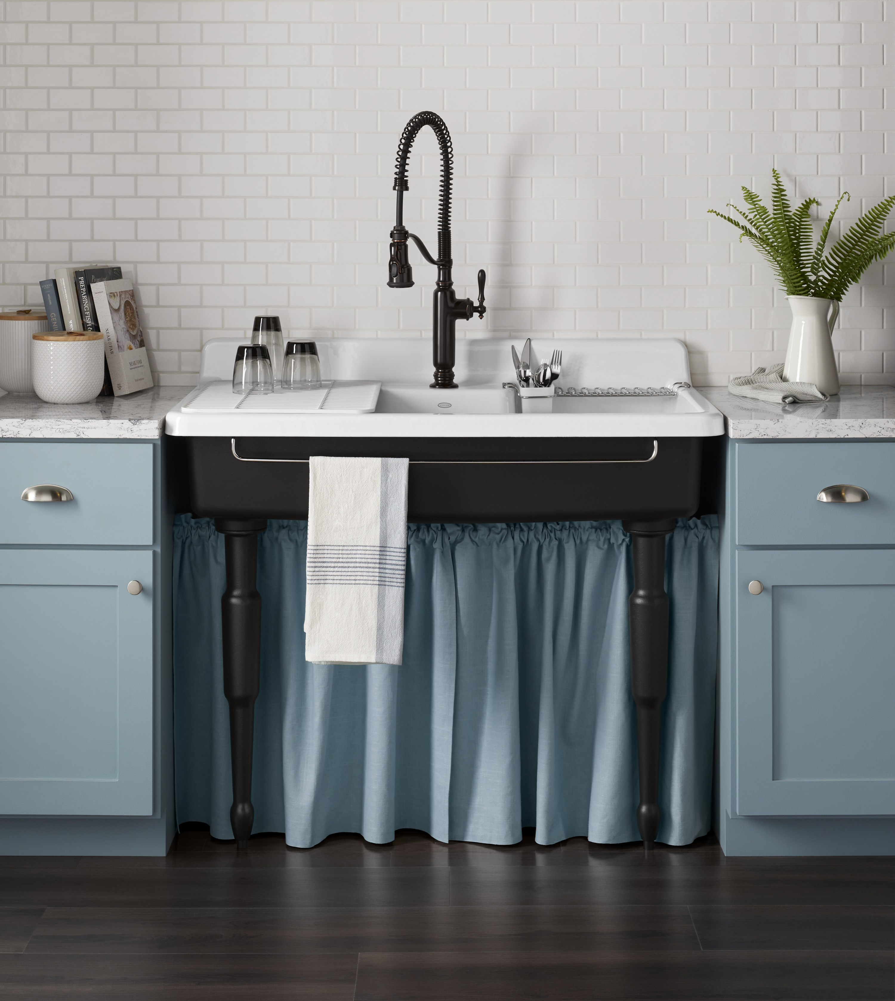
Pastels, if you hadn't already noticed, are a kitchen trend for having fun with. The granny-chic vibes of a sugar-almond pink, say, or a baby blue make it a perfect concept for mixing up with the so-called "grandmillennial" movement, ie, the act of mixing granny's old china, crocheted blankets, and - yes - sink skirts - in a more modern, design-led way, as indeed a millennial with a great eye might. So, as has been done here beneath a vintage-style Kohler Farmstead sink, consider adding pastel cabinetry along with a fun, matching sink skirt.
"The skirt is nostalgic and comforting, but so playful," says Alexandra Yacavone of Kohler. "It's a cool way to add texture to a space." Keeping these pastels monochromatic, she adds, "gives a modernizing feel". Another great thing about the skirt is that it's not permanent, she points out: "You can switch it out."
Be The First To Know
The Livingetc newsletters are your inside source for what’s shaping interiors now - and what’s next. Discover trend forecasts, smart style ideas, and curated shopping inspiration that brings design to life. Subscribe today and stay ahead of the curve.
Fleur Britten is a well-respected journalist who for years was the Senior Features Editor at Sunday Times Style. She is known as one of the smartest lifestyle journalists around, revered for being able to decode trends and report on new zeitgeists as they happen. She now writes for the Telegraph, Livingetc, Vogue, The Times, Harper's Bazaar and the Guardian.
-
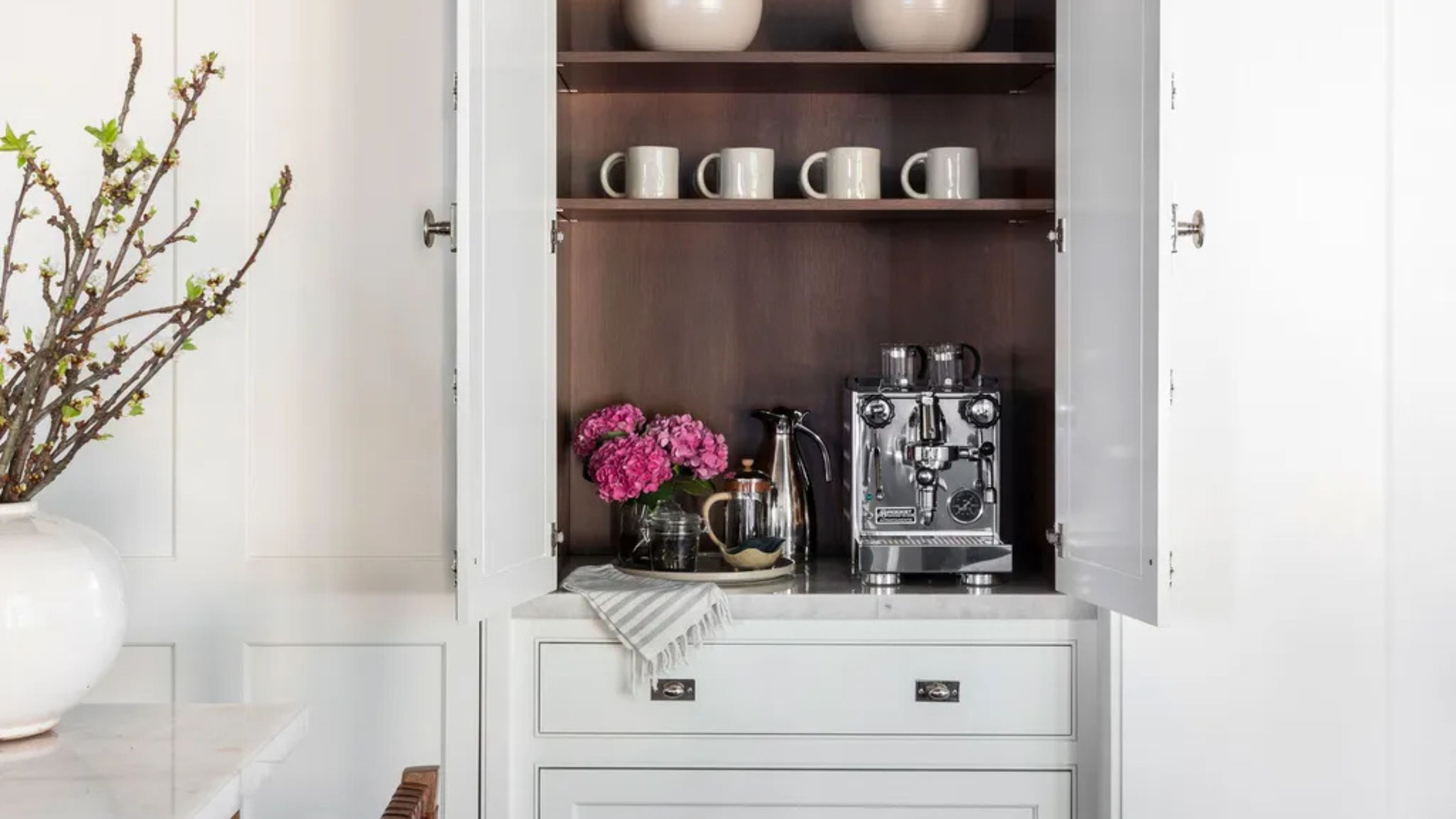 Turns Out the Coolest New Café is Actually In Your Kitchen — Here's How to Steal the Style of TikTok's Latest Trend
Goodbye, over-priced lattes. Hello, home-brewed coffee with friends. TikTok's 'Home Cafe' trend brings stylish cafe culture into the comfort of your own home
By Devin Toolen Published
-
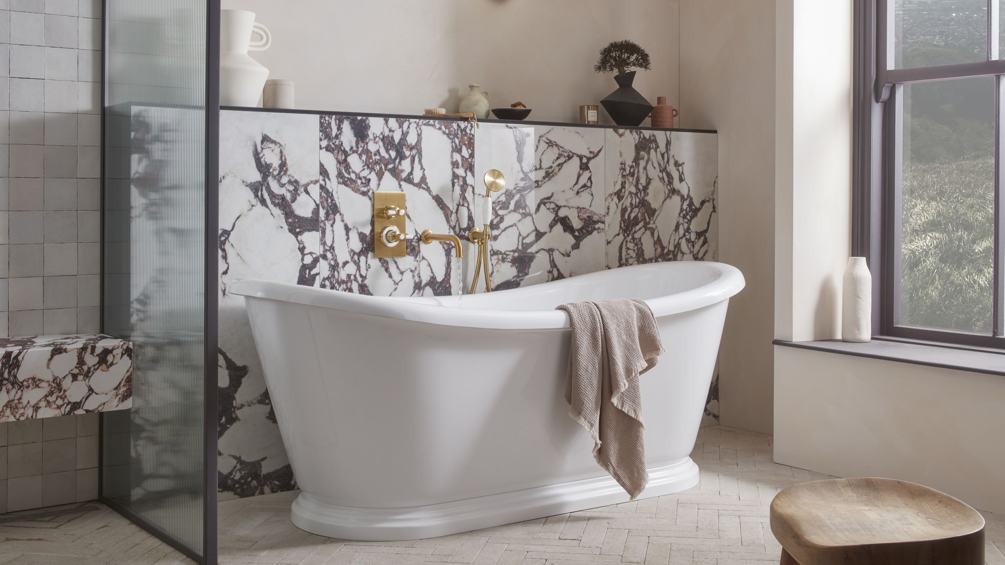 5 Bathroom Layouts That Look Dated in 2025 — Plus the Alternatives Designers Use Instead for a More Contemporary Space
For a bathroom that feels in line with the times, avoid these layouts and be more intentional with the placement and positioning of your features and fixtures
By Lilith Hudson Published