

With a tendency to feel sweet, even sugary, pastel hues are often relegated to children’s rooms in interior design. But recently, we’ve noticed designers employing these soft shades in place of white and other neutrals on trims, highlighting architectural features in a playful new way.
Many of the color trends for 2024 are all about joyful palettes and mood-lifting hues – and we think pastel accent trims tap right into this too. ‘Using soft pastel colours can be an enjoyable method to introduce intrigue or enhance the harmony within a room,’ explains Flora Hogg, interior designer and color consultant at Craig & Rose.
Intrigued? Us too – so we’ve rounded up some of our favorite examples of room schemes that use pastel trims to get you inspired.
1. Mint green and yellow

Proving that this look has lasting appeal, this apartment project by Stockholm firm Note (design studio) was actually completed back in 2017 – but it feels as fresh today as it did back then. Inspired by the color palette of the 19th-century remnants the designers found, they crafted a sophisticated pastel color scheme that’s soft enough for the shades to sit together without fighting for attention.
The result, the studio explains, is a ‘harmonious but rich color experience.’ In this living room color scheme, a buttery yellow shade envelopes the walls and ceiling, while skirting and doorways in a minty blue-green help highlight some of the many traditional architectural details.
2. Pale blue with pink

A pale pastel blue is the unexpected addition to this dining room scheme by Toronto interior designer Ashley Montgomery, but it works because the peachy pink wallpaper is a complementary shade on the color wheel. Rich woods and heavy furniture shapes help to ground the scheme, taking it from sugary sweet into something much more grown-up and stylish.
3. Baby blue with plaster

In this bespoke kitchen by British kitchen makers Jetsam Made, pastel blue is used to outline the shape of the room in the absence of architectural details like coving – and set against a raw plaster finish, it adds a gentle pop of color. We’re also big fans of the coral used on the kitchen cabinets themselves, mimicking the rhythm of the pastel blue but in a bolder hue.
Pastels would also work on the cabinetry itself if you want a slightly more pared-back look, says Manuela Hamilford, founder and creative director of London's Hamilford Design: ‘Pastel accents can be used well in kitchens to give a kitschy, whimsical feel and work well on kitchen cupboards or to highlight details. A delicate yellow or green would be ideal.’
4. Pastel pink with simple white

If you’re unsure about pairing pastel trim with another color, white is always a good bedfellow – as this white bedroom scheme by Dekay & Tate demonstrates. ‘Pastels often compliment one another and go well together, but you can easily team them with white as they often have a white chalky undertone,’ says Manuela Hamilford.
Incidentally, many of the designers and color experts we spoke to recommended the bedroom as the best space to try out a pastel accent. ‘Pastels can enhance the feel to any room, though I particularly love them in bedrooms as they offer a tranquil and gentle aesthetic,’ says Flora Hogg of Craig & Rose.
5. Baby pink with mossy green

This intense color palette from Copenhagen paint brand File Under Pop feels just the right amount of moody – and for a dining or living room, it’s perfect. It’s also a great example of when a pastel shade can be more conducive to a cohesive scheme than white ever could.
‘Choosing a soft, dusty shade of pink or yellow instead of a white ceiling creates a more cohesive experience of a space,’ explains the brand's PR manager Michael Schmidt. ‘White can create a very harsh contrast, when paired with colors: opting for a pastel tone or off-white shade will add a more welcoming feel to your home.’
6. Neutral pink with beige tones

On the more muted end of the pastel spectrum, a minimalist pink-toned beige is used in this open-plan living space by Truss Interiors to highlight windows and skirting; it takes more of a supporting role than an accent, however, thanks to the use of textural wallpaper and cabinetry in a very pale aqua hue. To help the trim blend into the scheme further, the shade is picked up in a lighter finish in the walls and ceiling of the kitchen.

Finish: Interior Standard
Price: $75 for 1 gallon

Finish: ADVANCE® Interior Paint
Price: $79.99 for 1 gallon

Finish: Estate Eggshell
Price: $142 for 1 gallon

-
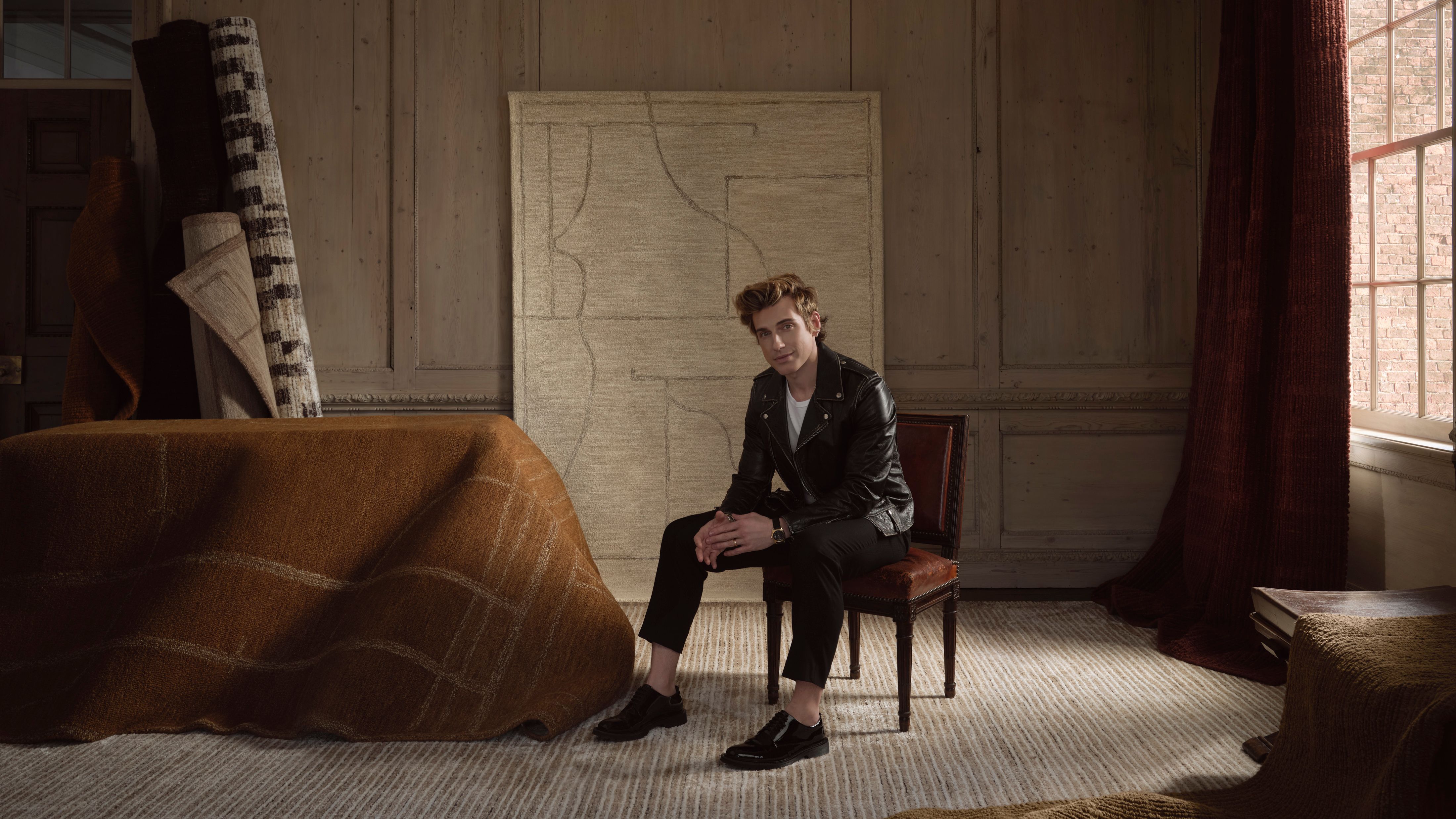 Jeremiah Brent Captures the Grit and Glamour of NYC in His New Loloi Collaboration
The TV-famous interior designer looked out of his own window — and hit the pavement — for a collection that turns city spirit into tactile design
-
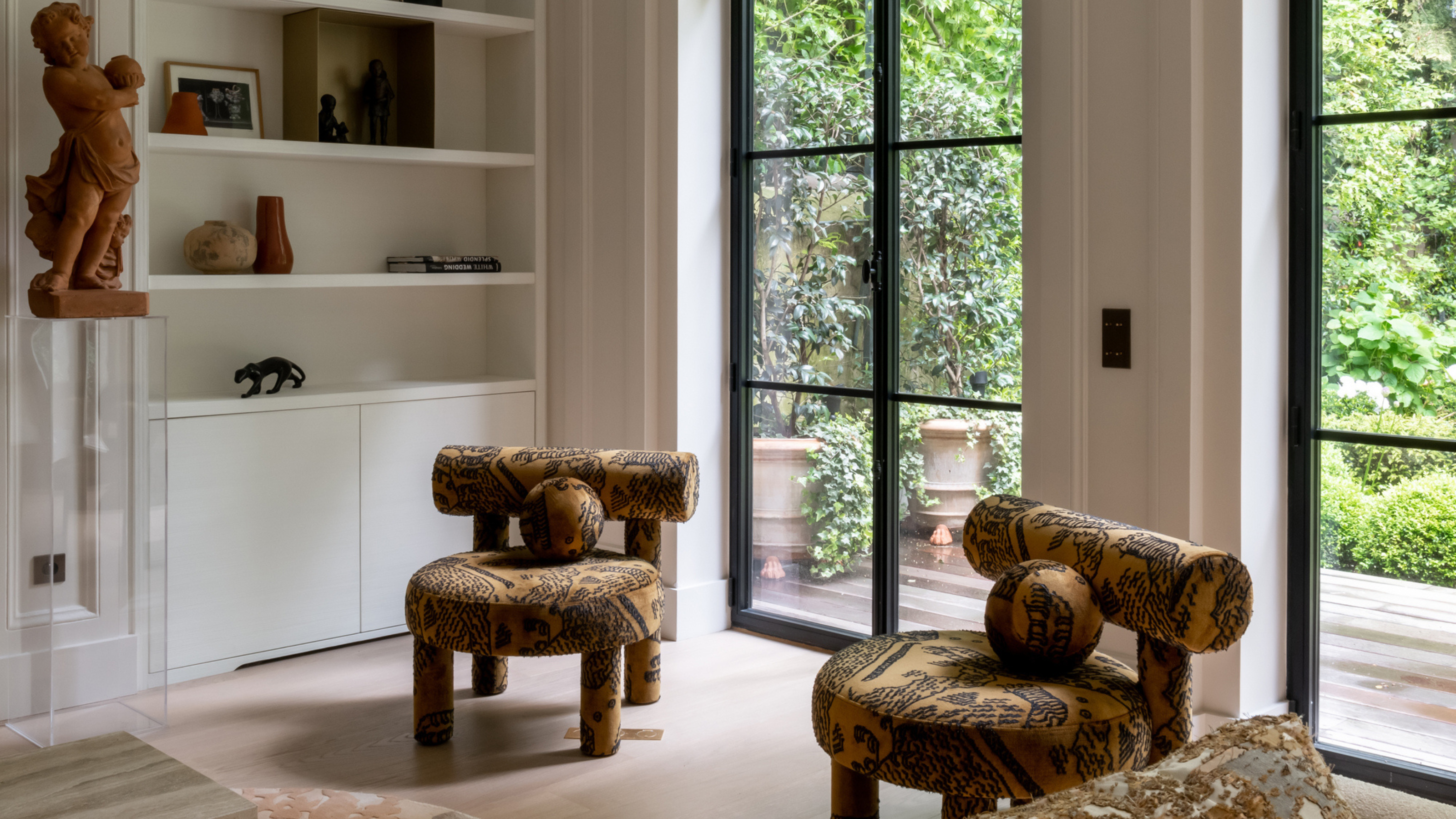 This Specific Fabric Print Is Literally Everywhere Right Now — Here's Why
It's whimsical, artistic, and full of character. We've called it already: Dedar's 'Tiger Mountain' is the fabric that will define 2025


-
I Spy With My Design Eye: This Specific Fabric Print Is Literally Everywhere Right Now — We've IDed It for You
It's whimsical, artistic, and full of character. We've called it already: Dedar's 'Tiger Mountain' is the fabric that will define 2025
-
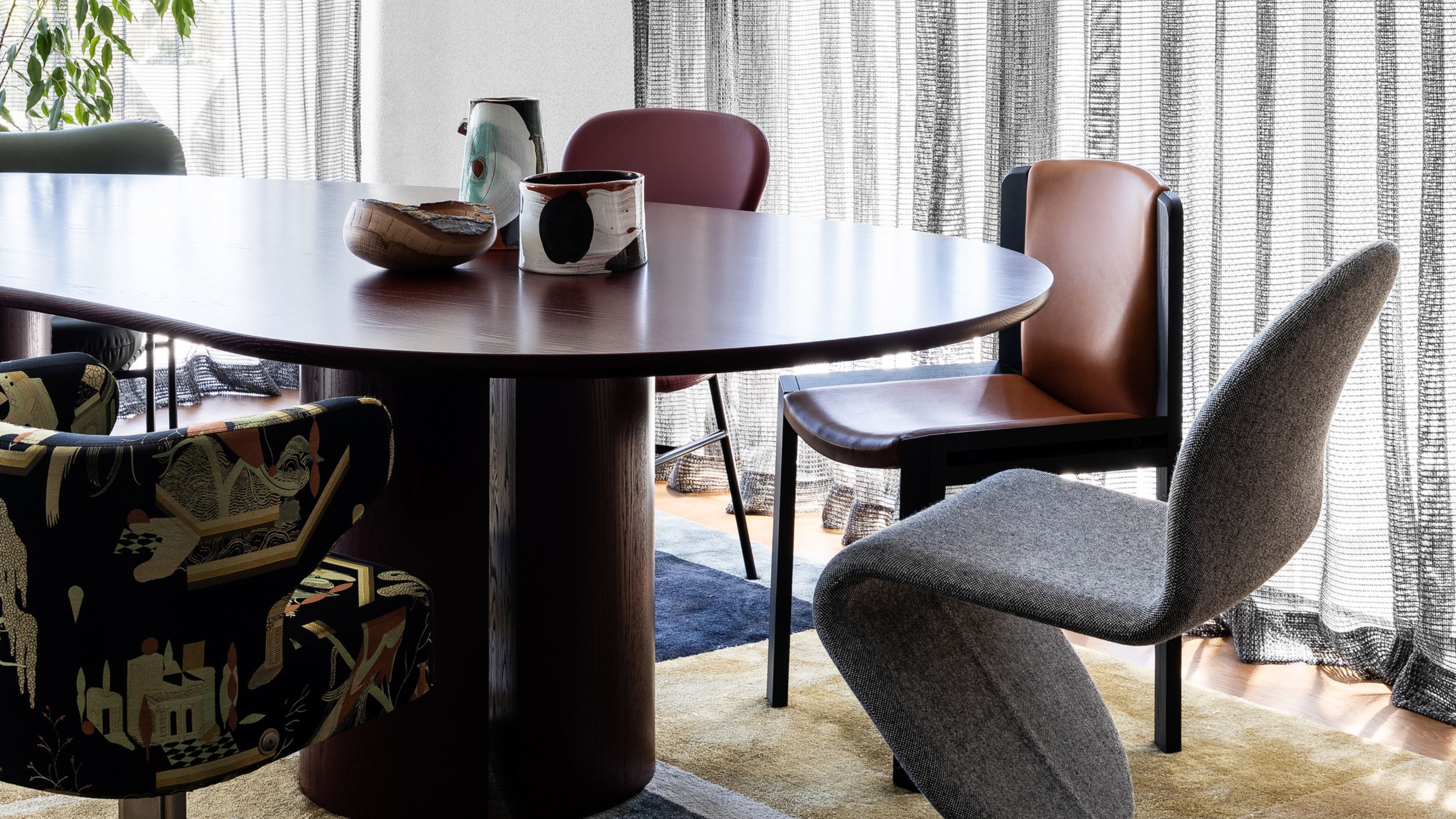 Having Mismatched Dining Chairs Is the New Telltale Sign of Serious Style — Here's How to Make It Look Intentional
Once considered a sign of a lack of care, a dining room table with different chairs now screams ultimate curation... if you can do it right, that is
-
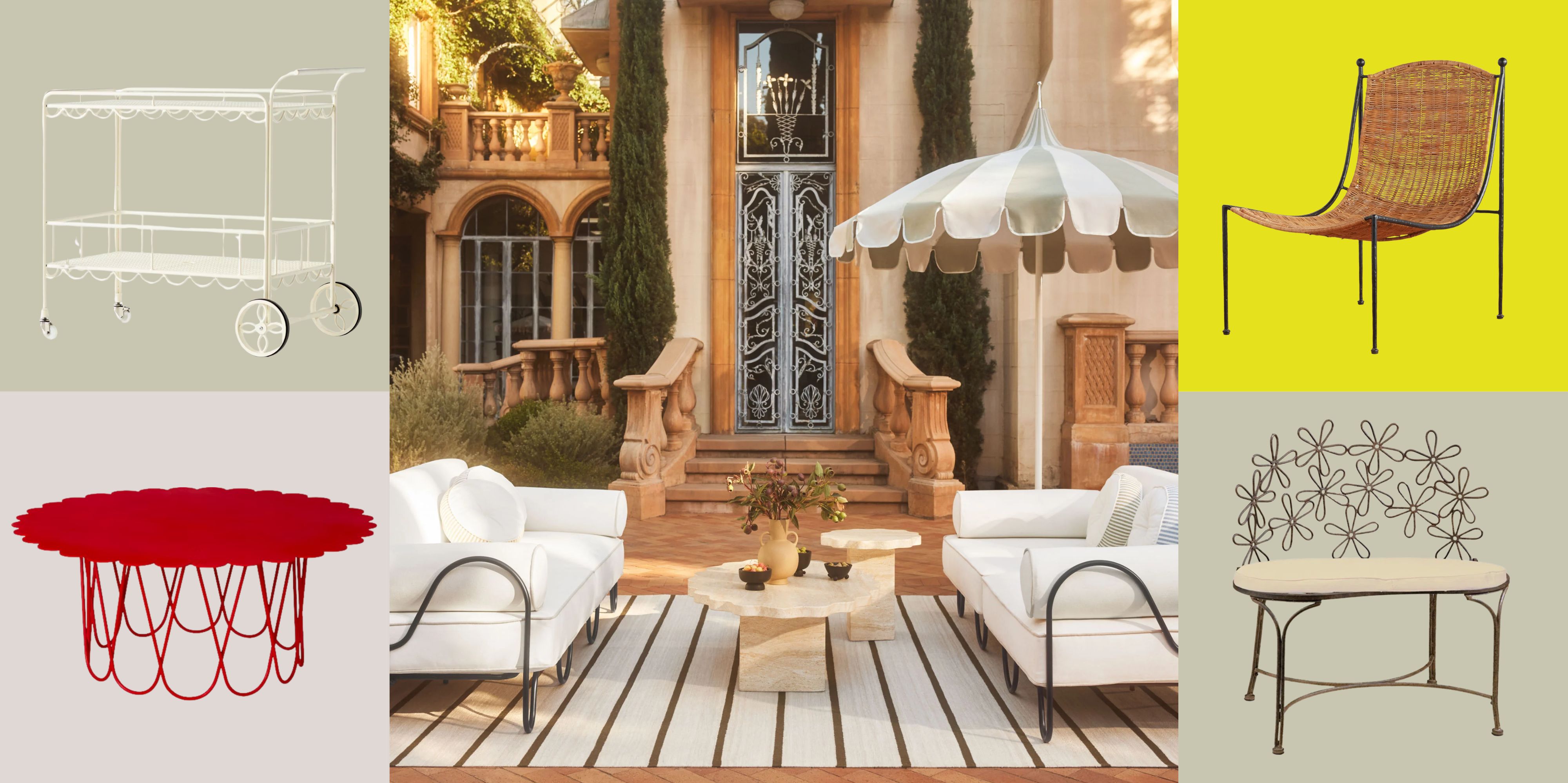 There’s a New Shape in the Garden — Why Whimsical Curves Might Be the Outdoor Furniture Silhouette of the Summer
Powder-coated petals, wavy lines, and a hint of surrealism — this microtrend is blooming, and we’re paying attention
-
 I Asked Interior Designers to Share the Worst Decorating Trends They've Seen on Social Media
Just because something is trending, doesn't mean it's tasteful — from dupe-culture to OTT lighting, here's what designers hate seeing in homes
-
 I'm Calling It — Chrome Decor Is the Most Influential Design Trend of 2025 for Rooms That Feel Effortlessly Cool
Have you been eyeing a chrome candle holder or side table to complete your room's look? This is your sign to embrace the shiny, chic material
-
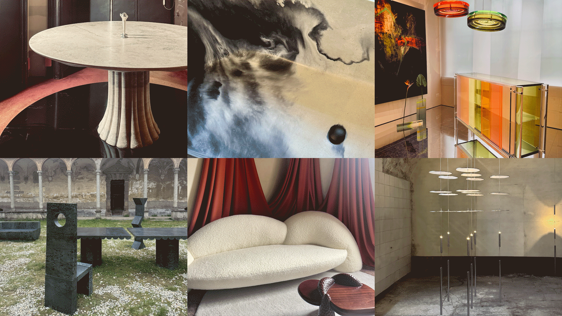 Straight from Salone: 5 Emerging Trends I Found in Milan That'll Shape Interiors for the Year Ahead
From reflective silver to fluidity, here's my perspective on the key themes and new moods coming through from Milan Design Week
-
 The 'Red Table Trick' Is the Easiest and Most Expensive-Looking Trend to Hit 2025 So Far
A red dining table makes a seriously stylish statement; the beloved pop of red trend just got an bold and expensive-looking upgrade
-
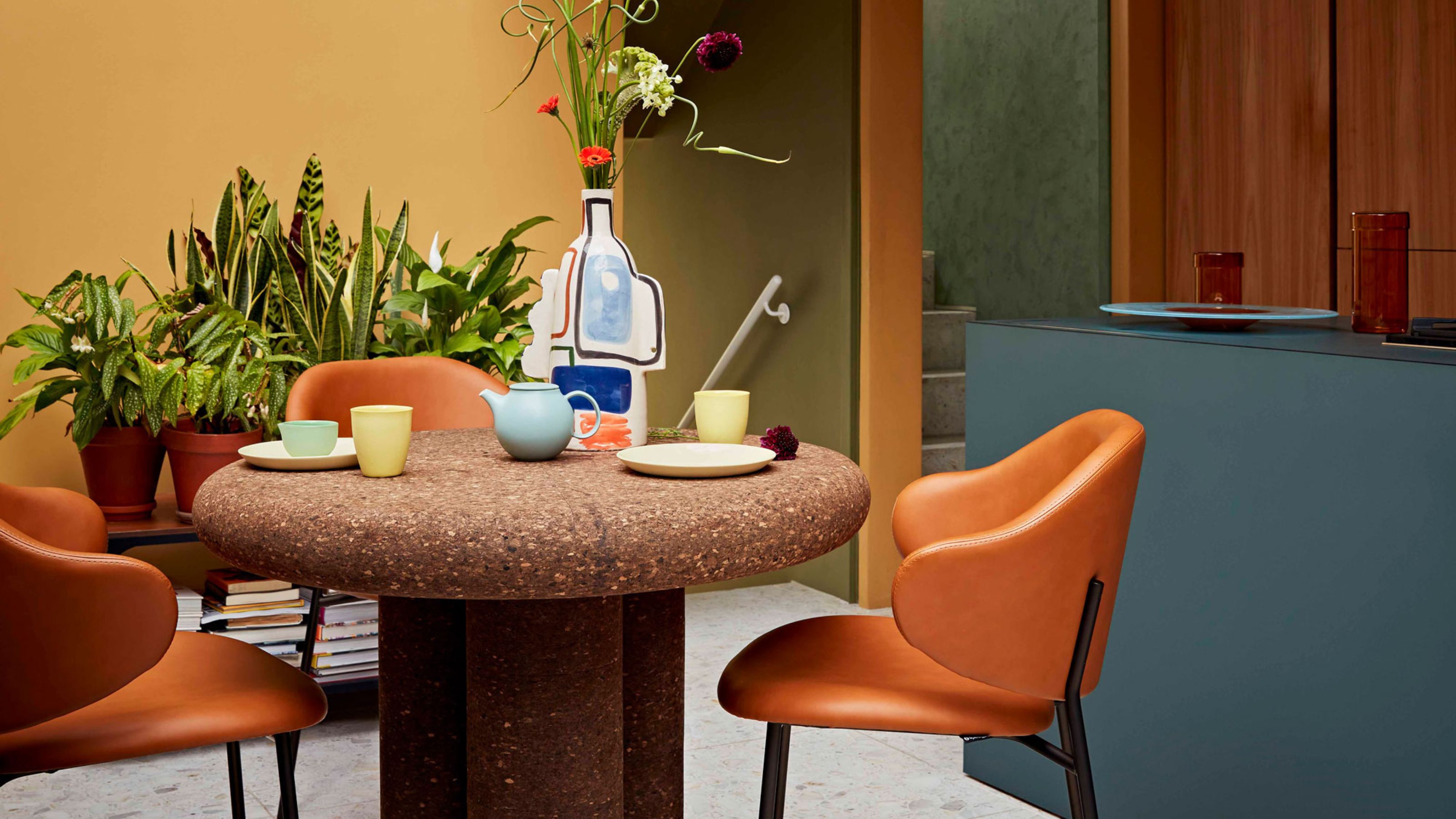 Cork Is the Cool, Sustainable, and Surprisingly Chic Material We Can't Stop Furnishing With Right Now
In honor of Earth Month, we’re toasting to cork... furniture, that is


