

If you're up-to-date in the interior design world, you may have noticed that the pendulum has swung back in favor of patterns lately. Sofas, wallpapers, rugs — nothing is off the table. But the thing about playing with patterns is that it's actually much harder than it looks. For a foolproof strategy, meet a new trick we're calling 'pattern sprinkling.'
It's not drenching a space in pattern; it's not purposely clashing prints — it's cleverly 'sprinkling' the same motif across a space, creating a more cohesive yet playful palette. "I absolutely love this approach," says Marta Balazs, a London-based interior designer and founder of Embee Interiors. "It’s a sophisticated and intentional way to introduce visual interest without overwhelming a space, particularly for people who aren't necessarily into maximalism. Subtle patterns bring a sense of rhythm and movement, making a room feel dynamic yet cohesive."
And while patterns can imbue a space with personality, the interior design trend can also easily start to feel chaotic, rather than curated. So how does 'pattern sprinkling' work? We break down our new concept below.

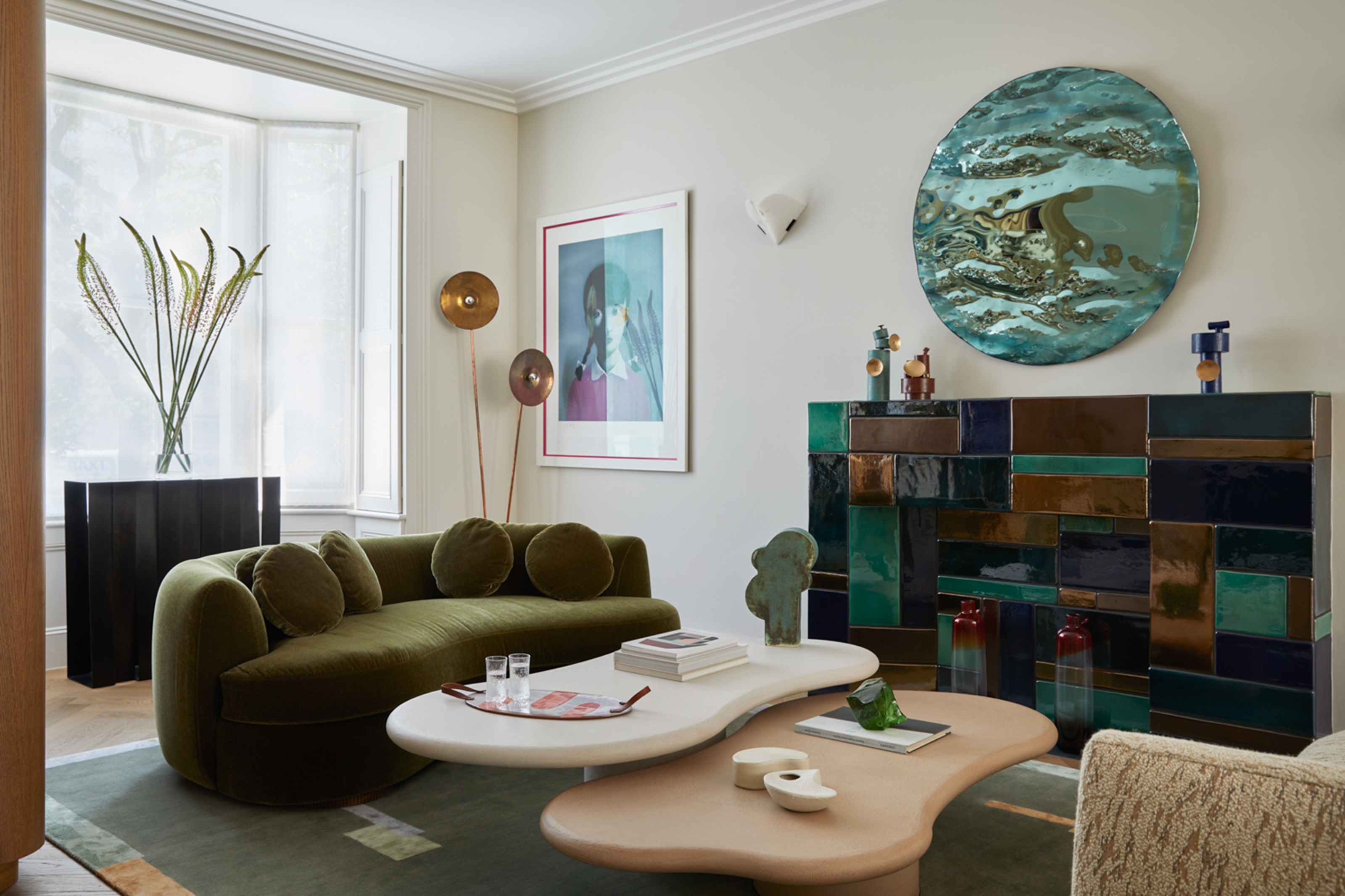
The geometric print on the floor rug is repeated in the artwork hanging above the fireplace, giving the space a sense of cohesion.
As explained, pattern sprinkling is exactly what the name implies: sprinkling a repeated pattern or motif throughout a room. Unlike pattern drenching, this approach is much softer and more subtle. The key is ensuring you maintain a sense of balance. Don't feel like you need to repeat the exact same pattern — but incorporate a common shape, color, or pattern in at least two-three different ways throughout the room.
"Repetition in interior design creates a sense of harmony and balance," says Marta Balazs. "When patterns are subtly echoed throughout a room — like in a rug, cushions, and artwork — it ties everything together effortlessly. This approach ensures that the space feels intentional and luxe rather than busy or mismatched."
In the living room above, a geometric print is repeated in both the patterned rug, as well as in the artwork hanging above the fireplace. The effect is subtle, but brings a sense of cohesion to the space.

Marta is a London-based interior designer who has used patterns extensively in her client's homes. Marta has worked for various renown design studios and retailers before founding her own interior design business in 2017. Marta's design cater heavily to craft spaces that are unique to the individual.
When picking your pattern, you want to remember how it may affect the room. For example, "Pattern can be a great choice to make open concept rooms feel cozy, making the design and layout feel more intentional and well connected," says James Mellan-Matulewicz, an interior designer and CEO at UK-based luxury design and wallpaper studio, Bobbi Beck.
James adds, "To prevent a room from feeling flat or one-dimensional try adding vertical stripes to your walls to make ceilings feel taller or using repeated horizontal patterns helps to widen a room."

The repetition of stripes throughout the spaces is a perfect example of pattern sprinkling done in a more maximalist way.

James is the CEO and interior designer at Cornwall-based design and print studio, Bobbi Beck. His company expertly crafts patterned wallpapers to incorporate in interiors. James' experience and business make him an expert at pattern design and how prints work within interior spaces.
Whether you want to use pattern sprinkling to embrace your wildest maximalist design ideas, or to bring a little life to your otherwise neutral space, this decorating technique will help create a design-forward space.
For a refined take on pattern sprinkling, Marta suggests following these four rules:
1. Varying Scales — Mix different sizes of the same pattern (e.g., a bold striped rug with fine pinstripe cushions) to create depth without overwhelming the space.
2. Playing with Texture — Introduce patterns through different materials, like a subtly embossed wallpaper (the bas relief trend would be a stunning take on textured pattern) or a woven textile, for added sophistication.
3. Keep the Color Palette Cohesive — Monochromatic color schemes or tonal variations ensure the look feels elevated rather than chaotic. It is a common misconception that pattern has to mean bold, bright colors. Go for a print in a neutral tone for an elegant play on the trend.
4. Anchoring with Solids — To maintain balance, pair patterned elements with solid-colored furniture and finishes to let them stand out without competing.
Shop the Look

Price: £58 - £68
Color: Dark Blue

Price: £325
Size: 140 x 200 cm

Price: £41.60, Was: £52
Size: 24" x 61"

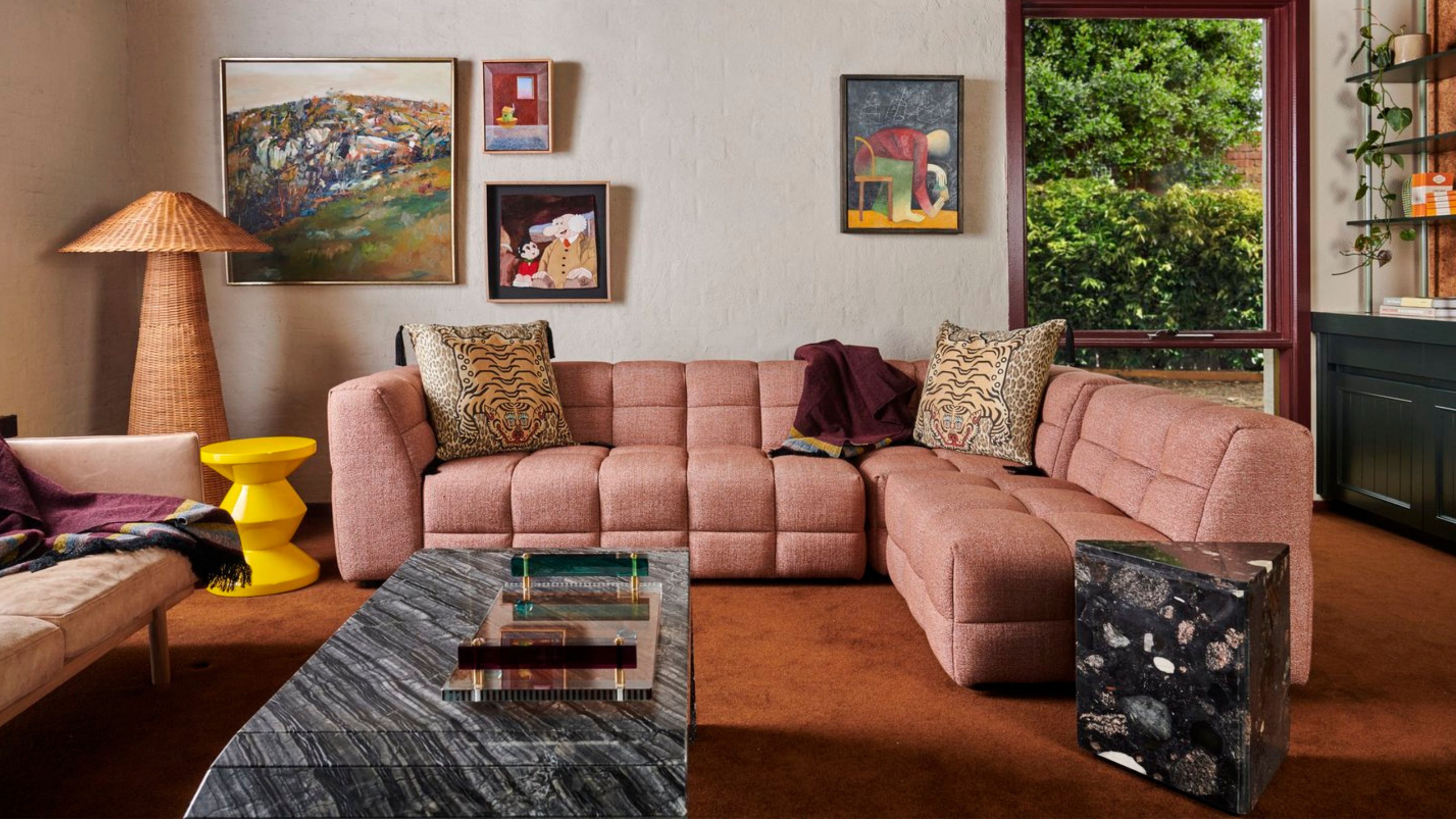
Slightly different takes on the same print helps 'pattern sprinkling' feel more organic.
Now that you have all the knowledge you need, it is time to start sprinkling your home with a playful print or two. Stripes, florals, checkers, or plaid; I am betting that pattern sprinkling will be the trend to try this year.

-
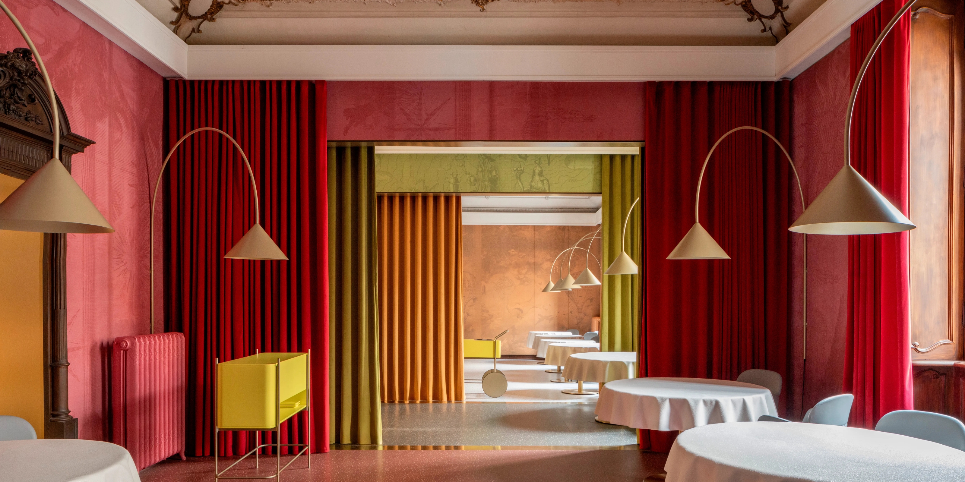 10 Arrestingly Beautiful Milan Restaurants Locals *Actually* Dine at — Selected for Their Interiors
Brought to you by our community of culture insiders, this edit of the best restaurants in Milan sees authentic Italian food and immersive design unite
-
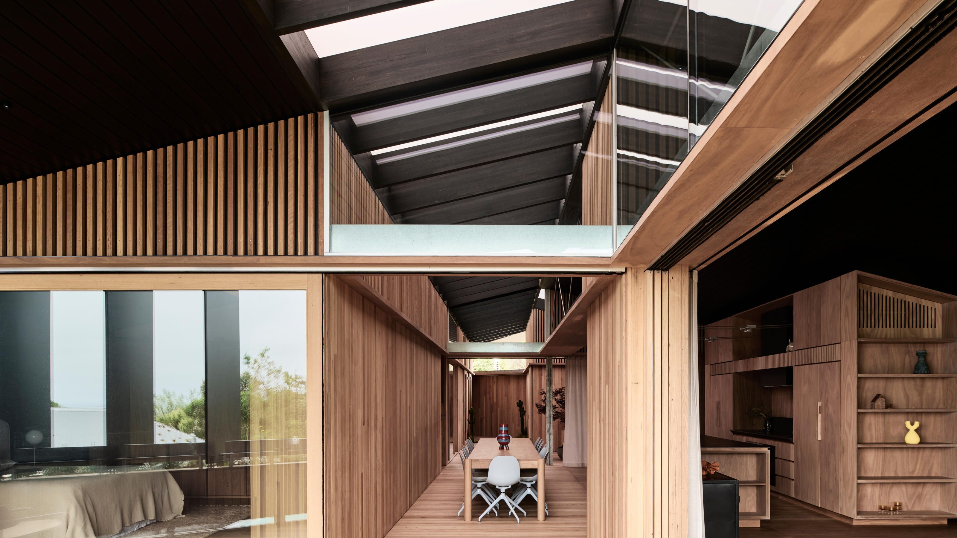 What Is Compression and Release? The Secret to Frank Lloyd Wright's Architectural Technique That Can Make Homes Feel More Expansive
Popularized by Frank Lloyd Wright, this design philosophy may change how you look at your home forever


-
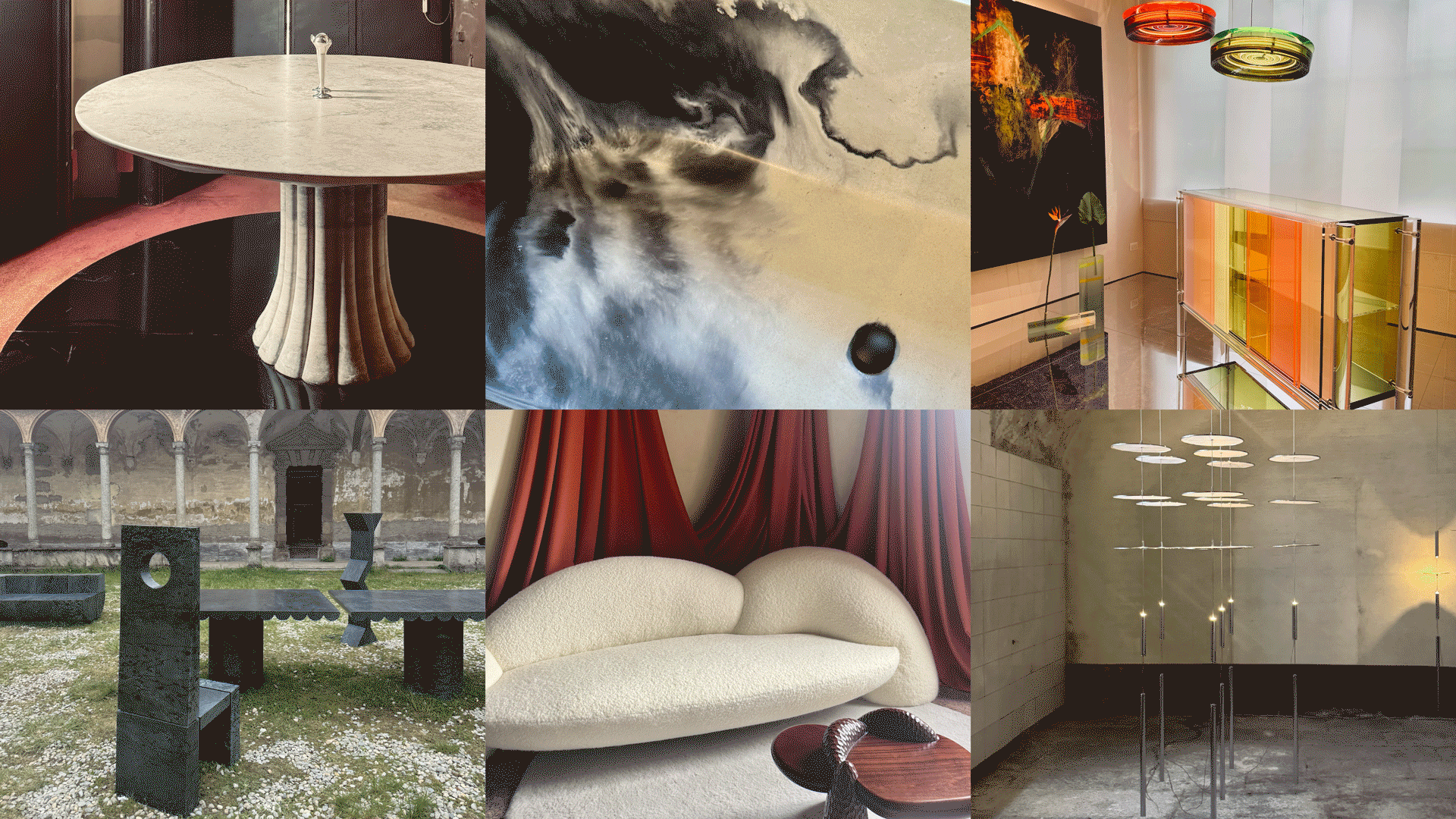 Straight from Salone: 5 Emerging Trends I Found in Milan That'll Shape Interiors for the Year Ahead
From reflective silver to fluidity, here's my perspective on the key themes and new moods coming through from Milan Design Week
-
 The 'Red Table Trick' Is the Easiest and Most Expensive-Looking Trend to Hit 2025 So Far
A red dining table makes a seriously stylish statement; the beloved pop of red trend just got an bold and expensive-looking upgrade
-
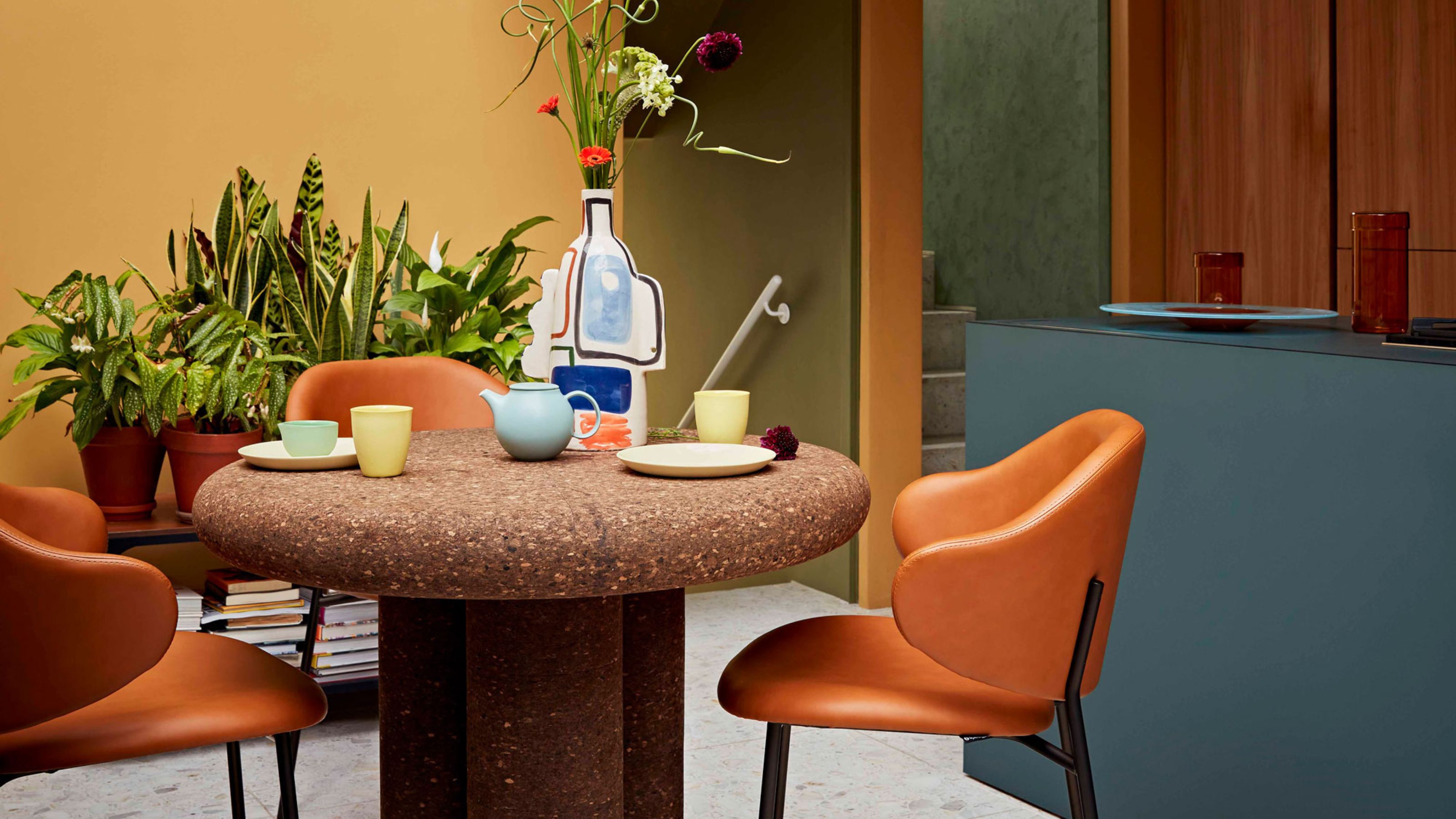 Cork Is the Cool, Sustainable, and Surprisingly Chic Material We Can't Stop Furnishing With Right Now
In honor of Earth Month, we’re toasting to cork... furniture, that is
-
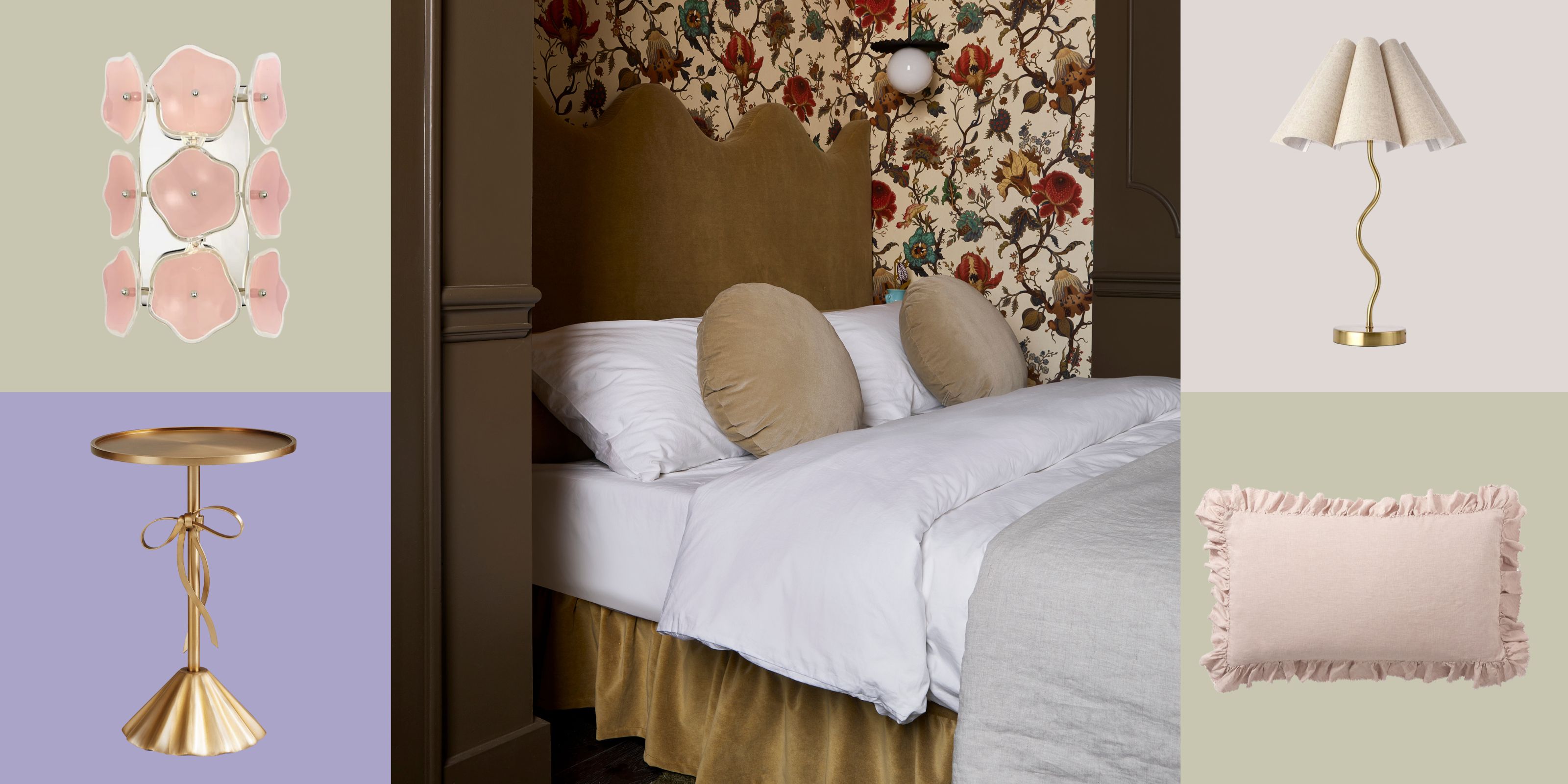 The Coquette Aesthetic Is Still Going Strong in Homes in 2025 — But Now It's Charming, Whimsical, and Has Modern Flair
A designer weighs in on how you can make the classic coquette trend feel modern while still retaining its whimsical elegance
-
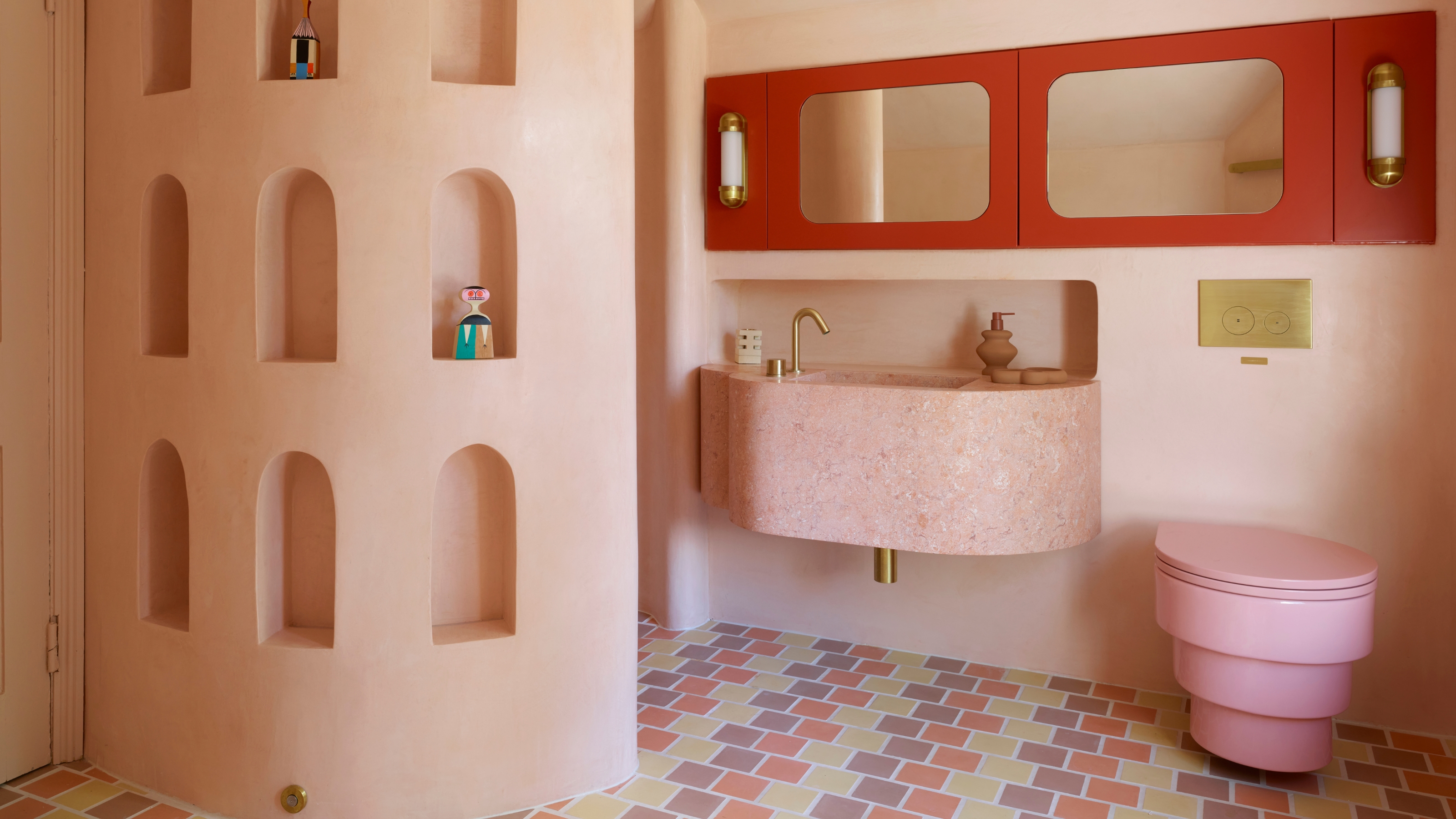 Spotted in the Coolest Bathrooms of the Moment — This Colorful-but-Divisive Trend Is the Idea You'll Either Love or Hate
See you later, sterile white. This playful plumbing trend is bringing color back to our bathrooms in an utterly unexpected way
-
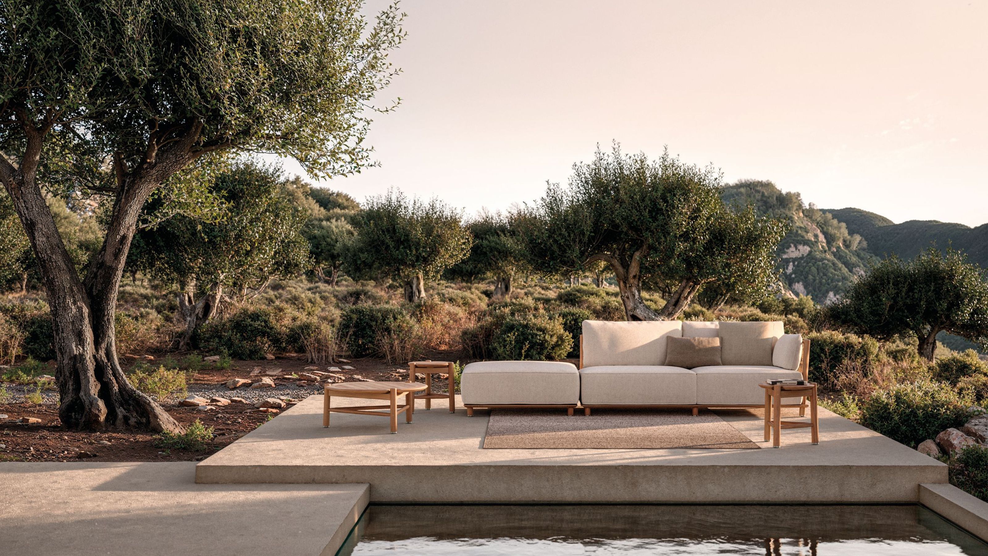 The Biggest Outdoor Furniture Trends for 2025 Embrace the Natural World, White Lotus, and a Touch of Whimsy
Sofas as plush as your living room’s, tables fit for a five-star resort, and materials straight from nature — here’s how outdoor living is evolving this year
-
 The "One Amazing Thing" Theory Could Just Be the Secret to Making Your Decorating Budget Go Further (While Making More Impact)
What if we told you designers had found a way to control a project's spend even while elevating the final result? This new trend does just that
-
 Carpets Used to Give Me the Ick, but This Bold New Style Makes Me Think They're the Next 70s Design Detail Due for a Revival
I've always had visions of ripping up wall-to-wall carpets, but now I'm thinking about actually installing them — what gives?


