

Somewhere along the way, dark jewel-toned greens became synonymous with refined luxury, elegance, and timeless taste. Yes, there are hunter-greens and rich emeralds, but there's also another specific shade that keeps popping up in both the world of fashion and interiors as of late, and I'm convinced this moody hue may just be the secret to a more expensive-looking home.
Phthalo, prounced 'THAL-oh, is a deep rich green that's making waves as the go-to color for luxury brand goods. Could this really be the most expensive looking color? "Phthalo Green has the deepness we associate with jewel tones, and jewels," explains Livingetc's color expert, Amy Moorea Wong. "We can all envisage European royalty bedecked in rich green capes and gowns, so it’s no wonder it has a dressed-up-for-the-occasion feel."
So, if you want to discover more about this history of Phthalo Green, and how to decorate with this elevated color trend, I've answered all for you, below.

As a jewel-tone, Phthalo Green often shines through natural stones, like in this kitchen by Arent&Pyke.

Amy is a color authority, interior design writer, and Livingetc’s Color Expert. She has contributed to several renowned interior design publications and her latest interior design book Kaleidoscope: Modern Homes in Every Colour explores the use of bold, creative colors in interiors and how to make a home come to life.
Short for "phthalocyanine", Phthalo refers to specific pigments of blue and green and was used as early as the 1960s. But, what makes this color special?
There are plenty of colors that make a house look expensive, and Phthalo Green is certainly near the top of that list. Ryan Mahoney, creative director of Brooklyn-based design studio, Workstead Buildings and Interiors, says, "Phthalo Green is an excellent choice for chic interiors due to its rich, vibrant tone and neutral ambiguity, sitting somewhere between green, blue, and black."
This unique balance of undertones creates a versatile color that acts as a complementary neutral backdrop in spaces, drawing inspiration from lush outdoor environments. "Unlike similar dark grays, which can sometimes feel detached or inorganic, Phthalo Green is a vibrant neutral color that brings the outdoors inside," he adds.
And indeed, it's the sort of color you'd expect to find yourself surrounded by in the depths of a jungle. "Its greenness is pure intensity, a dark lushness that’s almost a subtler, quietly powerful take on emerald green," explains Amy Moorea Wong. "The dash of blue in it is what makes it so deliciously alluring, pulling you into it like the waves of a suddenly darkening ocean. It feels hypnotic and mysterious, but also grounding and strangely familiar."
That intriguing versatility allows Phthalo Green to easily exist in statement-making designs and more immersive, serene environments. All with a refined edge, of course.

In the home office idea above, phthalo green is used all over. Though it seems like a dark color choice for walls, "In many ways, the Phthalo Green recedes, allowing the carefully selected furnishings and the gorgeous porch view to shine," explains Ryan Mahoney.

Ryan has a B.F.A. from The School of the Art Institute of Chicago and a Master's of architecture from RISD. Ryan heads Workstead’s interiors and building commissions from the firm’s Brooklyn office. Before this, Ryan designed and built sets for Chicago’s Redmoon Theatre, which gave him a keen eye for designing handcrafted pieces. He also has experience designing coastal residences for a New England design studio.
Phthalo Green Paint Colors

Price: £5.95/sample

Price: £5.50/sample

Price: £1.50/peel-and-stick sample
Though Phthalo Green definitely channels the recent 'Castlecore' design trend, and would suit a sophisticated formal sitting room, decorating with greens in this shade aren't as intimidating as you might at first assume.
Whether used in cozy living room ideas with a mix of warm woods or in a dining area where sleek whites and brass accents serve as a contrast, "Phthalo Green can bring a sophisticated, grounded feeling to any space," says Ryan.

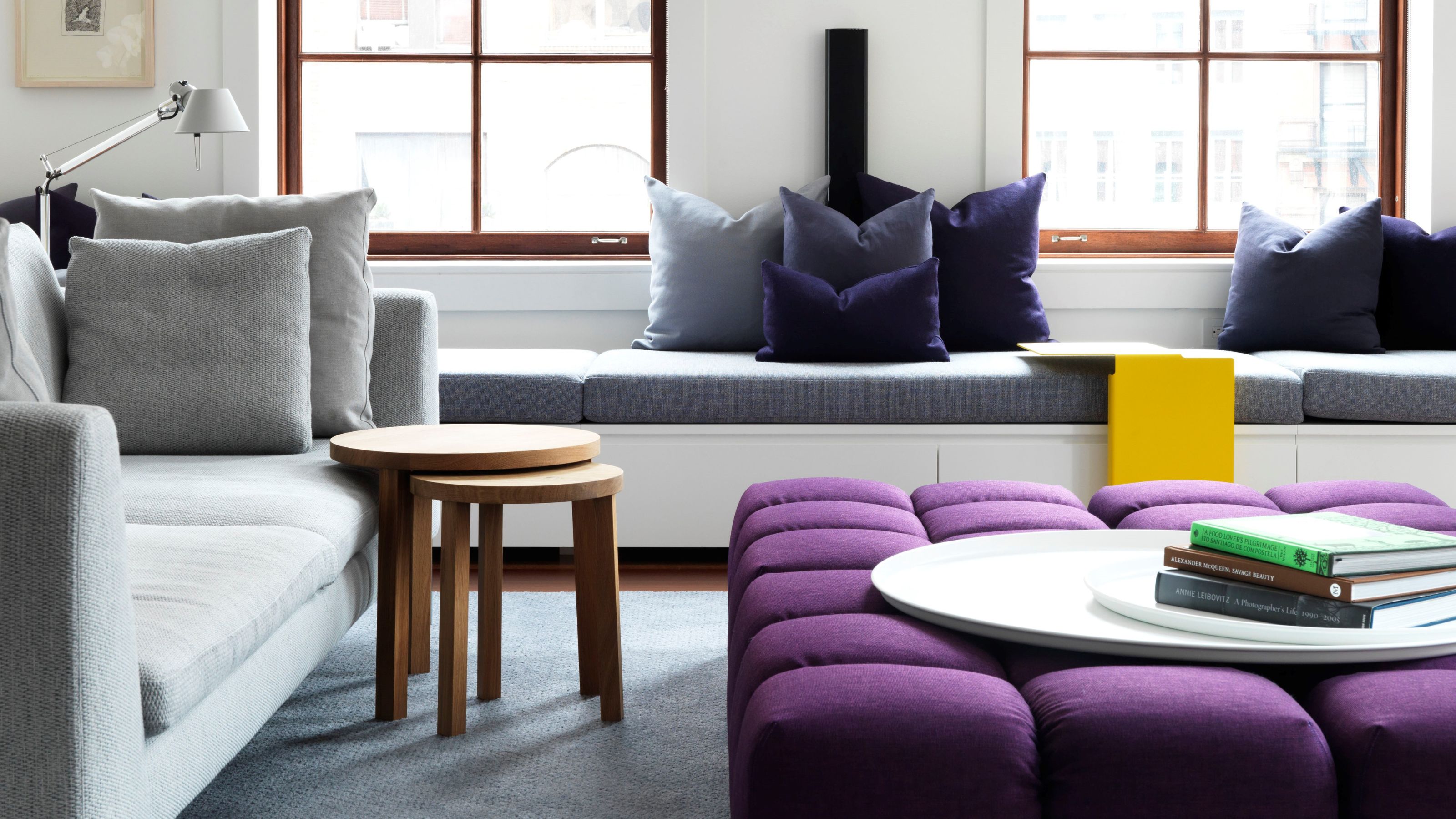
The Phthalo Green accents in this otherwise neutral living room give the space an elevated edge.
Stylistically, Phthalo Green pairs beautifully with traditional homes or interiors that cater more to minimalism in interior design. Luxe natural materials amp up the elegance — think of accents of dark marbles, warm woods, bronzes, and crisp whites to "form a harmonious balance of earthy, natural tones and clean contrasts," says Ryan.
He adds: "The richness of warm woods and bronzes provides a beautiful complement, while colors like crisp whites create a fresh, bright backdrop that highlights Phthalo Green's lush and moody depth of color." This makes it ideal for spaces that embrace the natural beauty of the outdoors, "where the color is in direct relationship to windows, plants, or vistas," he says.
As for colors that go with dark green, the pairings are almost infinite; it is all about finding the right complements and materials to optimize the shade's natural opulence.
"Most greens and blues should slide in easily for a bold take on a natural palette," says Amy. To keep things dramatic, "layer in the likes of petrol blue, cobalt, oxblood red, or charcoal," she adds. Or, to achieve balance in interior design, match Phthalo Green's richness with "clean lines, matte finishes, and minimalist materials accented by cobalt, mustard, rose, or sage for some fun," she says.
Shop Phthalo Green Decor

Price: £270
Size: 14W x 32H cm

Price: £7,750
Material and Color: Fadini Borghi, Opio Bouclé, Prussiana

Price: £79
Size: 65 X 65 cm
Phthalo Green is a color choice to impress and inspire. It is not quite emerald, but a touch more blue than Hunter Green.
Phthalo Green is moody, chic, and definitely has my vote for the most expensive-looking color.

-
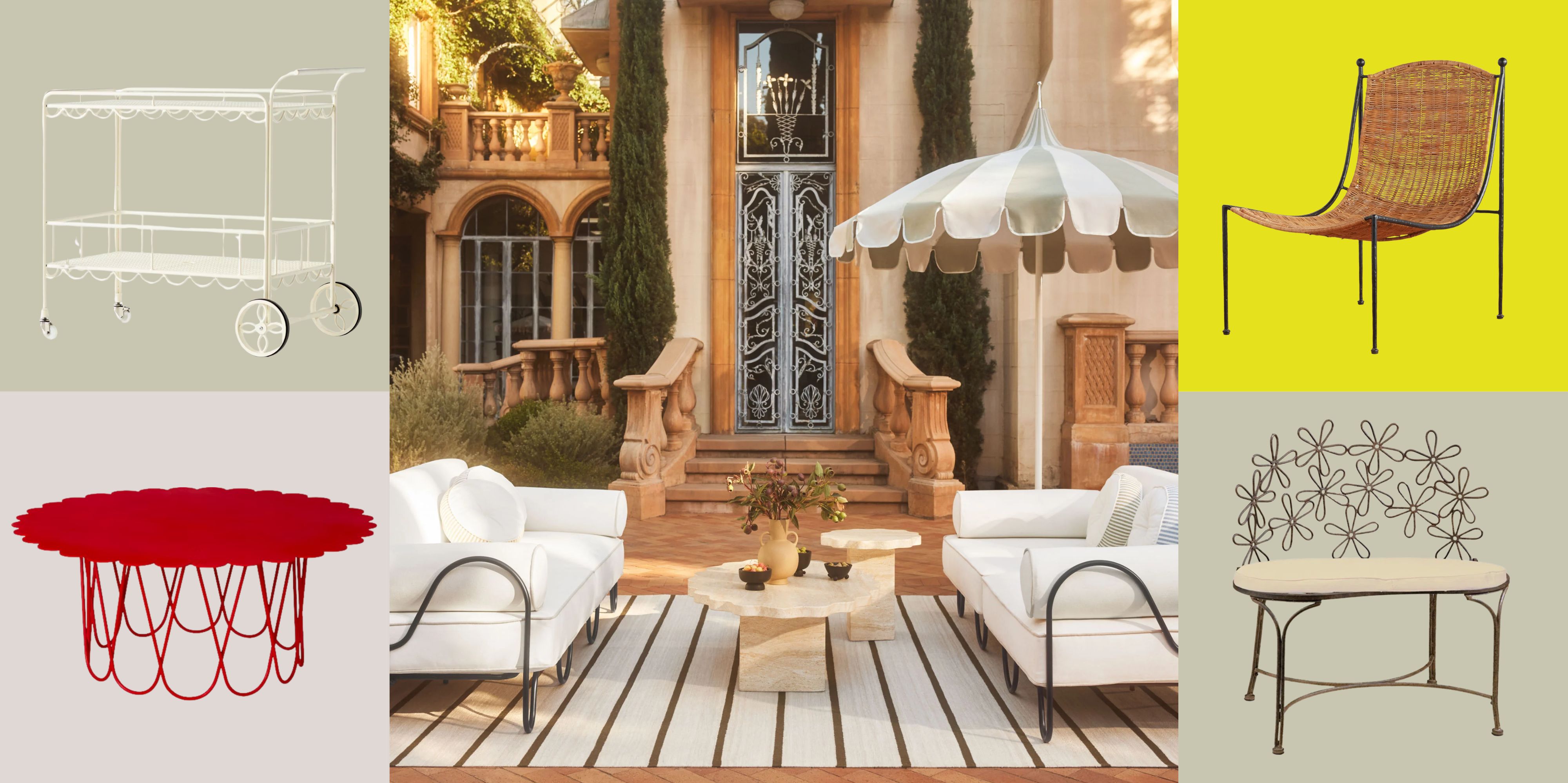 There’s a New Shape in the Garden — Why Whimsical Curves Might Be the Outdoor Furniture Silhouette of the Summer
Powder-coated petals, wavy lines, and a hint of surrealism — this microtrend is blooming, and we’re paying attention
-
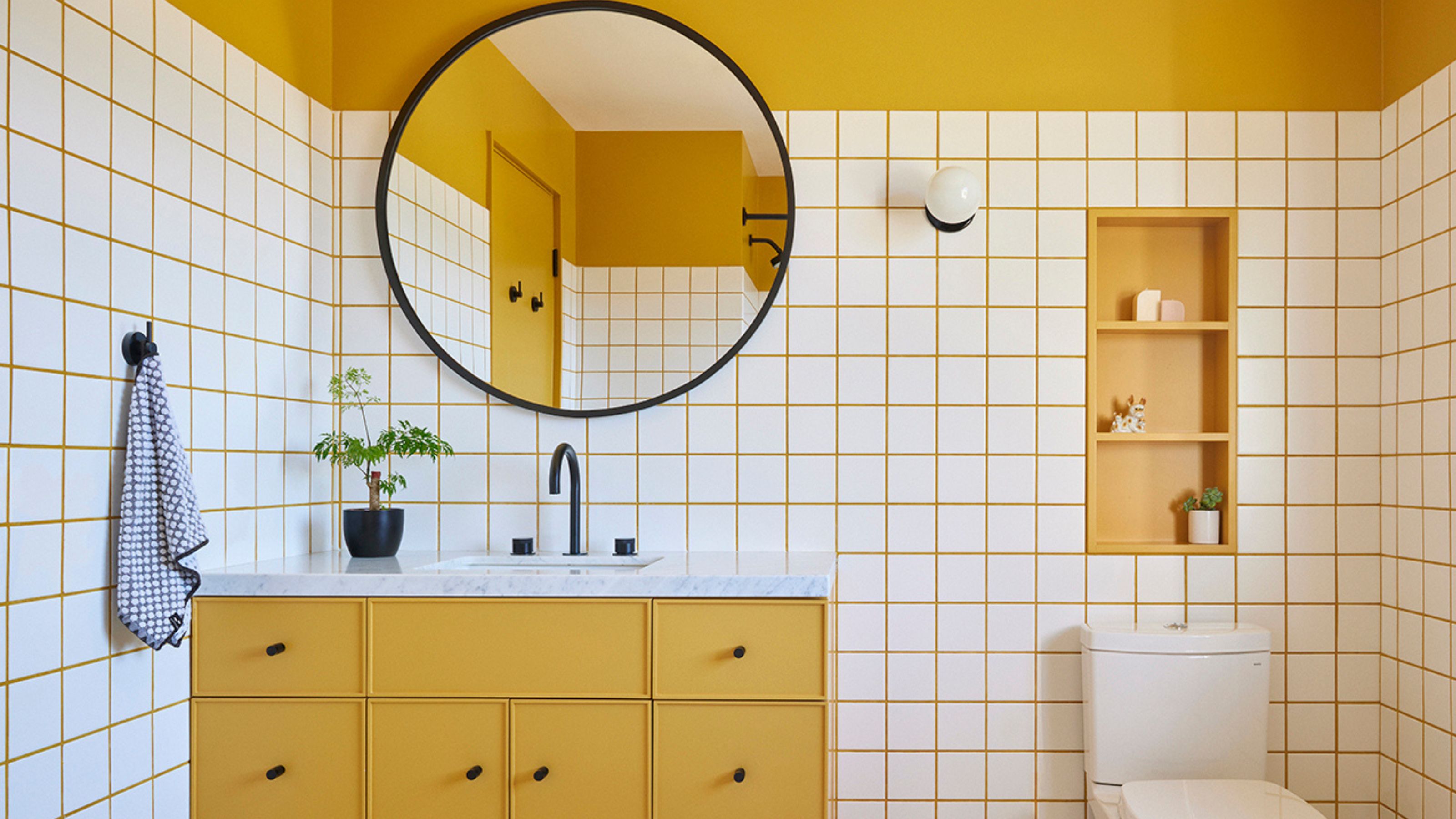 10 Yellow Bathroom Ideas That Vitalize Your Mornings and Look Unexpectedly Sophisticated While Doing So
Yellow is a color that by its very nature is energetic and full of life, and these designers have proved it's ideal for a bathroom


-
There’s a New Shape in the Garden — Why Whimsical Curves Might Be the Outdoor Furniture Silhouette of the Summer
Powder-coated petals, wavy lines, and a hint of surrealism — this microtrend is blooming, and we’re paying attention
-
10 Yellow Bathroom Ideas That Vitalize Your Mornings and Look Unexpectedly Sophisticated While Doing So
Yellow is a color that by its very nature is energetic and full of life, and these designers have proved it's ideal for a bathroom
-
 I Asked Interior Designers to Share the Worst Decorating Trends They've Seen on Social Media
Just because something is trending, doesn't mean it's tasteful — from dupe-culture to OTT lighting, here's what designers hate seeing in homes
-
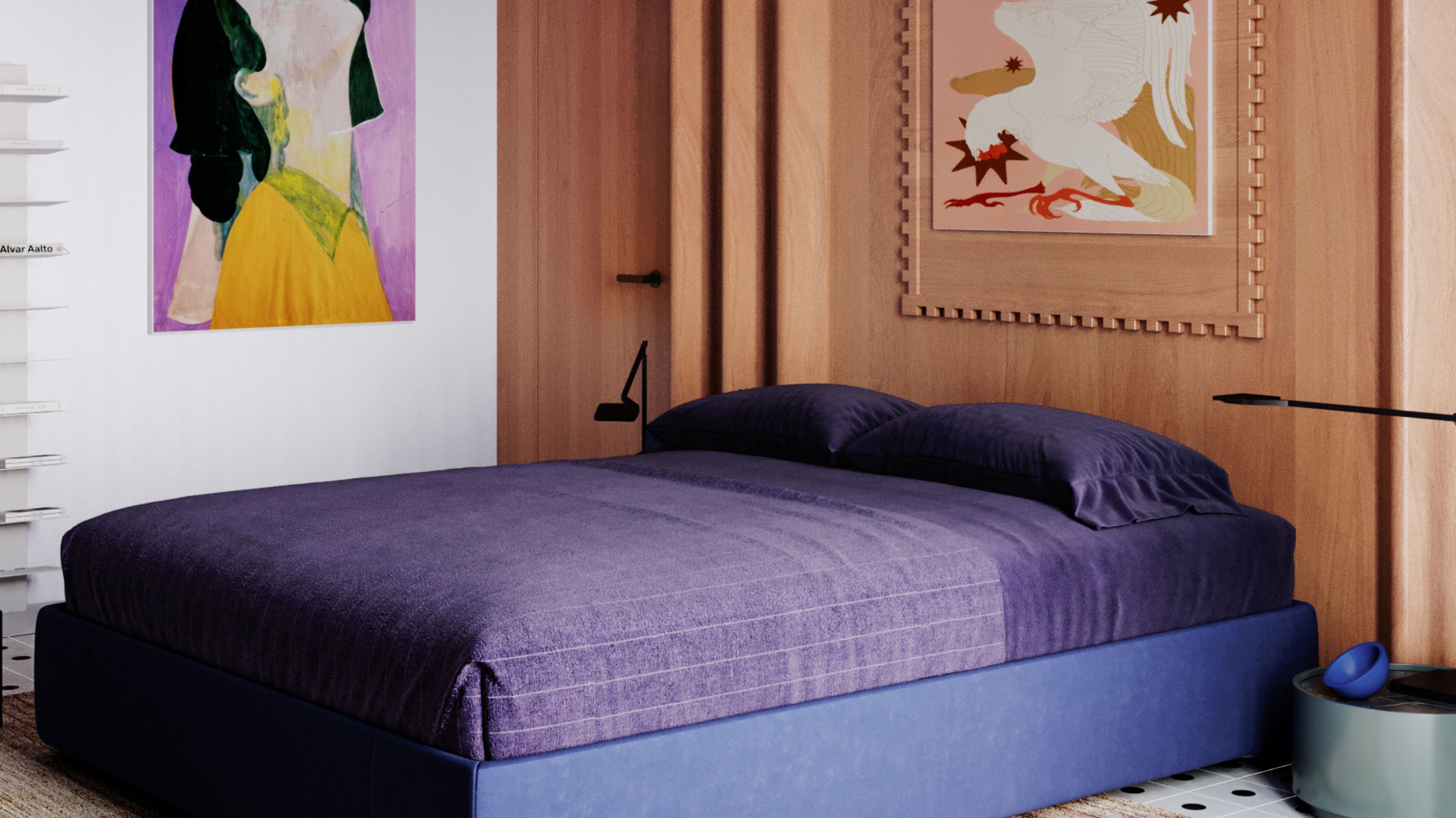 It's a Color Symbolic of Dreams, so These Purple Bedroom Ideas Almost Guarantee a Good Night's Sleep, Right?
Not always an obvious choice for the bedroom, these designs prove that purple has restful and calming qualities, making it perfect for the bedroom
-
 Amethyst, Heather, Pansy, Plum — Turns Out Decorating With Purple Opens You Up to a World of Possibilities
Purple certainly isn't a color for the faint hearted, it's a shade that can smell your fear. Here's how to conquer it through your interiors
-
 I'm Calling It — Chrome Decor Is the Most Influential Design Trend of 2025 for Rooms That Feel Effortlessly Cool
Have you been eyeing a chrome candle holder or side table to complete your room's look? This is your sign to embrace the shiny, chic material
-
 The Combination You Weren't Expecting to Love — 8 Blue And Orange Living Room Ideas That Feel Surprisingly Elevated
A blue and orange scheme for living rooms may sound jarring, but these spaces prove they're striking, vibrant, and certainly unforgettable
-
 Smeg Says Teal, and We’re Listening — The Kitchen Shade of the Year Is Here
Designers are already using the soft, sea-glass green everywhere from cabinetry to countertops


