Pink and grey living room ideas – 10 ways designers have refreshed this soothing palette
Designer tips for pink and grey living room ideas to create chic, subtle, smart and smoothing decor

We are seeing pink and grey living room ideas everywhere right now. We can't scroll through Instagram without seeing a peachy pink sofa paired with a soft grey paint. And it's a combination that totally makes sense too. Whenever we give advice on decorating with grey, the top tip is always to balance out those cooler tones with warmer hues. So pinks, whether you like them best in their palest blush form or up for using a bold fuschia, are the perfect hue to give grey a warmer, more welcoming vibe.
But, as with any color scheme, there are rules to follow and ways to get this look right. You want to be using the right amount of each color, be using the right tones, and bring together these on-trend shades in a way that feels classic and sophisticated. So we asked designers for their top tips on bringing these two ever-loved colors together to create a grey living room with just a hint of blush.
10 elevated pink and grey living room schemes to try
Pairing pink and grey for a living room is a pretty safe bet, but you'll need to consider how different tones interact to get your scheme right. From blush to salmon, greige to charcoal, each combination will offer your space a different look.
It's a classic combination, so how do you keep it feeling modern? Go for a more interesting pink, suggests Keren Richter, co-founder of interior design studio White Arrow. 'Millennial pink has had its moment — and at this point almost feels like a neutral!'
These 10 room ideas, each using pink and grey, cover an array of approaches to using this color scheme in a modern way .
1. Tone down the sweetness of baby pink
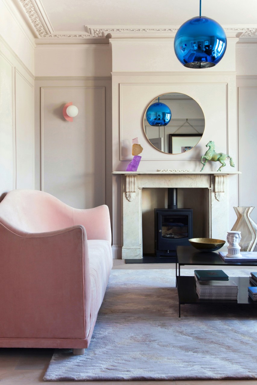
Blush baby pinks have been going strong since Millenial Pink made its appearance back in 2016. But despite the never-ending love we have for this rosy hue, it does risk looking a tad... saccharine if used in the wrong quantities. Now in a bedroom, or even a bold bathroom, we are all for taking this bubblegum hue over every surface, but in a living room, which by its very nature is the most lived-in room, we think it needs a bit of a grown-up touch – enter grey.
Just like in grey and white living rooms, pink - like white - is given more depth next to grey. The subtle warm grey walls in this living room not only compliment the pink but ground it too. 'A modern twist on pink and grey here, a warm pinkish-grey (Mylands Rose Theatre) with a pop of unexpected metallic blue to keep it fresh and modern,' explains Russell Whitehead, co-founder of 2LG Studio.
2. Get the amount of each color right
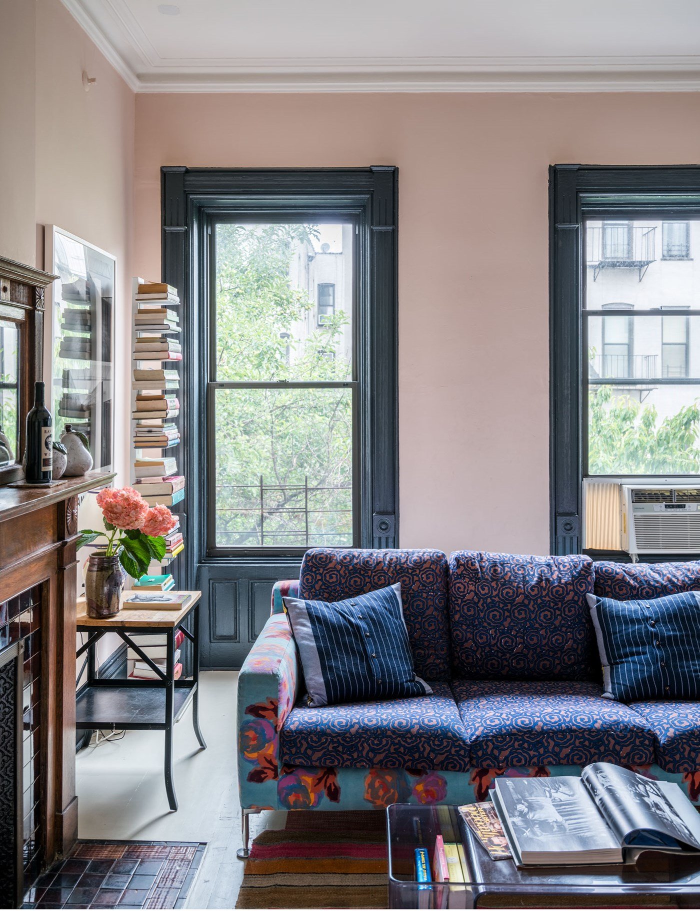
When it comes to any two-tone color scheme, we'd never recommend doing a totally 50/50 look. The space ends up looking flat and too deliberate. You want one color to be dominant, and the second to be more of an accent hue. If you want a more neutral space the obvious choice is have grey as the main color and bring in pops of pink in the form of accent furniture and decor. However, for a brave look let pink rule.
This pink living room is the perfect example. The deep blue-toned grey woodwork creates a lovely contrast with the pink but doesn't overwhelm it. 'Whilst pink & grey have connotations of late 80’s color combinations, bring the balance right up to date with specifically toned colors of said families,' explains Farrow & Ball's, Patrick O’Donnell.
'Walls painted in the just off-pink of Calamine, a truly restful shade of pink and paint your woodwork in one of our darkest greys, Mole’s Breath in Estate Eggshell,' adds Patrick. 'This has elegant brown notes so never feels too clinical and cold and has a great big dollop of empathy to really let the pink sing.'
3. Choose terracotta tones
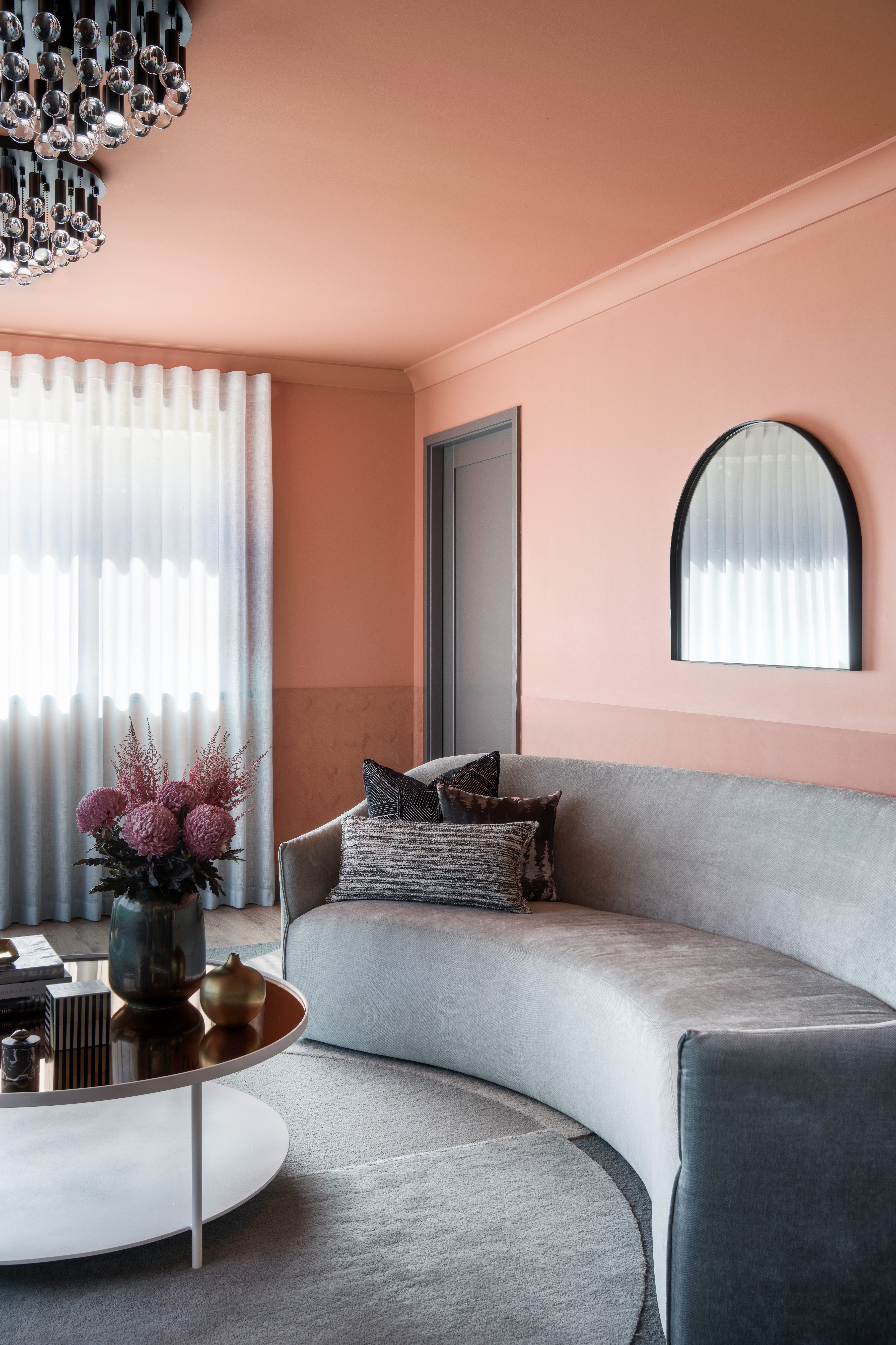
Orange-toned pinks, almost like a terracotta can work with so many styles, from that very on-trend rustic Mediterranean look to a bold retro vibe as seen in this living room by Kaiko Designs. Cool grey comes into play to balance out this warm hue, giving a modern, clean twist that makes it more of a livable shade.
'Here we have been bold with paint using Dulux 'Terracotta Chip' on the upper part of the wall and onto the ceiling and cornice. A matching textured paint finish was used on the lower dado of the wall seen behind the sofa. We have used copper mirror on the coffee table to echo this terracotta paint finish. This house was all about a "contemporary nod to the 60s" so curves have formed a major part of not only the interior design but also the decorative layer,' explains Nicholas Kaiko founder of Kaiko Designs.
'To recreate this look be bold with color and don't be afraid to let it be immersive. Paint the ceiling! This space works by balancing the warm background paint with cool upholstery and rug. Black and white are essential for contrast and to help anchor the room - your eye needs places to rest.' This approach is particularly impactful in a small grey living room.
4. Use grey and pink and a backdrop for a more colorful space
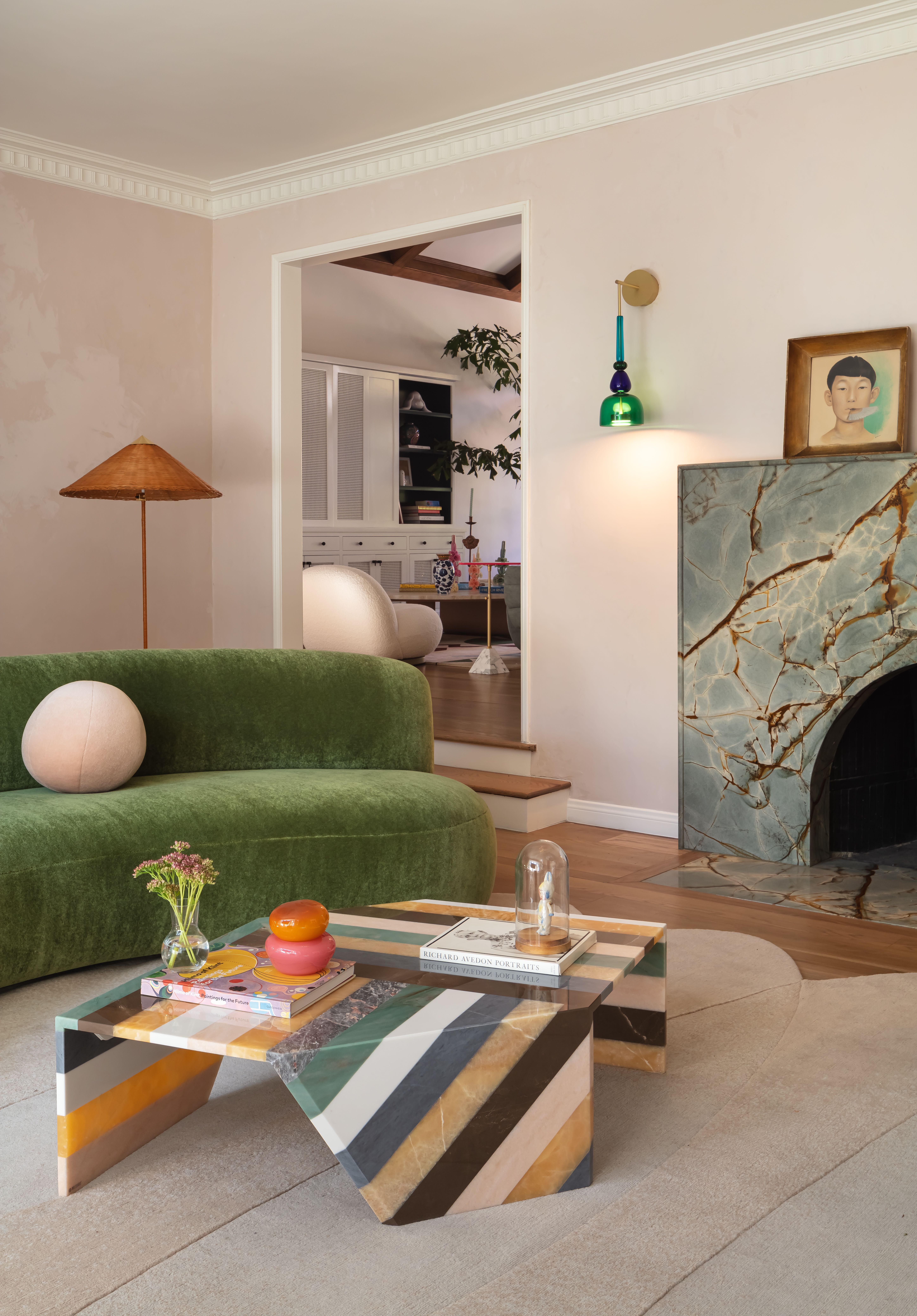
We know that, when it comes to what colors go with grey, pink is perfect. Because pink in its palest, most beige form can act very like a neutral, and paired with grey you have the perfect warm neutral backdrop for bringing in bolder hues. Muted greens and bright yellows give this pink and grey living an unexpected pop of contemporary, on-trend color, lifting the very soft scheme.
'We started this room knowing we wanted a subtle pink hue to play off the daylight in the room.' explains Lia McNairy founder of LaLa Reimagined. 'Different times of the day bring out different shades of the pink walls that are treated in Roman Clay giving us variations of textures. Once we found the coffee table by Patricia Urquiola with subtle shades of grey (a neutral) we knew we could tie in the whole room together no matter what colors we would bring in next!'
5. Opt for a pink toned beige for a subtle combination
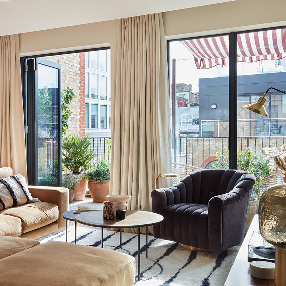
For a long time beige was shunned as being a blah shade, but so many designers are now proving it's far from boring. Pink-toned beige is perfect for a living room, warm, soft, and welcoming and a deep grey makes the perfect living room color scheme, grounding those toasty hues and giving the room some focus.
'We were tasked by our clients with turning an empty light-filled Covent Garden apartment into a showstopping boutique hotel-inspired home from home, designed around cocktailing and entertaining, furnished and styled into a dynamic, maximalist interior scheme oozing with character, vibrant tones, oodles of pattern and interesting textures.' says Anna Burles, Creative Director of Run For The Hills.
'The open-plan beige living room and dining area shown here looks onto a glorious south-facing roof terrace with striped awning and beautiful planting, so we kept the interiors natural and layered with pinky caramel velvets accented by a dark grey cocktail armchair and cozied up with soft drapes to frame the view. Rugs then zone the sofa space, adding a sense of luxurious comfort.'
6. Use copper to enhance pink accents
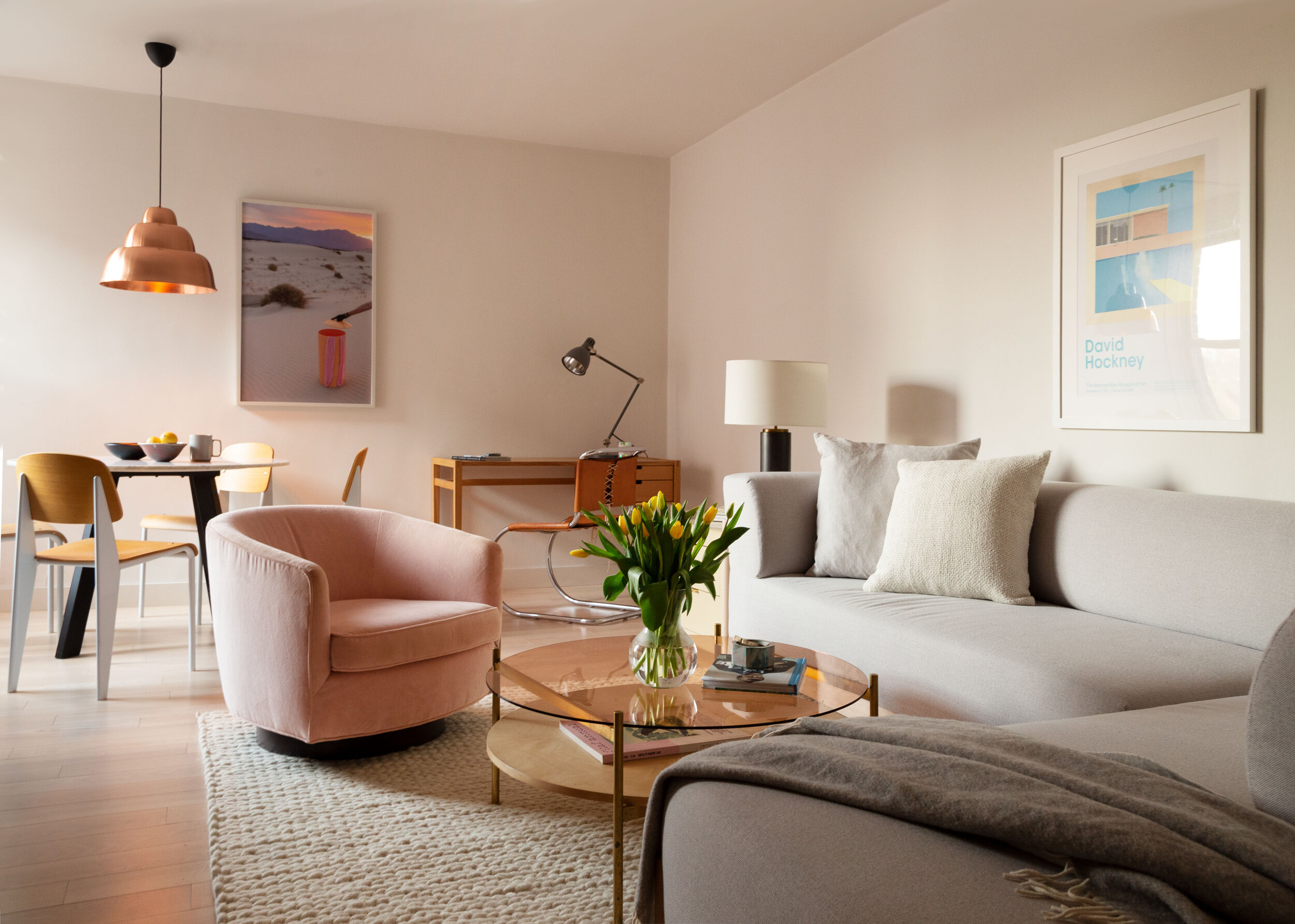
Enhance the pink accents in a grey couch living room scheme by adding touches of copper. Now we know copper and rose gold may have had their day, but done right in the right space they can very much enhance a space. Case in point the retro copper pendant light and the ever-so-subtle copper glass of the coffee table.
'This image is from a project we designed for an NYC photographer and a celebrity hairstylist. The couple’s open-plan living room and dining room feels fresh and fun but very down-to-earth.' explains Keren Richter, co-founder of White Arrow.
'We used a variety of modern pieces, including a coffee table from Yield, a copper Hem pendant light, and desk from Hedge House, in conjunction with some vintage pieces and vintage reissues. We like how the copper accents, white oak flooring, and the warmer wood tones pair nicely with the light upholstery colors. In addition, the couple lives with two dogs — so we opted for a light grey performance fabric on their Fest Amsterdam sofa to help hide some of their pets’ fur.'
7. Color drench the room and add accents of a second color
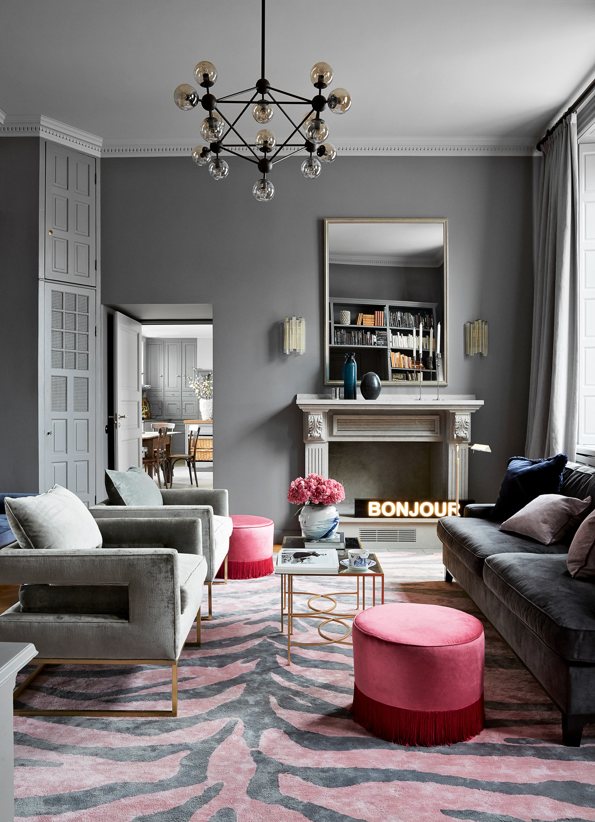
Color drenching, ie. going over all the room's surfaces and furnishings is a big living room trend but you do risk it falling flat and the space not having depth. So in a pink and grey living room scheme, we'd recommend taking one color over the majority of the space and then make the second color really pop as an accent hue that just comes in in furnishings and accessories.
'In any living room color scheme, I love having a dark element. It anchors the space, it adds some depth,' explains Tash Bradley, color expert at Lick. 'That deeper hue can be on your furnishings, it can be on your woodwork. In a pink living room this could come from a very dark grey – say pink on all the walls and a pop of dark grey on the skirting.'
'Or you could flip it around,' Tash suggests. 'A dark rich grey on all the walls and all the woodwork and then warm it up by going for pink furnishing – oh imagine an all grey room with a pink corally velvet sofa. Unreal. That's when a room starts to feel very contemporary, very sleek.'
8. Tone down the contrast with a grey-toned pink

Often the best two-toned living rooms take the more subtle route, toning down the contrast and bringing together shades that whilst differ also have very strong similarities. As White Arrow's Keren Richter explains, 'Pink and grey can work nicely together if they’re shades that are of the same saturation level.'
'While the particular shade of pink or grey may shift, I am designing with a lot of mauves and more grey-tone pinks lately — I think the pair can have a nice balance of warmth and cool. When they’re paired with whites or a neutral palate they easily work together.'
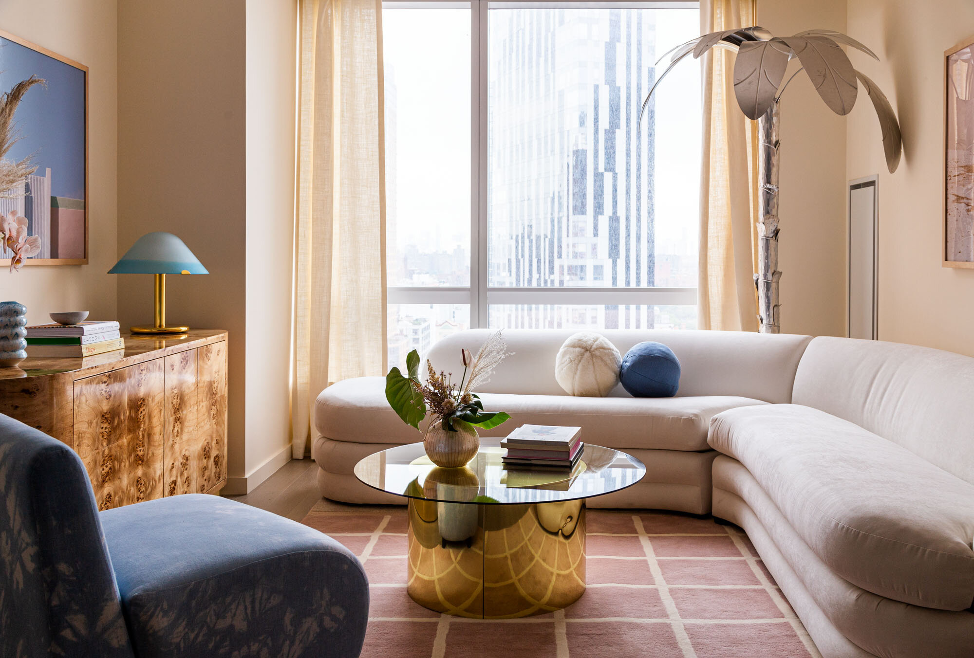
'This image is for an apartment in downtown Brooklyn. The pink rug is from Brooklyn design studio Pieces. We paired it with a vintage Adrian Pearsall sofa we reupholstered, along with an armchair upholstered in a custom tie-dye fabric from Upstate,' continues Keren Richter. 'We liked pairing contemporary Brooklyn-based designers with a mix of fun and feminine vintage items. The room exudes warmth and feels very welcoming.'
9. Make bold choices
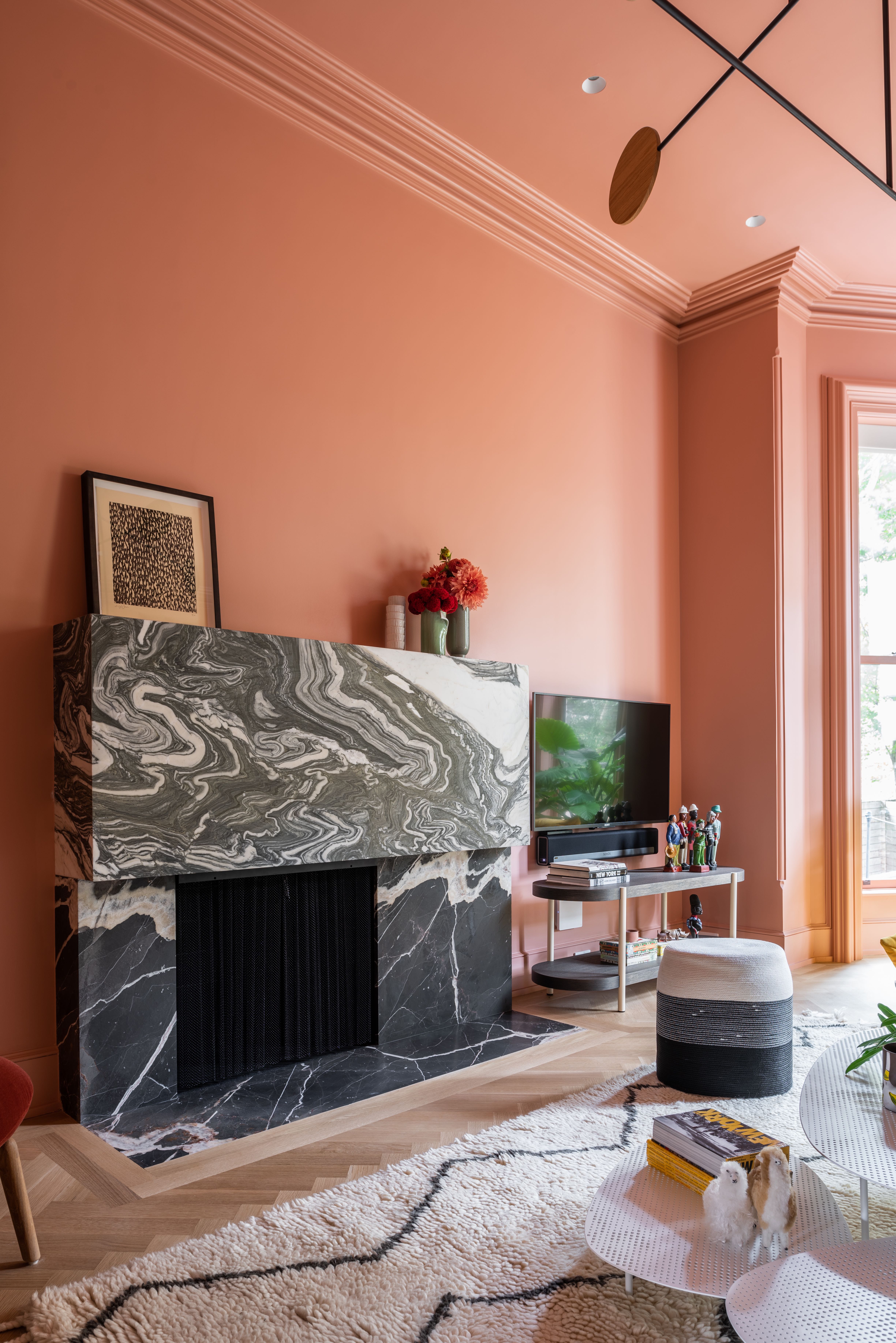
Another perfect example of how the best pink and grey living rooms don't play it safe. In this living room designed by MKCA Design the space feels far from just a dabble in an on-trend color palette, this room feels brave, bold, and dramatic enough so that it feels uber-contemporary, but the balance of vivid coral pink and grounding greys makes it livable - and that's why grey is one of the best colors that go with pink.
'We selected that particular hue of pink because it was both very vibrant and also a little bit ambiguous,' explains Micheal K Chen founder of MKCA. 'Painting the wall in its entirety makes it incredibly spatial so that you occupy the color – you don’t look at the color, you inhabit it. It surrounds you, and you perceive the shifts and play of natural light in the space throughout the day in a way that is both subtle and rich.'
10. Opt for lilacy pinks for an on trend look
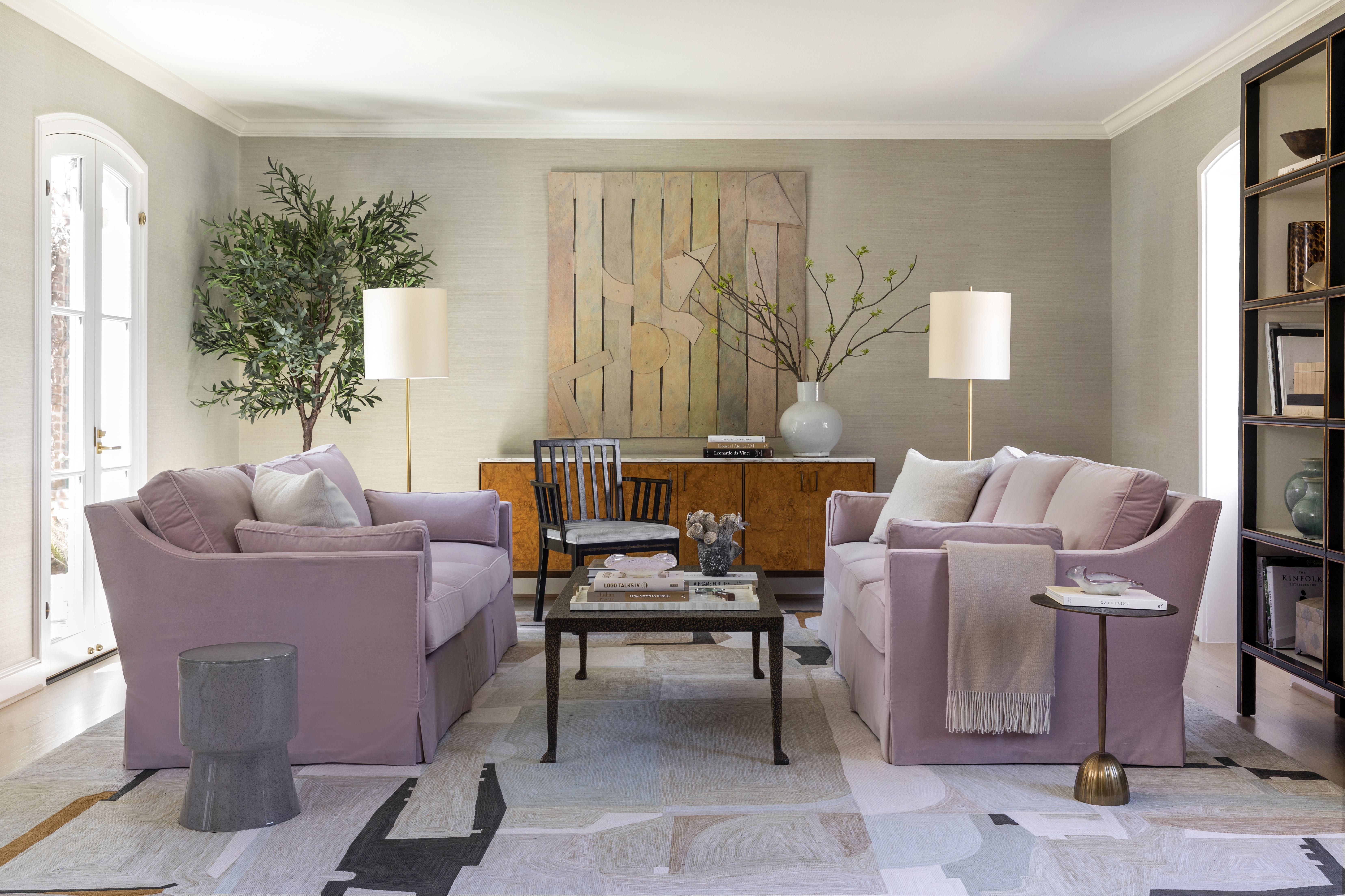
Lilac has been slowly creeping up in color trends over this year. We are seeing this bluey pink increasingly being used as a new alternative to blush pink and it just feels fresher a more modern. Plus it works perfectly paired with grey as it matches with the cool undertones.
'For this room, we pulled the color palette from one of the homeowner’s Indian heritage,' explains designer Marie Flanigan. 'This formal living room served as a lovely celebration of color, but in muted, nuanced tones. From the rose-colored walls to the artwork that weaves in additional tones, it was truly a play in softness. The furniture is also a beautiful blend of mid-century modern and traditional, which keeps the space warm and inviting.'
Do pink and grey work together?
Yes. Pink and grey work so well together because they balance each other out. A pink warms up a grey and yet doesn't clash with it as say an orange or a red would.
Lick's Tash Bradley does warn that 'what you want to totally avoid is very steely, architectural greys with no warmth to it. Pair this with a grey and you'll end up with the space looking flat you want to it look very tonally complimentary. So choose greys with warm red undertones, that will then complement any pink and make the room feel a lot more considered.'
Be The First To Know
The Livingetc newsletters are your inside source for what’s shaping interiors now - and what’s next. Discover trend forecasts, smart style ideas, and curated shopping inspiration that brings design to life. Subscribe today and stay ahead of the curve.

Formerly the Digital Editor of Livingetc, Hebe is currently the Head of Interiors at sister site Homes & Gardens; she has a background in lifestyle and interior journalism and a passion for renovating small spaces. You'll usually find her attempting DIY, whether it's spray painting her whole kitchen, don't try that at home, or ever-changing the wallpaper in her entryway. She loves being able to help others make decisions when decorating their own homes. A couple of years ago she moved from renting to owning her first teeny tiny Edwardian flat in London with her whippet Willow (who yes she chose to match her interiors...) and is already on the lookout for her next project.
-
 5 Things You Should Never Buy From a Thrift Store, According to People Who Know About Antiques
It may look like treasure, but it may also just be trash. Here is how to know what to avoid while thrifting, and what to look for instead
By Olivia Wolfe Published
-
 7 Pantry Organization Mistakes That Are an Organizer's Worst Nightmare
Get that Pinterest-perfect pantry by avoiding these certified organization faux pas
By Amiya Baratan Published