Architects Are Embracing "Porthole" Windows Right Now — And They Make for Such Joyful Spaces
Indulging contemporary architecture’s love affair with soft curves, porthole windows bring whimsy and major wow-factor to modern interiors
Picture a regular window and you’re bound to think of a rectangle. But sometimes the right window for your space doesn’t require any right angles at all: porthole windows have come full circle as a means for whimsical and shapely facades, and the architectural feature is even popping up across interior walls.
And while they're most common on exterior walls, specifically for bathroom or kitchen window ideas, installing a porthole as an interior window creates soft connections between rooms while flowing light from one space to the next – all with a bit of charm. ‘Internal windows can be tricky to get right, and a porthole window is a more playful way to connect two spaces than a rectilinear one,’ says Tom Surman, director at London’s Surman Weston.
Sure, portholes may not be an obvious choice for your home – but this interior design trick is a clever way to infuse space with out-of-the-ordinary design. Here are a few ways architects use porthole windows to round out the latest residential designs.
1. Create a line break
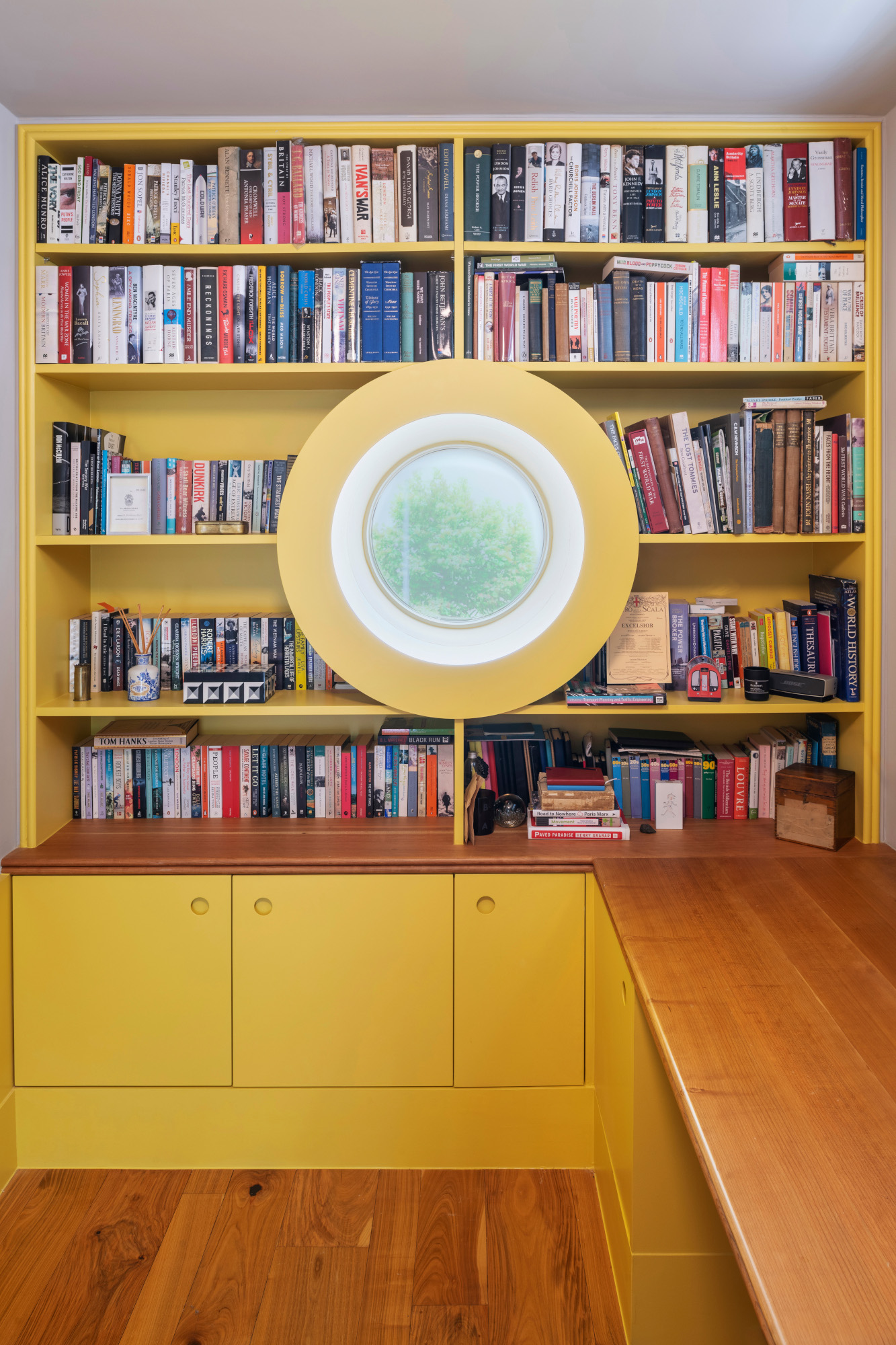
For a rather novel idea, this home office in Wimbledon, London plays with straight and circular lines alike. ‘The idea was to incorporate the window into a piece of fitted furniture so it feels like it’s floating among the books,’ says Christian Ducker, director at London’s Gundry + Ducker, who constructed a bespoke bookshelf to surround the round window. ‘Amongst straight lines, it provides a visual contrast.’ Situated at eye height when sitting down at the desk, the intimate window offers a sweet view of the outdoors when the homeowner needs to rest their eyes – a refreshing break from any rectangular computer screen.
Adding another layer to the design, Gundry + Ducker opted for a wide trim at the front of the window (painted in a playful submarine yellow), allowing books to stack against the curve, fully framing the view with reading material. Not to be overlooked, the depth of the window also plays a supporting role: ‘Here, the window looks out directly onto a shared access path, so the deep recess retains privacy while bringing light into the room,’ adds Christian.
2. Connect two divided spaces
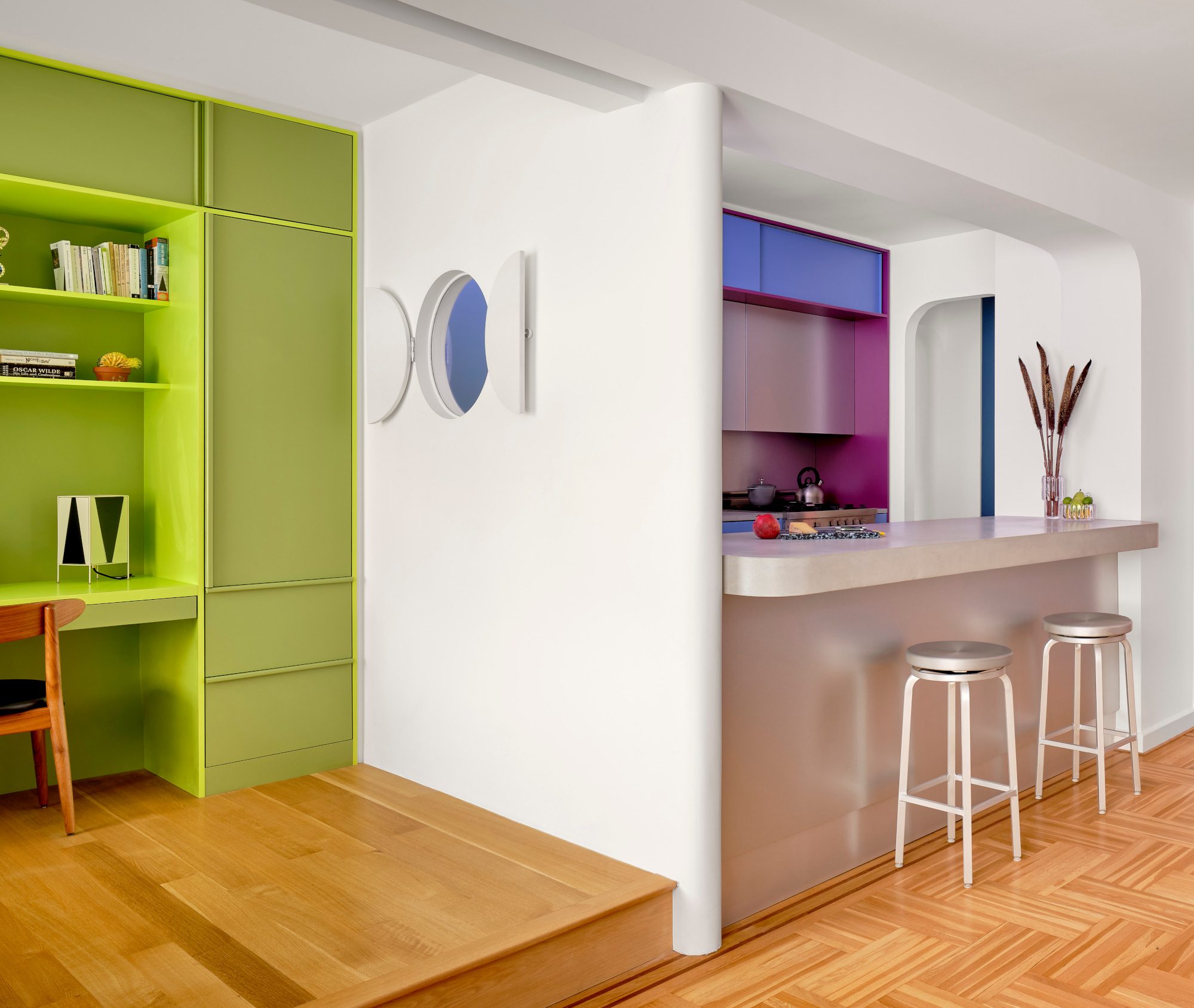
Placed at head height, a small porthole connects a slim Manhattan kitchen with a hybrid space that serves as an office and kid’s room. ‘It’s an invitation to have a playful interaction across the wall between two people,’ say Jacob Esocoff and Henry Ng, principals of New York’s Ideas of Order. To create an even more dynamic feature, the designers added another element that might be surprising for an interior wall. 'There are also shutters on the bedroom side that add a playful element to interact with,' they say. 'These additional moves encourage a more layered reading that prevents a theatrical design move from feeling like a one-liner.'
Adding to the visual connection, the interior window between isn’t just a crude cutout. ‘We softened the edges of the drywall framing, which one may not notice until close to the window,’ the duo add. ‘We like to add subtle details into bold design moves that reward closer attention.’
3. Create a sense of theater
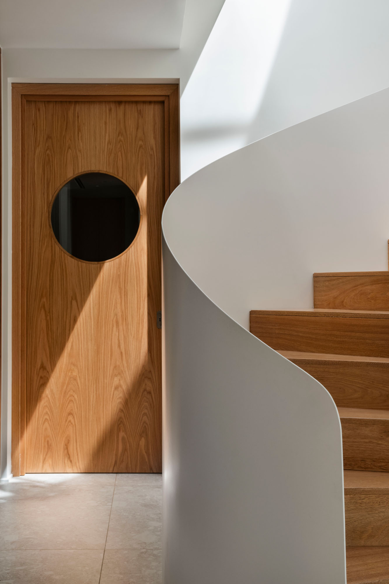
In commercial spaces like restaurants, porthole doors allow servers to see if someone is approaching from the other side. Conjuring fond memories of food culture, this Buenos Aires home by Estudio Karina Kreth features a porthole door that creates visual interest – and connection – between the living room and kitchen. ‘The only caveat to take into account with the porthole window is the quality of the finish because it will be at the level of your eyes,’ says architect and designer Karina Kreth. ‘And of course, keep in mind that we will always be seeing what is happening on the other side, both on the shot and shot reverse.’
For Karina, the porthole door brings a hint of theater to the narrative. 'We appeal to experiential memory as a crucial tool in every project,' she adds. 'The porthole in this function indicates the program behind that door, almost always of service and essentially with the kitchen or everything that has to do with food. This in turn awakens smells and memories in each of us.'
4. Opt for a pane-less window
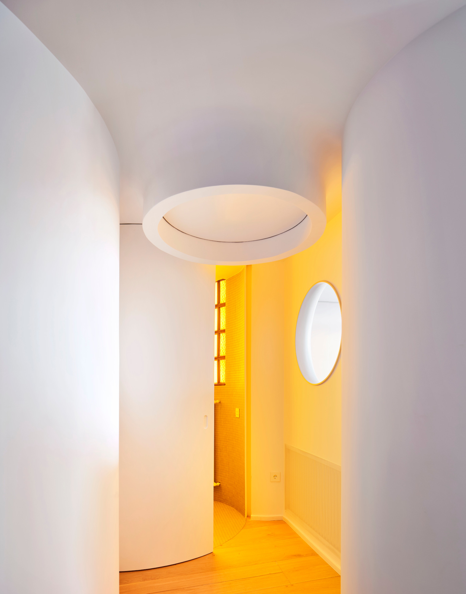
Exterior portholes usually incorporate glass while interior portholes can remain open, maximizing light flow between rooms. The porthole-style opening in this Madrid apartment channels tinged light from a tinted glass-brick window in the adjacent room, and architects softened its edges for a cinematic look. ‘The fact that the window has rounded edges produces a much more atmospheric effect when light passes through the opening,’ says Antonio Mora, architect and interior designer at Studio.Noju. ‘We wanted with this opening design to "capture" the evening light passing through the yellow glass block, recreating a sunset inside the house.’
To create the sculptural opening, Studio.Noju used a special material inspired by natural stone to create a soft, seamless shape. 'For the window opening we decided to use a solid surface material called KRION, produced by the Spanish company Porcelanosa,' explains Antonio. 'It is a very versatile material that allows to create plastic and curved shapes and at the same time (once hardened) be very resistant.'
5. Soften architectural elements
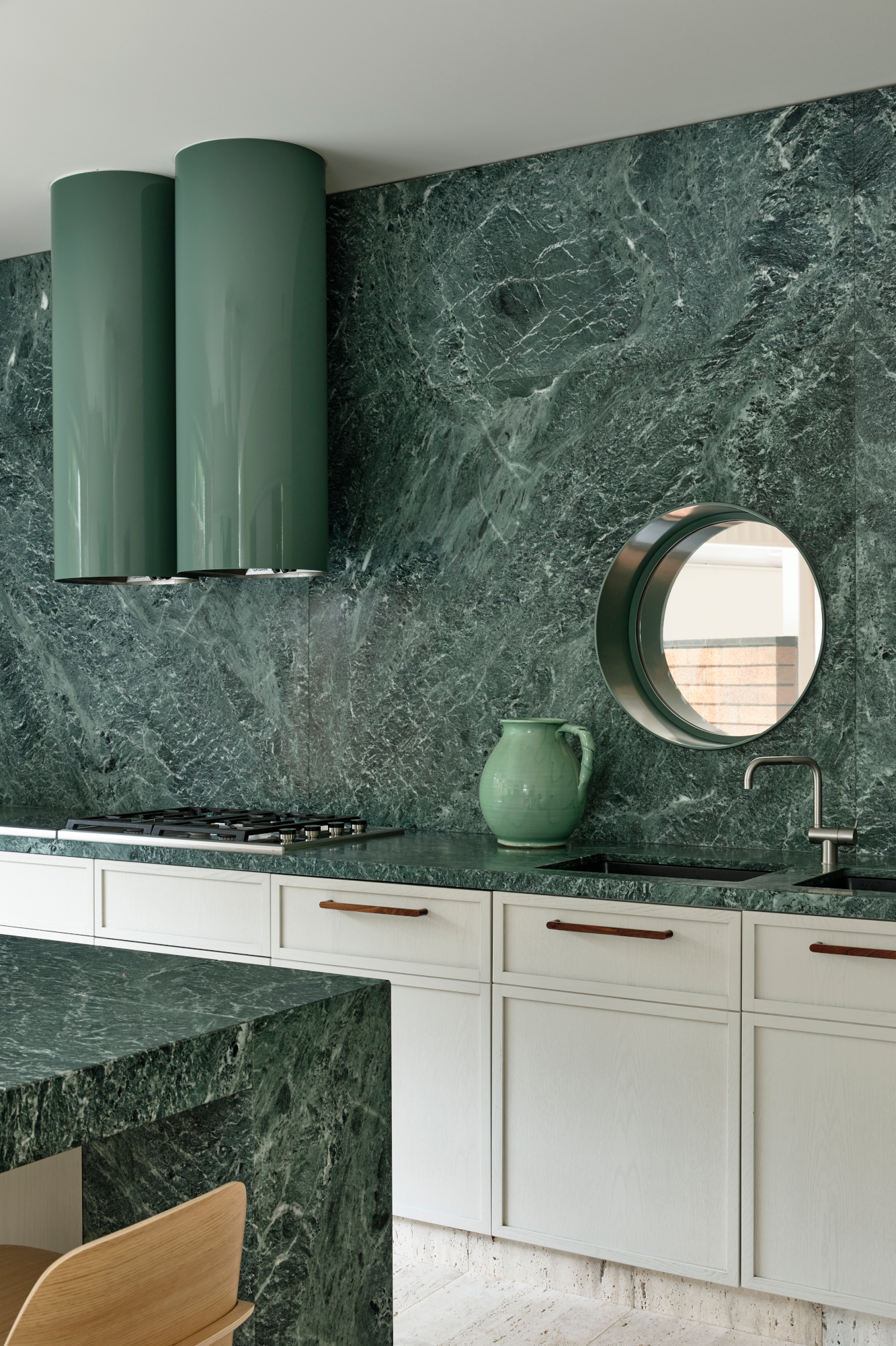
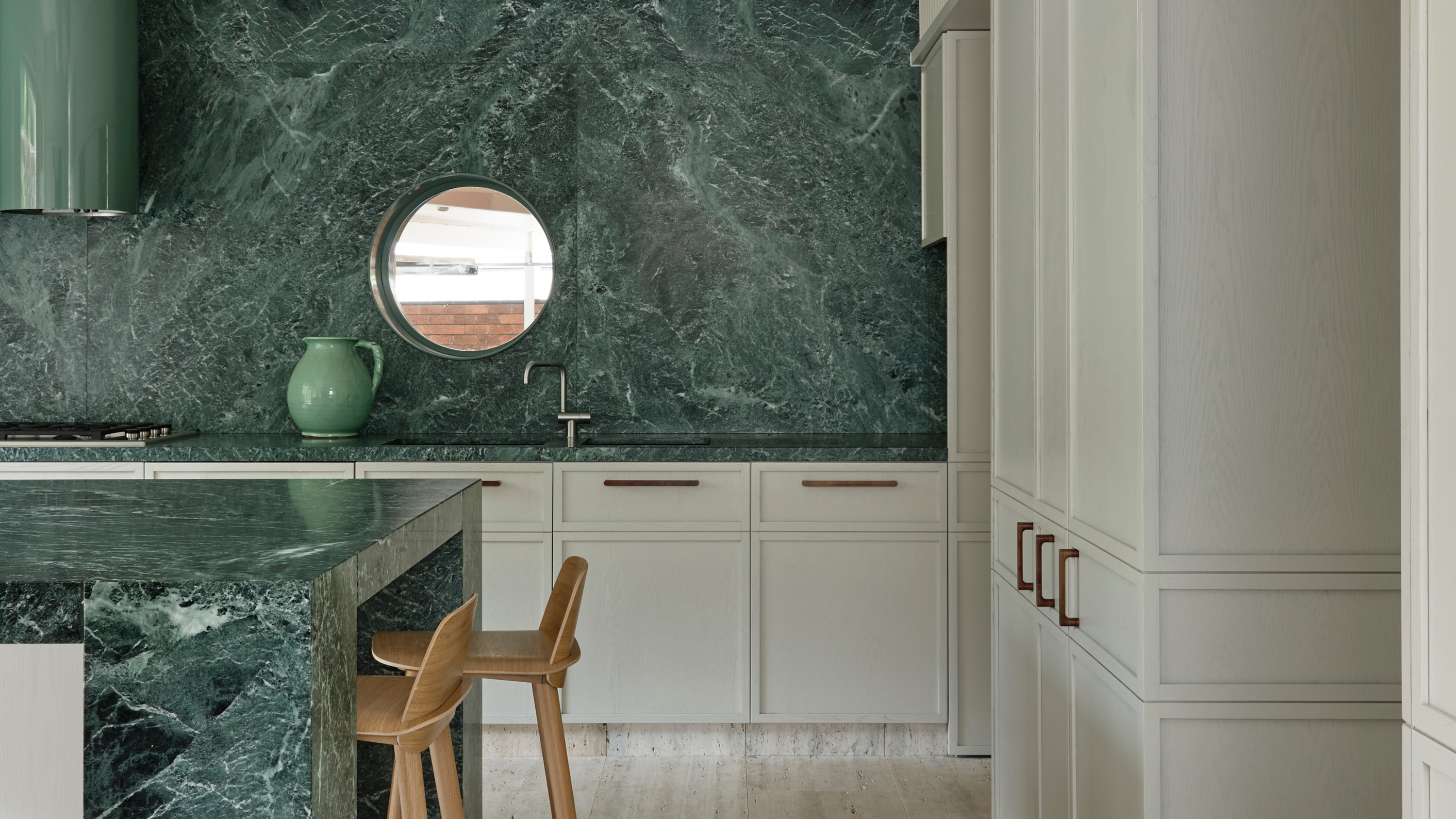
The porthole in this material-rich Melbourne home is both practical and aesthetic – it frames a view of the front entrance from the kitchen bench while also creating soft contrast. ‘We use circular openings as they’re a gentle form that punctuates the façade,’ says Adriana Hanna, director of architecture at Australia’s Kennedy Nolan. ‘Compositionally it can resolve a façade and prevent it feeling solid and austere.’ Paired with other rounded elements like a double cylinder extractor hood and globe light fixtures, the porthole also softens the sharp lines of the interior scheme.
And while portholes have many suitable placements, Kennedy Nolan recommends adding them to spaces that are sometimes overlooked. 'Often the best places to incorporate circular windows tend to be corridors or stairs – any areas you circulate and move past as it provides a small glimpse beyond the interior,' adds Adriana.
6. Add a privacy screen
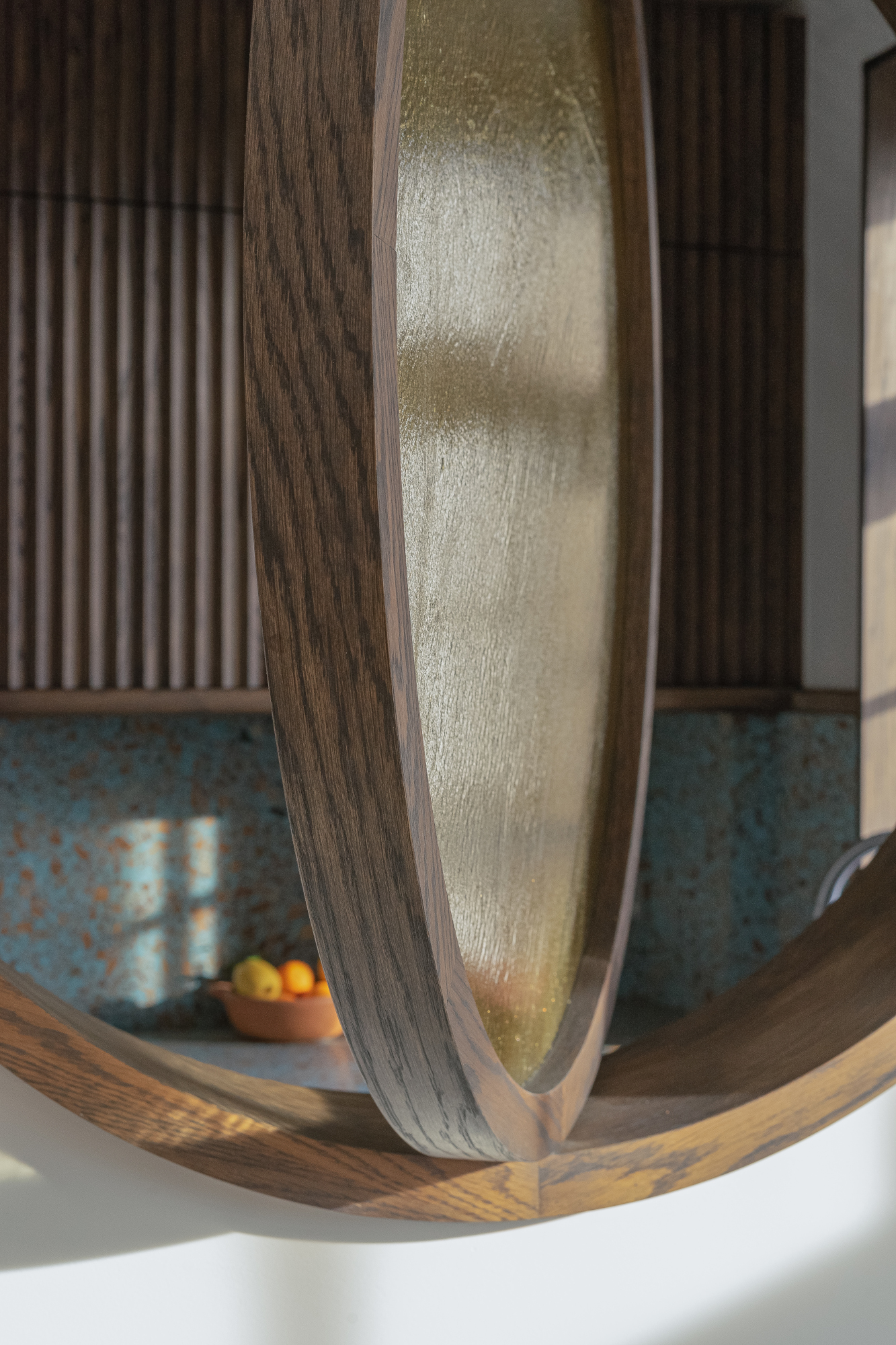
In this London apartment, a large internal window creates a sightline from the kitchen and the living room; the bespoke porthole spins on a vertical axis, allowing the window to open and close, controlling the visual connection of the room divider. Adding another layer to their bespoke design, architects also used glazing to blur the lines between spaces. ‘We glazed the window with stained glass which is translucent rather than completely transparent,’ says Tom Surman of London’s Surman Weston. ‘As such, when the window is closed the spaces have a degree of privacy.’
Having full control over the visual connection was paramount to the architects, as well as the homeowners. 'In our case, we wanted a porthole window that could be opened and closed to connect the kitchen and living space,' adds Tom. 'When open, someone cooking in the kitchen can chat to someone in the room next door, when closed there's a bit more separation between the two spaces but you still have a sense of what's going on in the adjacent room.'
7. Go for an oversized design
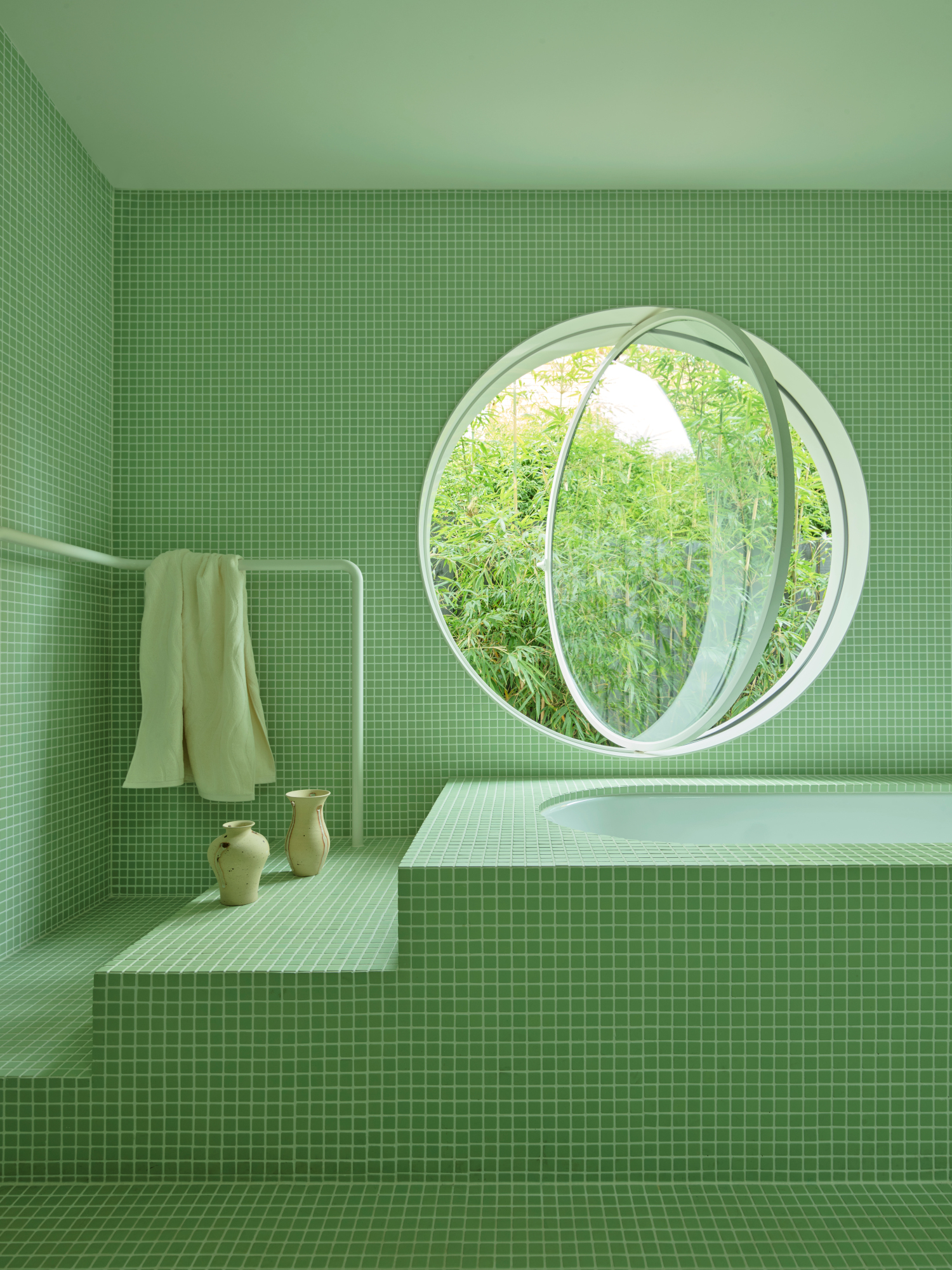
For clients with busy lives, architects Studio Doherty created a bathroom window treatment facing a serene garden, creating a sense of calm whilst connecting to the outdoors. ‘The rest of the design for the space fell into place and was a direct response to the porthole window,’ explains Phoebe Lipscombe, associate at Studio Doherty. 'Introducing angular, monolithic forms and using a single color in the room – via an apple green mosaic tile – was done in an effort to offset and amplify the impact of the porthole window.'
While the whole interior scheme appears seamless, Phoebe stressed the need to find skilled fabricators and builders that can pull it off. 'The window was completely custom and quite large, so there was a lot of workshopping and problem solving between the steel fabricator, builder and us to ensure the window not only looked amazing, but was also functional and usable,' she says. 'The powder coated shroud to the window reveal was also essential in hiding any potential for messy junctions with the tiled wall finish.'
8. Create a sense of connection
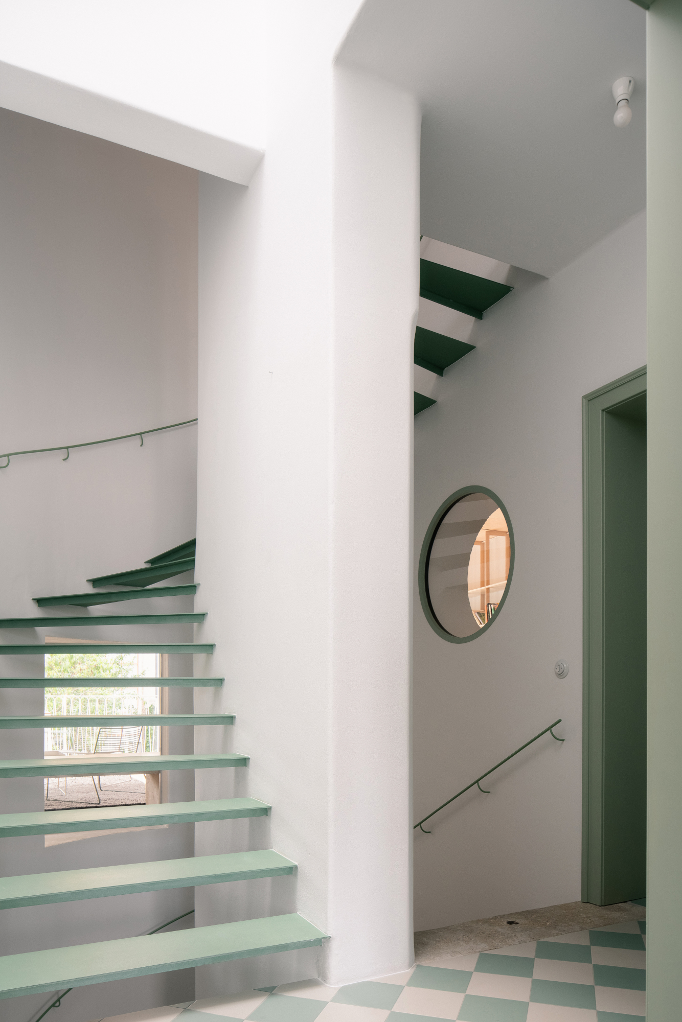
For architect Jan Holub of Prague’s Byró Architekti, the softness of a porthole window can lend itself to a shift he's seeing in residential design: architecture with a human touch, that plays on feelings and emotions. To create a deeper spacial experience inside a home renovation, a large window rises to the occasion, allowing light to flow from a spiral staircase into the kitchen while offering a sense of connection.
'Generally we wanted to use inner windows to connect the interior of the house as much as possible,' says Jan, noting how the window also happened to fit the style of the original house, furthering a connection between old and new.
9. Mimic the sun with higher placement
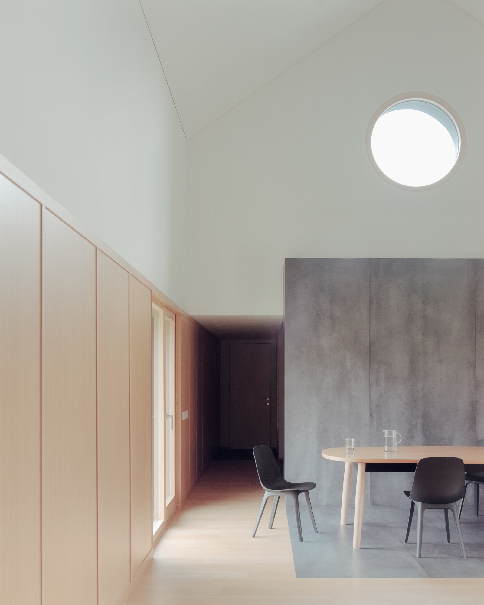
In this clean-lined house near Italy and Switzerland’s Lake Lugano, architects placed a fixed porthole window up high for two reasons: first, the circular window creates a brilliant frame that captures views of the mountains when viewed from the staircase. And second, the upper window behaves like the sun and moon–in the shape of each, no less–casting light across the interior directly from the sky.
‘In our case the porthole was chosen to bring a bit of sun and moon inside the house,’ says LCA Architetti, noting how the window also frames the scenic outdoors. ‘Poetry and nature are part of our way of doing architecture.’ While any conventional window placed up high can bring in natural light, the porthole’s unique shape is especially eye-catching in this two-level living area.
Be The First To Know
The Livingetc newsletters are your inside source for what’s shaping interiors now - and what’s next. Discover trend forecasts, smart style ideas, and curated shopping inspiration that brings design to life. Subscribe today and stay ahead of the curve.
Keith Flanagan is a New York based journalist specialising in design, food and travel. He has been an editor at Time Out New York, and has written for such publications as Architectural Digest, Conde Nast Traveller, Food 52 and USA Today. He regularly contributes to Livingetc, reporting on design trends and offering insight from the biggest names in the US. His intelligent approach to interiors also sees him as an expert in explaining the different disciplines in design.
-
 Straight from Salone: Five Emerging Trends I Found That'll Shape Interiors For the Year Ahead
From reflective silver to fluidity, here's my perspective on the key themes and new moods coming through from Milan Design Week
By Sarah Spiteri Published
-
 9 Bathroom Storage Mistakes You're Probably Making That Make Using This Space Much Harder — And What to Do Instead
Discover which mistakes are to blame for your overcrowded and cluttered bathroom
By Seraphina Kyprios Published
-
 Straight from Salone: 5 Emerging Trends I Found in Milan That'll Shape Interiors For the Year Ahead
From reflective silver to fluidity, here's my perspective on the key themes and new moods coming through from Milan Design Week
By Sarah Spiteri Published
-
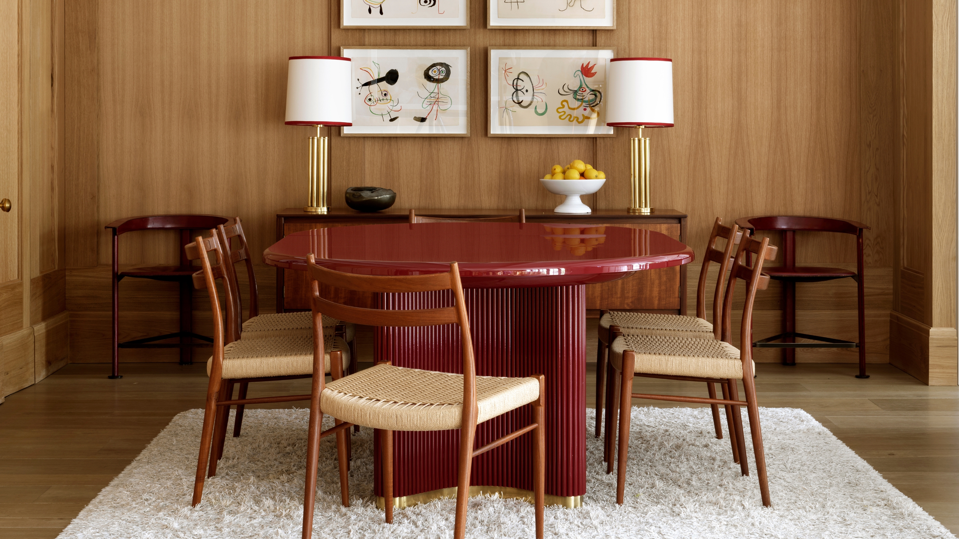 The 'Red Table Trick' Is the Easiest and Most Expensive-Looking Trend to Hit 2025 So Far
A red dining table makes a seriously stylish statement; the beloved pop of red trend just got an bold and expensive-looking upgrade
By Olivia Wolfe Published
-
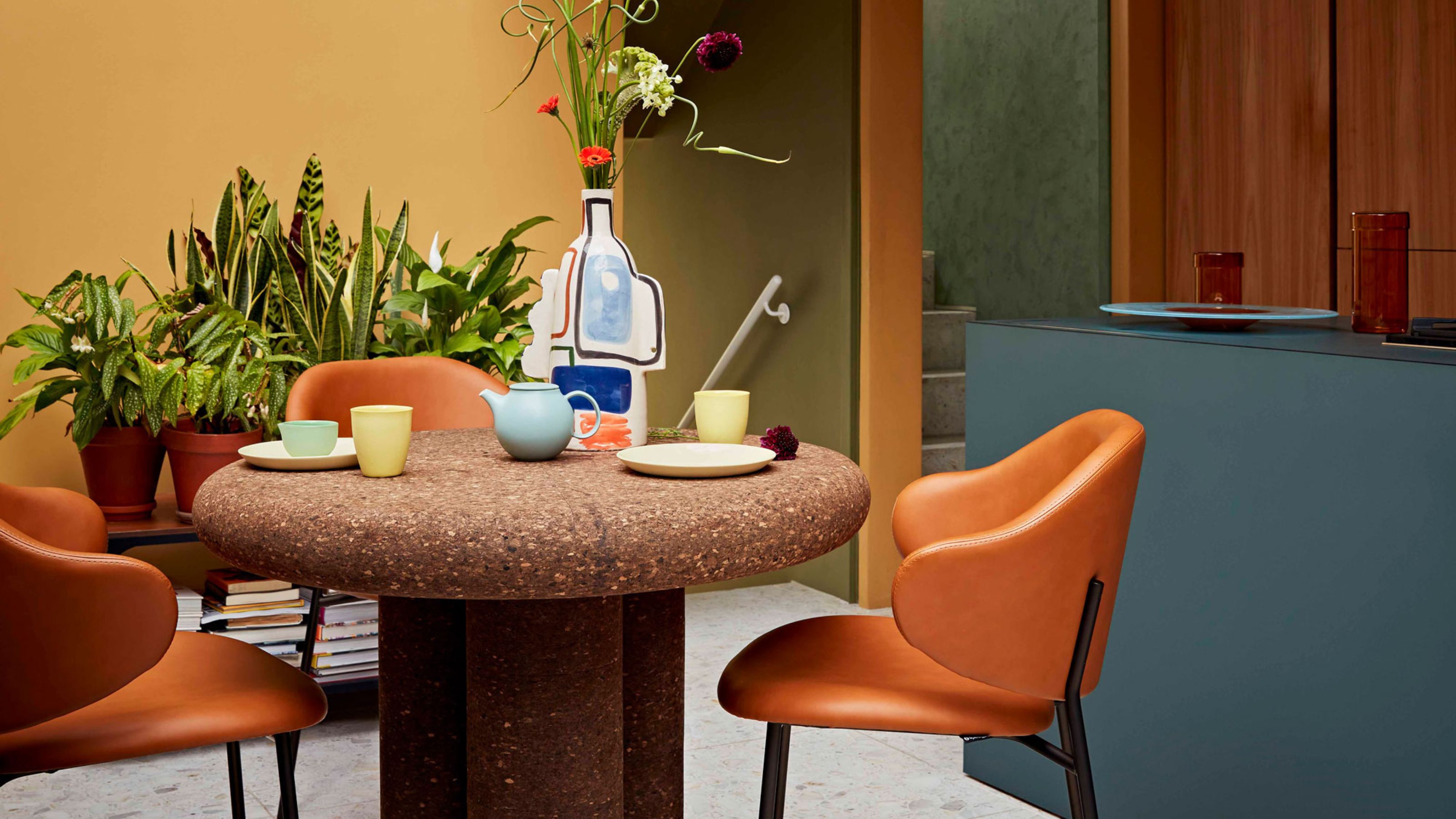 Cork Is the Cool, Sustainable, and Surprisingly Chic Material We Can't Stop Furnishing With Right Now
In honor of Earth Month, we’re toasting to cork... furniture, that is
By Julia Demer Published
-
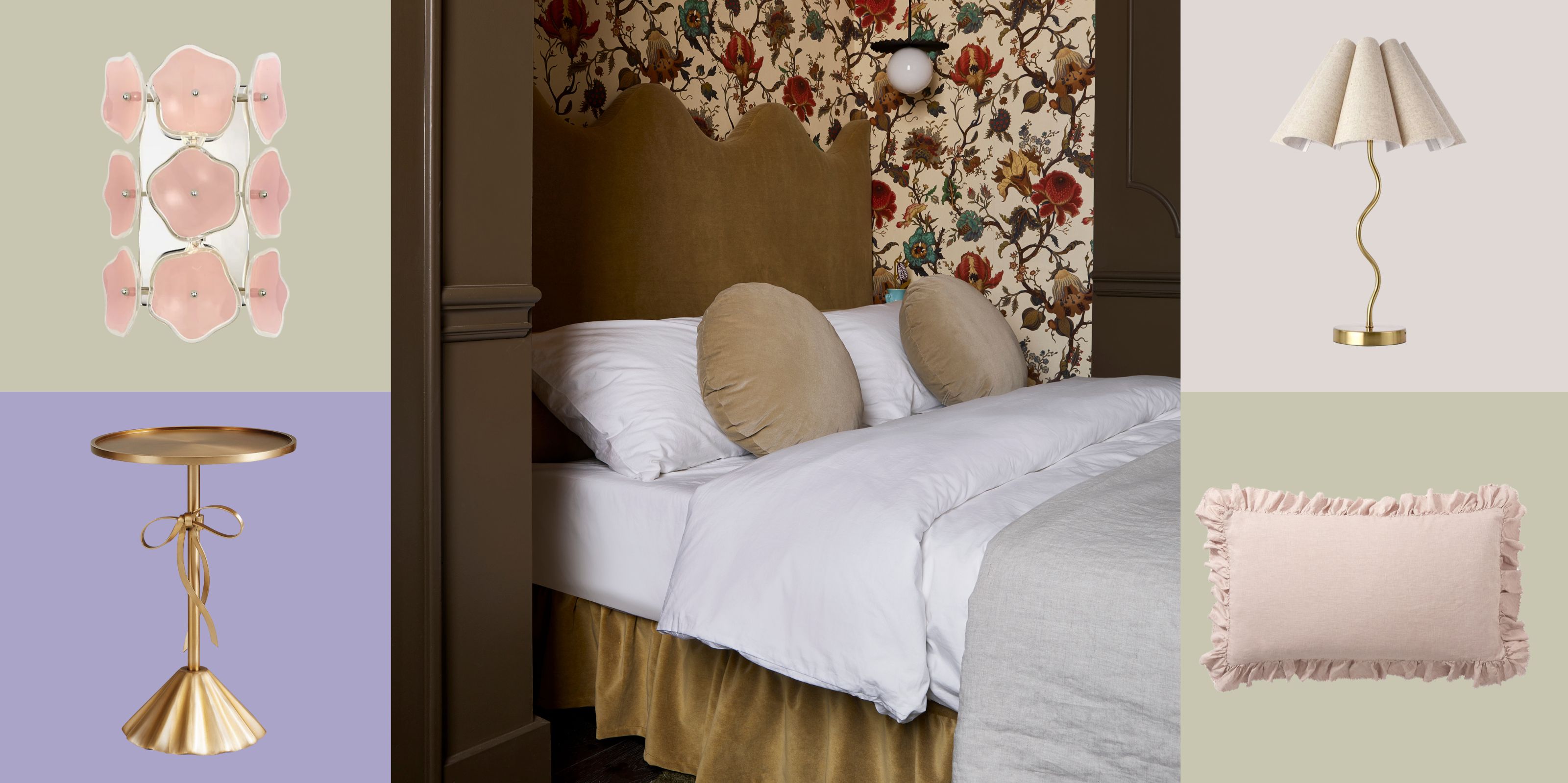 The Coquette Aesthetic Is Still Going Strong in Homes in 2025 — But Now It's Charming, Whimsical, and Has Modern Flair
A designer weighs in on how you can make the classic coquette trend feel modern while still retaining its whimsical elegance
By Devin Toolen Published
-
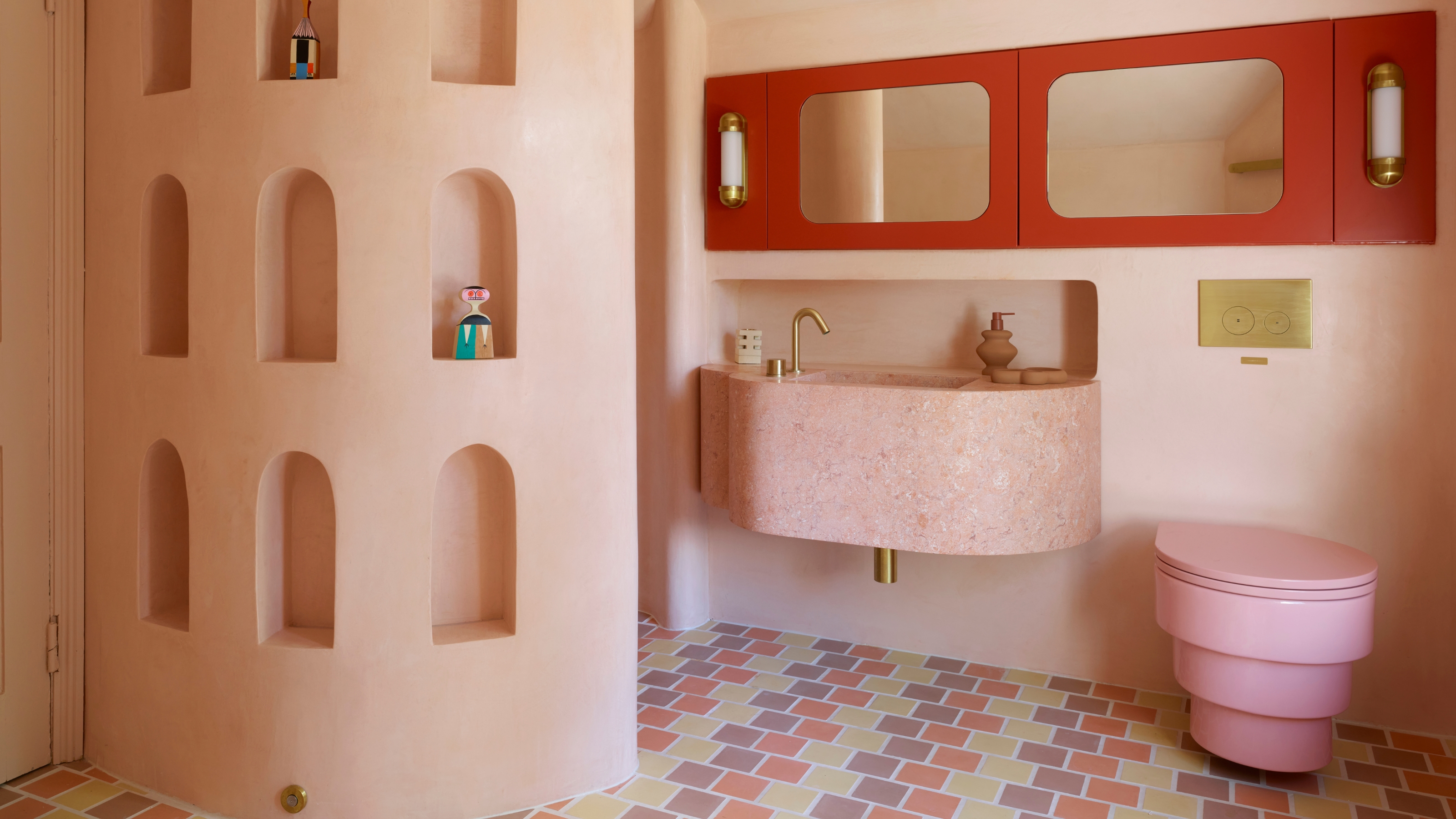 Spotted in the Coolest Bathrooms of the Moment — This Colorful-but-Divisive Trend Is the Idea You'll Either Love or Hate
See you later, sterile white. This playful plumbing trend is bringing color back to our bathrooms in an utterly unexpected way
By Olivia Wolfe Published
-
 The Biggest Outdoor Furniture Trends for 2025 Embrace the Natural World, White Lotus, and a Touch of Whimsy
Sofas as plush as your living room’s, tables fit for a five-star resort, and materials straight from nature — here’s how outdoor living is evolving this year
By Julia Demer Published
-
 The "One Amazing Thing" Theory Could Just Be the Secret to Making Your Decorating Budget Go Further (While Making More Impact)
What if we told you designers had found a way to control a project's spend even while elevating the final result? This new trend does just that
By Pip Rich Published
-
 Carpets Used to Give Me the Ick, but This Bold New Style Makes Me Think They're the Next 70s Design Detail Due for a Revival
I've always had visions of ripping up wall-to-wall carpets, but now I'm thinking about actually installing them — what gives?
By Emma Breislin Published