10 living rooms that have perfected the "quiet luxury" trend, for homes that feel effortlessly expensive
Add these quiet luxe living rooms to your interiors moodboard – and read top interior designers' tips for achieving the look

The Livingetc newsletters are your inside source for what’s shaping interiors now - and what’s next. Discover trend forecasts, smart style ideas, and curated shopping inspiration that brings design to life. Subscribe today and stay ahead of the curve.
You are now subscribed
Your newsletter sign-up was successful
In the time that’s passed since that Gwyneth Paltrow court appearance, the trend for quiet luxury – a style that’s classy, expensive-looking but understated – has made its way from fashion to interiors, putting a new name to a look we’ve loved for a long time.
Now, of course, all everyone wants to know is how to get the look for their own home – and we’d argue that the living room is the perfect place to start, thanks to its associations with coziness, comfort and layering, a key component to the quiet luxury trend.
Naturally, there’s no better way to find inspiration than to look to the top designers – so to get you going, we’ve searched high and low for the best living room ideas that encompass quiet luxury from our favorite creatives (and asked them for some tips, too).
Article continues below10 living rooms that nail the quiet luxury trend
Before we dive in, a quick refresher on what quiet luxury actually means when it comes to interiors. ‘To me, “quiet luxury” denotes an elegance that whispers rather than shouts,’ says Artem Kropovinsky, founder of New York interior design studio Arsight. ‘It is the idea of luxurious subtlety, a symphony of details that come together harmoniously without overwhelming the senses.’
This look is all about the layering – of colors, textures, shapes and sensory experiences – to create that poetic ‘symphony of details’: something that these 10 living rooms do very well.
1. This tonal all-white space with textural depth
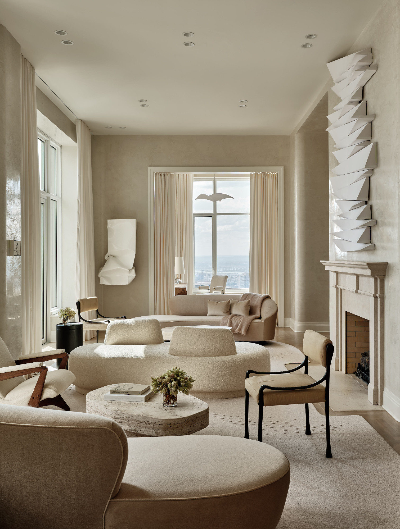
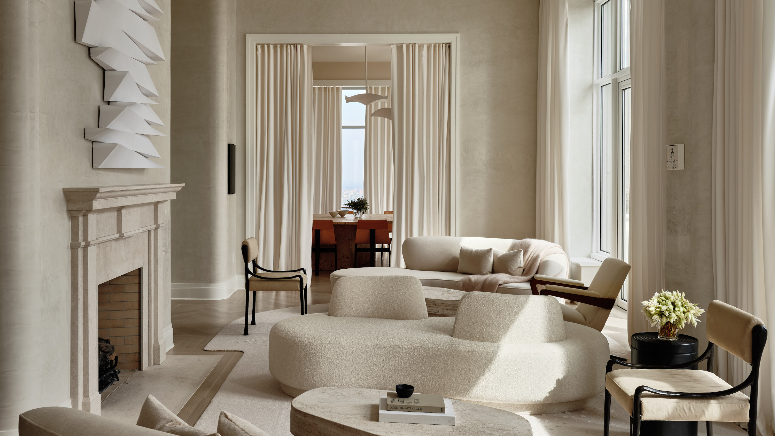
This neutral living room is bold in its monochromatic look – but the pared-back color scheme also allowed New York architecture firm Workshop/APD to focus on the details. ‘I think quiet luxury is about comfort, ease, and quality,’ says founding principal Andrew Kotchen. ‘In the home, it's not performative, but instead is focused on functionality, craftsmanship, beauty and ease. Balancing the neutral palette with textural depth is key to creating a warm feel in a monochromatic home like this one. A soft, slightly reflective decorative plaster wall finish adds so much subtle dimension, while cozy sofas and plush rugs imbue the room with softness.’
2. This moody scheme that showcases the dark side of the trend
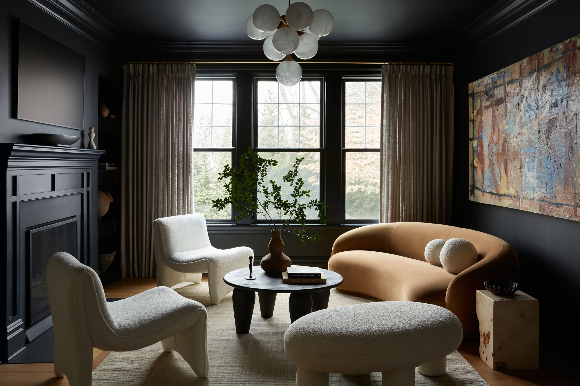
Across fashion and interiors, quiet luxury is regularly associated with a neutral color palette – as we discuss below – but this scheme by Philadelphia interior design practice Far Studio shows that it’s much more far-reaching than that. ‘We absolutely love dark rooms and try to do one in every home we do – I find it to be sexy and romantic and to really create a special vibe,’ explains lead designer Brittany Hakimfar. ‘I think what makes this room feel "quiet luxury" is the camel-colored velvet sofa and the oversize artwork, which balance out the layers in this space – as well as the lighter linen drapery, which are a warm touch.’
The Livingetc newsletters are your inside source for what’s shaping interiors now - and what’s next. Discover trend forecasts, smart style ideas, and curated shopping inspiration that brings design to life. Subscribe today and stay ahead of the curve.
3. This maximalist look with bold, intentional color
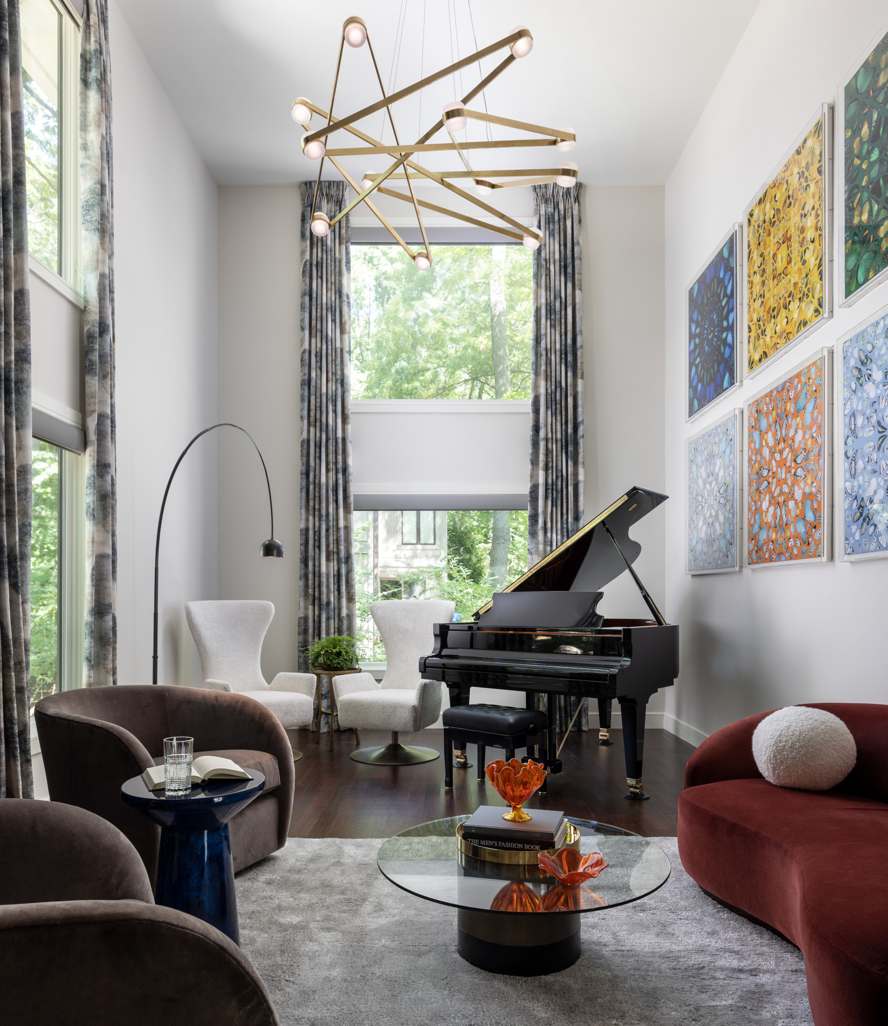
As we’ve already mentioned, quiet luxury is often assumed to feature exclusively tonal, neutral color palettes – but some of the best interior designers are showing that there’s much more to the trend. ‘Quiet luxury to us means rich materials, sumptuous shapes and items with a large scale that feel grand in the room,’ says Stephanie Henderson, designer at Jane Henderson Interiors. 'This space features bold color, but used intentionally – in a decadent velvet on the curved settee and in a large-scale art installation mounted in acrylic boxes. This art, as well as the custom window treatments, which soar to two-story ceiling height, emphasize the vertical height of the space. The result is a space that certainly feels luxurious, while still leaning into a playful color palette.’
4. This demonstration of how ‘quiet luxury’ is all in the material mix
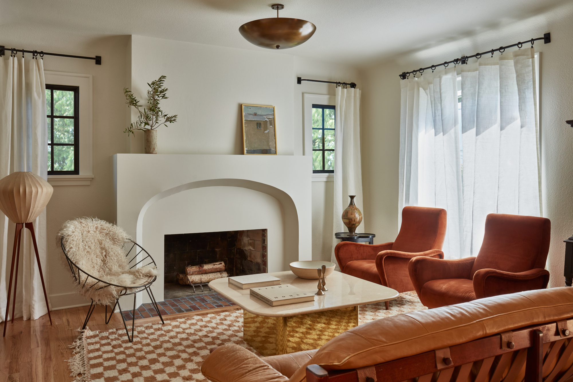
Quiet luxury, according to Washington-based interior designer Lisa Staton, is about ‘always including a mix of new and old, and a range of texture.’ For this living room, she mixed old and new pieces, and commissioned a new stucco chimney breast with an arch form that calls out the home’s Tudor roots. ‘Velvet, brass, stone and leather are often thought of as “luxury” materials, but to us they are also some of the most approachable and inviting,’ she adds. ‘Leather, stone, and brass age beautifully over time, and velvet really beckons you in with its rich feel. We stand behind the use of natural materials whenever possible, and always select pieces that will only look better with age.’
5. This soothing approach that plays with shapely contrast
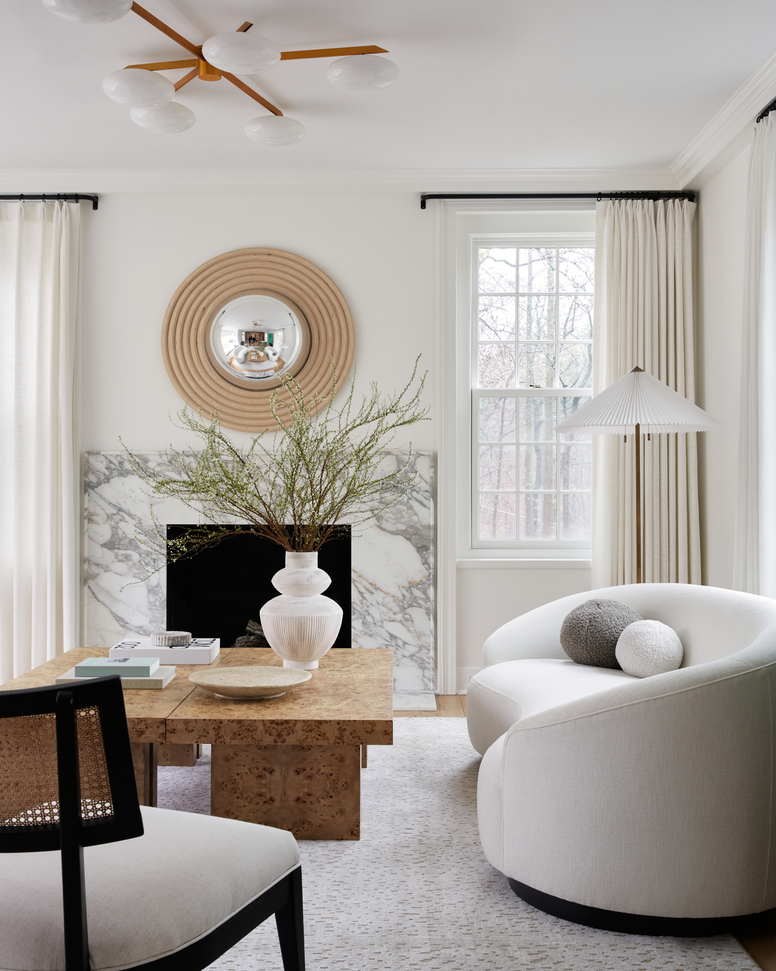
The curved sofa is probably the first piece you spot in this living room scheme by Far Studio – and it’s part of a wider approach to shape that’s all about playfulness. ‘For this room I felt that the sofas were very important in the overall design,’ explains Brittany Hakimfar. ‘I wanted to incorporate layers using different materials and felt that the burl wood coffee tables were a great accent. To properly create quiet luxury you need to play with different shapes and materials.’
6. This living room that elevates natural, rustic textures
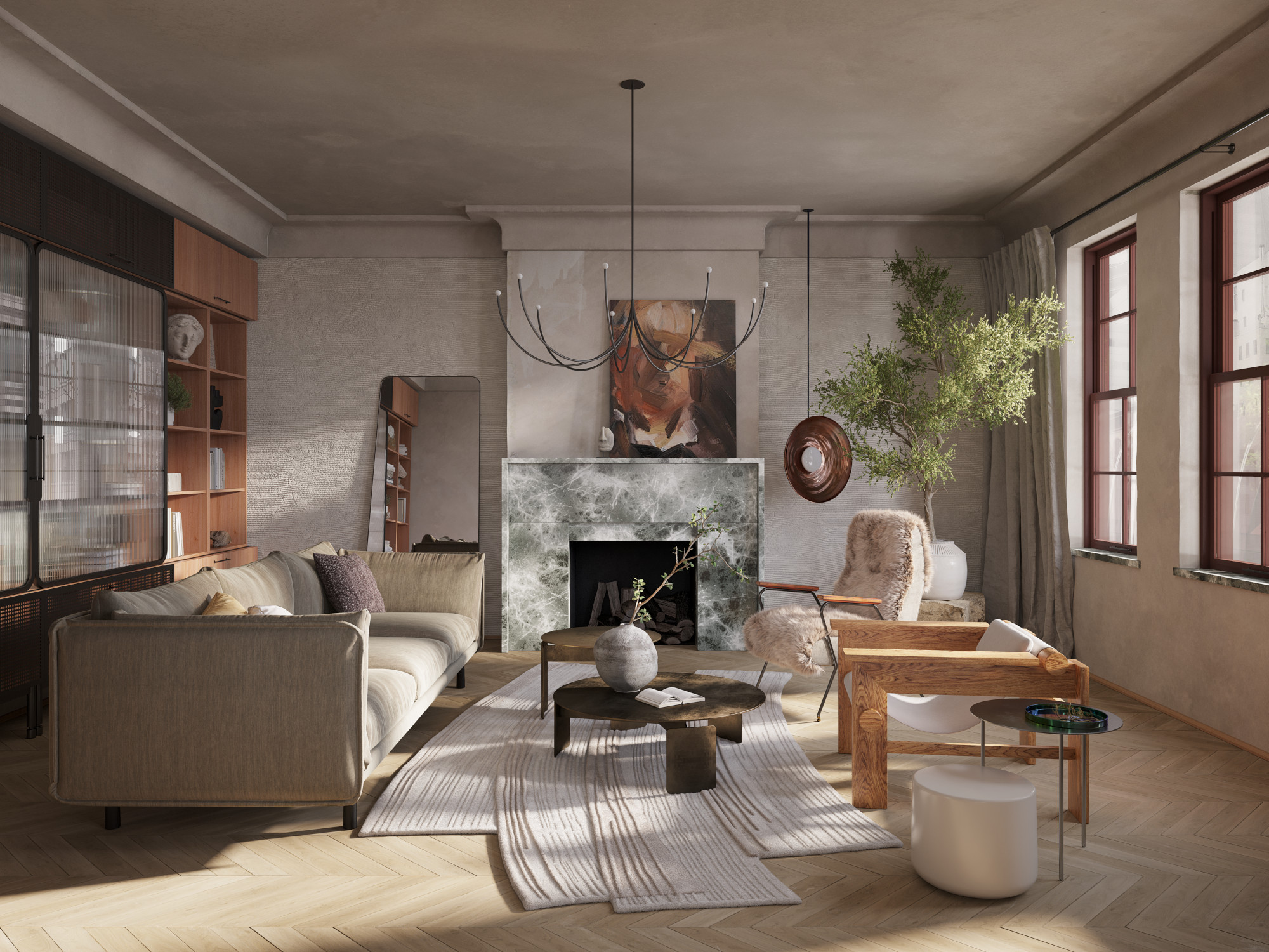
Polished metals have their place in a quiet luxe scheme, but so too do more ‘earthy’ materials – something this scheme by Arsight balances so well. ‘The standout feature of this room is undeniably its melange of textures,’ says Artem Kropovinsky. ‘Each has been chosen for how it complements and contrasts with its counterparts. The hand-trowelled, distressed plaster walls are a nod to rustic charm, yet they present it in a polished manner. This juxtaposition between rustic and polished echoes throughout the room, from the rugged beauty of the stone fireplace to the sleek window sills. The armchair adds a touch of softness, an oasis of comfort in a room of firm structures. As for the natural wood, it provides warmth, grounding the entire design.’
7. This considered design that shows the art of good lighting
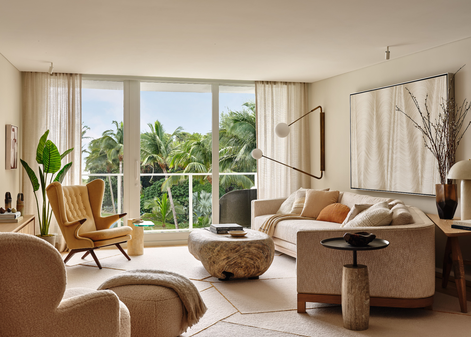
Layered living room lighting is a key component to a quiet luxury interior scheme, setting the mood and helping to highlight a room’s strengths. For this living room by Workshop/APD, a mix of stand-out and subtle pieces work wonders. ‘We’ve used very small, minimalist, functional ceiling light primarily to highlight the art, while other decorative lamps and fixtures play with height and shape to draw the eye and create levels within the space,’ explains Andrew Kotchen. ‘But at the end of the day, natural light is the greatest luxury, so we’re always working to draw it into and around the space.’
8. This pared-back space that allows the art to be front and center
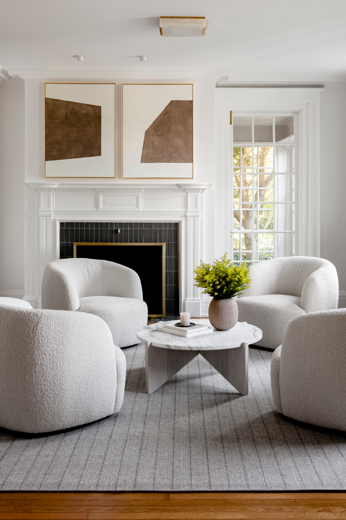
Gallery walls are rarely part of the quiet luxury interiors trend, being as they are a little busier on the eye: instead, it’s all about a curated approach to living room wall art, focusing on a few key pieces and giving them space in a scheme. For Maryland-based interior designer Elizabeth Lawson, the rest of the room can speak to the artwork you choose, and vice versa. ‘The chairs and coffee table both have an architectural quality to them, and the angles of the artwork seemed to speak directly to those lines,’ she says of this space. ‘The warm taupe color in the pieces also complement the brass tones throughout the room.’
9. This grand space with a focus on curated silhouettes
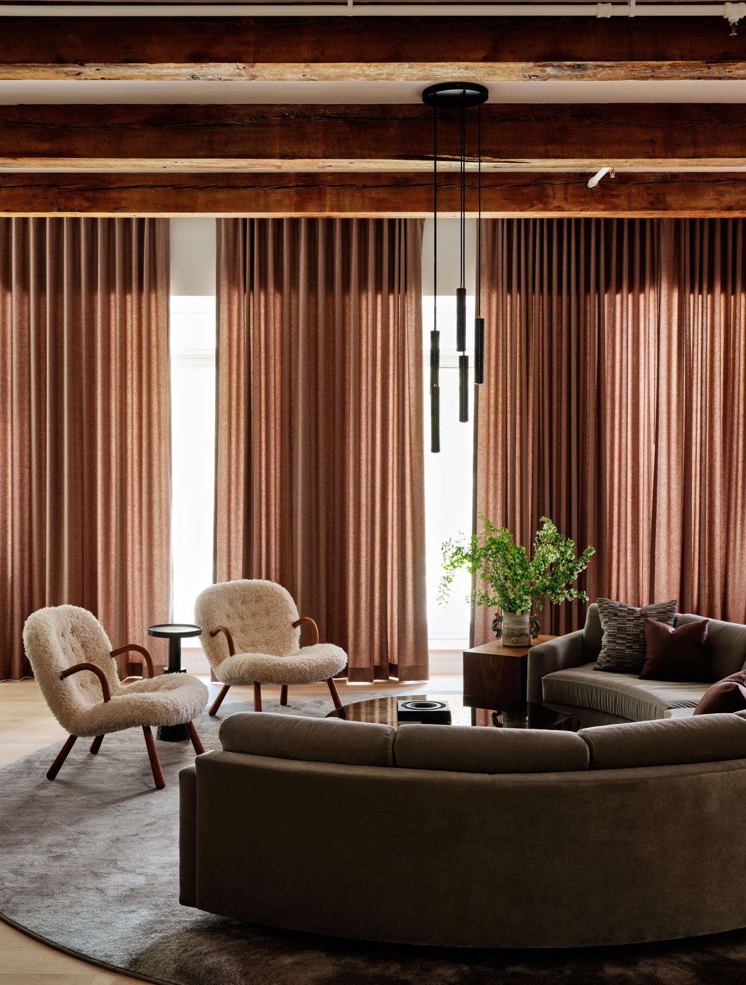
The dramatic curve of the sofa and the height of the drapes help elevate this living room by New York's Studio Todd Raymond to something quietly grand. ‘Quiet luxury means a subtle attitude, aesthetic, and understated silhouettes, and in this room, we focused more on construction, quality, and texture to help achieve this,’ Todd Raymond explains. ‘Simple round shapes help draw focus and center the room. We positioned the sofa to "hug" the view facing the gorgeous planted terrace. It's a subtle effect but paramount in how someone experiences a space.’ For the living room curtains, the studio chose a reddish-brown color in a wool sateen. ‘We knew we wanted to bring in a subtle color for the drama, and wool sateen hangs nicely, helping to emphasize the ripple fold style. It's a simple, repetitive shape that adds to that “quiet luxe” feel.’
10. This cool apartment space that includes nods to nature
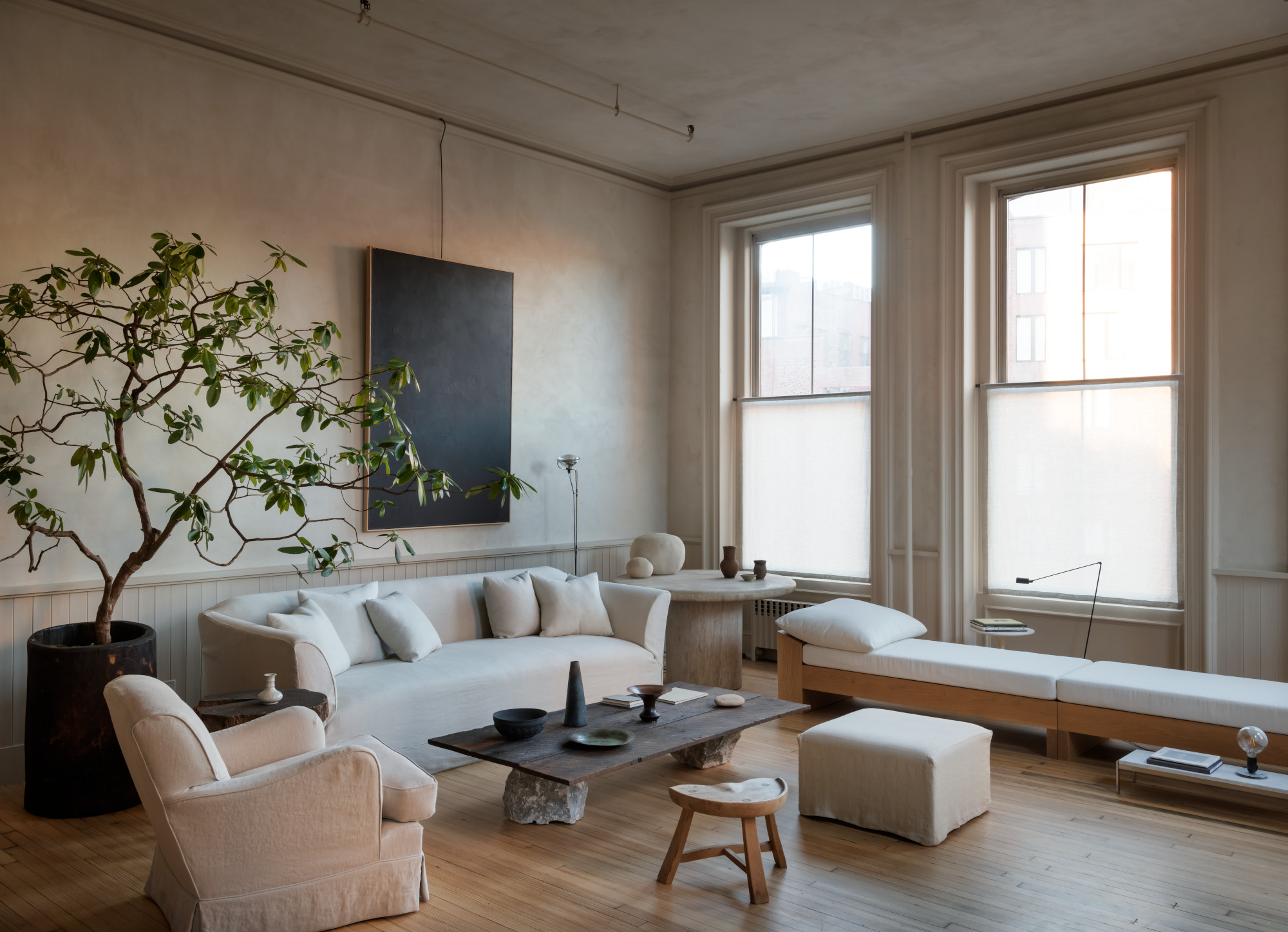
New York superstylist Colin King does minimaluxe interiors so well, so it was only natural that his own New York apartment’s living room makes this list. Paring the space right back allows the focus to be on the original windows, mouldings and flooring – as well as natural touches like the indoor tree. ‘I’ve included several pieces from past projects, plus reminders of my childhood such as rocks [referencing his childhood hobby of collecting stones], which add a natural element to an otherwise urban environment,’ he told us when we toured his home.

Ellen is deputy editor of Livingetc magazine. She works with our fabulous art and production teams to publish the monthly print title, which features the most inspiring homes around the globe, interviews with leading designers, reporting on the hottest trends, and shopping edits of the best new pieces to refresh your space. Before Livingetc she was deputy editor at Real Homes, and has also written for titles including Homes & Gardens and Gardeningetc. Being surrounded by so much inspiration makes it tricky to decide what to do first in her own flat – a pretty nice problem to have, really. In her spare time, Ellen can be found pottering around in her balcony garden, reading her way through her overstacked bookshelf or planning her next holiday.

