Trend Forecasters Have Finally Revealed a Kitchen Look That Will Take Over 2024
Say hello to "rough luxury" - the kitchen trend that combines elegant materials with raw, rustic ones for a look that feels expensive yet friendly, too

The Livingetc newsletters are your inside source for what’s shaping interiors now - and what’s next. Discover trend forecasts, smart style ideas, and curated shopping inspiration that brings design to life. Subscribe today and stay ahead of the curve.
You are now subscribed
Your newsletter sign-up was successful
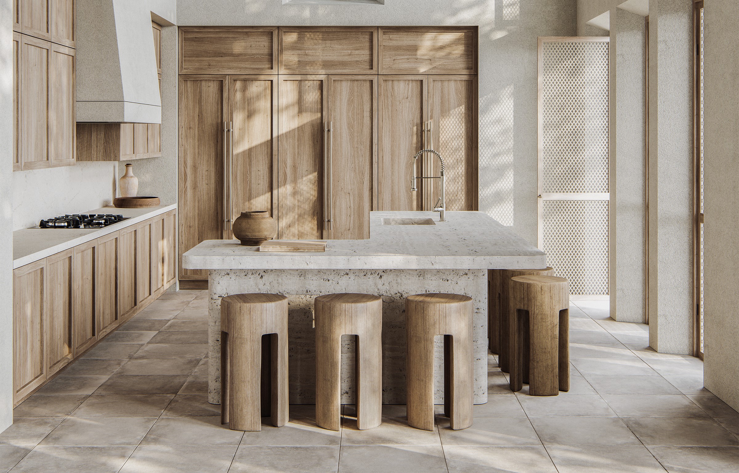
When it comes to kitchen trend, there's a shift in the way people now want this space to look and feel. Luxury and timelessness have become the staples in this busy room where you cook and even socialize. But there's also that need for it to be warm, welcoming, and cozy; somewhere you can spend hours without feeling uncomfortable. This has led to a new trend that experts have now christened as "rough luxury".
This new brand of modern kitchen mixes materials that spell elegance and earthiness. But what does this space look like and feel like? And is it practical? Experts answer all the burning questions.
What is rough luxury?
If you've always found rustic kitchens charming but a bit too raw, then this design trend might be the one for you, as it effortlessly mixes modern and organic in a fresh, welcoming way.
Article continues below'In kitchen design, the interplay of refined and rustic materials creates a captivating visual contrast,' says interior designer Kerrie Kelly. 'Think of pairing materials like marble with distressed wood or quartz with rugged stone...this contrast can evoke a sense of "rough luxury."
'It's all about designing with natural elements and working out how these elements should work in tandem,' says Marie Flanigan, founder of Marie Flanigan Interiors. 'I think the most important part of using rustic materials is balancing them with updated and elevated finishes so that the design does not feel dated.'
What materials can be used to create this look?
1. Steel and wood
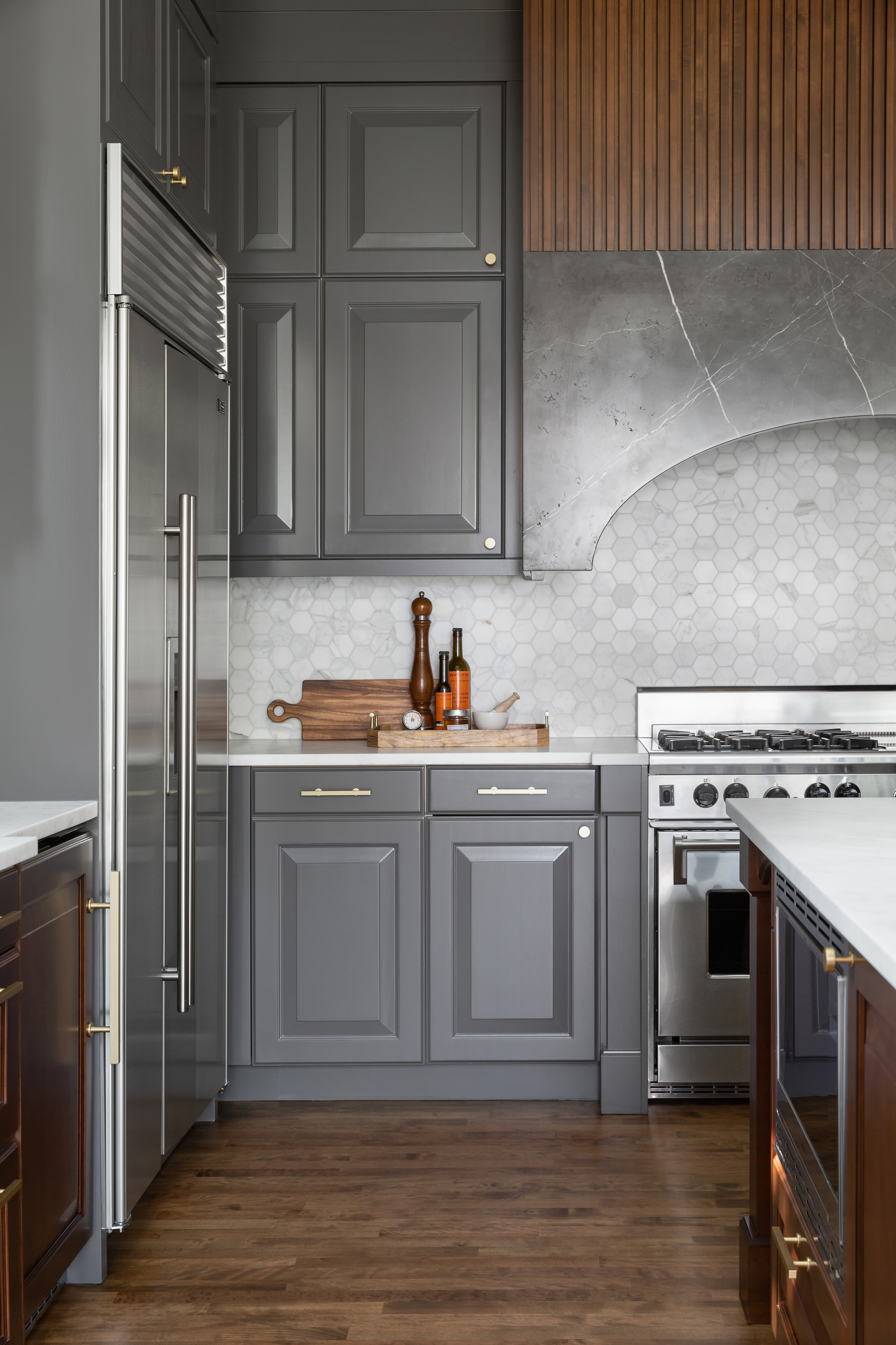
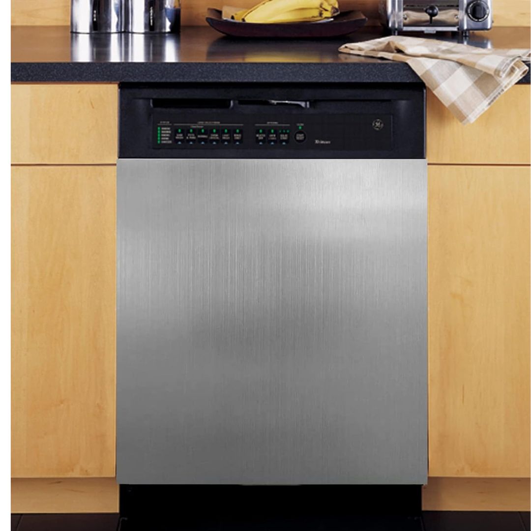
There's been a recent trend of stainless steel kitchens (also seen in David Beckham's kitchen), showcasing industrial, restaurant-like qualities. But if this style feels a bit too cold for you, you could consider mixing in other earthy materials to balance the visuals.
'Think sleek stainless steel alongside warm, natural wood tones to create a harmonious balance in the space,' says Kerrie. 'Hestan appliances, for instance, epitomize the essence of "rough luxury" in kitchen design. Their sleek, high-performance stainless steel and vibrant lacquer-like finishes with their signature Marquis handle bring a refined yet robust quality to the space. Pairing these premium appliances with natural materials like reclaimed wood or textured stone countertops creates a stunning contrast, elevating a kitchen's aesthetic while ensuring top-notch functionality.'
The Livingetc newsletters are your inside source for what’s shaping interiors now - and what’s next. Discover trend forecasts, smart style ideas, and curated shopping inspiration that brings design to life. Subscribe today and stay ahead of the curve.
'Essentially mixing contrasting materials can create an imperfectly luxurious atmosphere in any kitchen,' says Richard Misso, creative director of The Stylesmiths.
2. Marble and limestone
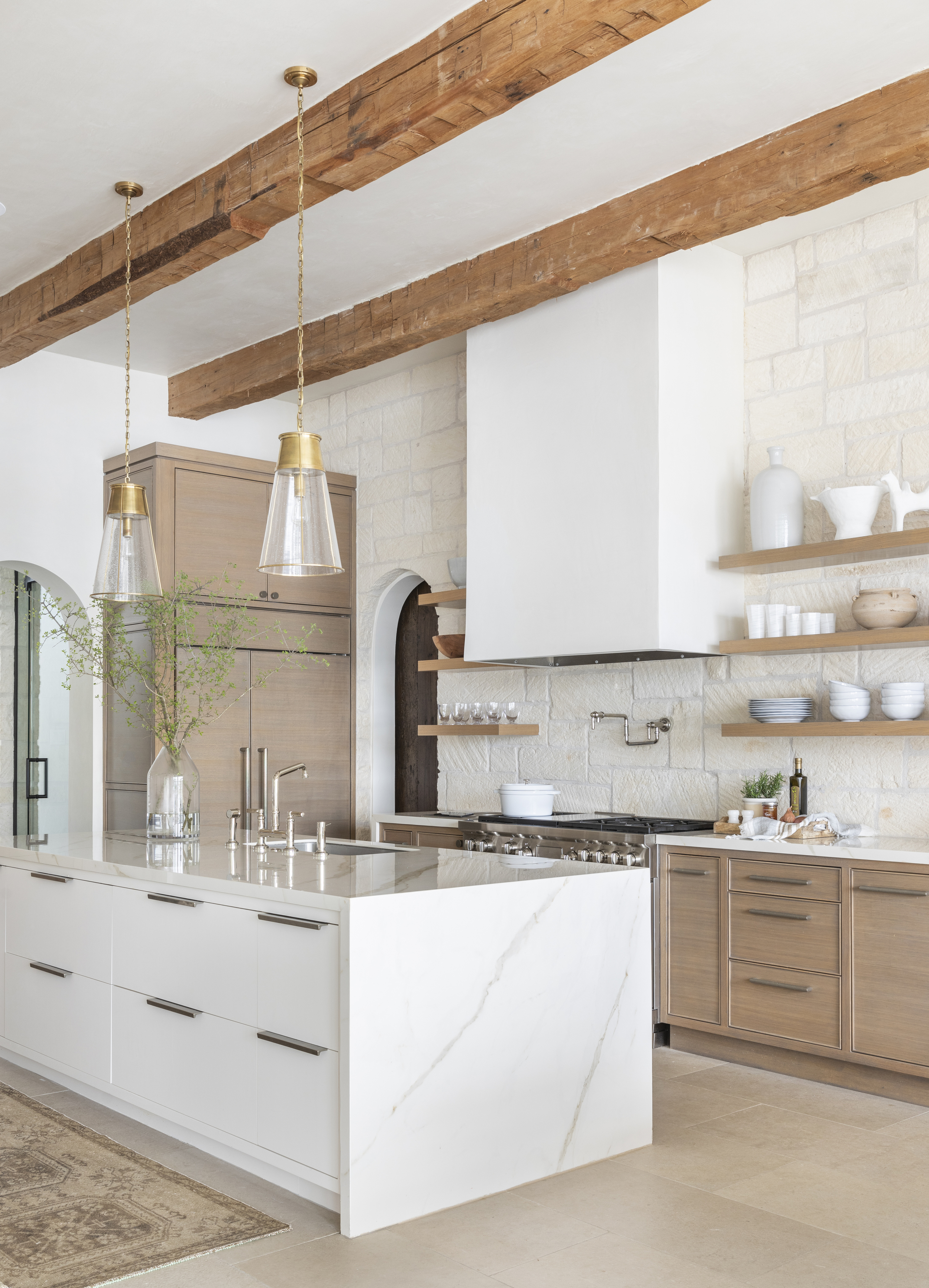
While marble kitchens are a timeless choice, with this material seen in more and more homes, a great way to add an organic charm to the all-white space could be with natural stone.
'In this kitchen, I tried to use materials that are native to the area, like reclaimed wood beams, limestone flooring, an Austin stone backsplash, and white oak,' says Marie. 'The space still feels light, bright, and open. The backsplash is cut to enhance the rough edges of the stone and I love how this texture contrasts the smooth and glossy Calacatta counters. To ensure this new build didn’t feel overly rustic we mixed rift-cut white oak cabinets with a more modern storage and a waterfall edge on the island.'
'As the home is on a lake in Texas, we wanted to make the interior and exterior feel like seamless transitions between spaces,' says Marie
3. Zellige tiles and natural stone

Kitchens with zellige tiles have been gaining momentum lately, as they add depth, texture, and movement to any type of space.
'Moroccan Zellige tiles are hand-made tiles that originated from Morocco, made from a blend of local clay and then glazed and fired, resulting in a surface with various irregularities that give each tile a unique look,' says Richard. 'Applied to walls or as a backsplash, the variety of tone, flatness, depth, and shade is perfect for "rough luxury". Pair it with natural stone such as marble countertops and timber cabinetry.'
4. Vintage lighting with modern hardware
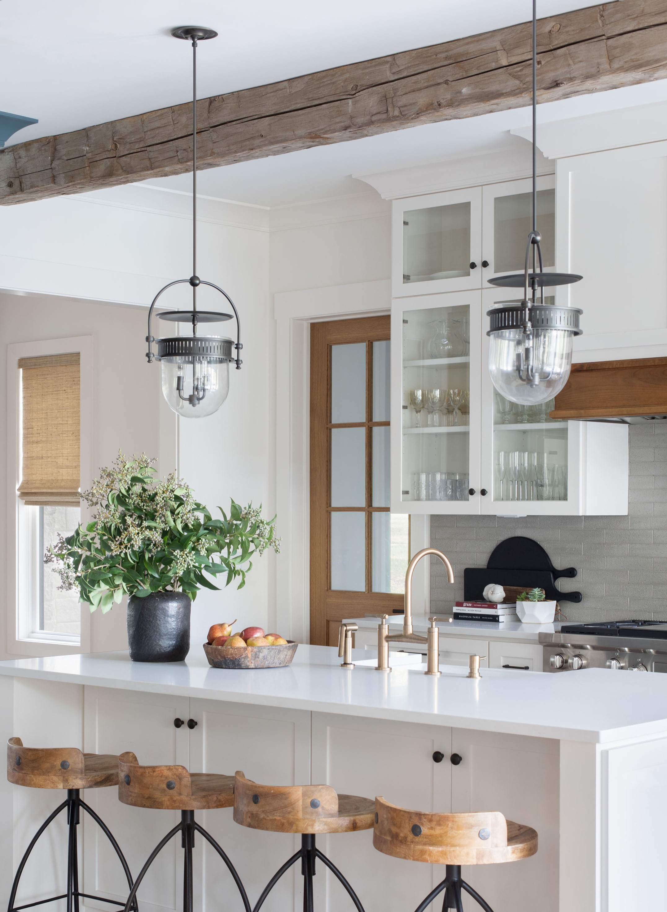
And finally, 'hardware and lighting are always the jewelry of the space and another opportunity to add modern, elevated touches that provide balance to a primitive feel,' says Marie.'
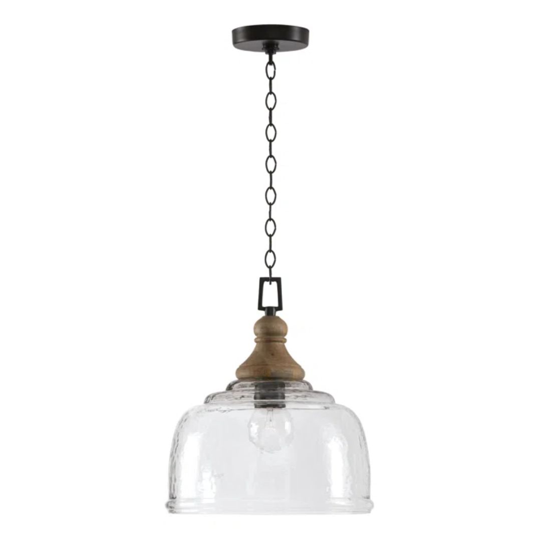
'Vintage lighting is perfect for focal point lighting such as a statement pendant or a wall sconce,' says Richard. 'Modern kitchens can sometimes look soul-less, too shiny and new. Adding some vintage lighting and pairing some of the finishes with the newer items such as brass details in the taps or knobs can establish a sense of belonging or history.
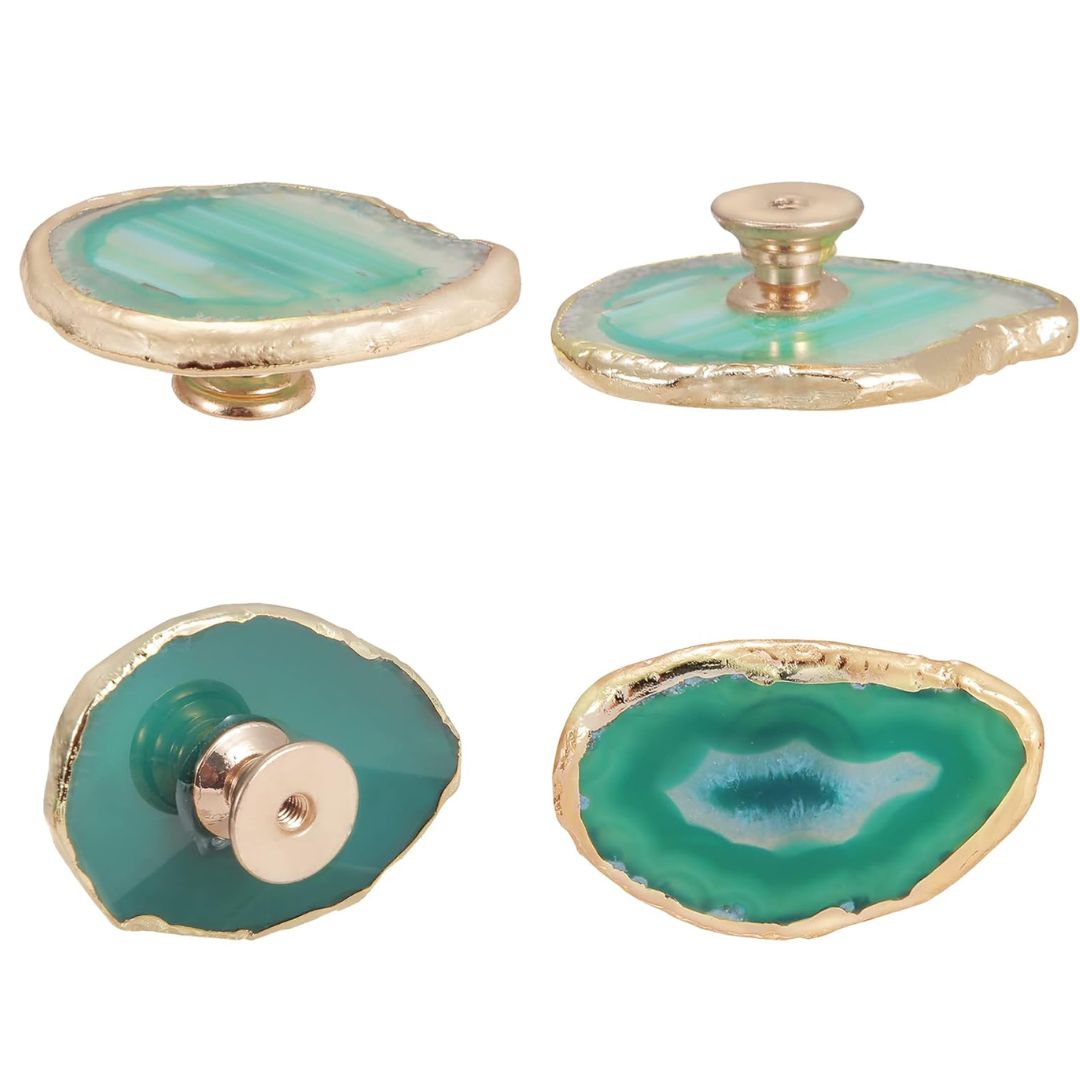
Think brass knobs and taps, cool blue Amazonite pulls, high-shine handles, and more. Look to kitchen hardware trends to see what would look fresh and modern.
Is Rough Luxury a Practical Design Choice?
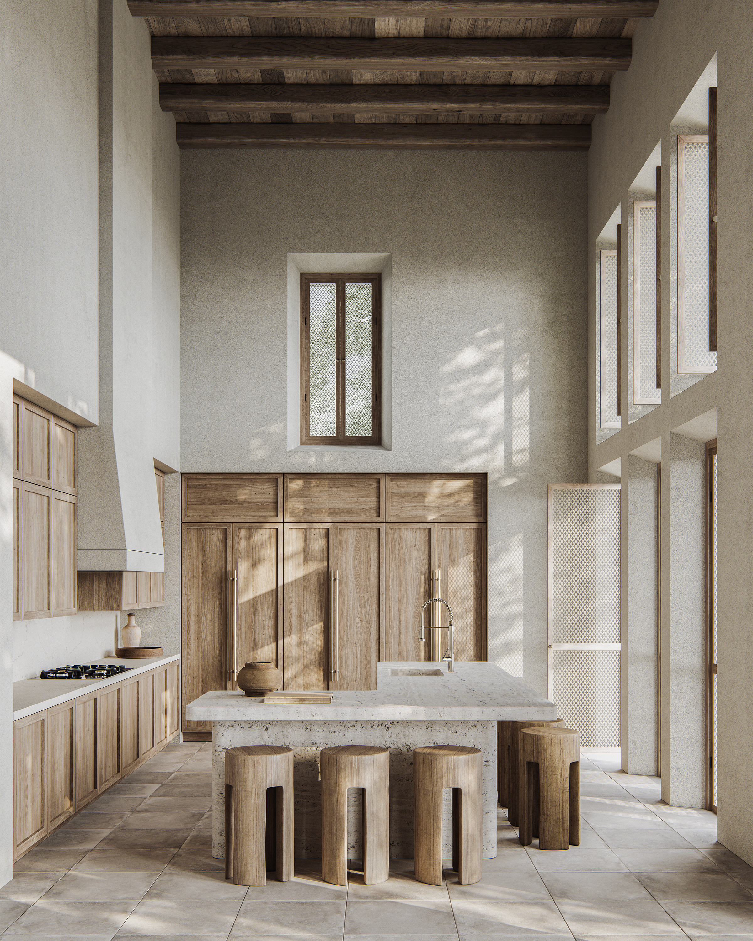
So, the question arises - while the design may feel and look appealing, is it going to become an outdated kitchen trend over time, or does it have the potential to be a timeless one?
'Functionality is key in kitchens,' says Kerrie. 'Blending diverse materials, while visually striking, needs to ensure that they remain practical for their respective purposes. This is possible. For instance, durable and stain-resistant surfaces like quartz or stainless steel can coexist seamlessly with more tactile and textured materials like wood, providing both aesthetic appeal and functional durability for a well-rounded culinary space.'
3 products to incorporate rough luxury in kitchens

Aditi Sharma Maheshwari started her career at The Address (The Times of India), a tabloid on interiors and art. She wrote profiles of Indian artists, designers, and architects, and covered inspiring houses and commercial properties. After four years, she moved to ELLE DECOR as a senior features writer, where she contributed to the magazine and website, and also worked alongside the events team on India Design ID — the brand’s 10-day, annual design show. She wrote across topics: from designer interviews, and house tours, to new product launches, shopping pages, and reviews. After three years, she was hired as the senior editor at Houzz. The website content focused on practical advice on decorating the home and making design feel more approachable. She created fresh series on budget buys, design hacks, and DIYs, all backed with expert advice. Equipped with sizable knowledge of the industry and with a good network, she moved to Architectural Digest (Conde Nast) as the digital editor. The publication's focus was on high-end design, and her content highlighted A-listers, starchitects, and high-concept products, all customized for an audience that loves and invests in luxury. After a two-year stint, she moved to the UK and was hired at Livingetc as a design editor. She now freelances for a variety of interiors publications.
