

However ambitious our paint color plans are, ultimately, what we need is a color that will harmoniously background our lives. A color to cultivate community in the kitchen, or a paint shade to promote better sleep — well, creating sensory-conscious palettes is at the heart of Graham & Brown's new collaboration with The Sensory Home.
Pippa Jameson, interior stylist and creative director of The Sensory Home (an interior brand dedicated to creating sensory-conscious environments), says the idea behind this collection of 16 pigments was born from her relationship with neurodivergence. The goal being to create calm color palettes for those seeking softer and more soothing alternatives to brights.
Though contemporary color trends may point towards bright reds and electric blues, if you're looking for a palette that promises a more restorative and relaxing atmosphere, the Graham & Brown x The Sensory Home collection is one to bookmark.
So, What Are Sensory-Conscious Colors?

The wall color as well as the samples each depict a different sensory-conscious color.
If my degree in fine art and color theory taught me anything, it's that color stimulates emotion and affects how we interact with the space around us. An electric blue may create a fun accent in the living room, but it may not be a tolerable tone for getting a good night's sleep. While everyone has their own sensory preferences, this collaboration's colors are intentionally muted and low in saturation.
Pale blues, natural greens, and earth tones in general are the most common colors among the sensory-conscious group. Pippa Jameson explains to me that the team "approached sensory sensitivity by giving each color a gray undertone, keeping the overall palette soft and balanced. Nothing is too hot or jarring — everything sits in that gentler, shorter wavelength space, which is naturally easier on the eye."
The softness is less distracting without sacrificing saturation and warmth. So first step is to pick paint colors that make you feel calmer, then, build them into a scheme that will work best with the purpose of the room.

Pippa Jameson is an interior stylist, creative director, and author with over 25 years of industry experience. Pippa’s journey, working for several leading UK home publications and a diverse portfolio covering advertising, and editorial work, laid the foundation for The Sensory Home. Pippa's brand is dedicated to enhancing well-being through sensory design, and she has published a book on the topic also called The Sensory Home.
Sensory-conscious colors are about more than just aesthetics. "Life is busy, and our homes should act as sanctuaries — places where we can reset, regulate, and feel supported," says Pippa. "That’s the essence of sensory design."
Iona Graham of Graham & Brown adds that "Color has such a powerful influence on our mood and emotions, so it made sense to build a palette that goes beyond aesthetics."
Each color in the collection was chosen not just for how it looks, but for how it can support the way you want to feel in a space. "That’s why we attached both a narrative and a function to each palette — to help people connect emotionally with their homes," explains Pippa. This kind of sensory design is about using color as a tool for emotional balance, not just decoration.
As part of the collaboration, Sensory Home and Graham & Brown created four palettes, each with four different shades, designed for different situations and settings.
"The Gather, Rest, Focus, and Nook palettes were created to serve as a guide to help people choose shades that reflect our emotional response to color," says Pippa. Each palette is designed to complement a different state of mind, which I've explored in more detail, below.
"NOOK" — For Quiet, Cozy Corners

The image above has Warm Baguette featured in a cozy and subdued living space.
Nook is for all the cozy living room ideas and reading nooks — the places in your home designed for relaxation outside of the bedroom. The colors in this palette are "your quiet retreat," says Pippa. She describes them as, "Muted, cocooning tones that create a sense of stillness and comfort; ideal for reading corners, breakaway zones, or any space designed to reset and restore."
Mossy greens and soft browns make up the base of this palette, and they're best paired with soft textiles and fluffy throws for the ultimate 'nook' style. “As someone who deeply values quiet moments at home, especially in a busy family life, I’m drawn to those muted, cocooning tones, which I then layer with cushions, candles, soft lighting, and all of the other sensory elements,” says Pippa.
Layer the Complete Palette


"GATHER" — For Lively, Social Spaces

Uluwatu is on the walls of this cozy, yet dramatic dining room.
Gather is all about incorporating saturation-rich shades, that are not distracting for the company around you. Pippa says these colors are "all about warmth and connection."
Rich, grounding shades, like deep greens and earthy browns, "help the body feel at ease. They are ideal for living and dining spaces where we come together to connect and share," Pippa adds.
Deep tones are drawn from nature to encourage warmth, social connection, and comfort. The more prominent saturation mixed with subtly makes the perfect backdrop for dining room dinner parties or living rooms with a bit more drama.
Layer the Complete Palette


"REST" — For Relaxation Zones

The back wall of this bedroom feature's Chimney Sweep from the collection to incite deep relaxation.
While darker colors are not always a first choice for a bedroom paint color idea, these shades once again blend the drama with a subtle softness.
"Rest encourages calm and relaxation," says Pippa. Green-gray tones are paired with gentle neutrals to create a soft, non-demanding scheme that helps the mind transition from day to night.
"These shades are perfect for bedrooms and quiet spaces," adds Pippa, creating a backdrop for those calming moments in our sleep sanctuaries; they might even be the answer for how to sleep better.
Layer the Complete Palette


"FOCUS" — To Capture Attention

FOCUS is brought to life in this office by coating the walls in the paint color Breathe from the palette.
Focus is the sensory-conscious color palette that caught my attention the most. In the age of 'work-from-home', I need all the help I can get to focus in my home office. It seems a cool, light blue is one of the best shades to promote productivity.
"Focus is designed to support mental clarity and concentration," explains Pippa. "These cool, balanced shades filter visual noise and help maintain attention, making them perfect for home offices or multifunctional spaces."
Look for cool blues with a hint of a warm neutral tone to create a balance between focus and comfort. "Helping with concentration, regulation, and clarity," adds Pippa.
The best part of working with a soft shade of blue is that there are plenty of colors that go with light blue you can decorate with. You can still incorporate that pop of cherry red while staying sensory-conscious.
Layer the Complete Palette


Our homes are a sanctuary, a personal retreat to reflect our interests and host our lives, but they have also become multi-functional spaces for our work and community.
Every room has a mood and every mood needs a color to match the energy. Don't make the mistake of accidentally picking an unhappy color, instead, sensory-conscious paint colors help you design a home that eases every emotion.

-
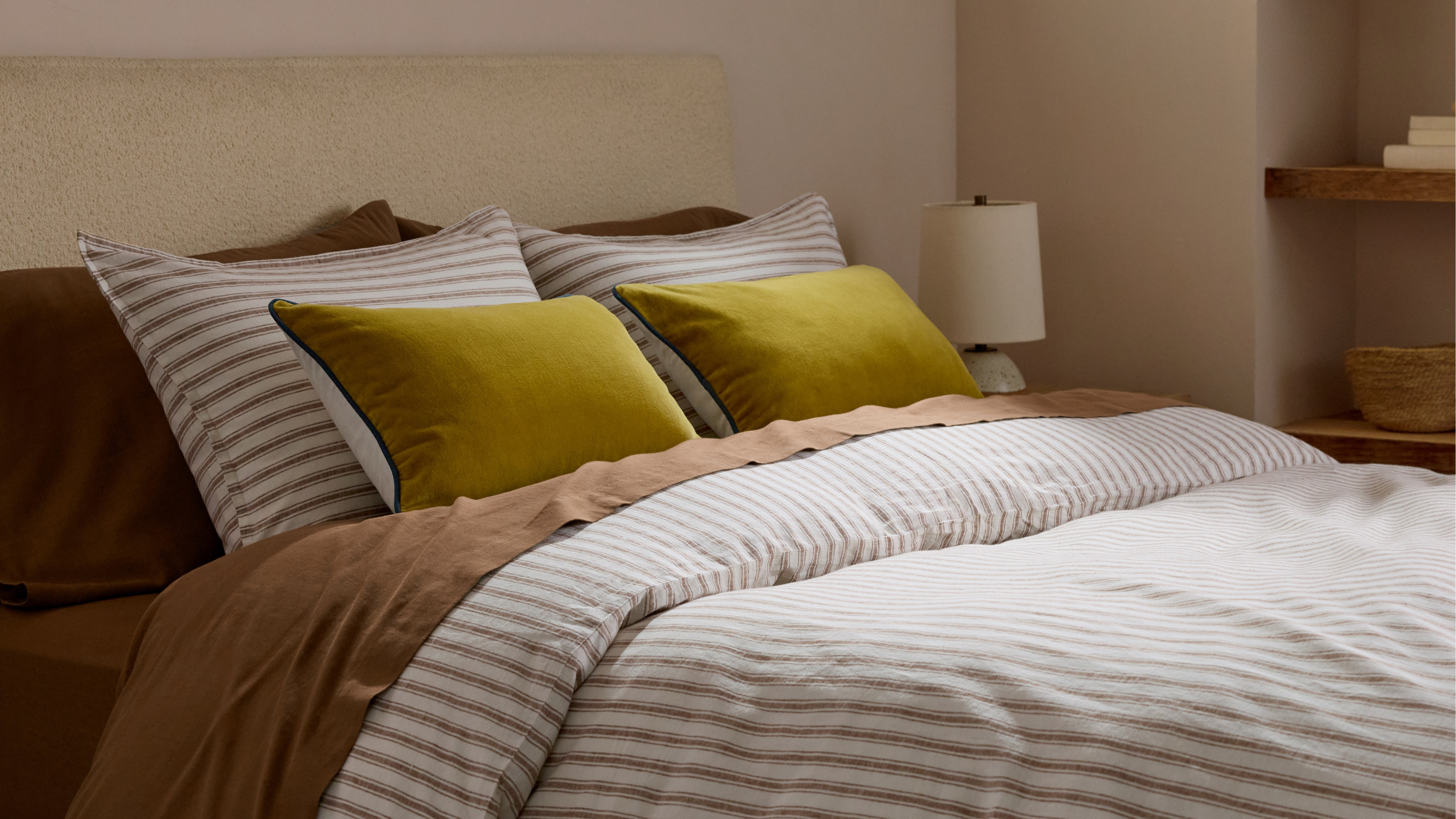 Parachute Just Dropped a Collection at Target and It's A Guaranteed Sell Out
High quality bedding and bath linens just got a lot more accessible. Parachute's signature effortlessly chic style is now available in over 200+ pieces at Target
-
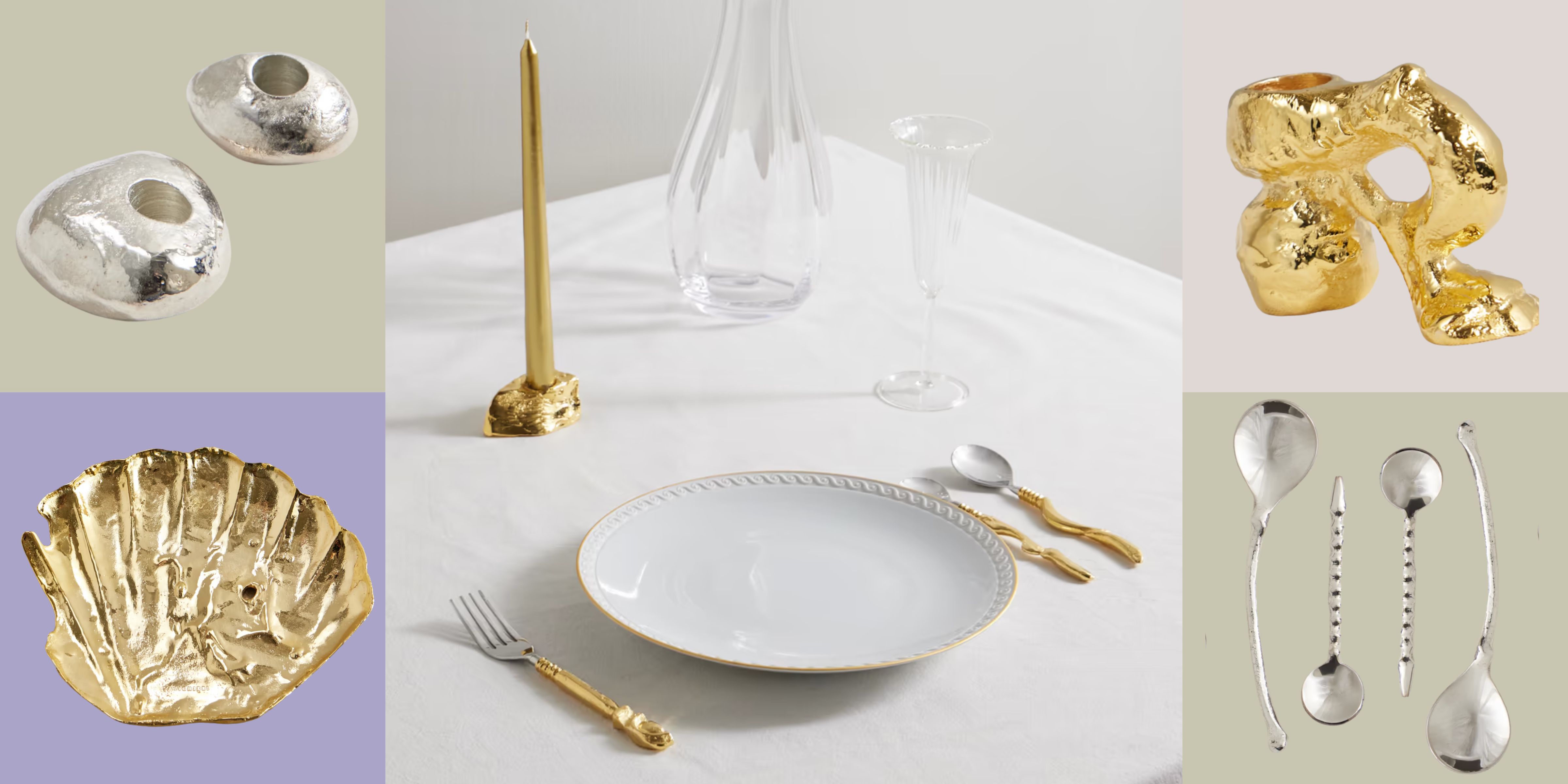 Now Serving: Jewelry for Dinner — Alighieri Brings Its Signature Raw Beauty to the Table
Alighieri CASA is what happens when a jewelry house designs your cutlery — and yes, it’s just as fabulous as it sounds


-
 Everyone's Going Crazy for This One New Shade From Farrow & Ball Online — So What's the Big Deal With 'Scallop'?
It's a classic beige, but with a hint of blush — and it's the shade we're expecting to see in every minimalist's home this year
-
 4 Times Designers Say You Definitely Shouldn't Paint Your Walls and Ceiling in the Same Color
Though spaces washed all in one color are certainly popular right now, it could be throwing off your entire room's aesthetic

