Shelving ideas – how to add personality, style and storage to any room
The best shelving ideas will give any room color, texture and personal, so we asked the experts how to get it right
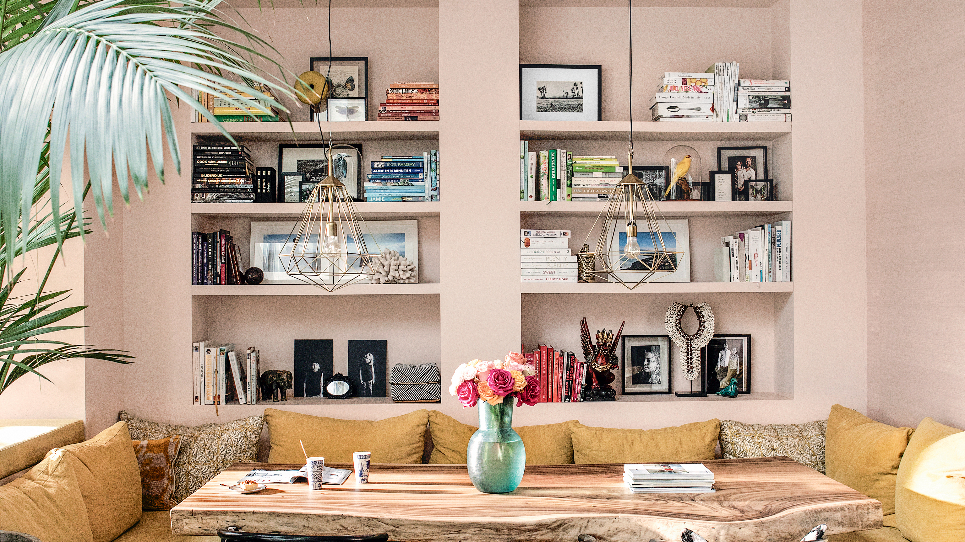

Shelving ideas, whether used in a bathroom or a kitchen for mostly practicality or in a living room or bedroom when you often have the luxury of them being purely decorative, add so much to a space. Color, texture, pattern, personality, even if they are just for storage, they can still bring all of these things into any room.
But decorating a shelf is actually a trickier task than it first seems. Pinterest boards, whole books, an entire Instagram hashtag has been dedicated to curating shelving, and there's an art to getting that effortless, everything just ending up here look. So in order for you to get it right, we've asked the experts for all their best shelf styling tips and brought together all our favorite storage ideas to get your inspired to get your shelves looking at their most beautiful.
1. First think practically
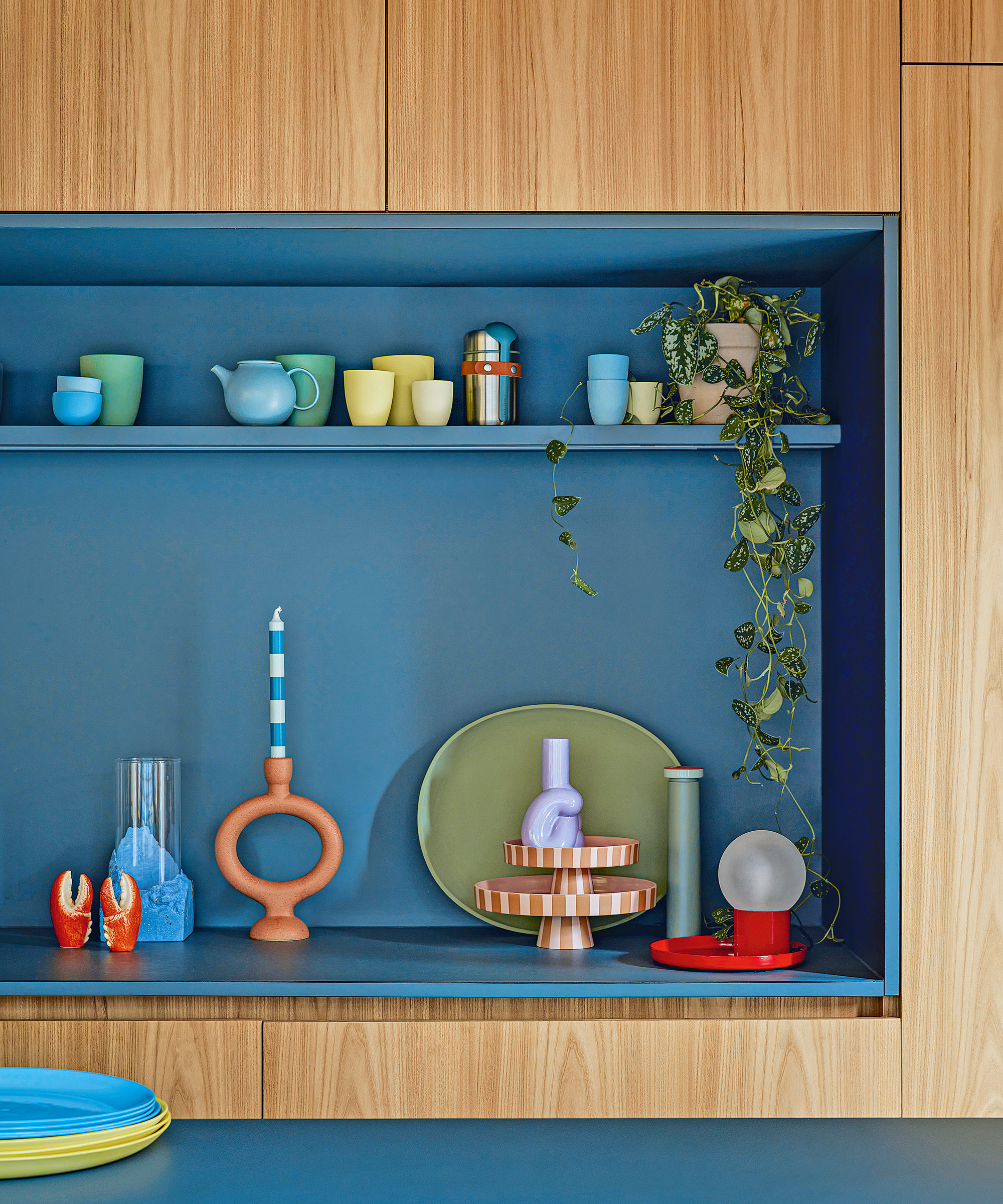
Because there's a strategy to styling the perfect shelf, and you have to consider the space you have before deciding when you want to display. Consider the length of your shelving, the depth, the height between if you have more than one.
As Martin Waller, founder of Andrew Martin advises, 'start by deciding what it is you want to display. Half-empty shelves can often look unfinished or over-styled so begin by gathering together all of the objects you want to include, making sure you have enough to comfortably fill your shelves. This will also give you the opportunity to consider how wide, deep and high your shelves need to be, and which objects will fit where.'
2. Decide on a color scheme for your shelving
Once you have a vague idea of what you want to display, and where you'll display it, color is the next consideration.
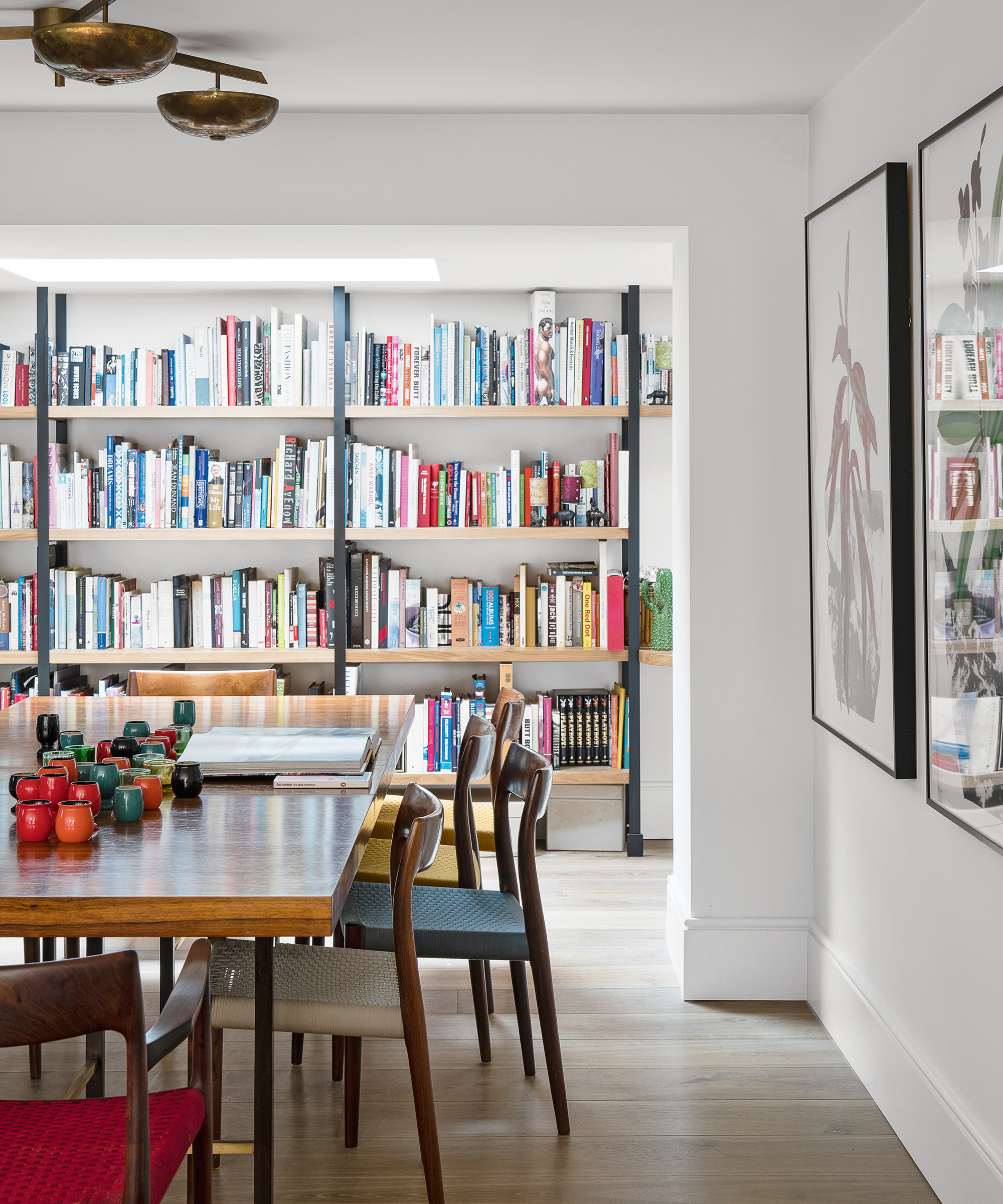
'Use of color plays an important role in the overall look and impact of your shelves. It's worth considering the wider use of color across the whole area rather than in small sections.' explains Andrew. 'For example, arranging a whole bookshelf by the color of the book spines can turn a generic-looking bookcase into a design statement. Alternatively, gathering a collection of objects in a single color across all your shelves is just as effective.'
Now a color scheme might sound restrictive, but it needn't be, if you want to create a really eclectic look with a rainbow of color then go for it, but our only advice is to pick out a few strong colors you can repeat throughout, just to get that cohesiveness that ties the overall look together.
3. Create a cohesiveness between what you display
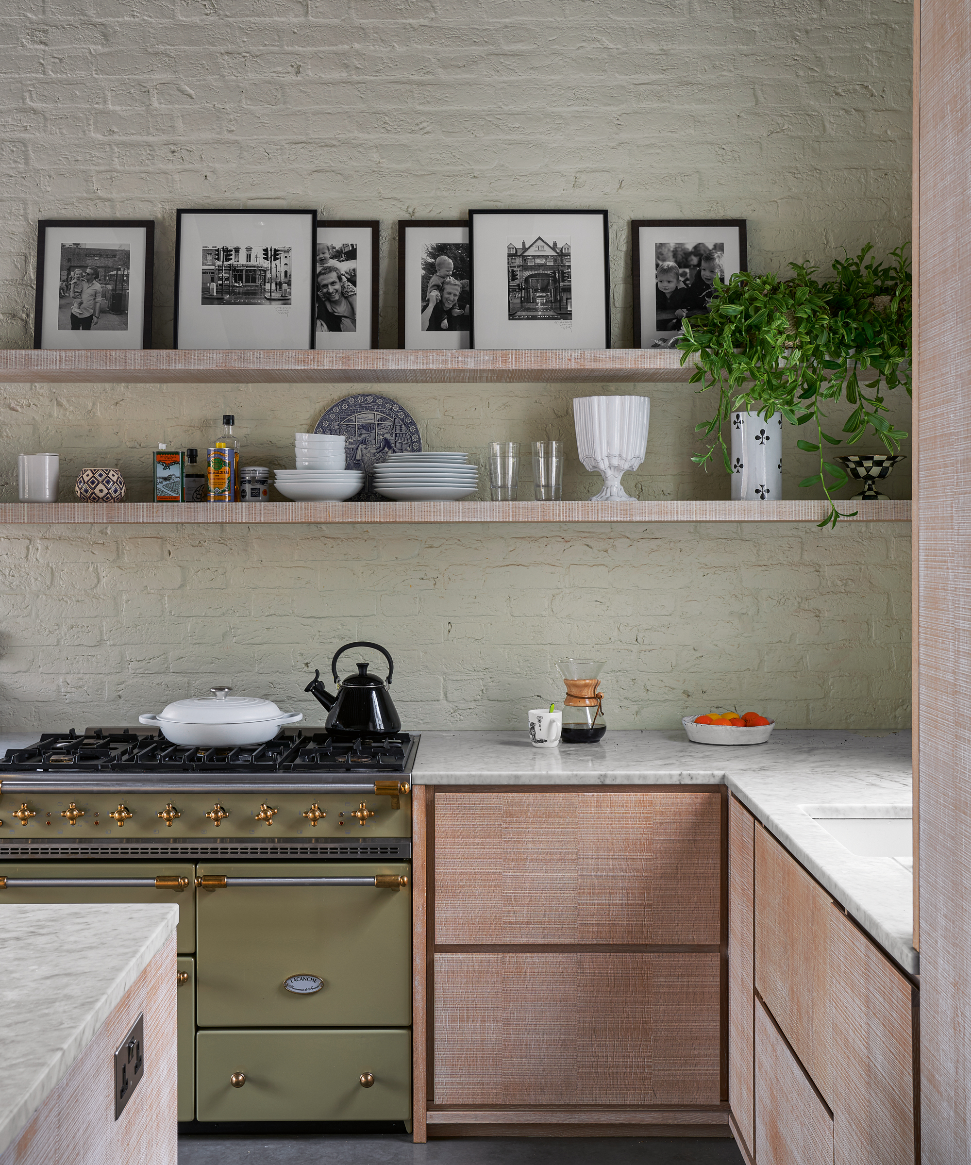
What will really create the cohesiveness, are the links between what you display. Now, these links can be as subtle or as clear as you like, of course, the links will also depend on the room too. Say in a kitchen, it's likely the link will be really obvious, you'll be displaying crockery, or glassware, or cookbooks. Whereas in a living room, the connection might be through prints of photographs with random decor dotted in between. It's this connection that will make your shelves feel more curated and less random.
'The way in which multiple possessions are organized will make all the difference between a calm and curated display and unruly and distracting clutter' explains stylist Sally Denning in her new book Calm. 'Regardless of what they are, if your belongings are arranged in a considered way, pretty much anything can look good.'
'Items that fall into the same category always sit well together. You might have a collection of vintage ceramic jugs, for example, or it might be stoneware pots, glass vases, or black and white photos.'
Take these beautiful kitchen shelving. The collection feels curated as the display is mainly made up of pretty crockery, but not overly so, as there are some different elements in there like the wooden chopping boards and the vase of branches that add different textures and shapes amongst the ceramics.
4. Design shelves that reflect you and your style
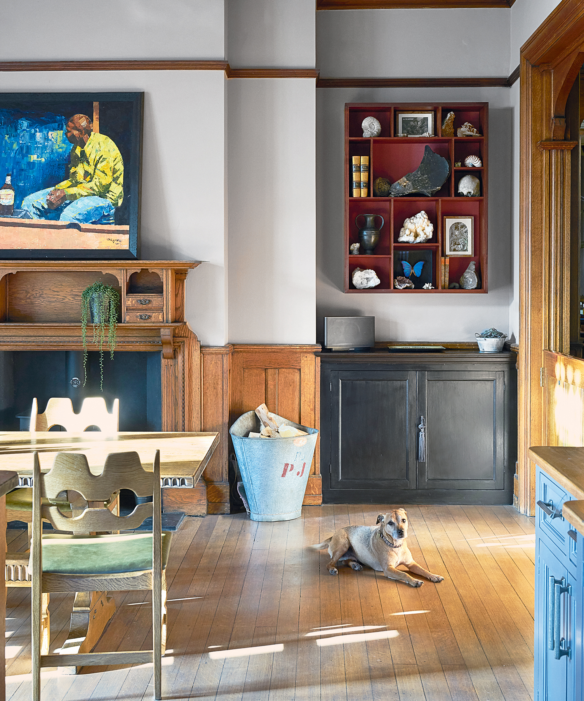
Shelving is one of few areas of your home that is constantly on display, making them a top spot for all your favorite pieces. Fill them with photos, decor and memorabilia that really mean something to you, collections that have value and don't just look pretty on a shelf.
'Don't give up valuable real estate in your home for things that aren't special to you and your family – fill it with meaningful things, memories, items collected on vacation, things gifted or passed down through your family. They don’t need to be expensive, but they need to be meaningful.' suggests designer Sabrina Albanese.
And if you do want to add new pieces to your collection, shop secondhand before you buy new, for decor that's going to add a load of character. 'Collect things with intention, look at antique shops or flea markets, second-hand stores. And be sure to find different shapes, lots of different textures and colors.'
5. Create balance with varying heights and shapes
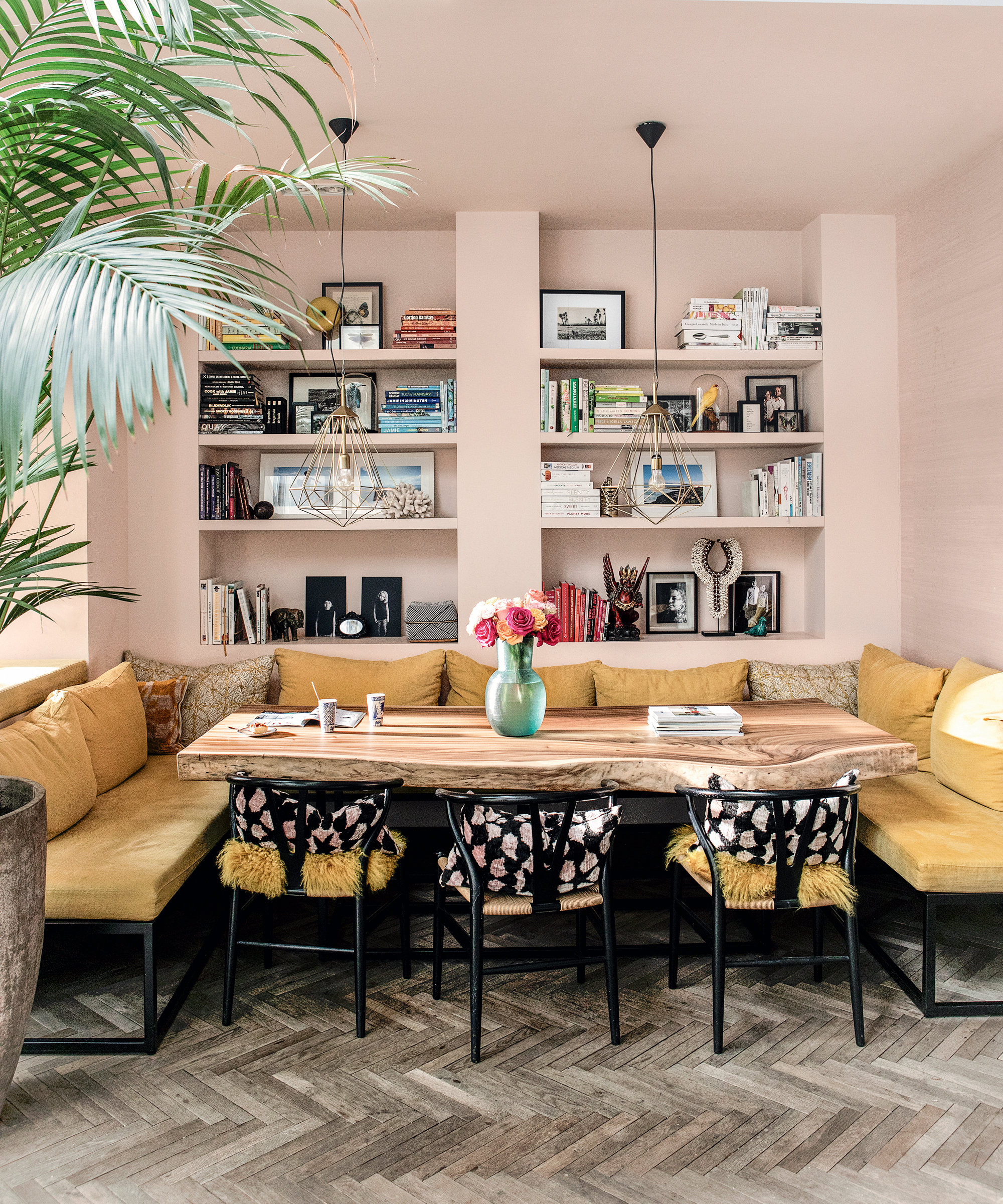
While we do love a bookcase filled to the brim with vertical spines, it doesn't have much variation. If you want to create shelving that has intrigues and draws you in to discover the display, you want variation. Variation in height and variation in shape. The ideal is to look at your shelves and see very few straight lines or repeated shapes but to have a balanced overall.
These lovely living room shelves are the perfect example. There's a real mix of heights, textures, and shapes, and yet the prints that run through give the shelves some structure without looking overly curated. And note how the books sit both vertically and horizontally, it might not feel all that natural to lay a pile of books on their side on your shelves but break the mold and try it, it can add character and quirk.
6. Group in odd numbers
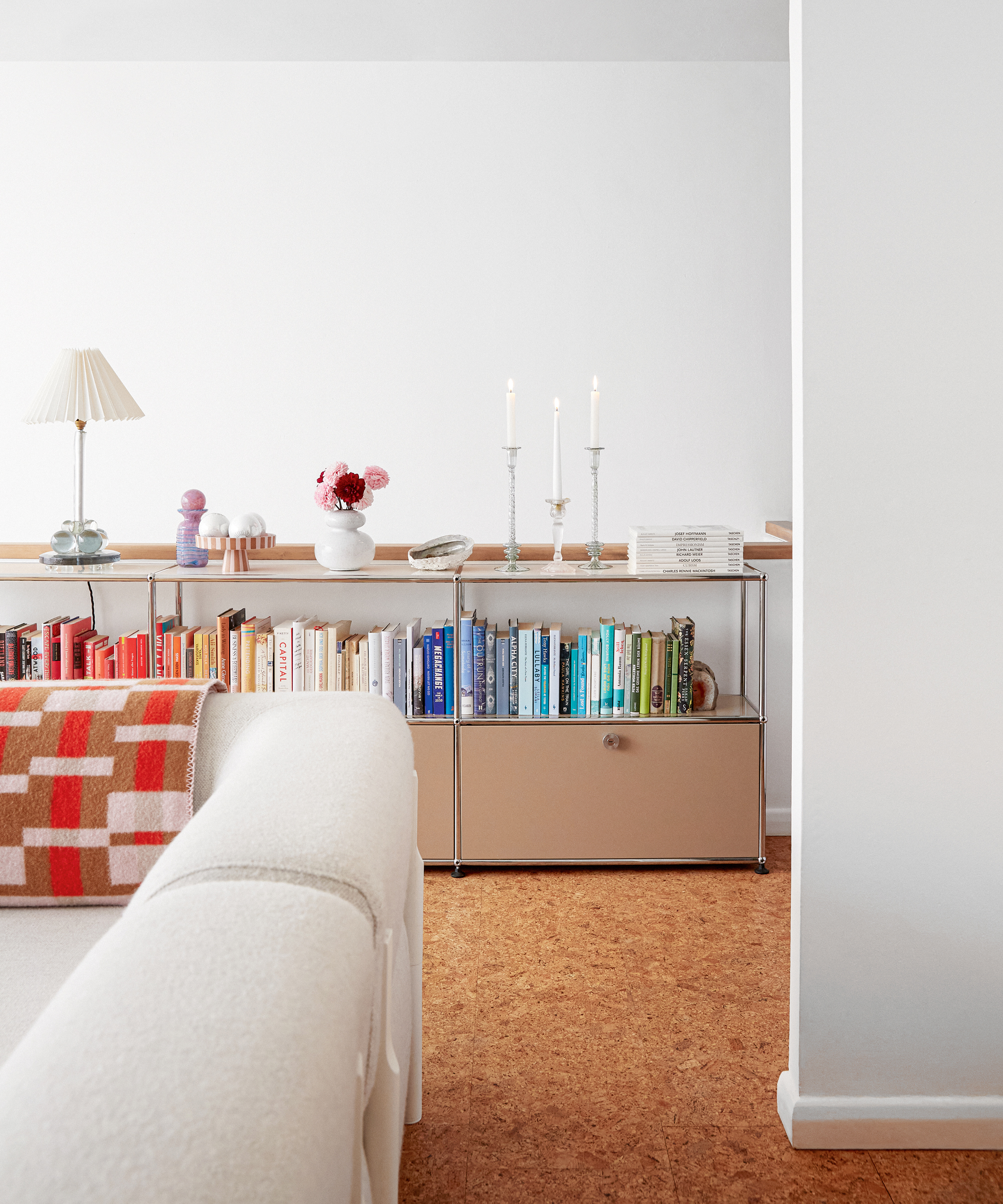
It's interior design 101, grouping things in threes, but it's an old age rule for a reason. And it's not set in stone that it should just be three objects is more about sticking to odd numbers. According to the 'Rule of Three', odd numbers are more pleasing and memorable when we see a collection of items in an odd number it forms less of a straightforward pattern in our brains and we are forced to look harder, and consider more so we focus of the display for longer.
So it therefore makes sense when styling a shelf that you stick with odd numbers. As Sally says 'Grouping items in threes – pots, paintings, books – in threes is a fail-safe stylist's trick but you can experiment with larger collections on open shelves to create a beautifully balanced installation.'
7. Remember to include negative space
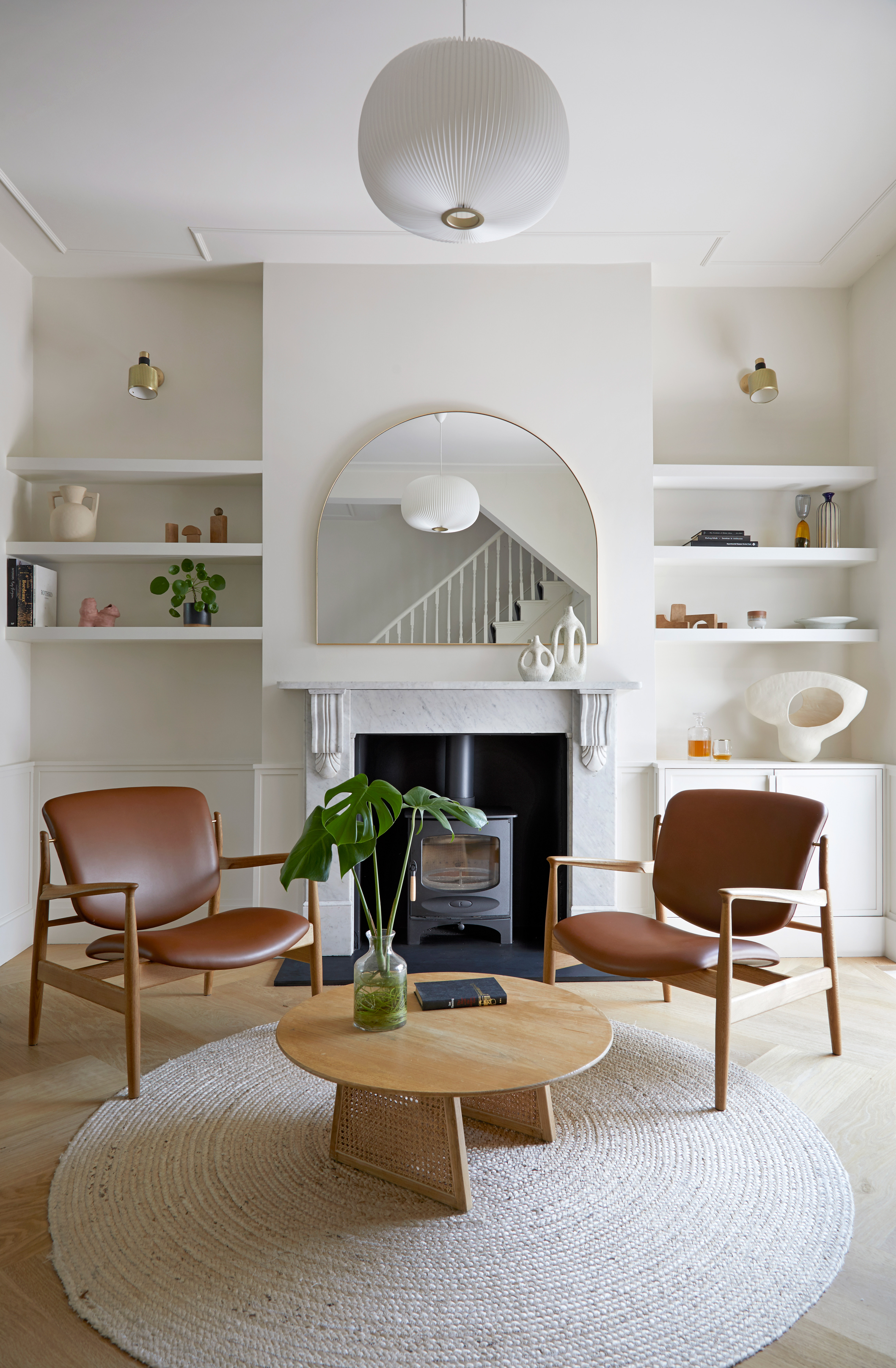
Don't be tempted to overcrowd your shelves, even if you are after that eclectic vibe, there's a fine line between eclectic and cluttered. The key to keeping on the right side is negative space. You should always incorporate gaps in your displays, whether that be between objects or between the tops of shelving, you should be able to see some blank spaces.
'When it comes to shelf displays, the space between your objects is just as important as the space itself.' says Livingetc editor Pip Rich. 'Too often I've crammed all my favorite things in a row and it just looks like clutter. Stand back, remove a couple of pieces and take note of the shape of the air around your display. It sounds, well, airy-fairy, but that contour you create is where the magic happens. As a guide, I'd suggest a minimum of two inches between each item.'
8. Use picture ledges when space is tight
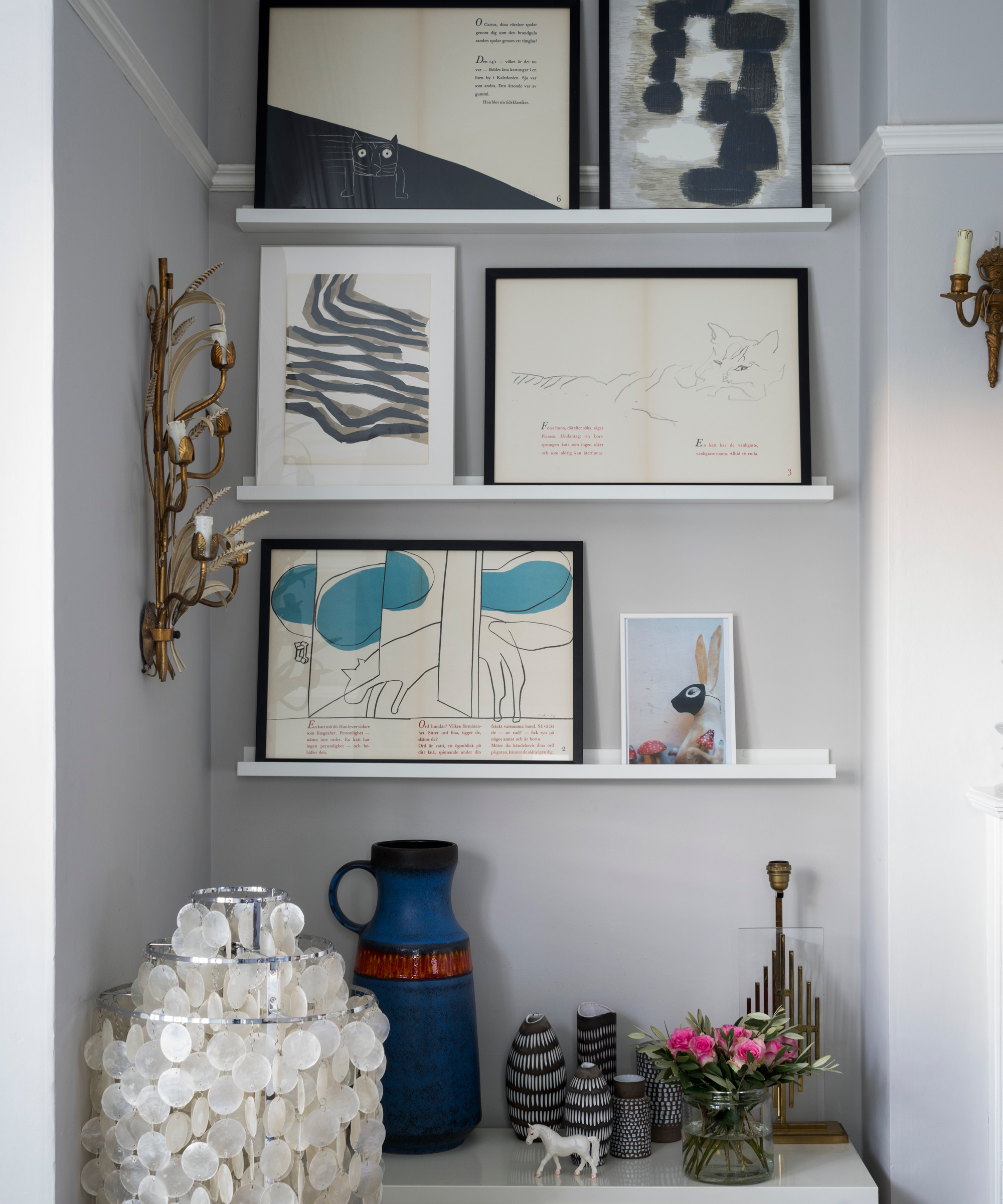
When space is tight, say in a shallow alcove or when you don't want your shelves to protrude too much into the room, picture shelves make for great alternatives to traditional floating shelves. They are of course designed for prints but often you'll find they are deep enough to add small decor items too like bud vases or books.
To create a display that has intrigue, it's all about sizes, again unless you want a sleek more minimalist look, avoid creating any lines with your pictures. Everything should sit at a different level – it's a bit like the rule of three, it gives the eye more to look at and you have to spend time taking it in. You could also add extra texture, color, or pattern by layering your frames slightly too, just be sure to leave some of that all-important negative space somewhere along the shelf.
9. Incorporate a shelf above a backsplash
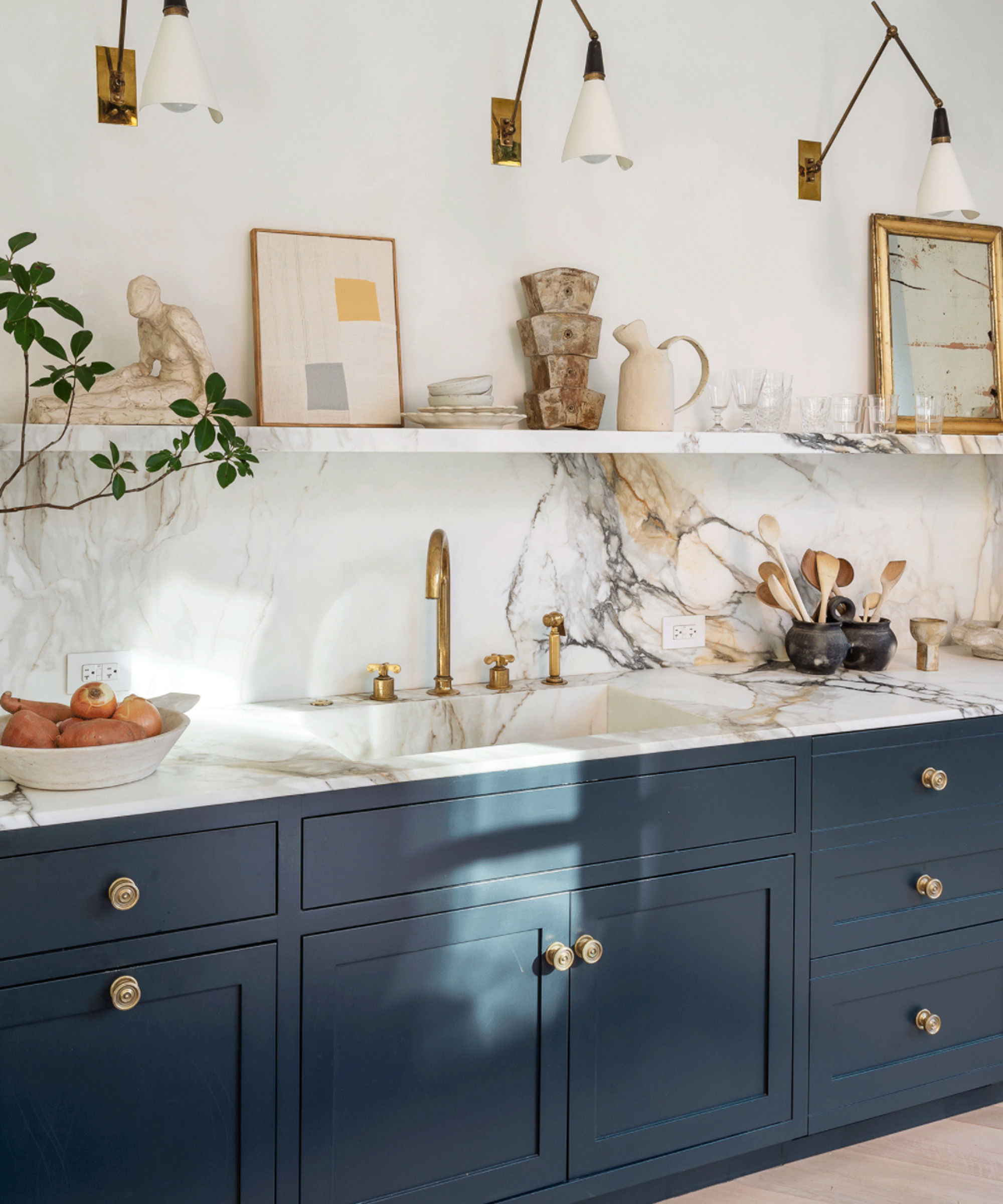
A narrow shelf that runs along the top of your backsplash, not only looks really sharp but can be a practical addition to your kitchen too, adding kitchen storage as well as a place to create displays. Kitchens can be such tricky spaces to add real personality as they are by nature such practical spaces, but a shelf allows you the space to bring in pieces you wouldn't necessarily find in the kitchen like prints, paintings, house plants, vases, sculptures, etc.
We love how this shelf almost blends into the backsplash, being made from the same dramatically veined marble it creates such a cohesive look, so doesn't look too fussy or cluttered, despite the display.
10. Keep it simple

If you like a clean, minimalist look, you can still style shelves so that they fit with a more pared-back aesthetic. To achieve this 'opt for a restricted color palette to maintain a calm vibe, but mix and match different sizes and add texture with vintage or handmade pieces.' explains Sally Denning. 'Stack kitchen or glassware on shelves or color match spines of books. Less is more as the saying goes, so if you are unsure, leave it out.'
In this neutral living room, the shelves don't distract from the calming scheme, the mix of blacks, whites, greys, and creams all fit perfectly. The color palette may be limited but you still get all those lovely textures and shapes from the well-thought-out mix of plants, vases, and books.
Be The First To Know
The Livingetc newsletters are your inside source for what’s shaping interiors now - and what’s next. Discover trend forecasts, smart style ideas, and curated shopping inspiration that brings design to life. Subscribe today and stay ahead of the curve.

Formerly the Digital Editor of Livingetc, Hebe is currently the Head of Interiors at sister site Homes & Gardens; she has a background in lifestyle and interior journalism and a passion for renovating small spaces. You'll usually find her attempting DIY, whether it's spray painting her whole kitchen, don't try that at home, or ever-changing the wallpaper in her entryway. She loves being able to help others make decisions when decorating their own homes. A couple of years ago she moved from renting to owning her first teeny tiny Edwardian flat in London with her whippet Willow (who yes she chose to match her interiors...) and is already on the lookout for her next project.
-
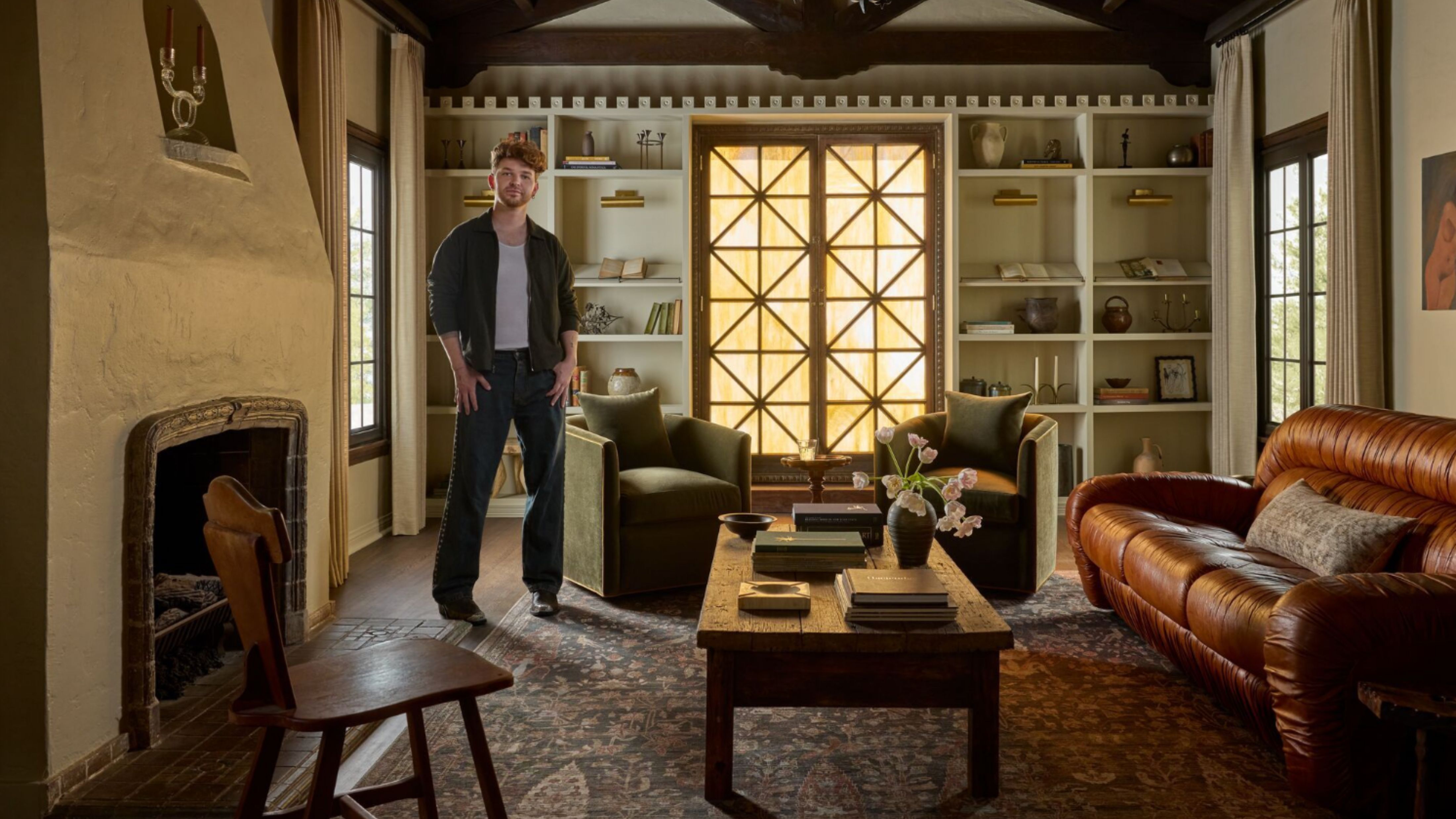 Lone Fox's Drew Michael Scott Drops a Vintage Capsule with Joon Loloi (And Some Seriously Good Tips For Thrifting Antiques)
Sourced straight from one of the world's biggest antique shows, Drew shares how to stay sane, cut through the noise, and score what you actually want
By Julia Demer Published
-
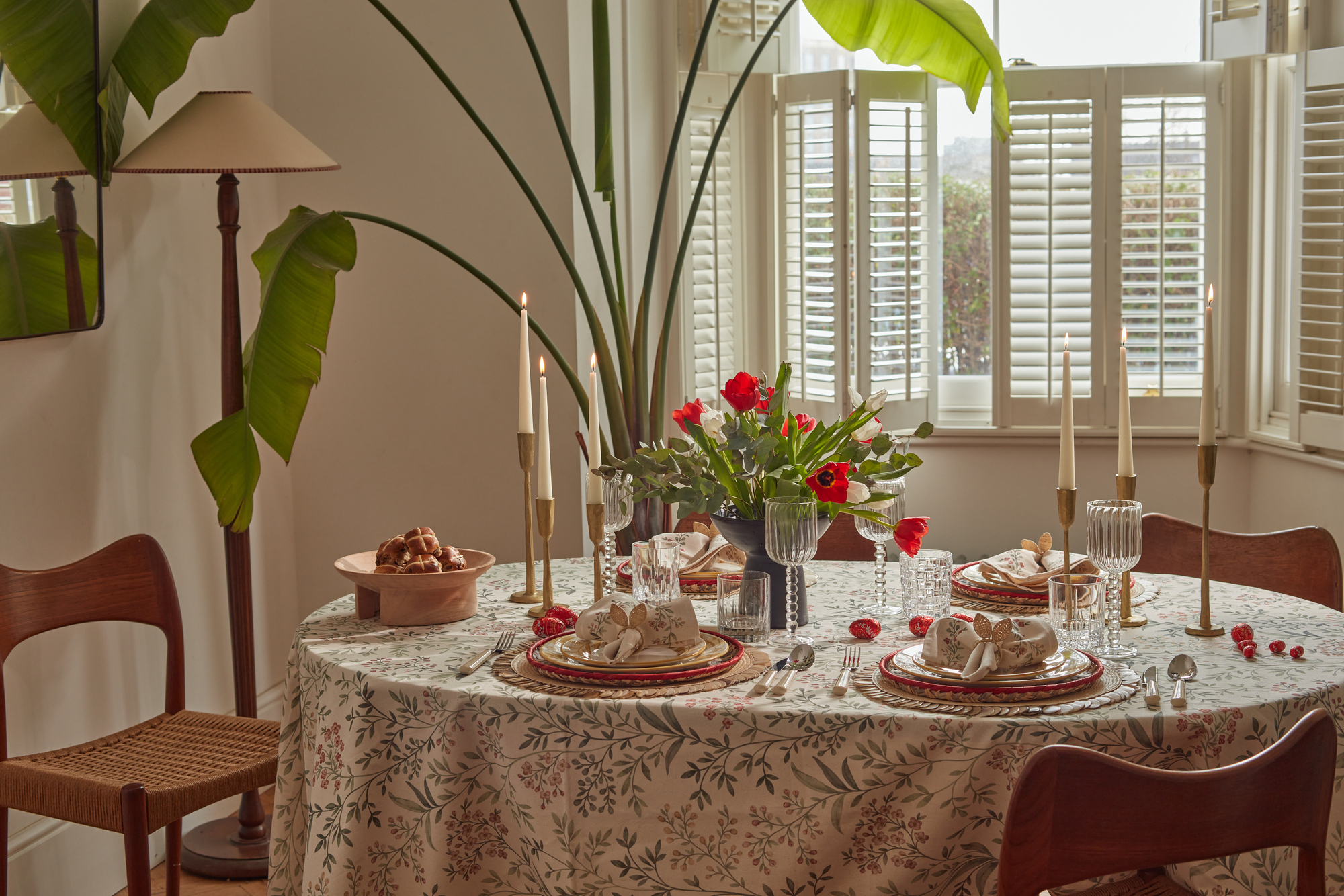 9 Easter Table Decor Ideas to Plan Now for Perfect Tablescapes This Season
From centerpieces and color schemes to tablecloths and seasonal themes, let these designer-approved ideas inspire your table styling this Easter
By Lilith Hudson Published