I thought I was over shiplap bathrooms, but these 10 spaces have convinced me they can be both timeless and on-trend
Shiplap bathrooms aren't a new phenomenon, but whether you're looking for classic or something a little cooler, they still have plenty to offer
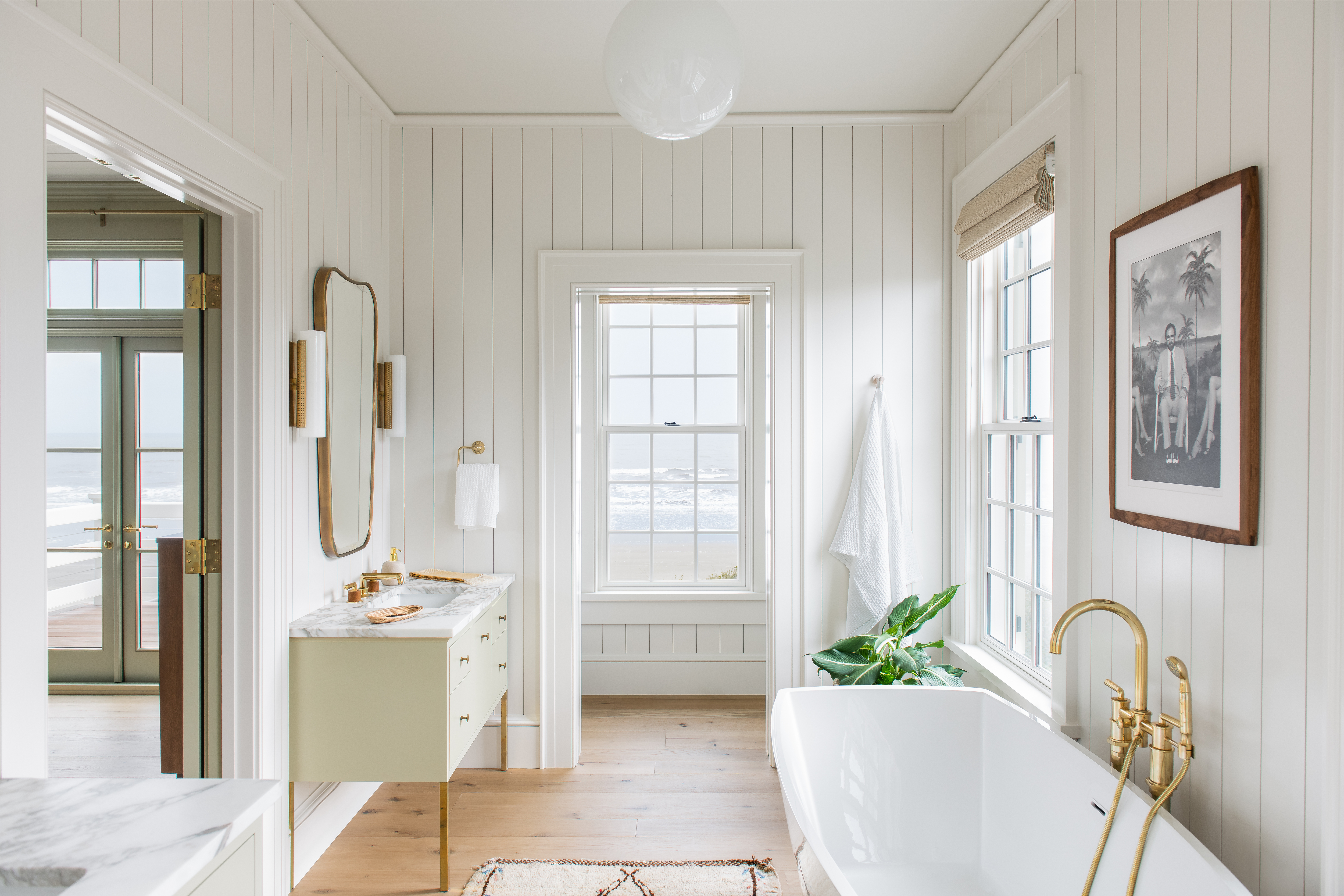

Shiplap has become a popular choice for bathrooms in recent times – so much so that it has become a bit of a design cliché. For some people, that's fine, but don't discount shiplap just because it's been used extensively in other people's homes. After all, a few good shiplap bathroom ideas will give you a new perspective on how to use this architectural feature in fresh, unique ways.
Whether installed on all walls and ceilings or as an accent feature, the look of these wooden slats is eye-catching. While traditionally this feature was seen more in modern farmhouses or coastal homes, today it fits perfectly into transitional, traditional, and sometimes even modern homes.
With that in mind, we asked some of our favorite designers who love to use shiplap how they use it in a modern bathroom. Take a look and get inspired.

Aditi is an experienced homes writer and editor. She has written hundreds of articles for various international titles helping readers make the best home design choices, and spends her days interviewing interiors industry experts to bring the latest ideas to her readers. For this piece she spoke to the world's best designers to find out interesting ways to use shiplap in bathrooms.
10 shiplap bathroom ideas for the coziest space
Wondering what's shiplap? This is a board milled with a halved groove called a rabbet. The edges of the board connect perfectly together, one on top of the other, leaving a distinctive reveal line between the boards. While shiplap is not a new, cutting-edge addition, when it comes to interior paneling, shiplap continues to be the hottest thing going.
One thing to note is that shiplap is different from tongue and groove paneling, where the tongue of one board fits inside the channel of the adjacent board. The latter provides a tighter seal and less of a visible line between boards.
A timeless bathroom trend, shiplap, surprisingly can be modern, industrial, and traditional, and can offer a smart combination of warmth and durability to the interiors.
1. Embrace the natural beauty of wooden shiplap
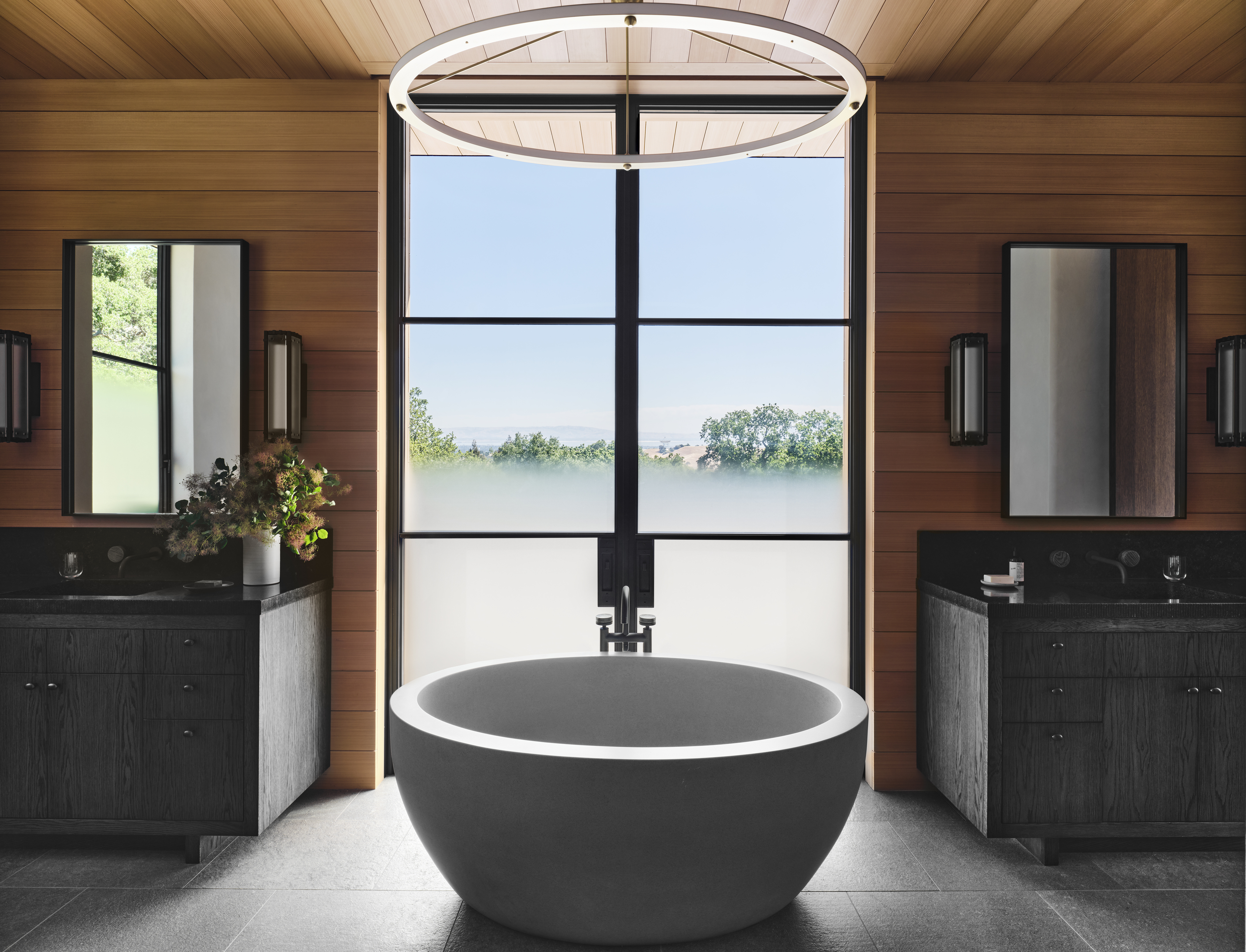
Transitional bathrooms are all about breaking set rules and seamlessly melding opposing design styles. In this bathroom by NICOLEHOLLIS, it’s all about clean lines-meets-old style; classic-meets-chic. The shiplap walls and ceiling in light wood create a cottage-style vibe, but the modern tub, the mirrors, and the sleek light above break the traditional look.
Shiplap is mostly pine or cedar, but it can be found in many other types of wood as well. Stained shiplap has a more earthy, natural feel, and can be further stained in dark, rich tones or a lighter shade.
While deciding how to remodel a bathroom into a transitional one, remember to keep traditional furnishings or elaborate or highly embellished accents at bay. Also, avoid super trendy decor. It should feel elegant and sophisticated.
This oval tub has a modern, sculptural presence, and can add an understated, refined look to the bathroom.
2. Create a beach vibe with soft blue shiplap walls
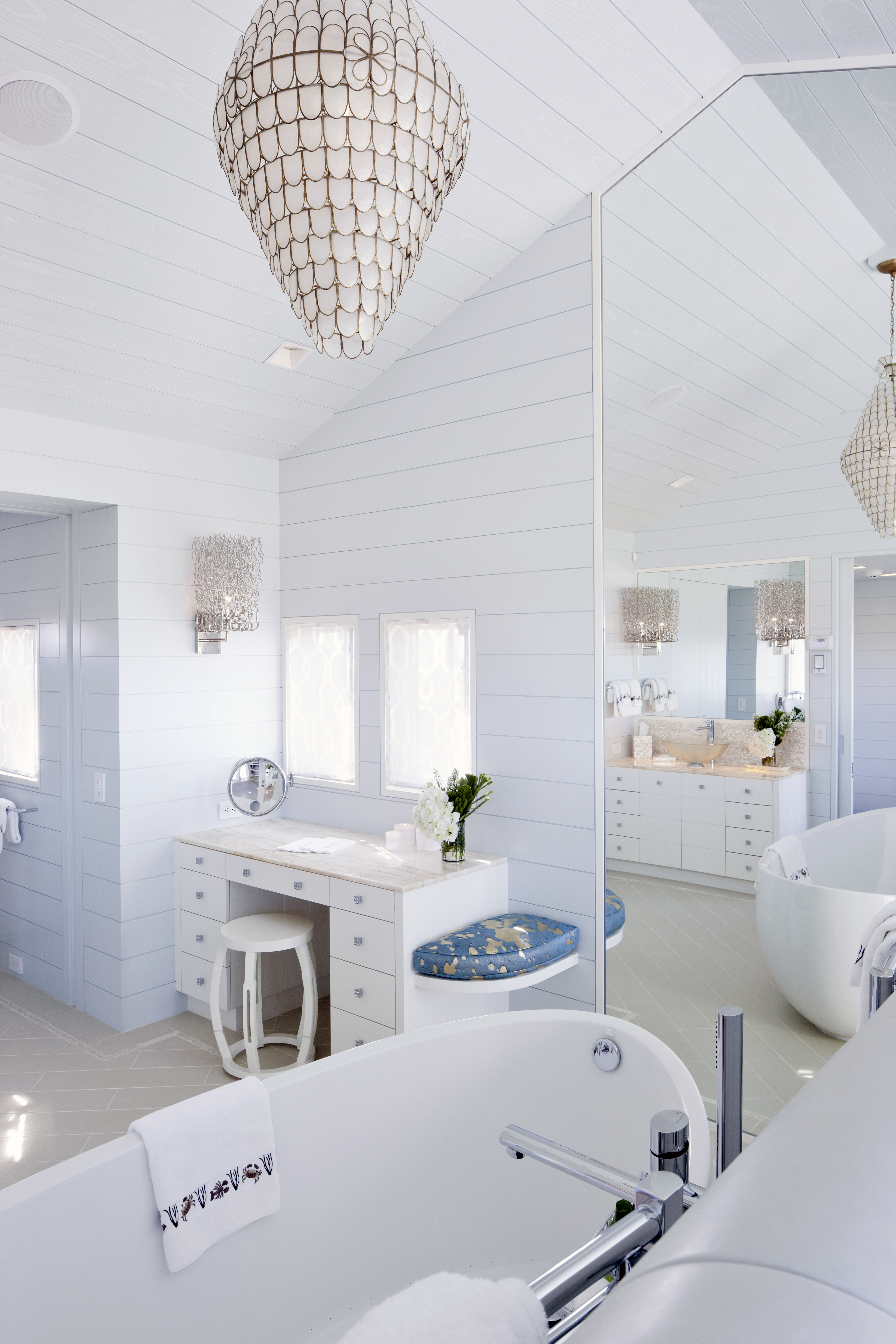
While shiplap is most often seen in white, it doesn’t mean you can’t paint it any color your heart desires. Color-drenching bathroom wall paneling and a ceiling will create a cocooning effect.
'The inspiration for this project was the seaside environment and the vernacular architecture of the area,' says Wendy Valliere, founder of Seldom Scene Interiors. 'By painting the shiplap we set a clean stage for a modern bathroom that stayed historically and stylistically true to the house. The warmth of the wood can be felt through the paint. It’s both fresh and rustic at once.'
This fresh mid blue is a calm, relaxing tone and works especially well in low lit rooms. It can be used on walls and woodwork.
3. Contrast shapes and colors with linear shiplap
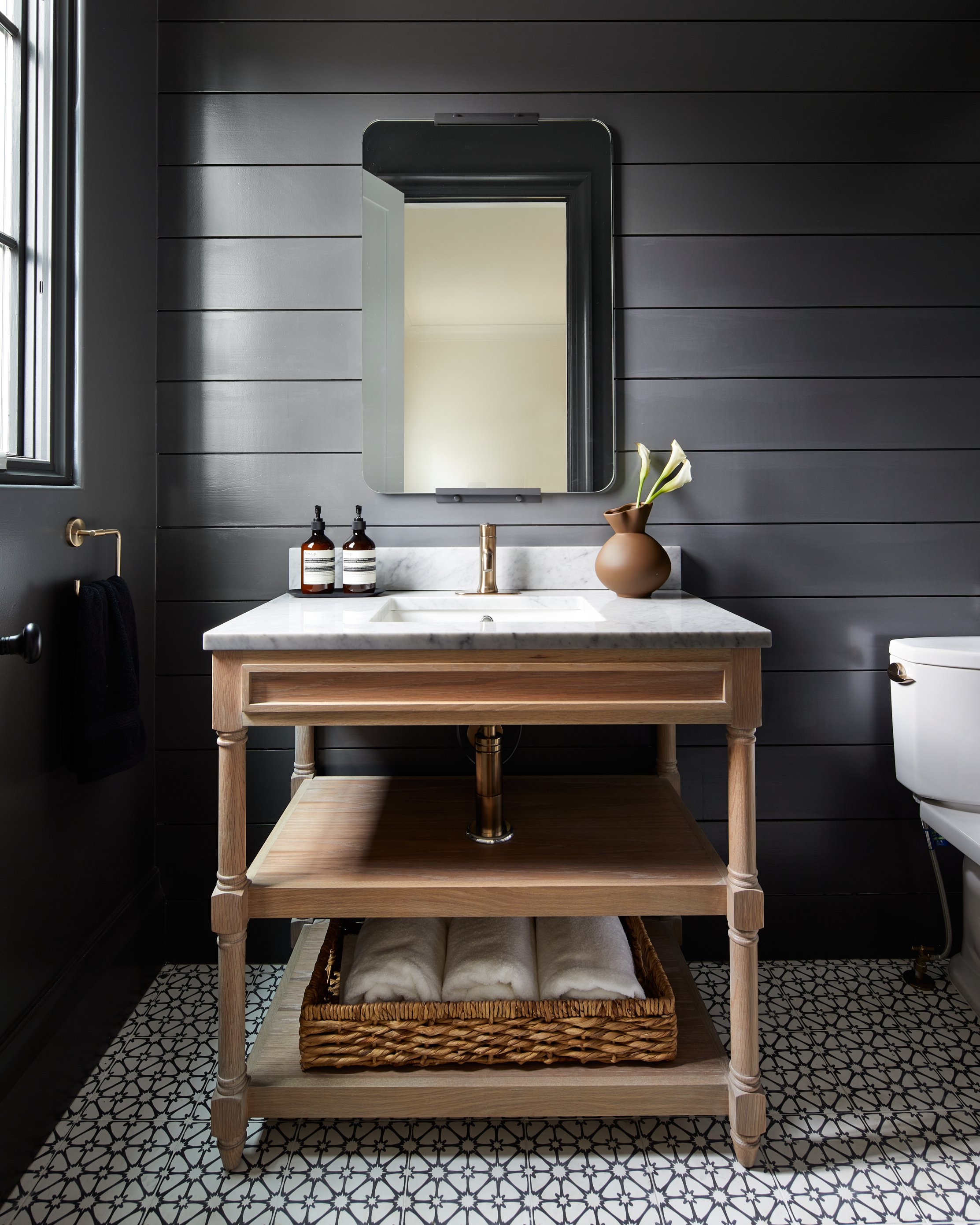
Shiplap is a great way to replace that bland drywall with something unique, but this design feature, usually installed horizontally can sometimes make a space feel a little too linear and repetitive. Use a round or rectangular bathroom mirror and an interesting basin to break the straight lines of the room.
'This basin is made of oak and honed and sealed marble,' says Ellie Mroz, founder of Ellie Mroz Design. 'A freestanding basin was chosen for this bathroom so that it wouldn't overshadow the selections (flooring) and the dramatic, black-painted shiplap. The open-air feel of the basin is a nice juxtaposition against the moodiness of the walls.'
4. Have a pitched roof? Make it a focal point with shiplap
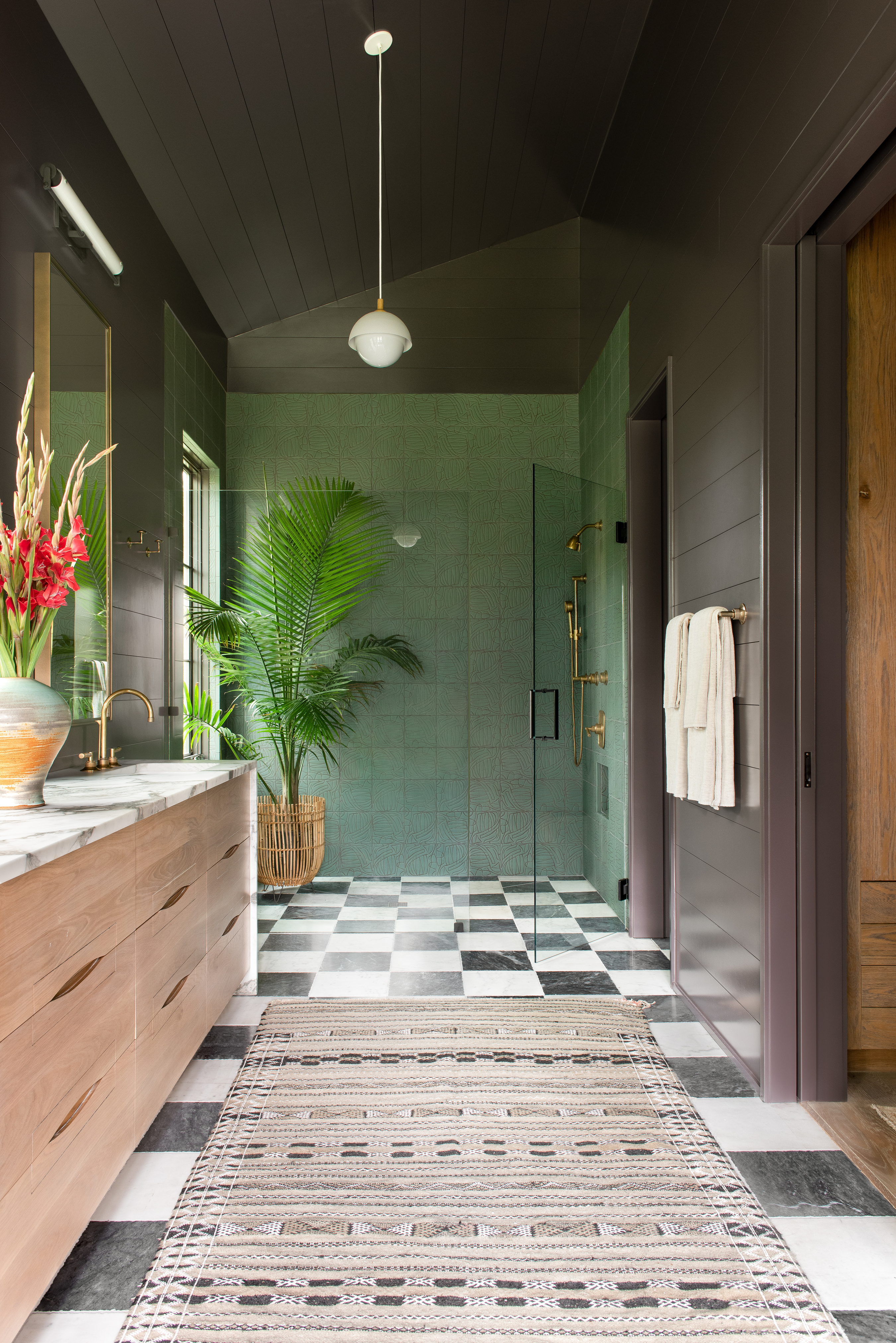
Incorporating shiplap walls is a great way to enhance the space's visual qualities, even if you have minimal decor. The long, straight lines of the wood, in fact, help accentuate not only the bathroom walls but also the bones of the room, making the architectural element that deserves the limelight truly stand out.
In this bathroom by Cortney Bishop, the black-painted shiplap boards draw attention to the room's dimensions and encourage the user to look up, thereby noticing the pitched roof design. The long, thin pendant further highlights the height of the room, contrasting wonderfully with the dark interiors.
5. Add textural charm to an all-white bathroom with shiplap
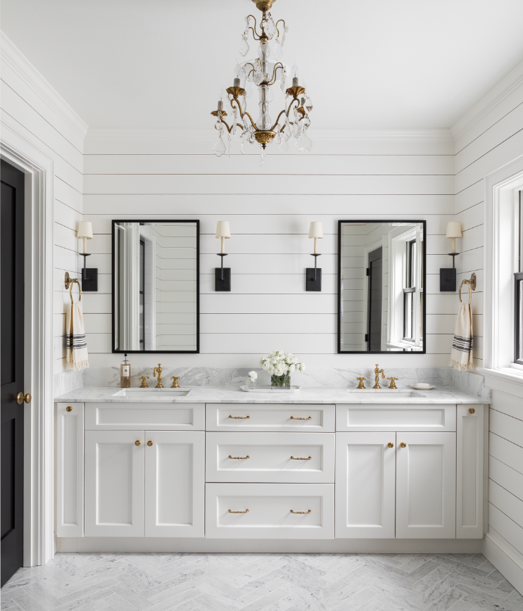
'Shiplap is a timeless trend in bathrooms, as it adds textural charm and clean lines to the space, thereby elevating it and giving it a forever visual interest,' says Marianne Simon, founder of Marianne Simon Design.
White bathrooms with muted shiplap walls are popular for their clean aesthetic and offer a great background for contrasting colors and materials. Consider a whitewashed finish for a rustic appearance.
The beauty of white-painted panels is that while they create a muted aesthetic, it is far from clinical or boring. The texture of the wood gives depth and movement to the interior.
'Shiplap looks great with anything from a mere whitewash to a dense coat of color,' says Wendy. 'If the wood is original to the house and you want to give it a fresh look, we recommend that you prime the wood with a stain blocker first. Kilz or BIN Primer is great for sealing in stains such as tree sap. This will also help you save money on your finished paint. Old wood can be very dry and soak up a lot of paint. Other tips are to sand the wood down; it makes paint application a lot easier. You can also fill knots or nail holes with wood filler for a cleaner look.'
6. Expand the visuals of a powder room with wainscoting

Shiplap can be used anywhere you would normally use beadboard wainscoting – in a hall, kitchen, or even the bathroom. The orientation of the slats too can heavily influence the perceived size of the bathroom. While vertical shiplap can make the space appear larger, horizontal lines can increase the visual width and depth of a small space.
'For this powder room, we wanted to create a light and bright, beachy vibe,' says Kim Stoegbauer, founder of The TomKat Studio. 'Gorgeous patterned tile was installed on the focal wall and then a white shiplap was installed horizontally, halfway up on the other three walls in the space, expanding its visual dimensions. The wood flooring adds warmth to the black, white, and grey color palette of the room.'
7. Inject a whimsical touch to shiplap with painted borders and ceiling
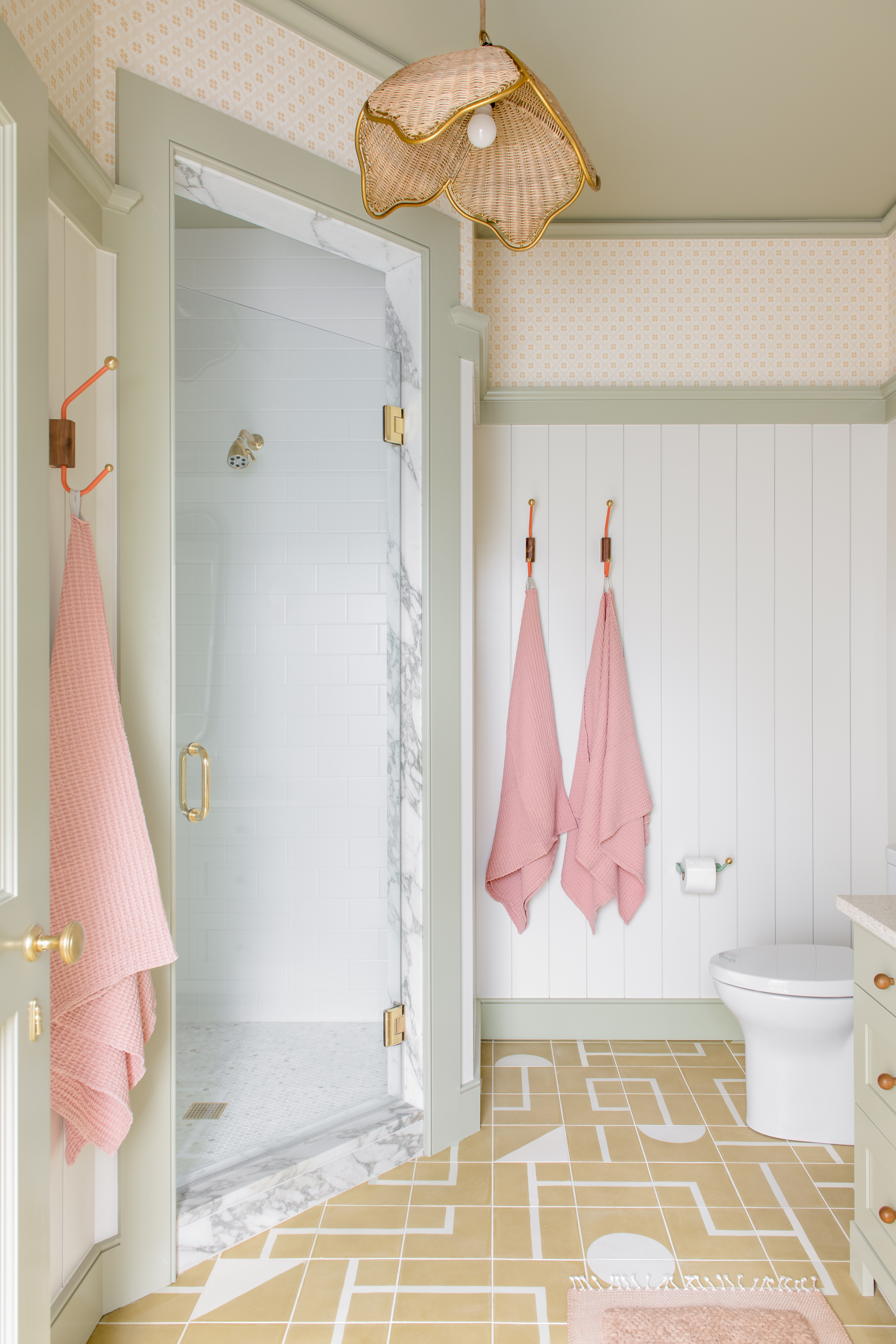
Want to accent your shiplap look with a modern paint job? Consider pairing the long, wooden slats with contrasting shades on the borders and ceiling, giving the bathroom color ideas a unique edge. Interesting, geometric-style floor tiles too can layer in further interest.
Keep the entire scheme cohesive by choosing accessories bathed in the same or similar hues.
This sage green in a crisp matt finish has a dreamy tone to it and offers even coverage without imperfections.
8. Create a striking look by pairing shiplap with geometric tiles

If you love shiplap, but you don’t want to fully commit to it across the entire room, there are ways to use it, sparingly yet effectively. Plus, who says shiplap has to fill the entire room?
Try it along one half of the bathroom and create a lovely feature out of the shower area with geometric bathroom tiles. The contrast will stand out and make the room feel like a lovely, jewel box. Plus, if you're painting your wall panels white, consider tiles in a striking color such as black or blue for a further eye-catching feel.
9. Color drench the walls and vanity to give the room depth
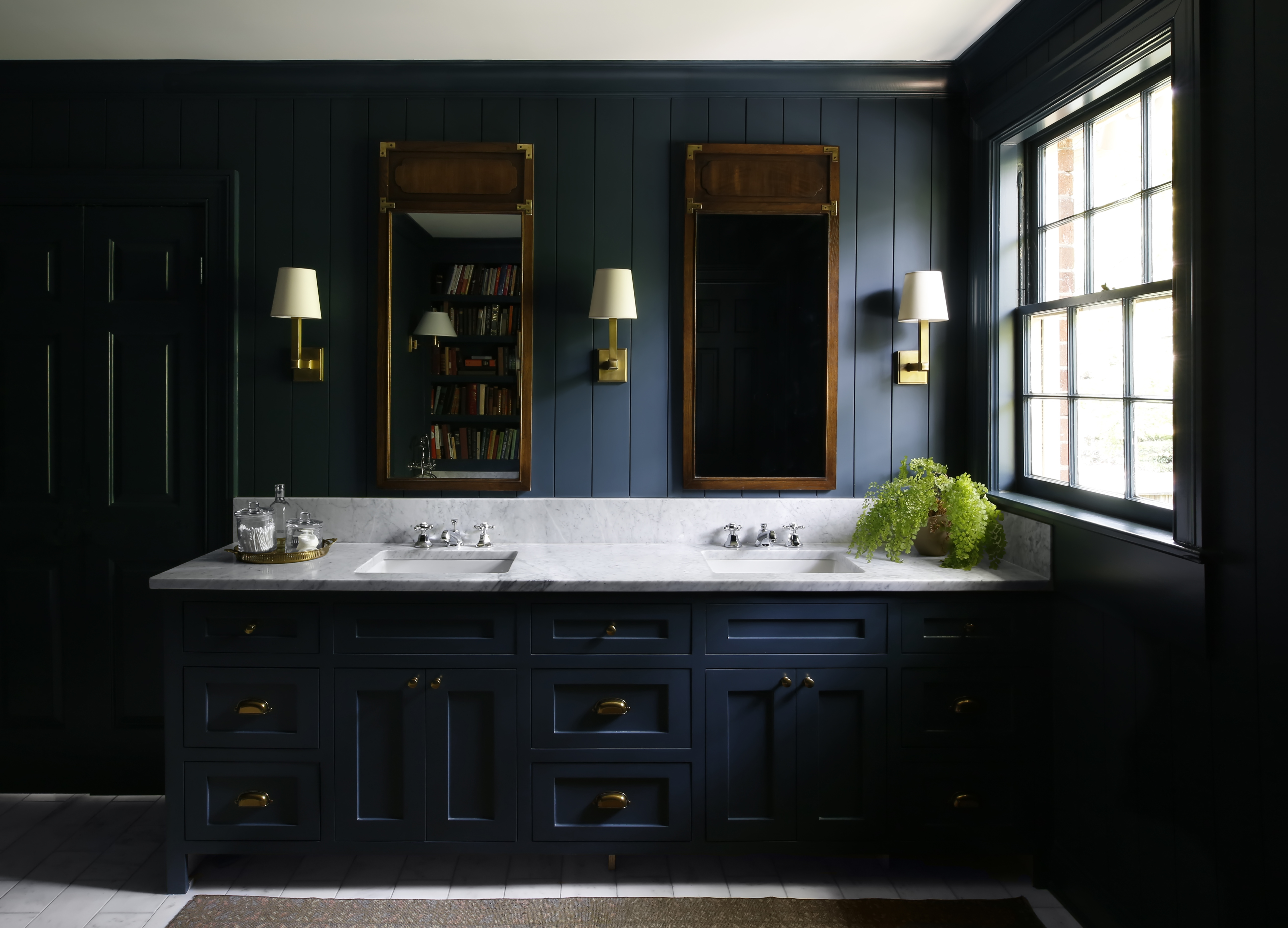
Consider a bold bathroom paint, and color drench the room, giving it depth, and a big boost of personality. A deep tone of blue, black, and charcoal grey can do the trick. The same color painted across different surfaces will create a feeling of semblance while still retaining the textural quality of the room.
One thing to keep in mind with deep-toned bathrooms is that the room can become too dark and seem closed in. It's essential to open up the windows so that the room is always airy, breezy, and bright. Plus, layer in extra lighting fixtures to maintain a well-illuminated look indoors.
10. Add a luxe touch to a shiplap bathroom with opulent fixtures

A white bathroom creates a feeling of airiness, space, and boosted dimensions. These lay grounds for other palettes to shine through, creating a clean, calm look that every homeowner dreams of. If you want to elevate the look of white walls, consider brass-finished accessories that will add a little sparkle to the overall aesthetic.
If you are considering unlacquered brass bathroom sinks, taps, and showerheads realize that the look of the fixtures will change over time, with patina. If you are drawn to the warmth of brass, you’ll love it. If you need a perfectly polished look all the time, unlacquered brass will drive you mad.
Be The First To Know
The Livingetc newsletters are your inside source for what’s shaping interiors now - and what’s next. Discover trend forecasts, smart style ideas, and curated shopping inspiration that brings design to life. Subscribe today and stay ahead of the curve.

Aditi Sharma Maheshwari started her career at The Address (The Times of India), a tabloid on interiors and art. She wrote profiles of Indian artists, designers, and architects, and covered inspiring houses and commercial properties. After four years, she moved to ELLE DECOR as a senior features writer, where she contributed to the magazine and website, and also worked alongside the events team on India Design ID — the brand’s 10-day, annual design show. She wrote across topics: from designer interviews, and house tours, to new product launches, shopping pages, and reviews. After three years, she was hired as the senior editor at Houzz. The website content focused on practical advice on decorating the home and making design feel more approachable. She created fresh series on budget buys, design hacks, and DIYs, all backed with expert advice. Equipped with sizable knowledge of the industry and with a good network, she moved to Architectural Digest (Conde Nast) as the digital editor. The publication's focus was on high-end design, and her content highlighted A-listers, starchitects, and high-concept products, all customized for an audience that loves and invests in luxury. After a two-year stint, she moved to the UK and was hired at Livingetc as a design editor. She now freelances for a variety of interiors publications.
-
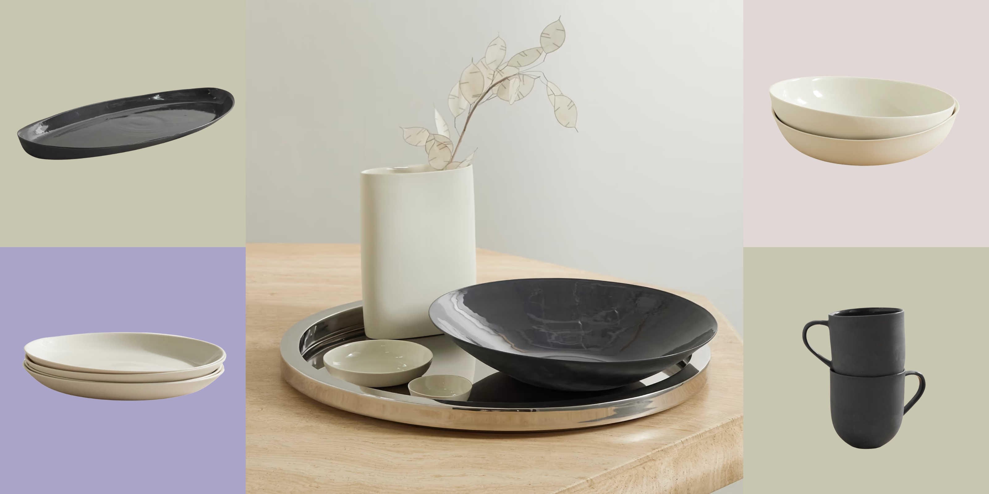 Turns Out, Sustainable Design Can Be Chic, and Net-a-Porter's 'Net Sustain' Curation Is Proof — Here's What I'm Shopping
From the Net Sustain collection, Mud Australia's homeware is not only design-oriented, but eco-focused, too
By Devin Toolen
-
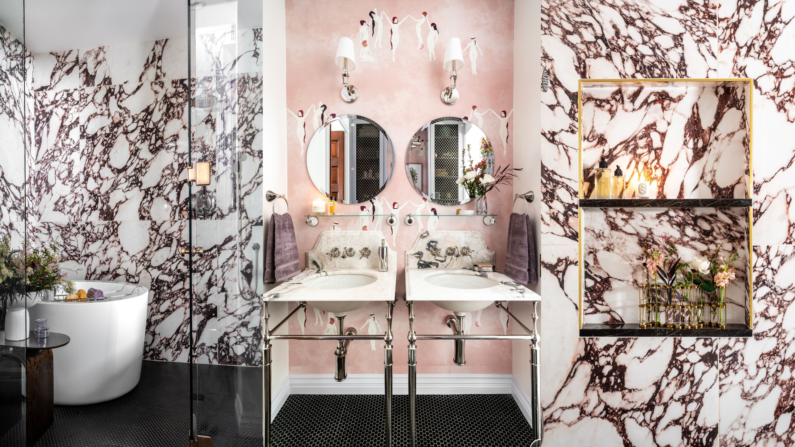 Before and After — How This Jewel-Box Bathroom Made the Most of Its Proportions With Maximalist Design and a 'Soaking Tub'
This design offers a masterclass on creating a luxurious bathroom that is equally playful and elegant.
By Maya Glantz
