5 Small Apartment Dining Room Ideas That Are as Clever as They Are Good-Looking
It's all down to the right furniture design, storage and clever decor tricks

Small apartment dining rooms are like tiny macaroons rather than tiered layered cakes — delightful yet compact. Small spaces open up the opportunity to be creative, and there's a lot you can fit in with the right furniture, placement, and decor elements. And, you can maximize seating and tabletop space without dominating the entire area.
To help you through this process, we asked top designers to offer tips and advice. Take a look at these 5 small dining room ideas, and learn how to make yours as stunning and functional as these.
1. Add a folding dining table
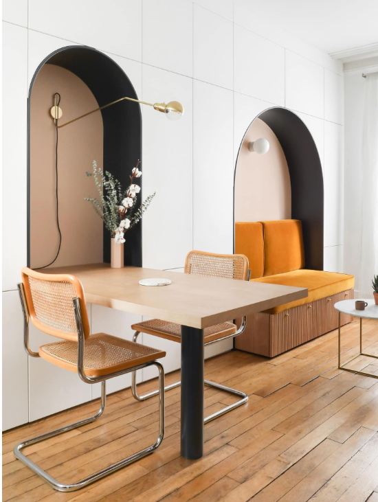
Certain one-bedroom or studio apartments do not have the space for a dining room — these usually feature a kitchen, a tiny living room, and a bed. In such cases, you can eke out a small dining room by installing a folding table on the wall. These are flexible elements that can be pulled up and down as per the need. These also double up as writing/reading tables when meal time is over.
'This is a full storage wall,' says Hélène Pinaud, co-founder of Heju. 'Our goal was to have a large white storage cupboard that blends into the room. The closet is punctuated by arches that delimit the different functions of the living room. The dining table and the sofa have been made to measure and integrated into the cupboard to save as much space as possible. We wanted to create furniture with a Scandinavian and retro character that gives a strong identity to the room. We mixed a warm pale pink with a contrasting shade of black and ocher velvet and small wooden slats to warm up the room.'
2. Or an extendable one

A flexible, extendable dining table is ideal for when you have guests over. The furniture piece can easily be folded back when not in use, saving space, and offering good circulation around the room.
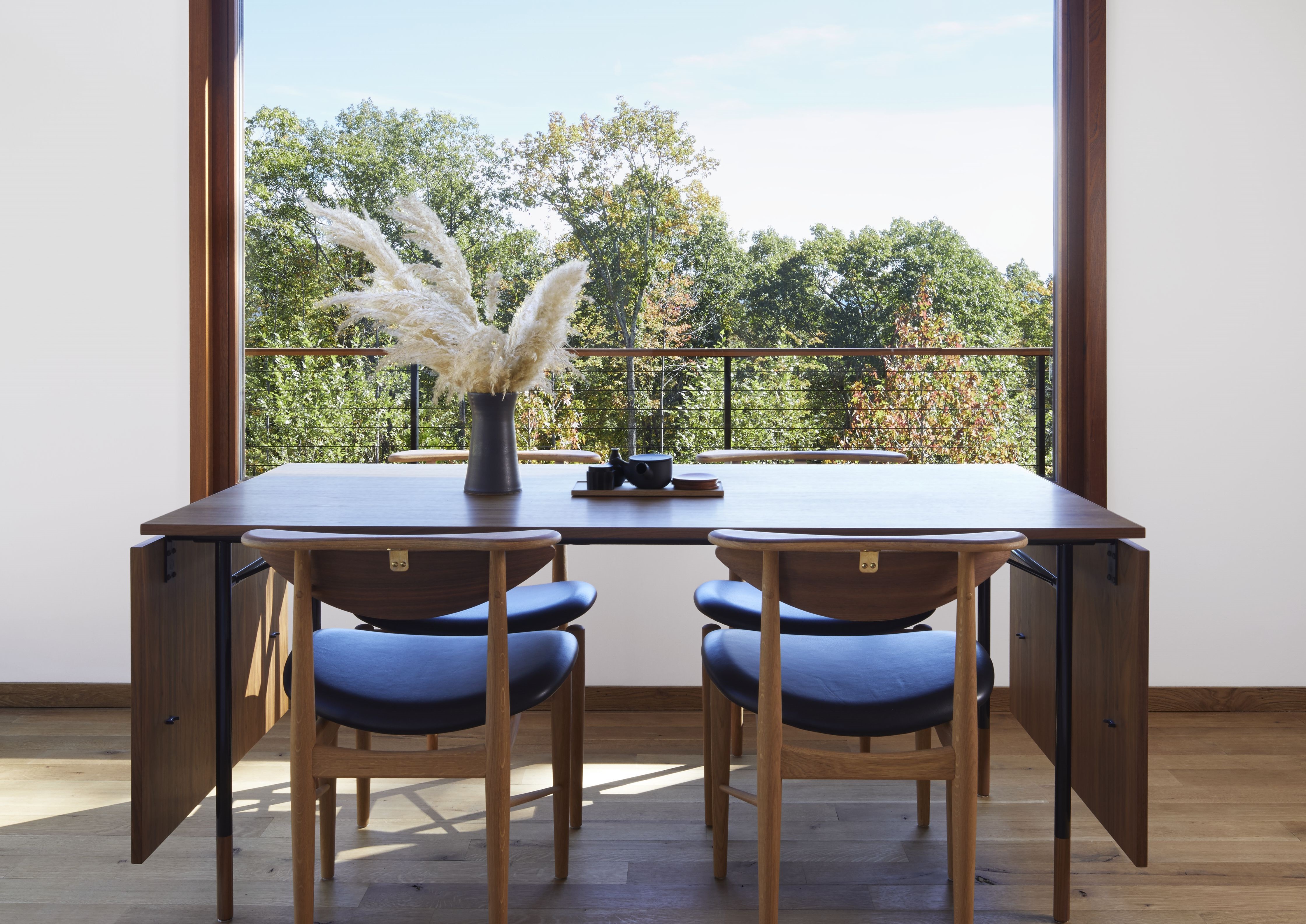
This particular dining table was designed by furniture maker, Finn Juhl. It was made as a Reading Chair and a dining room chair. It is intended to be equally comfortable facing the front or the back.
'The house, including the dining area, is a harmony of American craftsmanship, Japanese philosophy and rooted in it, Scandinavian mid-century aesthetic,' says Eva Dornstreich of The Brooklyn Home Company. 'The flexible dining area complements its natural setting of woods and meadows framed by the window.'
3. Choose minimalist furniture
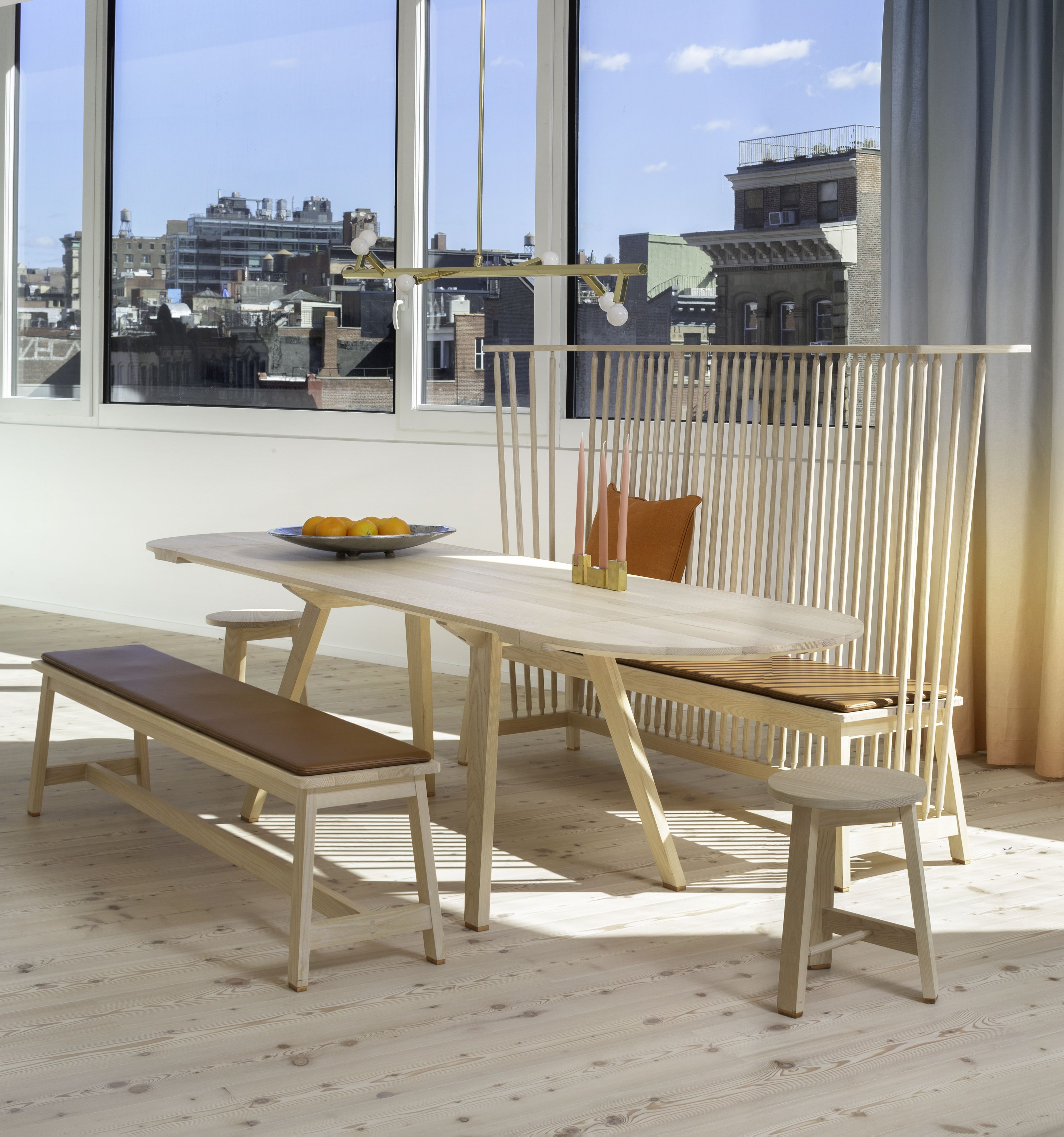
Sleek, thin, and minimalist furniture pieces are a big dining table trend at the moment. These pieces not only have light visuals but also take up minimal square footage, and make the dining room seem bigger.
'This project was a collaboration with The Future Perfect and De La Espada for 100 Franklin by DDG,' says Guillaume Coutheillas, founder of frenchCALIFORNIA. 'The soft palette of De La Espada's furniture sets the tone—enveloping one in a space that is warm, and super comfortable to call home. The seating is from De La Espada Part of Studioilse's Seating for Eating collective. The Bench with Back is reassuringly familiar but carefully detailed.'
4. Consider a built-in

A great small kitchen diner idea is to fit a dining table within a small nook in the room. This provides the essential perching spot to eat without taking up much space in the house. It also becomes a cozy, snug spot for conversations while the other person cooks.
'Our clients really wanted a less formal dining space to accommodate a more modern lifestyle,' says Megan Prime, principal at JAM. 'Instead of opting for the more popular choice of an island and stools, we leaned into the galley kitchen idea and lined the wall opposite the sink and range with this built-in bench and a small floating table, perfect for a couple of dining chairs to be pulled in as needed. Our clients loved the feel of an eat-in kitchen for breakfasts and for the kids, and the coffee shop vibe for the WFH days. We used the same color and material palette as the rest of the kitchen to keep things as streamlined and open as possible within the narrow footprint, but we think the oak bench really warms everything up and makes a great cozy spot to enjoy a cup of tea.'
5. Add mirrors and round furniture in the small dining

Shapes and key decor elements can make a space feel a lot bigger than it is. Decorating with mirrors can have an unexpected effect in your home, as can curving or round-shaped tables.
'When it comes to small dining rooms, we always prefer round tables as they promote conversation and everyone seated can look at the opposite person and engage,' says Nishita Kamdar, founder of Studio Nishita Kamdar. 'Food brings people together and a food on a round table makes it even more interactive.'
Round furniture also boosts circulation space, so it's easier to walk around in the room and around the furniture. Tables and chairs aside, another element that can create the illusion of space is mirrors. 'Here, we clad one wall with a full-height mirror to give the room an illusion of width,' shares Nishita. 'The mirror polish black marble reflects the space and makes it look taller as well. The soft shades of nude pink on the chair and olive green lights add a pop of color to the space.'
Be The First To Know
The Livingetc newsletters are your inside source for what’s shaping interiors now - and what’s next. Discover trend forecasts, smart style ideas, and curated shopping inspiration that brings design to life. Subscribe today and stay ahead of the curve.

Aditi Sharma Maheshwari started her career at The Address (The Times of India), a tabloid on interiors and art. She wrote profiles of Indian artists, designers, and architects, and covered inspiring houses and commercial properties. After four years, she moved to ELLE DECOR as a senior features writer, where she contributed to the magazine and website, and also worked alongside the events team on India Design ID — the brand’s 10-day, annual design show. She wrote across topics: from designer interviews, and house tours, to new product launches, shopping pages, and reviews. After three years, she was hired as the senior editor at Houzz. The website content focused on practical advice on decorating the home and making design feel more approachable. She created fresh series on budget buys, design hacks, and DIYs, all backed with expert advice. Equipped with sizable knowledge of the industry and with a good network, she moved to Architectural Digest (Conde Nast) as the digital editor. The publication's focus was on high-end design, and her content highlighted A-listers, starchitects, and high-concept products, all customized for an audience that loves and invests in luxury. After a two-year stint, she moved to the UK and was hired at Livingetc as a design editor. She now freelances for a variety of interiors publications.
-
 The 'New British' Style? This Victorian London Home Embraces Its Owners' Global Background
Warm timber details, confident color pops, and an uninterrupted connection to the garden are the hallmarks of this relaxed yet design-forward family home
By Emma J Page
-
 Muji Living Room Ideas — 5 Ways to Harness The Calming Qualities of This Japanese Design Style
Inspired by Japanese "zen" principles, Muji living rooms are all about cultivating a calming, tranquil space that nourishes the soul
By Lilith Hudson
