Best Cabinets for Small Kitchens — 8 Ideas That Make the Most of Every Inch
These best cabinets for small kitchens do not curtail either the style or functionality of the space and these examples prove it
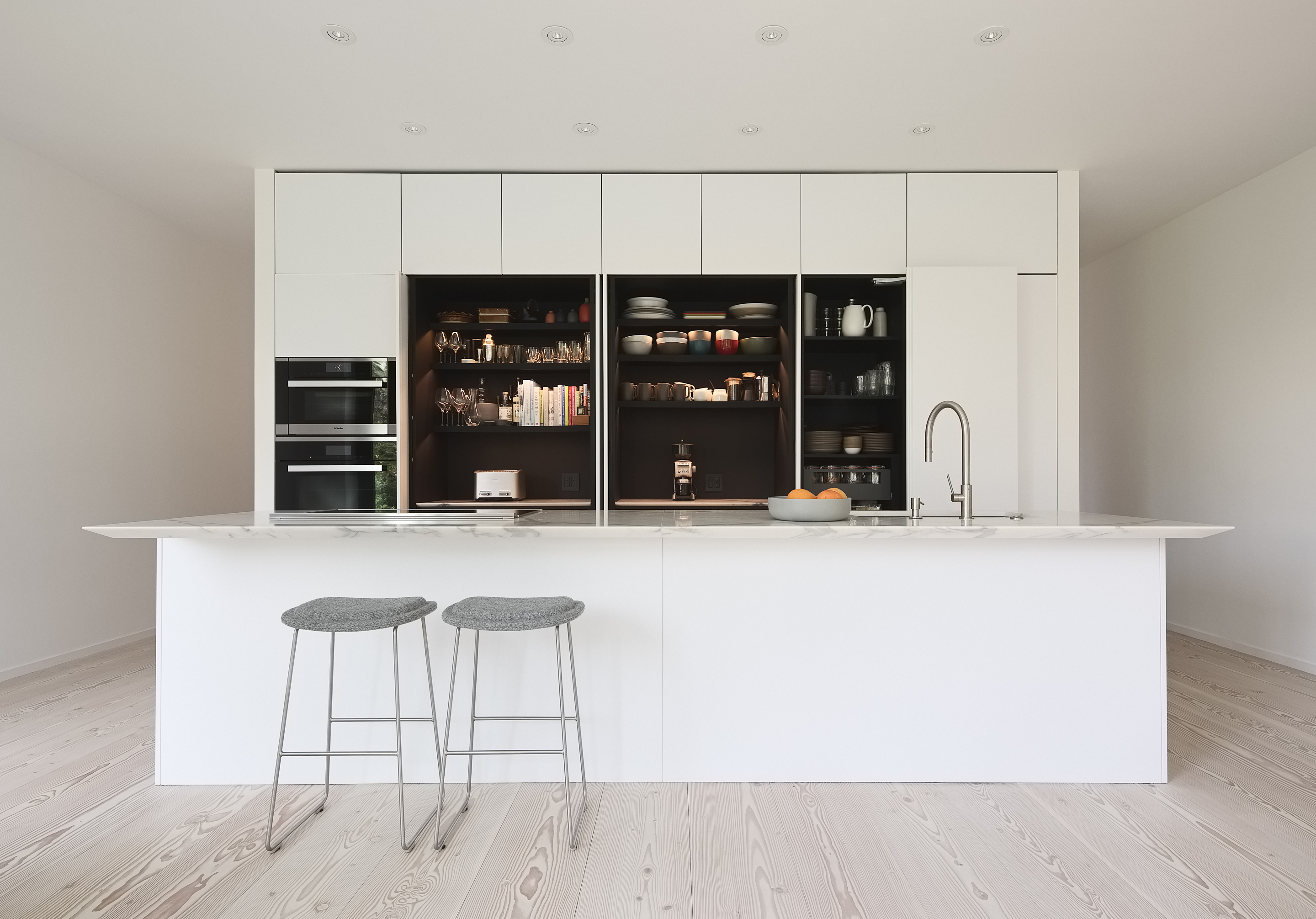
As with all elements of small-kitchen design, choosing the best cabinets for small kitchens can be a tough call. However, some of the most interesting interiors often arise through finding creative solutions to various constraints. Perhaps one of the biggest design dilemmas here is how best to squeeze in enough storage, as the smaller the kitchen, the more cluttered it will feel if appliances and utensils aren’t tucked away out of sight.
If budget allows, it’s worth enlisting the help of an experienced kitchen designer, interior designer or architect to help you maximize every inch of storage, and recommend cabinetry that ticks your boxes in terms of aesthetics and functionality. Before getting started, it’s definitely advisable to do an inventory of everything in your kitchen, and discard or give away anything that you don’t use or isn’t in good working order. That way, you’re only dedicating that much-needed cabinet space to items that really need to be there.
You might find that, after culling a some possessions, you can afford to dispense with some or even all of your wall cabinets, which will instantly make your small kitchen feel bigger. Swap out for open shelving, or a mix of both, depending on what you’d like to keep on display. For the cabinetry that remains, look to clever, ergonomic solutions such as pocket doors and pull-out inserts to make your space work harder. Deep drawers can also be easier to access and to organize. And, it’s wise to go for recessed or simple, low-profile handles, so you don’t constantly find yourself catching things on cabinet hardware.
If your budget doesn’t allow for a kitchen redesign, there are a few DIY hacks that can make your cabinetry better suited to a small space, such as swapping upper cabinet doors for glass-fronted options. You could also paint or replace dark or fussy cupboards with simpler fronts in paler shades. If your wall-hung units are in good condition, you might consider simply removing the doors and painting the carcasses to transform them into open shelving. For more hints and tips, read our expert guide to the best cabinet styles for small kitchens.
1. SWAP CUPBOARDS FOR OPEN SHELVING

While two layers of kitchen cabinets might seem necessary for storage in a small space, it’s worth remembering that the boxy, blocky look this can create might make your space feel cramped and overcrowded. When Shapeless Studio designed this Brooklyn kitchen, they wanted to place greater emphasis on the details of lower millwork, and so eschewed wall-hung units above.
‘We specifically wanted to use open shelving instead of upper cabinetry to both provide a sense of lightness and also to display our clients sculptural collection of plateware,’ explains studio co-founder Jess Hinshaw. ‘We chose to use the same marble for the countertop, backsplash and shelving, in order to reduce the amount of overall materials in the kitchen, allowing your eye to focus on the detailing and shadows created from the millwork below.’
2. OPT FOR POCKET DOORS
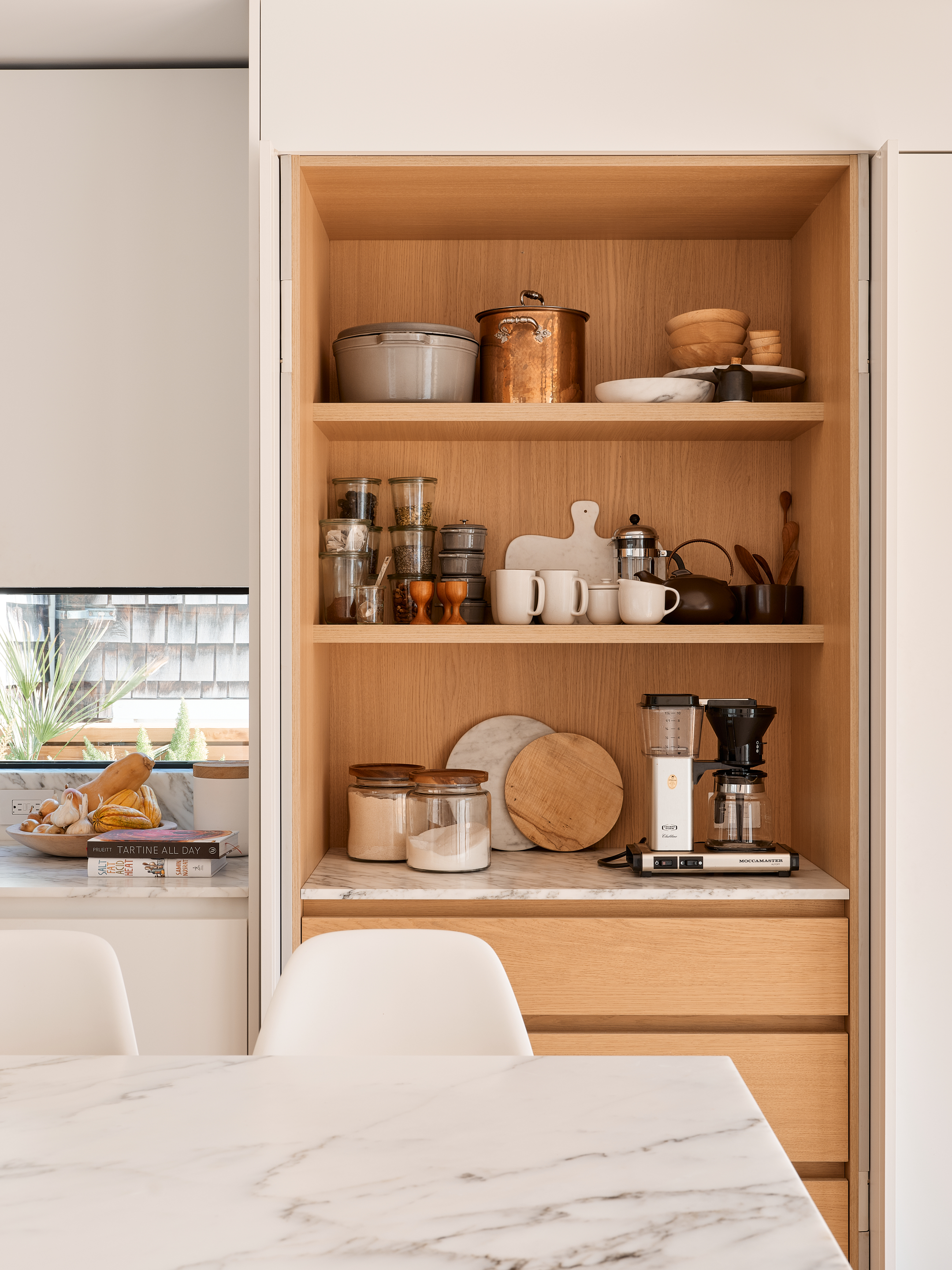
When designing kitchens small and large, San Francisco studio Edmonds + Lee Architects favor pocket door cabinetry for keeping surfaces streamlined. ‘There's always the question of where to put the microwave, toaster and other appliances you use on a day-to-day basis but don't want to necessarily want on show, particularly in an open-plan kitchen’ says practice co-founder Robert Edmonds.
‘Pocket doors help to conceal everything while keeping it easily accessible,’ Robert says of the space-saving, retractable design. ‘There’s also an ergonomic aspect, as you can maximize the efficiency of your storage: Instead of lining a counter with everything you might need, you can stack it, freeing up valuable space.’
3. CAPITALIZE ON VERTICAL SPACE
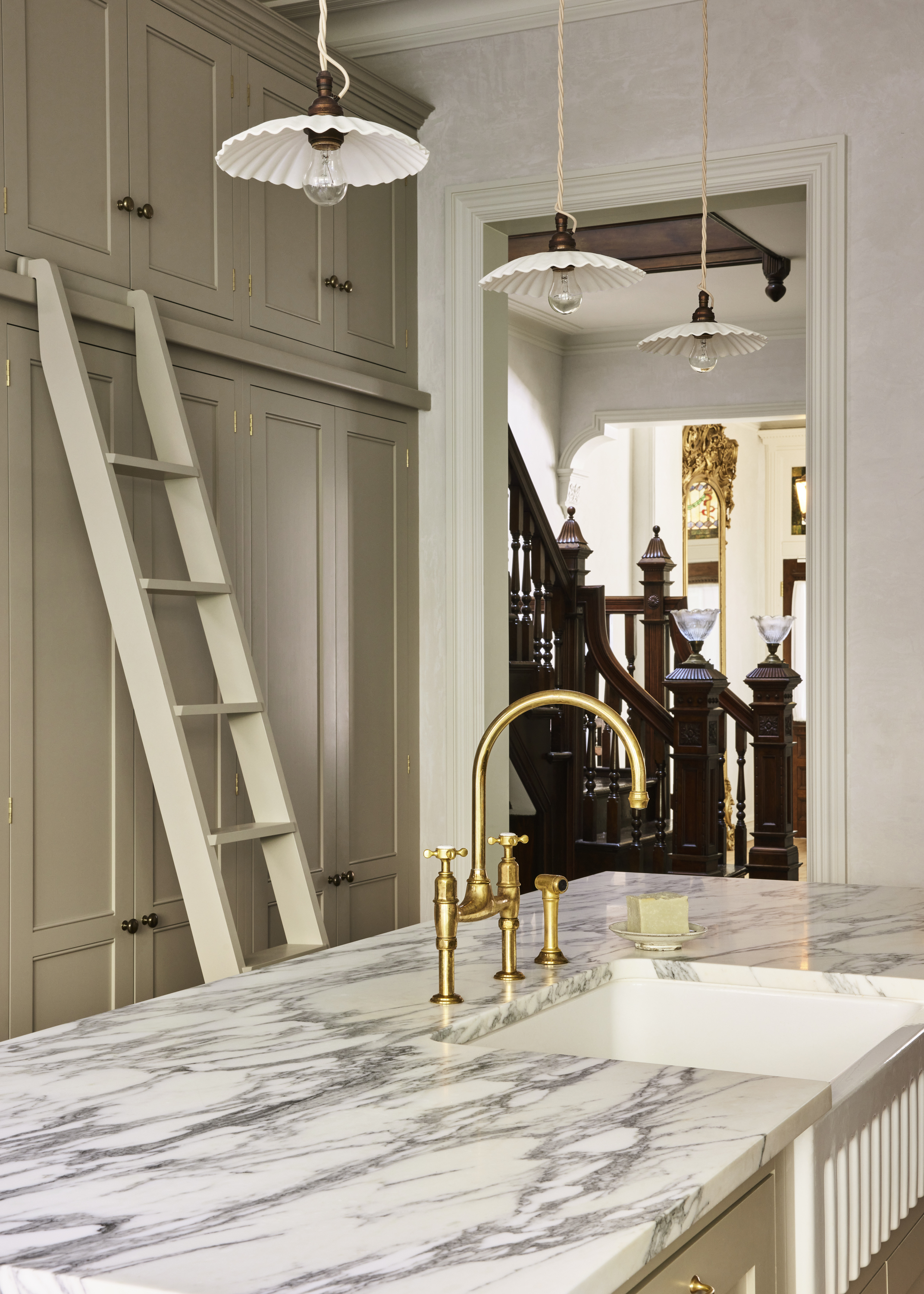
‘For this project, we were lucky enough to have very tall ceilings,’ says And Studio founder Arianna De Gasperis of the kitchen in her Jersey City brownstone. ‘Thanks to the room height, we were able to extend the pantry cabinetry to just below the ceiling to maximize storage in the space.’
Arianna kept the rest of the cabinetry at a lower height to avoid spoiling the kitchen’s proportions. ‘I think the juxtaposition is nice,’ she adds. ‘Given the height of the pantry cabinets, we had to incorporate a ladder to access the upper cabinets when needed. Adding an element like this just adds more character, which helps bring the space together and make it feel more considered.’
4. CONSIDER SLIDING DOORS

Amy Vroom of The Residency Bureau employed a host of clever tricks when overhauling the kitchen in this two-bedroom condo in Seattle, including sliding slatted timber doors on the upper cabinetry that nod to the home’s 1960s origins. ‘The house is only 1262 square feet, so every inch was important to my clients,’ says Amy.
‘The slatted doors save on space in a narrow galley kitchen as there is no door swing to work around when cooking and prepping, not to mention they're just fun to use! Visually, they appear more open than regular cabinet doors due to the slats, which is a bonus in a small space,’ adds the interior designer. ‘It's a nice alternative to floating shelves.’
5. INSTALL PULL-OUT SOLUTIONS
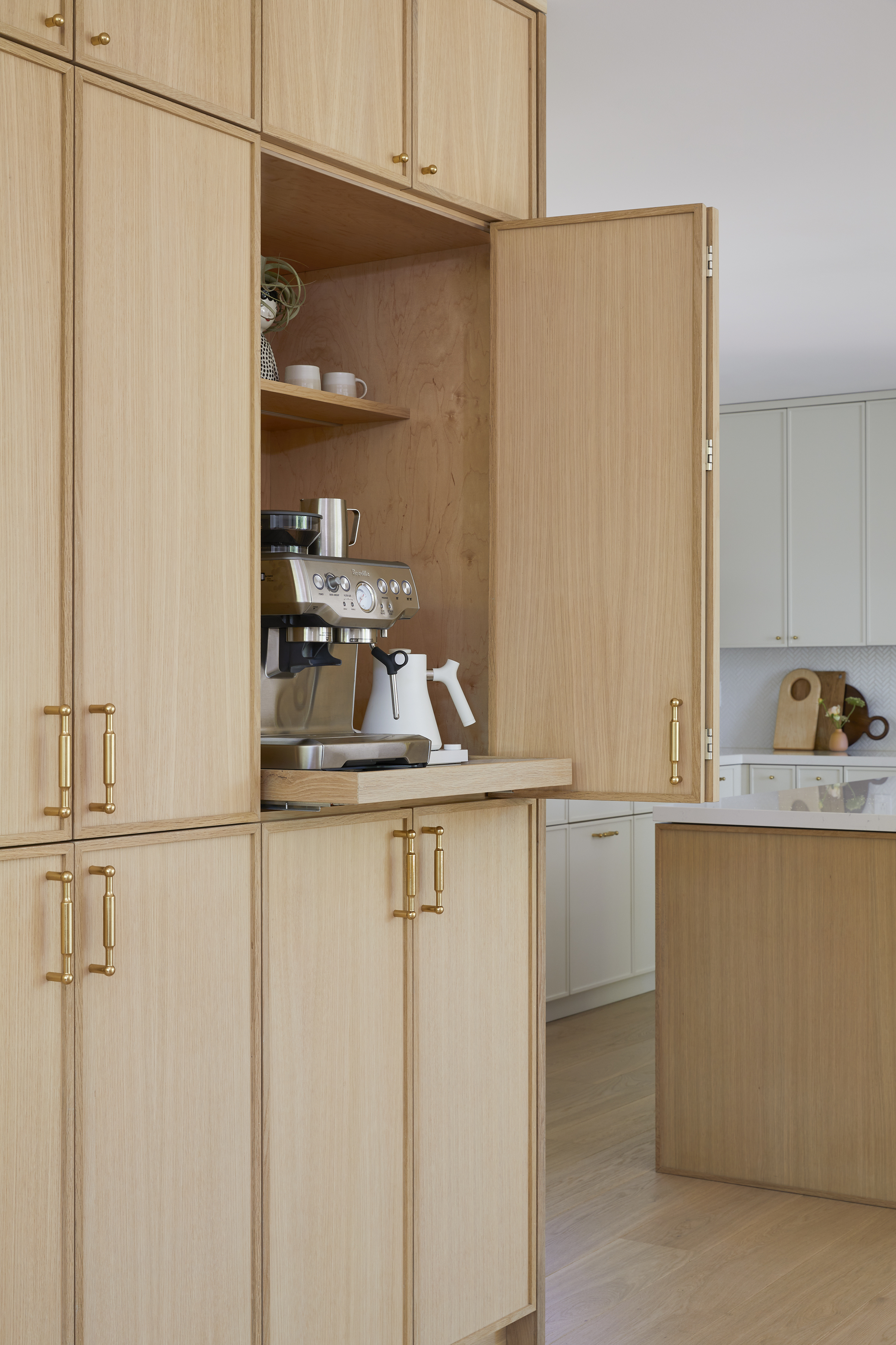
We love this neat little coffee bar, which interior designer Cathie Hong installed as part of a Californian kitchen redesign. A bi-fold door in this bank of oak cabinetry peels back to reveal a perfectly configured coffee station, which can hidden away when not in use.
‘The concealed coffee cabinet aligns symmetrically with the pantry cabinets, tucking neatly away when no longer needed,’ says Cathie. ‘We designed it with a pull-out tray inside, so it can be extended when boiling hot water and making pour-overs. The hidden feature conserves countertop space in the main kitchen & keeps clutter at bay, while looking aesthetically beautiful when closed.’
6. INTEGRATE CURVED CABINETRY
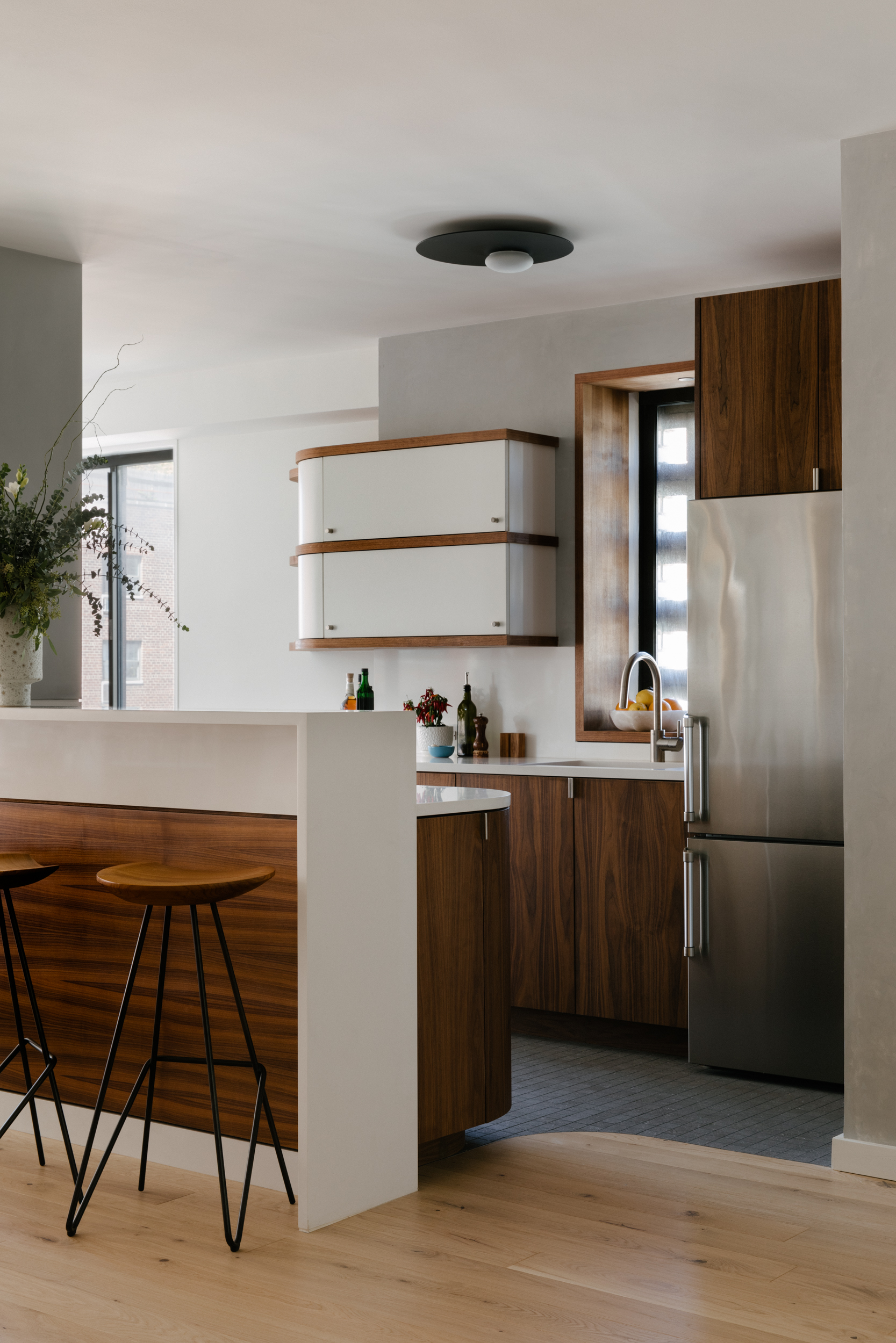
When Idan Naor of Inworkshop Architecture reworked this New York apartment, he implemented curved cabinets as a functional response to a challenge in the floor plan. ‘The design of the curved cabinetry centers around creating a fluid use of space in a high-traffic area,’ explains Idan.
‘One corner on each end of the compact kitchen has been rounded to improve circulation through the space. The solution became an opportunity to turn a bug into a feature, and we embraced the visual language to bring a sense of elevated craft to the project,’ Idan continues, referencing the geometry of the stone and millwork. ‘Curved cabinetry can be a calibrated ergonomic response to a tight space, but we always tweak it to optimize access to various types of storage.’
7. EMBRACE UPLIFTING COLOR
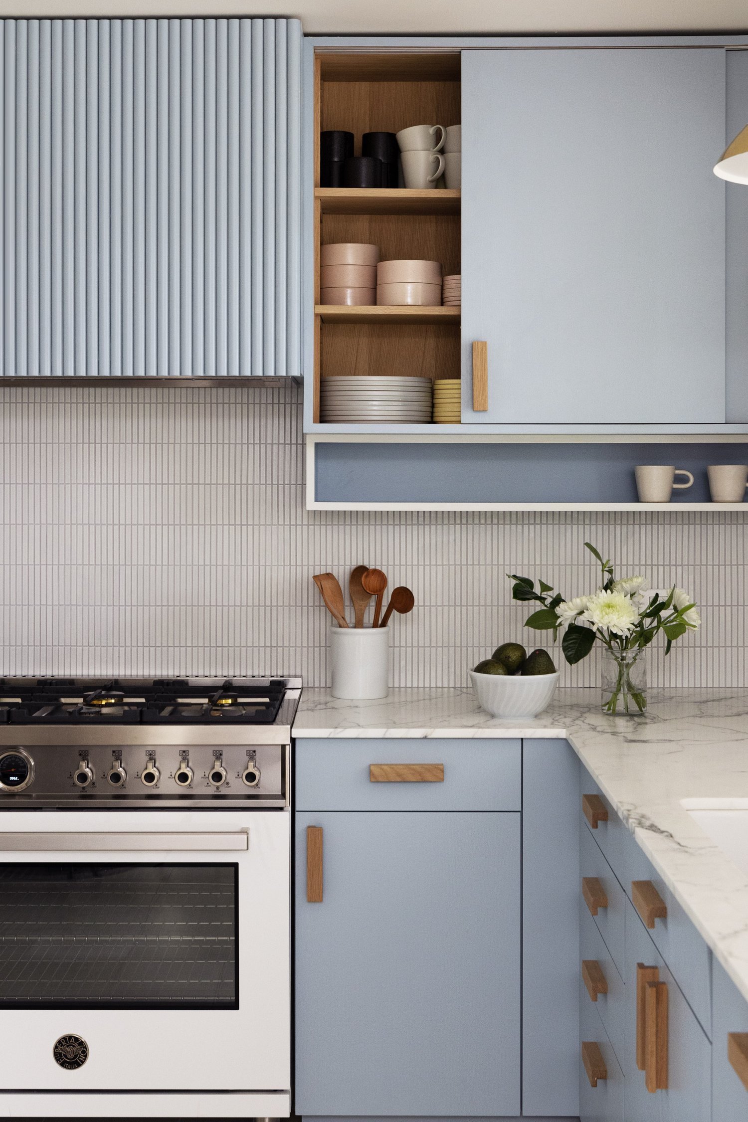
‘Color can profoundly affect your mood and can do a lot of the heavy lifting in smaller spaces to create a specific atmosphere or feeling,’ says Keren Richter of White Arrow studio, who chose the marine-inspired ‘Hazy’ shade from Kelly Wearstler’s Farrow & Ball collection for the kitchen color scheme in this Hamptons beach house.
‘I pulled color and design references from both Bauhaus and modernist kitchen design; I love the more muted colors and enjoyed creating a highly functional space in a small footprint,’ Keren continues. ‘Sliding doors are very much a part of that strategy, and underneath the upper cabinetry, we incorporated a small, set-back shelf for spices or cups, which adds both visual interest and functionality.’
8. CONSIDER A TWO-TONE SCHEME
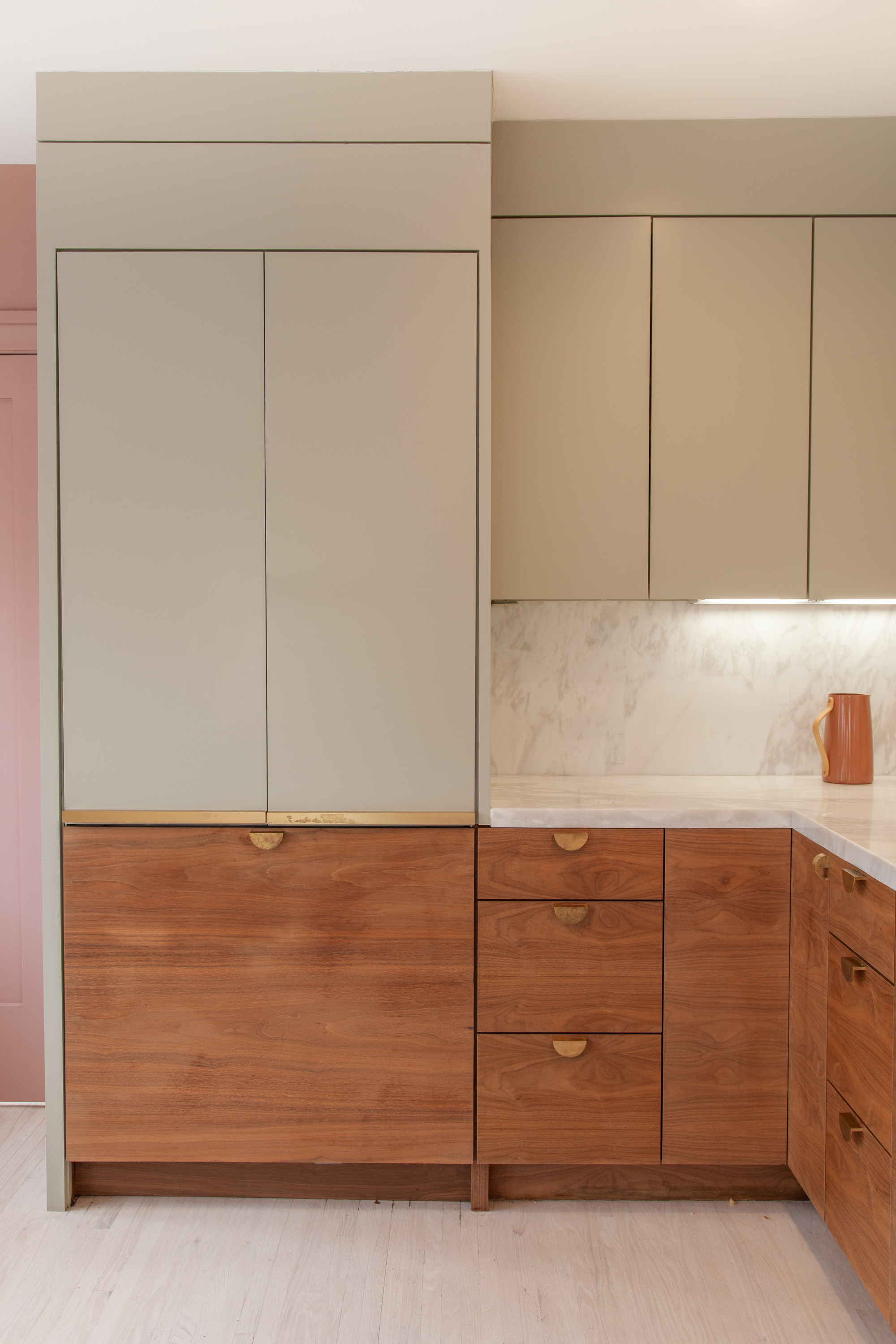
If storage requirements necessitate wall-hung units (as they often do when space is tight), one way to lessen the impact of upper cabinetry is to choose a lighter color than that used for the base cupboards. New Generation Improvements offset the stained timber cabinetry in this Silver Lake remodel with pale-green cabinets above to create a two tone kitchen.
‘The reason installing upper units in a lighter shade works well is that it plays with your sense of depth perspective,’ says New Generation Improvements’ Marisela Arechiga. ‘When you walk into a room, your eye is drawn the more obvious elements, but goes beyond the paler cabinetry, making the space appear bigger.’
6 Storage Essentials to Better Organize Cabinets
Be The First To Know
The Livingetc newsletters are your inside source for what’s shaping interiors now - and what’s next. Discover trend forecasts, smart style ideas, and curated shopping inspiration that brings design to life. Subscribe today and stay ahead of the curve.
Tessa Pearson is an interiors and architecture journalist, formerly Homes Director at ELLE Decoration and Editor of ELLE Decoration Country. When she's not covering design and decorative trends for Livingetc, Tessa contributes to publications such as The Observer and Table Magazine, and has recently written a book on forest architecture. Based in Sussex, Tessa has a keen interest in rural and coastal life, and spends as much time as possible by the sea.
-
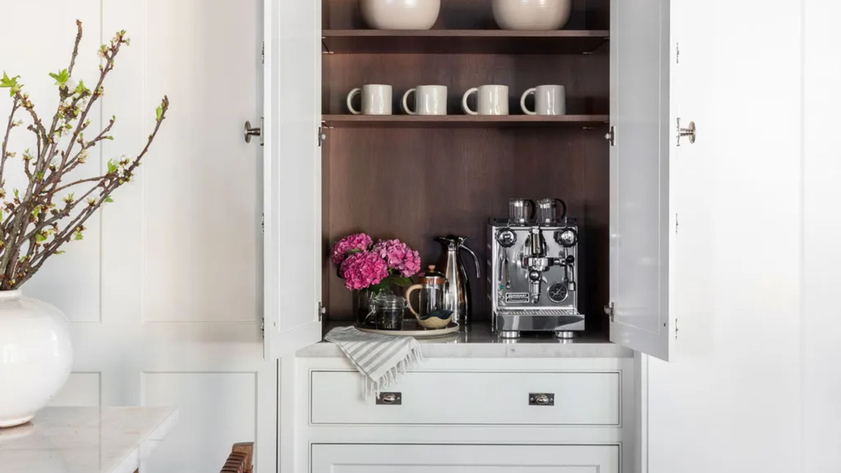 Turns Out the Coolest New Café is Actually In Your Kitchen — Here's How to Steal the Style of TikTok's Latest Trend
Goodbye, over-priced lattes. Hello, home-brewed coffee with friends. TikTok's 'Home Cafe' trend brings stylish cafe culture into the comfort of your own home
By Devin Toolen Published
-
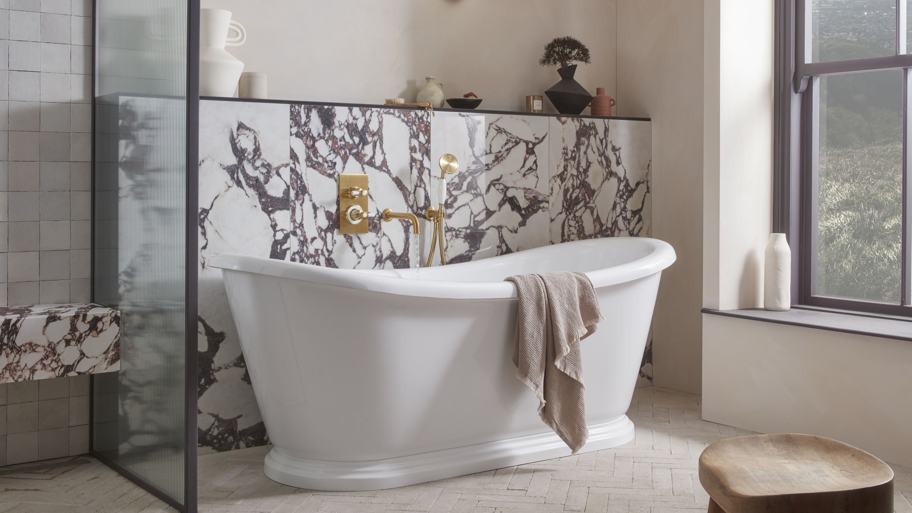 5 Bathroom Layouts That Look Dated in 2025 — Plus the Alternatives Designers Use Instead for a More Contemporary Space
For a bathroom that feels in line with the times, avoid these layouts and be more intentional with the placement and positioning of your features and fixtures
By Lilith Hudson Published
