This might be my favorite ever small kitchen – a pull-out countertop is among its cleverest space-saving ideas
Designed for a New York apartment, this partitioned kitchen effortlessly makes small space living look beautiful
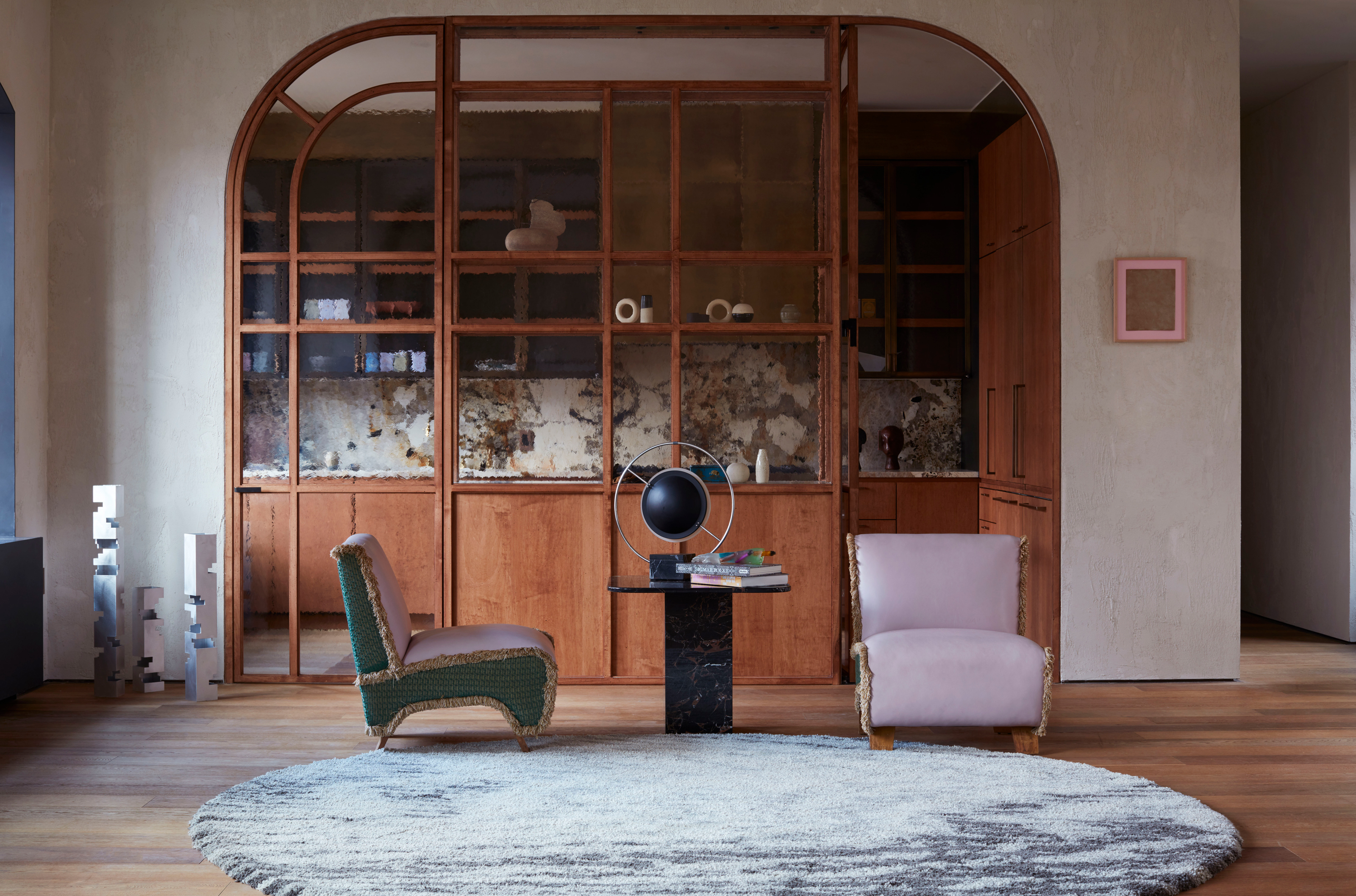

'It nods to my passion for creating surprise within a space, adding that welcome dose of the unexpected,' interior designer Tala Fustok tells me, when I question her on one of the many brilliant details of the kitchen in this New York apartment.
Out of context, it would be hard to narrow down the particular feature the London-based designer is referring to. As someone who has a small kitchen of their own to contend with, I'm a sucker for a clever space-saving idea – something this design packs in. Yet, as functional as the end space may be, it's a kitchen that doesn't put ever put practicality at the expense of beauty.
Don't get me wrong, this loft apartment itself is anything but minute. 'Bleecker Street gave us the opportunity to transform a true industrial space of a restored late-1800s build within the West Village,' Tala explains. 'We worked with Crina Architecture on a stripped-back approach to allow for space maximization to elongate and add grandeur.'
The apartment has been beautifully re-appointed in its newest incarnation – the light from its oversized windows highlight the raw, textured walls, while industrial-luxe metals and statement-making marbles capture the contrast of elements that define the design.
Yet, despite these incredible elements you can see throughout the Bleecker Street apartment, the kitchen stands out as the hero of the space.

From a young age, interior designer Tala Fustok has had a constant passion for interiors and design, and these same influences have informed her style now seen throughout her work. Her studio takes a fully immersive approach that creates unique atmospheres inspired by their client’s identity. Committed to creating timeless spaces with an innate sense of theatre, and a dash of the unexpected, the studio pushes boundaries in the world of design.
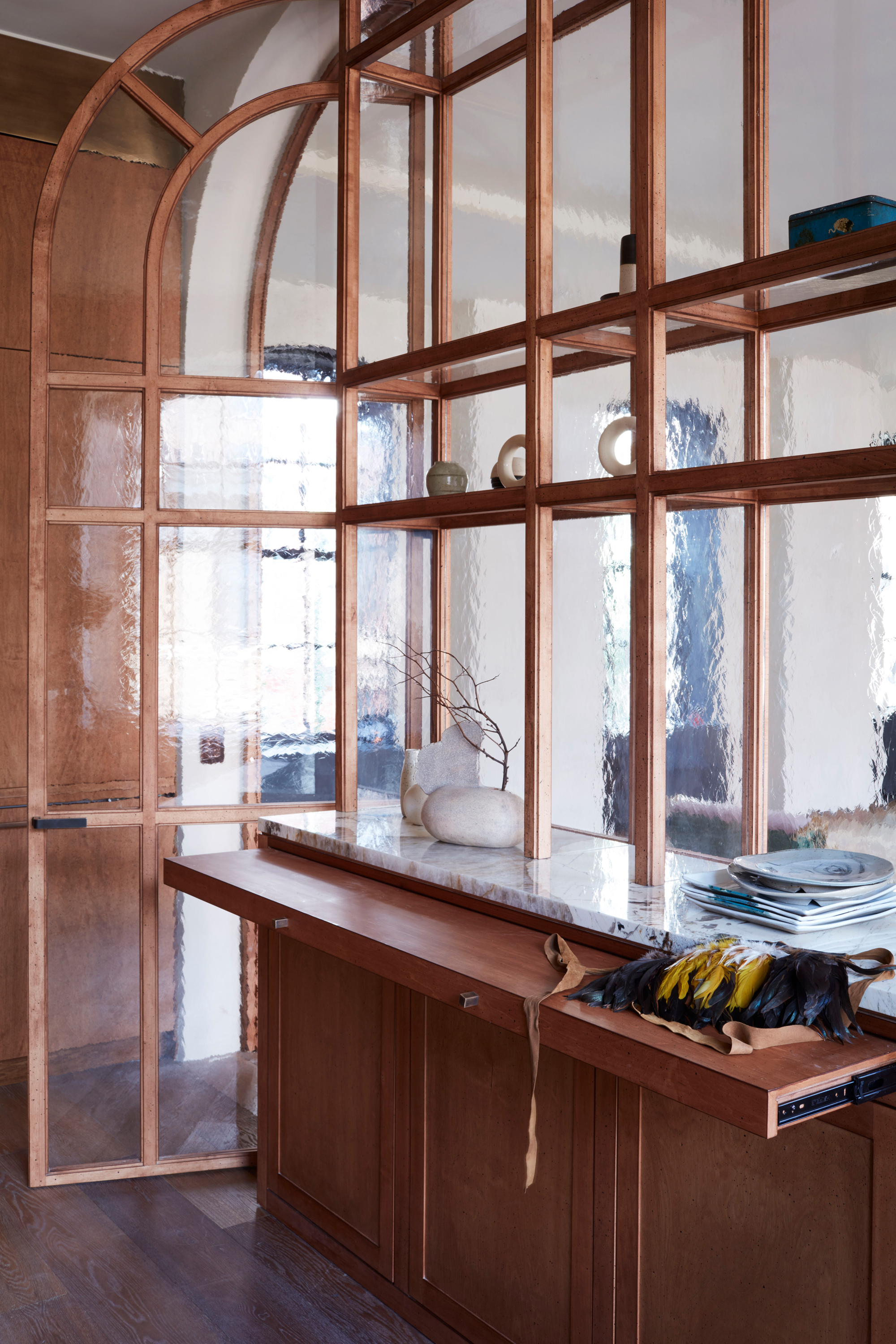
It's a surprisingly small kitchen for an apartment this size, but the designers created a sense of proportion with a striking timber room divider. 'To amplify the somewhat compact kitchen arena and avoid clutter, we incorporated a textured glass to enhance the natural light and connect the spaces,' Tala says.
Once inside this transitional-style kitchen, the glass divider gives rise to a kitchen island of sorts, with glass and timber shelving extending up to the space's lofty ceiling. It's here that we find one of my favorite features of the space – the real element of surprise in this small kitchen.
Under the kitchen countertop, a pull-out works to extend the surface space, designed into the space in a way that doesn't feel gimmicky. 'The subtle pull-out countertop immediately adds that level of versatility to a working yet premium kitchen,' Tala says.
The design also includes a built-in window perch, helping add a social aspect to the space, all framed by a burnished brass range hood and incredibly decorative Patagonia stone surfaces. 'The kitchen needed to be practical yet in keeping with the calm contemporary design of the luxuriously urban space,' Tala surmises.
How can I create a pull out countertop?
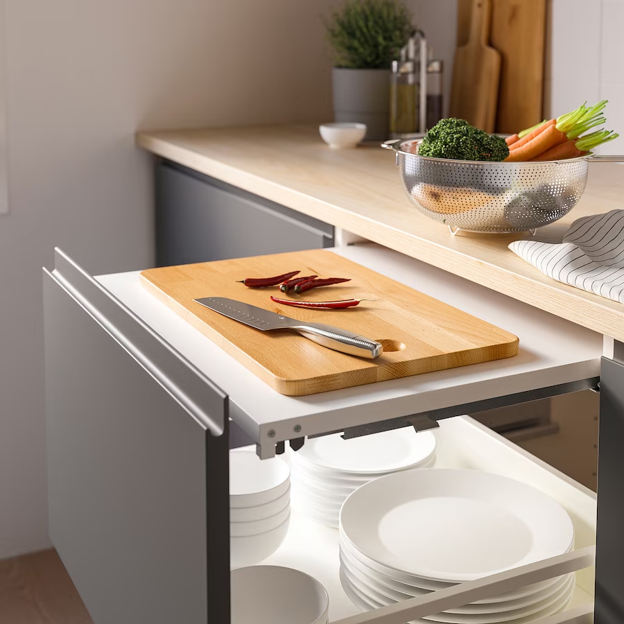
This isn't, by any means, the first example of a pull-out countertop I've seen, though it's probably one of the best examples of the idea I've come across, especially on such a large scale. Pull-out countertops are often used behind pocket doors in kitchens, especially under appliances where extra surface space can, occasionally, be helpful, such as in areas like coffee bars.
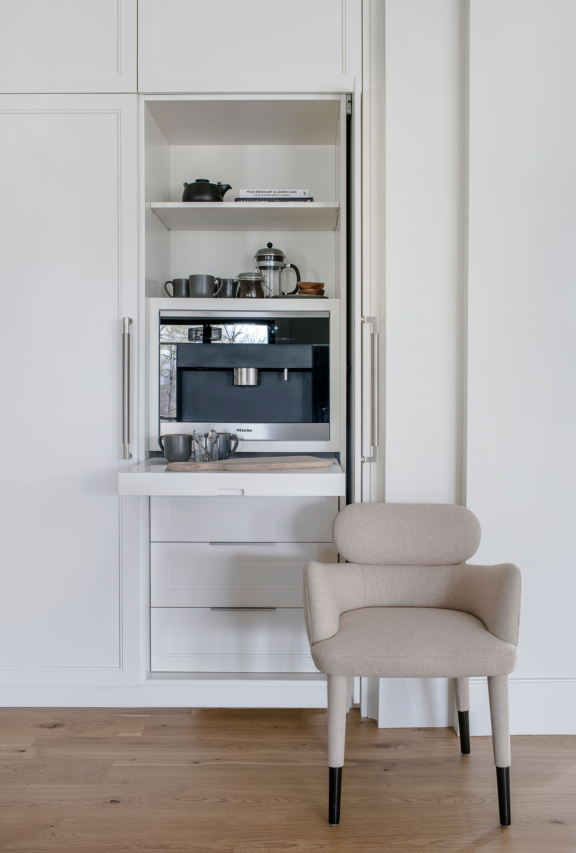
By in large, they're something you'd design into a bespoke kitchen at the time of inception, however, there are ways to introduce an idea like this into your kitchen. Take a look below for some of the best buys for creating a pullout countertop in your home.
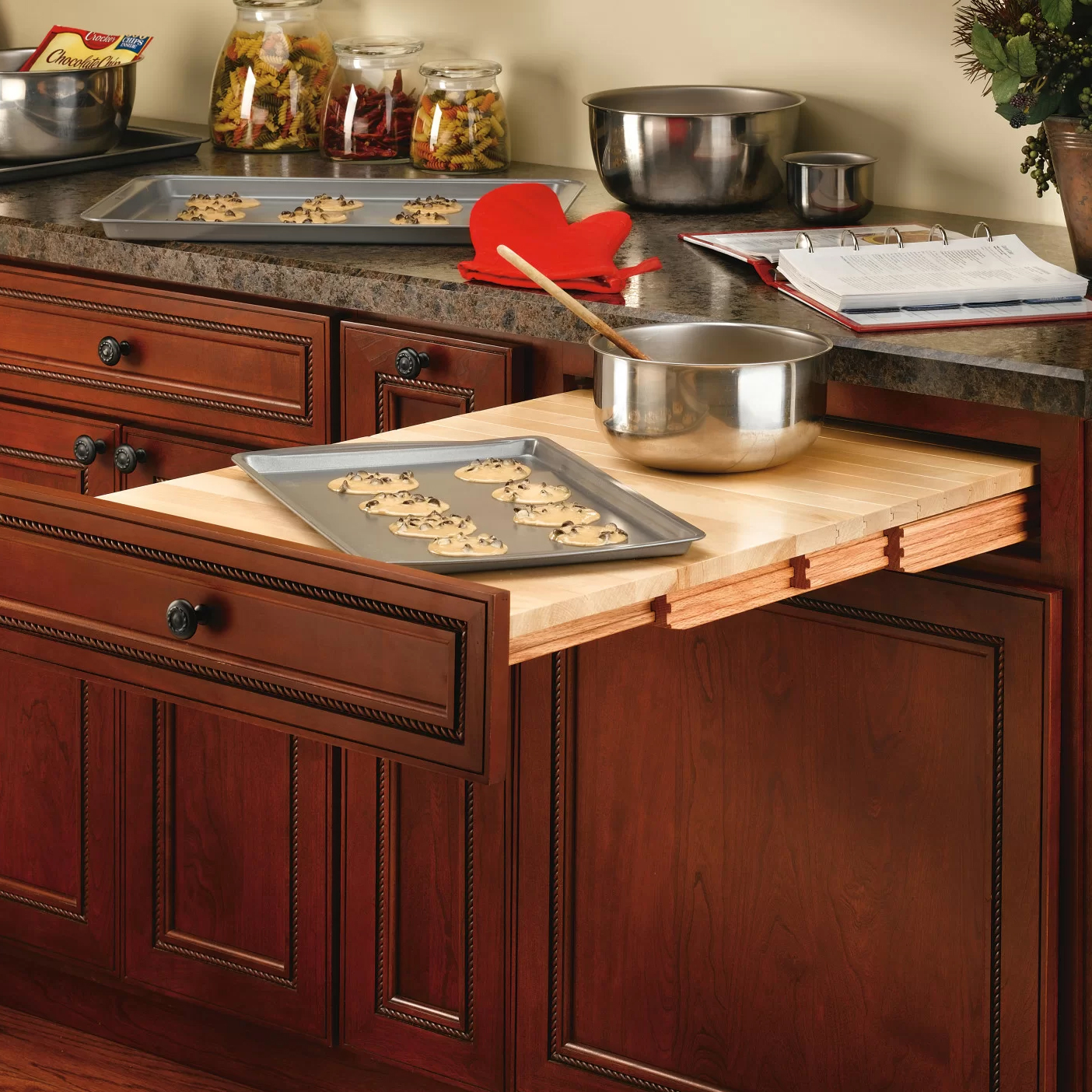
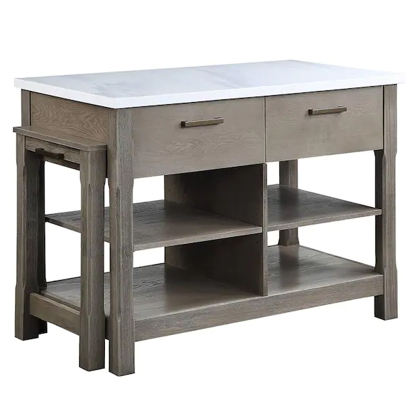
This tambour pull-out countertop can be fitted behind a standard drawer front for a surprising, yet useful extra bit of worksurface space.
Be The First To Know
The Livingetc newsletters are your inside source for what’s shaping interiors now - and what’s next. Discover trend forecasts, smart style ideas, and curated shopping inspiration that brings design to life. Subscribe today and stay ahead of the curve.

Hugh is Livingetc.com’s editor. With 8 years in the interiors industry under his belt, he has the nose for what people want to know about re-decorating their homes. He prides himself as an expert trend forecaster, visiting design fairs, showrooms and keeping an eye out for emerging designers to hone his eye. He joined Livingetc back in 2022 as a content editor, as a long-time reader of the print magazine, before becoming its online editor. Hugh has previously spent time as an editor for a kitchen and bathroom magazine, and has written for “hands-on” home brands such as Homebuilding & Renovating and Grand Designs magazine, so his knowledge of what it takes to create a home goes beyond the surface, too. Though not a trained interior designer, Hugh has cut his design teeth by managing several major interior design projects to date, each for private clients. He's also a keen DIYer — he's done everything from laying his own patio and building an integrated cooker hood from scratch, to undertaking plenty of creative IKEA hacks to help achieve the luxurious look he loves in design, when his budget doesn't always stretch that far.
