Sofia Richie's Expensive-Looking Entryway is the Envy of Designers — Here's How to Recreate the Look in Your Home
Discover how to create a celeb-worthy entryway to set the tone for your whole house


Sofia Richie has been top of our inspiration board for a while now. Ever since her epic South of France wedding took place - a display of her good taste - we've been keeping tabs on the model's every move. Most recently, it's her gorgeous entryway that we can't take our eyes off.
The entryway is one of the most important places in a home. It's the first thing people see and it sets the tone for the rest of your space, meaning we always aim to create a welcoming, stylish, and expensive-looking space. Sofia's - unsurprisingly - ticks all of the above boxes, providing ample inspiration for our own designs.
You might think it merely looks expensive because of its unrealistic size indicative of its mansion status, but you should think again. We asked interior designers for their suggestions on what makes this entryway feel so luxurious, and the things you can do to get the same effect in your space. Here's what you need to know.
Lighting

Lighting is the key to making most rooms look expensive. Huge windows are a luxury that most of us don't have access to, but that doesn't mean we can't emulate the effect.
'Ideally, you want as much natural light as possible in your entryway,' says VP at furniture design company BDI, Dave Adams. 'Bright natural light makes even a small space feel open and inviting,' he says. While it's true that natural light can transform any space, most entryways are limited on this, making the space look dull and dated.
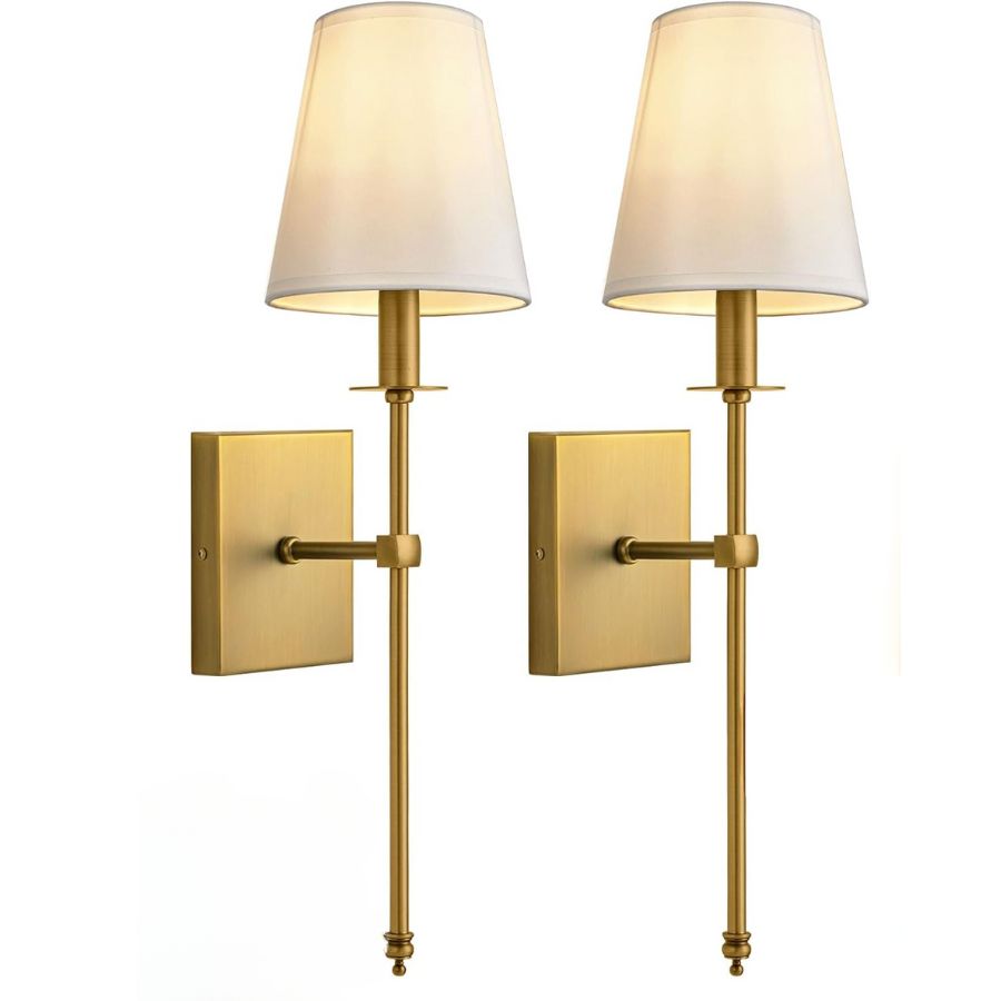
If your home isn't blessed with 10 foot tall windows, then fear not. There are plenty of chic lighting ideas to give you that luxe entryway look. Take some inspiration from Sofia's home and try some warm bulbs in a dramatic wall sconce, like this one from Amazon. It will immediately liven up the space.
Proportions
)
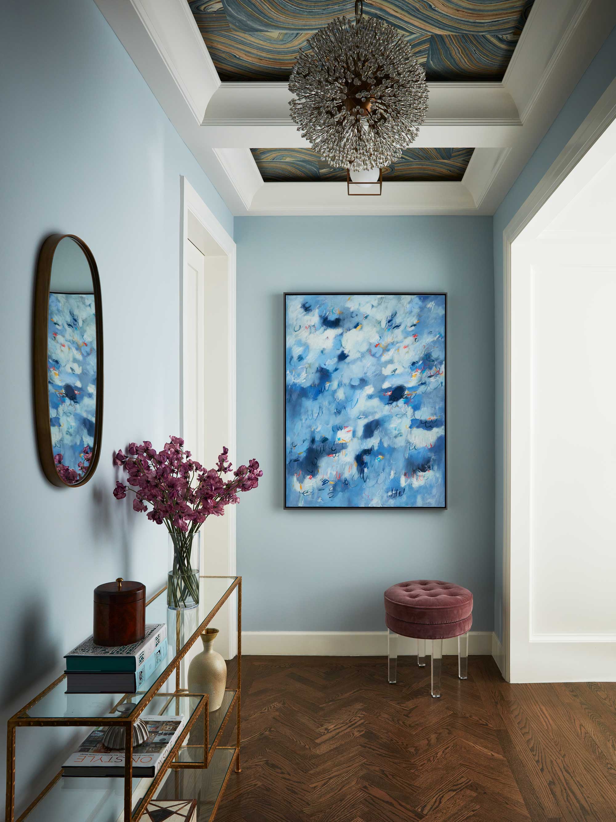
'Not all entryways are created equal,' says Dave. 'But, no matter if you have a grand entryway with marble floors, a front door that enters into an open floor plan, or a tiny nook in your condo or apartment, there is always a way to create a statement in your foyer.'
Sofia Richie is clearly blessed with a beautiful home, but that doesn't mean you can't take lessons from her space. One thing she has clearly got right is the proportions of the space. Large open-plan spaces can often feel empty and soulless but with a few strategic decisions, she knows how to make an entryway look more expensive.
'Consider using furniture, art, rugs, and other design elements to wow your guests and set the tone for that transitional space between stepping through the door and entering the heart of your home,' says Dave. 'If you have the space, a console table makes an immediate design impression while offering you a space for storage of purses, keys, mail, and other objects you need close at hand but out of sight.'
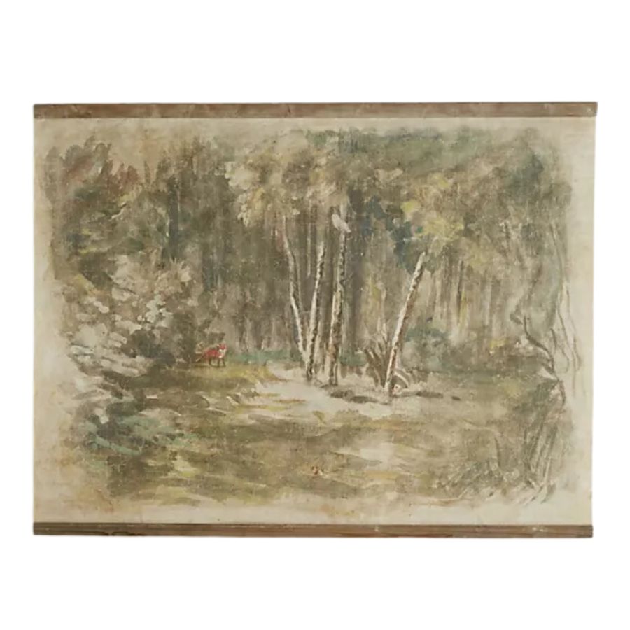
In Sofia's home the gathered curtains and side table are what your eyes are immediately drawn to. Try emulating a similar focal point in your space, a large piece of art or gallery wall can be a great option.
Go Clutter-free
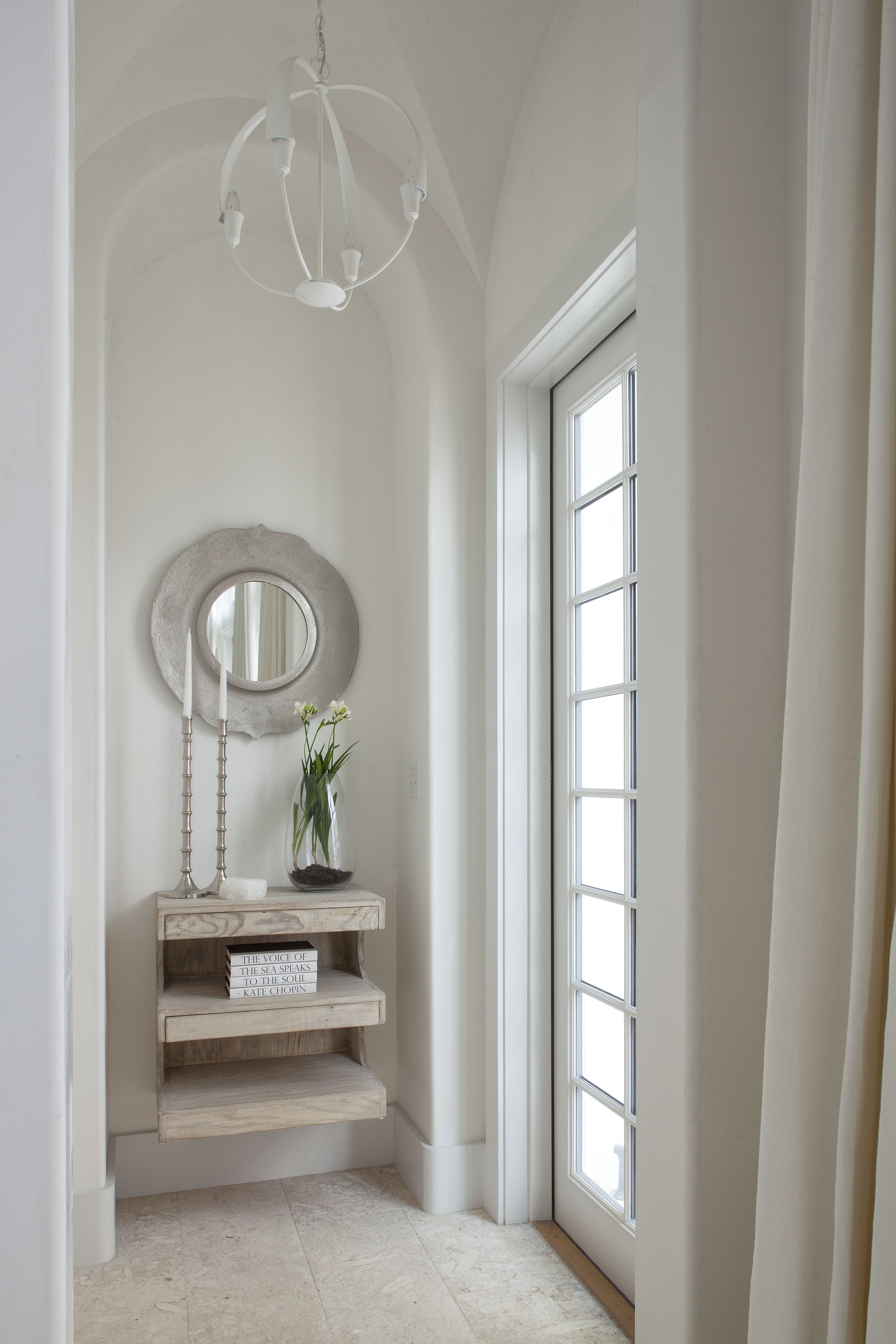
One of the first things you notice in Sofia's entryway is its minimalist nature. A clutter-free space instantly looks more luxe than one filled to the brim with stuff, and when it comes to how to organize an entryway, stylish, space-saving storage is key to hiding away the clutter.
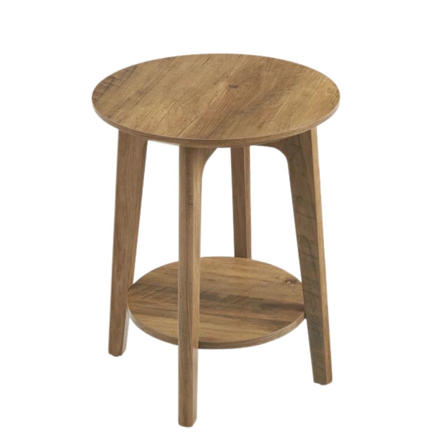
'The key to an inviting entryway is not to overwhelm the space with excessive clutter or bulky furniture,' says interior decorator Vivianne Chow. 'Sofia Richie has a simple round table styled with white flowers for an understated yet inviting look.'
Even if you prefer a more eclectic style and refute the minimalist aesthetic, your entryway should lean towards the latter. Decluttering your entryway will make the biggest difference in your quest to create a luxurious, welcoming, and stylish entryway.
A post shared by Sofia Richie Grainge (@sofiarichiegrainge)
A photo posted by on
Get the look
Be The First To Know
The Livingetc newsletters are your inside source for what’s shaping interiors now - and what’s next. Discover trend forecasts, smart style ideas, and curated shopping inspiration that brings design to life. Subscribe today and stay ahead of the curve.

Formerly a news writer for Livingetc, Amy completed an MA in Magazine Journalism at City, University of London, and has experience writing for Women’s lifestyle publications across arts, culture, and beauty. She has a particular love for the minimalist aesthetic mixed with mid-century furniture, especially combining unique vintage finds with more modern pieces. Her previous work in luxury jewellery has given her a keen eye for beautiful things and clever design, that plays into her love of interiors. As a result, Amy will often be heard justifying homeware purchases as 'an investment', wise words to live by.
-
 This Outdoor Lounger Is the Color of the Season for Garden Furniture — And It's on Sale This Weekend
This year, it's all about the contrast, and this bright, sunny hue is the perfect foil to your green outdoor spaces
By Hugh Metcalf
-
 Kelly Wearstler Designed an Animal Hospital Where "Anxiety Just Melts Away", and I'm Taking Notes for My Own Home
The renowned designer's foray into healthcare demonstrates have even the most functional of spaces can still be design-forward
By Devin Toolen
