Spanish style home decor - 10 ways to create the feeling of vacation every day in your decor
Knowing just when to add pattern and just when to go plain is the secret to Spanish style home decor, as these designers explain
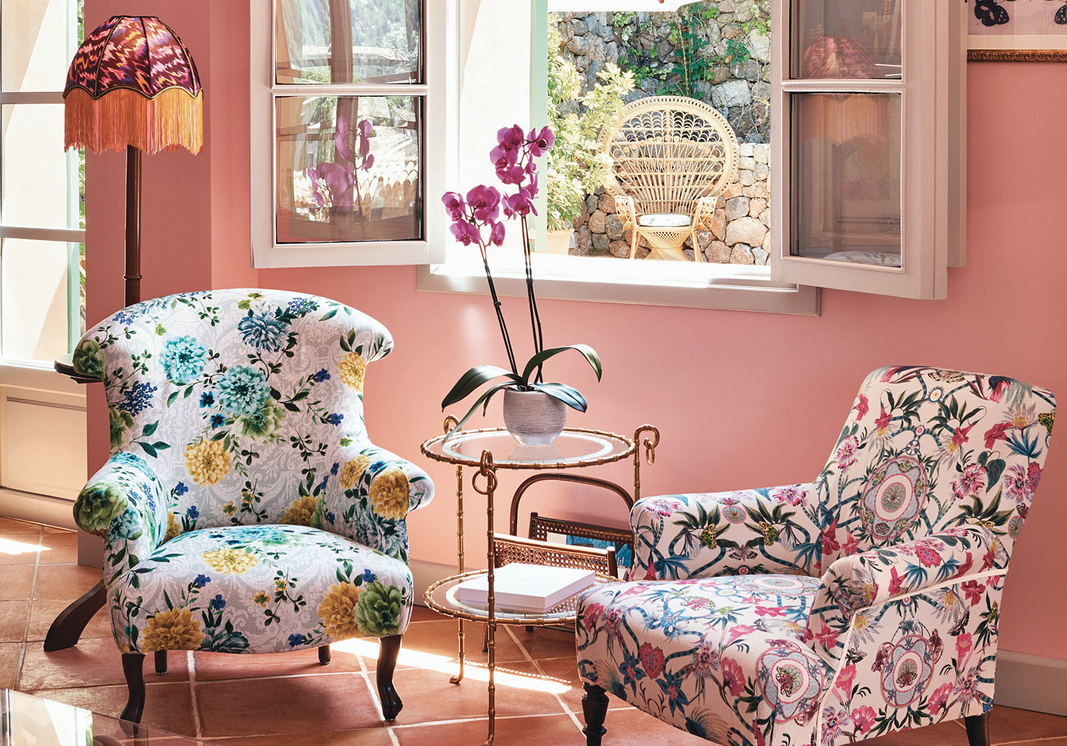
Spanish style home decor covers a lot of decorative ground. Perhaps first to mind is the whitewashed fincas found in the Hollywood hills. But the more authentic approach, that is easier to recreate anywhere, comes from Spain itself.
Earthy palettes, stucco walls and hand-painted ceramics ooze joy and magnetism as notes of lavender, orange blossom and citrus scents fill the air.
While the magic of Spain is best experienced first-hand, bringing it home is now a little easier with designers, makers and brands immersing the aesthetic into products, color selections and even scents, to ensure it can be transported further than just the country itself. Your home may not resemble the structure of a Mediterranean villa but, through color and material selections, you can embrace some of the core elements of Spanish style to radiate its ambience within the home wherever you might be located.
Spanish style is a key aesthetic in interior design, and is about embracing bold colors and vivacious patterns. Designers also advise on how to implement these touches without going overboard. We spoke with 10 creatives to gain an insight into some of these tips and tricks.
1. Start with a checkerboard floor
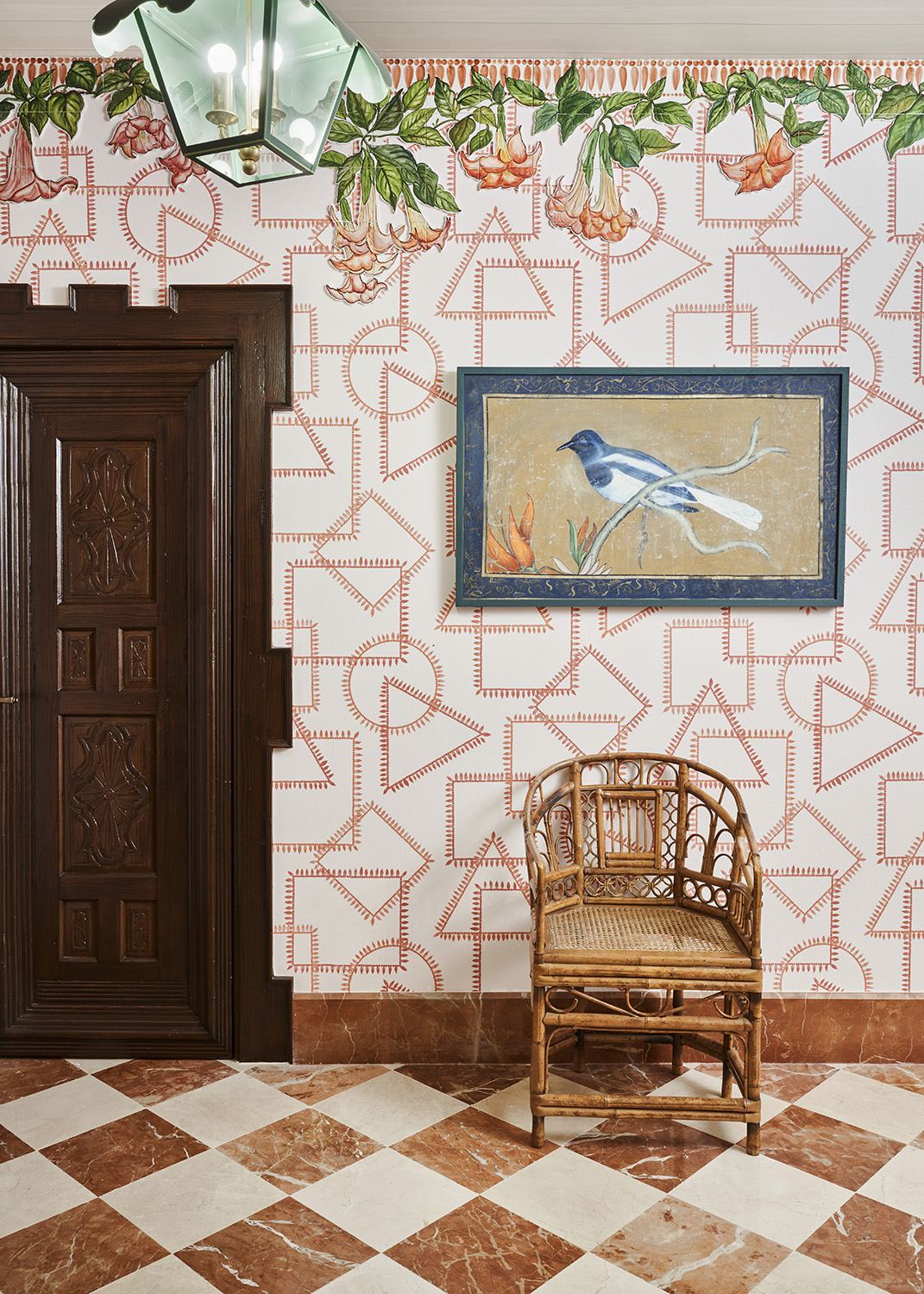
The Marbella Club Hotel designed by EMCI Design Studio
Seen here in a pink and white colorway at The Marbella Club Hotel designed by EMCI Design Studio, a checkerboard floor is a great way to set the tone for a Spanish influenced interior, especially at this scale.
“Spain has an effortless approach to interiors that resonates with me,” comments interior designer and upholsterer Micaela Sharp. “The Marbella Club is one of my favourite hotels and I adore the layering of patterns such as stripes, shells, and florals.”
This layering is again important to allow for a variety of textures to blend well together, especially against a muted color palette. The decorative wooden ceiling also adds depth and sets a natural tone alongside the rattan, bamboo, and decorative ceramics; all finishes that help to bring the Spanish verve to life.
2. Highlight existing features
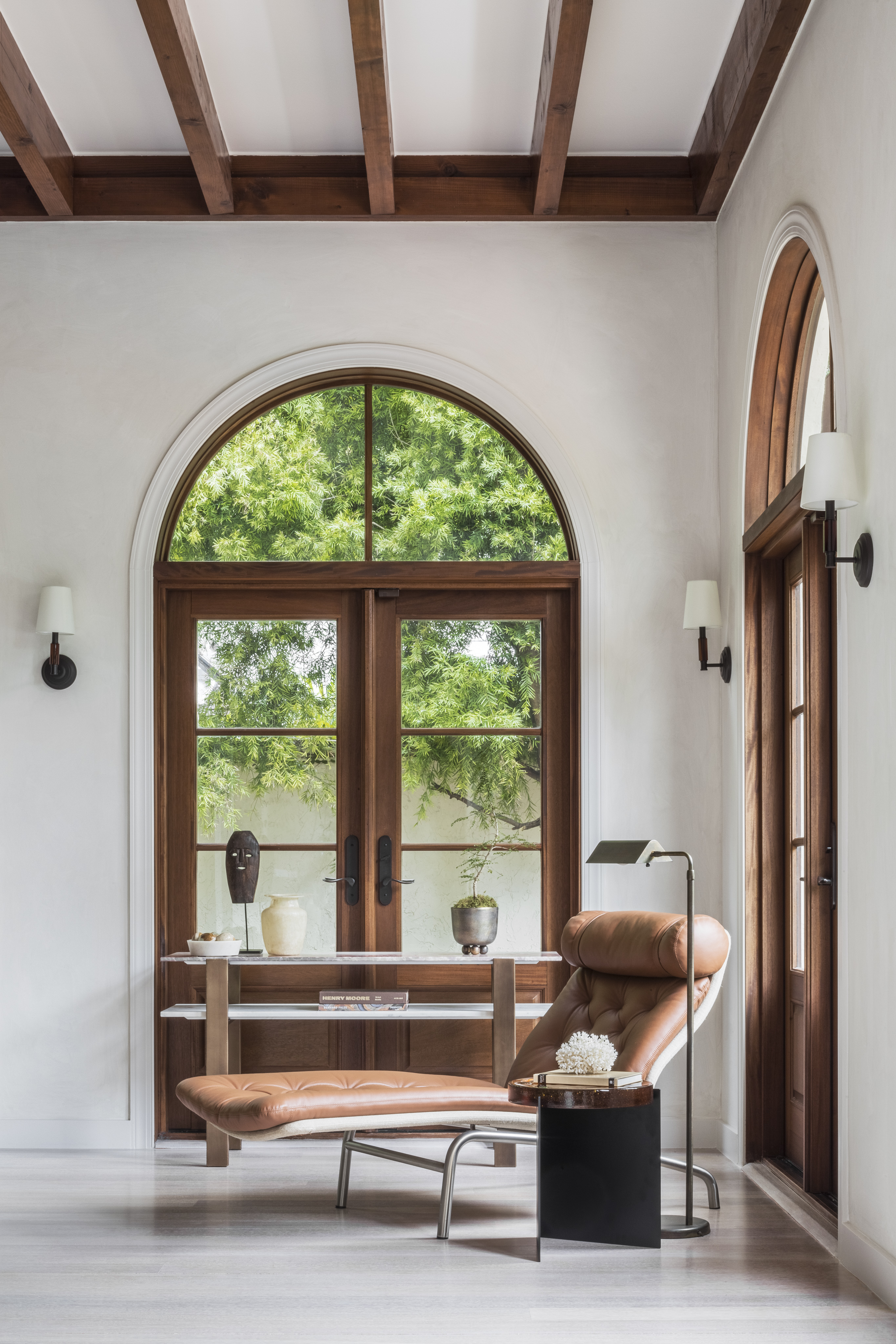
One of the joys of the Spanish-style homes found in Hollywood are their period features. They tend to be old, they tend to have wood beams or iron work, and the tend not to cover them up.
This is a principle that anyone can use anywhere - and it adds a bit of modern farmhouse meets Spanish decor flair. Miami-based Interior designer Constanza Collarte loves the 1930s local architecture which takes stimulus from Spanish and Mediterranean design. Talking about her own home renovation, she said it was a balance of updating the home for a growing family whilst honouring the building’s vernacular which she says is very important. “Through preserving original wood doors and terracotta tiles, alongside the exposed structural elements in the interior, we drew attention to, and celebrated, the rustic Spanish details.”
By working with existing features, even in farmhouse-style properties not in Spain, it can add to the ambience mimicking a look that isn’t too dissimilar from that of a Spanish villa. “These features can be complemented in the furnishings and accessories,” Collarte continues, “especially through the application of patinated leather in the soft goods and antique wooden case pieces.”
3. Pair bright blues with wood
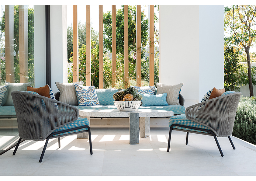
“In Spain I’m naturally drawn to stone with a rustic feel like tumbled limestone and distressed woods that you might find in a traditional interior,” says London-based interior designer Natalia Miyar, who has worked on a number of projects in Ibiza. “However, I try not to use these in a typical way. I also don’t have rules for the types of fabrics I use in a Spanish villa and I’m happy to use silk drapes for elegance and contrast this with a relaxed woven linen headboard for instance.”
Focusing on different elements such as this is a nice way of adding a touch of Spanish flair without going over the top. Color can also play a pivotal part in anchoring the project - like this smart patio above - with an individual identity and sense of place. “I bring in bright blue shades alongside bold, lush greens of tropical plants and pops of playful accent colors such as terracotta,” she continues. “The blend of contrasting textures and hues creates layers of easeful comfort, the key to creating a nuanced and inviting interior.”
4. Contrast patterned prints with plain walls

While pattern is a key ingredient within Spanish homes, contrast is important to ensure the overall aesthetic comes together. “A Spanish feel centers on paring some elements all the way down and punching some all the way up,” says the Spanish-based interior designer Matthew Williamson. “Traditional Spanish textiles and tiles are non-negotiable as they add vibrancy, color, personality and detail.”
Wall art or accessories such as lampshades are also a great way to add in pattern, set against a color-blocked backdrop. “Don’t be afraid of color here,” Williamson continues. “Channel the warmth of the sun with a palette of pinks, oranges and even terracotta and paprika tones.” (Paprika just so happens to be a big color trend for 2023).
Contrast doesn’t have to lie in just the colors but also in materials too. For example, textured fabrics against plastered walls or large flagstones can create a cool, informal look.
5. Mix in decorative tiles wherever you can
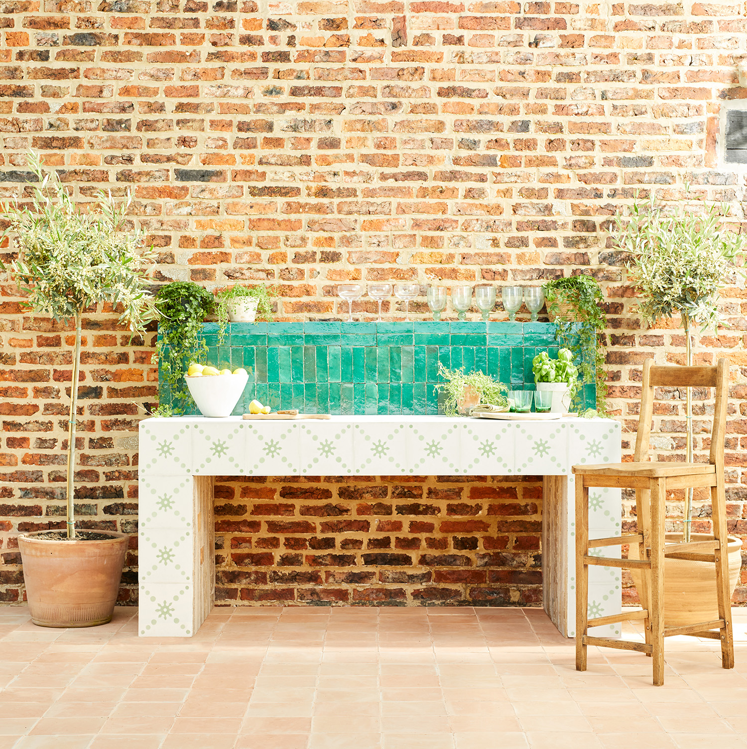
Translating Spanish vibes into an often-greyer climate means bringing touches of decorative style through tiles or materials like rattan and stone not only inside but outside too. “I’m tile obsessed,” says interior stylist and designer Emma Merry who spent many years living in Spain during her twenties and noted the Moorish influence on Spanish architecture and design. “I believe there is always room for some Mediterranean style in a space, be it brightly colored pottery mixed with geometric patterns and warm, earthy tones.”
Adding touches to an exterior space such as terraces or patios can enhance and encourage the alfresco lifestyle too, which is customary in warmer climates. Merry states that her love for an eclectic mix of pattern and color stems from her time in the country and challenges anyone to visit the Alhambra and not come away bursting with ideas! If you have the space, think about an outdoor sanctuary with an open-air bath and outdoor kitchen finished with antique-style Spanish tiles such as these from Bert & May.
6. Tile the floor with pattern
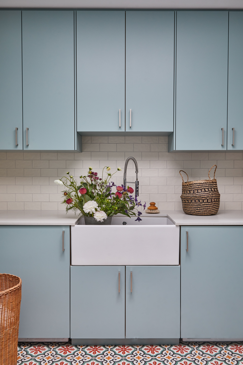
Design by Cave Interiors
Speaking of Spanish-inspired tiles, using them as a floor type in more traditional spaces can have a big impact. With the origins and production of Spanish tiles dating back thousands of years, they are seen extensively in architecture and interior spaces across the country. That’s why incorporating patterned tiles into the home is an easy, and important, way of embracing the Spanish aesthetic. Not only do they provide a burst of colour, but they also reference the history of the architecture itself.
“A simple bathroom or kitchen design can be elevated by a cool toned, mismatched patterned tiled floor,” says interior designer Bhavin Taylor. “It is used a lot to create a cooler environment for those hot Spanish summers and, even in monochromatic colourways, they can bring a room to life. A tile can also be a great feature to base your interior scheme on as it will influence the colours and textures you want to use alongside it.”
7. Be inspired by folksy Spanish patterns
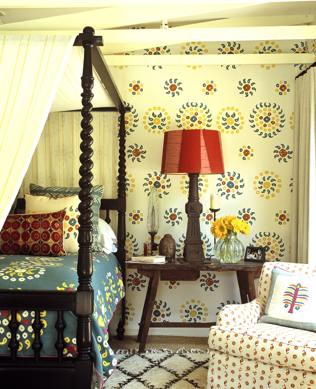
Design by Kathryn M. Ireland
Wall-hung hand-painted ceramics are often seen within traditional Spanish homes and interior designer Kathryn M. Ireland feels adding pattern to walls can replicate this visually. The designer, who has just launched her first online course with Create Academy, based a recent modern bedroom scheme around a statement block print wallpaper which reminded her of these traditional Spanish ceramics.
“To continue the narrative of the room, I made sure to carry the same predominant colors – yellow, green, and red – as well as the mark-making across the textiles and lampshade,” she explains. “This tied everything together and made it look curated rather than just an explosion of color.”
Complementing the scheme with dark wood and a vintage Spanish table helped to augment the rustic feel with a sheer canopy over the four-poster bed bringing in a cool, breezy Spanish vibe that Ireland says she loves. Again, this combination of color, pattern and texture helps to encapsulate the traditional Spanish style but in a current and contemporary way.
8. Combine reds with untreated materials
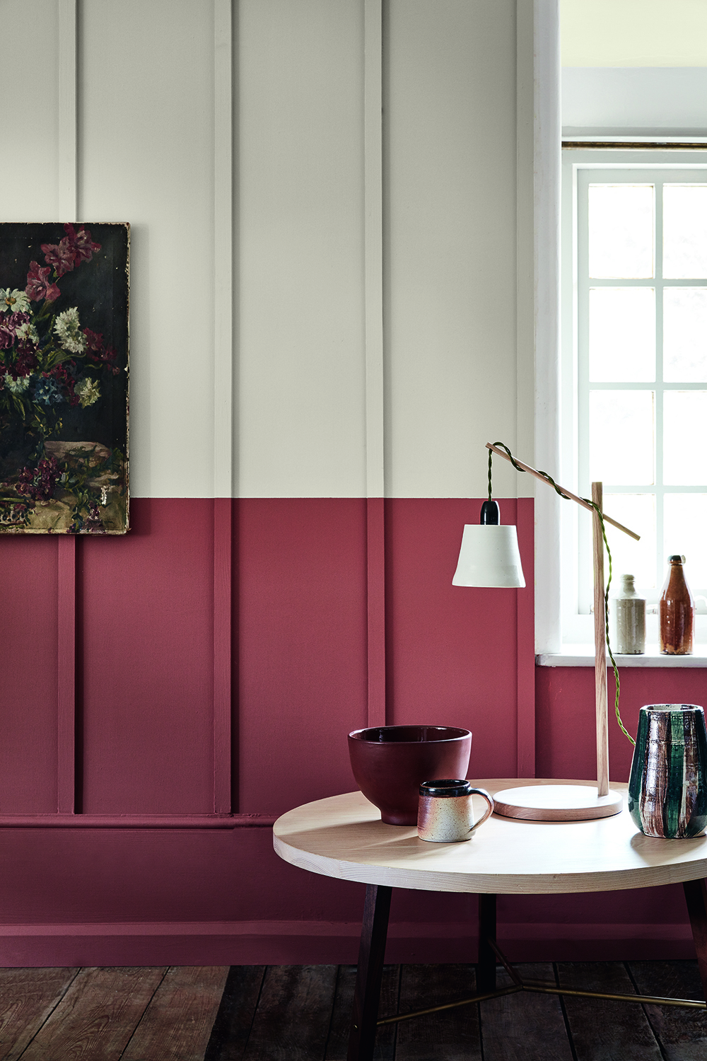
Warmer tones such as red and orange work well together and can be a good step towards a Spanish-style interior. Accompanying these richer hues with natural or untreated materials will also assist in achieving the Mediterranean feel, especially when using brick or stone as a backdrop.
“You can play with bolder soft furnishings and home accessories to add depth,” says Sophia Ayrton-Grime, the creative force behind Studio Raff and Atelier Raff. Bringing in touches of earthenware and wood alongside the oranges and reds, compliments the scheme and will encourage that coastline feeling.
9. Incorporate reclaimed Spanish architectural features into the space
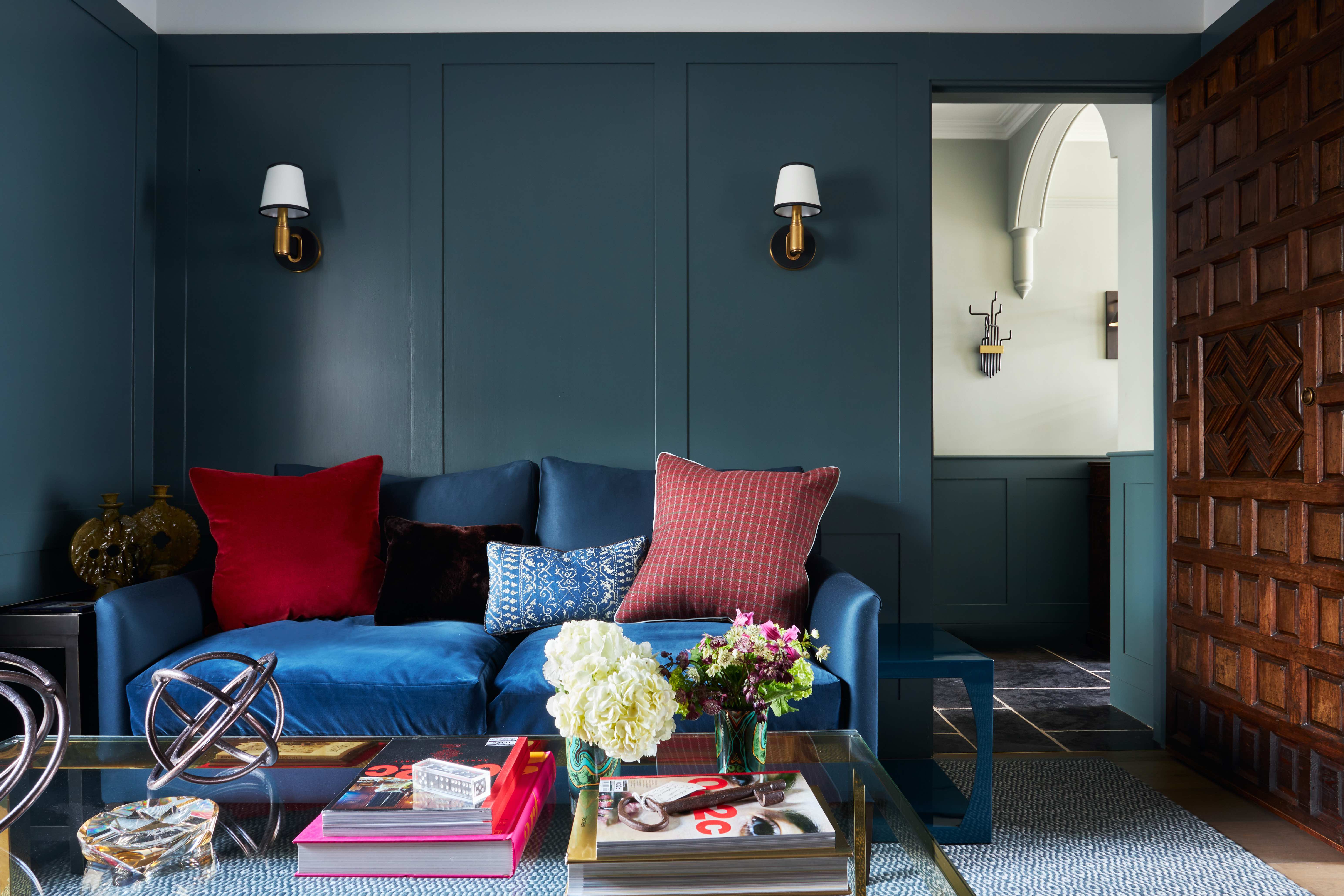
With the reclaimed and vintage market booming in recent years, you can often find architectural features such as doors and windows which have been salvaged from Spanish villas and fincas during a renovation project. Interior designer Melissa Hutley, one half of Hutley and Humm, recently added an antique Spanish carved door into a client’s library/snug room, as they wanted to reference their Spanish heritage in the décor itself. “It brought depth and character to the interior architecture,” Hutley explains, “while also making it an extremely personal space for the client.”
To complement the darker wood tones of such features, make sure to pair it with colourful weaves and textured fabrics to lift the scheme. “Stone flooring is also often seen in Spanish homes to create a cool atmosphere against the heat,” she adds. Again, another product which can be sourced through reclamation dealers and vintage platforms.
10. Keep it light and airy with relaxed linens and sheer fabrics
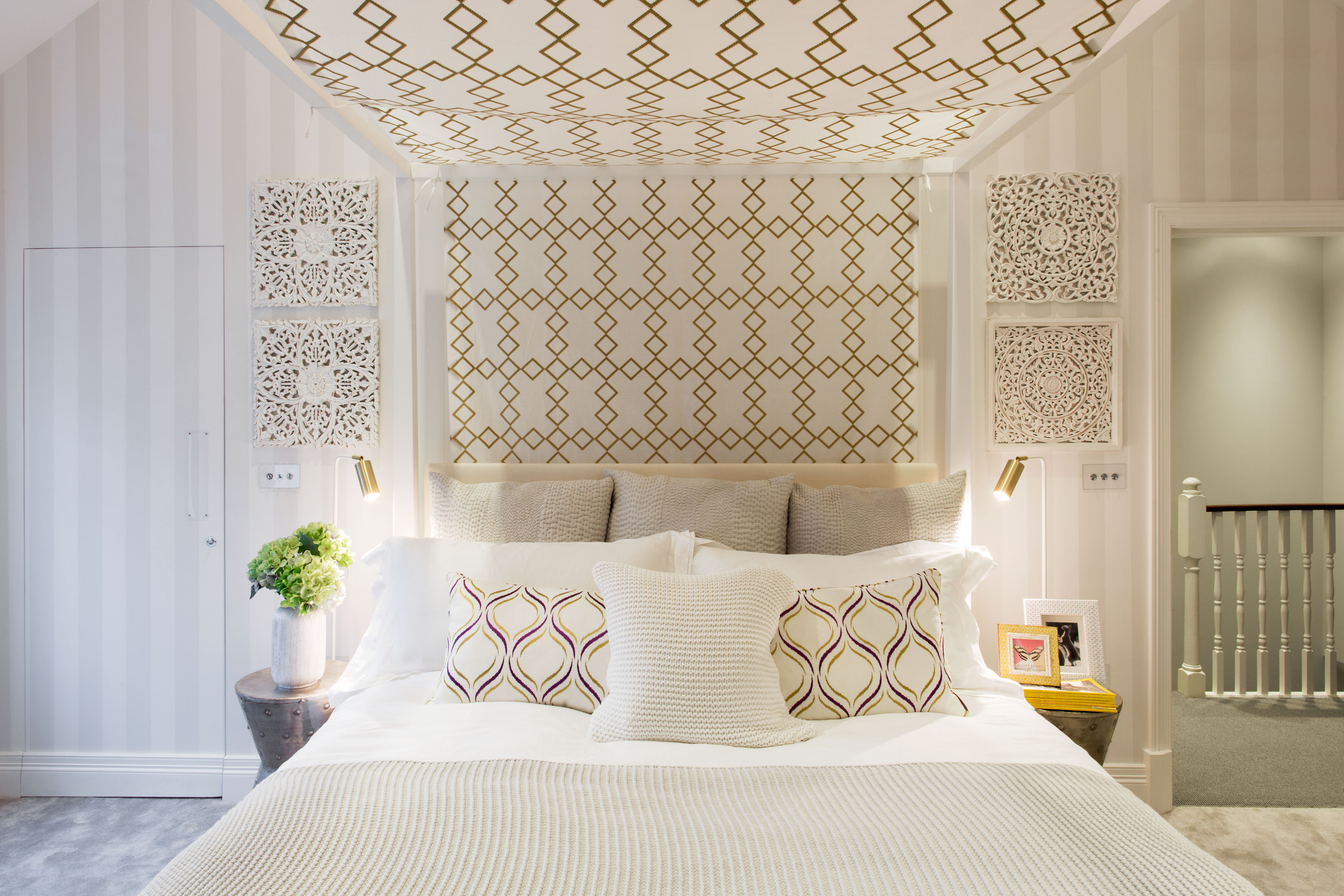
“Tie a simple flat panel of white embroidered sheer fabric over a four-poster bed to keep it fresh and open,” states interior designer Juliette Wright, co-founder of design studio Stephenson Wright. “Also, choose a fabric style that nods to the Spanish mosaic patterns you might see in tiles which will amplify the characteristics of this look.” Decorative wood accent wall panels can also help to frame a bed or act as a headboard, another alternative to four-poster options.
Outside, natural materials will help to create a relaxed ambience. “A woven swing seat on a courtyard or terrace, styled with oversized neutral cushions and linen patterned throws, is a great way to continue the Spanish style,” Wright continues. “Woven baskets and large glass jars filled with leaves also help to add a botanical touch.” With such textures and intricate carvings emanating the feel of a villa itself, layering them against neutral bases with pops of color works well in creating a cohesive scheme.
Be The First To Know
The Livingetc newsletters are your inside source for what’s shaping interiors now - and what’s next. Discover trend forecasts, smart style ideas, and curated shopping inspiration that brings design to life. Subscribe today and stay ahead of the curve.
Design writer, presenter, panel host, consultant and journalist Roddy Clarke is a regular on the pages of Livingetc. He also writes frequently for FT Weekend and Forbes. Based in London, and with a breadth of skills and hands-on industry experience, Roddy now offers an exclusive interior styling and design service.
-
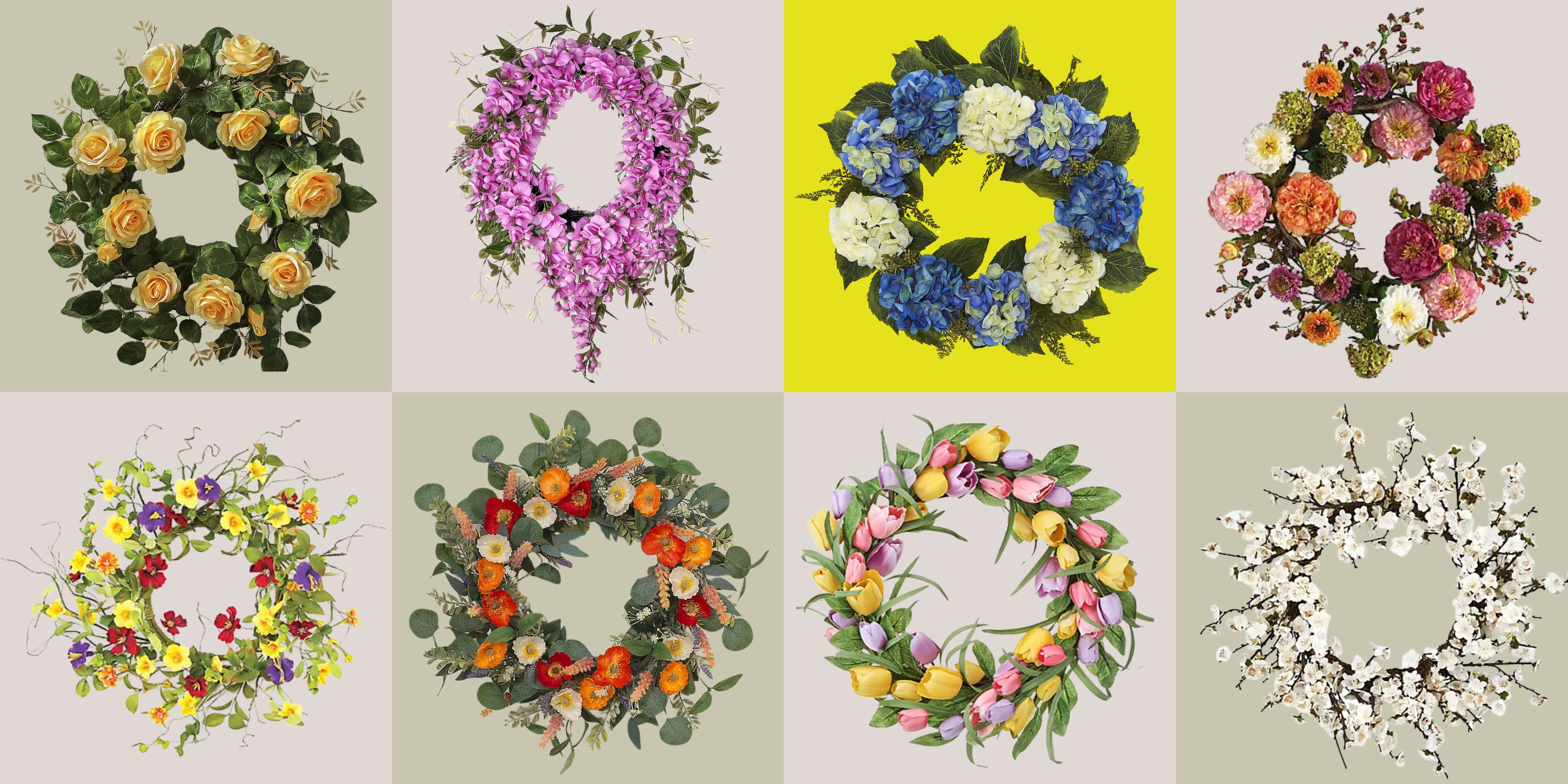 These Are the Flower Crowns I’m Wearing This Spring (Spoiler: They’re Actually for My Door)
Coachella confirmed the comeback of flower crowns. At home, they just go by another name: the spring wreath
By Julia Demer
-
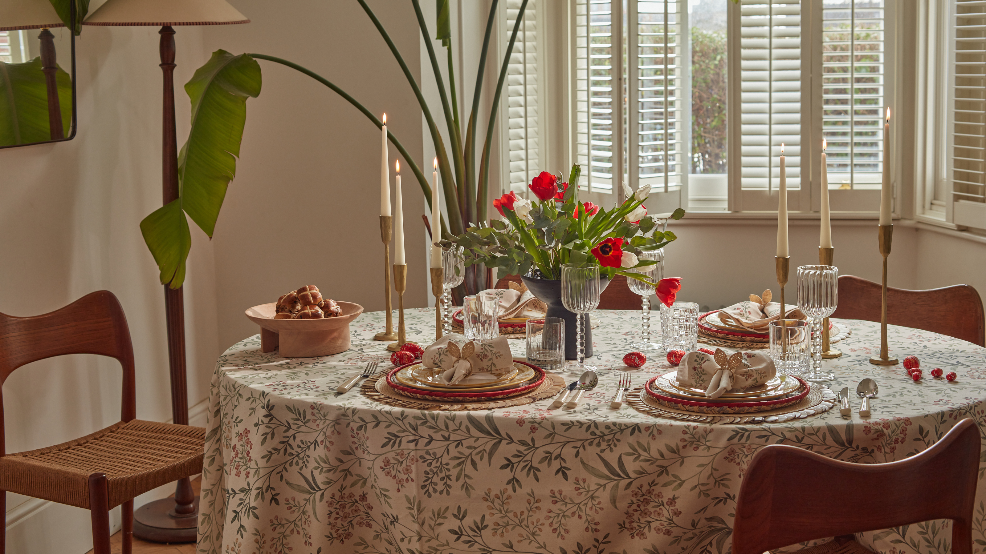 Bunny Ears, Be Gone — 7 Easter Table Styling Mistakes That Will Take Your Setting from Tawdry to Tasteful
From fussy floral displays that disrupt conversation to over-relying on tacky tropes, don't fall victim to these errors when decorating your Easter table
By Lilith Hudson