

What comes to mind when you think of spring color palettes? Most likely the classic combinations of a variation of soft pastels. Rose petal pink, duck egg blue, buttercup yellow, or soft lavender — these delicate shades have come to define the season, and for good reason.
"Their gentle tones represent hope, and whisper promises that the cold, dark nights are over, that summer is coming, and that color is back after a long winter hibernation," says Livingetc's color expert, Amy Moorea Wong.
Indeed, spring colors are joyful, spirited, and playful. They make you want to frolic through fields of meadow flowers. But when it comes to interior design, they require a touch more consideration and nuance to ensure they can carry through to the months ahead. And, as always, it pays to pay attention to the latest color trends, for inspiration on how to elevate the expected.
Lately, I've found that the best way to reinvent the color of your spring decor ideas, is by pairing the expected pastel with a more unexpected partner. A light with a dark, a soft with a bold. Think deep shades of burgundy to spice up a more muted butter yellow, or picking a peach that leans a little more terracotta. It's pastel, but punchy.

Amy Moorea Wong is a color authority and interior design writer who has specialized in all things decorating for over a decade. She is Livingetc's color expert and has published her own contemporary interior design book, Kaleidoscope: Modern Homes in Every Colour. Amy has a beautifully refined eye for color that makes her designs feel exciting, dynamic, and contemporary.
A refined spring color palette means being unafraid to mix, match, and layer. Interior designer Micaela Nardella, founder of London and Milan-based studio, Duelle, says, "A spring color palette should feel hopeful, earthy with pops of delicate flower-like colors, and most of all fun." You can stay on the subtle and soft side of things, or lean into the more energetic colors that provide extravagant visual pops.
"Color is all about how you want to feel in that room, the emotion or feeling you hope to achieve — cocooning, expansive, energized, retreated — so take care to consider emotional impact as it's the one you will really 'feel' the most," adds Micaela.
It's the season of renewal after all, so below, I've shared five unexpected spring color pairings that may just change your whole perception of the season.
1. Baby Blue and Chocolate Brown


To truly achieve a spring aesthetic, you can't kick the pastel color palettes completely. This baby, bluebird blue calls on the daintiness of spring, while the deep chocolate browns provide just the right amount of contrast.
When it comes to decorating with light blue, it's worth noting that it's a sensory-conscious color, which means it works wonderfully in large doses without overwhelming a space.
A light blue wall, bedding, or even large furniture pieces in the soft shade are all great places to start. And then brown can easily be added in through dark woods, throws, and decor accents.
Chocolate brown and baby blue are a classic pairing and such a timeless way to brighten things up for spring while still keeping that stylish edge.


2. Ice Blue and Pistachio Green

This living room shows pistachio and ice blue in a tonal, color-drenching technique, making the space feel calm rather than too vibrant.
I'm not always so easily convinced when it comes to decorating with pastels, but when I see a fabulous combination like this, even I can't deny its star power. I stumbled upon the ice blue-pistachio green pairing while searching for spring fashion inspiration, and knew it would work in interiors, too.
Blue and green are analogous colors on the color wheel, meaning they are next to each other and therefore make for a smooth and harmonious pairing. Interior designer Christophe Penasse from Masquespacio, tells me, "Spring color palettes should feel explosive, optimistic, and with few over-saturated colors."
He says this almost monochromatic scheme works because "you can rely on color blocking techniques to help define the room, and light blue is easy to combine with every tone." If you want a little more vibrancy in the mix, there are plenty of colors that go with pistachio; green is a natural color after all.


3. Butter Yellow and Oxblood


Oxblood red and butter yellow is, hands down, my favorite spring color palette of the season. Something about the sultry, deep red mingles with the soft, subtle yellow in all the right ways. And the best part is that this color combination will make a stylish addition any time of year.
To bring this look to life, start by choosing which color will act as your base. My favorite iteration of this pairing is through soft yellow walls with deep oxblood accent pieces. A muted yellow on the walls will feel relaxing while a pop of unexpected red here and there will keep the space lively.


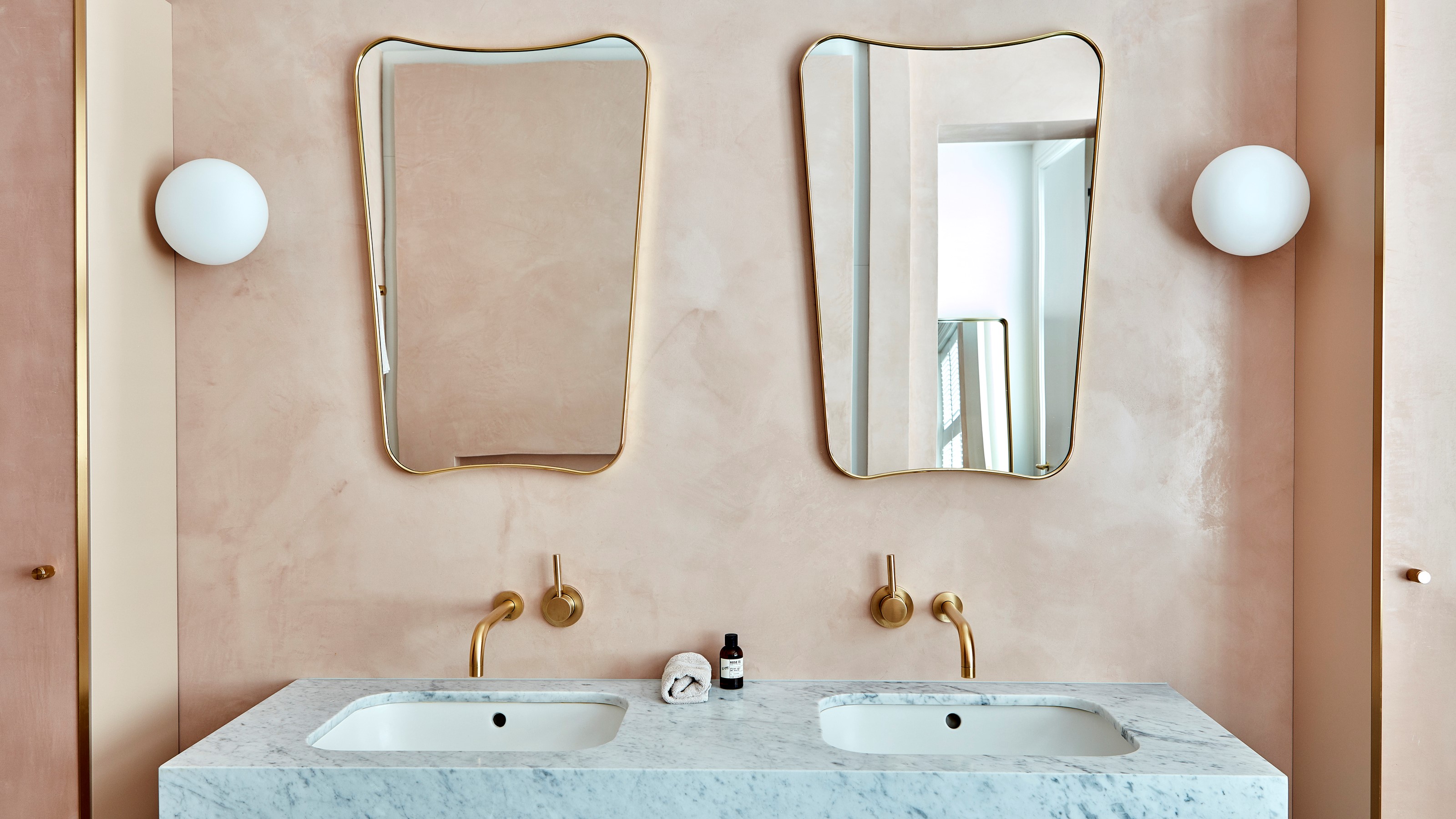
4. Mint and Dirty Peach


For a modern take on pastels, Amy says, "Go for tones such as glacier blue, fresh mint, gentle lavender, paired with a warm muted peach."
The contrast of warm to cool works well to "create subtle impact and helps to really pop the colors when you see them side by side," adds Micaela. "This particular bedroom and bathroom have a north-facing light, a bit cool and soft. So the warmer peach tone is tonal with the warm oak throughout the bedroom and brightens the space even though the color is deeper."
Top it off with an iridescent accent such as pearl-colored light to create a soft, enchanting, and dreamlike aura.

DUELLE is a boutique Interior Design studio working internationally from bases in London and Milan. The studio was founded by Micaela Nardella and Melanie Liaw.
The studio's approach to design is influenced by the duo's mixed Italian and Canadian-Chinese-British heritage, and their shared expertise designing hotel and restaurants for iconic global brands. Transforming stories into spaces, their interiors are nostalgia-rich and tactile.


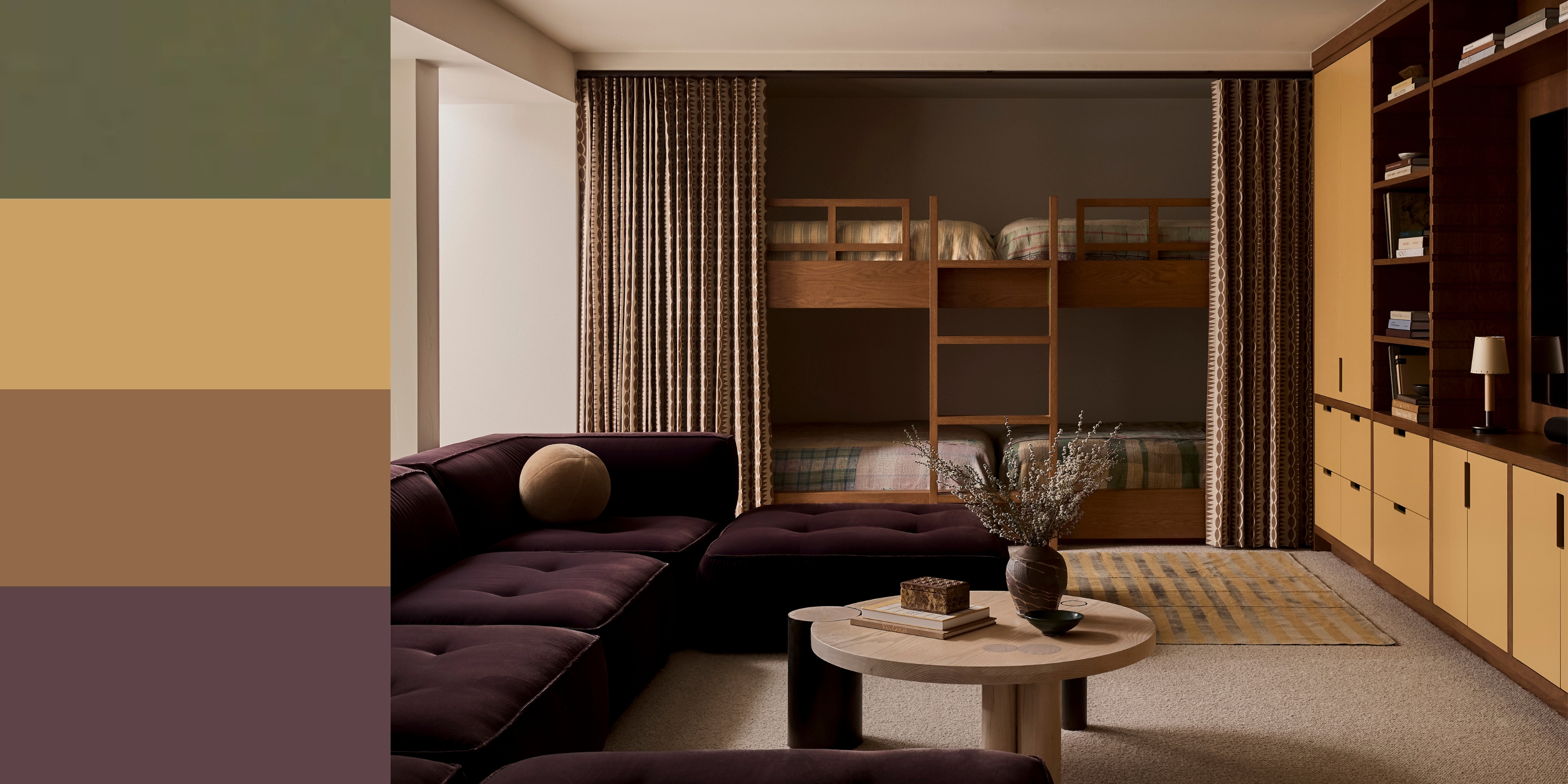
5. A Chic Combination of Olive Greens

In this living room the accents of olive green feel bright and airy, just like a spring color palette should feel.
Olive Girl Spring, anyone? While olive green works any time of year, I think it's high time we bring this shade back into the spring color palette.
Amy agrees, saying that she finds olive green to be an edgier, slightly more grown-up take, and that "sage and olive green are both earthy and dusty while still feeling fresh and fun."
Just because it's a darker green, doesn't mean you have to make your space feel heavy, either. Pair olive with a warm white like Benjamin Moore's Swiss Coffee paint color to keep things light and fresh.
If you’re in a subtle and soft mood, Amy says, "Try pairing olive with something really pushed back like ivory, opal, muted green celadon, or powdery blue wisteria, for a floaty and ethereal feel."
Decorating with earth tones will always bring in the blossoming aesthetics of spring; they just may need a pastel or two to brighten the look.


"A spring palette is more a mood rather than a calendar-based color calculator — feeling hopeful? Fresh? Uplifted? Subtle? Spry? Then go for the colors that speak to you," says Amy.

-
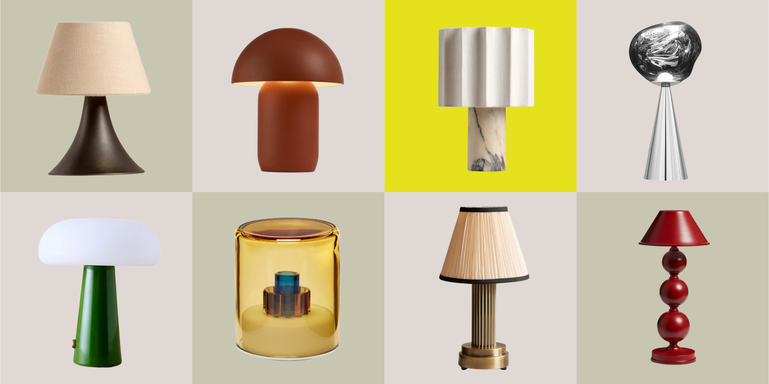 The Best Rechargeable Lamps Have No Cords, but Loads of Style
Want a lamp to style on your kitchen counter, on your bookshelf, or even in your garden? These portable, pretty, and plug-free lamps are the answer
-
 This Overlooked Space in Your Kitchen Could Be Causing Feng Shui Problems — Here's What to Do to Avoid Negative Flow
According to Feng Shui, where your stove sits matters. So instead of tampering with the chi in your home, here are six rules to note for a harmonious kitchen.


-
 Smeg Says Teal, and We’re Listening — The Kitchen Shade of the Year Is Here
Designers are already using the soft, sea-glass green everywhere from cabinetry to countertops
-
 Do Yellow and Purple Go Together? Designers Reveal How to Make This Unexpected Pairing Feel "Totally Intentional"
In an era where unexpected combinations have become cool, we've done a deep-dive to discover how to pair yellow and purple in a space
-
 The 'Red Table Trick' Is the Easiest and Most Expensive-Looking Trend to Hit 2025 So Far
A red dining table makes a seriously stylish statement; the beloved pop of red trend just got an bold and expensive-looking upgrade
-
 Everyone's Going Crazy for This One New Shade From Farrow & Ball Online — So What's the Big Deal With 'Scallop'?
It's a classic beige, but with a hint of blush — and it's the shade we're expecting to see in every minimalist's home this year
-
 4 Bathroom Colors That Are Going Out of Style in 2025 — Don't Say We Didn't Warn You
If you're redecorating your bathroom this year, our design experts suggest you avoid these outdated colors
-
 70s Color Palettes That Work for 2025 — 4 Designer-Approved Color 'Recipes' That Feel Modern Enough for Homes Today
It's time to bring out your paisley print and disco shoes — the golden yellows, olive greens, and deep purples of 70s color palettes are making a comeback
-
 "It's Akin to a Shot of Caffeine" — 4 Ways You Should Be Decorating With Cobalt Blue to Wake Your Home Up
Experts reveal everything you need to know to decorate with this powerful shade in the home
-
 The 10 Best Benjamin Moore Blues Interior Designers Always Come Back to
Benjamin Moore has a spectrum of blue shades to choose from, but what are the designer's favorites? Here, they will help you choose what's best for your home


