

When someone says the word 'neon' my mind races to highlighter pens and exercise tights from the 80s. It's bright, bold, and slightly hard to look at for too long — and not something I'd generally consider when styling my home. But when the internet's favorite trend predictor, Taylor Simon (the interior designer behind the now viral 'unexpected red theory') says "strategic neon" is the new way to elevate your space, I can't help but pay attention.
"I think people are craving more color in their spaces," she explains of her rationale behind the latest interior design trend. "Neutrals and shades of beige (now kindly coined 'sad beige'), were super popular over the last few years, but I think the pendulum is swinging the other way towards colors and prints."
By drawing the eye to an unexpected pop in the space — be that a piece of decor, an artwork, or even something as statement as furniture — the "strategic" placement of a touch of neon (note, not the entire room) can really energize a space, adding luminosity and plenty of character. But, it's certainly not as simple as a touch of red, so to help you get it right, we've broken down everything you need to know about strategically styling neon in your interiors, below.
Why is "strategic neon" trending in interiors?

Basically, if you were a fan of the "unexpected red theory", you will be a fan of "strategic neon", you just need to understand how it works. I got the chance to chat with Taylor Simon, about it, and she explained to me that she first come across the idea while scrolling Pinterest for inspiration.
"I saw the very intentional use of neon in otherwise subdued rooms, and I really liked the pop of something unexpected," she told me. She's also a fan of interior designer Paige Wassel's YouTube videos, and after hearing Paige speak about neon, Taylor knew there was something behind the trend.
This year has seen designers and homeowners embrace new ways of adding personality, fun, and what we've dubbed 'Playfulism' into their homes — and this color trend ties right into that.
So, why not neon?
How to Style the "Strategic Neon" Trend in Your Home

Neon colors are not an easy palette to work with in the home, but Taylor is changing that narrative. You don't have to go big to do it well, in fact, opting instead for a more subtle accent is what makes "strategic neon" strategic.
"It could look like a single painting, a single book, or even a flower arrangement if you're really non-committal," explains Taylor. "I think the key is only having one or two items, because a little goes a long way, and you don't want your home to look like an underground rave."
But in saying that, Taylor adds "I never say never, but this is a particular color I would avoid color drenching, although I'd love to see someone pull it off. I do think a muted lime or pale yellow look great color-drenched." (Note: It's been done, and it does — see the space by Muuto/File Under Pop, shown above.)

Since neon is so artificial, contrasting it with natural materials will help tone down the hues and make them blend more harmoniously into your home. Materials like wood, stone, and more relaxed fabrics like linen will act as a balance for the exaggerated saturations of neon. "The juxtaposition or what I like to call 'conflict' of neon interacting with those items is what makes it so interesting," says Taylor.
Interior designer Lauren Sweet-Schuler, principal of Studio Sweet-Schuler says that "Neon is great in artwork, which is the most accessible way to insert the color. However, we like to use it in very small doses like in books, lighting, and small accessories on a shelf."
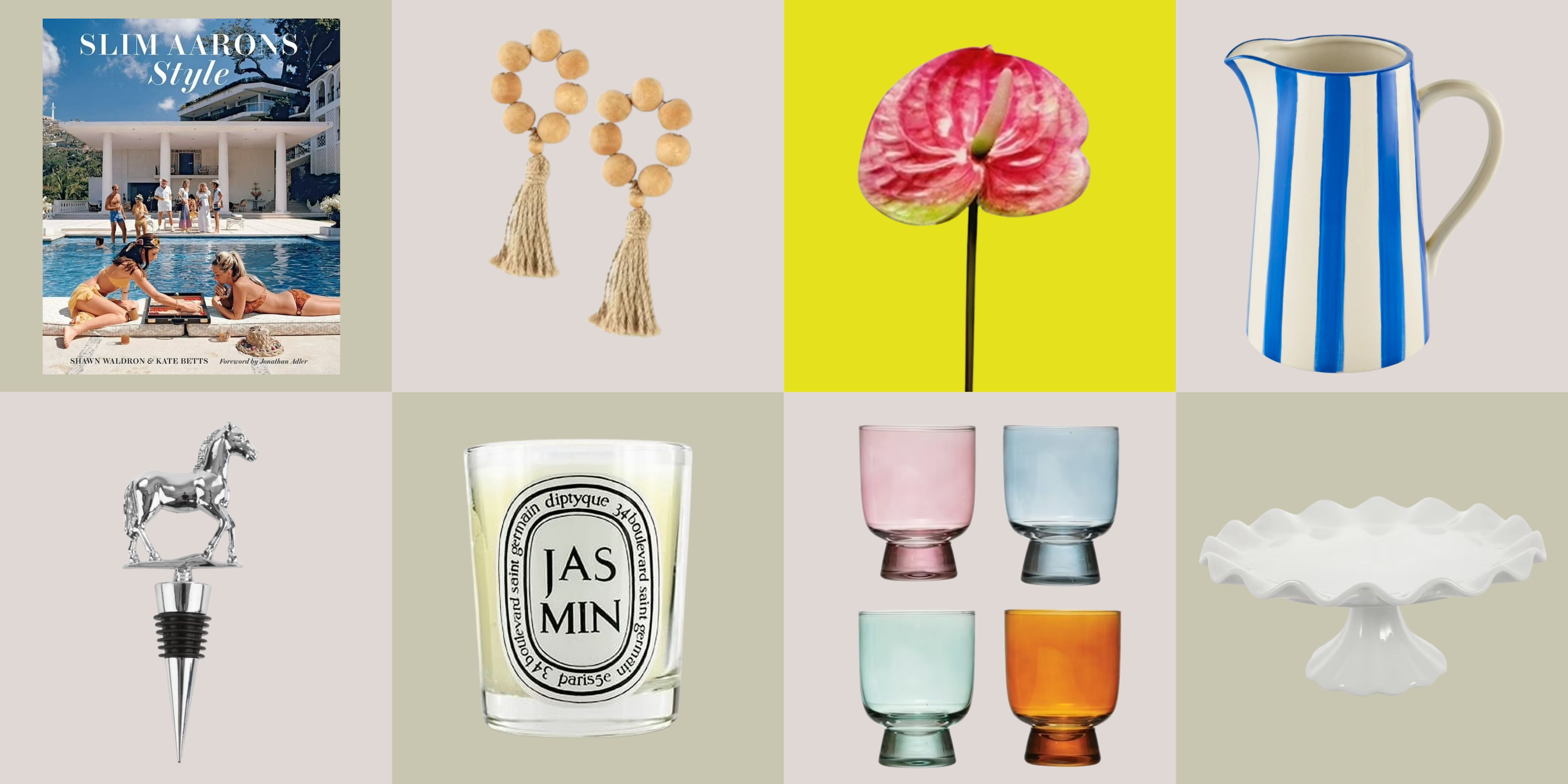
Shop "Strategic Neon" Decor

Price: $40
This coffee table book is by award-winning British designer, Matthew Williamson. He is a genius at all things color and contrast, so while you're adding a bit of neon decor, you can also gain a few stylish tips.

Price: $220.41, Was: $244.90
Size: 16" x 24", Stretched Canvas
This playful pink painting comes stretched on canvas and ready to hang in your home. Art pieces are the easiest way to add a pop of neon to your interior, and pink is always the best way to go.

Price: $8.29
Neon green is my favorite color in the neon family, and this candlestick holder is a stylish and subtle way to jump on the trend. You can "strategically" pull these out while styling certain events, or keep them on display year-round.
What Colors Complement Neon?

As for what color palettes would work well with this trend, Lauren notes "Neon works really well in a monochromatic scheme where the room or elevation is all a harmonious color." You can then add a pop of a neon version of your main color in the room and it creates just the right amount of dimensions and subtle interest. "It feels daring and that is what we love that about neon," adds Lauren.
You can even embrace the playfulness of the trend even further by introducing neon into more maximalist spaces; the bright shades are more versatile than you think. In the kitchen above, a neon yellow range is paired with natural woods and a checkerboard patterned backsplash.
"This kitchen energizes classic elements with contemporary colors for a space that screams fun," explains its designer, DC-based Zoe Feldman, the founder and principal of Zoe Feldman Design. "The neon yellow range and hood pops against the black and white checkerboard tile backsplash and peachy cabinets."

This is a trend that allows you to feel like anything goes, and there is nothing more exciting than curating a home that feels both stylish and a bit daring. Will you be bold enough to try the "strategic neon" interior trend in your home?

-
 12 Essentials Every Cool, Collected Spring Host Needs — And You’ll Never Guess Where They’re From
Guests will think you thought of everything, you just knew where to shop
-
 Smeg Says Teal, and We’re Listening — The Kitchen Shade of the Year Is Here
Designers are already using the soft, sea-glass green everywhere from cabinetry to countertops


-
Smeg Says Teal, and We’re Listening — The Kitchen Shade of the Year Is Here
Designers are already using the soft, sea-glass green everywhere from cabinetry to countertops
-
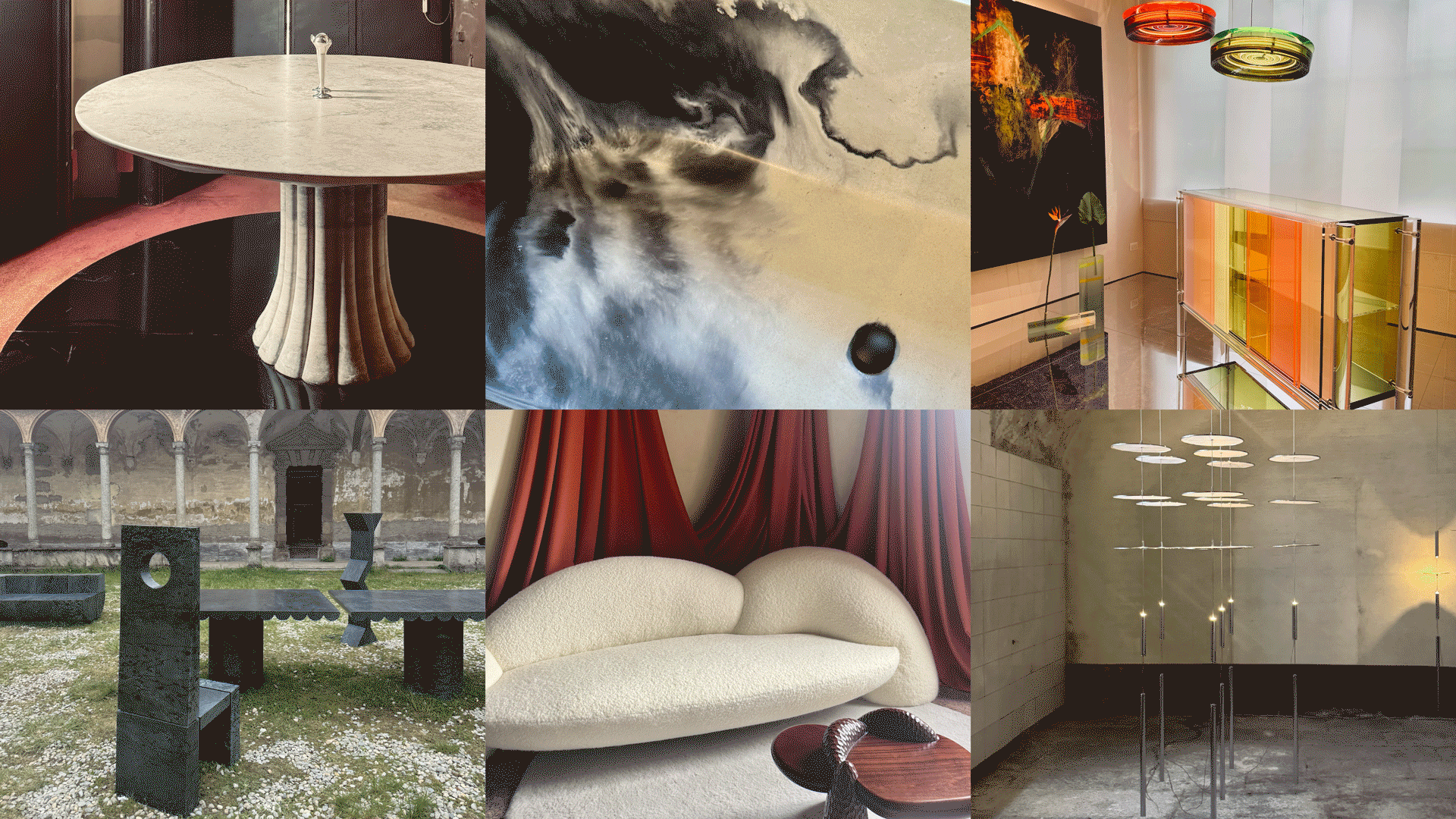 Straight from Salone: 5 Emerging Trends I Found in Milan That'll Shape Interiors For the Year Ahead
From reflective silver to fluidity, here's my perspective on the key themes and new moods coming through from Milan Design Week
-
 Do Yellow and Purple Go Together? Designers Reveal How to Make This Unexpected Pairing Feel "Totally Intentional"
In an era where unexpected combinations have become cool, we've done a deep-dive to discover how to pair yellow and purple in a space
-
 5 Unexpected but Seriously Stylish Spring Color Palettes to Shake Up the Season — "It's Pastel, but Punchy"
Spring color palettes are notorious for their use of pretty pastels, but that doesn't mean they have to lack variation
-
 The 'Red Table Trick' Is the Easiest and Most Expensive-Looking Trend to Hit 2025 So Far
A red dining table makes a seriously stylish statement; the beloved pop of red trend just got an bold and expensive-looking upgrade
-
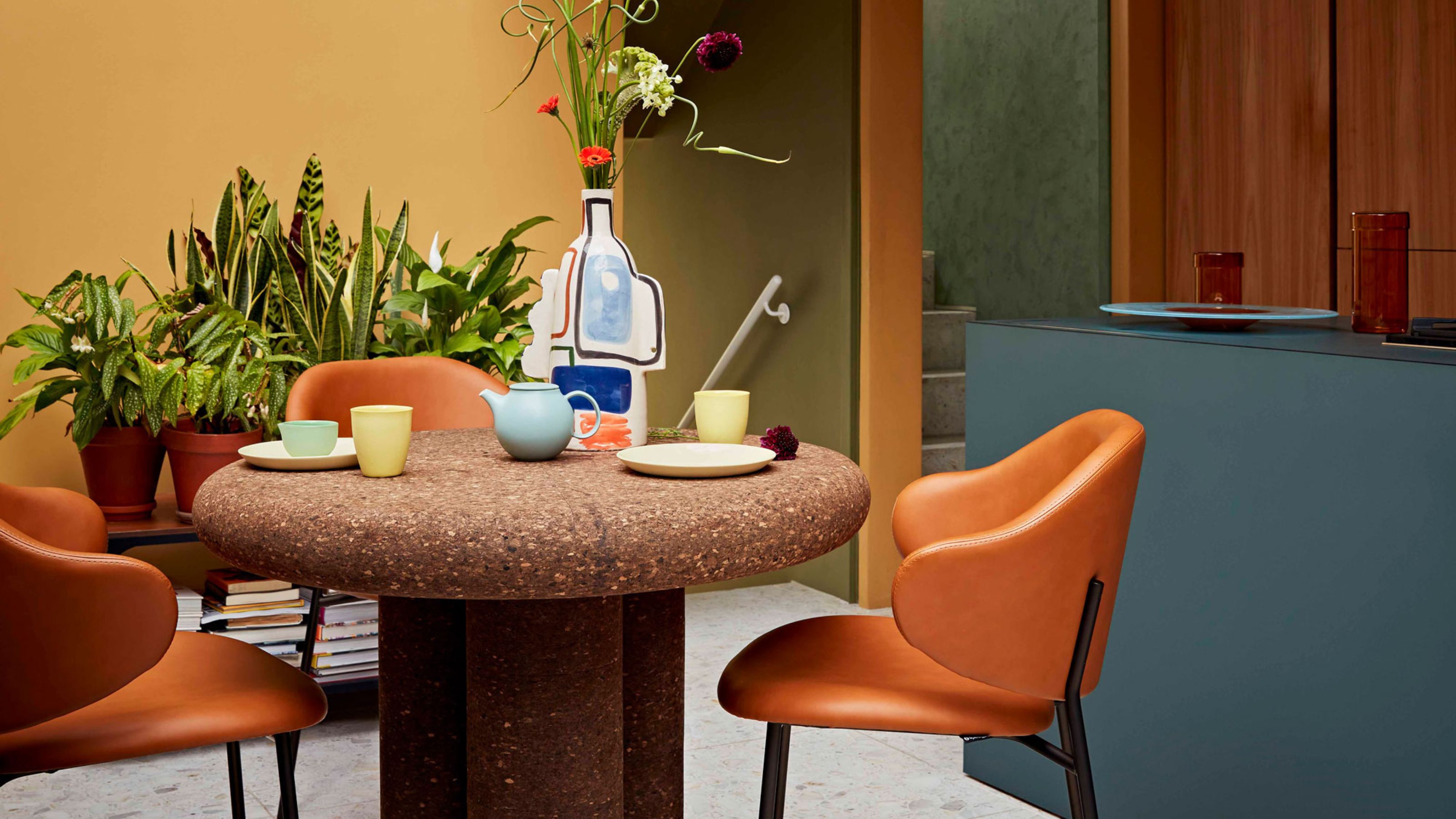 Cork Is the Cool, Sustainable, and Surprisingly Chic Material We Can't Stop Furnishing With Right Now
In honor of Earth Month, we’re toasting to cork... furniture, that is
-
 The Coquette Aesthetic Is Still Going Strong in Homes in 2025 — But Now It's Charming, Whimsical, and Has Modern Flair
A designer weighs in on how you can make the classic coquette trend feel modern while still retaining its whimsical elegance
-
 Everyone's Going Crazy for This One New Shade From Farrow & Ball Online — So What's the Big Deal With 'Scallop'?
It's a classic beige, but with a hint of blush — and it's the shade we're expecting to see in every minimalist's home this year


