Studio apartment layout ideas – creative floorplans to fit a bed, sofa and kitchen into one room
These clever studio apartment layout ideas can turn even the tiniest of studios into a comfortable home

The Livingetc newsletters are your inside source for what’s shaping interiors now - and what’s next. Discover trend forecasts, smart style ideas, and curated shopping inspiration that brings design to life. Subscribe today and stay ahead of the curve.
You are now subscribed
Your newsletter sign-up was successful
Working out the right studio apartment layout ideas is tricky; after all, there are a lot of moving parts to contend with. A bed, sofa, kitchen, and dining table, all in one small space? Yes, designing a studio apartment is something a little different from the ordinary.
However, limitations are the source of some of the most creative design solutions around, and this is no different for studio apartments. With the right-minded designer or architect to hand, there's the opportunity to create a brilliant space that will squeeze a lot of living into even a very small floor plan.
The first step in configuring your studio apartment ideas? Establishing your priorities, says Sydney-based architect Brad Swartz. 'You can’t have everything when you’ve got a micro-apartment, so work out if cooking and a good kitchen is important to you, or if you would forgo a dining room for a nice big sofa and so on,' he says. 'Once you know what’s critical to how you live, you can start to jigsaw the plan together.'
Article continues belowThis piecing together of a studio apartment layout idea is where the fun comes in, and with these clever real-life studio apartments serving as inspiration, you'll soon see that there are some incredibly creative ways to get exactly what you want from even the tiniest of spaces.
6 studio apartment layout ideas to consider
While we've collected some very different approaches to studio apartment layouts, they all share one thing in common. When designing and decorating an apartment, designers are looking to create pockets of privacy, despite the one-room nature of these layouts.
'For me, it's about trying to create a divide between the public and private spaces, similar to what you would find in a larger apartment,' says Brad Swartz. 'That might be a big sliding door that hides the bed or a tiny room designed around the size of a bed.'
These studio apartment layout ideas all take into account this dichotomy between private and public areas, ensuring you get distinct areas where you need them, without losing the charm of one-room living.
The Livingetc newsletters are your inside source for what’s shaping interiors now - and what’s next. Discover trend forecasts, smart style ideas, and curated shopping inspiration that brings design to life. Subscribe today and stay ahead of the curve.
1. Design in a loft bed for a separate sleeping area
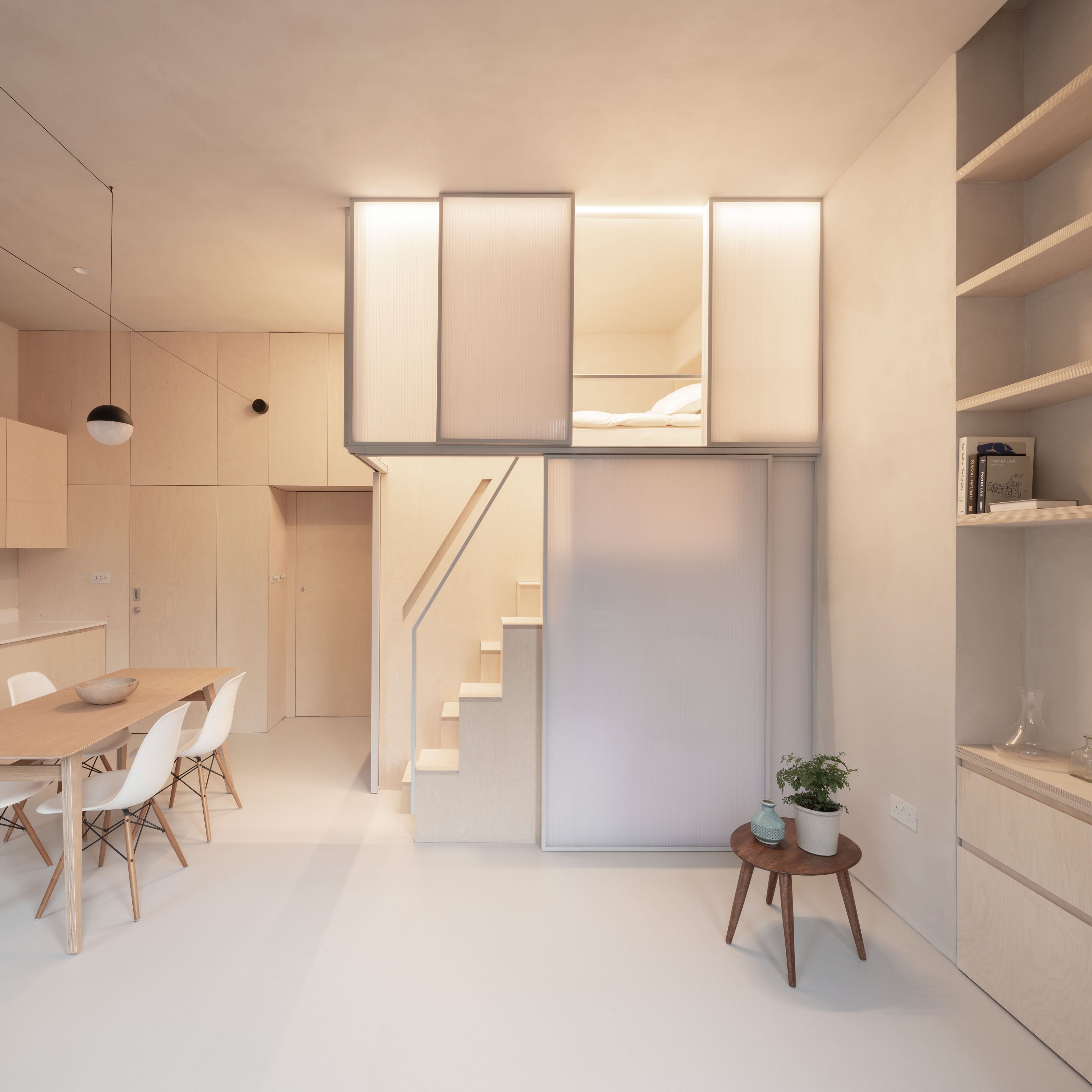
Where you've got the ceiling height for it, creating a loft bed idea for a studio apartment can really help you to stretch a small square footage. It not only gives you a distinct place to sleep that feels separate from the main living area, but also gives you the space underneath the platform to use for a different function.
In the design of Shoji Apartment, London-based architect practice Proctor and Shaw created a loft bed with sliding panels, inspired by traditional Japanese Shoji screens. The screens can be completely closed, making the bedroom appear like a white box in the daytime, or left open, to help the bedroom not feel so enclosed when you don't want it to be.
An alternate tread style stair helps with the steep angle of the staircase, while underneath the bed platform, room has been dedicated to a walk-in closet.
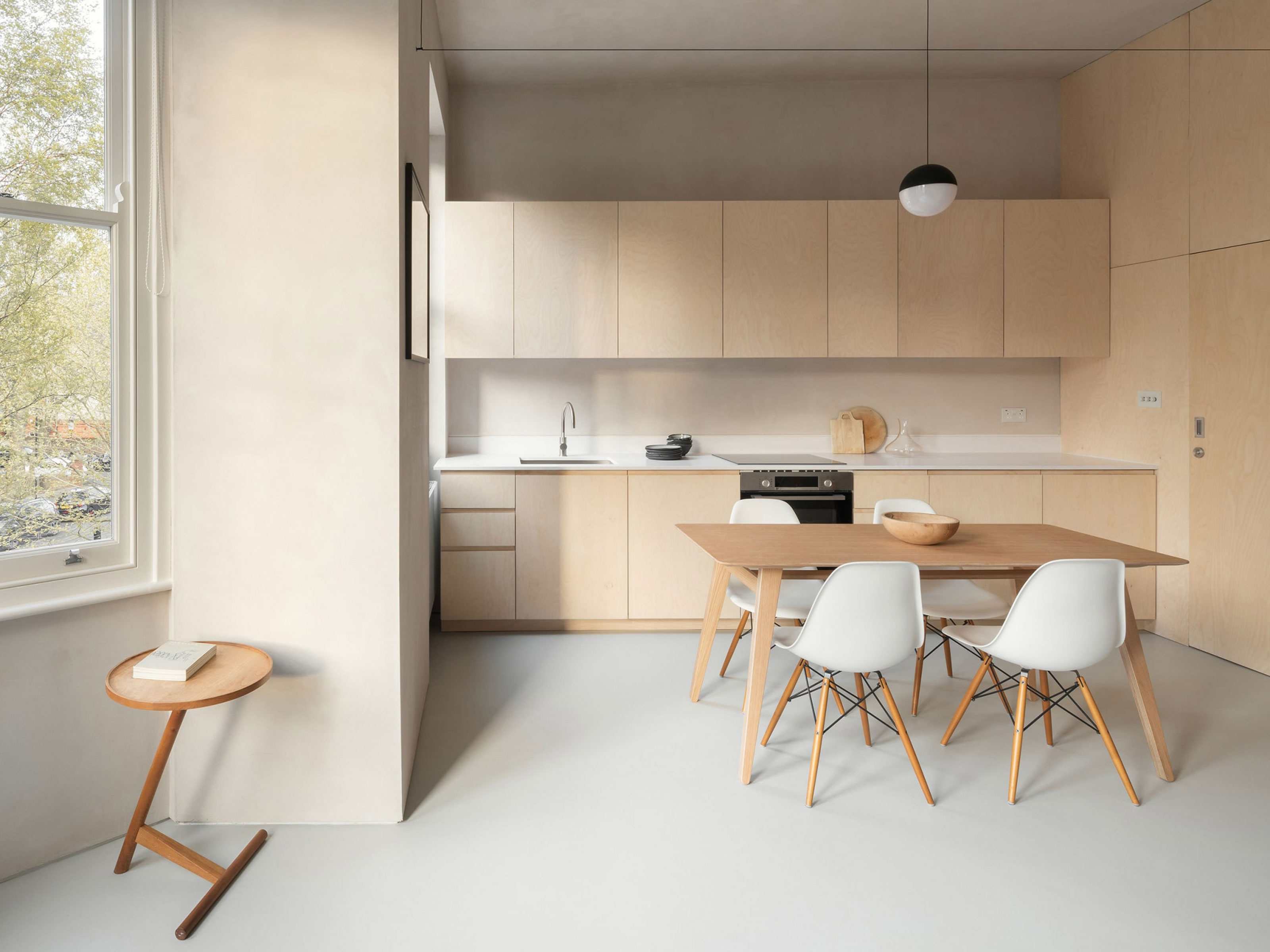
By using a uniform palette of materials throughout the remainder of the space, the designers have created a minimalist feel, while also allowing for plenty of storage ideas to be designed into the space almost seamlessly.
The bathroom door camouflages into the ply-paneled walls too, minimizing its effect on the clean, contemporary design style.
2. Create an invisible kitchen
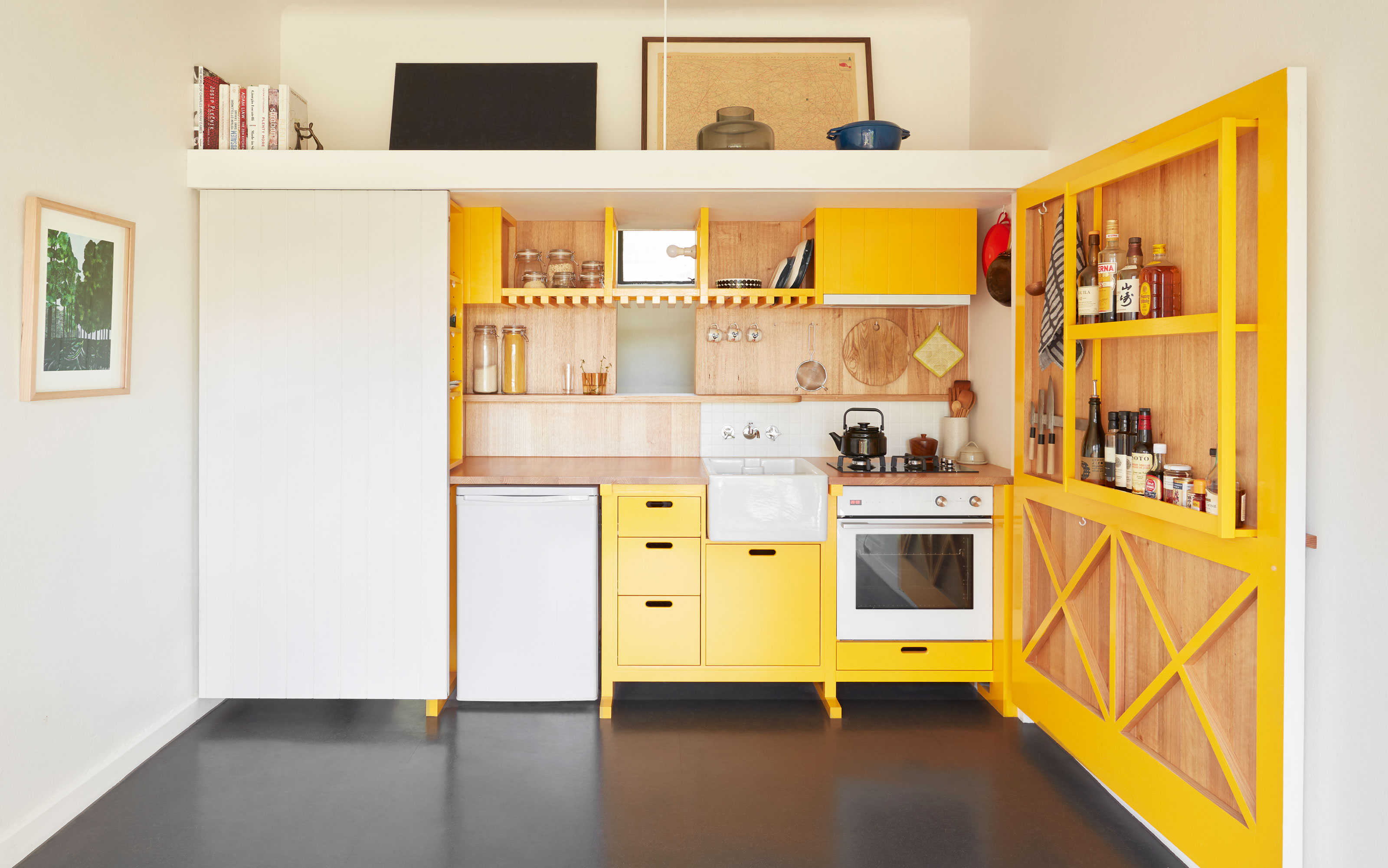
If a separation between your living and sleeping spaces and your kitchen is number one on the priority list, then looking at apartment kitchen ideas that hide away your food prep area might be the solution.
In this design by Agius Scorpio Architects, a tiny studio apartment has been divided up into two distinct spaces with a partition wall. 'I approached the seemingly absurd notion of adding rooms to the tiny plan,' says architect Nic Agius. 'Reconsidering the task of walls and doors permitted these additions.'
In the main living space, a huge hinged door has been included, which opens up to reveal the small kitchen with appliances. On the rear of the door, extra storage is included which in effect takes your kitchen space from one wall to an L-shape, creating a more functional design with a working triangle.
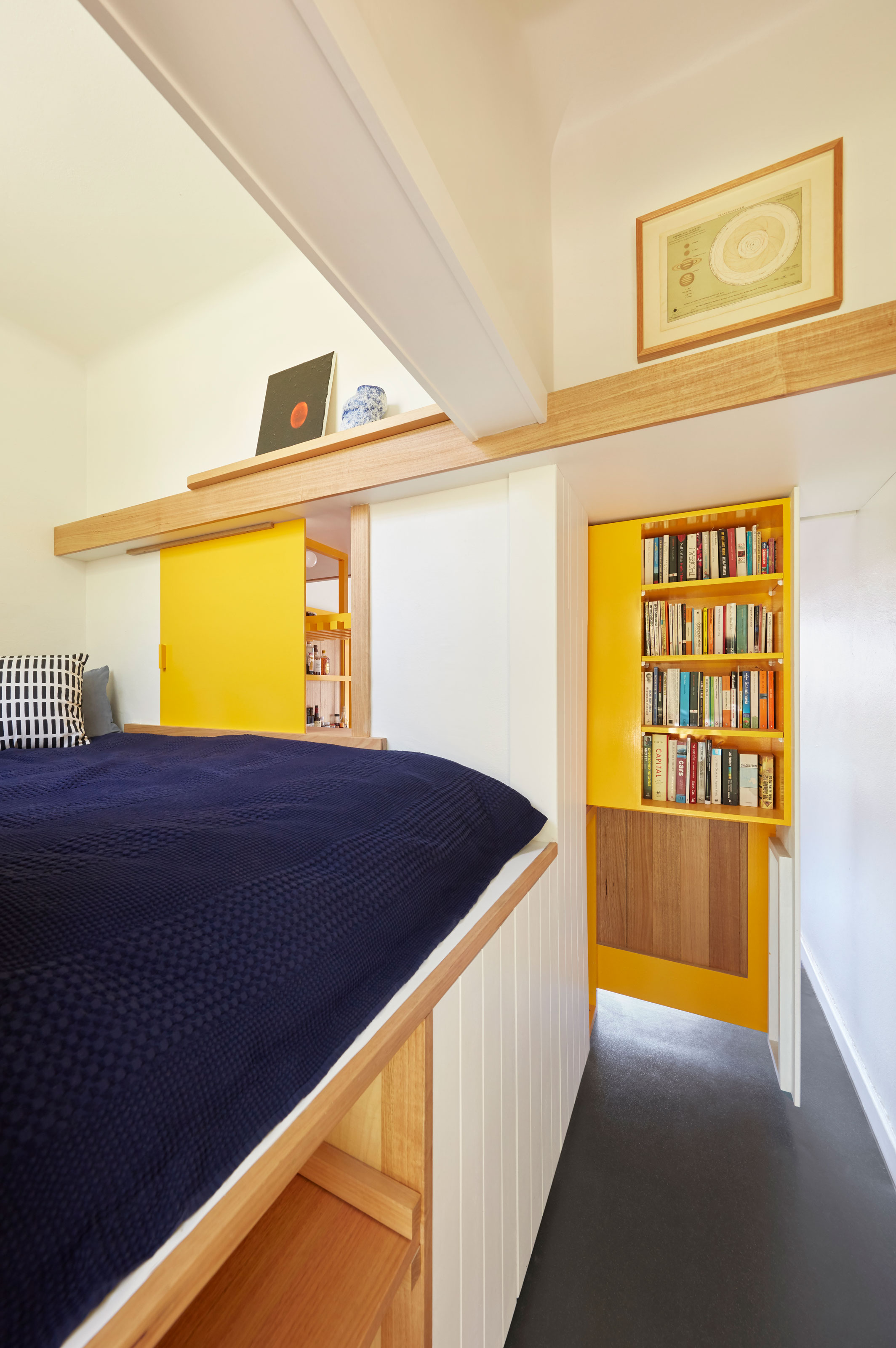
One panel from this sometimes invisible kitchen also slides across, blocking the passage to the bedroom to create a more private space, while also integrating a bookshelf.
The bed sits on the other side of the kitchen wall, elevated to allow for storage underneath. The sleeping pod also has a small hatch in it, to create a vista through to the main living area to give the bedroom the full sense of the apartment's space when desired.
3. Divide up spaces with a sliding screen
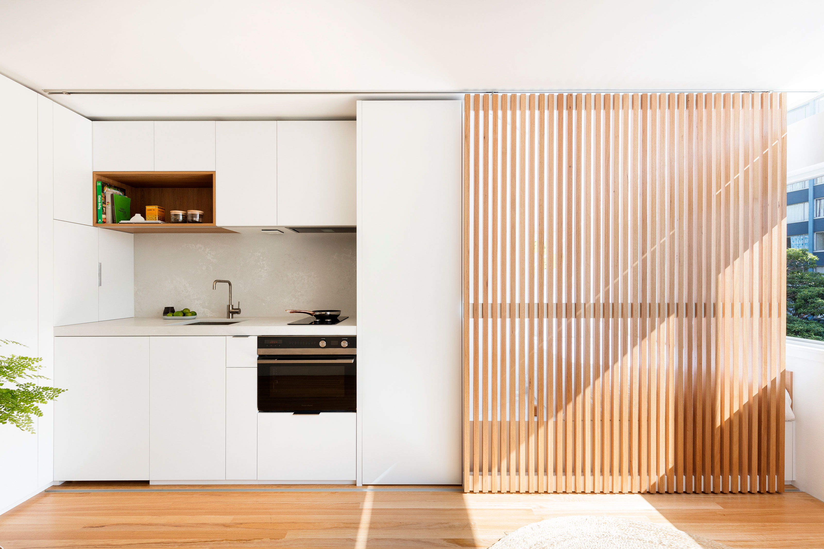
In a studio apartment especially, you need to be clever when implementing room divider ideas. The wrong one could make a small space trickier to use, but the right one can be the key to comfortable living in a studio.
This design by Brad Swartz Architects is a great example of a room divider working overtime. The sliding slatted panel helps define the room for different purposes. In one position, it's a kitchen-living space, while in the other, it's a cozy bedroom flooded with natural light.
In the center of the two distinct spaces, a door leads to a separate bathroom, which can be accessed no matter which configuration the room is in.
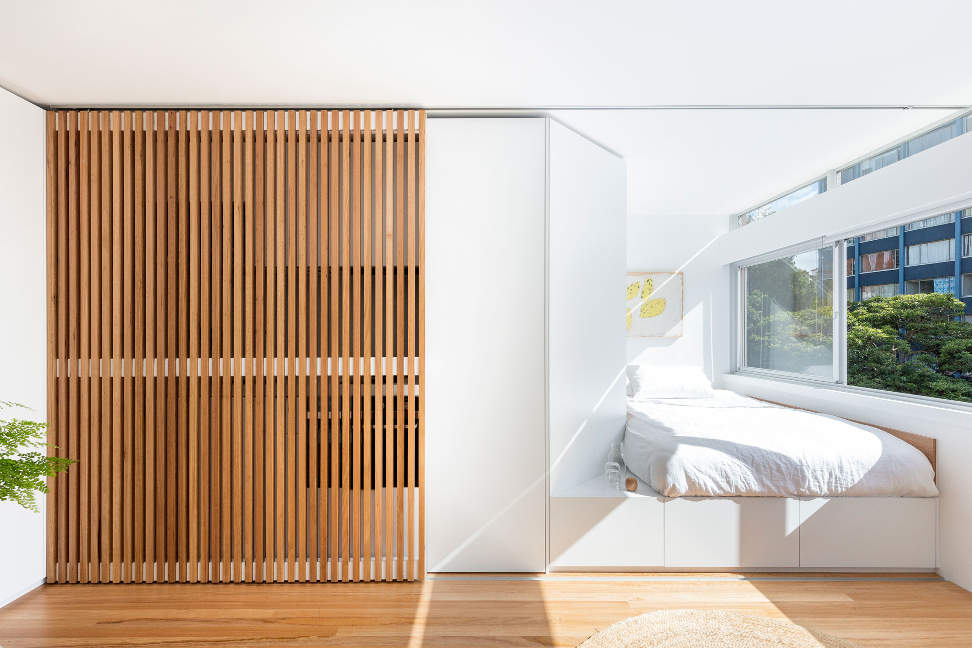
An elevated platform bed again allows for extra bedroom storage, while built-in wardrobes line the hallway leading to the small bathroom located behind the kitchen. The main living space also has a small sofa.
4. Create a partition with built-in furniture
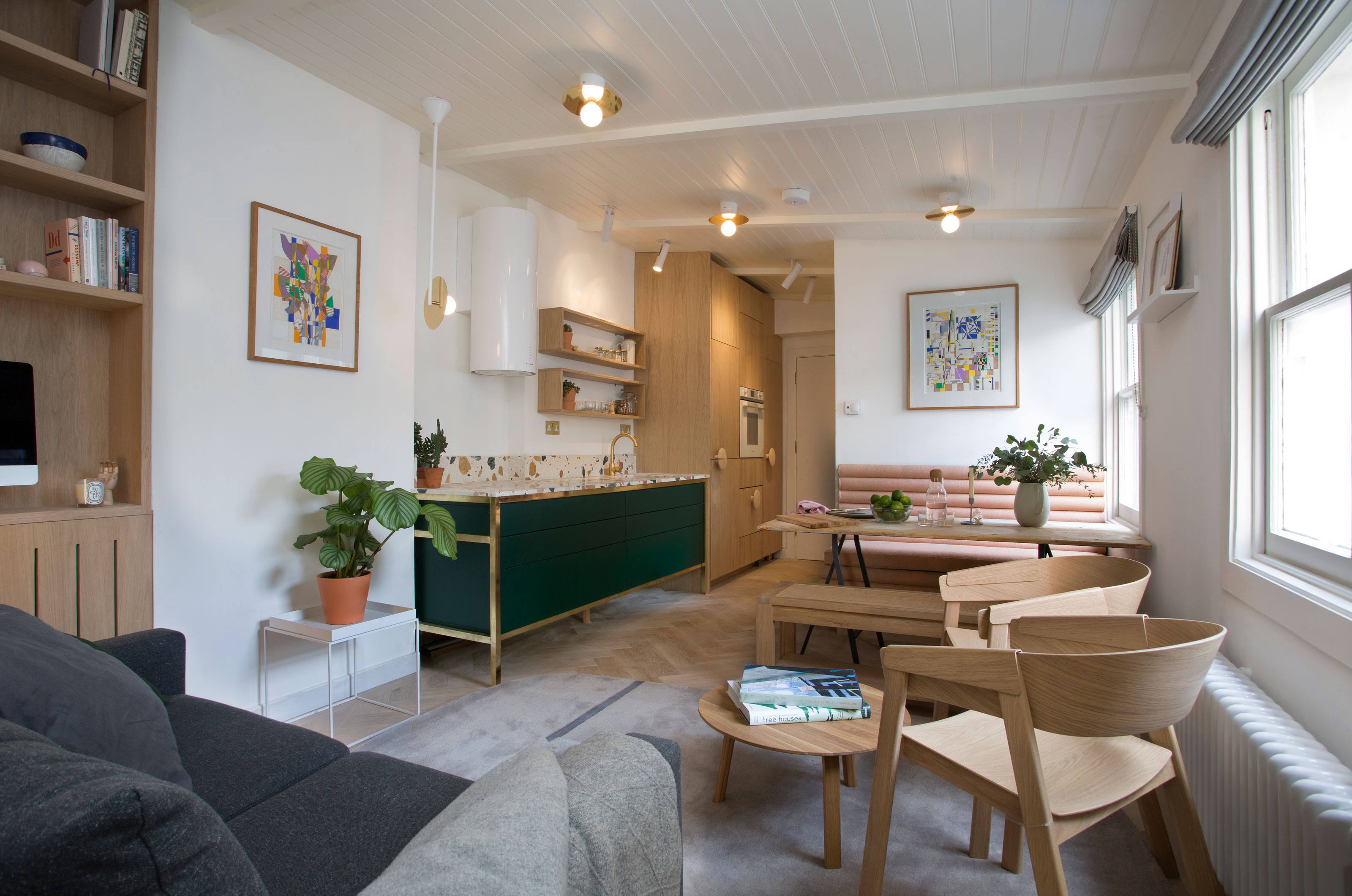
A lot is packed into this micro-apartment design created by design studio Play Associates. A generous one-wall kitchen makes use of floor-to-ceiling cabinetry, while a larger-than-you'd-expect dining table can be incorporated thanks to clever banquette seating.
To create a separate bedroom, the designers added a partition with a built-in bedroom storage idea, matching the style of the kitchen and small home office area.
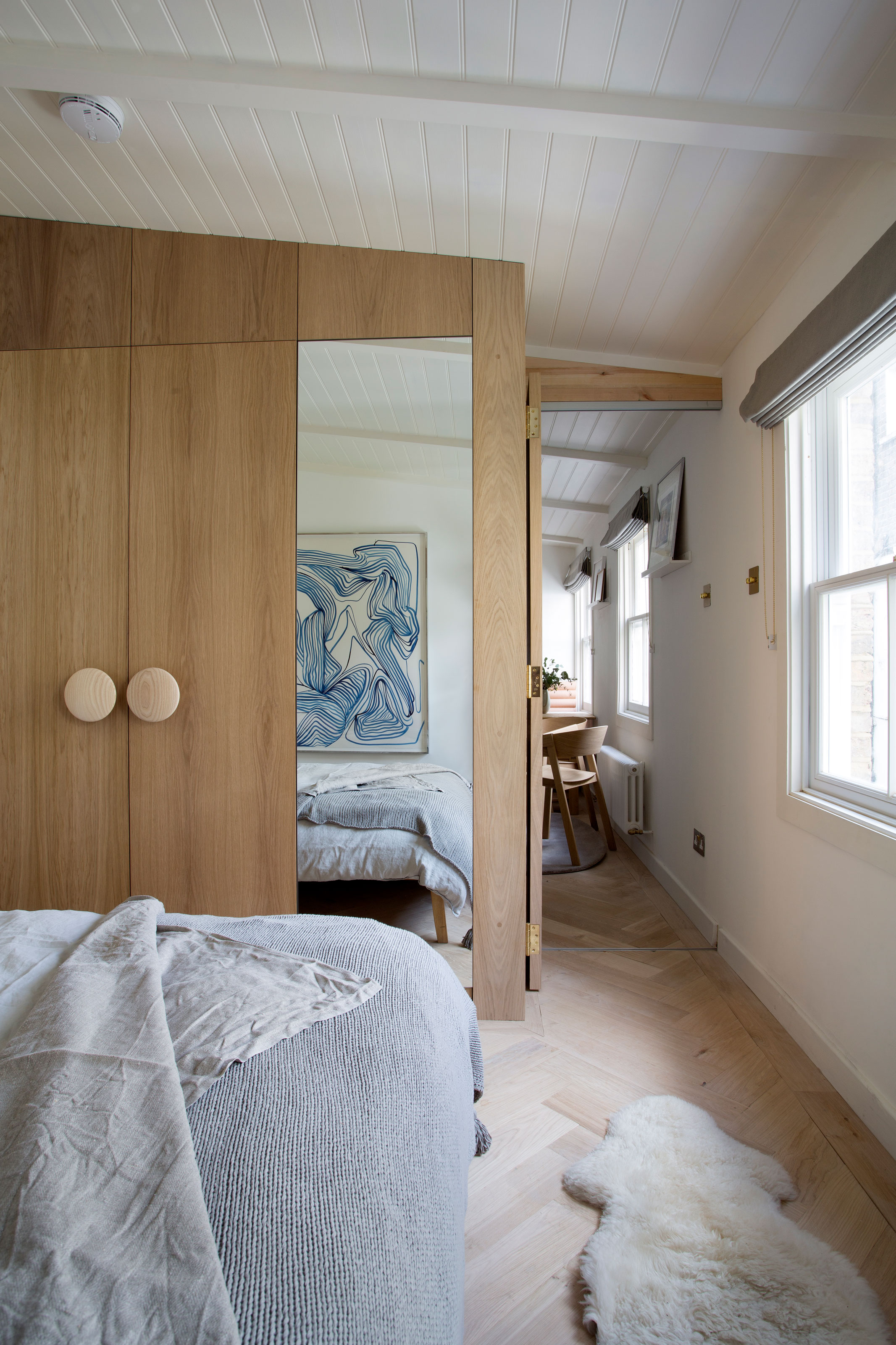
Built bespoke to the ceiling, following the line of the pitched roof, the addition in essence transforms the space from a studio to a tiny one-bedroom apartment. However, the choice of a single floor type throughout the apartment, and sightlines through to the apartment and almost-temporary feel of the bi-folding door dividing the rooms keep the spirit of this studio apartment alive.
5. Use hard and soft room dividers
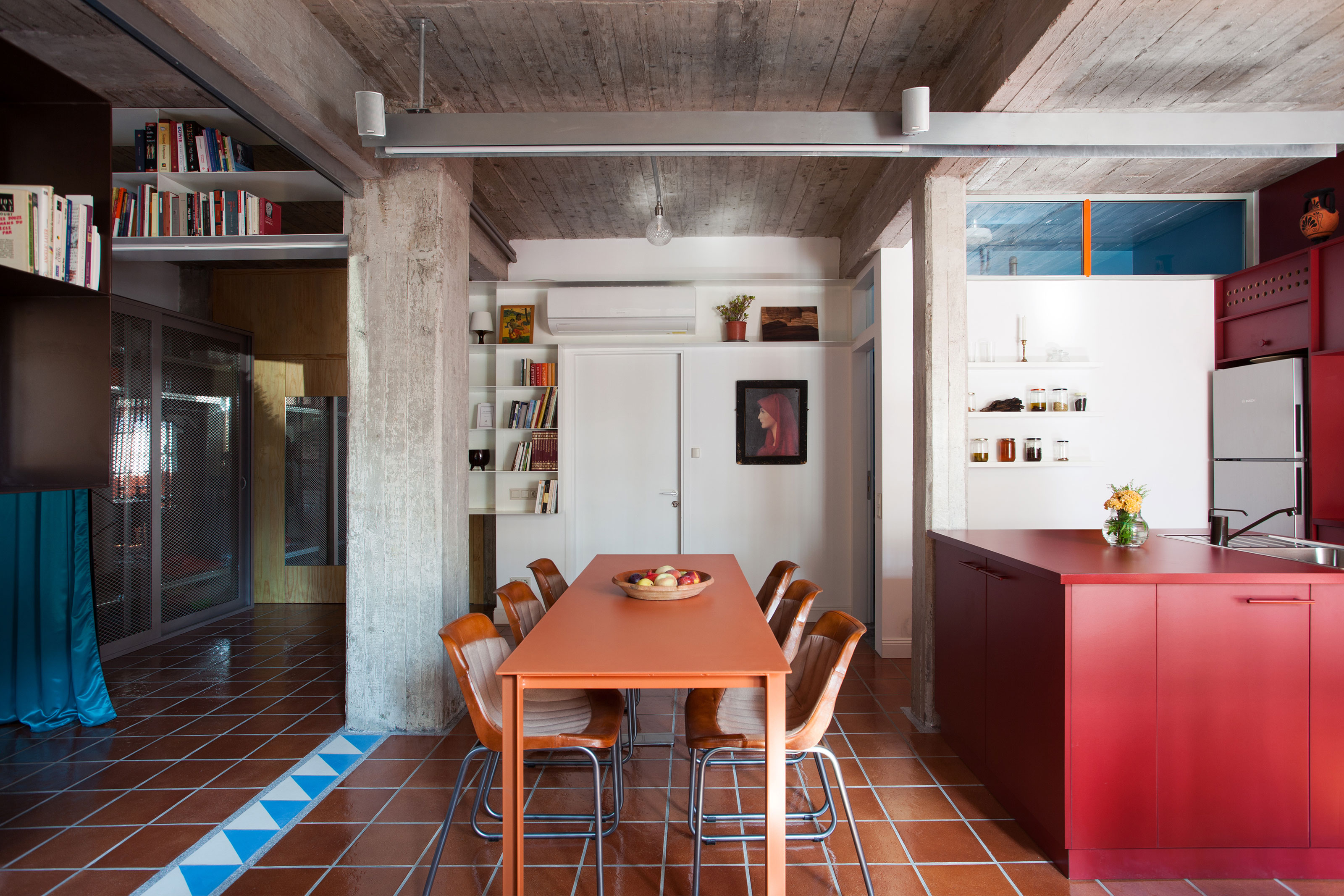
Creating a studio apartment with room dividers doesn't have to have huge structural implications, in fact, some easy-to-add dividers can make your studio more versatile in its design.
Consider adding both soft and hard dividers to your studio apartment layout. Soft interventions, such as drapes that can be drawn across an area, won't take up much space and are great for creating distinct rooms when you need them. They don't however, do much for soundproofing a room, which is where hard divides are more useful.
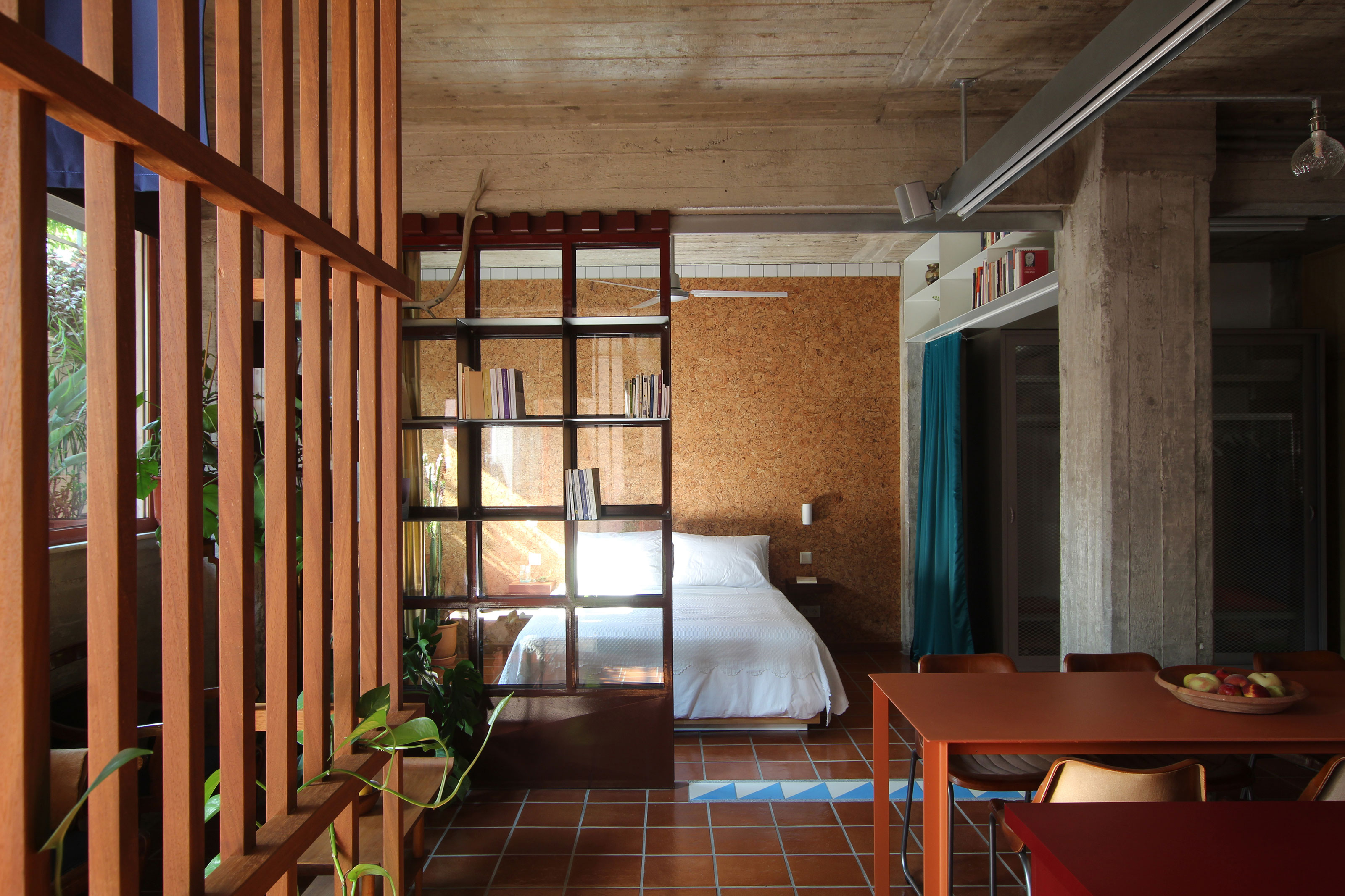
In this studio apartment by Point Supreme Architects, sliding Crittall-style doors have been combined with curtains and slatted dividers to bring structure to the open plan space.
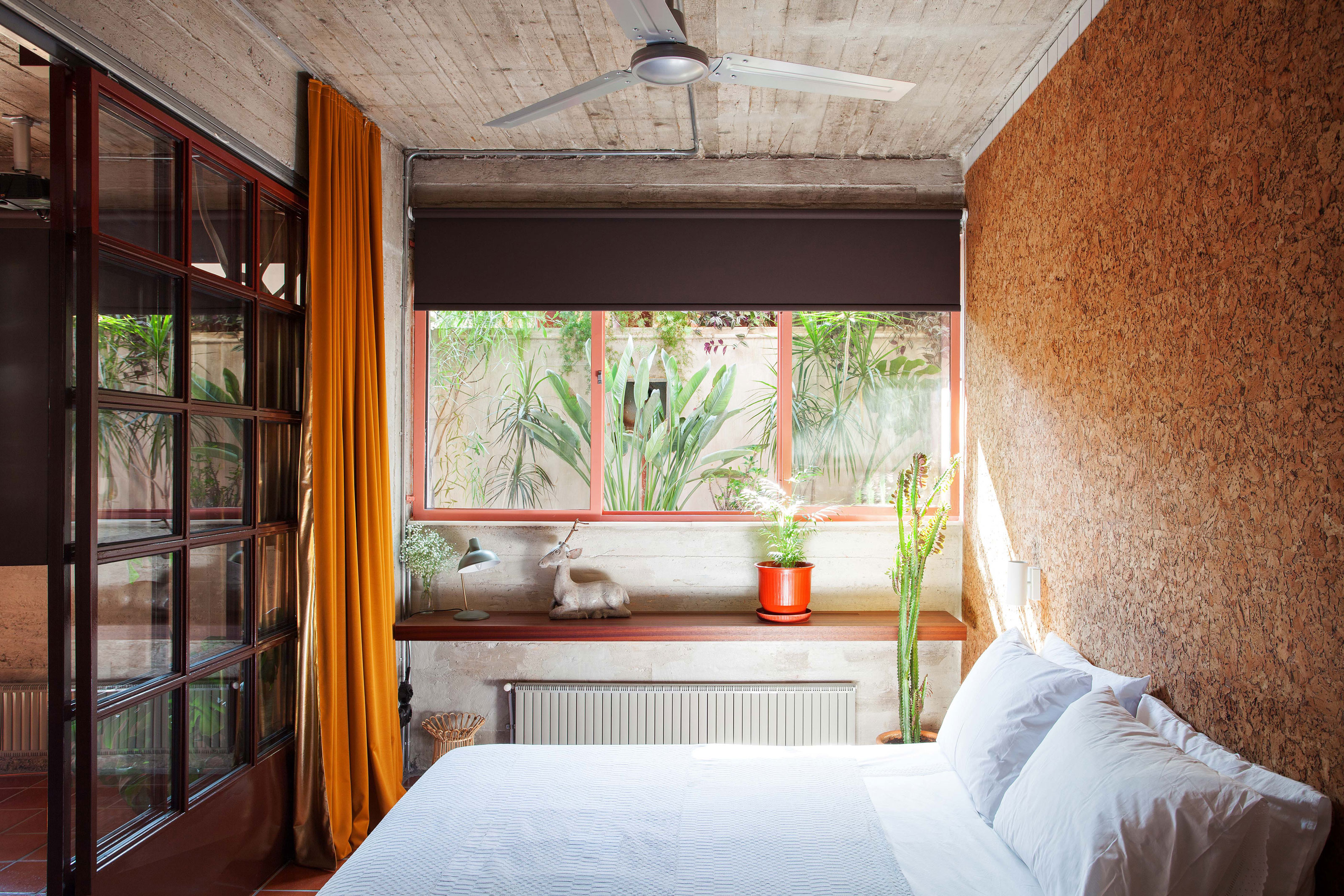
The bedroom can be easily separated from the rest of the space using curtains, while the glass doors offer the sense of a more physical, concrete divide.
The design of this apartment makes use of its natural structural qualities, with the central column becoming an asset, rather than a nuisance in helping to demarcate different areas.
A separate bathroom also borrows light from the main living space through a small transom window.
6. Try a linear layout
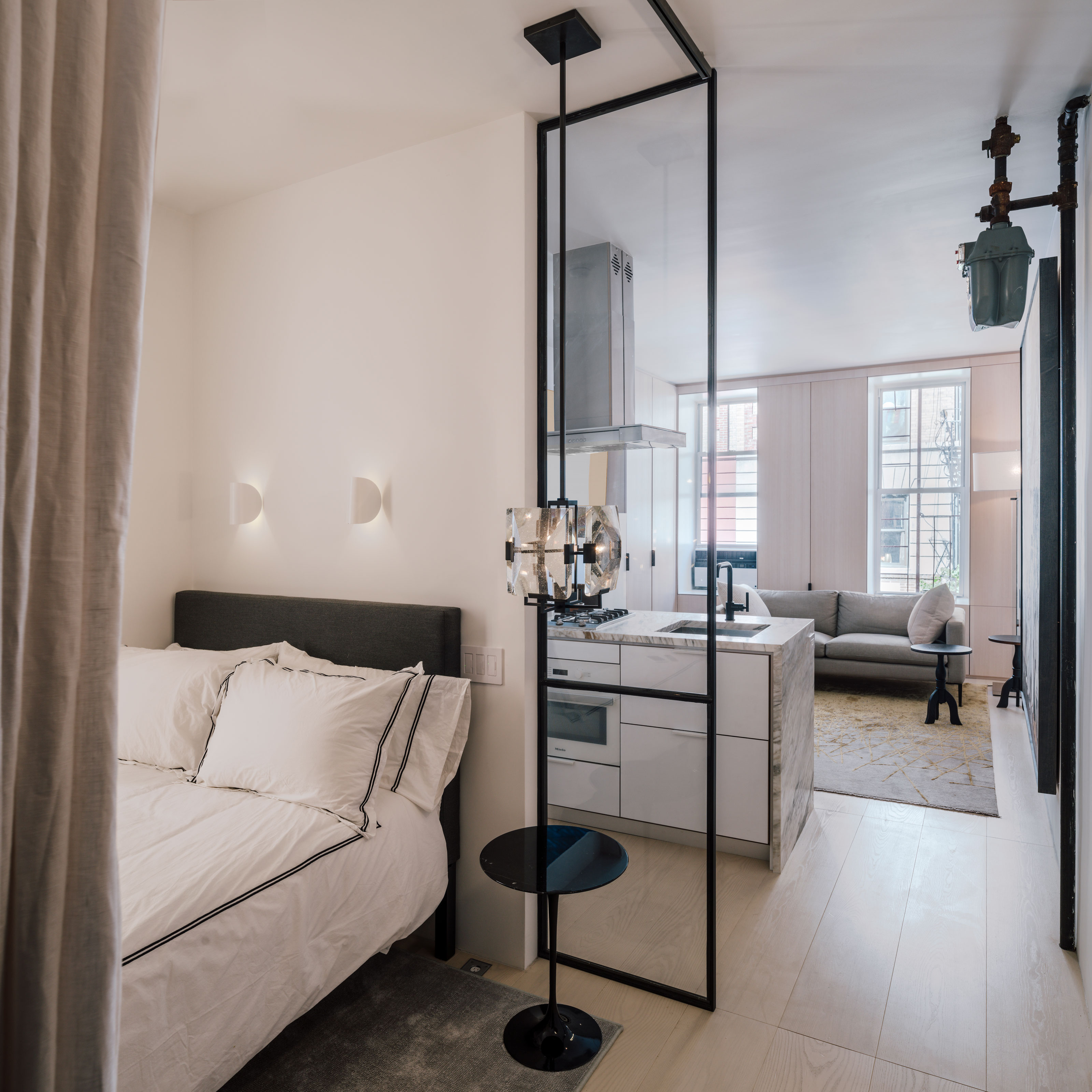
How you create separate zones in a studio apartment depends on the proportions of the space you have to live with. While you may think a more evenly-proportioned studio might give you more design options, this isn't always a good thing. A narrow, long apartment is sometimes easier to design a studio apartment layout idea for, as you can simply create different areas along a line.
In designing this New York pied-à-terre, studio FIERRO could create any layout within the space, as the project incorporated a full renovation. While this linear layout might seem simple, it's both unfussy and effective in keeping the areas you want to be separated away from each other.
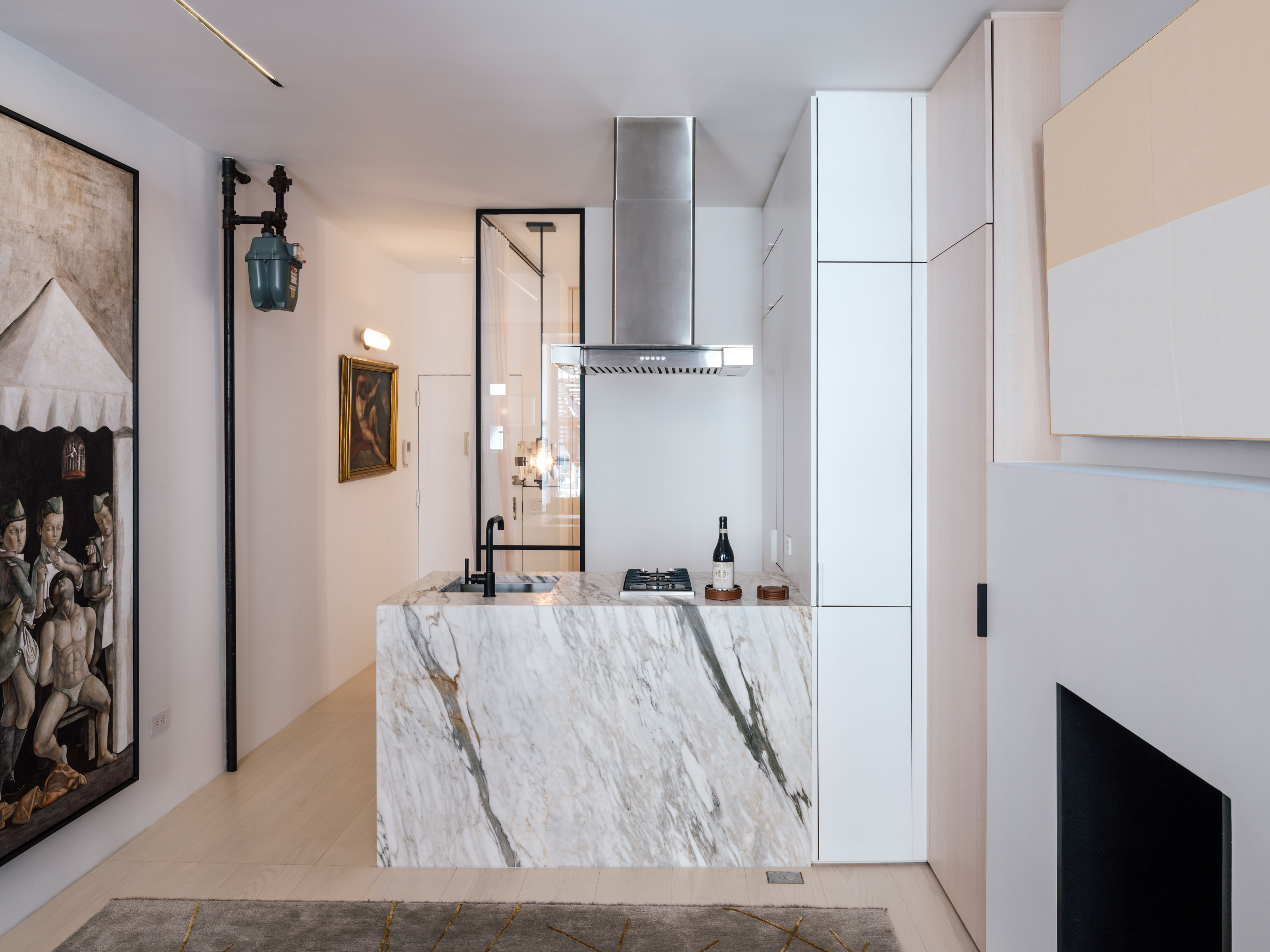
'The layout was maximized by opening up the space by creating four very distinct areas: living room, kitchen, bedroom and bathroom,' says the designer, Laura Gonzalez Fierro. 'This generated a spectrum from the most public into the most private spaces.'
The bedroom benefits from the space a walkway to the small apartment living room provides, something that works much better in an apartment for one or two people than it ever would in a family space.
How do I design a minimalist studio apartment?
When you're inhabiting a small space like a studio apartment, clutter isn't your friend. However, you'll also want to live feeling like you have everything you want to hand without too drastically editing down your possessions.
The key, of course, is storage. Modern studio apartment layouts focus on a more minimalist interior design style of hidden storage that's really effective for these spaces. Choosing handleless cupboards and drawers, for example, can make your storage space look like paneled walls, helping the more practical side of your space fade into the background.
For studio apartments in particular, there's often a focus on clever ideas for adaptable furniture that has a double function or can be hidden away from view. While this can contribute to the minimalist aesthetic, consider how they'll factor in your daily life too.
'It’s easy when designing small spaces to be seduced by tricks or mechanisms that you think will create ease and flexibility,' says architect Nic Agius, 'when, in reality, they are likely become frustrating to engage with on a day to day basis.'
Sometimes, a minimalist studio apartment really does just mean that you keep your design simple.

Hugh is Livingetc.com’s editor. With 8 years in the interiors industry under his belt, he has the nose for what people want to know about re-decorating their homes. He prides himself as an expert trend forecaster, visiting design fairs, showrooms and keeping an eye out for emerging designers to hone his eye. He joined Livingetc back in 2022 as a content editor, as a long-time reader of the print magazine, before becoming its online editor. Hugh has previously spent time as an editor for a kitchen and bathroom magazine, and has written for “hands-on” home brands such as Homebuilding & Renovating and Grand Designs magazine, so his knowledge of what it takes to create a home goes beyond the surface, too. Though not a trained interior designer, Hugh has cut his design teeth by managing several major interior design projects to date, each for private clients. He's also a keen DIYer — he's done everything from laying his own patio and building an integrated cooker hood from scratch, to undertaking plenty of creative IKEA hacks to help achieve the luxurious look he loves in design, when his budget doesn't always stretch that far.