
Summer color palettes are here to stay - for so much longer than just the sunny season ahead. They're the pairings and combinations that designers use to make rooms feel as joyful as a burst of sunshine, or as cooling as an afternoon nap while on vacation in the Med.
And they take in a mix of shades. Focusing on jewel brights, dark greens and neutrals, what they all have in the common is that somehow they evoke the happy relaxation you want to associate with the summer months.
'I love yellows and rusts and pale greens with muted blues,' says interior designer Brigette Romanek, describing summer color palettes that will also keep you warm in winter. 'I like to take a lavender and mix it with a little gray. [These colors] look like they have the sun in them. Somehow, they make a room feel kind.'
So take inspiration from these nine palettes that feature all the latest color trends and are guaranteed to give you that sunshine feeling all year.
1. Off-white, sage green and oak brown

There's an earthiness to this bleached-out, blissed-out summer palette from the Los Angeles-based design studio LALA Reimagined. Because all three shades are similarly gray-tinged, nothing jars, stands out too much, or stops the general sense of serene visual style.
And by focusing on this pared-down palette, you can have more fun with shapes and patterns, adding in curves and stripes for contemporary flair while still not making any aesthetic noise.
'We never tiptoe around stripes,' says Lia McNairy, one of the studio's co-founders, explaining their motivation behind the unique striped fireplace idea in this calming space. 'They're like rattan, just timeless. And the color combinations you can play with [when using them] can be just so unexpected.'
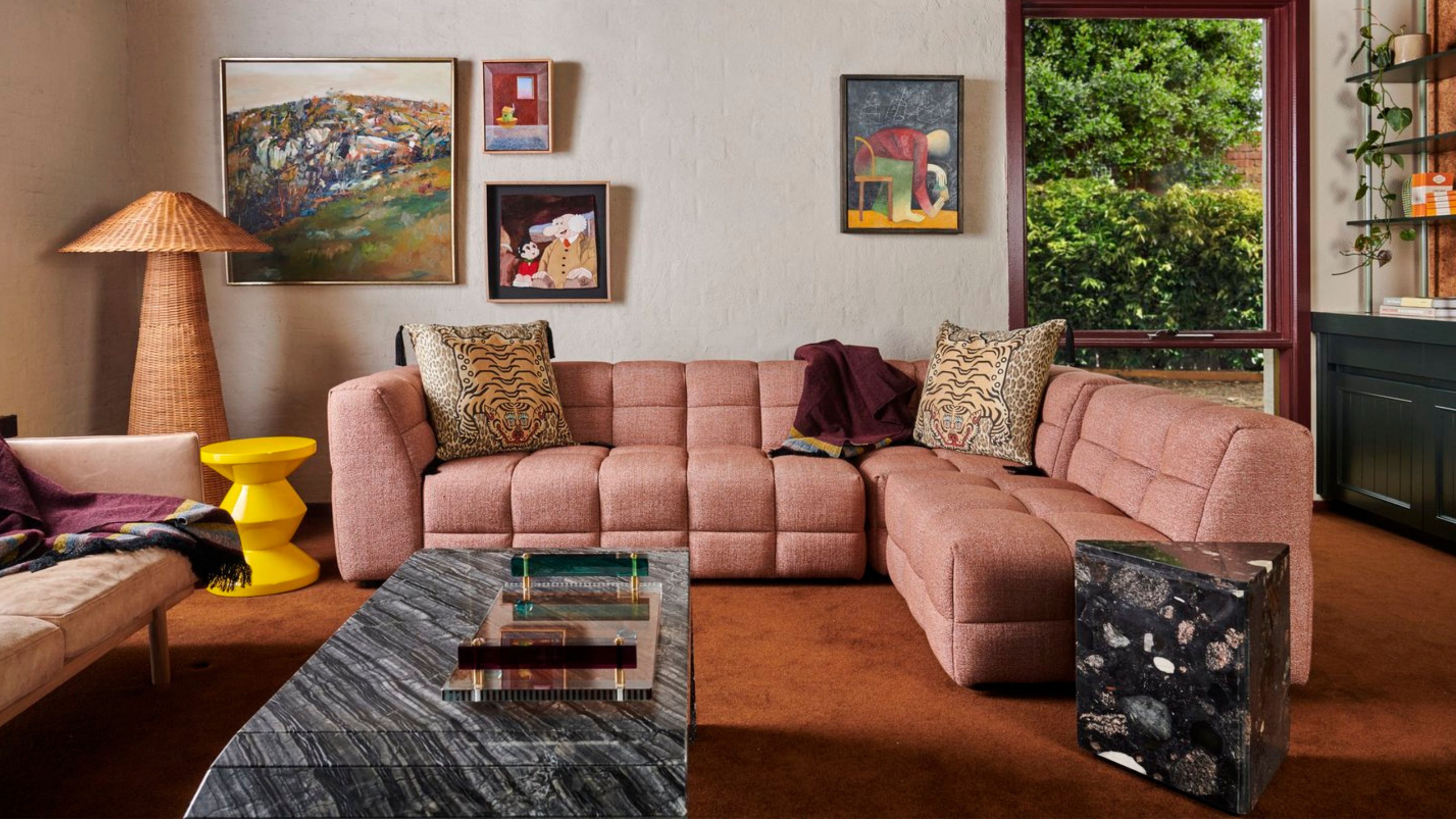
2. Pink and red

Pink is such an easy shade to live with - year round, sure, but particularly as part of a summer color palette. It's softer than white, more uplifting than gray, but no more jarring than either classic neutral.
The sweet shade is given a fresh twist in this living space by Koi Color Studio. It's the contrast between the pale pink and the bold crimson that makes it work so well, proving red can certainly be a color that goes with pink.
'I would say that it makes it easier to succeed when the nuances you choose do not have the same hue,' says the studio's creative director Dagny Thurmann-Moe. 'Like in this room, where the wall is a pale shade of pink, and the reds are all hot and bothered. But again - if you spread your nuances, you can make a whole house look amazing in only red and pinks. They’re incredibly versatile and nuance-rich.'
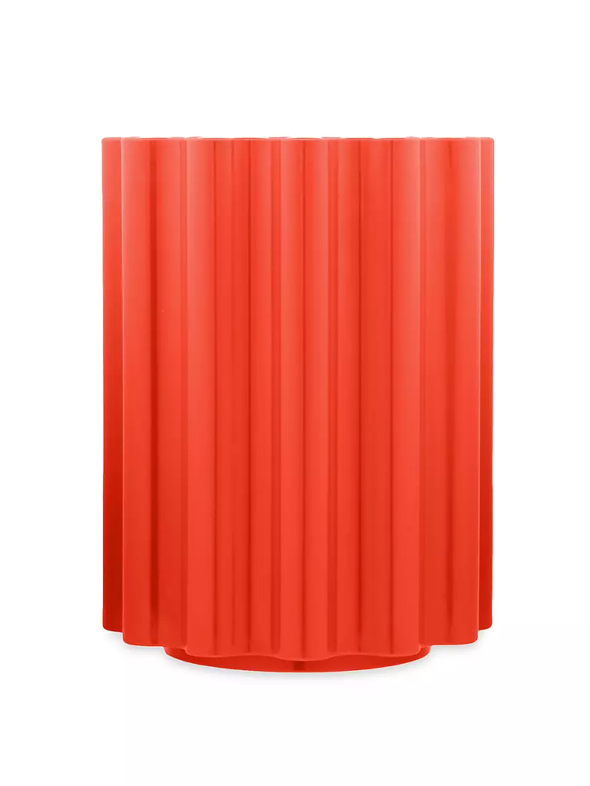
Price: $520
Material: Painted batch-dyed thermoplastic technopolymer
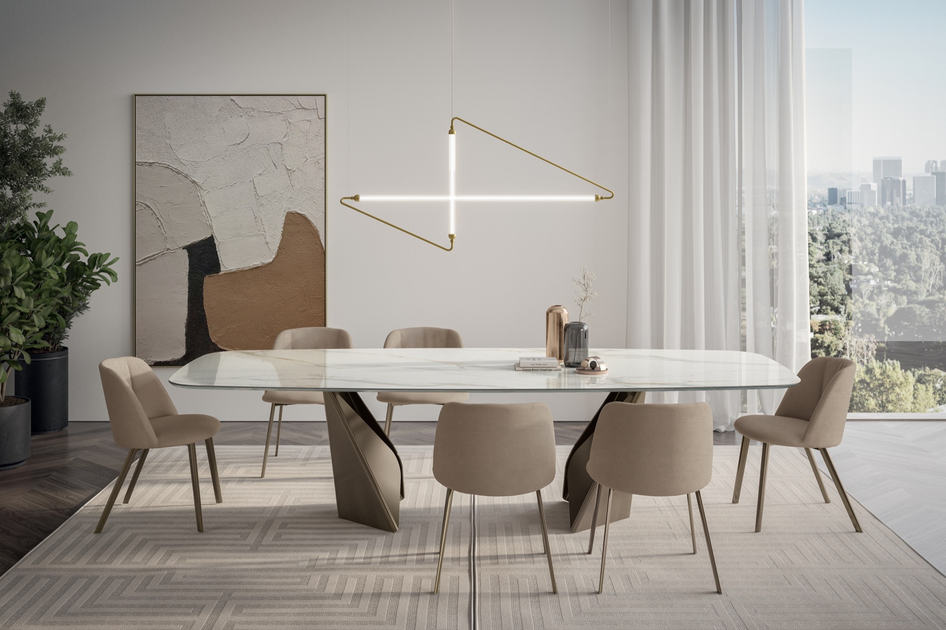
3. Dark gray, oak and primary pops

Allowing the light in and creating a sense of airiness is the key to any summer color palette, but that doesn't mean sticking to solely pale shades. In this New York dining space by the design studio Charles and Co, the darker hues of the chairs and credenza only serve as a grounding base for the creamy off-white walls and pops of color in the stylish gallery wall, which draws the eye up and towards the light.
'This Brooklyn townhouse was all about combining the 19th century architecture with mid-century and modern silhouettes,' says the studio co-founder Vicky Charles. 'The family has three boys, so we wanted the tones of the fabric and rugs to be a little masculine whilst the artwork brings in a touch of playfulness and color.'
4. Royal blue, mustard and purple

On paper, this may sound like a full-on palette - all those deep hues and rich shades working perhaps against each other - but the reality is they all match each other in intensity, resulting in a sense of sumptuous playfulness. Taking inspiration from the colors seen in summer skies and on sandy beaches (with a dash of purple thrown in for good contemporary measure), this living room by from a project En Masse Architecture and Design in collaboration with Steve & Filip Design is bursting with the sort of joie de vivre you'd hope would characterize your summer.
The secret to their success is to keep the color in the middle of the room and use a neutral or light-toned white paint for the walls, drawing the eye up and out the windows to keep the feeling of airiness that these hues need to breathe.

Price: $350
Material: Murano Glass
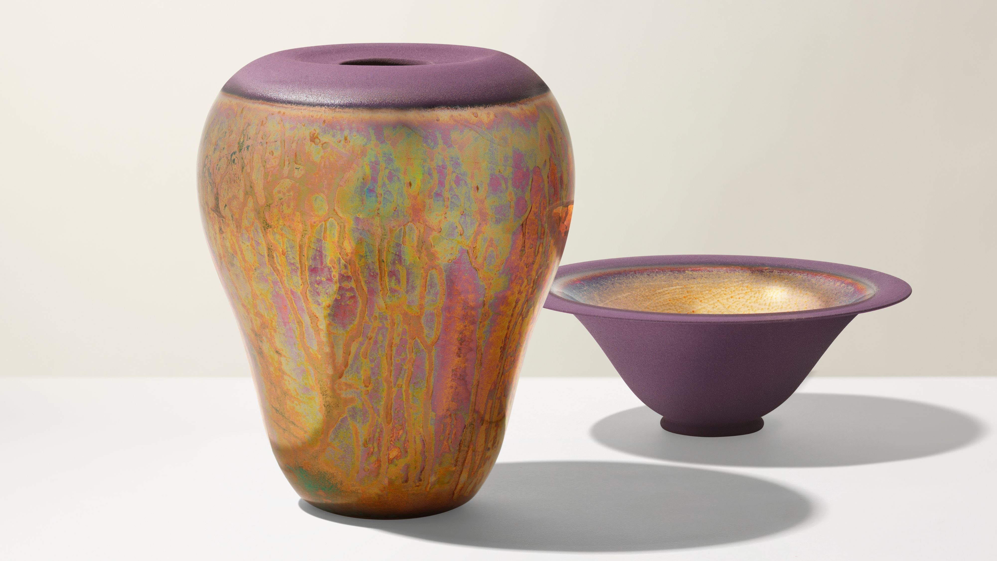
5. Primary colors and white

Another twist on the classic summer color palette of sunshine yellow and sky blue, this living room by the Los Angeles-based studio Jessie Lane Interiors throws in the third primary color - red - for good measure, and underpins them all with a burst of brilliant white. The effect is enlivening.
'I am always drawn to dramatic spaces with saturated colors,' says the studio founder Jessie Lane McLaughlin. 'For my living room design, I started with the sofa fabric. While I normally tell clients to begin with the rug as the foundation of the room, anything that you're drawn to or sparks interest can be where you begin. The luxe teal blue velvet was the perfect compliment to the curves of the Kagan-inspired sofa. The raspberry antique Balouchi rug held up against the saturation of the sofa. As I played around with different curtain colors, I realized that I had to go bold and mustard fit the bill. The result was a surprising version of the primary color palette which I'm very rarely drawn to. However, by tweaking each color the result is a dramatic and fresh combo.'

Price: $168
Colors: Citron, Light Blue
Materials: Glazed earthenware
6. Mixed browns and creams

Taking a more minimalist approach to summer color palettes, there is plenty to be said for the soothing effect of driftwood shades, and playing with the soft browns and creams you might find on an early morning walk along the beach. In this dining space by Prospect Refuge Studio, the gentle palette implies quiet sunny moments spent peacefully reflecting. Pure vacation vibes.
'Sitting in this space is very airy,' says the studio's founder Victoria Sass. 'There is so much natural light, but also a lot of negative space to the table and chair profiles, which helps. Really the space is composed of a collection of woods, and I feel that bringing so many different woods together highlights the unique qualities of each.'
7. Lilac and oak

Summer color palettes either focus on jolts of serotonin-boosting boldness, or on soporific shades which you can lie down and feel cool in. The aim of this approach is to help you relax - it's summer after all, a time where lazy afternoons are encouraged.
That doesn't necessarily mean a neutral color scheme though, and this reading room by Los Angeles-based designer Jake Arnold turns the color dial up a notch by using lilac on the walls.
'I’ll tell you what comfort isn’t,' Jake says, explaining why he chose this approach. 'Gray. People love it but I think it's cold, even the hues with richer pigments. Use a palette of jewel tones instead. So much more elegant, and yes, comfortable too.' Ideal for long summer days.

Price: $17.99
Colors: Lilac, Pink, Light Dusty Green
Material: 100% cotton
8. Dark Green and lilac

Dark green is a surprising choice for a summer palette, perhaps, but as this bold bathroom color by British designer Eva Sonaike for C.P. Hart shows, it can be revitalizing, too. It helps that Eva took her inspiration squarely from the most summery of moments.
'Think of wisteria and lilac flowers, of the greens of their foliage,' Eva says. 'It’s such a refreshing and natural combination. Green, for me, is a neutral, and lavender has evolved as long as you find one with a greige undertone so that it has an earthy smoothness to it.'
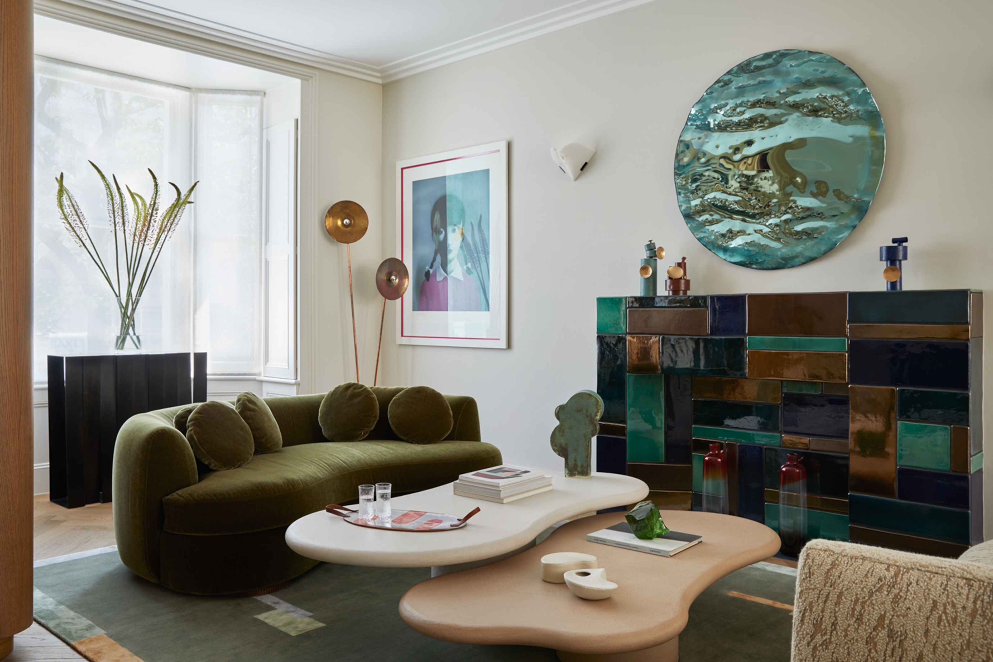
9. Dark green and copper

More dark green, again taking inspiration from the colors of nature - think a pine forest in midsummer - and using them as the starting point for a palette that looks cool in the heat of a sunshine-filled day. Add in the copper painted ceiling of this home office by Elisa Ossino Studio and the warmth of the season becomes inherent to the scheme.
'My vision was to reinterpret the space, using striking and vivid accents to create three-dimensional pictures, and furniture and objects as bold contrasting points of color,' says the studio's founder Elisa Ossino.

Price: from $82
Colors: Green, Brown/Gray, Brown, Beige
Sizes: 2'3''x3'9'', 3'6''x5'6'', 5'x7'6'', 7'9''x9'9'', 9'3x13', 2'6''x7'6''
-
 My 10 Favorite Designs at Milan Design Week 2025 — Out of the Hundreds of Pieces I Saw
There is a new elegance, color, and shape being shown in Milan this week, and these are the pieces that caught my eye
-
 Iridescence Is Chrome’s More Playful, Hard-to-Define Cousin — And You're About to See It Everywhere
This kinetic finish signals a broader shift toward surfaces that move, shimmer, and surprise. Here's where to find it now


-
 Straight from Salone: 5 Emerging Trends I Found in Milan That'll Shape Interiors for the Year Ahead
From reflective silver to fluidity, here's my perspective on the key themes and new moods coming through from Milan Design Week
-
 The 'Red Table Trick' Is the Easiest and Most Expensive-Looking Trend to Hit 2025 So Far
A red dining table makes a seriously stylish statement; the beloved pop of red trend just got an bold and expensive-looking upgrade
-
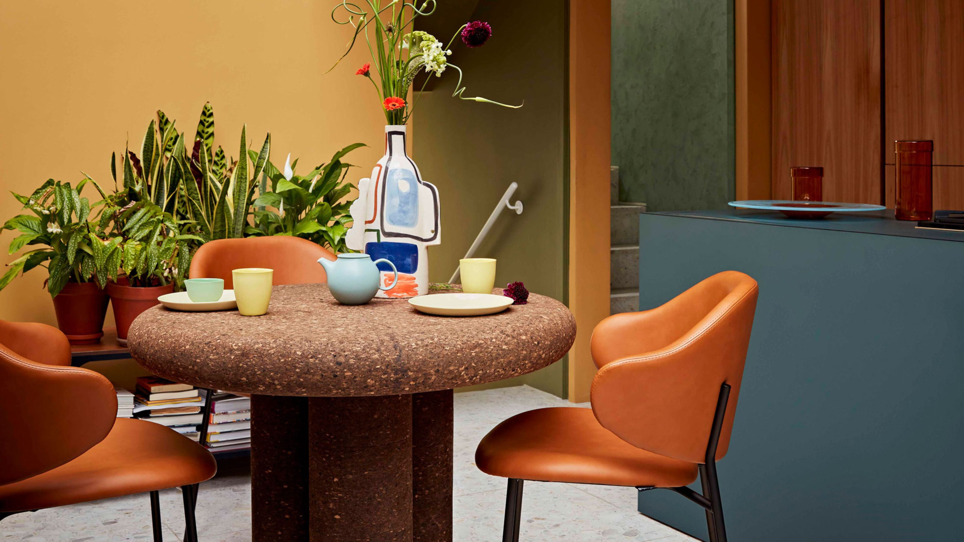 Cork Is the Cool, Sustainable, and Surprisingly Chic Material We Can't Stop Furnishing With Right Now
In honor of Earth Month, we’re toasting to cork... furniture, that is
-
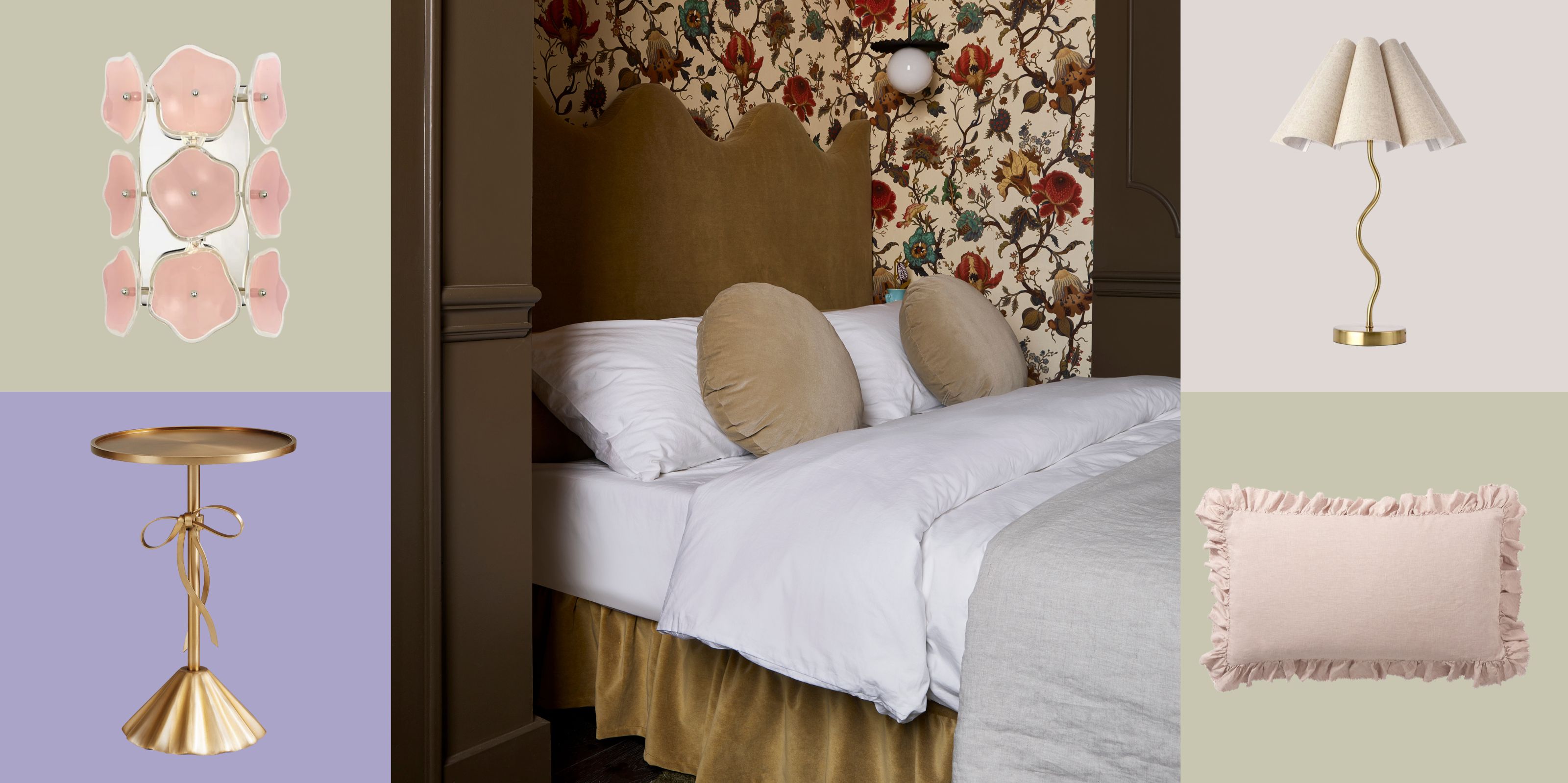 The Coquette Aesthetic Is Still Going Strong in Homes in 2025 — But Now It's Charming, Whimsical, and Has Modern Flair
A designer weighs in on how you can make the classic coquette trend feel modern while still retaining its whimsical elegance
-
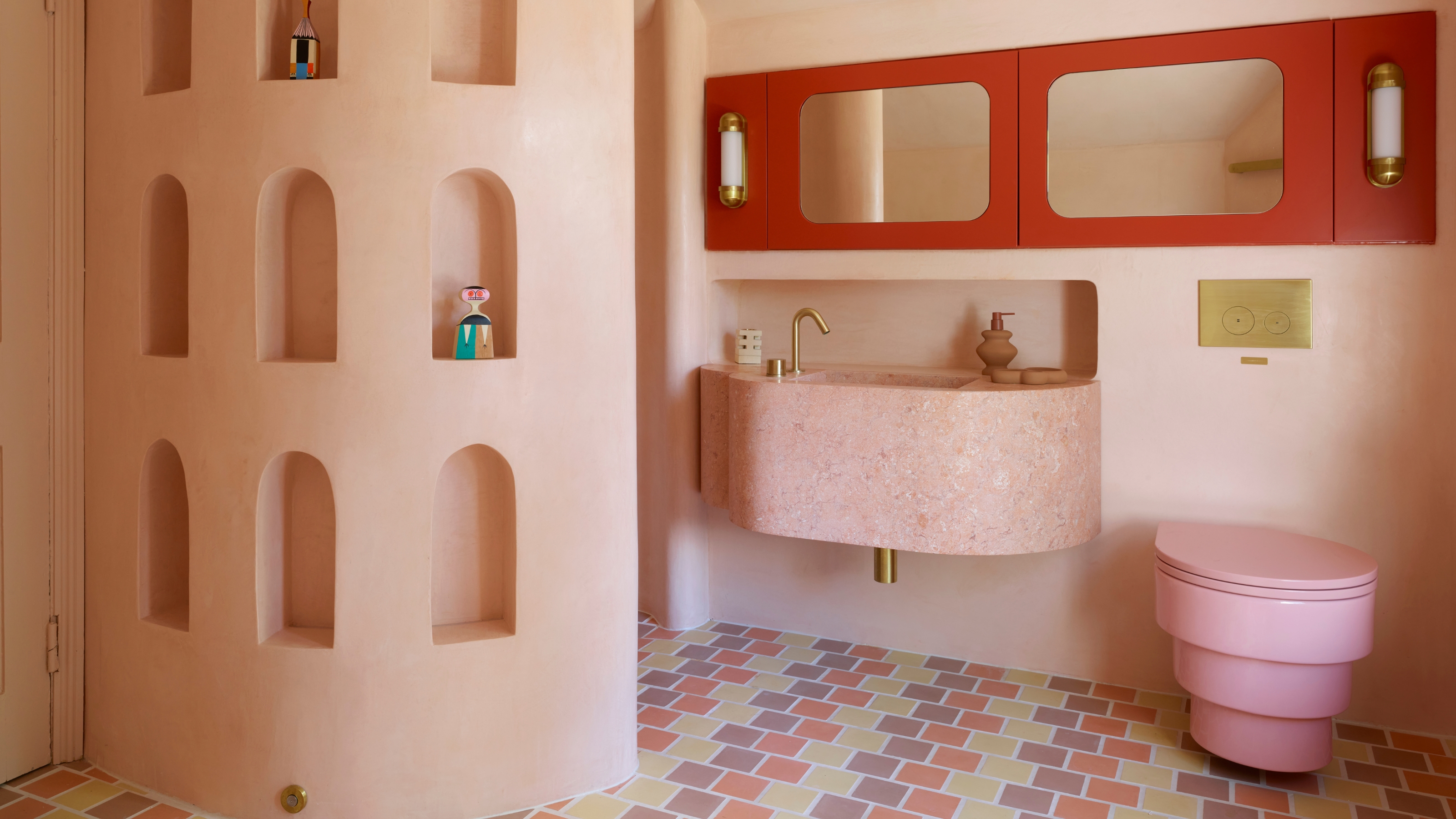 Spotted in the Coolest Bathrooms of the Moment — This Colorful-but-Divisive Trend Is the Idea You'll Either Love or Hate
See you later, sterile white. This playful plumbing trend is bringing color back to our bathrooms in an utterly unexpected way
-
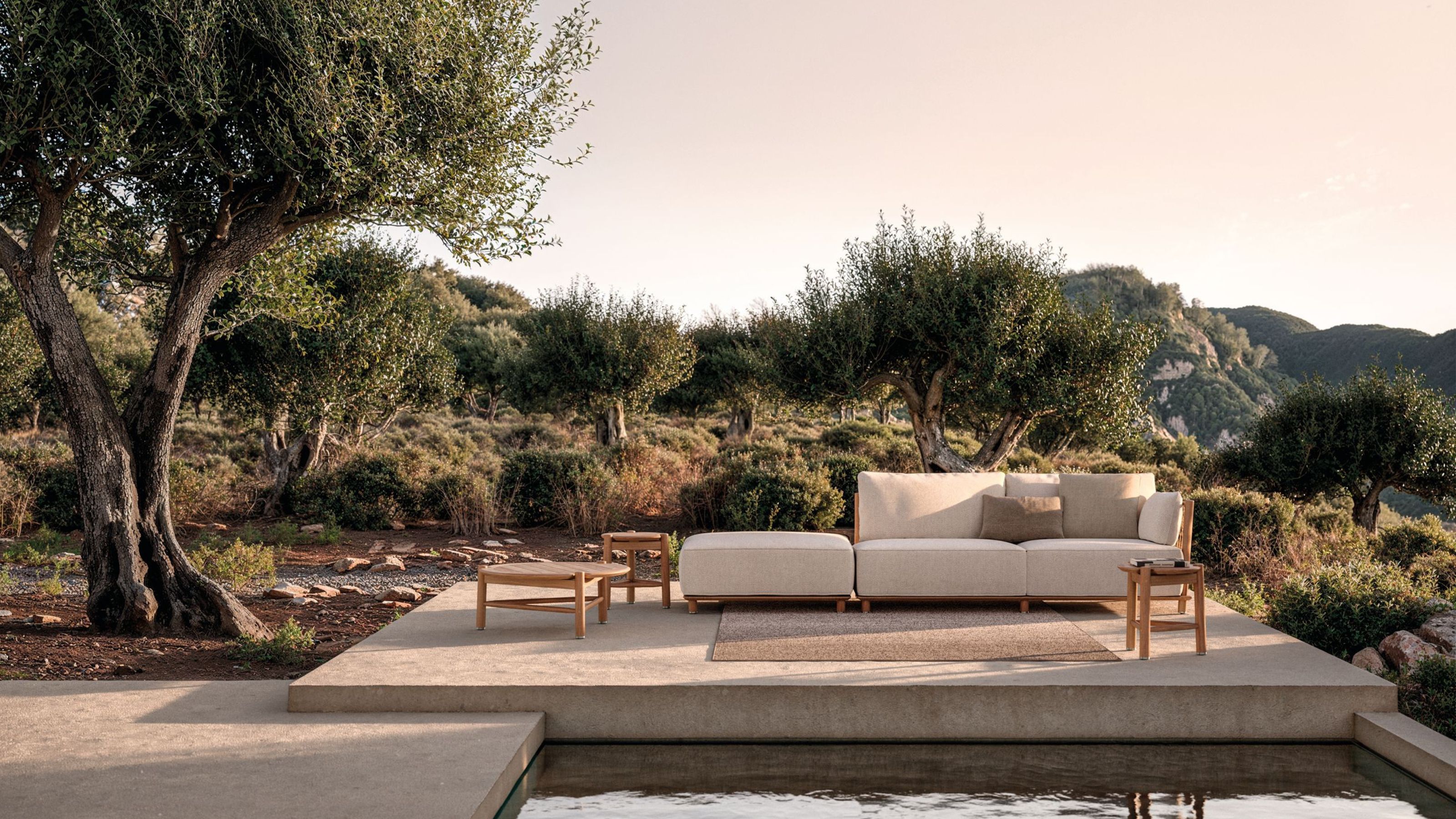 The Biggest Outdoor Furniture Trends for 2025 Embrace the Natural World, White Lotus, and a Touch of Whimsy
Sofas as plush as your living room’s, tables fit for a five-star resort, and materials straight from nature — here’s how outdoor living is evolving this year
-
 The "One Amazing Thing" Theory Could Just Be the Secret to Making Your Decorating Budget Go Further (While Making More Impact)
What if we told you designers had found a way to control a project's spend even while elevating the final result? This new trend does just that
-
 Carpets Used to Give Me the Ick, but This Bold New Style Makes Me Think They're the Next 70s Design Detail Due for a Revival
I've always had visions of ripping up wall-to-wall carpets, but now I'm thinking about actually installing them — what gives?


