5 Colors to Paint a Summerhouse That Will Make Your Outdoor Spaces Feel Modern and Stylish
Summerhouses, sheds and more will all benefit from a carefully chosen color palette — here are 5 shades that designers love

A summerhouse is a desirable backyard addition, particularly as the seasons change and we use our backyards more and more. From a smaller garden shed that's been given a coat of paint, to fully functioning pavilions and luxurious pool houses, there is a type of summerhouse that works for all shapes and sizes of backyard.
Color is key to making your summerhouse look at home in its surroundings. You can pick a paint color that forces your summerhouse to shrink into the shadows, creating a bit of mystique and aura to your garden retreat, or you can choose a tone that ties with the surrounding flora and fauna, or even go brave and bold with a color pop. We've spoken to the landscape designers, pulling together some fabulous examples to help you pick the perfect color for your summerhouse.
1. A bright color pop
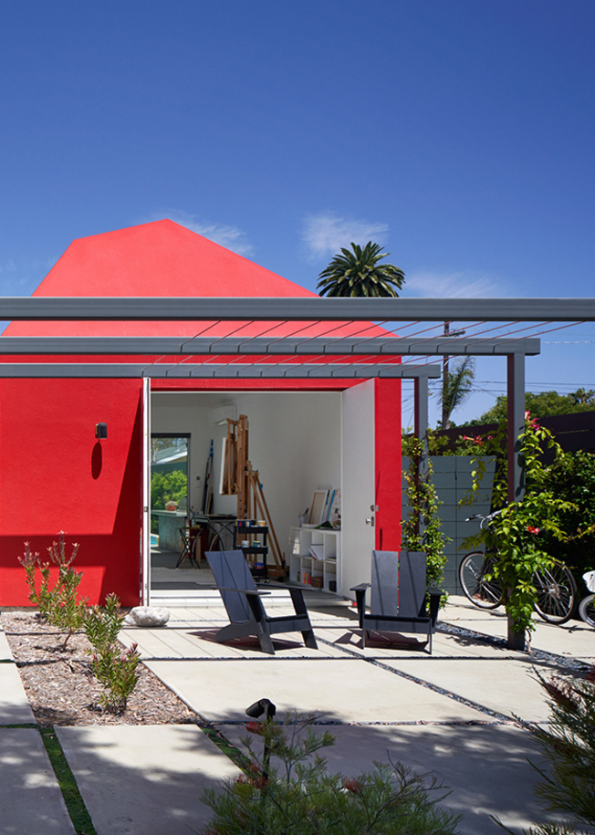
This summerhouse was designed to function as an art studio, housing the homeowners' art collection and providing a place of escape from the main home next door. Architect Oonagh Ryan hoped it would evolve as the family's needs and circumstances changed over time.
The studio, in contrast to the house, is a red box referencing the form of the neighborhood's many one-story gable cottages. The fiercely bold hue showcases the summerhouse trend of using a bright color to paint the space. 'The art studio’s pop of red color was inspired by a strawberry bush at the owner’s former home and adds surprise,' says Oonagh. 'Traditional elements such as wood window shutters and a barn door are juxtaposed with the home’s contemporary forms.'
2. Muted tones
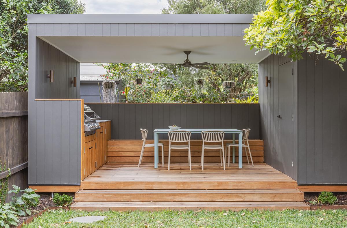
'The best color for a summerhouse is one that most closely represents what the client is hoping to achieve in their backyard,' says Joana Emhof, founding partner of ArcDen Studio.
'Are they looking to blend and be immersed in a surrounding forest? Do they want to feel invigorated and energized with bold pops of color in an urban environment? Do they want their home to reflect the light and calming hues of an ocean view.'
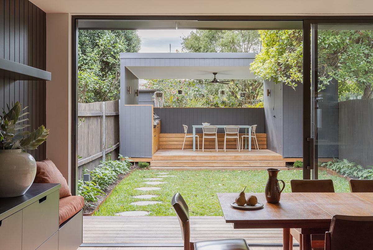
In this example by Sandbox Studio, going for a muted tone of light grey paint alongside a golden teak helps the backyard feel relaxing as it merges into the surrounding landscape without feeling too intrusive.
The neutral palette of a warm grey offers a strong base and allows the surrounding nature to take center stage. The style of summerhouse has been selected to fit with the surroundings. 'Weaving tradition and a contemporary focus on living connectedly, Towoomba draws from the existing eclecticism of Sydney’s architectural landscape,' says Mukesh Vanjani of Sandbox.
'We feel that the light grey coloring evokes a sense of calm. It is quite close to the tone of unfinished concrete, giving the home a slightly industrial, raw aesthetic, which is quite contextual for the location.'
3. Dark near-black shades
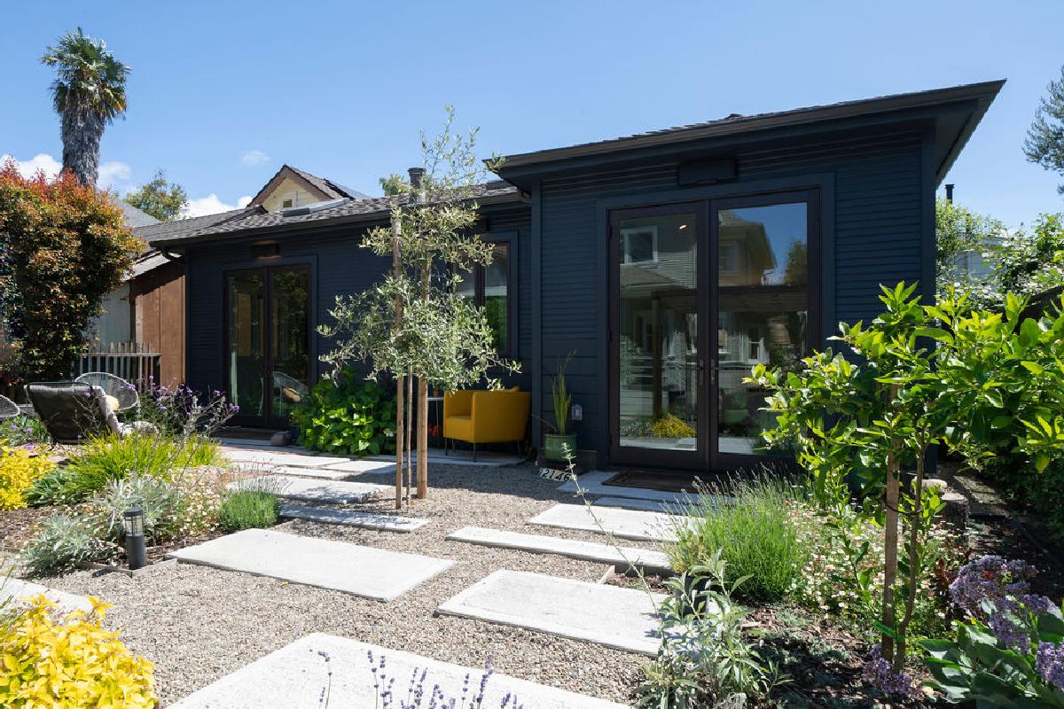
Going dark with paint is a classic look for a summerhouse. Staying away from the light shades and going for darker color trends like charcoals, dark grays, and near-black blues makes your summerhouse feel less twee and more modern, slick, and urban.
'This summerhouse is painted in a rich dark blue-grey color that allows it to blend seamlessly into the garden while maintaining a contemporary aesthetic,' says architect Carrie Diller, principal at both Inspired ADUs & Larson Shores Architects.
'The siding of the cottage has two different widths, and the hip roof line mirrors the Victorian style of the main house.'
4. Pale green
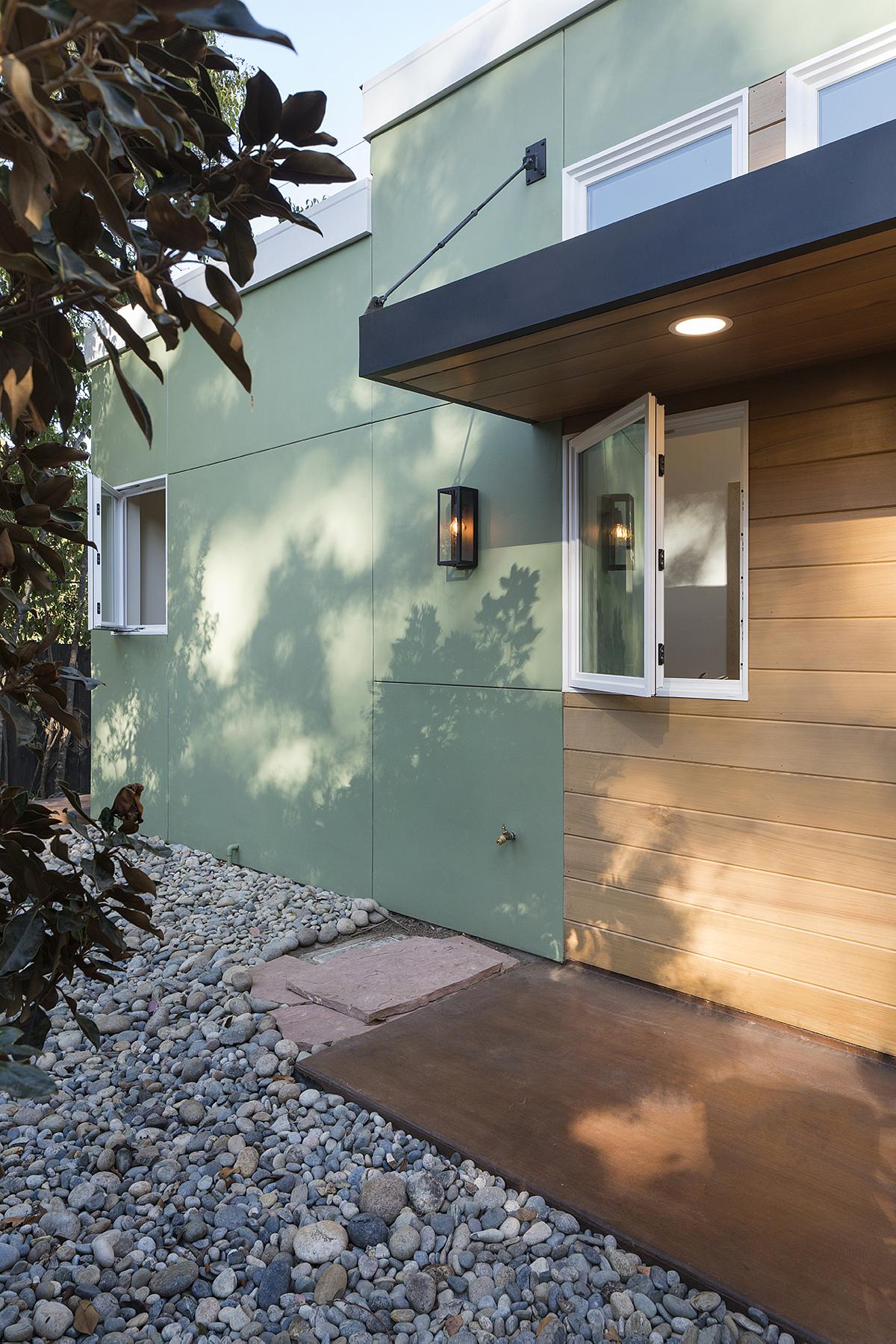
Green is a reliable color that works well in your backyard. In all its hues, it blends with the surrounding nature and can enhance that feeling of escapism and relaxation.
‘The choice of colors for summer residences is intricately tied to their surroundings,’ says Esther Stam of Studio Modijefsky. ‘Drawing inspiration from local techniques, materials, architectural heritage, and natural elements like stones or pigments, you should aim to harmonize the design with its environment.'
'This tranquil retreat provides a private oasis for relaxation and rejuvenation,' says Carrie, who designed this space. 'At the entry, a welcoming awning invites you to enjoy the outdoors, offering a cozy backyard spot for quiet moments or delightful gatherings with loved ones.'
5. Natural materials
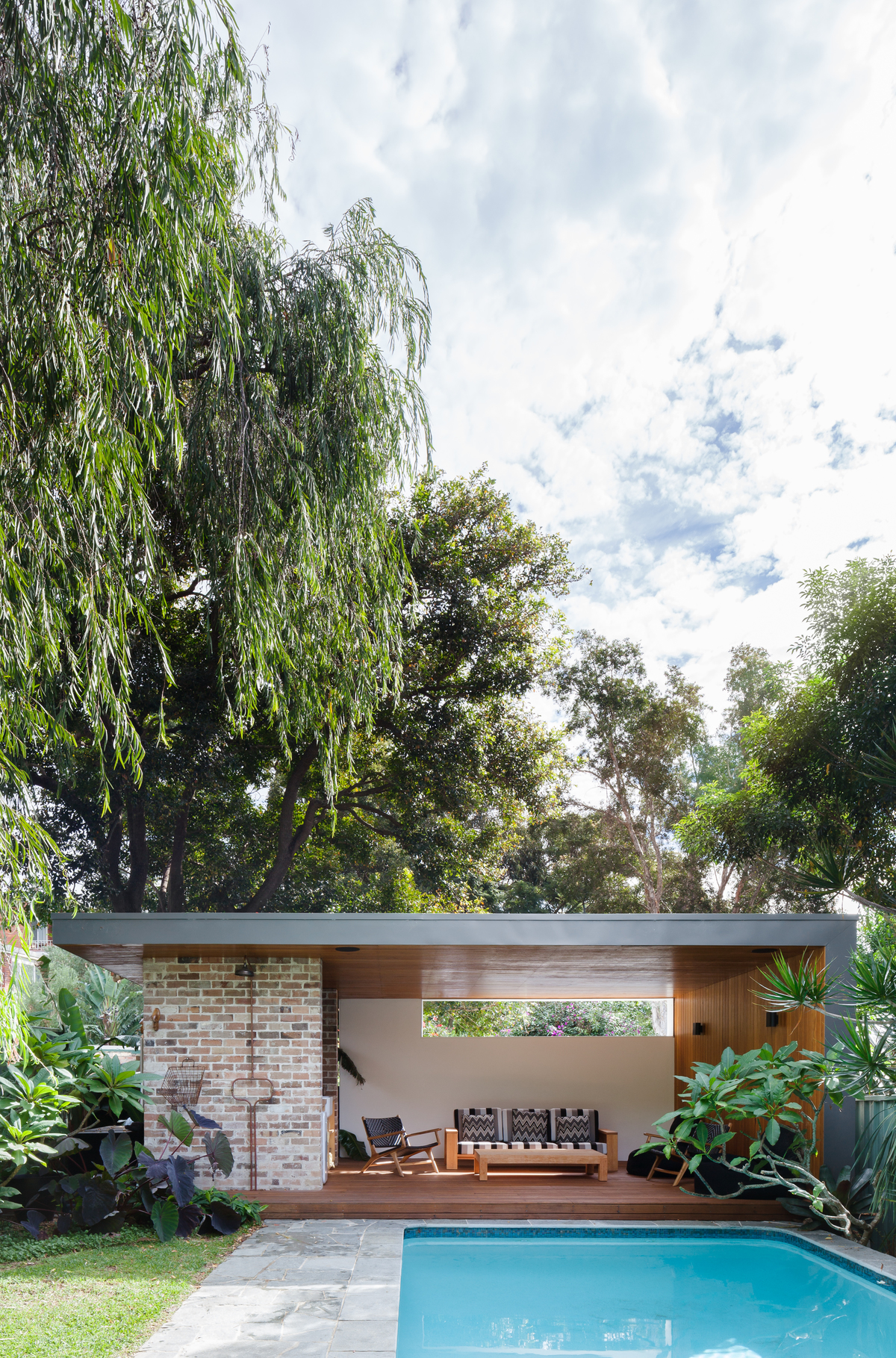
Finally, why not embrace the organic colors of the natural materials used. 'In this way, the focus might not be on any color, but rather a material with inherent color that evokes context,' says Joana. 'We deeply consider site conditions and context, as well as how a client wants to feel in their home, before embarking on a design,' she says.
This summerhouse is one such example where the designers have relied on the color and tones of the brickwork.
'A new pool house was added to the rear of the pool just above the existing pool level to extend the living spaces further into the garden,' explains Vanessa Wegner of Vanessa Wegner Architect.
'We integrated the new living spaces around the existing pool and used ecycled brick to screen neighbors and to contain the outdoor living areas.'
Backyard landscaping books to inspire you
Be The First To Know
The Livingetc newsletters are your inside source for what’s shaping interiors now - and what’s next. Discover trend forecasts, smart style ideas, and curated shopping inspiration that brings design to life. Subscribe today and stay ahead of the curve.

Former content editor at Livingetc.com, Oonagh is an expert at spotting the interior trends that are making waves in the design world. She has written a mix of everything from home tours to news, long-form features to design idea pieces, as well as having frequently been featured in the monthly print magazine. She is the go-to for design advice in the home. Previously, she worked on a London property title, producing long-read interiors features, style pages and conducting interviews with a range of famous faces from the UK interiors scene, from Kit Kemp to Robert Kime. In doing so, she has developed a keen interest in London's historical architecture and the city's distinct tastemakers paving the way in the world of interiors.
-
 The 'New British' Style? This Victorian London Home Embraces Its Owners' Global Background
Warm timber details, confident color pops, and an uninterrupted connection to the garden are the hallmarks of this relaxed yet design-forward family home
By Emma J Page
-
 Muji Living Room Ideas — 5 Ways to Harness The Calming Qualities of This Japanese Design Style
Inspired by Japanese "zen" principles, Muji living rooms are all about cultivating a calming, tranquil space that nourishes the soul
By Lilith Hudson
