These Bathroom Colors Were Once Considered "Ugly" — Now They're Having a Renaissance in Modern Homes
Interior designers are choosing bathrooms in a unconventional array of colors - here they tell us why

The Livingetc newsletters are your inside source for what’s shaping interiors now - and what’s next. Discover trend forecasts, smart style ideas, and curated shopping inspiration that brings design to life. Subscribe today and stay ahead of the curve.
You are now subscribed
Your newsletter sign-up was successful
We’ve come a long way since the clinical white bathroom was the way to go, now after seeing some serious inspiration of colors we don’t usually expect to see in a bathroom, we’re longing for earthy tones and darker shades, along the lines of, dare I say it, colors we'd usually consider too "ugly" for bathroom.
So, why are they ticking all the boxes when it’s a bathroom trend so far from what we already know? 'In a broader design context, we're seeing a shift away from the once ubiquitous all-white, minimalist bathrooms,' interior designer Nicholas Kaiko tells us. 'Today, there's a growing appetite for bathrooms that feel more personalized, more in tune with the rest of our living spaces. People are embracing textures and colors that add depth and character. It's about creating a space that's not just clean and functional but also warm, inviting.'
We found 5 bathrooms that all feel surprising in their use of color that may convince you to reject the plain white bathroom once and for all.
1. A natural connection
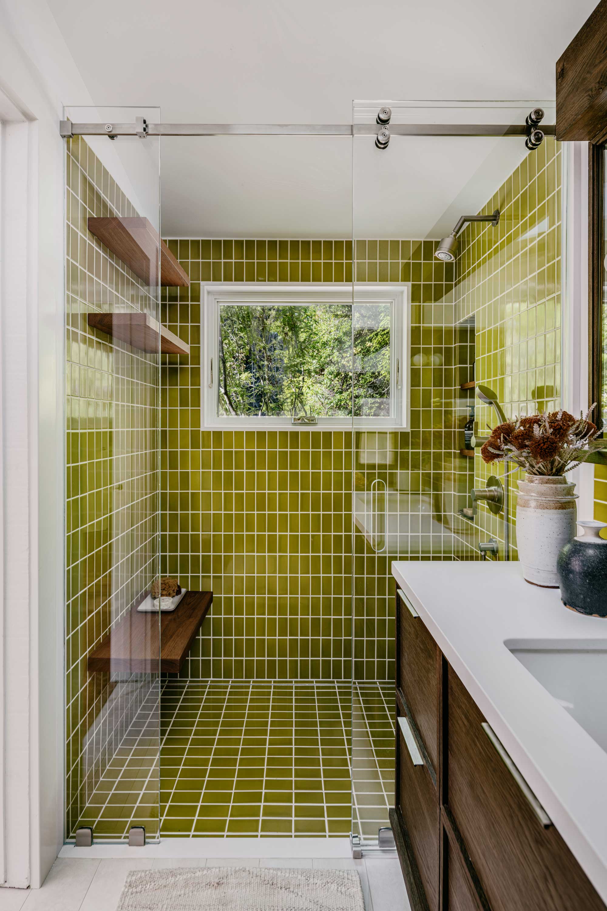
Strong natural palettes are most definitely a huge color trend, we’re at a time where it’s all about stripping things back to the simple things in life and making sure we look after ourselves, and bringing nature indoors is a popular way to introduce this to our home.
'Reminiscent to being in nature, these earth tones have inviting and calming characteristics,' says Gretchen Murdock, Principal Design Director at Modtage Design. 'For this bathroom project, we loved the idea of using a green tile to tie into the beautiful greenery at the exterior. We added wood elements to soften and balance the palette and provide another connection to the outdoors.'
It’s definitely a striking color to have on a large scale, but the uniformed tile gives the space a soothing and satisfying spa-like effect.
2. Momentary escape
)
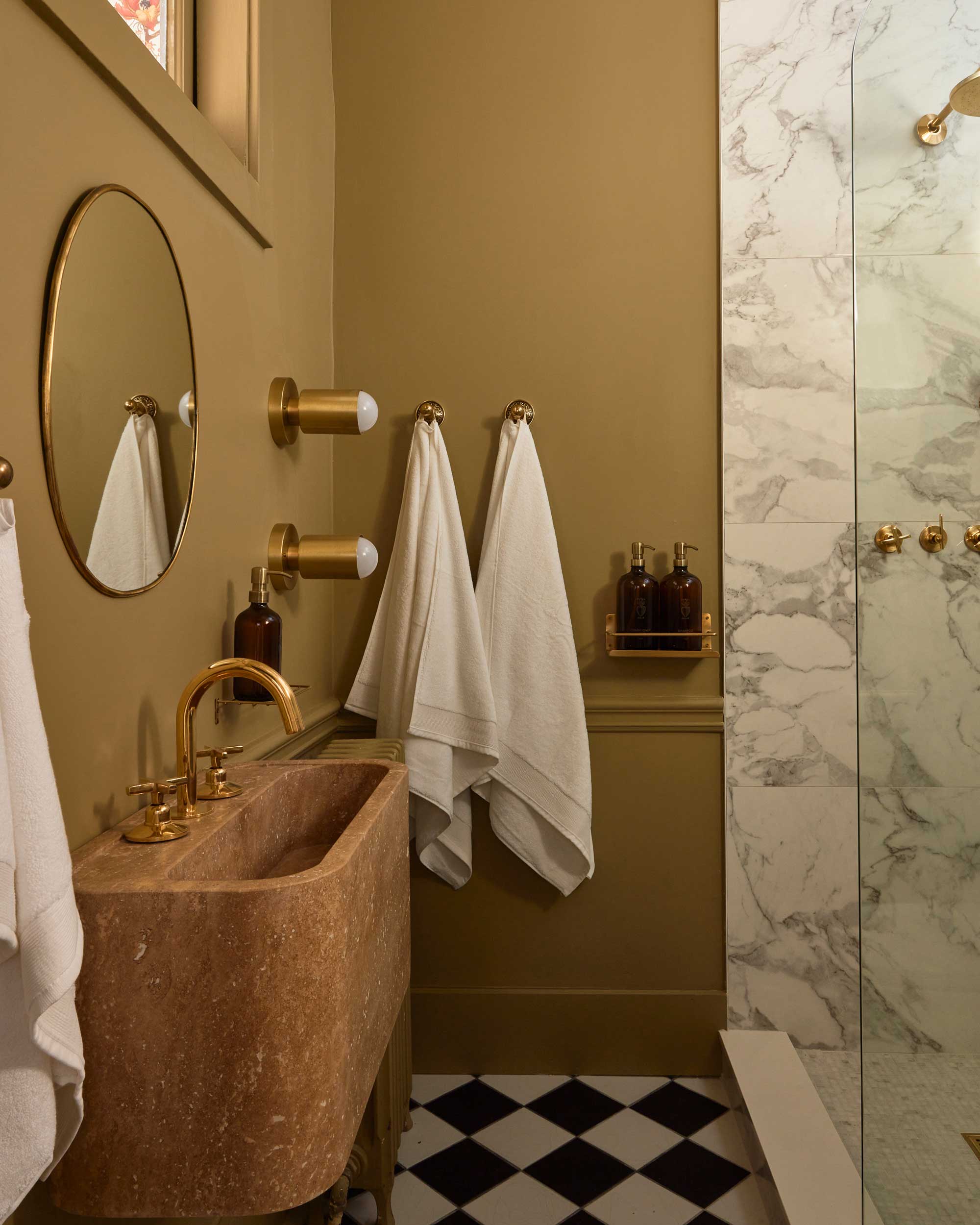
Brown is a color that once you'd never consider for a bathroom, but now we're seeing interesting earth-tone neutrals becoming more popular for bathroom color schemes.
The Livingetc newsletters are your inside source for what’s shaping interiors now - and what’s next. Discover trend forecasts, smart style ideas, and curated shopping inspiration that brings design to life. Subscribe today and stay ahead of the curve.
Embracing the curves at all angles, this hotel bathroom you’ll find inside Hotel Julie is designed by Twenty-Two Twelve and Stay Here. It boasts a palette of muddy beige and dusky pink is elevated by the rich finishes of brass and marble.
Design elements such as these are perhaps reminiscent of hotel experiences and subconsciously feel like more of a momentary escape from day-to-day life.
3. Unique fusion
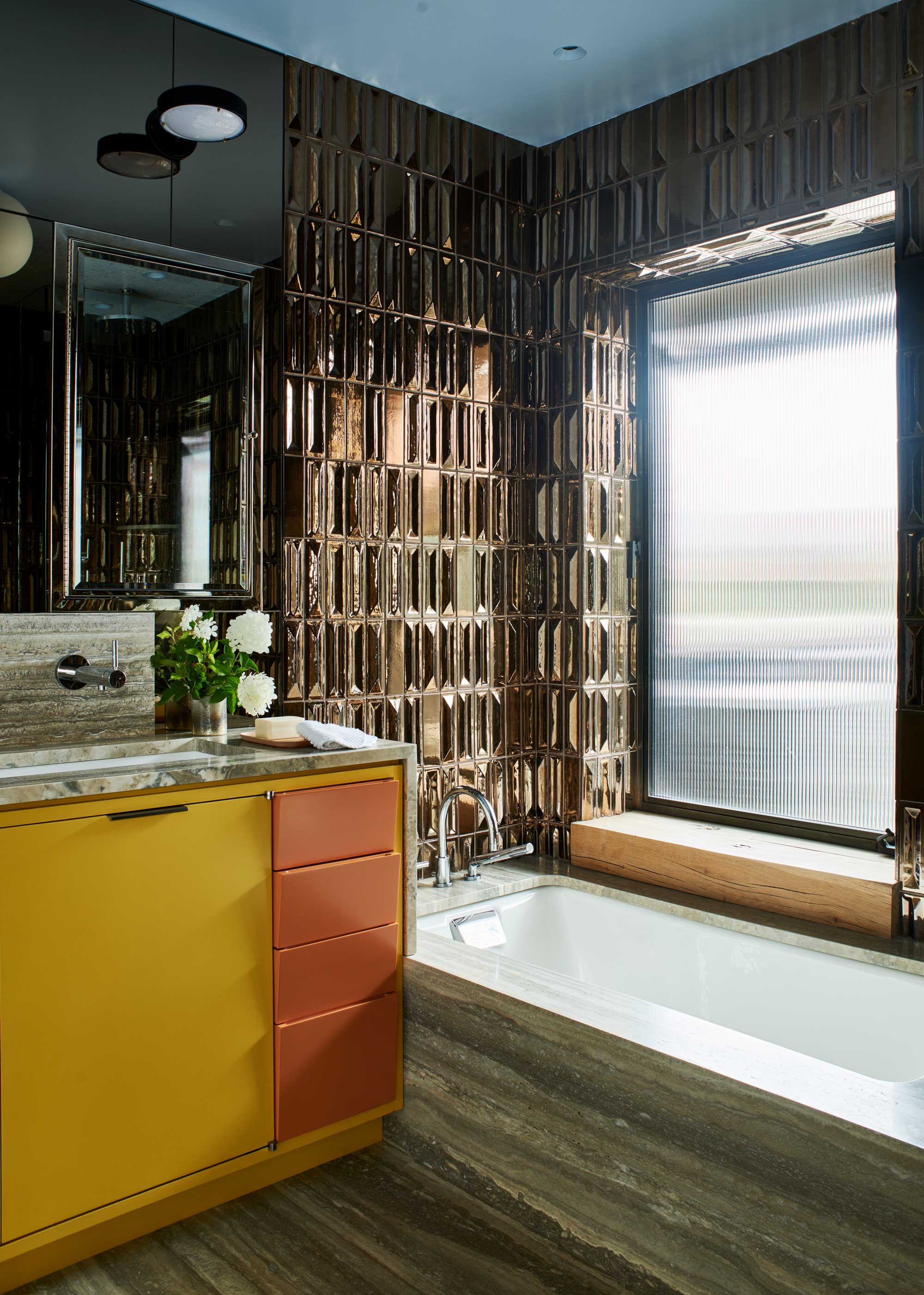
A luxury bronze brown bathroom tile from bath to ceiling adds a reflective shine to this bold space - and combined with pops of yellow and orange exudes a modern take on 60s vibes.
'The yellow/gold and orange of the vanity relate to the color scheme of the adjacent bedroom,' explains John Ike, Partner at Ike Baker Velten. 'The blue ceiling is a unifying element in all bathrooms and reflects the blue lampshade of the sconce over the sink. It is all designed to surprise and delight in contrast to the bronze Gio Ponti-designed wall tile and the silver travertine decks and floors. As with the rest of the house it is inspired by Italian precedents.'
The stone element grounds the daring color scheme and adds a sense of nature to the space, bringing balance. An exciting, yet relaxing interior full of unexpected color combinations.
4. Starting with the star moment
)
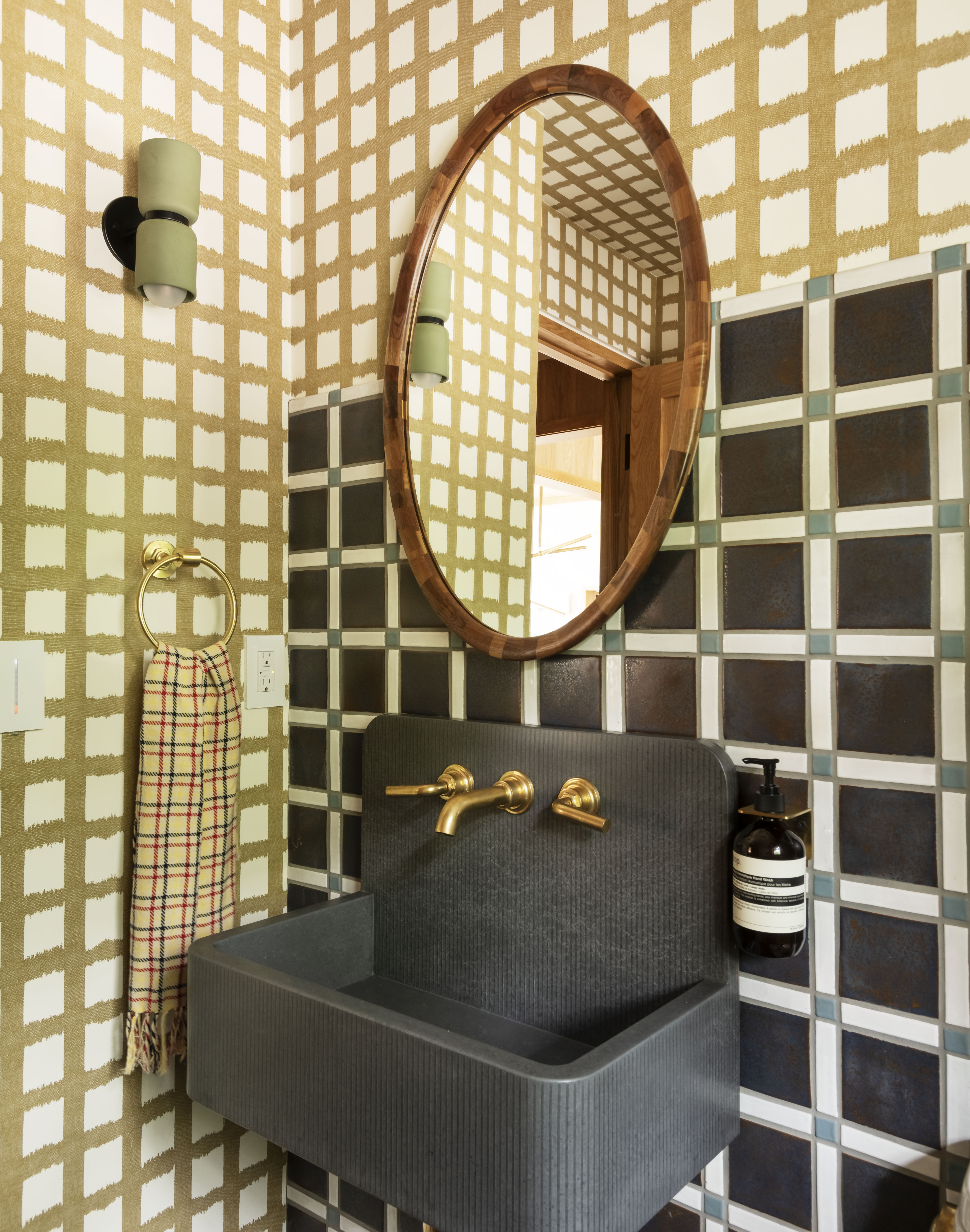
Homeowners are most definitely getting braver and more comfortable with dramatic bathrooms, and brassware and other finishes in the bathroom can make just as much impact as the wall color, but how is best to pull a scheme together with all of these different elements to consider?
'We like to build a materials palette like a child builds a sandcastle - start with the general shape, structure and scope,' explains Victoria Sass, Principal and Design Director at Prospect Refuge Studio. 'For example, know where you are going to want certain elements. Then begin to flush out the grander details starting with your star moment. If you find a stone you love, what metal finishes support that? If you know you want a strongly patterned tile, where will you balance that intensity with a breath. I find that making one decision often informs the next few.'
Each element that makes up this bathroom is strong, but the busy walls are broken up and pared back by the striking basin and its brassware, leading to a satisfying fusion.
5. Moody and soothing
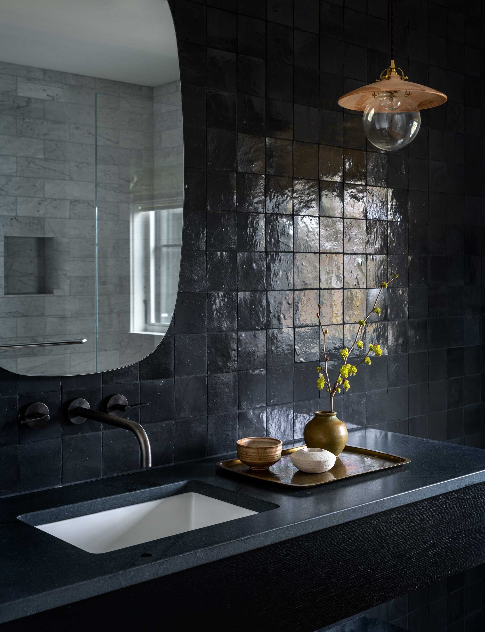
Darkness is usually quite the opposite of what we expect in a bathroom, considering we use the space for daily hygiene purposes and cleansing, yet Lisa Staton, Principal of Lisa Staton Design, expresses just how calming they can be.
'Dark and muddy colors can make a small bathroom feel enveloping and a retest all into itself,' Lisa say. 'Thus creating a moody and soothing experience.'
In this particular design by Lisa, even with almost black raised tiles, the shiny finish modernizes it and encourages light to bounce off the uneven surface. Broken up with a sprig of nature, and brought a touch of glamor with the styling details beside the basin provides tranquility.
Since a bathroom is one of the most intimate, private places you'll experience in a home, there is something intriguing about these unusually colored examples – they’re the safe space where you can take care of yourself both, creating a spa-like experience to maintain your health and wellness.
Victoria Sass of Project Refuse Studio agrees, 'There is a movement toward primary bathrooms that are more focused on rest and reflection, almost in a spiritual, emotionally supportive way rather than just sterile bathing and bodily maintenance. An earthy environment feels grounding and contemplative - a great starting place for wellness rituals or just quiet time with yourself.'
The great thing is, you get to decide what works best for you. 'Allow your bathroom to let you feel something by embracing the unique design decisions that feel right for you,' encourages Victoria.

Portia Carroll is an interior stylist, writer, and design consultant. With a background in interior architecture and design, she has a plethora of creative experience in the industry working with high end interior brands to capture beautiful spaces and products and enhance their qualities.
