5 Wall Colors We'd Never Have Believed We'd Love — But Now Feel SO Right for 2024
These are the five wall color ideas that have won us over in 2023, (and will still be going strong into 2024)


It's been a huge year for color trends, with 2023 big on bold wall colors, and unexpected color pairings that take our love of color to the next level. At the same time, designers have gone to the dark side, embracing deeper, moodier, and smoky browns and ashy blacks to bring coziness and a touch of the 70s color palette to the home.
Big and bold has been the message for this year, and it's a color mantra we'll be taking into 2024. But like so many trends, we weren't huge fans of them at the beginning. Here are five paint ideas for walls that we weren't too sure of at first, but have seriously won us over this year.
1. Steely green
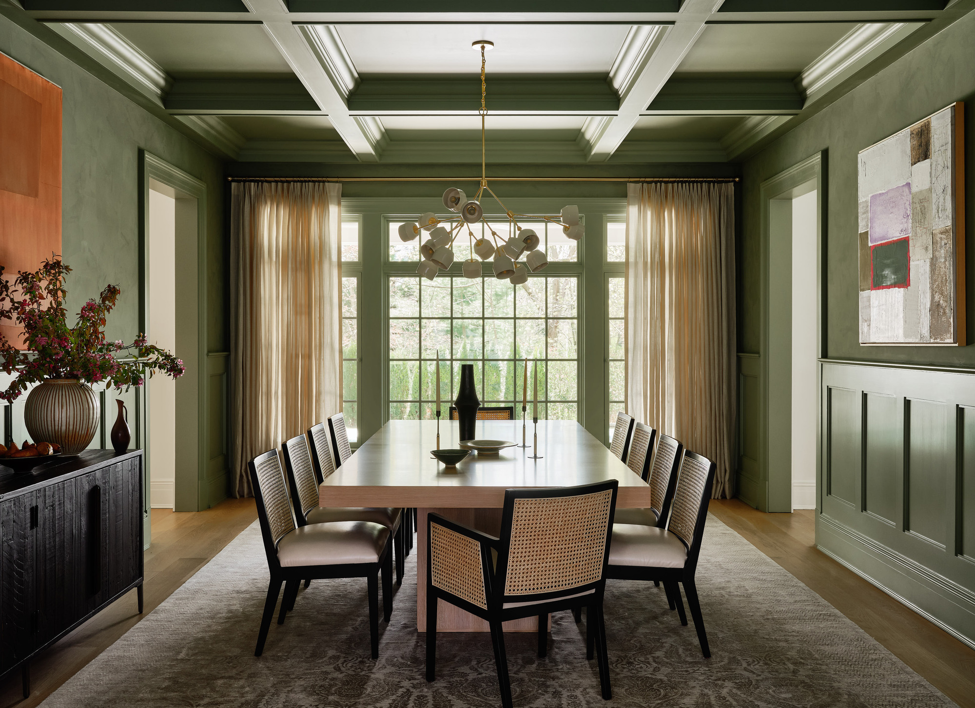
2023 has been a big year for earthy paint colors, and while green has long reined popular, what we're seeing emerge is something moodier. I have always loved green, but this version has seriously swayed me. It's more versatile and can feel light, spring-like, as well as sultry and sophisticated, all at once, depending on the light that shines into the room.
It brings such depth and steeliness to a space and works as well in open spaces as it does in enclosed, cozy rooms. This olive green dining room by Chango & Co has embraced the color trend in full force, with Portola Paints' Limewash Shelter on the walls and ceiling.
For the color experts at Dutch Boy, Ironside is the color of 2024, and has a similar steely tone to Portola Paints' Limewash Shelter. 'Creating a space for wellness should be a driving factor in everyday life,' said Ashley Banbury, color marketing manager, Dutch Boy Paints. 'Our 2024 Color of the Year is the stunning, strong Ironside. It incorporates all the above in one bold color and can be applied in one single coat.'
2. The 70s earthy palette
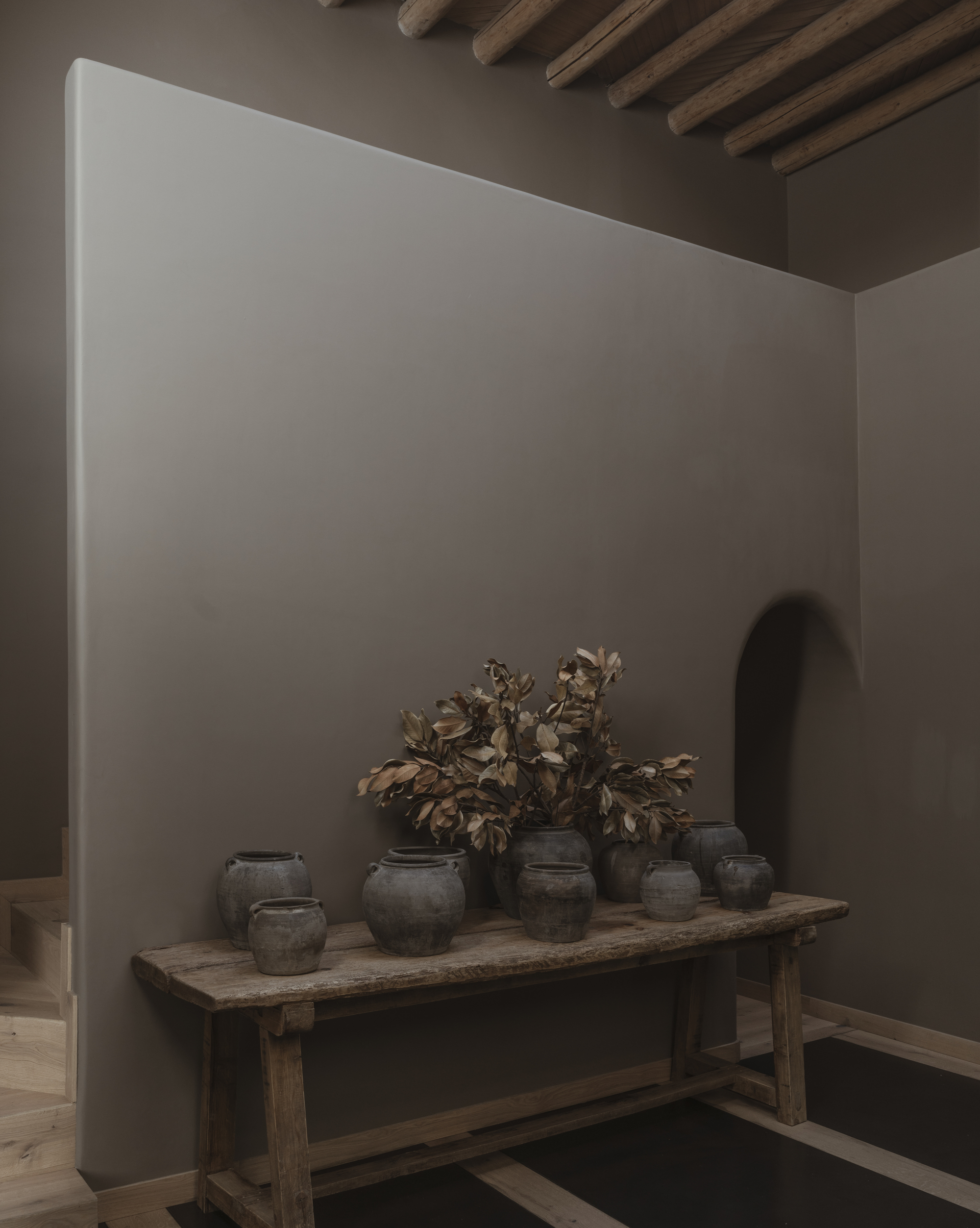
I've always been a bit unsure of dark brown, but if there was ever a year to convince me otherwise, it's 2023. Dark brown is a color that has seriously bounced back. The dark color trend first emerged in the smaller, decorative details, before being fully embraced by designers with full walls painted in a lick of dark brown paint.
'As evidenced by social media and the prevalence of emerald tones in home design, emerald has topped the charts for three years in a row,' says Anthony Barzilay Freund, 1stDibs editorial director. 'However, this reign as designers’ top prediction for popular colors has come to an end in 2024, with sage green taking the lead (by three percentage points) as the color that’s predicted to be most popular in 2024.
The next top color contender is dark brown and chocolate at 21 percent, which moved up from sixth to third place year-over-year. It’s followed by burnt/dusty orange, dark yellow/mustard and light brown/tan.' This proves the popularity of a 1970s-inspired palette and suggests it will continue to go strong.
I first wrote about this home back in April, but I come back to it time and time again as the perfect example of how browns have taken over the world of interiors as the new, calming color on the scene. It's slightly more of a mushroom shade than chocolate brown and is Sherwin Williams color Virtual Taupe SW7039.
3. Red lacquer
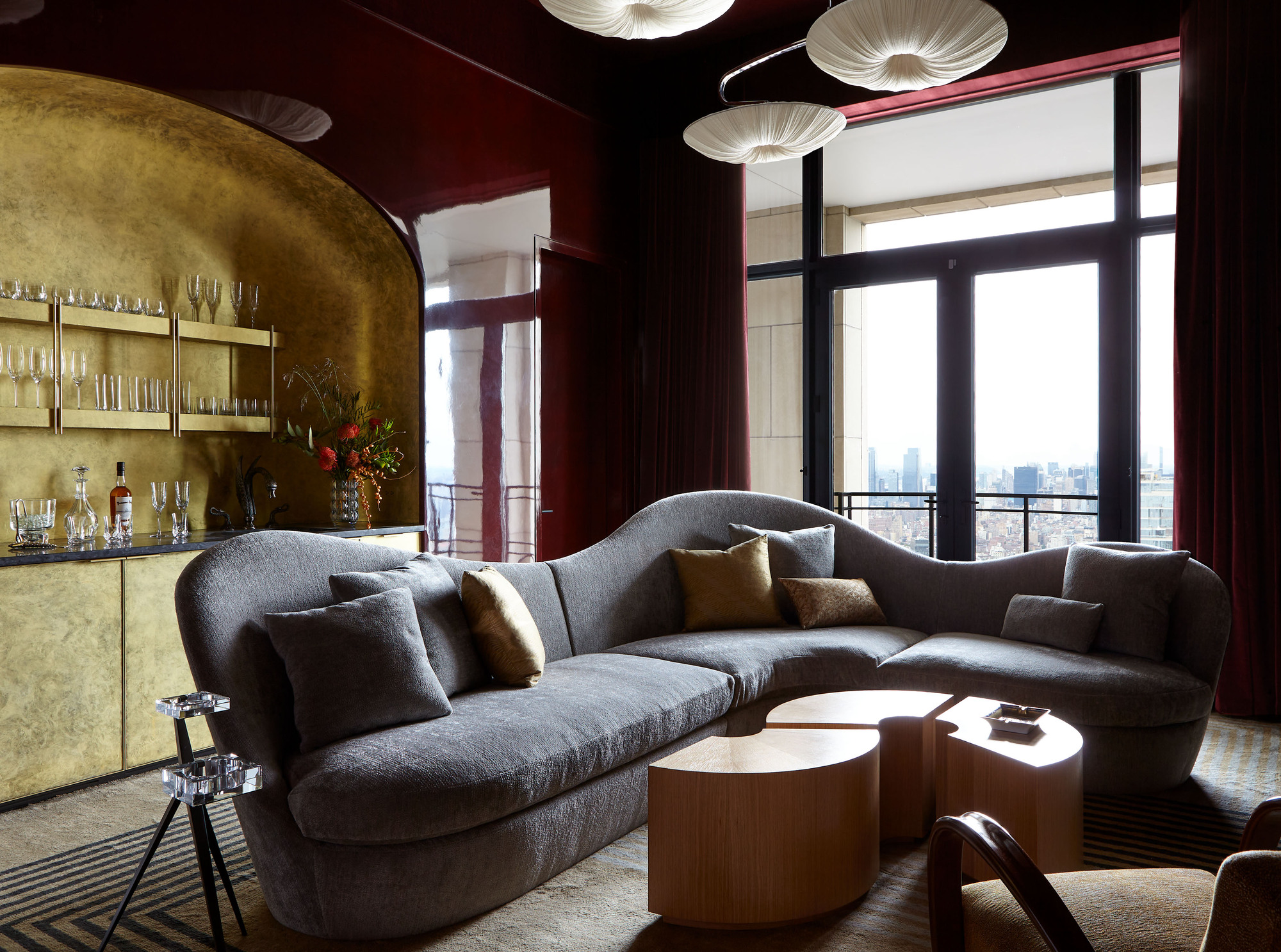
If you'd had told me last year that I'd be swooning over a red lacquered wall, I wouldn't have believed you, but this from Hines Collective has to be one of the coolest, moodiest rooms I've seen all year. The client's brief was 'vampire speakeasy' and it certainly fits the bill, with an oxblood monochromatic color scheme that feels seriously chic.
The lacquer look has picked up this year, with high gloss kitchen cabinets also on trend. It's nothing new, but the gloss look has certainly shaken off the shackles of its stereotype. Instead of feeling dated, it feels modern, high-end and slick. The easiest way to replicate the look is with high gloss lacquer paint. Because of the process and multiple layers, the finish ends up being quite durable and easy to clean too.
For the perfect oxblood red, Classic Burgundy by Benjamin Moore is great. ‘This moody hue is a favorite of mine for dramatic, intriguing color in dining rooms or on cabinets in a Butler's Pantry. Especially in a high-gloss finish,' says Maggie Griffin of Maggie Griffin Design.
Carter Plum by Benjamin Moore works too. 'Purples are back, and a little touch of this color can really make a room sing. I love pairing it with mustard yellow and powder blue for a fun, unexpected mix, especially in textiles'
4. Light black
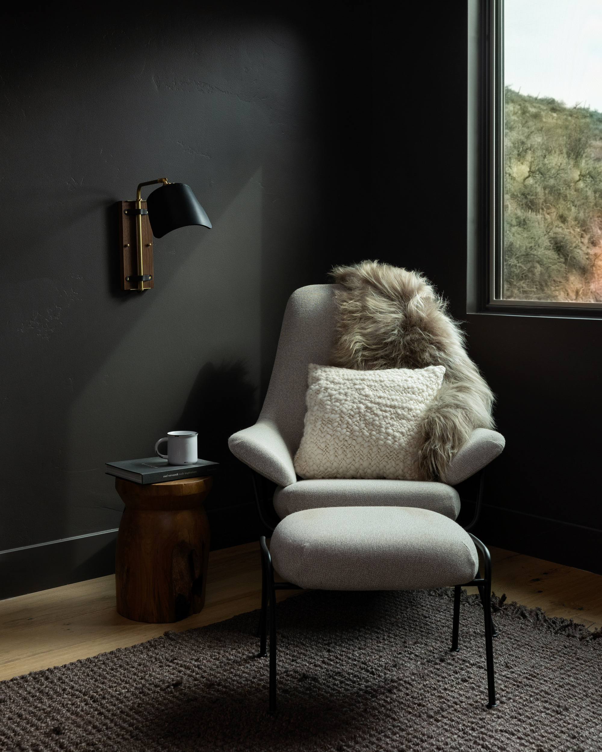
Since Behr revealed its Behr color of the year as Cracked Pepper back in August, I have rediscovered my black paint. This is darker than an anthracite grey but not quite pure black, with a smokey, moody feel.
Black on the walls has been viewed as outdated and a little too gloomy over recent years, and while it's not the best option for making a living room feel bigger, there is something stylish and cool about this ashy look.
Moodier hues have marked their territory in 2023,' says founder of paint brand, Clare, Nicole Gibbons. 'Shades like our Current Mood and Goodnight Moon and Blackish are carving out their niche.'
These colors work so well because they act as more modern new neutrals. They are subtle yet surprisingly versatile choices that complement a range of design schemes and work in any room. 'They are also social media favorites - likely because they’re so dramatic and adventurous,' says Nicole.
5. Dark colored plaster
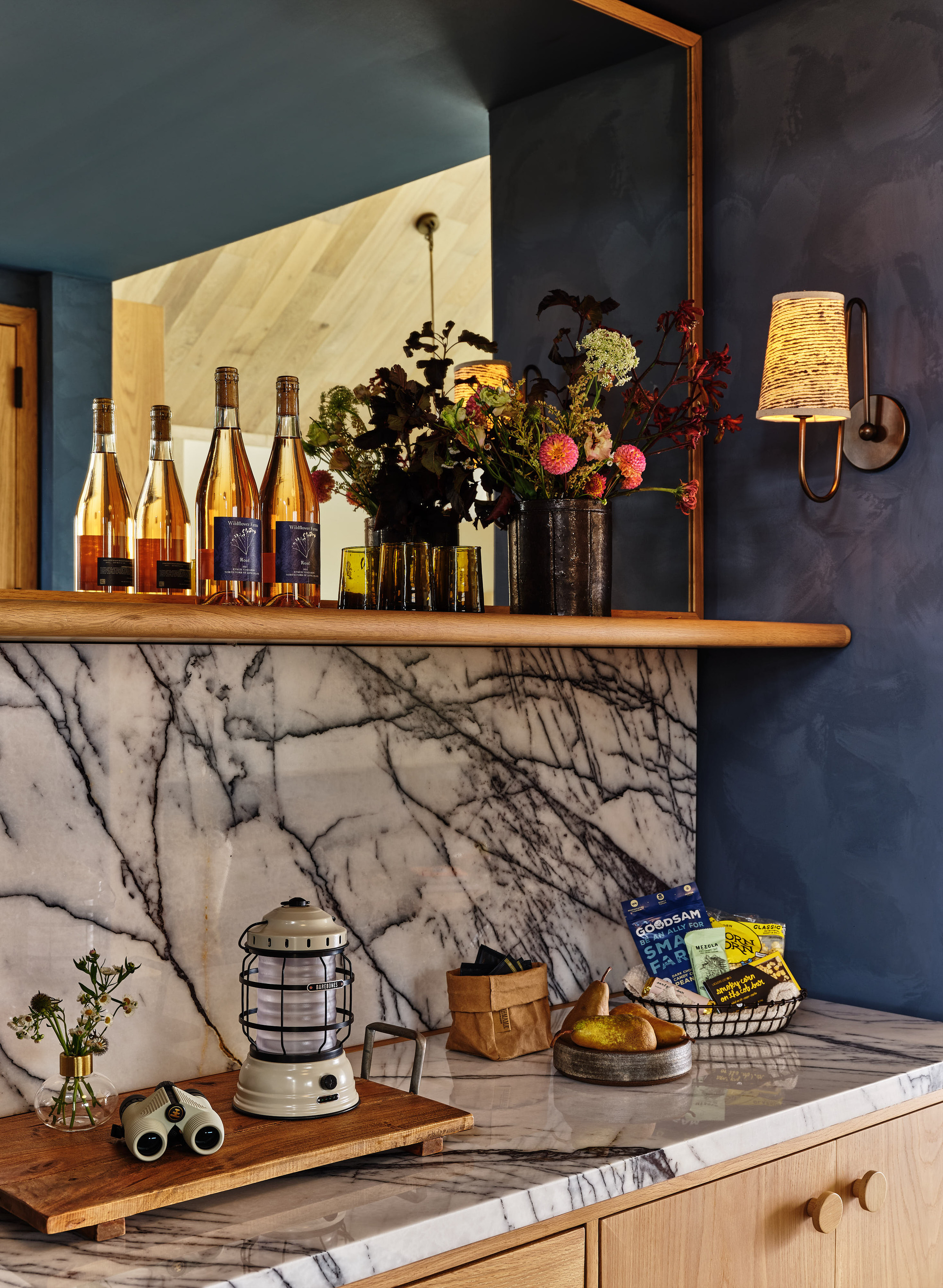
So often, we reserve plaster-effect walls for those lighter colors. At a push, we'd go as dark as terracotta with its evocative summery feel, so going for dark plaster is quite a plunge. It might sit at odds with what you'd expect from plaster, but it's won us over, as well as the team at Ward + Gray.
'We love this color choice because the rest of the suites are a very soothing, ivory plaster color,' says Christie Ward. 'We decided to go bold in the wet bar to bring in an entirely different feel when you walk into the room. We wanted the area to stand out and provide a sense of moodiness to the space.
'It was quite a deep tone for the project, where we otherwise kept it quite light with a farmhouse aesthetic in mind - we worried initially it could look too city or contemporary, but it ended up working out well for the space and creating a stand out feature.'
3 Bold Paints to Embrace in 2024
Be The First To Know
The Livingetc newsletters are your inside source for what’s shaping interiors now - and what’s next. Discover trend forecasts, smart style ideas, and curated shopping inspiration that brings design to life. Subscribe today and stay ahead of the curve.

Former content editor at Livingetc.com, Oonagh is an expert at spotting the interior trends that are making waves in the design world. She has written a mix of everything from home tours to news, long-form features to design idea pieces, as well as having frequently been featured in the monthly print magazine. She is the go-to for design advice in the home. Previously, she worked on a London property title, producing long-read interiors features, style pages and conducting interviews with a range of famous faces from the UK interiors scene, from Kit Kemp to Robert Kime. In doing so, she has developed a keen interest in London's historical architecture and the city's distinct tastemakers paving the way in the world of interiors.
-
 The 'New British' Style? This Victorian London Home Embraces Its Owners' Global Background
Warm timber details, confident color pops, and an uninterrupted connection to the garden are the hallmarks of this relaxed yet design-forward family home
By Emma J Page
-
 Muji Living Room Ideas — 5 Ways to Harness The Calming Qualities of This Japanese Design Style
Inspired by Japanese "zen" principles, Muji living rooms are all about cultivating a calming, tranquil space that nourishes the soul
By Lilith Hudson


