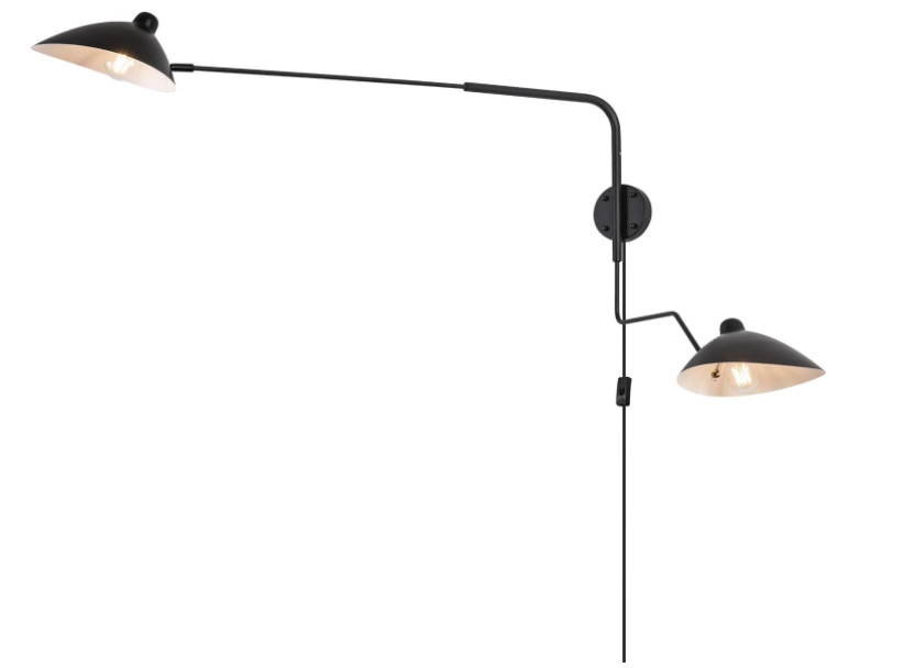
As they turn their back on the 'big light', designers are embracing this retro-style of lighting in new ways
Swing arm sconces are popping up in interiors everywhere, but what makes them so special? Experts tell us all

The Livingetc newsletters are your inside source for what’s shaping interiors now - and what’s next. Discover trend forecasts, smart style ideas, and curated shopping inspiration that brings design to life. Subscribe today and stay ahead of the curve.
You are now subscribed
Your newsletter sign-up was successful
Swing arm designs are an easy way to make an impact with your lighting. More than any other type of lighting, swing arm sconces act like pieces of art, adding structural beauty, while also being practical too.
Whether wall or floor lights, these handy pieces can swing and reach over large seating arrangements, tables, and chairs, and provide homeowners with illumination that is easily maneuverable. Plus, they spread a lovely glow rather than pooling over one specific area. If this new living room lighting trend has caught your fancy too, find out more about it as experts throw light on this piece.
1. They're versatile
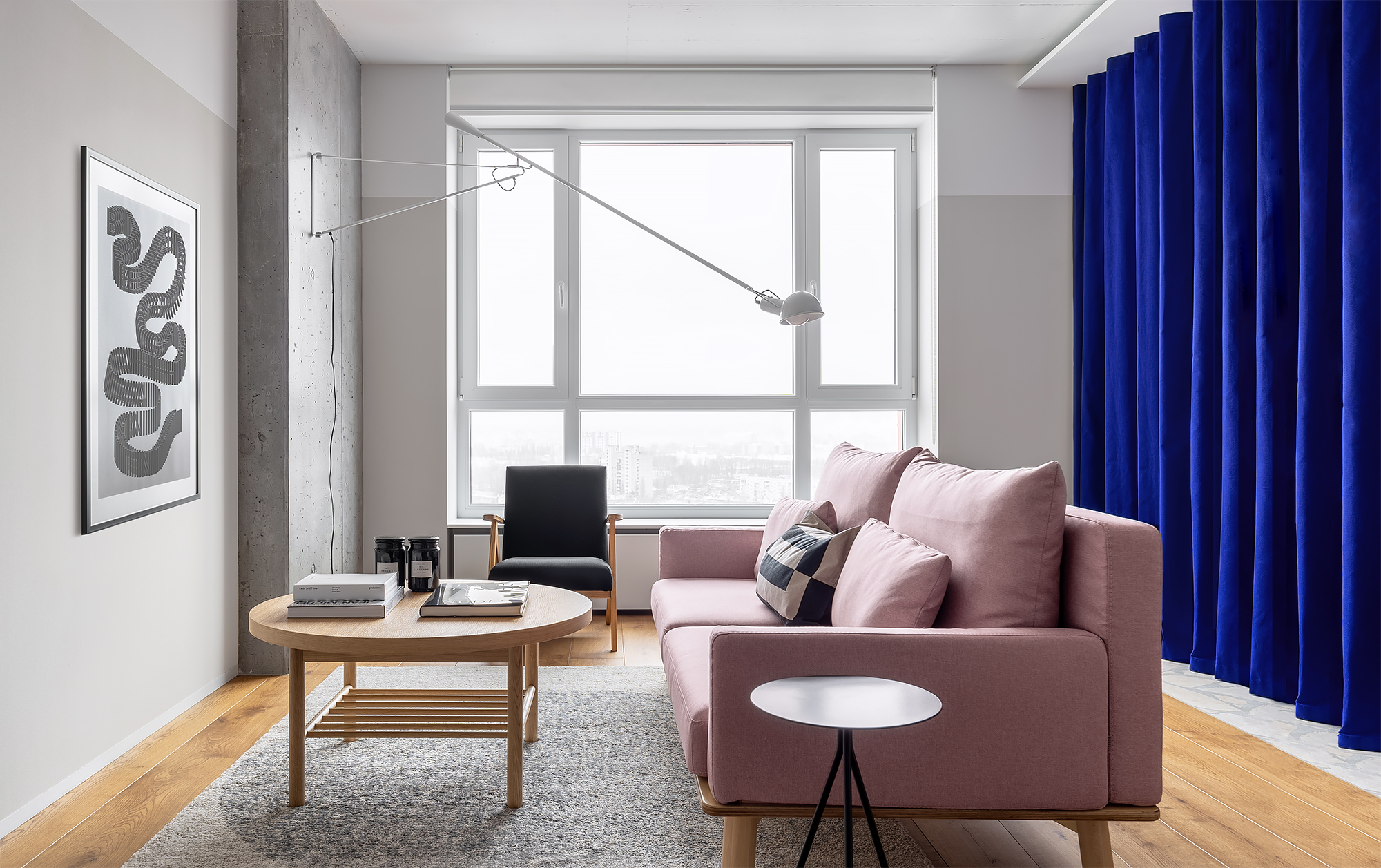
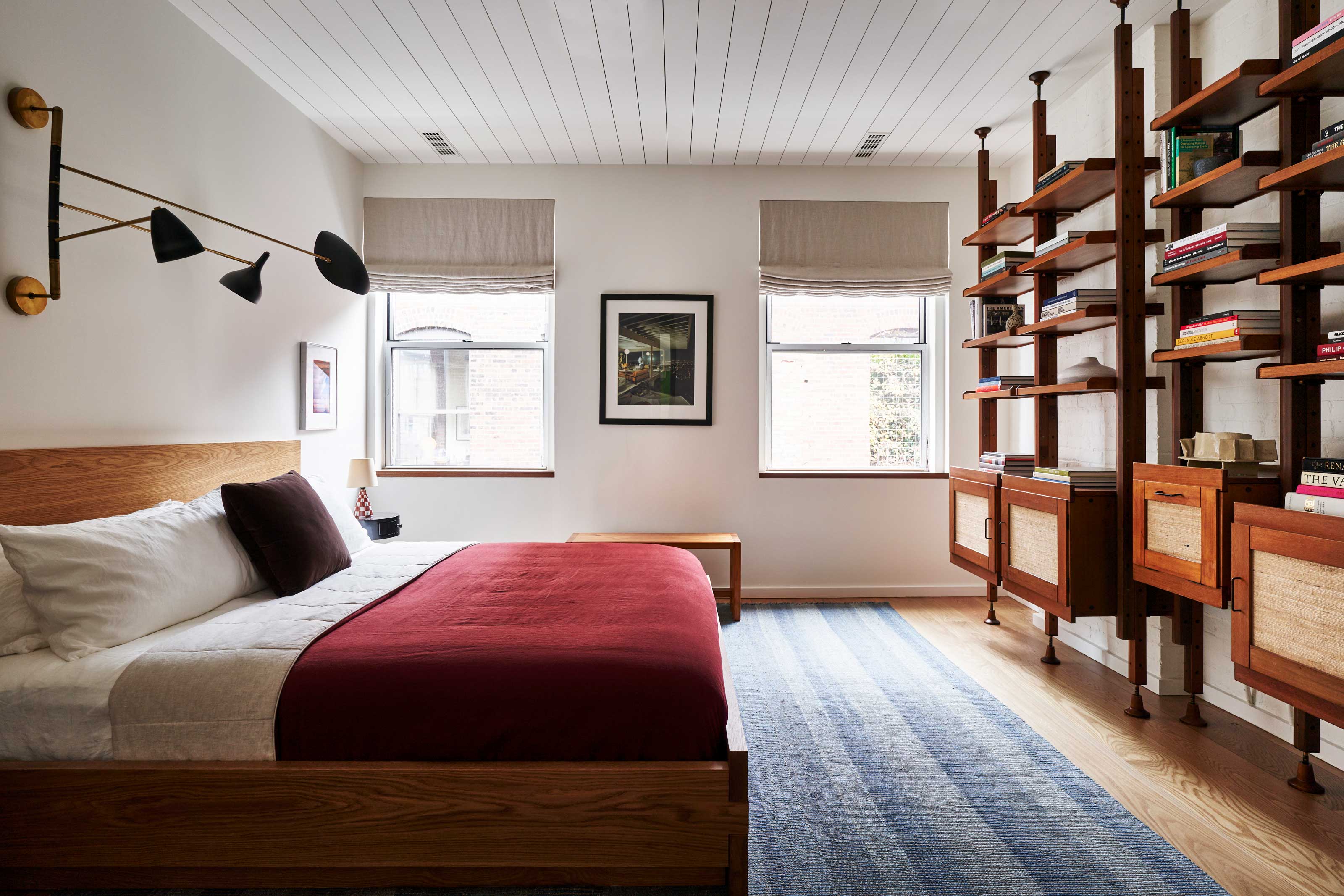
Swing arm lights can be placed on the floor or attached to the wall, and are easily adjustable. This allows you to move them in multiple directions, giving you complete control over where the light shines. Whether to illuminate a living room corner, a reading nook, or even the bedside, these are handy and flexible – perfectly usable in any situation. Plus, when they are no longer needed, the fixtures can easily be folded back towards the wall.
'Long-armed lighting has long been favored in mid-century design, with the Serge Mouille being the most iconic example,' says New Jersey-based designer Kristina Phillips, founder of Kristina Phillips Interior Design. 'What makes these special is that they are versatile, practical, and stylish – a trifecta of good design.'
2. They add an aesthetic touch
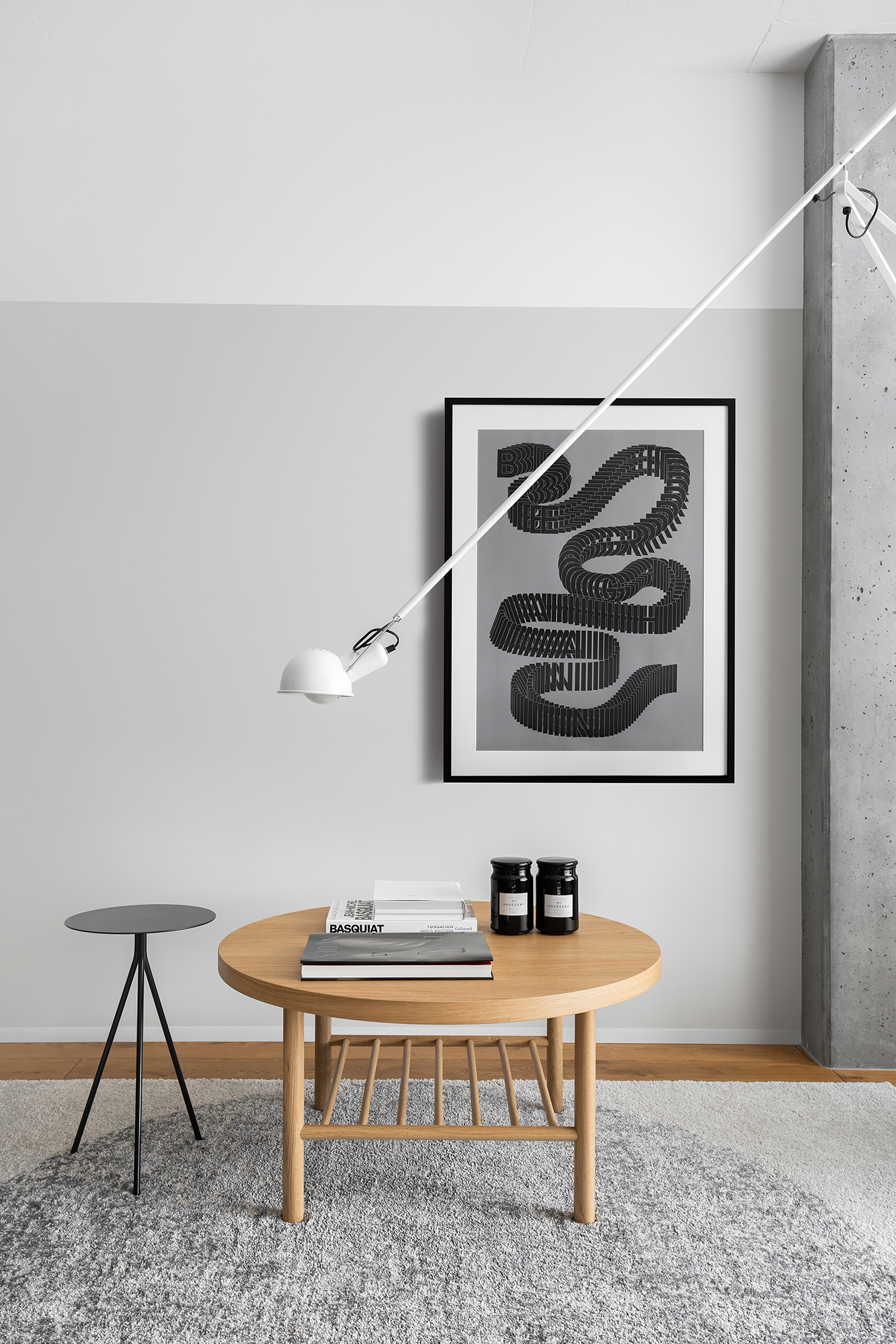
If you're wondering how to make my home's lighting more modern, there is no better, effortlessly stylish piece than this one. The long, swing arm fixture is sleek, minimalistic, smart, and available in several iterations; each as carefully crafted as the other. These contribute to the room's lighting scheme without adding to the visual weight of the room.
Neither too bulky nor too heavy, the contours of the lighting piece, especially the floor ones coincide extremely well, especially in a pared-back, minimalistic home.
'These lighting pieces also function as decorative arts objects, or sculptures, given their artfully-minded design and impact on the space,' says Guillaume Coutheillas, founder & creative Director of frenchCALIFORNIA. 'They can be great conversation pieces and help draw the eye to important pieces of furniture or artworks.'
The Livingetc newsletters are your inside source for what’s shaping interiors now - and what’s next. Discover trend forecasts, smart style ideas, and curated shopping inspiration that brings design to life. Subscribe today and stay ahead of the curve.
3. They're practical
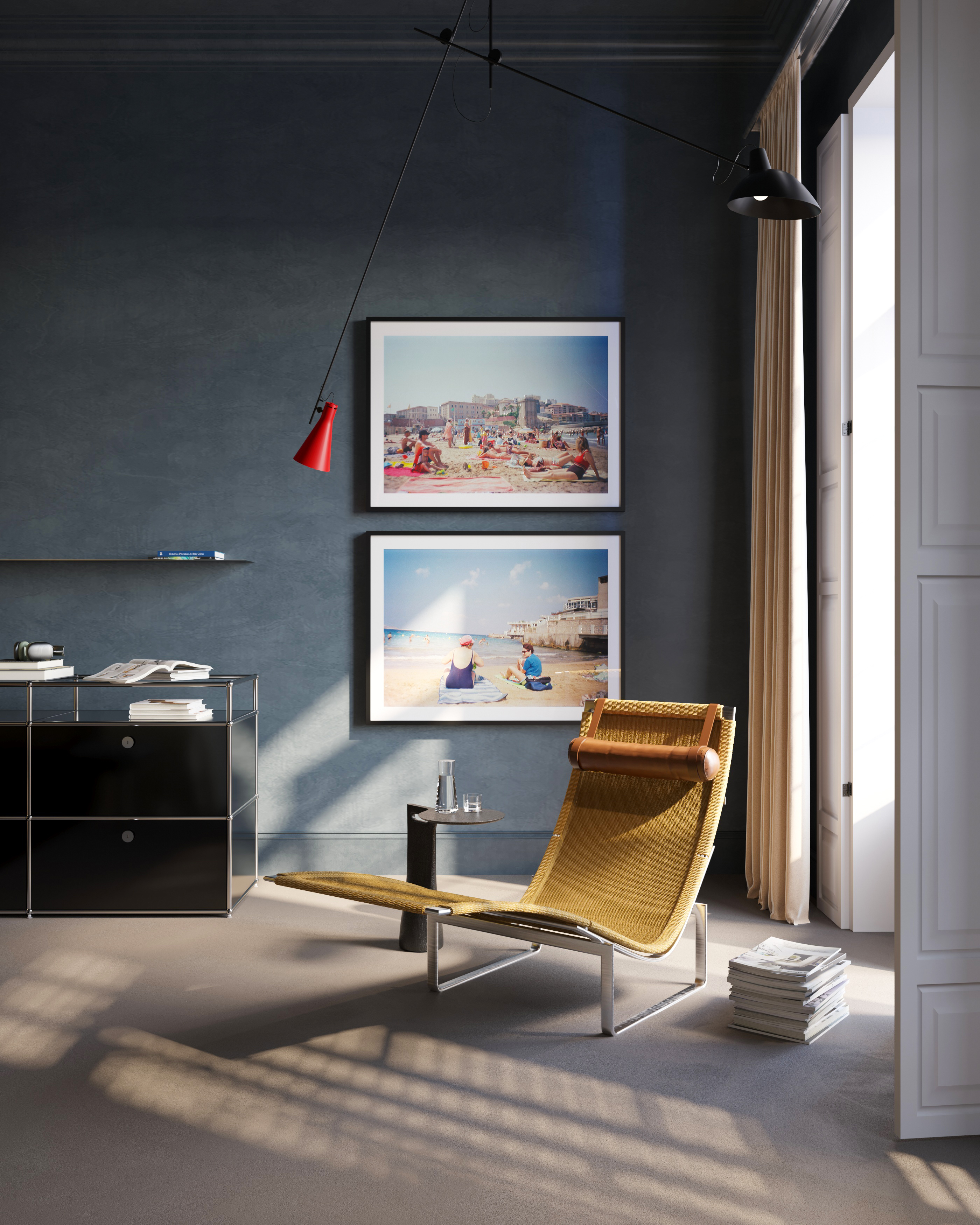
Practicality and flexibility aside, the swing lights are wonderful for their core purpose – lighting. Due to their easy-to-move or swing, flexible make, these allow you to help create the mood and vibe you desire. When pulled down, they can give focused lighting to a specific object or book.
When pulled back, it works as the perfect ambient lighting. Turn it towards a wall, and you can create an eye-catching wall-washing scene. It can be the ideal lighting solution for a dark room. Use it as the primary source of illumination in a room, and watch a nice play of light and shadow.
'Unlike a fixed sconce or standing lamp, these long, swing arm lighting pieces can be manipulated, or moved around, to direct light in a certain way,' says Guillaume. 'They can be adjusted to face a certain direction or highlight a particular piece in your home.'
'We love the idea of being able to play with the lighting inside the house,' says Ece Gokmenoglu, co-founder of folistudio. 'In this project, we used the Astep VV Cinquanta Lamp. The kinetic lamps can be used as both direct and indirect light. With its movable structure, the lamp becomes a dynamic feature of the room.'

Aditi Sharma Maheshwari started her career at The Address (The Times of India), a tabloid on interiors and art. She wrote profiles of Indian artists, designers, and architects, and covered inspiring houses and commercial properties. After four years, she moved to ELLE DECOR as a senior features writer, where she contributed to the magazine and website, and also worked alongside the events team on India Design ID — the brand’s 10-day, annual design show. She wrote across topics: from designer interviews, and house tours, to new product launches, shopping pages, and reviews. After three years, she was hired as the senior editor at Houzz. The website content focused on practical advice on decorating the home and making design feel more approachable. She created fresh series on budget buys, design hacks, and DIYs, all backed with expert advice. Equipped with sizable knowledge of the industry and with a good network, she moved to Architectural Digest (Conde Nast) as the digital editor. The publication's focus was on high-end design, and her content highlighted A-listers, starchitects, and high-concept products, all customized for an audience that loves and invests in luxury. After a two-year stint, she moved to the UK and was hired at Livingetc as a design editor. She now freelances for a variety of interiors publications.
