There's a new way designers are doing symmetrical living rooms and it could be 2023's biggest decorating trend
Once reserved for traditional living rooms, designers are increasingly using symmetrical living rooms to create comforting, contemporary spaces
Evident in the world’s most ancient structures, from Classical Greek architecture to Roman temples, symmetry - and symmetrical living rooms - might be the oldest trick in the book. “An obsession that began with the ancient Greeks, symmetry has continued to be a visual cheat sheet for artists, designers and architects alike,” says Monique Tollgård of Tollgard Design Group. “Beauty and balance play an integral role in our lives, evoking feelings of admiration, calm and peace. These are the very same feelings that our clients seek in their homes and reception rooms.”
But symmetry wasn’t invented by the ancient Greeks, or for living rooms, or by any human for that matter. It exists all around us in nature. “We are hard-wired to find symmetry pleasing: from the human body to the shape of trees, we are inherently attracted to it,” says Ines Kelly of Kelly Hopter Interiors. “By extension, symmetrical rooms give us a feeling of familiarity and comfort, something that we tend to crave especially during tumultuous times.”
Perhaps this comforting effect is one of the reasons behind our renewed attraction to symmetry. And why contemporary designers are playing fast and loose with the idea of symmetry to make a new version that feels modern, up to date, and right for now. “Because so many historical interiors were symmetrical, for a long time symmetry was associated with traditional style. But today we are seeing many more contemporary living rooms that use the principle of symmetry with great success,” says Ines Kelly.
So how are designers treating symmetry in modern living rooms differently, bringing balance to interior design? And how can we go about bringing that comfort and calm into our own homes?
10 ways to design a modern symmetrical living room
1. Pick a focal point
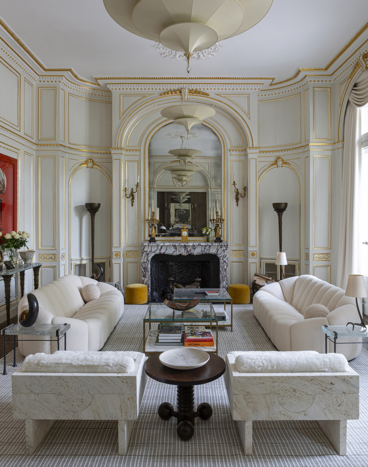
The essential step when going for this living room trend and creating any symmetrical design is to choose an appropriate focal point in the room, such as a fireplace, coffee table or a window. You can then build the symmetry out from that point.
“It’s quite appealing to impose a sense of order on a layout,” says Bryan O’Sullivan of Bryan O’Sullivan Studio. “We did a house in Paris [pictured above] which was gorgeously proportioned and we pushed a line of symmetry which felt really crisp. If you center furniture placement around a window, and work backward from where that’s positioned, you end up with a room that is super satisfying on the eye, and in some ways, on the soul, too.”
2. Be mindful of proportions
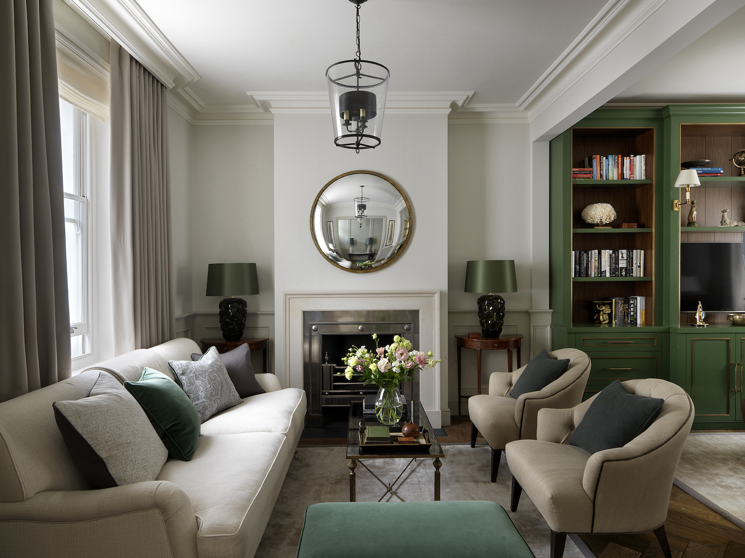
Once you’ve chosen your focal point, use it as an anchor to judge the proportions of other elements - the living room furniture and its placement. “Symmetrical living rooms give a sense of drama and elegance, but proportions are key,” says Baptiste Bohu of Baptiste Bohu Interiors.
“Even with a low ceiling, you can use symmetry to create drama, but you need to be careful with proportions. For instance, if you have a central fireplace and two cabinets on each side, the fireplace width needs to equal the cabinets width or be bigger but not the opposite. The center of the symmetry is what matters most.”
3. Look for ways to repeat patterns
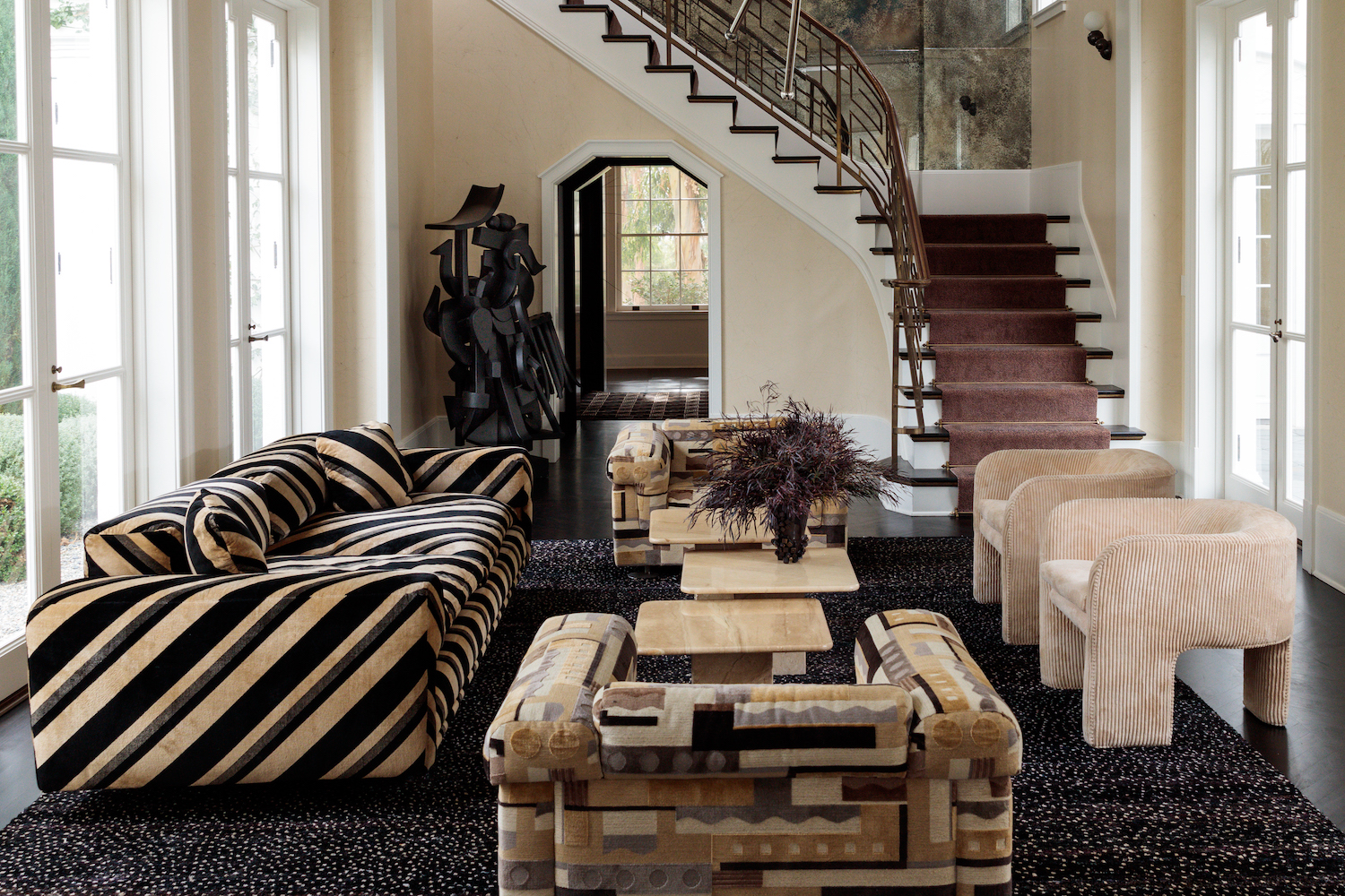
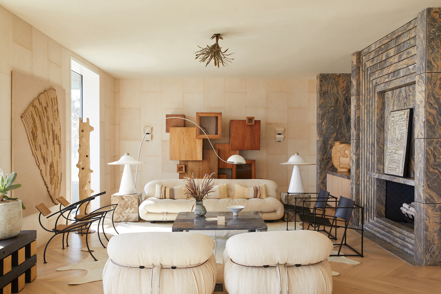
To achieve this look, you need to synchronize patterns, textiles and colors as well as the shapes and proportions in your living room. In the room pictured above by Kelly Wearstler, for example, the heavy black lines of the main sofa are repeated in both the armchairs and the sculpture.
“Opt for using pattern to implement your symmetrical design, repeating its use in wallpaper and textiles,” says Kelsey Leigh.
Your artwork can play a role in creating symmetry too. You can even create a symmetrical pattern with the position the frames. “A picture wall is a great way to create symmetry in a space. Try an arrangement of six pictures above a sofa,” says Louise Wicksteed, Design Director at Sims Hilditch.
4. Keep things informal with color and curves
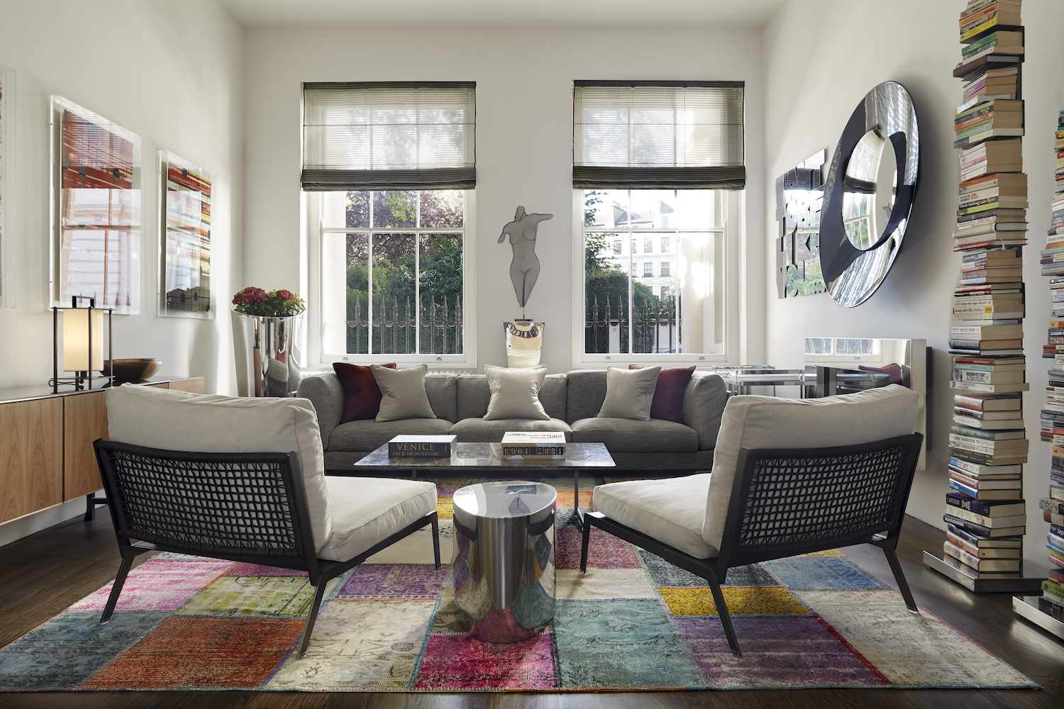
Unlike traditional symmetrical living rooms, today’s designs incorporate curved sofas, other rounded furniture and pops of color to keep the look inviting and relaxed.
“Symmetrical design can feel quite cold and very formal which is not ideal for a home,” says Baptiste Bohu. “Adding colors can bring warmth and playfulness. Also you can avoid creating too linear a design by bringing curves in through decorative objects. It is important to avoid a very formal look that symmetry will bring. It is really a question of balance between precise structural symmetry and interior playfulness.”
Monique Tollgård echoes his thoughts: “Executed excessively, symmetry can remove the other key ingredient in any wonderfully designed space: chaos. For our Bayswater apartment [pictured above], the colorful chaos was found in the form of our patterned rug and artwork. The Flexform sofa and chairs provide a stable lens through which to enjoy this characteristic vista. Symmetry helps us navigate the exciting elements whilst encouraging comfort and conversation.”
5. Play with asymmetry
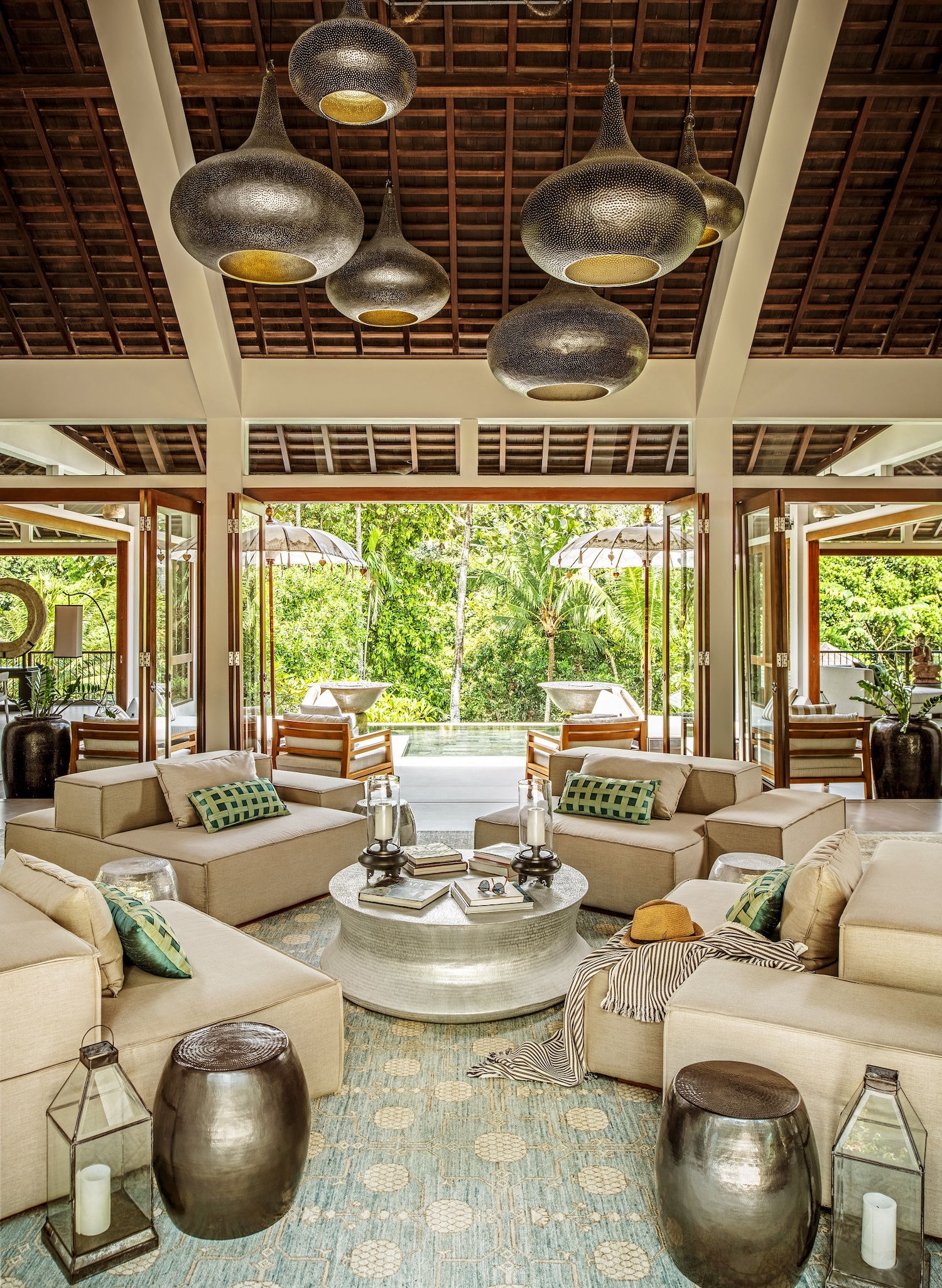
Another distinguishing feature of contemporary symmetrical living rooms is the considered use of asymmetrical elements. “In the past, symmetrical living rooms adhered to the rule of symmetry in fairly strict terms, with mirror images of most furniture and decor on two sides of the room,” says Ines Kelly. “Today's iteration is a little more relaxed and you will often see some variation in the design elements. While main furnishings and decor will be symmetrical, you may find asymmetry in smaller elements outside the core seating area.”
In the above example by Baptiste Bohu, the asymmetrical living room lighting hanging from the ceiling set off the orderly arrangement of the furniture. “Paradoxically, asymmetrical elements can be a good tool to reinforce your symmetry,” he says. “You can use different decorative objects to create asymmetrical lines which will look interesting and playful.”
Louise Wicksted from Sims Hilditch elaborates: “In contemporary interior design, it can be fun to position a piece slightly off-center to create an unexpected twist within a space. This might be the lighting, seating arrangement, or even where the coffee table is positioned. The overarching effect is still one of symmetry, but with a little bit of fun.”
6. Follow principles of informal balance
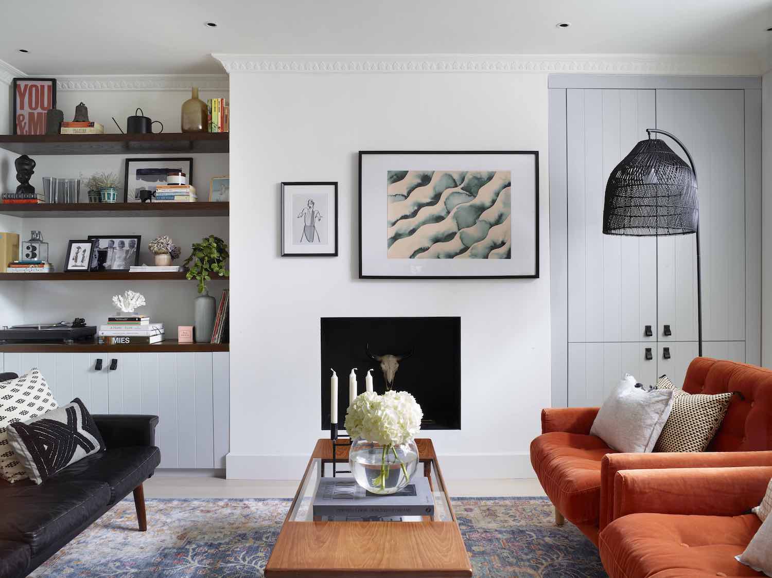
A more technical way to describe symmetry is informal balance. “I like to make sure that I'm using the principles of informal balance so the room doesn't feel too predictable or boring,” says Kelsey Leigh. “Modern iterations [of symmetrical design] will often use informal balance. This is when we preserve the visual "symmetry" of a space by balancing the scale and proportion and overall visual weight of the elements in the design around the chosen focal point. It's unexpected symmetry, but gives the same effect and keeps the eye interested as it moves around the room.”
Cathrine Dal, Founder of Cat Dal Interiors, explains that this technique helps to balance a room while creating “dynamic interest” at the same time. “For example, rather than two wall lights either side of a mirror, we might use two positioned on one side quite high, with a smaller light lower down the right side,” she says. “The difference in height creates the 'balance' yet the number of items either side is unequal.”
7. Keep your seating area symmetrical
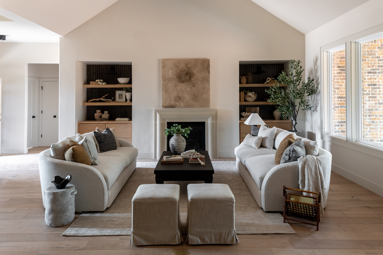
Of course, too much asymmetry and you’ll lose that sense of orderly calm. “You need to make sure that enough elements are truly symmetrical to achieve this effect,” says Ines Kelly. “While the modern interpretation allows for some variation, I suggest that the wall with your focal point and the core seating area are symmetrical. Otherwise, the design may feel out of balance.”
Kelsey Leigh shares a simple layout you could start with, as in the picture above: “Use a pair of identical sofas facing each other, lined up with a fireplace or alternate focal point, with a rectangular coffee table in the center (this is called mirroring or reflectional symmetry).”
8. Use accessories to reinforce symmetry
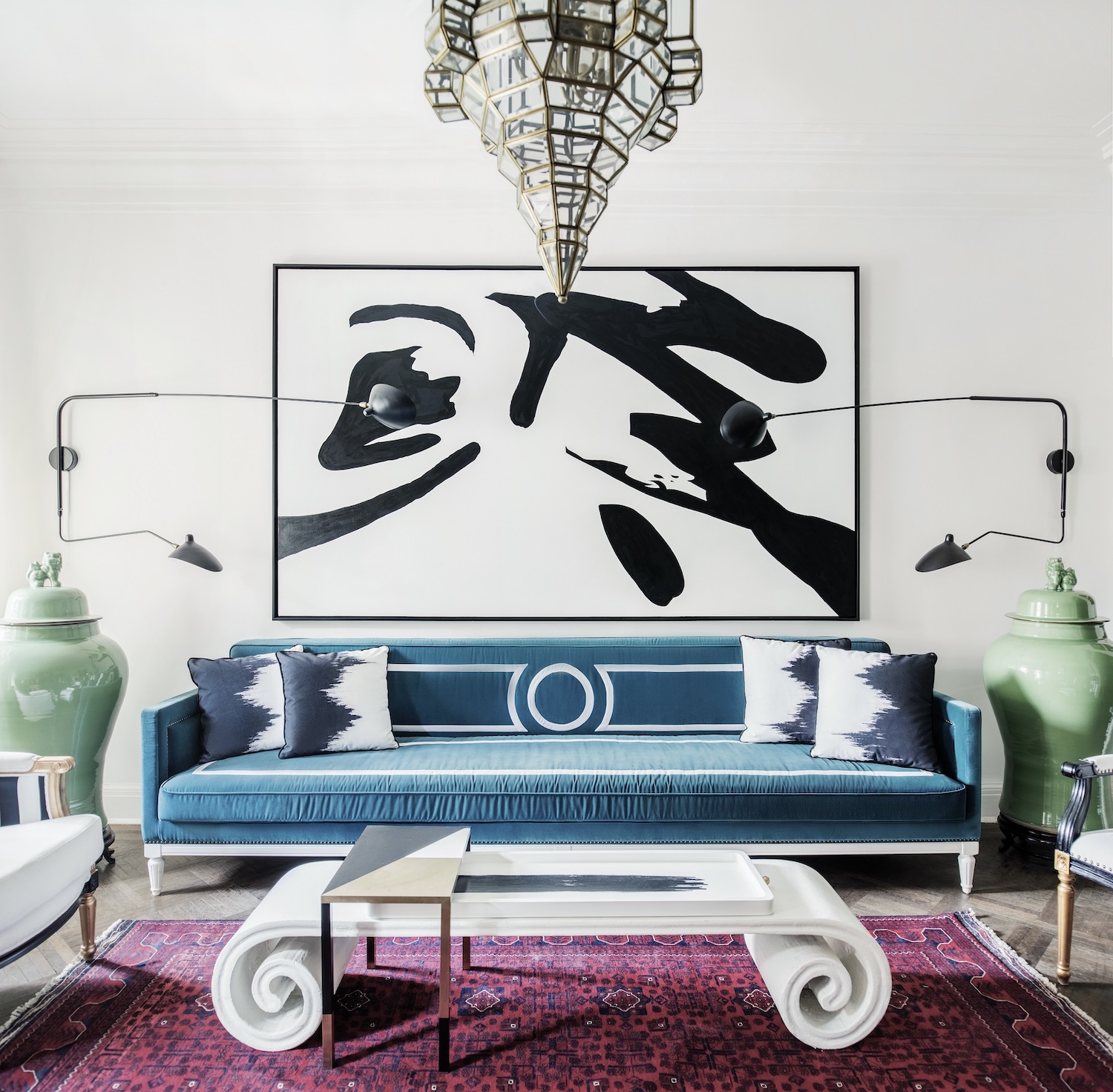
Accessories are easy ways to create or reinforce symmetry in your living room. “Beyond the main furnishings, accessories and smaller elements can be a very effective way to underscore the symmetry of the design,” says Ines Kelly of Kelly Hopter Interiors.
“Think identical pillows, lamps, sconces and side tables. They can also detract from any small irregularities in the room's architecture that you want to camouflage.”
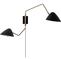
Bransyn Plug-in Armed Sconce, Wayfair
There are so many wall lights to choose from at Wayfair so we've done the hard work and edited it down to this one for you. Its two arms can be angled any way you choose, creating multiple pools of light.
9. Or, use accessories to loosen things up
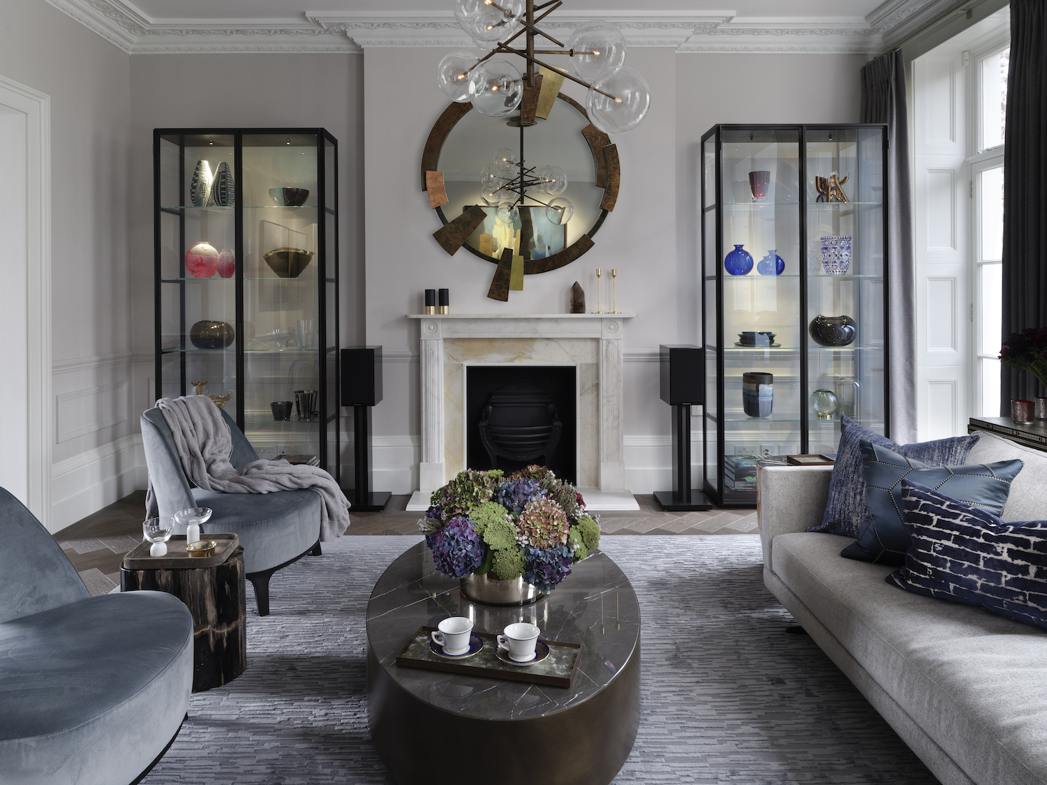
As you build out your symmetrical living room, you might want to redress the balance in the other direction to avoid things feeling too formal. “To create a more relaxed look, arrange pillows on the sofa in designs that complement each other, but don’t match,” says Louise Wicksteed. “Don’t become obsessed by symmetry. It is wonderful to have a well-balanced room, but if this is too stringently adhered to then the space can start to feel contrived and un-lived in.”
The room pictured above by Tollgård is a great example of using decorations to break up symmetry in a meaningful way. “Our clients wanted a grown-up and graceful space setting that would also make the most of the space around their fireplace,” explains Monique Tollgård. “Our answer to this question of living was to house their precious treasures and trinkets in Porro’s contemporary glass cabinets. Symmetry in this example contributes to form and function. Each expressive memory is different and prevents things from looking too identical.”
Monique Tollgård continues: “A great living room employs the best elements of symmetry without being bound to its rules. In every scheme, think of each side like a great pair of eyebrows: they are sisters and not twins.”
10. Don’t force it
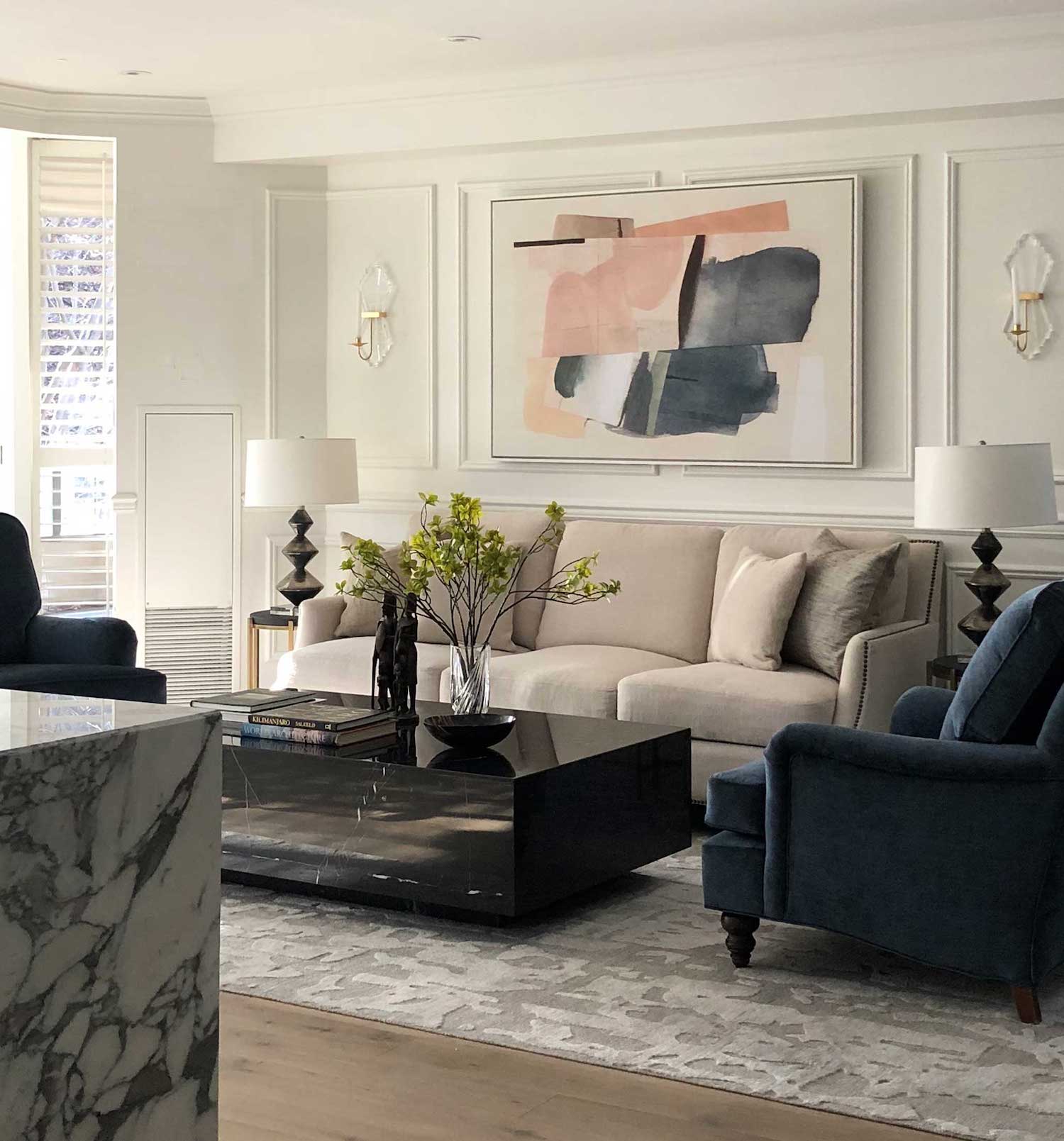
Not every room is well suited to this interior design trend, which should never feel forced. “If you are in a room where the structure doesn’t work with a symmetrical design, forget it, it should feel natural and smooth,” says Baptiste Bohu.
Ines Kelly elaborates: “If the architecture of the room is not conducive to a symmetrical design, you are better off choosing a different type of layout. Ideally you want elements such as fireplaces, windows and doors to be positioned in a way that allows for symmetrical furniture placement. Symmetrical design will emphasize irregularities in the architecture so if those elements are significantly offset or irregular, you are better off working with the natural architecture of the space.”
Be The First To Know
The Livingetc newsletters are your inside source for what’s shaping interiors now - and what’s next. Discover trend forecasts, smart style ideas, and curated shopping inspiration that brings design to life. Subscribe today and stay ahead of the curve.
Kate Hollowood is a freelance journalist who writes about a range of topics for Marie Claire UK, from current affairs to features on health, careers and relationships. She is a regular contributor to Livingetc, specializing in reporting on American designers and global interiors trends. Based in London, Kate has also written for titles like the i paper, Refinery29, Cosmopolitan and It’s Nice That.
-
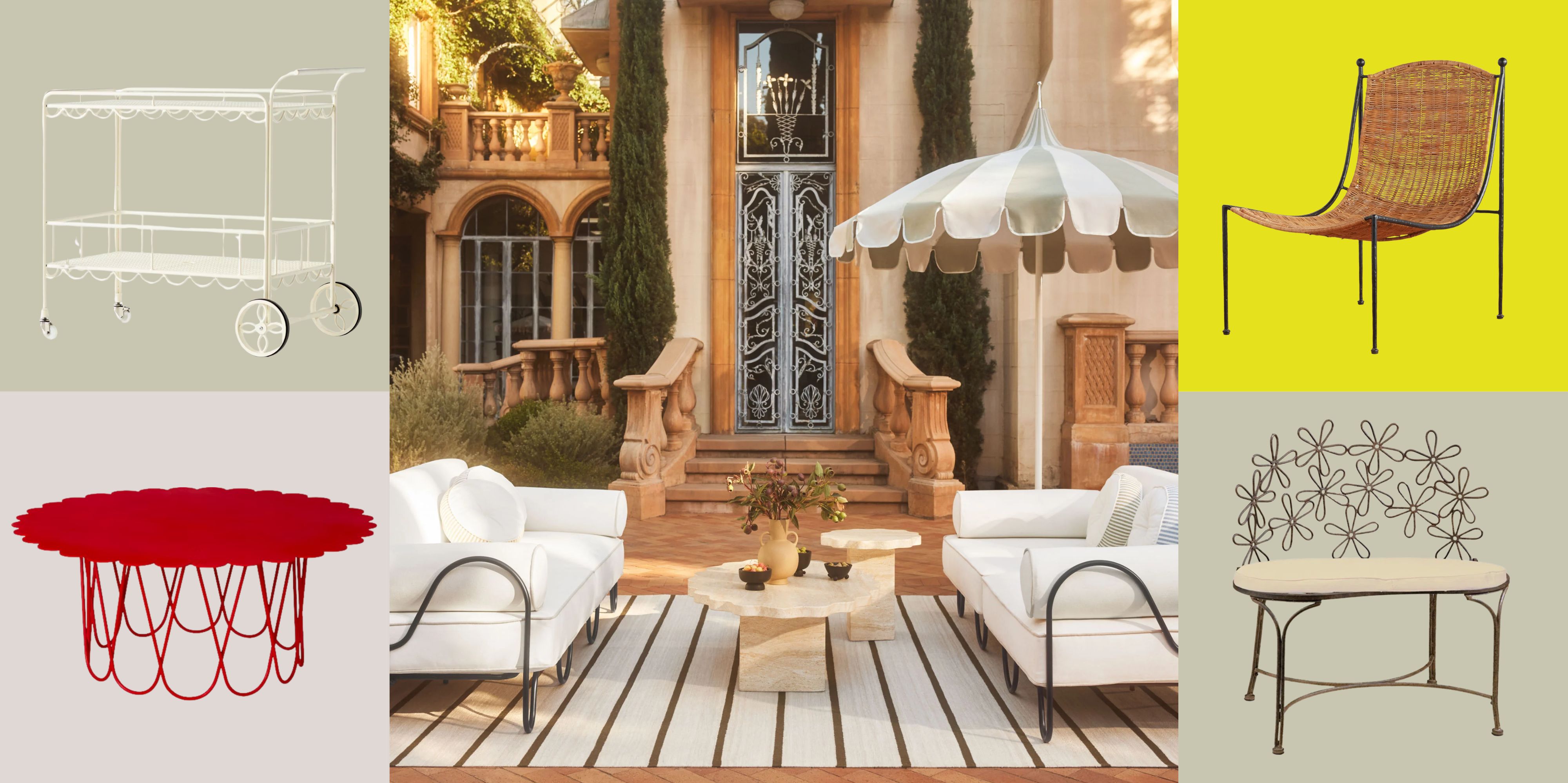 There’s a New Shape in the Garden — Why Whimsical Curves Might Be the Outdoor Furniture Silhouette of the Summer
Powder-coated petals, wavy lines, and a hint of surrealism — this microtrend is blooming, and we’re paying attention
By Julia Demer
-
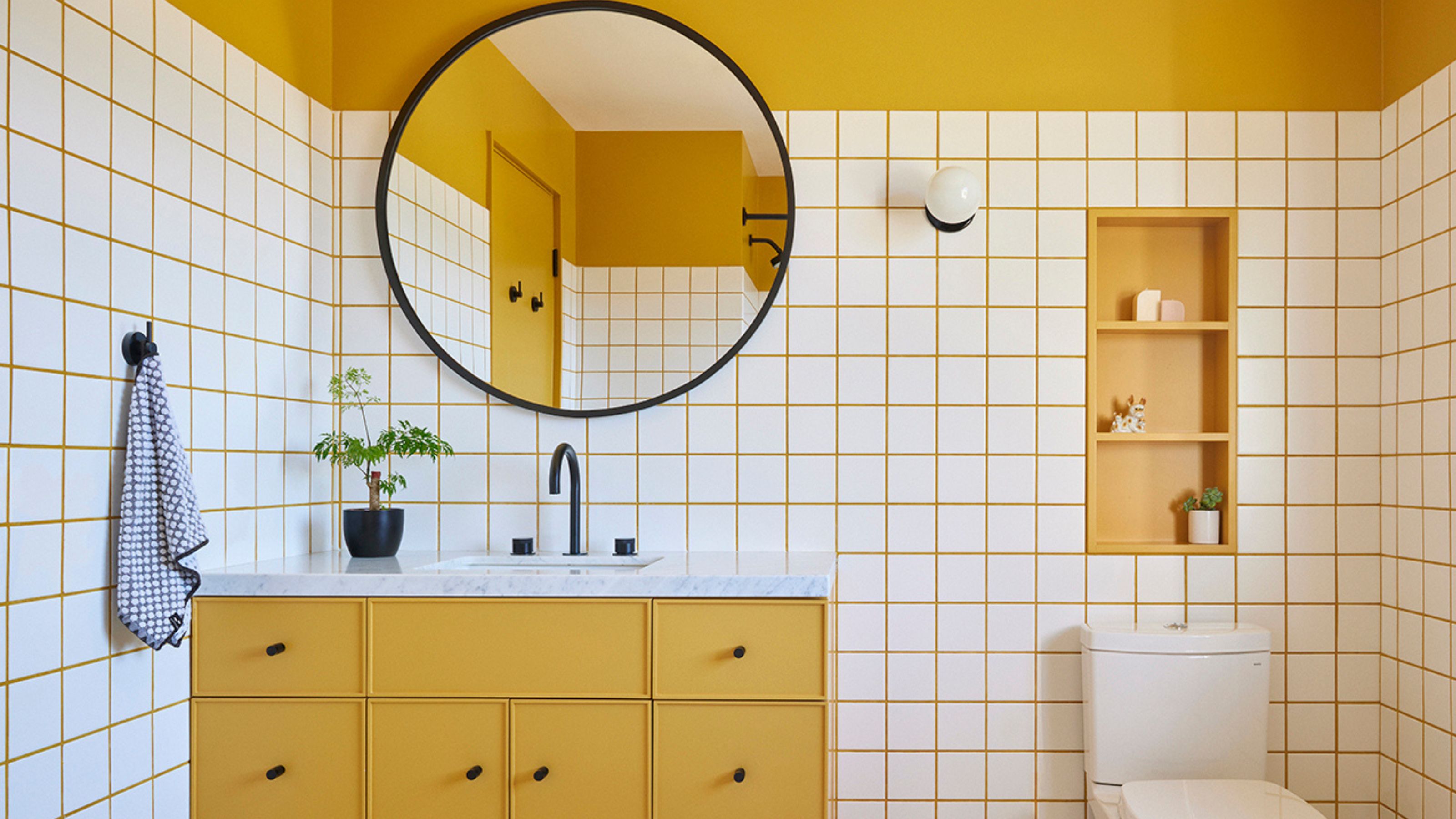 10 Yellow Bathroom Ideas That Vitalize Your Mornings and Look Unexpectedly Sophisticated While Doing So
Yellow is a color that by its very nature is energetic and full of life, and these designers have proved it's ideal for a bathroom
By Oonagh Turner
