The best kitchen layout ideas – 15 innovative ways to configure a space
Efficient kitchen layout ideas make a space, it's the most important element of your design, so here we break down the best options no matter what size or style of space you have
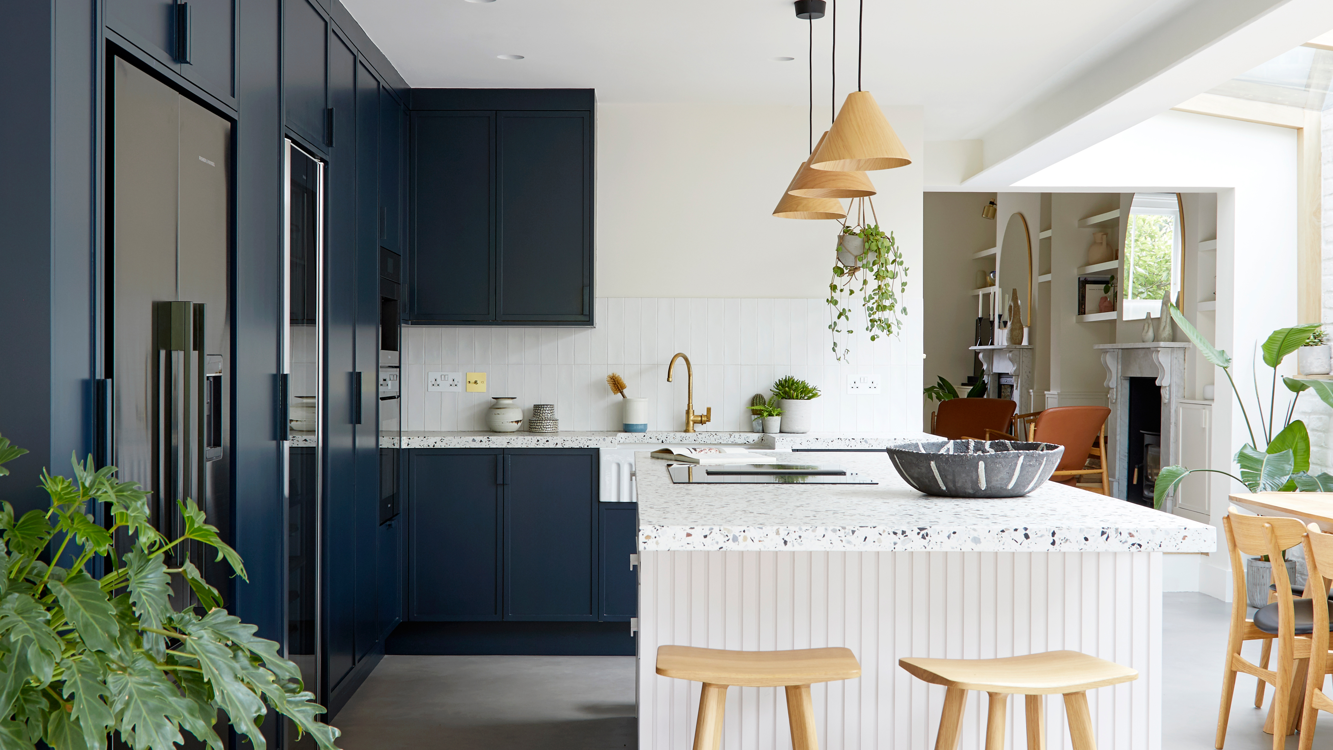

Kitchen layout ideas can make or break your space. The way you configure a kitchen has got to be the most important design decision you will make, and while it may not be as exciting as picking a cabinet style or choosing a paint color it needs just as much thought.
But where do you start when choosing the best layout for your space? With so many options and with it being such a key aspect of the room that's also a pretty permanent choice, it can be tricky to land on the best decision. However, we have made things easier by bringing together all the best kitchen layouts, both the classic designs like the trusty U-shape and hard-working L-shape and lesser-known options like peninsular layouts, as well as layout ideas if you want to add an island. We cover it all, no matter what size, shape, or style of kitchen.
Kitchen layout ideas to make the most of your space
1. Consider how you want to use your space
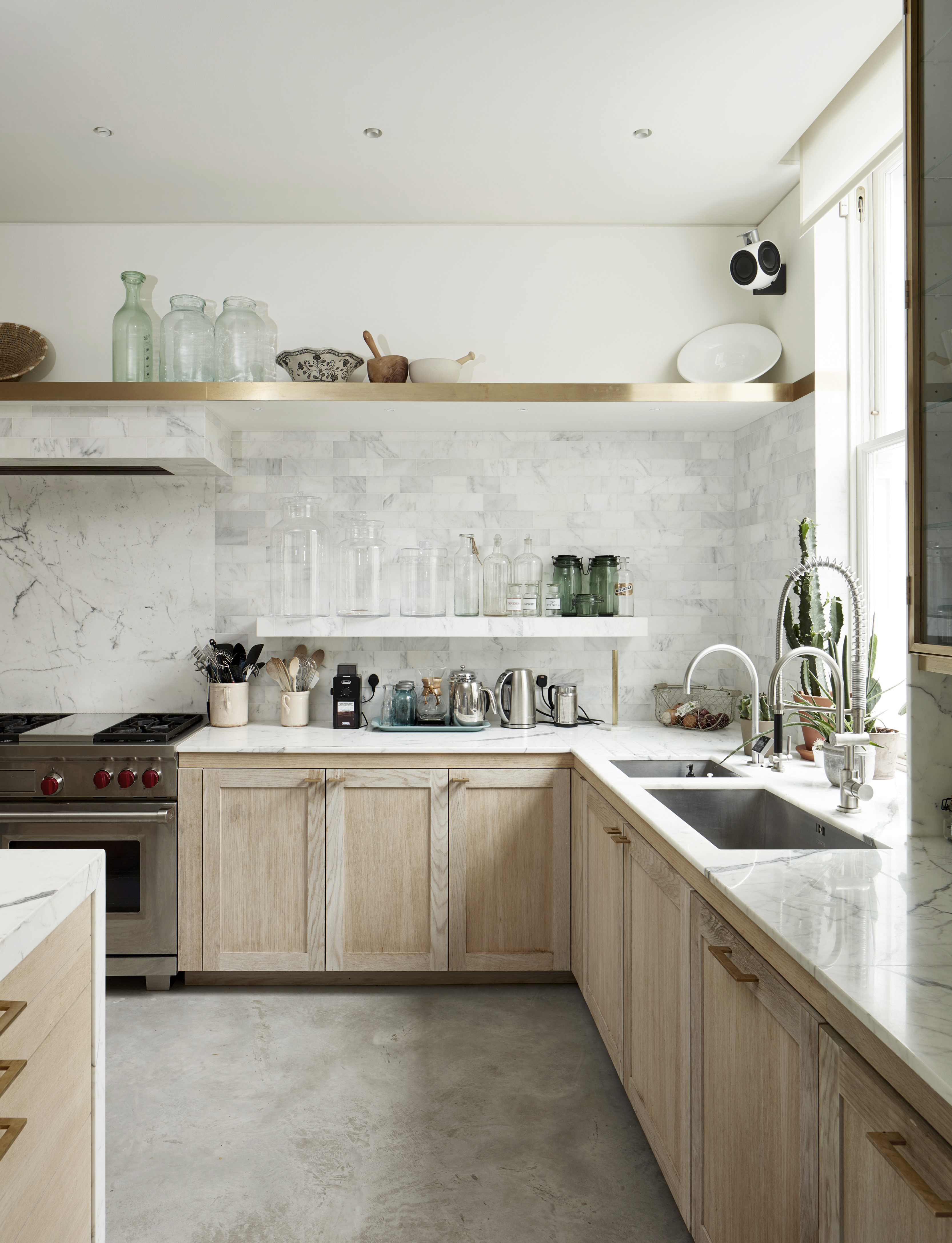
Before diving into the different kitchen layout options, a good place to start is to first consider how you want to use your space? Who will be using your space? Are you an avid cook who needs the room and efficiency to get creative? Do you like to host and therefore after a layout that will allow space for both guests and chef? Does your kitchen turn into a home office in the daytime or homework station of an evening?
'The layout of the room is what makes a kitchen design successful.' explains kitchen designer Tom Howley. 'The most important thing to consider is how you use your space. The overall design of the kitchen should focus on the balance of scale and proportion.'
If you are remodeling a kitchen, walk around our current space, really imagine how you'll move around it – what currently works about the layout and what doesn't. Where are you naturally drawn to cook, prep, host, work? Envisioning this dream space will help build an image in your mind of what layouts are going to work best for you.
2. Opt for a classic galley kitchen layout
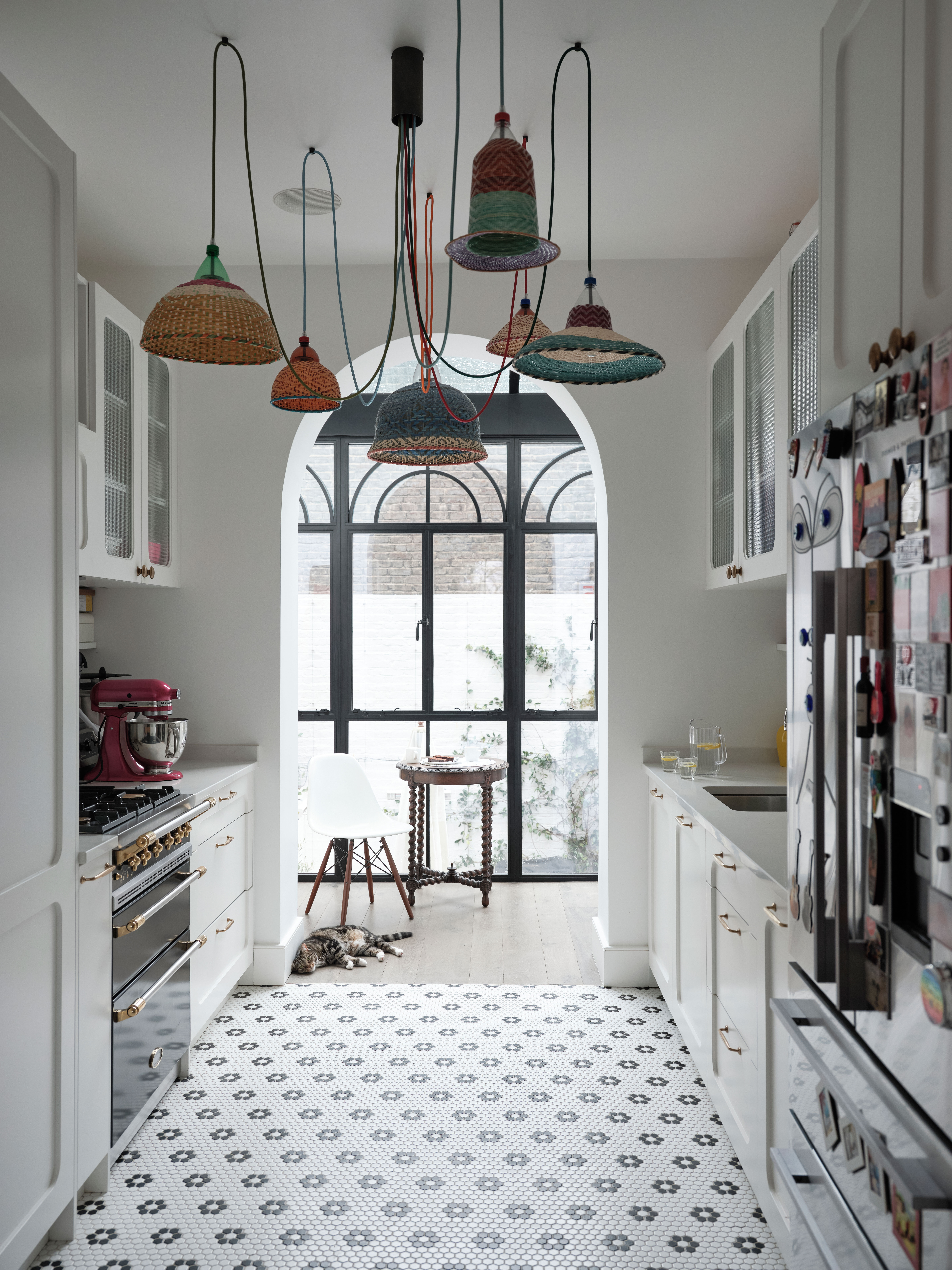
Okay, let's begin with a classic, the galley kitchen. Simple, but tried and tested and definitely a big contender if you are looking for small kitchen layout ideas. A galley kitchen is made up of two runs of cabinetry running down each side of the space – it's efficient, really maximizes space and lend themselves well to the whole kitchen triangle concept of having all your main appliances within easy reach of one another.
'Galley kitchens offer a simple, practical, and efficient layout and provide easy access between worktops, storage areas, and appliances.' explains Melissa Klink, Creative Director at Harvey Jones. 'However, in order for a galley kitchen to operate effectively, it is imperative that there is plenty of room between your appliances so that workspace does not become cramped.'
'It is important the traffic flow is minimized so that the cook is not obstructed as they use the kitchen. Plan your kitchen with this in mind. Look at placing your fridge freezer away from any windows and near to the main entrance of the kitchen to avoid natural light being stifled or too many people being inside the working triangle. Positioning your sink on the opposite side to your cooker is a good idea as it avoids workspace conflict promoting usability.'
3. For hardworking kitchens choose an open L-shape
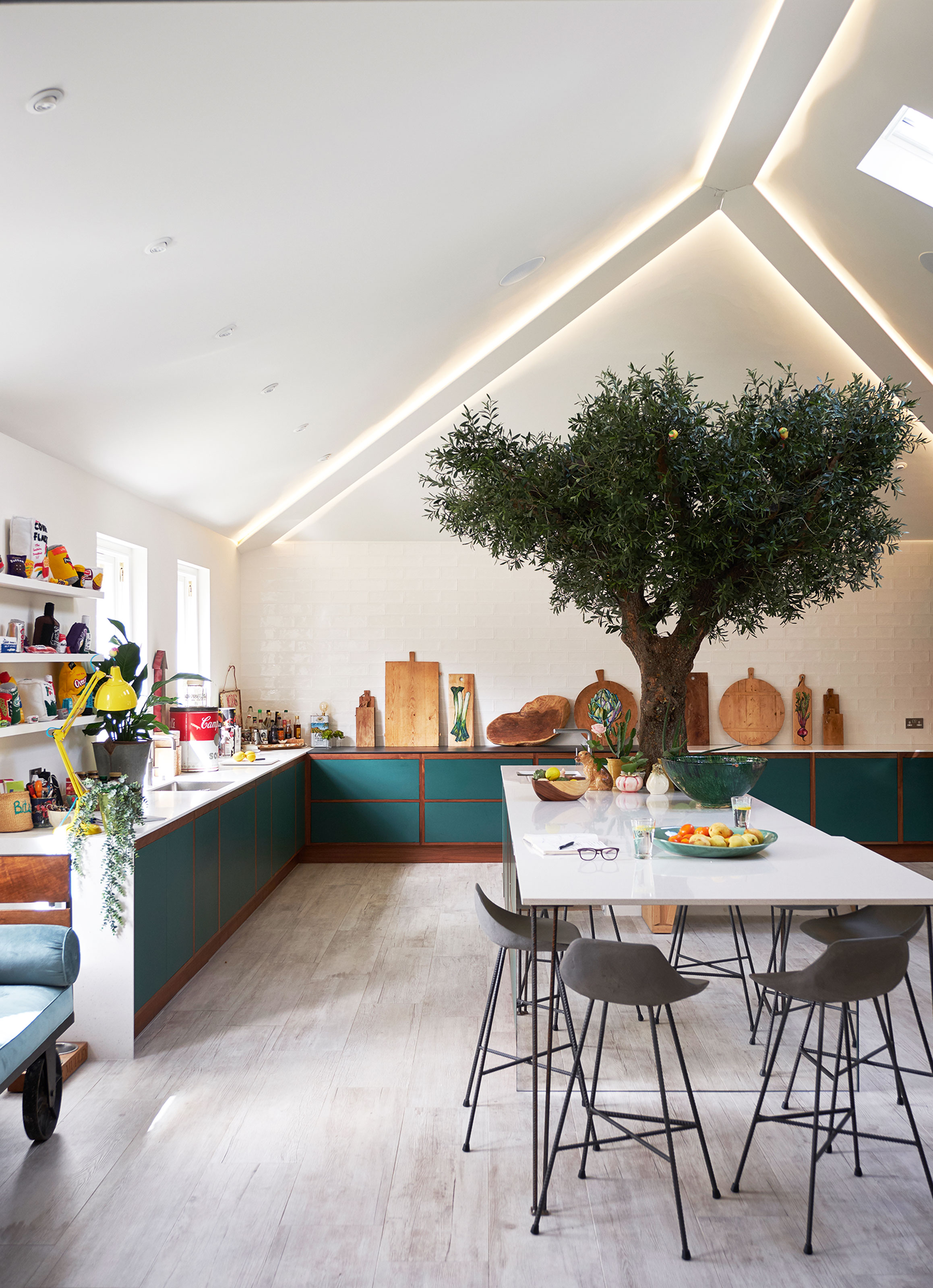
Another really common kitchen layout idea is the L-shape. Two walls of cabinets join at a corner to create well... a very hardworking L. This layout works really well in more open plan kitchens or large space were's there's room to play with and you can afford to have a lovely sea of floor space for an island or a dining table (or even just a statement kitchen rug to ground the room).
'An L-shaped solution will help you make good use of the space available, and you’ll have plenty of room for cabinets on one side, as well as ample space for bar-style meals on the other.' explains Simon Bodsworth, director of Daval. 'The cook has plenty of room to maneuver and can chat with guests at the same time, so it’s a real win-win in a hardworking kitchen that likes to entertain guests.'
If you have the luxury of space for plenty of floor cabinets, they consider ditching the wall cabinetry in an L-shaped layout. Having both wall and floor cabinets crowding the corner of your space risks shrinking the space, and blocking light, so instead keep the walls bare or add kitchen shelving to keep the area feeling bright and open.
4. Make the most of a small kitchen with a U-shaped design
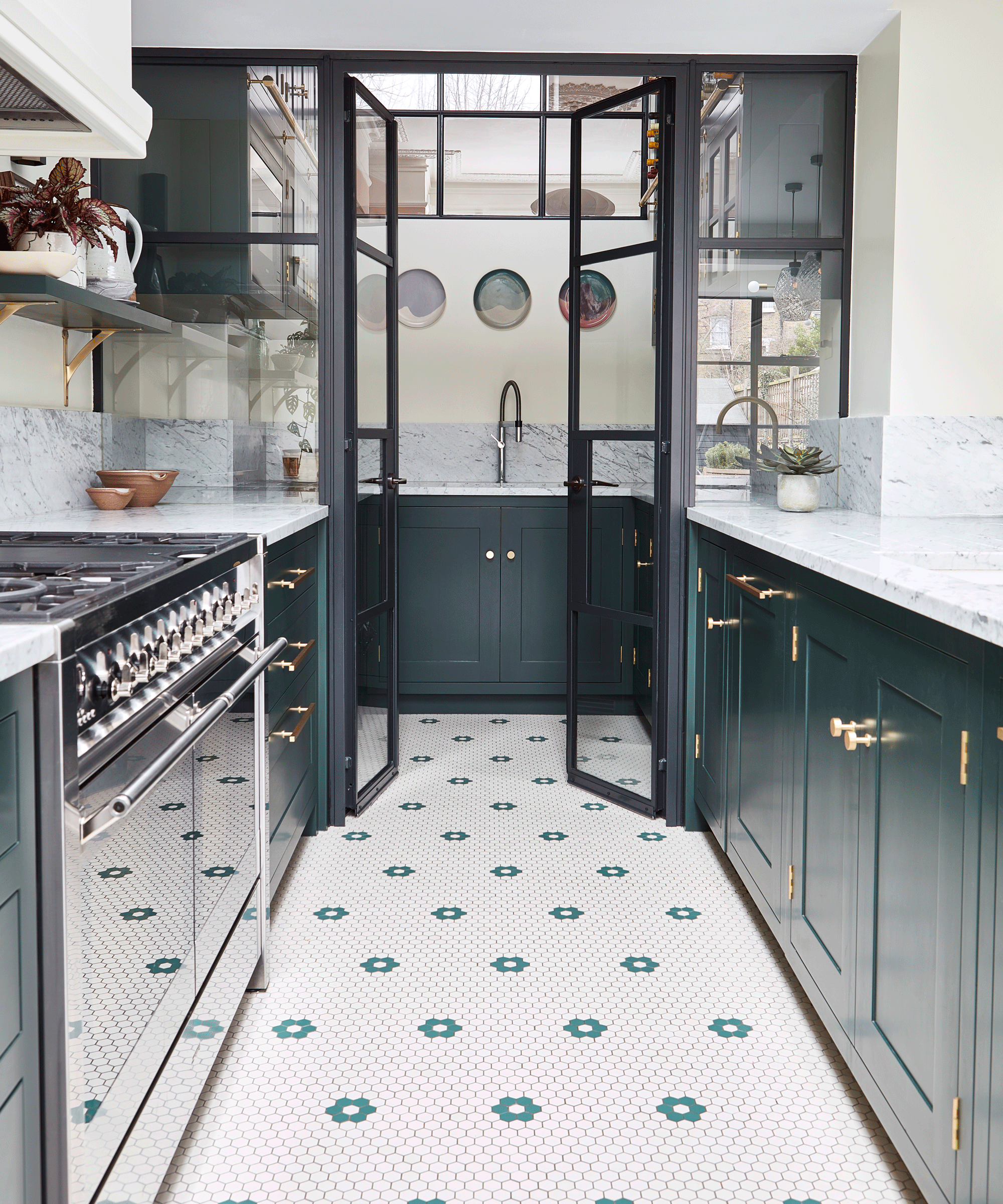
U-shaped kitchens are another great small space option, but can work equally well in open-plan spaces, or wrapped around an island in a larger kitchen. They are ideal layouts for avid cooks, as they are designed with the kitchen triangle rule in mind. The fridge, cooker, and sink can all be arranged within easy reach and you can easily move between them.
'U-shape layouts are your best solution in a small kitchen space as space is limited from the get-go. By going down this route, you’ll create a large amount of worktop space which is extremely practical for food preparation, cooking and even dining, if there is space for a discreet bar stool.' suggests Simon. 'You can also position the cabinetry around you, making full use of the available storage space from floor to ceiling.'
U-shaped can also be adapted for zoning an open plan space if you opt for a peninsular that protrudes into the room rather than hugging the walls. Simon suggests that 'If there is space for a peninsula island, then it makes sense to incorporate island appliances such as a wine cabinet, pop-up extractor fan or necessary waste receptacle as another way to keep everything in close proximity and maximize space: all the while creating a highly functional kitchen scheme that’s personal to your lifestyle. A connected design that turns a galley style kitchen into L-shaped, or an L-shaped kitchen into a U-shape. This type of island usually serves as a room divider between the kitchen and living area, and are typically designed to accommodate casual dining through to full-scale entertaining.'
5. Create zones with in your kitchen layout
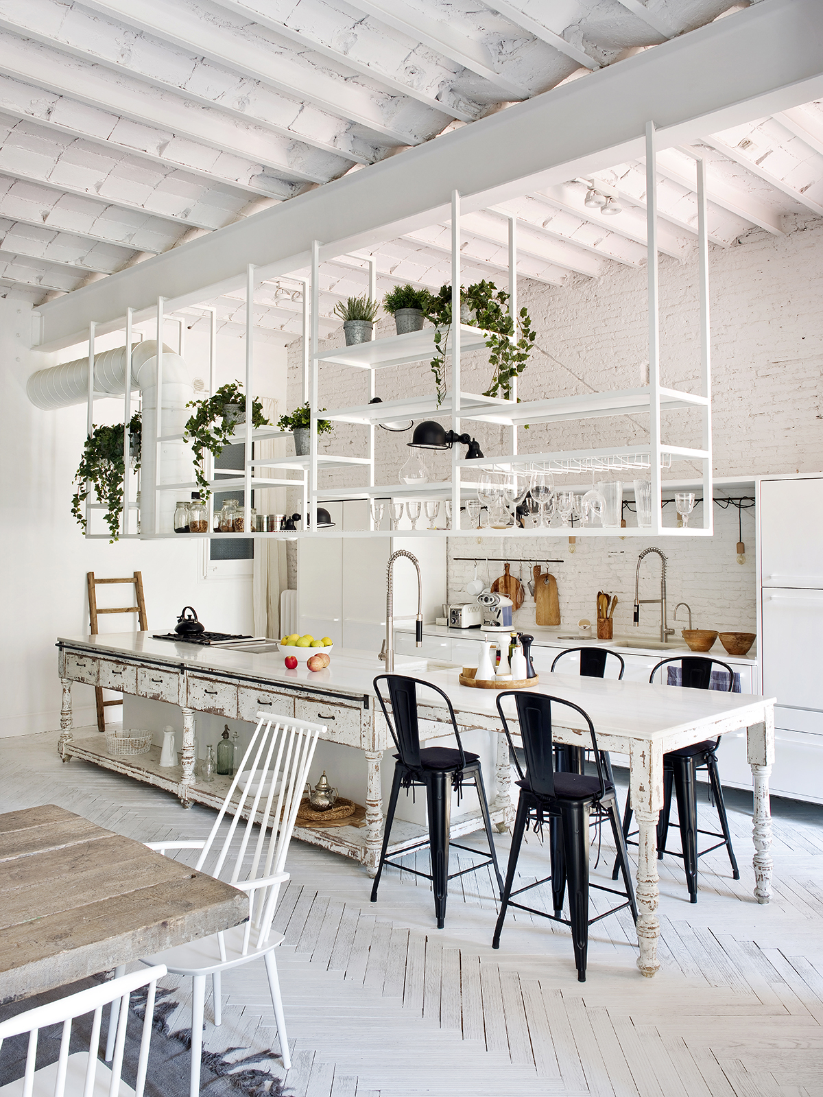
In larger or open plan kitchens, creating zones within the space gives it multifunctionality. Different areas can be used for different tasks – cooking, working, socializing, etc.
'Wherever possible, if you have the space (or can find the ways of making it) have an island unit within either a U or L shape of wall units, or in front a galley run. This not only maximizes working and kitchen storage space but also sociability (especially if you can incorporate a breakfast bar or even a full dining booth) and also clarifies the flow between work zones.' explains Julia Brown, Design Director at Mowlem & Co.
'In terms of those zones try to have all you need for prep in one section, everything for cooking in another and everything for serving/entertaining in another, and everything for clearing up in another. Make sure you have plenty of light, natural or otherwise. And why not differentiate zones with subtle tones of the same overall color? Where space is tight, maximize the height of wall units. If you have a walk-in pantry, or a dedicated breakfast or baking cupboard with integral worktop, this makes a great addition. If necessary move all the laundry elsewhere and keep the kitchen about nourishment, family and friend catch-ups.'
6. Be sure to pick the right size of island for your layout
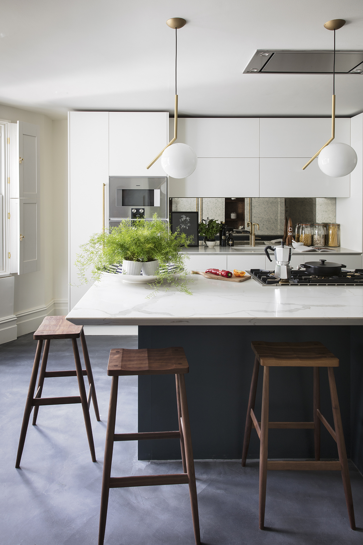
An island might be top of your kitchen lust list, but for your space to function, you really need to consider the size of island and how it will fit within your layout. As Graeme Smith of Life Kitchens says, 'Islands can be very space-hungry features in a kitchen, not only do you have the space required for the furniture but circulation space around the piece needs to be considered, especially if you have some function on there such as dishwasher. Typically you want to leave 1200mm between furniture (you can drop to a meter if pushed) but extra space may be sought in prep or cook areas that feature heavy traffic.'
'They are configurable to different sizes depending on what functions you want to include in them. A simple prep island can be bijou in size but offer a focal point and act as a social hub for the kitchen. A lot of people suffer from architectural dysmorphia and think they can fit an island in a space, when in reality it will compromise the functionality of the space. It can be many people's dream layout but fear not the peninsular can be a good alternative to the full island, as it gives that illusion whilst offering more storage, prep space, and functionality all without requiring that extra space to walk around.'
7. Introduce a peninsular to divide a smaller space
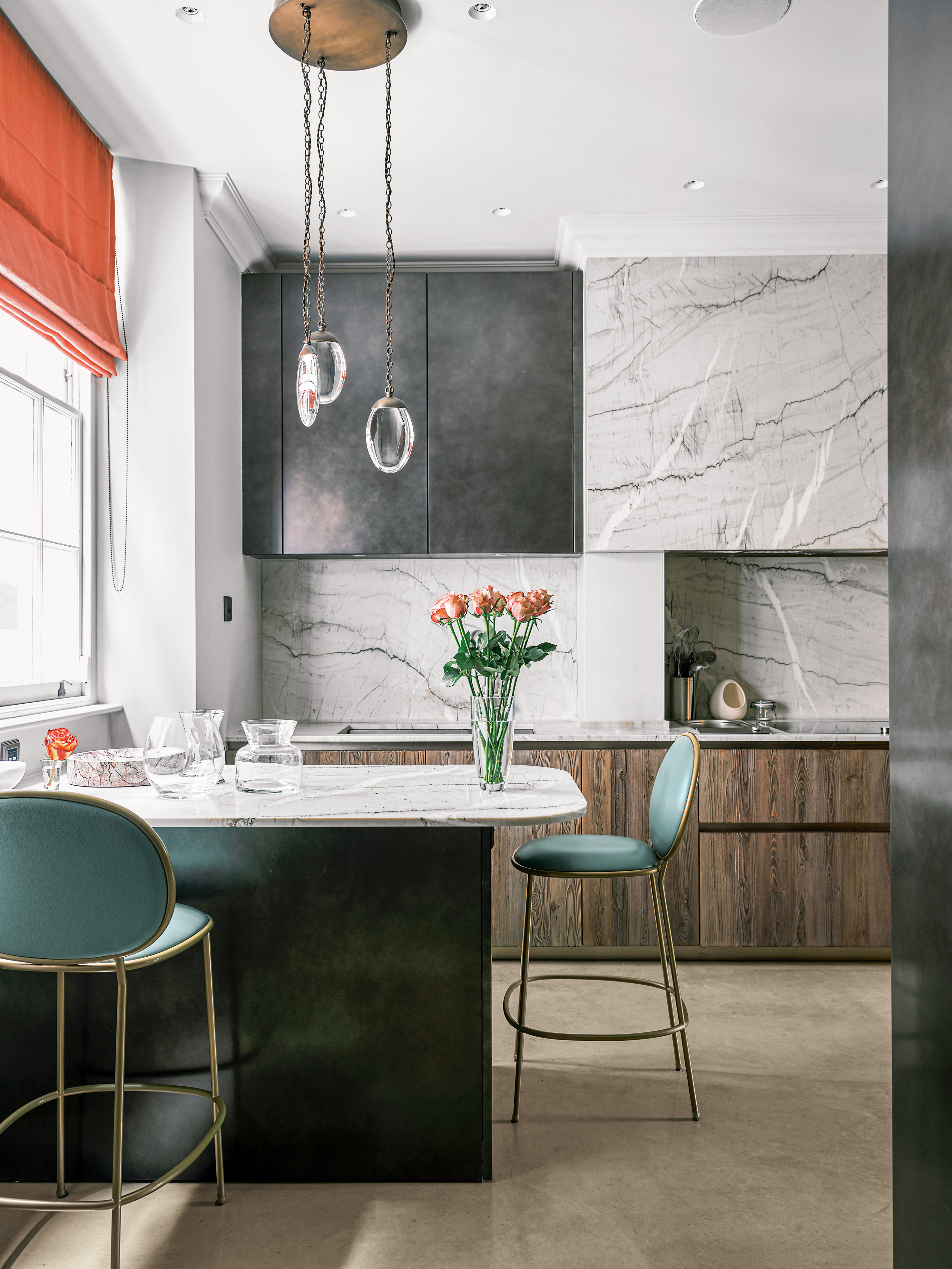
And when space doesn't allow for a kitchen island, consider adding a peninsular – you still benefit from the extra surface space, the storage, and the more sociable layout but doesn't take up as much space.
'Peninsulas are fantastic for smaller kitchens as, unlike islands, they are butted up against a wall so require less space around them. They enable the design to include a worktop that faces away from the main run of kitchen cabinetry. In many kitchens this means towards the table area, which means the cook doesn’t have their back to the room. They are also versatile so can be designed to include more storage or add another seating area.' George Glasier, co-founder of Pluck.
8. Go long with a kitchen island
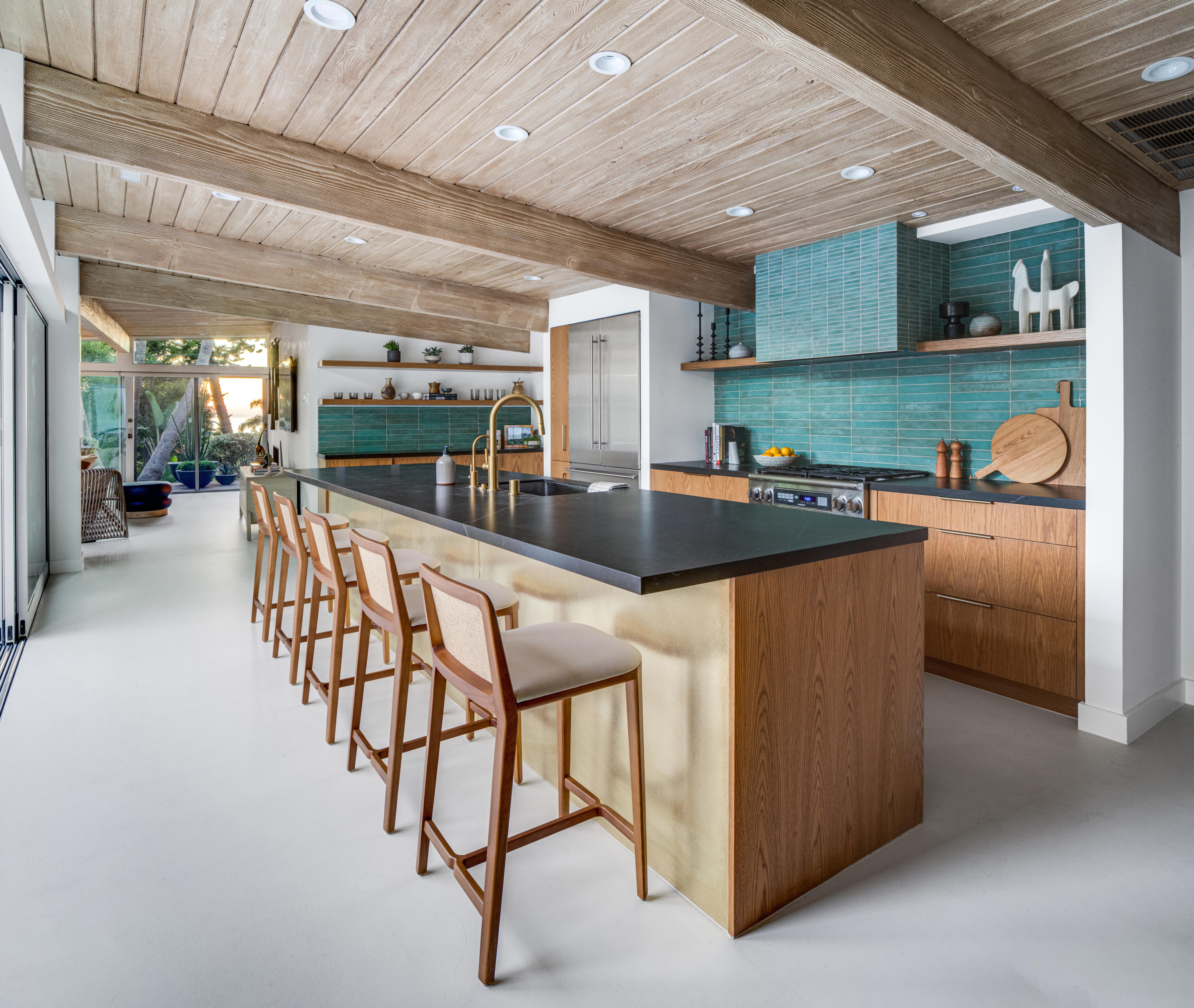
'In this mid-century home in Laguna Beach, we had a unique layout. The open concept kitchen sits in between the living room and dining room, open on both sides.' explains designer Jen Samson, founder of Jen Samson Design.
'In order to maximize both res functionality and the aesthetic, we stretched the island as long as the space would allow, providing plenty of seating as well as ample workspace. We were even able to create a perfect spot for the two resident dogs to enjoy their meals the kitchen as well!'
9. Open up a space with a single galley layout
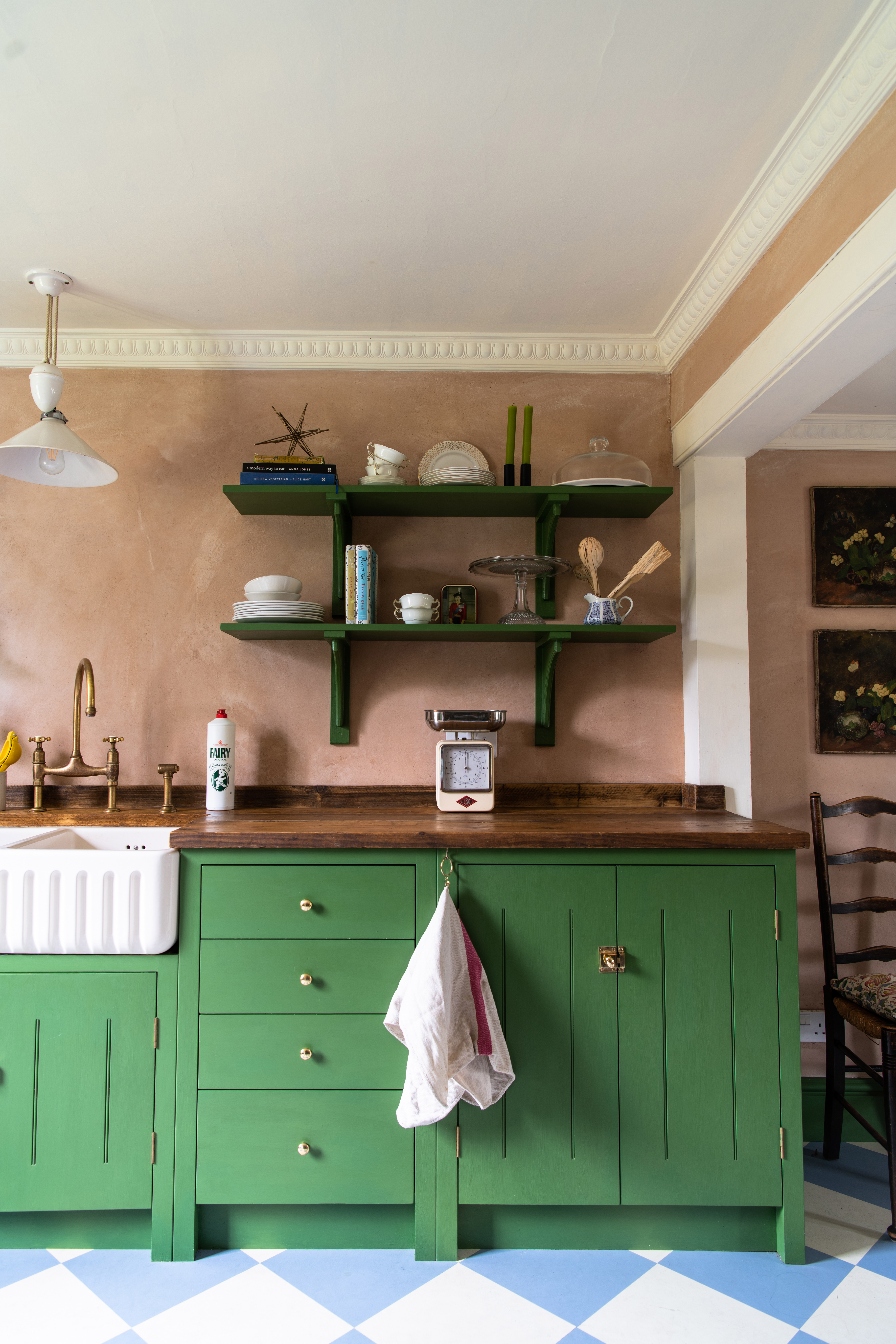
A single galley or one wall kitchen is a layout in which all the cabinetry, work surfaces, and appliances are set against well... one wall. Admittedly, it's a tricky layout to work with however, it's a common one, especially in lofts and studios and there's still plenty that can be done to make these kitchens chic and efficient.
The major pros of this simple configuration are that allows for easy workflow, all the major appliances are within easy reach of one another. And while they might not be in the traditional triangle, you never have far to go with this layout. It's also a great kitchen layout option in a smaller space where you want to keep that open and light feel or minimize the footprint of a kitchen in an open-plan apartment where it may need to share square footage with a living room and a dining room.
A one-wall kitchen may benefit from a portable island, or a butcher's block that can easily be maneuvered around the space. This will add that extra surface space and storage without breaking up the room.
10. Enhance a busy layout with lighter hues
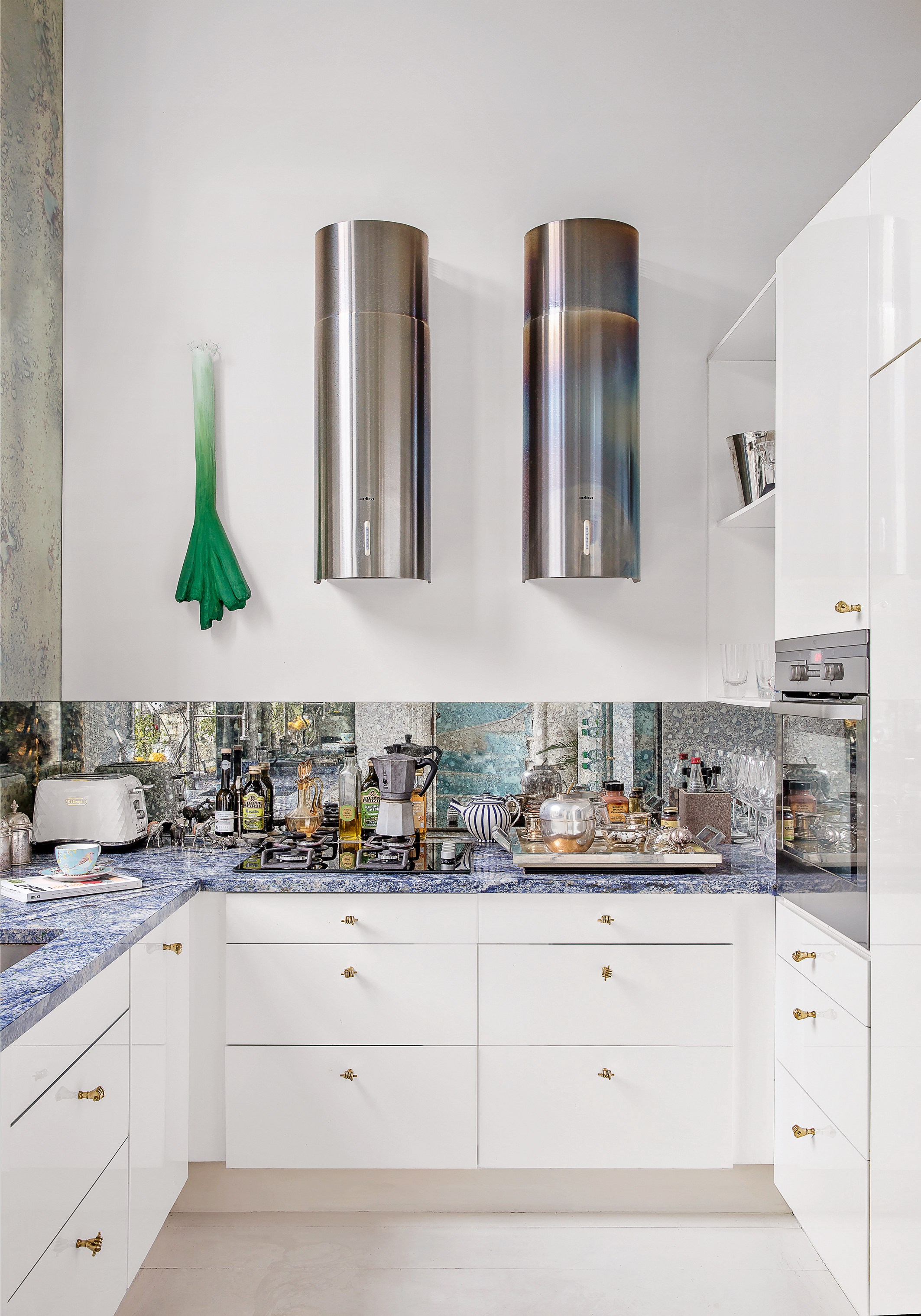
Kitchen layouts that incorporate a lot of cabinetry like galleys or U-shaped, maximize storage space sure, but they do risk being cramped and all those cabinets can block any natural light too. So our advice with these layouts is to keep the kitchen colors light. It's interior design 101 that lighter hues expand a space and make it feel more open, and while we don't always abide by this rule, in this instance it works.
'Using light, color, and mirrored splashbacks will make the space feel more open and bright.' explains Allison Lynch, Senior Design Consultant at Roundhouse. 'Keep things simple, and in galley kitchens in particular keep tall cupboards for dry food storage and the fridge to the ends of the room and perhaps limit to one side.'
'Too many details will crowd the space so keep to simple clean lines and lose the clutter. Be careful not to put a fridge into a corner and right up against a wall because it will be difficult to open the doors to get veg drawers out and allow for the depth of the handle too if opening onto a wall.'
11. Or keep the layout simple but go bold with color
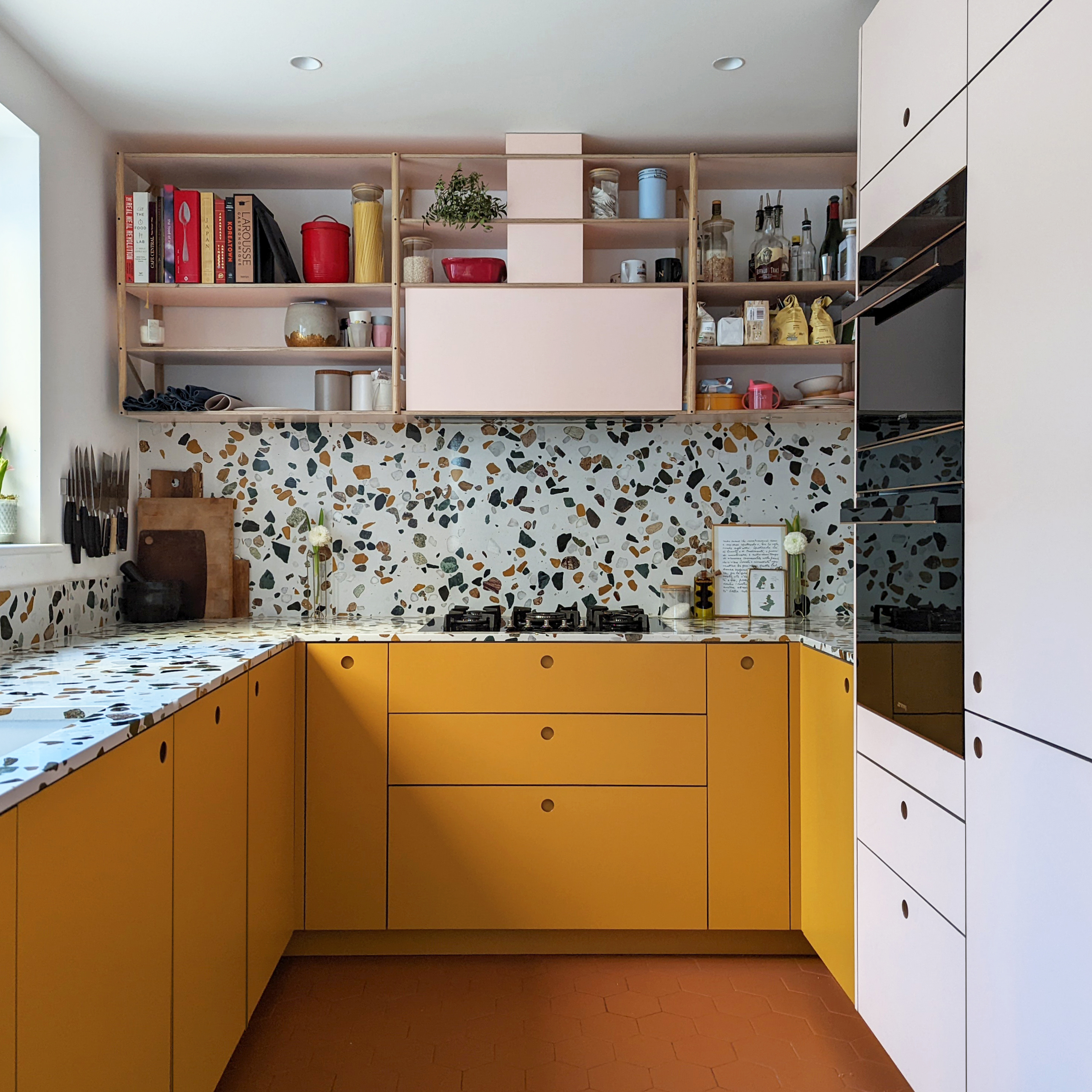
And if white kitchens aren't your vibe, allow a simple layout to let you be bold with color. Brighter hues can work in any size kitchen, the key is to balance the colors with fuss-free cabinetry and an equally fuss-free configuration, let the color be the focus.
As George Glasier explains, 'The great thing about galley kitchens is because they are small, color can have a big impact and make the hues you choose immersive. If you want to help the room feel lighter, keep darker colors to the lower planes. Two-tone cabinetry is great for this.'
And again, note the lack of wall cabinetry in this kitchen. The small space and bold color scheme would totally overwhelm the space if the walls weren't kept free from cabinets. Instead, shelving provides that extra storage and space to add character and texture.
12. Bring in freestanding pieces for extra surface space
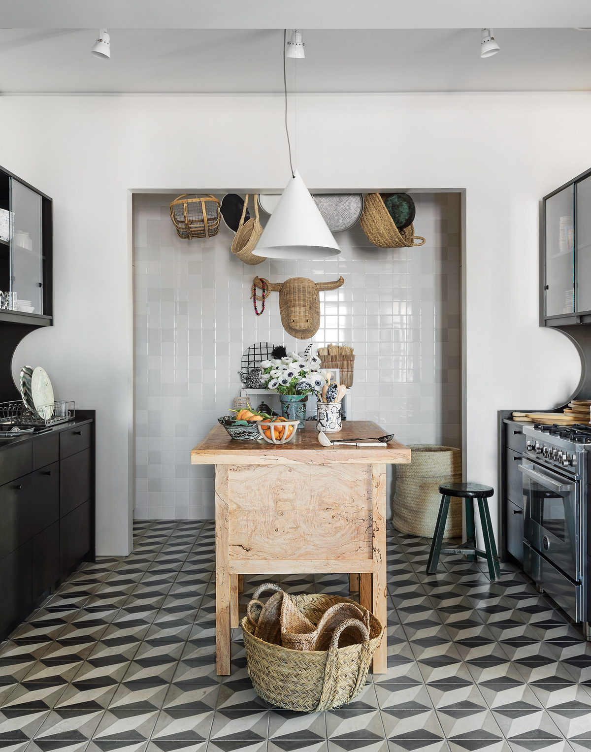
Freestanding furniture like butcher's blocks, dressers, and even cabinetry allows you to be really flexible with your layout. Opting for non-built in options is ideal if you are working with an awkward space and the shape doesn't fit easily with one of the more traditional layouts.
This more relaxed look lends itself perfectly to farmhouse style or rustic kitchens but can be adapted to suit any style. Or you could mix and match with some build-it pieces and some freestanding. This space makes a real case for this blending of styles – the sleek black cabinetry is softened by the natural textures of the vintage butcher's block that doubles as a small kitchen island.
13. Incorporate a dining nook into your kitchen layout
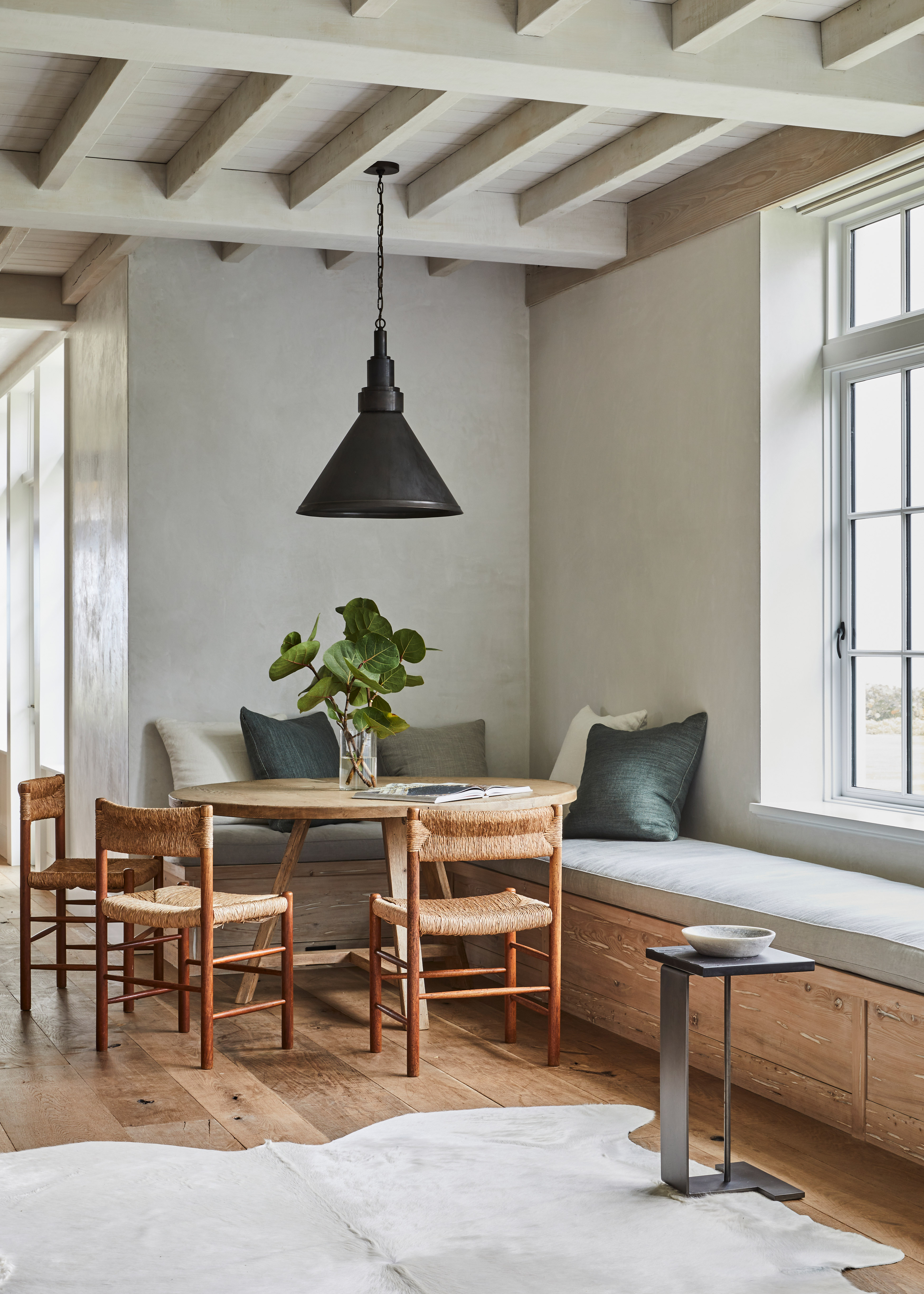
When creating a kitchen diner layout, consider choosing a banquette design that fits snuggly into the corner of a room. Switching to this style rather than a traditional table and chairs is not only a huge interior trend right now, but it saves space and creates an instant cozy nook that feels separate from the kitchen.
Plus, you can add in some extra handy storage within the bench should you need it. Be inspired by this kitchen diner and hang a single statement pendant light above a circular table to enhance the coziness and make it feel more like its own zone.
14. Double up a kitchen island with a dining table
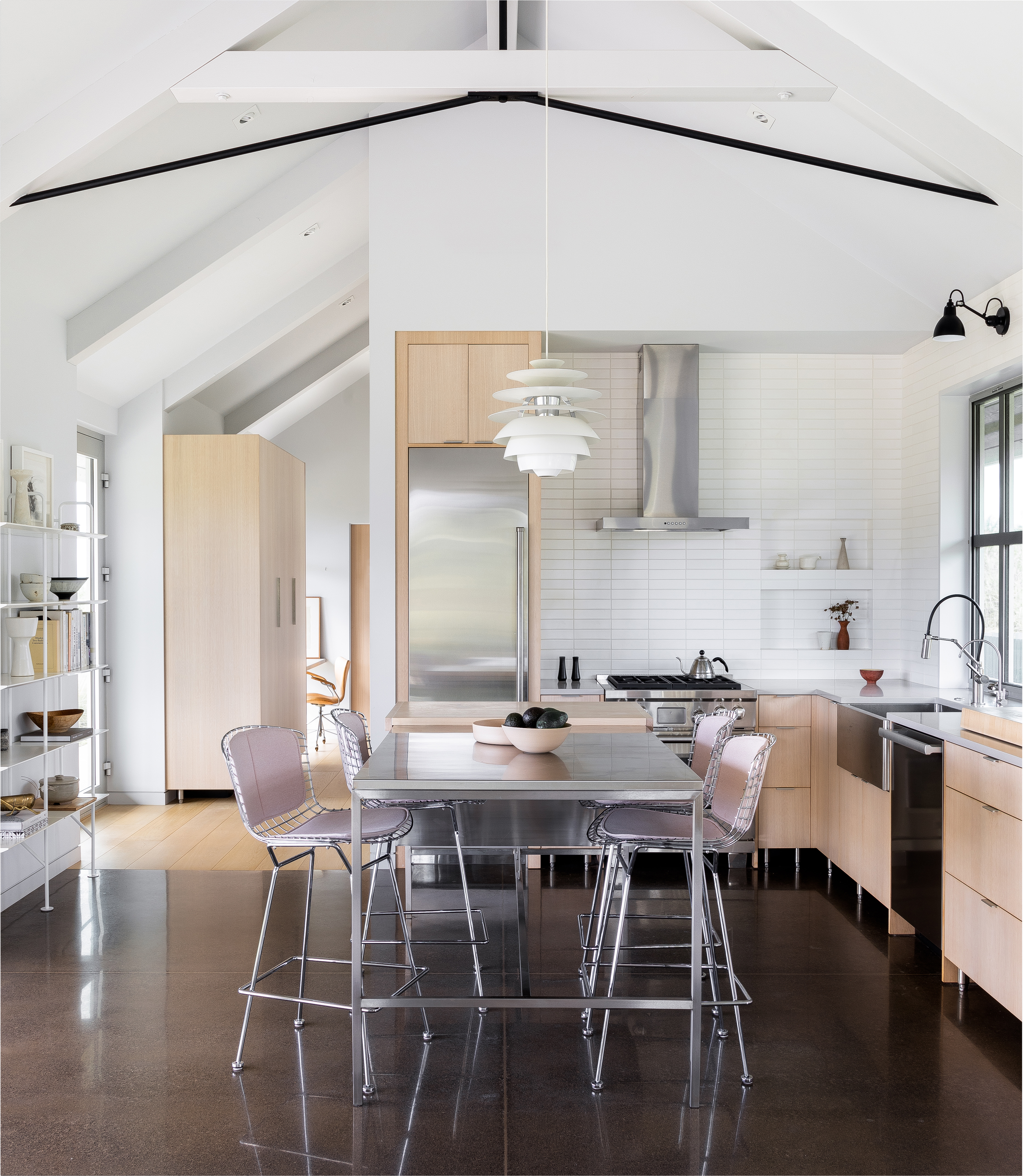
To make the most of space, consider doubling a kitchen island as a dining table, as can be seen in this industrial kitchen designed by Guggenheim Architecture. This way you get all that extra surface space for prep, plus plenty of seating. It's a nice way to bring in a contrasting material too, like the mix of wood and stainless steel used here.
'A Custom-designed stainless steel island adds additional prep space and doubles as the primary dining table in this compact Hawaiian cottage's kitchen.' explains the team at Guggenheim Architecture.
15. Ensure everything is to scale
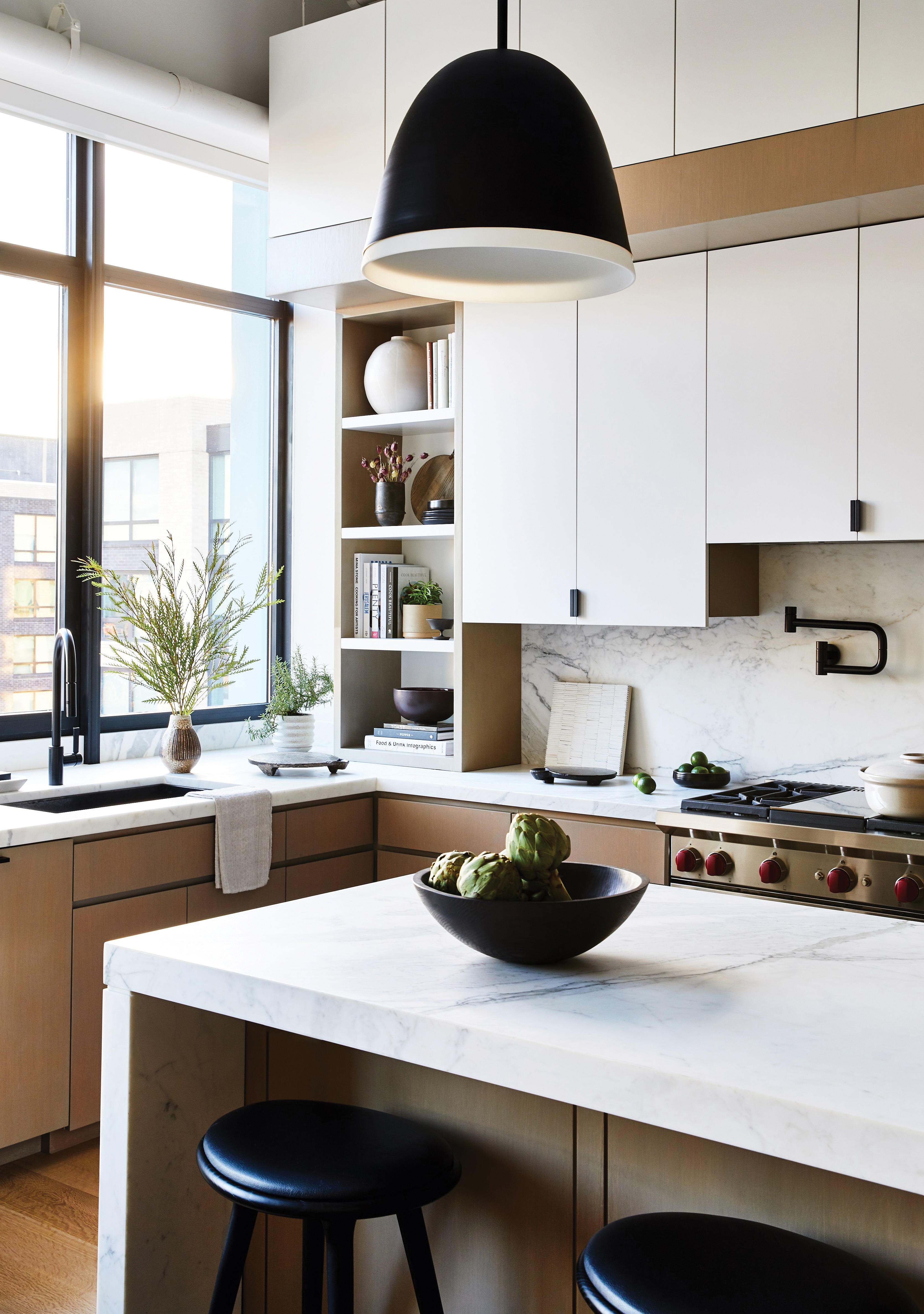
'Originally an industrial building, the space had been converted to residential living sometime in the mid 2000’s. The 17-foot ceilings, original concrete beams and breath-taking NYC/river views made this a dream project. We allowed the views to serve as the drama and kept things textural for most of the interior selections.' explains designer Joan Enger.
'We allowed the cabinetry design to lean into the expansive ceiling heights and paid great attention to the material choices, decorative lighting, and stone details. The extra thick honed Calcutta Island fit in perfectly with the overall scale. While the space would be considered modern and industrial, it was critical for it to feel warm and layered at the same time.'
What's the best way to layout a kitchen?
The best way to layout a kitchen is going to be totally based on your space and how you use it. However, there are the key, ever-popular designs that ensure an efficient use of space – U-shaped, L-shaped, galley, island, and peninsular.
'We find that L-shape, U-shape, and open plan kitchen layouts remain the go-to arrangements.' says Simon Bodsworth. 'The overall balance of the design is paramount, so picture the elevations carefully by considering how each piece will complement the other. Once you have the broad strokes of your space’s spatial layout, you can then more easily determine which design category your new kitchen best suits: U-shaped, L-shaped, Galley or an open-plan layout.'
'When lacking space an L-shaped kitchen allows for optimal storage whilst maintaining an efficient workflow. To keep an open feel choose light paint colors and reflective materials such as bright quartz or a mirrored splashback. Utilize every inch of space from the full height, awkward nooks, and the use of islands if you have room.' says Tom Howley.
'A U-shaped kitchen allows the space to feel more open plan. Strategically divide the kitchen into zones for optimal functionality. To add more space consider adding an island with the hob positioned overlooking so you can socialize whilst preparing dinner for friends and family.'
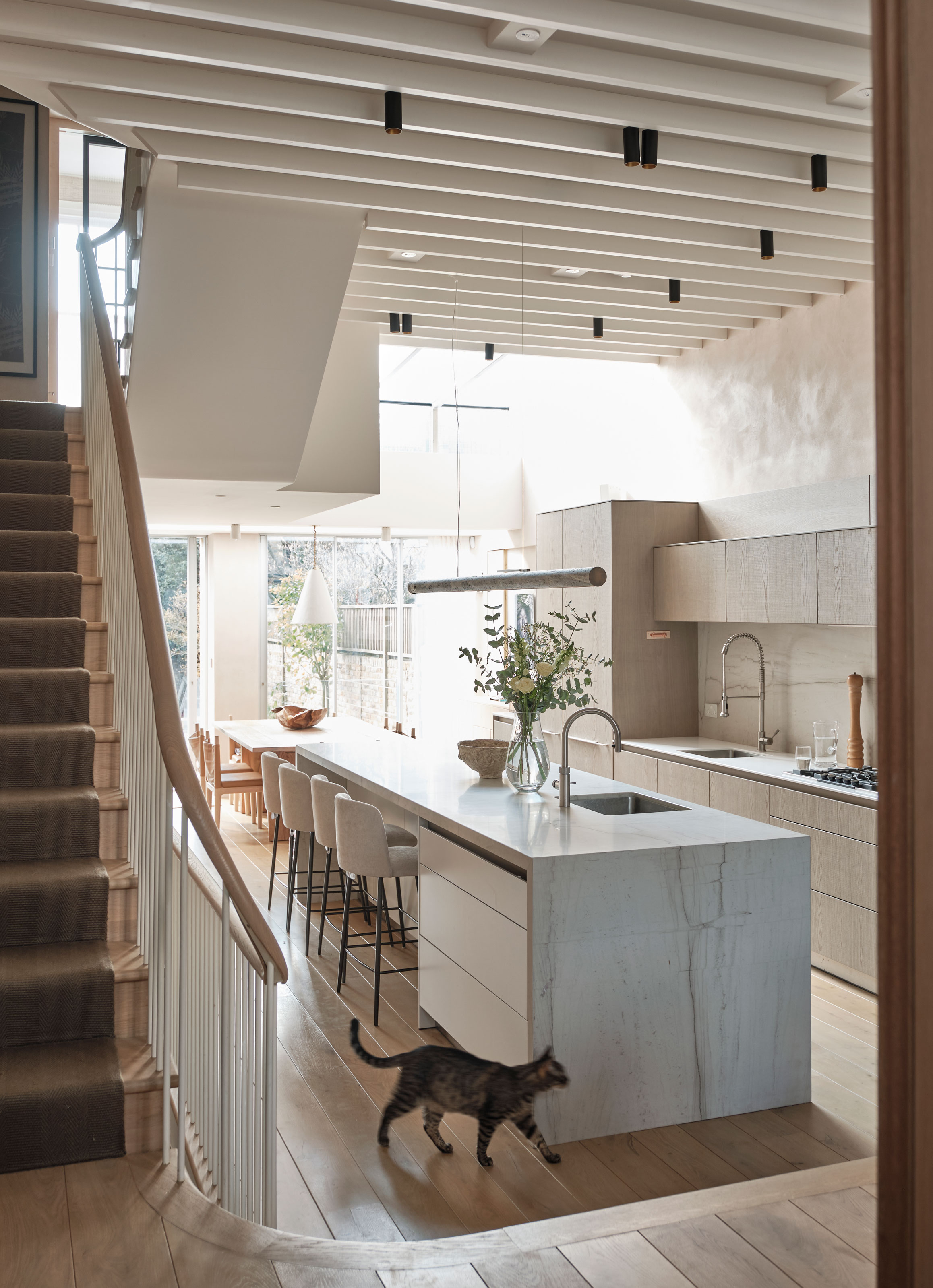
Island or peninsula kitchen layouts are a good choice in more open-plan spaces, as Simon says, 'zonal kitchen layouts have become the solution for open-plan living, able to define different spaces, living areas, and functionality without being confined by internal walls or boundaries. Therefore, planning is a pivotal stage of the design process as it will determine the most suitable orientation, arrangement and perspective of your broken-plan living scheme at the earliest phase of design.'
'The sole objective in a broken plan scheme is to pinpoint the areas in your life that have become routine and/or necessary, and then cater to these lifestyle trends within the overall design. As an open kitchen needs to be beautiful as well as functional, careful consideration needs to be given to the layout and what suits your home and lifestyle best. Once you have ascertained how you’re going to use the space with key areas, you can ensure the kitchen will be designed as ergonomically as possible for the ultimate in refined convenience.'
Where should appliances be placed in a kitchen layout?
The ideal way to place appliances in a kitchen layout is to follow the kitchen triangle rule. The 'rule', also known as the working triangle, goes back decades and is a theory based on the three main kitchen appliances (the fridge, cooker, and sink) should create a triangle. You should easily and quickly be able to move between the three, so ensure you don't have to walk more than 9 feet between each when planning where they will fit in your layout.
It makes sense to position a dishwasher near the sink so you can rinse and load. And for smaller appliances like kettles, toasters, and coffee machines, consider creating a breakfast station within your layout – a space where all these can be stored together along with mugs, tea, coffee, etc.
Be The First To Know
The Livingetc newsletters are your inside source for what’s shaping interiors now - and what’s next. Discover trend forecasts, smart style ideas, and curated shopping inspiration that brings design to life. Subscribe today and stay ahead of the curve.

Formerly the Digital Editor of Livingetc, Hebe is currently the Head of Interiors at sister site Homes & Gardens; she has a background in lifestyle and interior journalism and a passion for renovating small spaces. You'll usually find her attempting DIY, whether it's spray painting her whole kitchen, don't try that at home, or ever-changing the wallpaper in her entryway. She loves being able to help others make decisions when decorating their own homes. A couple of years ago she moved from renting to owning her first teeny tiny Edwardian flat in London with her whippet Willow (who yes she chose to match her interiors...) and is already on the lookout for her next project.
-
 Burl Wood Decor Is 2025’s Most Coveted Comeback — Here’s How to Get the Storied Swirls for Less
Irregularity is the ultimate luxury, but you don’t need an antiques dealer to find it
By Julia Demer Published
-
 5 Garden Features That Instantly Add Value to Your Home — While Making Your Outdoor Space More Practical, too
Get to know all the expert tips and tricks for making your backyard a standout selling point for your home.
By Maya Glantz Published