5 things minimalists never have in their entryways - set the right tone for a calming home
A minimalist aesthetic is high on our agenda, here’s what to remove from your entryway to achieve a clean but never empty look
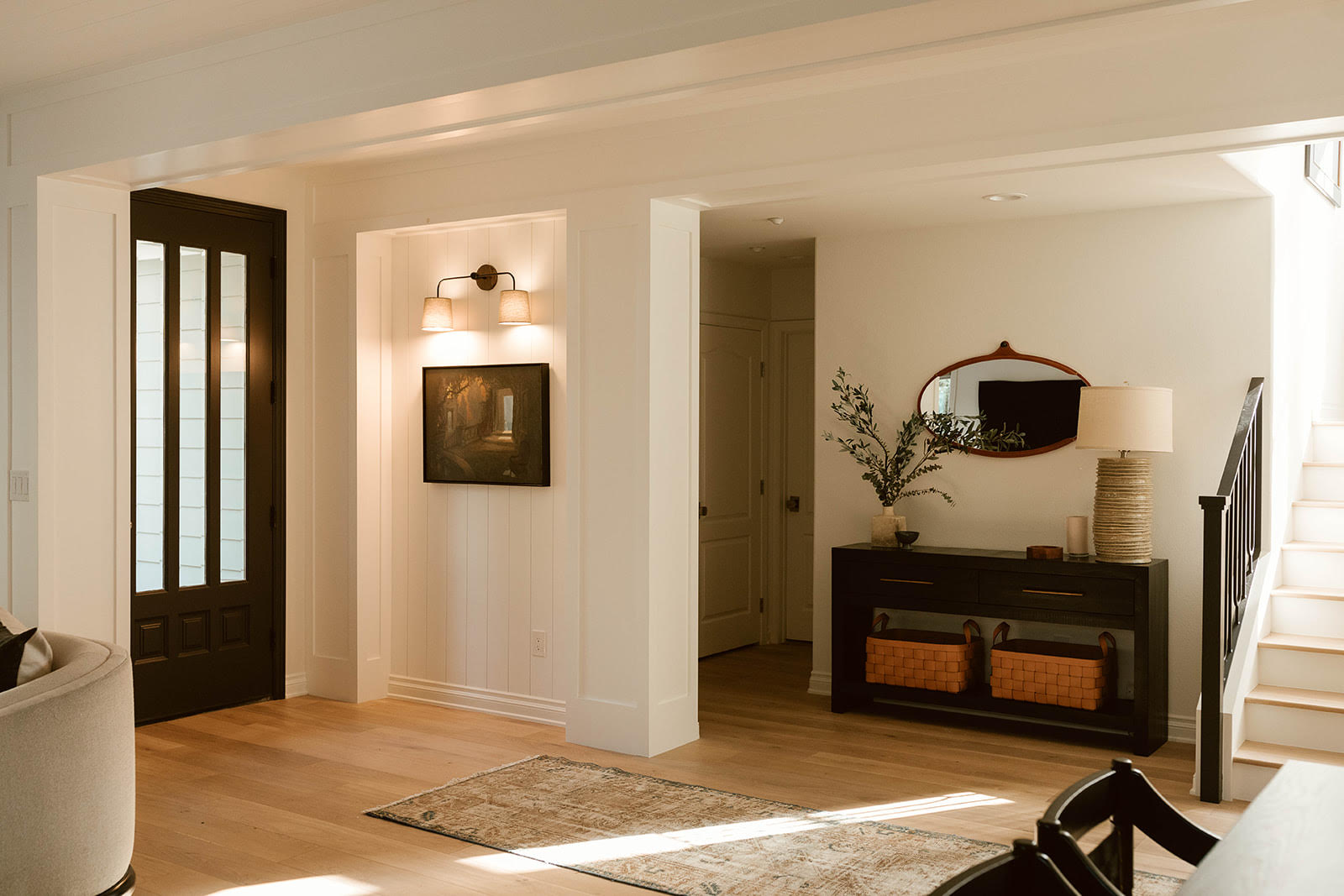
Interior designer Catherine Wilson tells us that “your entry sets the stage for what is to come: your home, your respite, your haven.” But that doesn’t mean that every design idea, ornamental piece or bright idea should be thrown at this area of the house.
In fact, a minimalist entryway will ensure that your guests first impressions of your home of that of order and tranquillity. Here are the top five things designers never use in an entryway, and that you could get rid off if you were hoping to create a calmer, softer start to the home.
1. A COAT STAND
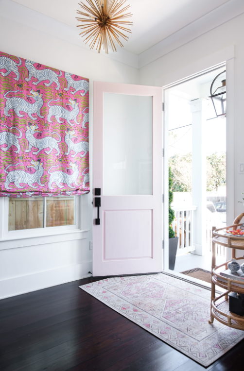
A coat stand is a classic example of something often put in an entryway which will always make a space look small and untidy. Louisiana-based designer, Megan Evans says “I believe outerwear should be placed in the closet. No one wants to be greeted by your puffy coat!”.
Alexis Peters of Home Styling by Alexis agrees that entryway storage is key. She tells us “a clean, organized, and elegant entryway creates a sense of peace for anyone walking in. Place the coats and shoes in the entryway closet away from guests and the space.”
Although you may want your coats near the door, if you want a calm feel to your entryway you should embrace the minimalist aesthetic in its truest form and stow coats away upstairs. If this is too impractical, opt for a closet which has a door so the coats are concealed. Use a table with drawers to stow necessities for a truly minimalist feel.
2. SMALL DECORATIVE ITEMS
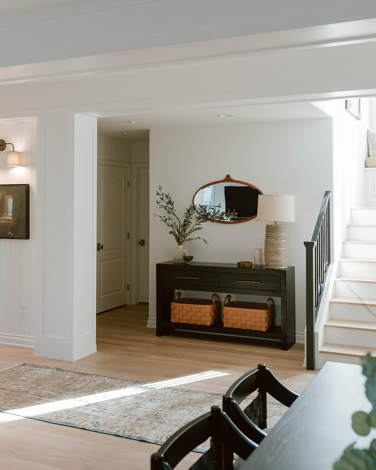
When designing a minimalist entryway you want to be aware of how many decorative items you are filling the space with as too many pieces will quickly make the space look busy. Instead prioritise pieces which are functional as well as beautiful to the space. Brooke Spreckman of Design Hutch says she always removes “small decorative objects that may get lost in the shuffle of using the space and will add clutter. She says this goes for “decorative ceramic objects - these will just add clutter and lose further floor space” referencing oversized plant pots.
Similarly, she says that floor lamps, which take up too much space and are difficult to move, have got to go. Find a lamp which can sit on top of a console table to keep your pieces contained and a singular house plant to add life into the space without adding clutter.
3. A BENCH
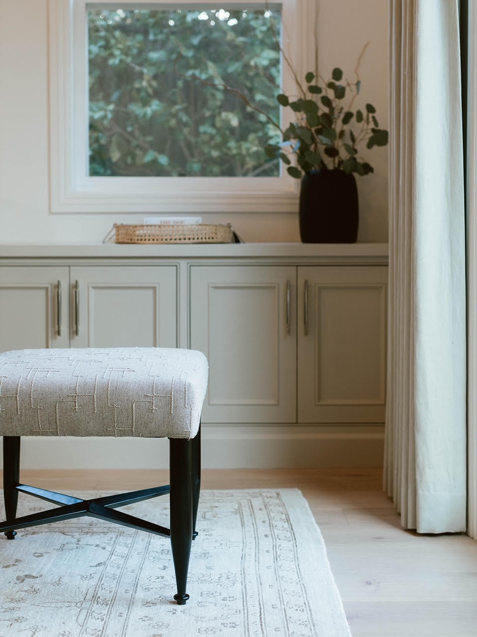
Like lots of small decorative items, bulky furniture can detract from an otherwise minimalist space. Spreckman says a prime example of this is a bench as “clutter will inevitably just begin piling up [on it].”
Not only will a bench become a dumping ground, but even left bare it can overpower the space. “Sometimes we love a piece of furniture and just want to make it work, says Emma Kemper of Emma Beryl interiors. “If you are aiming for minimalism you want to look for pieces that don’t feel too heavy and ones with clean lines. Clunky furniture can make the space feel smaller and more cramped which is the opposite of the light and airy feel minimalism evokes."
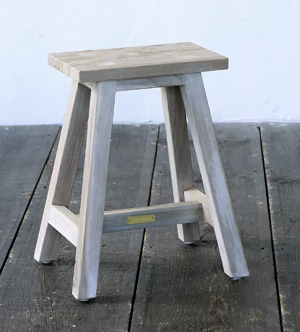
If you need somewhere to sit to put on shoes, instead opt for a small stool in a neutral tone which can easily be moved to other parts of the house as and when, or if left in the entryway won’t swamp the space.
4. TOO MUCH WALL ART
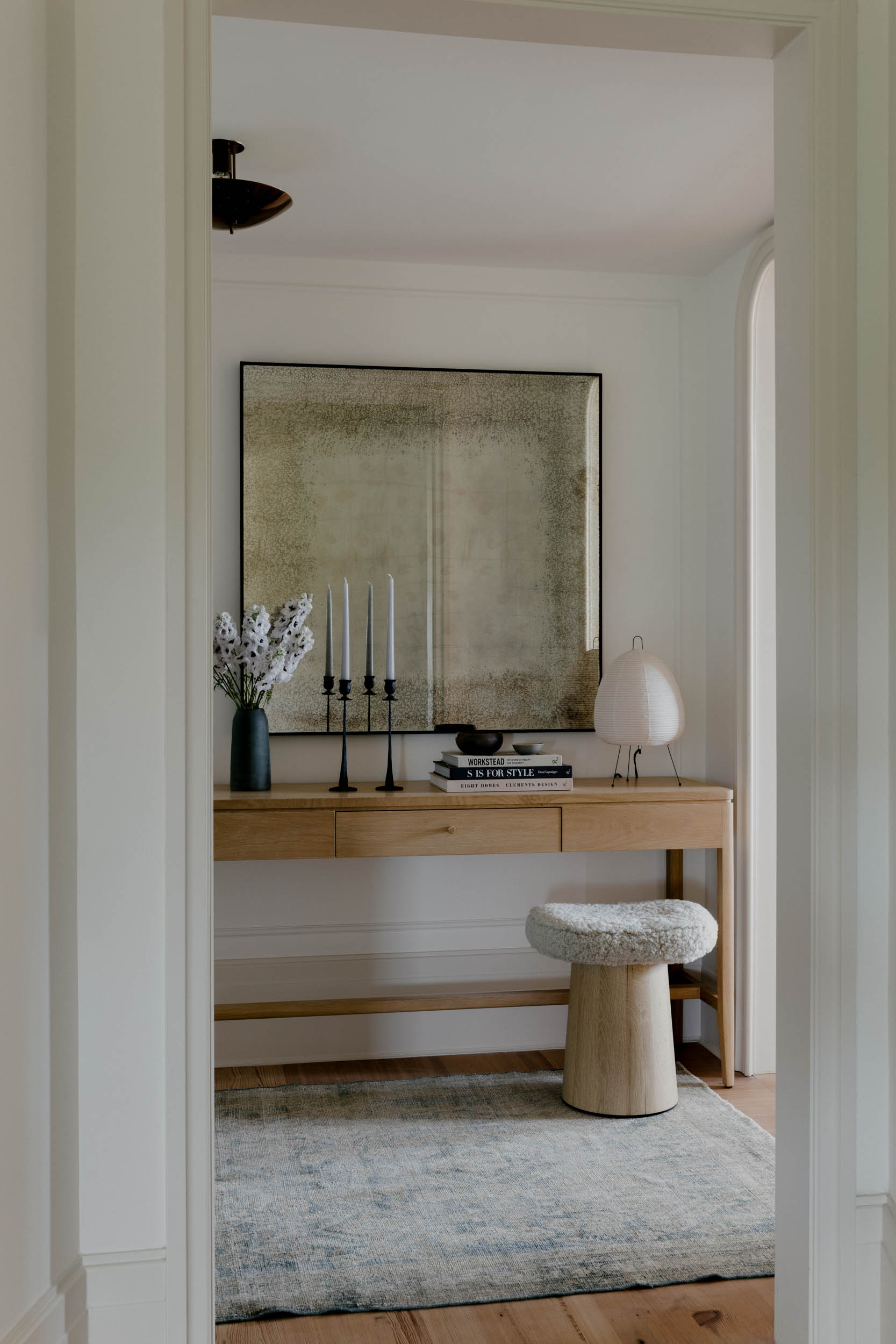
If you have rid the space of unnecessary furniture and the entryway still feels busy and like there is no rest for your eye, you may have too much on your walls. Though wall art or family portraits can add character to this space, too many pieces can make the space look chaotic, especially if they are in mismatched frames. Kemper has experience in resolving this issue. She says: “Who doesn’t love a gallery wall? It can look great in a space, but if you are aiming for a minimalistic entryway it can feel cluttered because your eye wants to look at every piece of art.”
Instead of throwing everything at your walls, be intentional. Pick one statement piece in a neutral palette or an even number of smaller pieces for symmetry in frames of matching tones to ensure that added personal touch is in keeping with a minimalist aesthetic.
5. MISMATCHED WALL COLORS
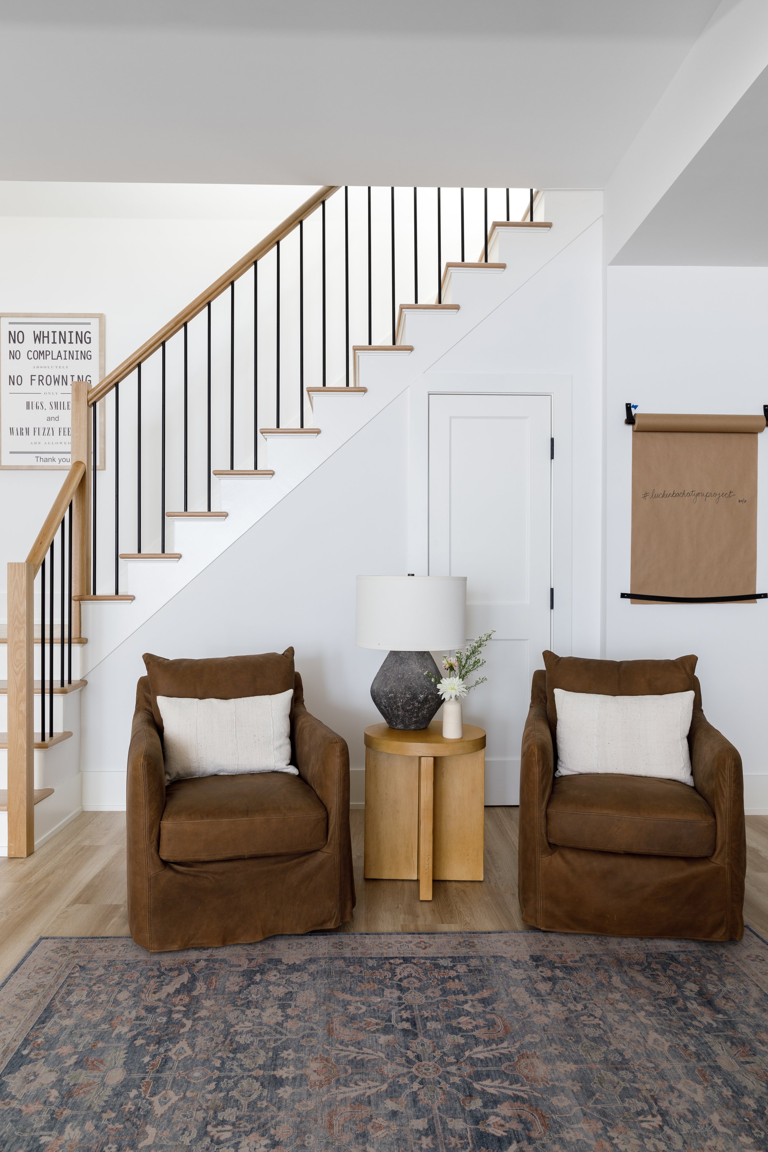
Though many think minimalism is about the amount of items in a room, a successful minimalist design will also take into account color schemes and having a sense of continuity throughout. New York-based designer, Becky Shea tells us how she keeps a minimalist vibe: “I work with an editorial palette so that there's material and color consistency throughout the whole home, and the entryway is no different.”
This means if you are opting for warm oak furniture, stick to a similar palette in your wall color, flooring and any soft furnishings.
Kemper provides some reassurance for those maximalists amongst us who wish desperately to become a minimalist for the sake of a calm home: “Sometimes the pieces aren’t needed but it doesn’t seem that way because you don’t realize you are only using it because it’s there. Removing doesn’t always mean nothing is going to take its place. You may need to remove a piece of furniture or decor to replace it with something that works better for your lifestyle.” We know we will be taking note.
Be The First To Know
The Livingetc newsletters are your inside source for what’s shaping interiors now - and what’s next. Discover trend forecasts, smart style ideas, and curated shopping inspiration that brings design to life. Subscribe today and stay ahead of the curve.
Katie is a freelance lifestyle writer who has recently finished an MA in Magazine Journalism at City, University of London. Before writing for Livingetc, Katie has gained bylines with The Caterer and The Telegraph and has interned at several lifestyle magazines including Grazia and Red. When not scrolling through Pinterest for interior design inspiration, Katie can be found writing about women's issues, trying out new beauty trends for her blog or seeing a West End show.
-
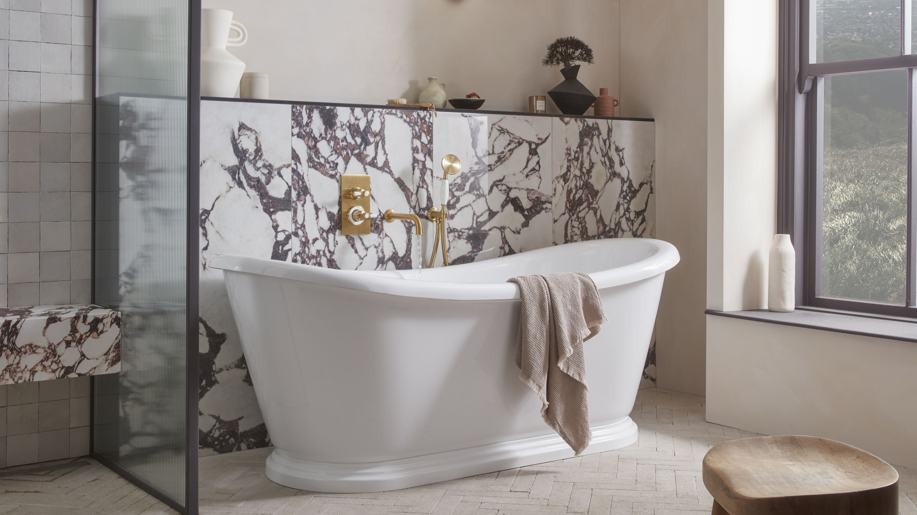 5 Bathroom Layouts That Look Dated in 2025 — Plus the Alternatives Designers Use Instead for a More Contemporary Space
For a bathroom that feels in line with the times, avoid these layouts and be more intentional with the placement and positioning of your features and fixtures
By Lilith Hudson Published
-
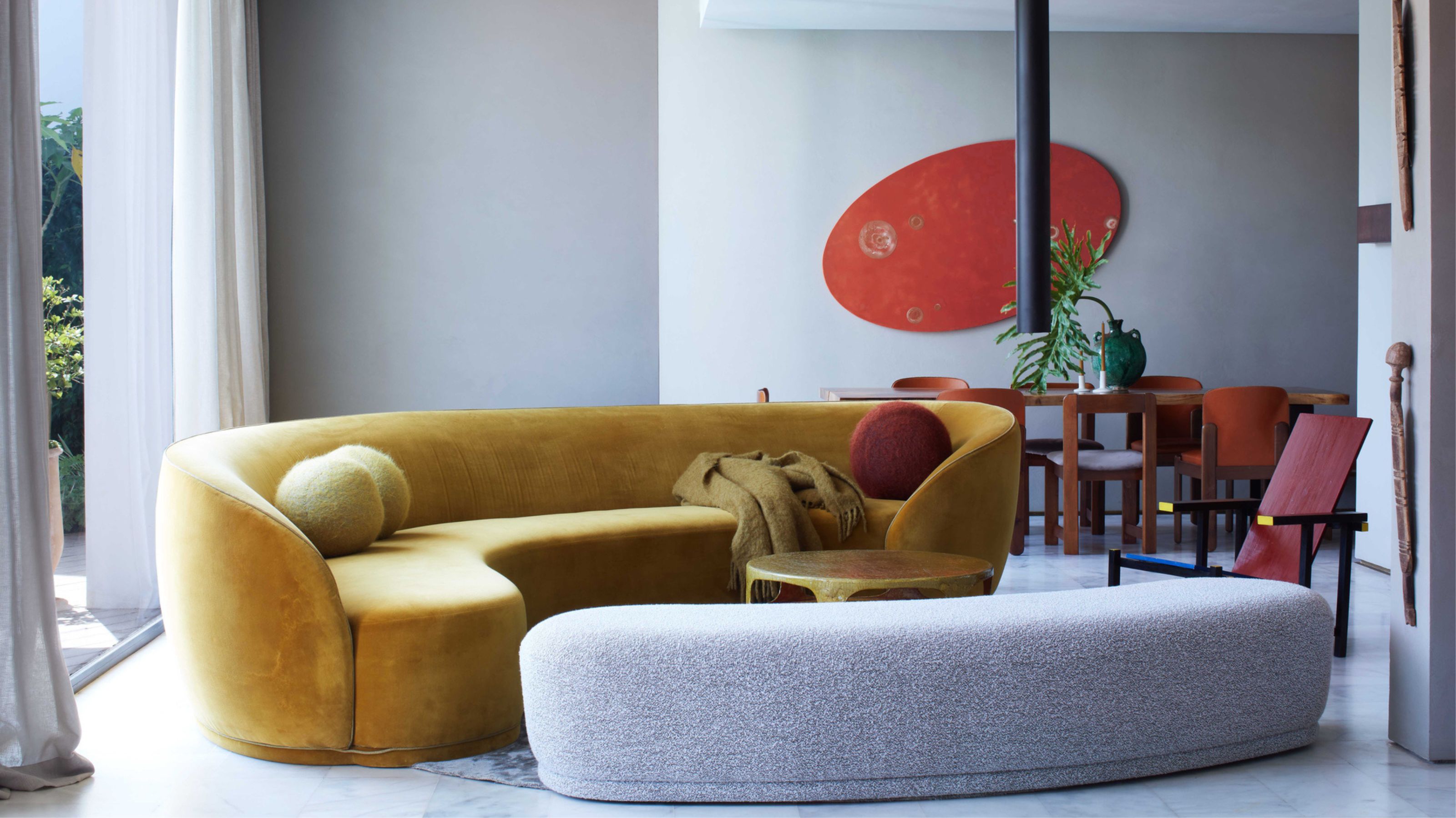 Why Decorating With Mustard Yellow Helps Fill Your Interiors With a Sense of "Confident Calm"
There is so much more to decorating with this turmeric-tinted sauce-wiggled-on-a-hotdog not-quite-yellow shade than meets the eye
By Amy Moorea Wong Published
