What Makes a Bedroom Look Cheap? 5 Things Designers Say You Should Avoid
From synthetic bedding to glossy paint, there are a few things you'll want to stay away from if you want to elevate your home

Faiza Saqib
The bedroom is a sanctuary, a place where you find peace and relaxation after a long day. It's also a space that often reflects your chosen style, from certain features to colors and materials — how you choose to decorate your bedroom can really elevate it.
But if the wrong materials and textures are added, your modern bedroom ideas can turn from chic to cheap. That's why it's important to know what works well to bring a room together cohesively and what might not.
We've spoken to some designers to find out what makes a bedroom look cheap and what you can do to avoid it. Here's what they had to say.
1. Glossy Paint Finishes
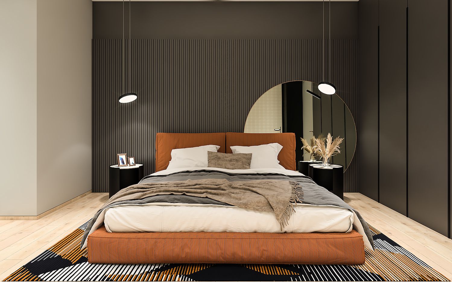
Whether you're doing a bedroom accent wall or the entire room, along with choosing the right color, it's important to also choose the correct paint finish. "Be very careful of glossy paint finishes," says Bethany Adams, founder of Bethany Adams Interiors. "They have to be applied to a perfect substrate (think brand new drywall or freshly installed millwork) to look good since the glossier a paint is, the more it will show any imperfection. If you live in an older home, stick to pearl or satin for your trim instead."
But what happens when a wall is textured, and you want to give it a fresh look? "In some of the older, builder-grade homes, there is texture on the wall," says Laura Williams, founder of ATX Interior Design. "Since this has become the norm in many areas, it puts a limitation on what you can do to your walls without smoothing the walls down."
Laura says when walls are textured, you should keep the sheen to a minimum, "while still allowing them to have some wipe-ability. For instance, I always recommend the walls be in an eggshell finish in these cases. If the walls were to be painted in a satin or semi-gloss finish, the texture would be magnified exponentially."
2. Synthetic Bedding
If you're wondering how to sleep better, think about the bedding in your home. The quality of the sheets, the thread count, the softness of the duvet, and the firmness of the mattress, all play a key role. So while selecting these essential elements, remember to choose the right type of bedding that aids sleep and also looks stylish.
"Synthetic fabric is a big no-no when it comes to your beauty sleep," says Saba Kapoor, co-founder of Nivasa. "Some of the synthetic fabrics including polyester or rayon might mask themselves as sumptuous fabrics but don’t fall for it. When it comes to your bedding the feel of the fabric is crucial."
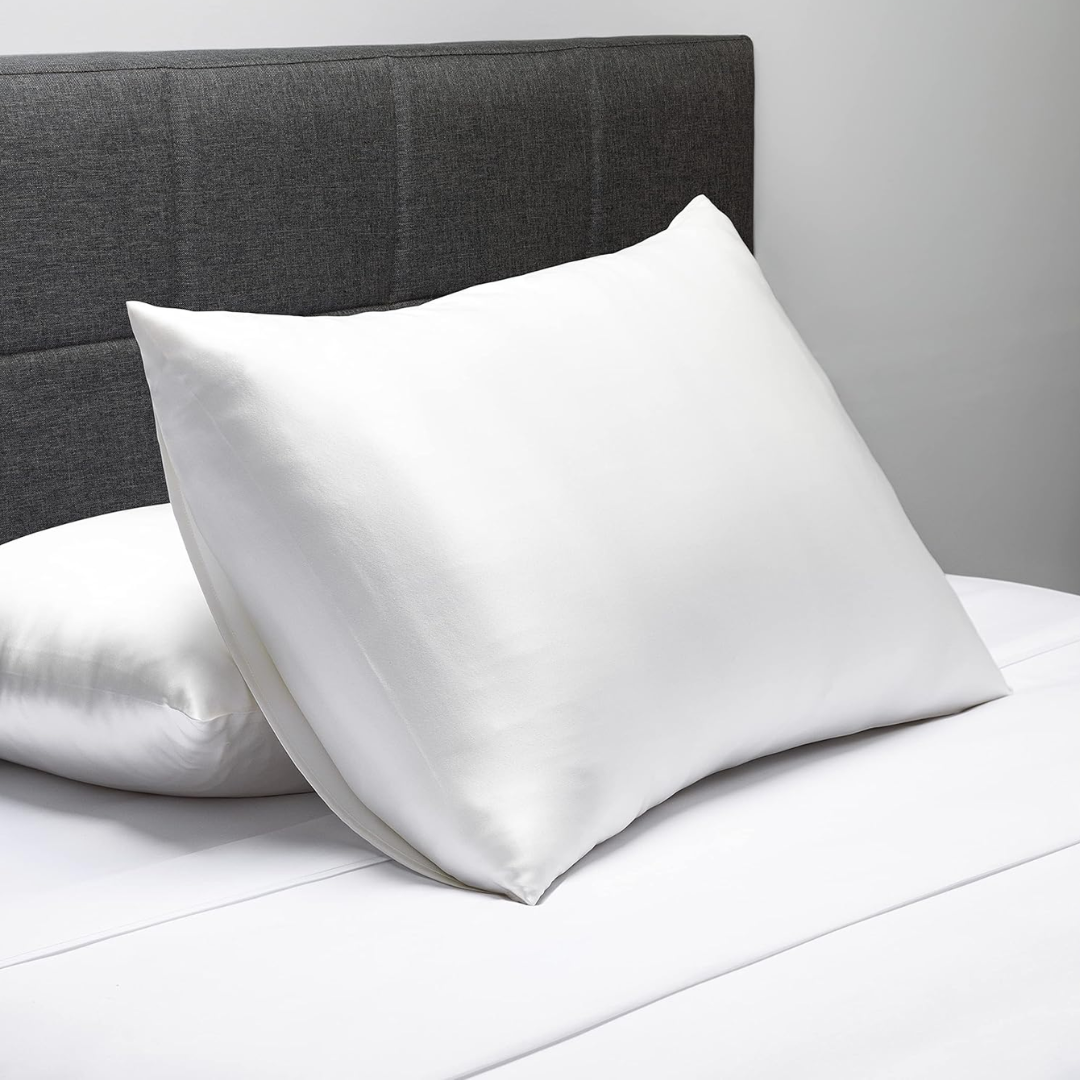
Saba continues: "Your bedding reflects your personality, so it's time to embrace natural fabrics including rich cotton, such as Egyptian cotton, pure linens, pure silk, and cashmere."
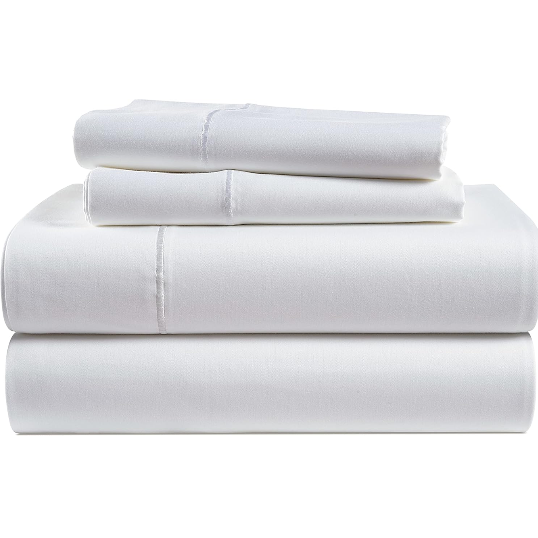
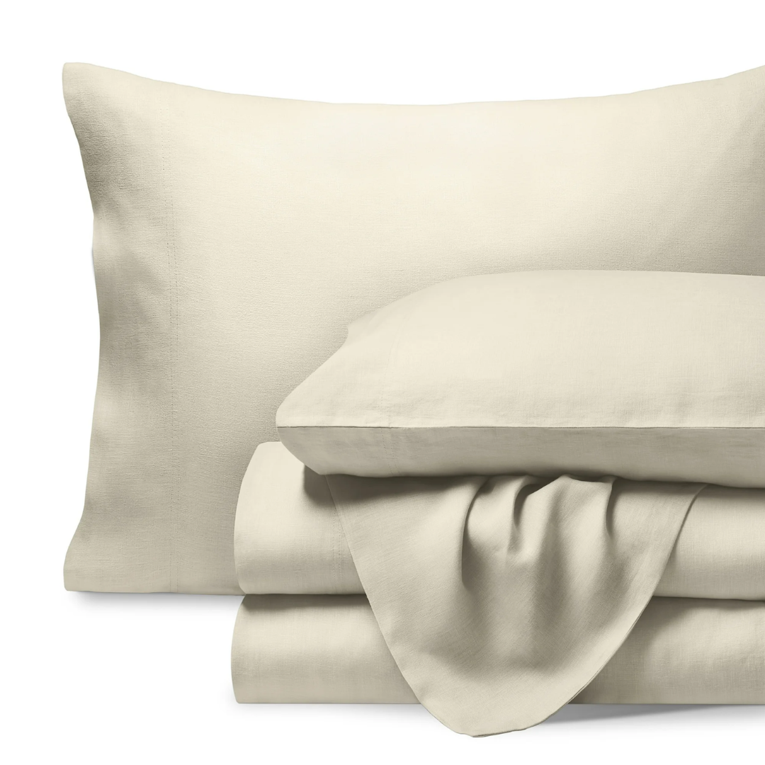
Price: $89.99
Was: $109.98
Available in many different colors, this authentic lane linen, Egyptian cotton bedding is ideal for Queen sized beds. It can fit a 17" mattress and will certainly bring luxury to your nights. Silky, soft and durable, these sheets will ensure a restful slumber.
3. Viscose and Polyester Curtains
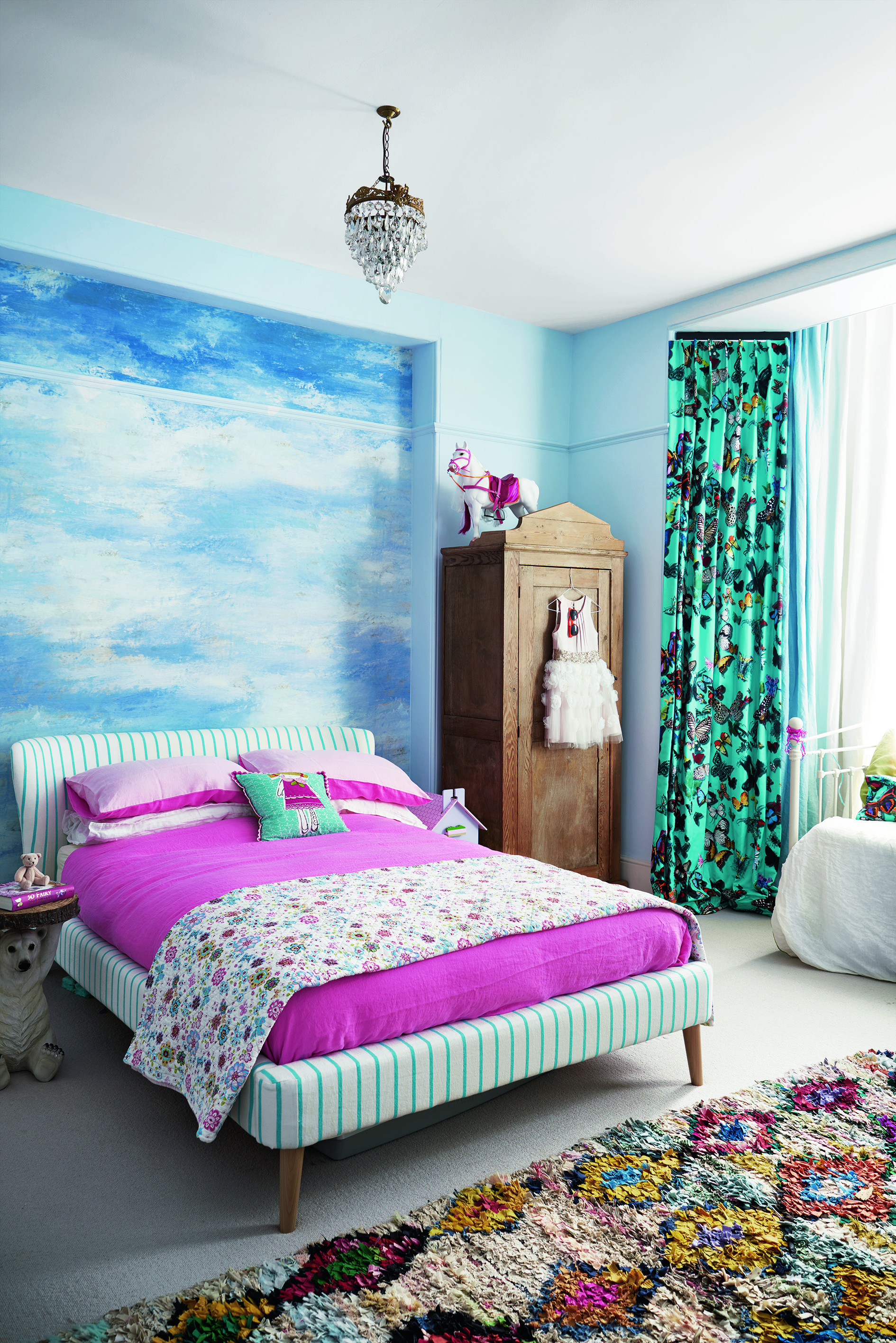
While thinking of fabrics, consider the materials for the bedroom curtains, too. Choose ones that look plush while also efficiently moderating light in the room. Saba says you should avoid viscose curtains at all costs as they make a room look cheap.
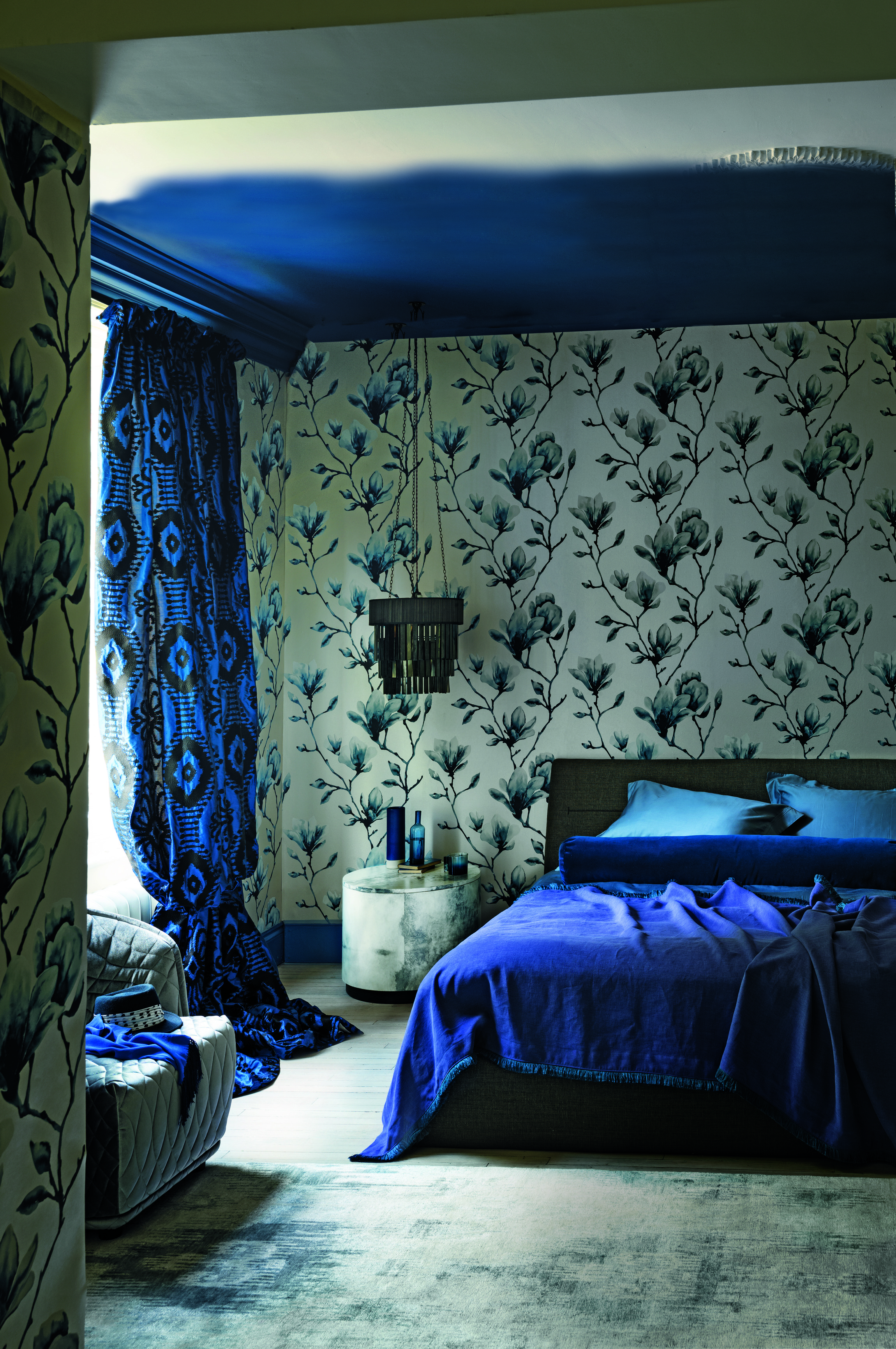
"This semi-synthetic curtain usually gives a cheap look and feel to the room. If you want your curtains to look light and flowy, go for lace or breezy cotton. Another curtain fabric to steer clear of is polyester," explains Saba. "Though cheap on the pocket, this material takes away the sumptuousness from a room and can never give a rich look, however beautiful the design is."
The designer says contemporary interior design trends are moving towards sustainability and eco-friendly fabrics, so it's best to add pure silks and linens into your space. "And if it’s a plush luxurious feel that you’re looking for, go for sumptuous velvet curtains," she adds.
Another thing to keep in mind before selecting curtains is the formality and application of the space. "If I’m installing in a luxe New York City apartment, I’m probably not going to select a heavily textured linen, whereas if it’s a country house, I’d do that chunky linen any day," says Joshua Smith, principal designer and founder of Joshua Smith Inc. "There’s also a level of softness that’s desired through organic textures and patterns, bringing trends away from the very tailored, traditional window treatments such as solid colors with a different leading edge."
"It’s important to not go overly heavy with your drapery, staying to a style like a European pinch pleat and simple rods, to keep it modern and classic," says Joshua. "When you’re working with a busier pattern, fold the fabric and imagine it as a stacked curtain panel. What you get is a lot of movement and color without being overwhelmed by the pattern. If you were to use the same pattern for a Roman shade, you’d see the full pattern more dramatically; something you may not want for the space."
4. Strong Geometric patterns
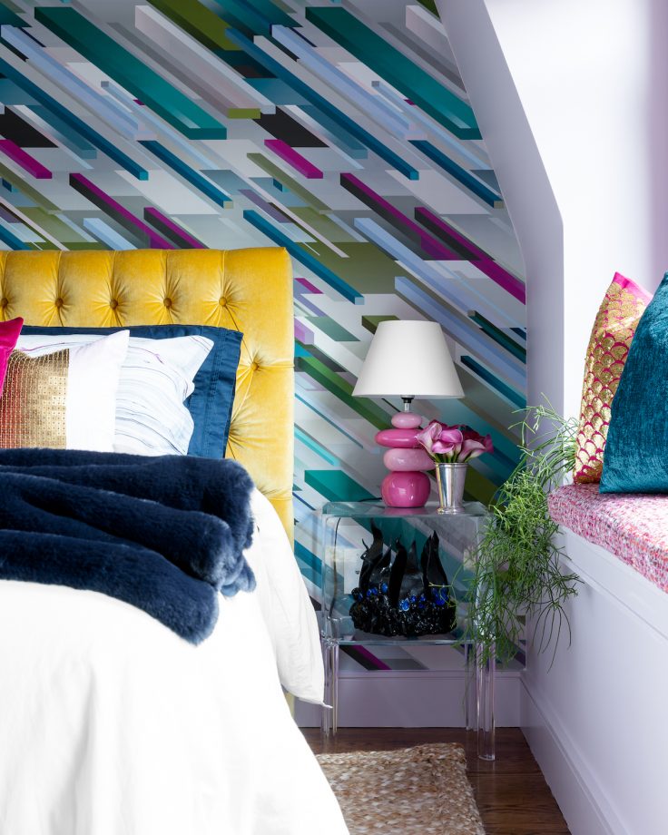
Your choice of prints can also change how expensive your bedroom looks. "We’ve noticed a shift away from strong geometrical patterns like chevrons and squares," says Joshua. "There’s been a strong migration to organics and clean designs in terms of fabrics and patterns."
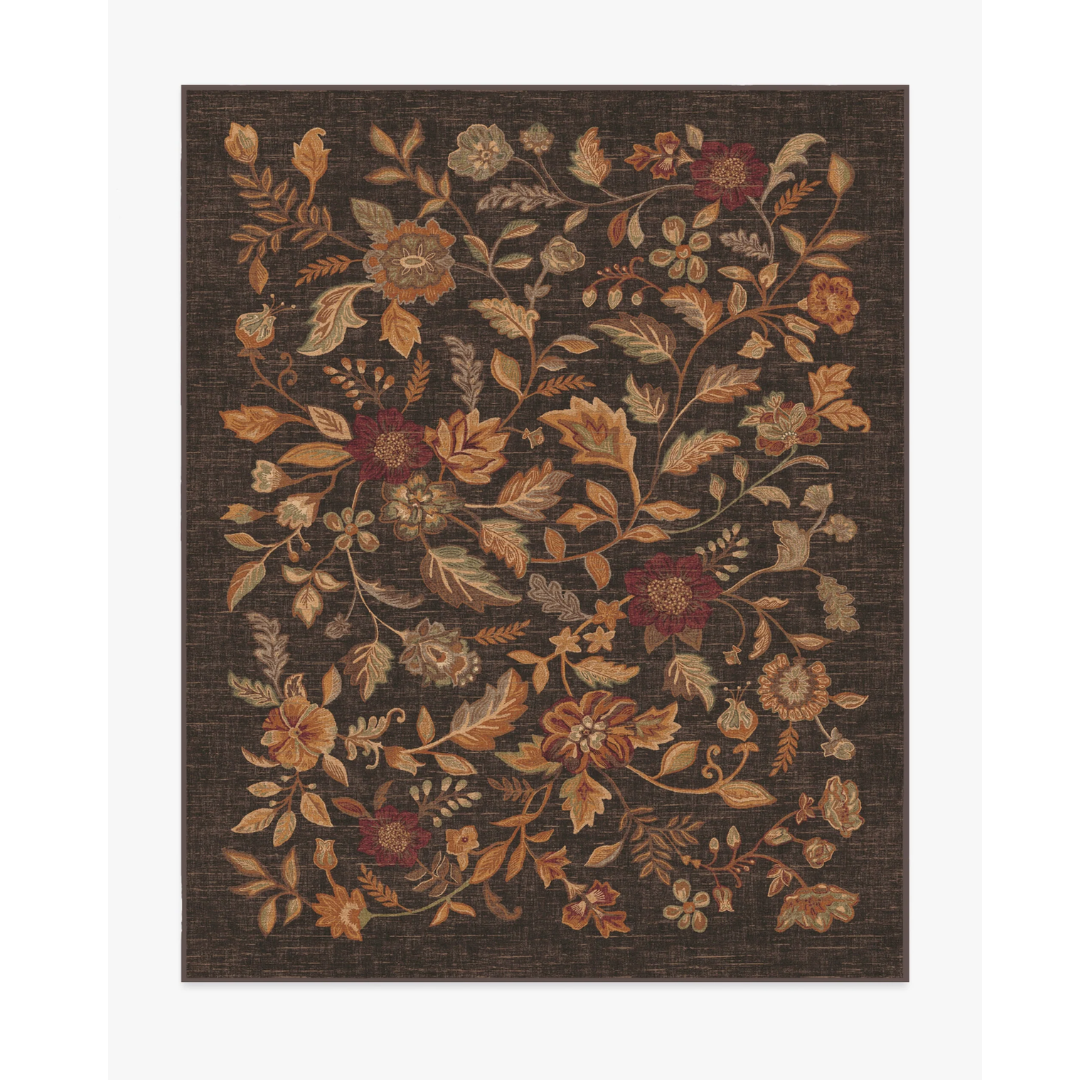
If you end up using large prints, keep them limited to very few pieces, like the pillows which you can always swap with another on-trend print later, or a bedroom rug that's easy to change. Balance out the prints with solid tones to prevent the room from looking too busy and cluttered with design.
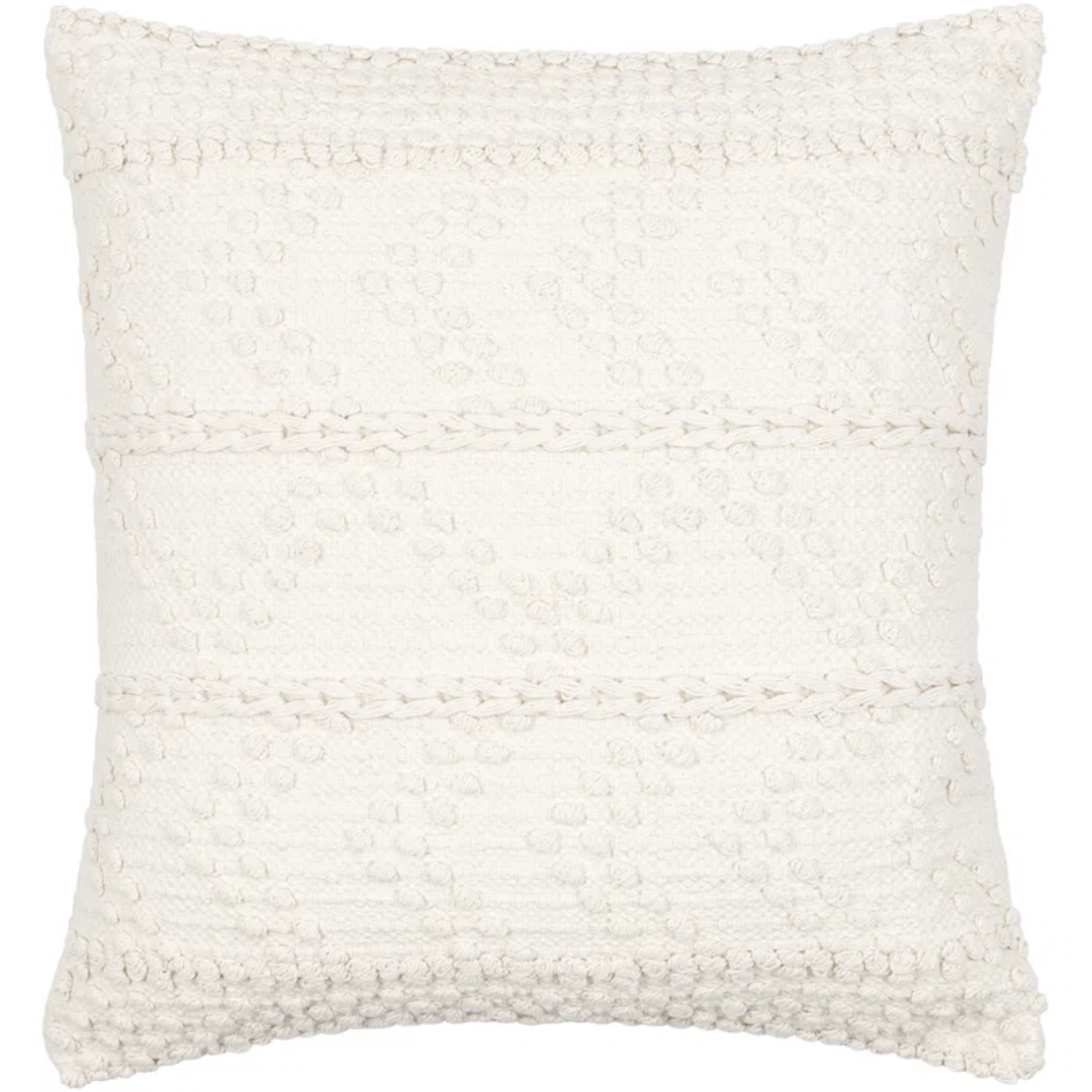
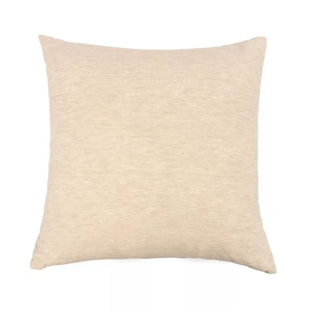
Price: $25.99
Was: $85
Bringing that boho-chic vibe to the bedroom, this Dorceus Throw Pillow is the perfect touch of style and elegance. This color is only available in two sizes and it also includes fillings.
5. Too Much Furniture
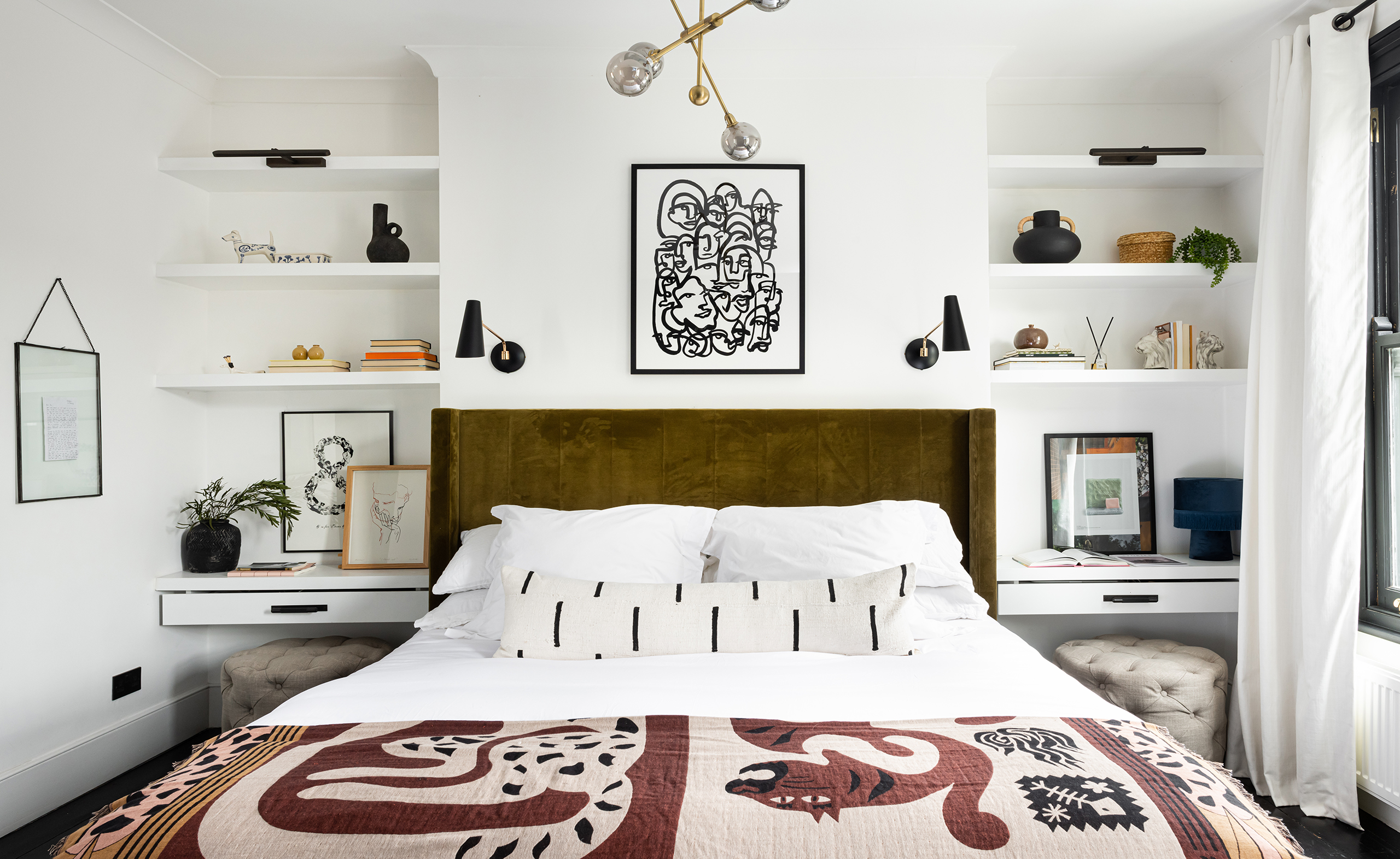
Finally, when it comes to modern bedroom furniture, you want to ensure that all the pieces in the room serve a purpose and do not crowd the room, making it feel cluttered and chaotic.
"Measure the size of your bed and select a wall that fits both the bed and one or two night tables, keeping in mind that a small night table can attach to your wall if your space is limited," says Julia Mack, founder of Julia Mack Design. "Add a modern bedroom furniture piece such as a vertical dresser instead of a long, low horizontal version to maximize open floor space and include a chair of any size."
FAQs
How to make your bedroom look expensive on a budget?
From bedroom wall art to bedding and throw pillows — there are a range of things you can do to make your bedroom look more expensive.
We recommend planning your bedroom and its decor elements and slowly adding different features in to make it pop. Throw pillows are a great way to elevate your bedroom while bringing extra comfort.
For example, you can mix this Mid-Century Modern Bouclé Throw Pillow from Wayfair with this 100% French Linen Sheet Set from Target for a more chic and elevated look. Mixing and matching colors will also add definition and an elegant contrast to your bedroom.
Be The First To Know
The Livingetc newsletters are your inside source for what’s shaping interiors now - and what’s next. Discover trend forecasts, smart style ideas, and curated shopping inspiration that brings design to life. Subscribe today and stay ahead of the curve.

Aditi Sharma Maheshwari started her career at The Address (The Times of India), a tabloid on interiors and art. She wrote profiles of Indian artists, designers, and architects, and covered inspiring houses and commercial properties. After four years, she moved to ELLE DECOR as a senior features writer, where she contributed to the magazine and website, and also worked alongside the events team on India Design ID — the brand’s 10-day, annual design show. She wrote across topics: from designer interviews, and house tours, to new product launches, shopping pages, and reviews. After three years, she was hired as the senior editor at Houzz. The website content focused on practical advice on decorating the home and making design feel more approachable. She created fresh series on budget buys, design hacks, and DIYs, all backed with expert advice. Equipped with sizable knowledge of the industry and with a good network, she moved to Architectural Digest (Conde Nast) as the digital editor. The publication's focus was on high-end design, and her content highlighted A-listers, starchitects, and high-concept products, all customized for an audience that loves and invests in luxury. After a two-year stint, she moved to the UK and was hired at Livingetc as a design editor. She now freelances for a variety of interiors publications.
- Faiza SaqibRenovation Editor
-
 Straight from Salone: 5 Emerging Trends I Found That'll Shape Interiors For the Year Ahead
From reflective silver to fluidity, here's my perspective on the key themes and new moods coming through from Milan Design Week
By Sarah Spiteri Published
-
 9 Bathroom Storage Mistakes You're Probably Making That Make Using This Space Much Harder — And What to Do Instead
Discover which mistakes are to blame for your overcrowded and cluttered bathroom
By Seraphina Kyprios Published
-
 9 Small Bedroom Clothes Storage Ideas That Are the Stuff of Organizers' (Sweet) Dreams
Save space and save yourself from rummaging around to find an outfit with a few smart storage tricks
By Natasha Brinsmead Published
-
 10 Small Guest Bedroom Ideas That Will Have Visitors Begging for an Extra Night's Stay
These brilliant design tricks for compact guest rooms will turn your home into the go-to destination for all your friends and family
By Natasha Brinsmead Published
-
 5 Quick Ways to Make Your Guest Bedroom Smell Like the Ritz-Carlton, According to Housekeepers and Scent Experts
We spoke to those in the know to uncover exactly how hotels make their guest suites smell oh-so-good. Here's how to leave a lingering impression
By Ciéra Cree Published
-
 7 Tricks for Making Your Guest Bedroom Look More Expensive That Will Make You Want to Sleep in the Spare Room
Plus your friends and family will soon be clamoring for overnight invites — and most of these tips won't cost you much, either
By Natasha Brinsmead Published
-
 10 Small Bedroom Organization Ideas — Maximize Even the Smallest of Spaces By Following These Simple Tips
If you want to know how to organize a small bedroom, then we have a few solutions up our sleeves. Here's what you need to know
By Aditi Sharma Maheshwari Last updated
-
 30 bedroom color ideas – stylish schemes to inspire a quick and easy makeover
Whether you are neutrals lover or color-obsessed, these bedroom color ideas are sure to make you want to redecorate
By Hebe Hatton Published
-
 Bedroom Shelving Ideas — 12 Clever Ways to Add Stylish Storage and Display Space
Whether you want to maximize space, create a charming display, or enhance the functionality of your bedroom, we've got you covered with these shelving tricks
By Hebe Hatton Last updated
-
 20 men's bedroom ideas for a sleek and chic retreat
Masculine style has many different looks, as these men's bedroom ideas prove, from dark and moody to light and airy, there's something here to suit all tastes...
By Hebe Hatton Last updated
