The best tile and grout color combinations – designer-approved pairings for more creative tiling
These innovative schemes prove there's a world beyond white when it comes to tile and grout color combinations
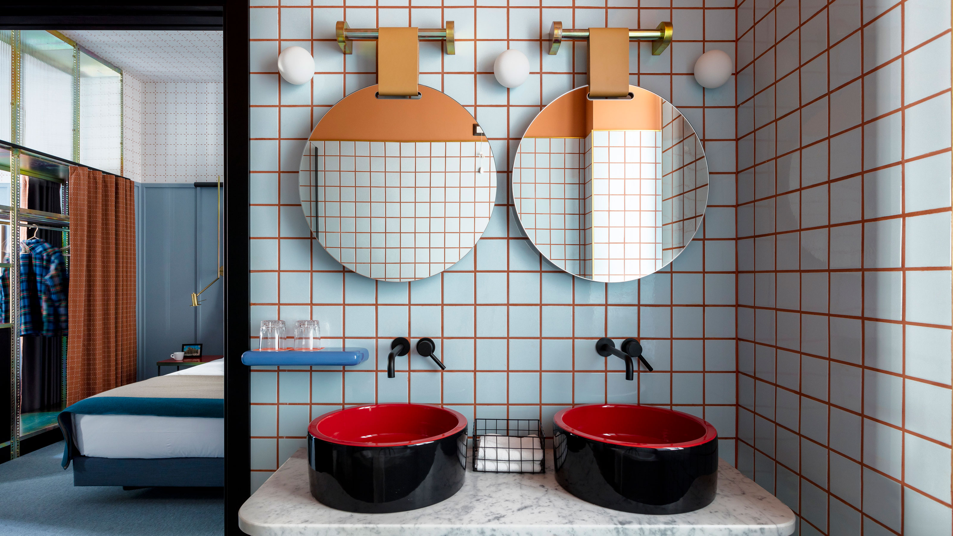

Looking at the majority of tile and grout color combinations you find in bathrooms, you'd be forgiven for assuming that grout only comes in white, black, and grey. Of course, this simply isn't true – there's a whole spectrum of grout out there to explore, from a variety of neutrals to bold and bright colors, as well as metallic finishes.
Of course, choosing feature grouting isn't the right choice for every bathroom. In some schemes, you'll be specifying bathroom tile ideas that minimize the visibility of grouting for a sleek and streamlined appearance. Yet, when using a small format tile – think classic metro styles, modern hexagonal shapes, square encaustic tiles, or even mosaics – more thoughtful consideration of the grout color you choose can help to elevate your tiling and imbue it with a different character.
And don't just take our word for it. Some of the most exciting interior designers around are proving that thinking creatively about grouting can bring something new and exciting to bathroom designs. Projects from the likes of Kelly Wearstler and Patricia Urquiola are included within our gallery of inspiration, for example.
'Color has permeated my work a lot, sometimes in a very intuitive way,' explains Patricia. 'What interests me is their meeting point.'
This pairing of colors is a unique relationship for tiling and grout. From simple tile and grout color combinations that make for an easy alternative to choosing white-on-white, to out-there pairings inspired by color theory, take a look at these ideas and how they can be applied to real spaces for a fresh perspective on using grout in your bathroom.
7 alternative tile and grout color combinations to try
Your choices for both tiles and grout can really feed into your overall bathroom color scheme, giving you another dimension with which to explore color and form. But how far should you go with experimenting in this medium?
'To help embody a singular narrative scheme, it is advantageous to keep the color scheme of larger rooms to a palette of just 3 or 4 shades,' says Rob Whitaker, Creative Director at Claybrook. 'Perhaps pick up the grout color in soft furnishings or accessories to tie the look together.'
1. Use white tile with colored grout for a twist on the classic
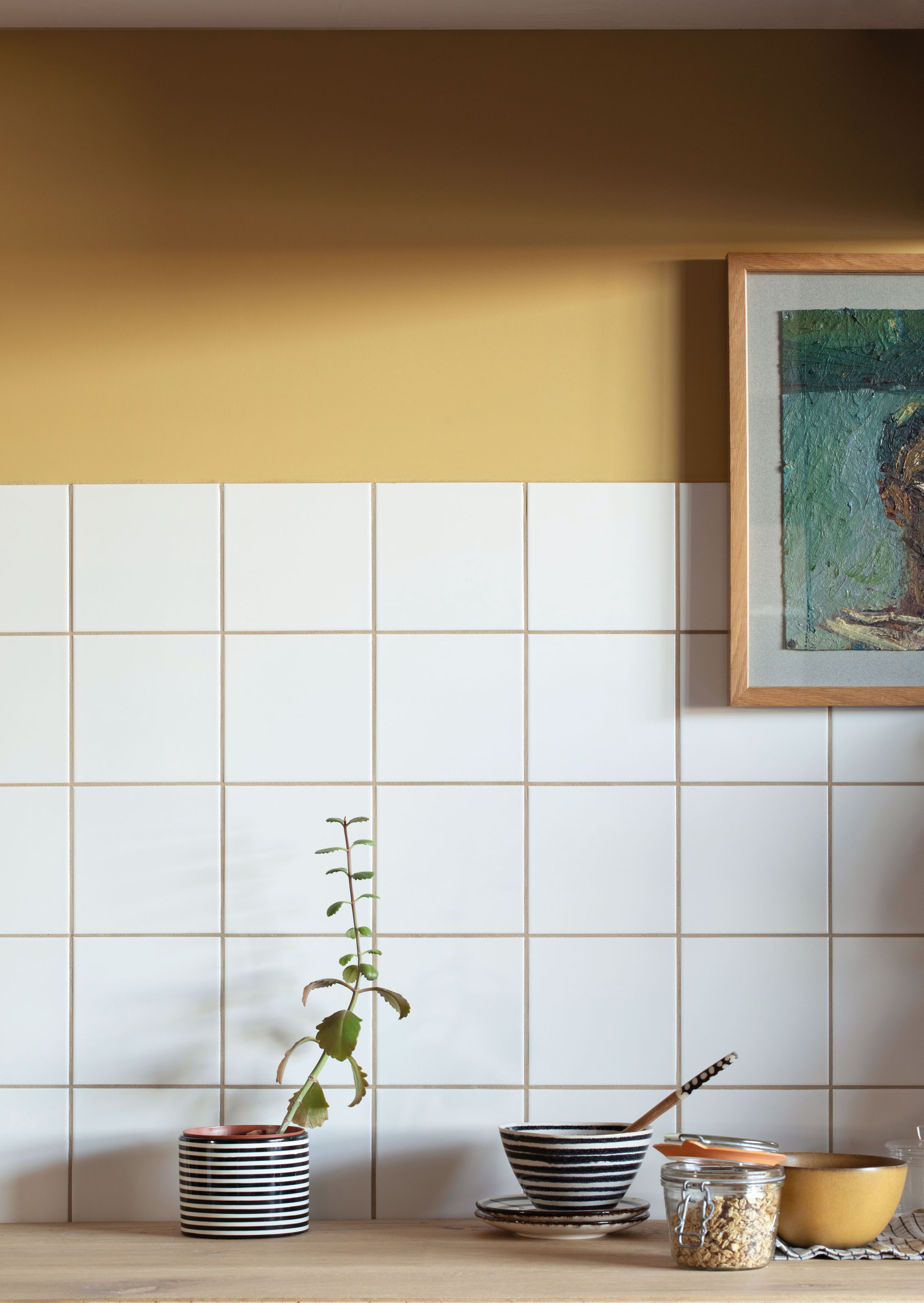
For a fresh take on a simple white tile, consider using a more interesting color grout than simply white, grey or black. In a kitchen backsplash design such as this, created by Claybrook, the grout rather than the tile becomes the point of interest, tying in with the wall paint and giving the simple splashback something more to say for itself.
'However you need to be careful when pairing colored grouts with white tile,' warns Claybrook's Rob Whitaker. 'Any imperfections in the surface glaze of the tile, particularly if handmade or hand-glazed, will trap darker grout. This can be hard to rectify and will spoil the desired effect.'
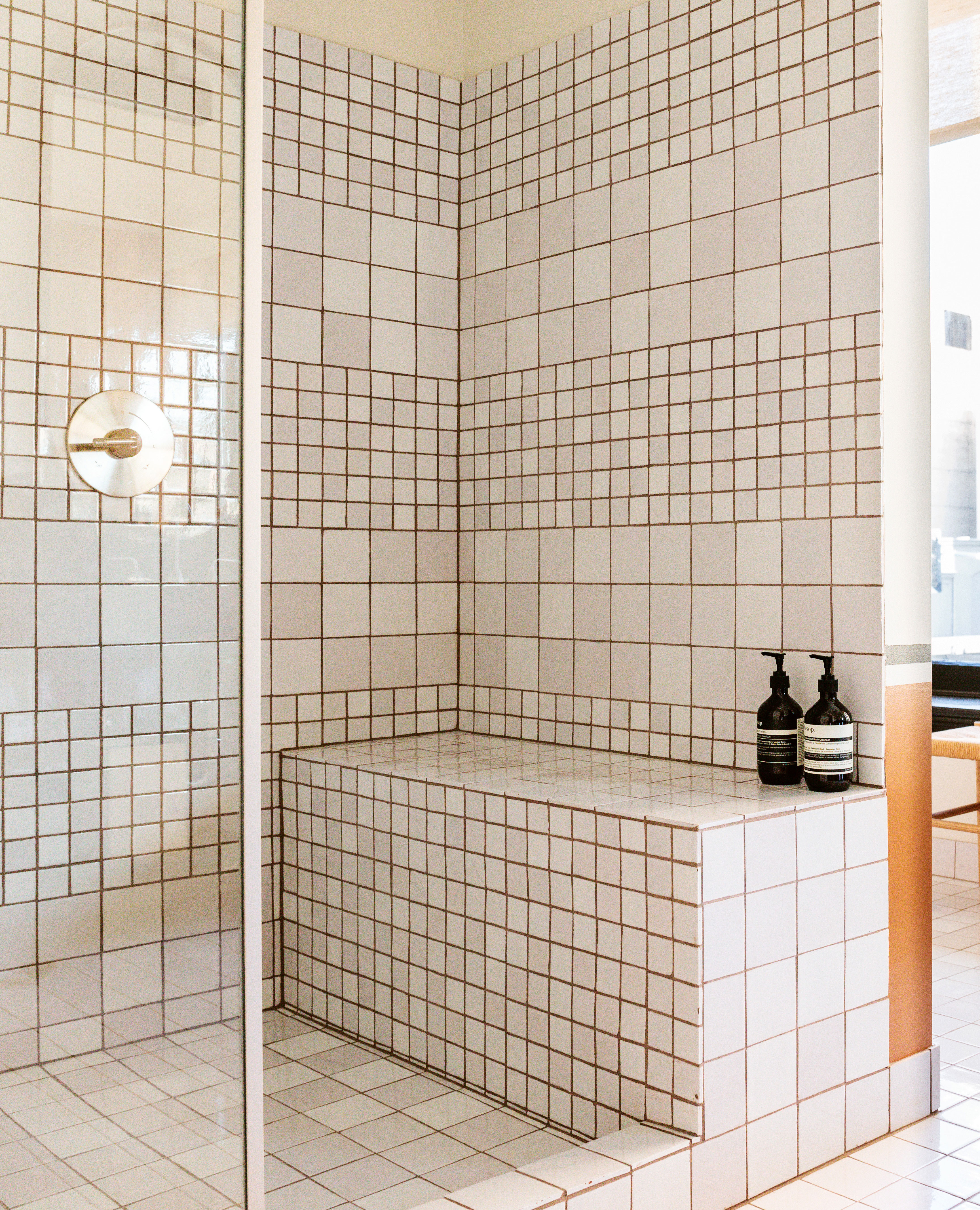
Remember, your choice isn't limited to standout shades – when it comes to specifying a grout for a white bathroom idea, sometimes it pays to be more nuanced.
Take this bathroom design from Kelly Wearstler's Proper Hotel in Downtown LA as an example. Complementing the wider color palette adopted across the hotel, Wearstler has added interest to this white shower tile idea by making a simple switch from grey or black grout to a dark brown one, creating a little moment – subtle, but engaging – that helps elevate this space beyond the everyday.
2. Opt for dark on dark for a sophisticated look
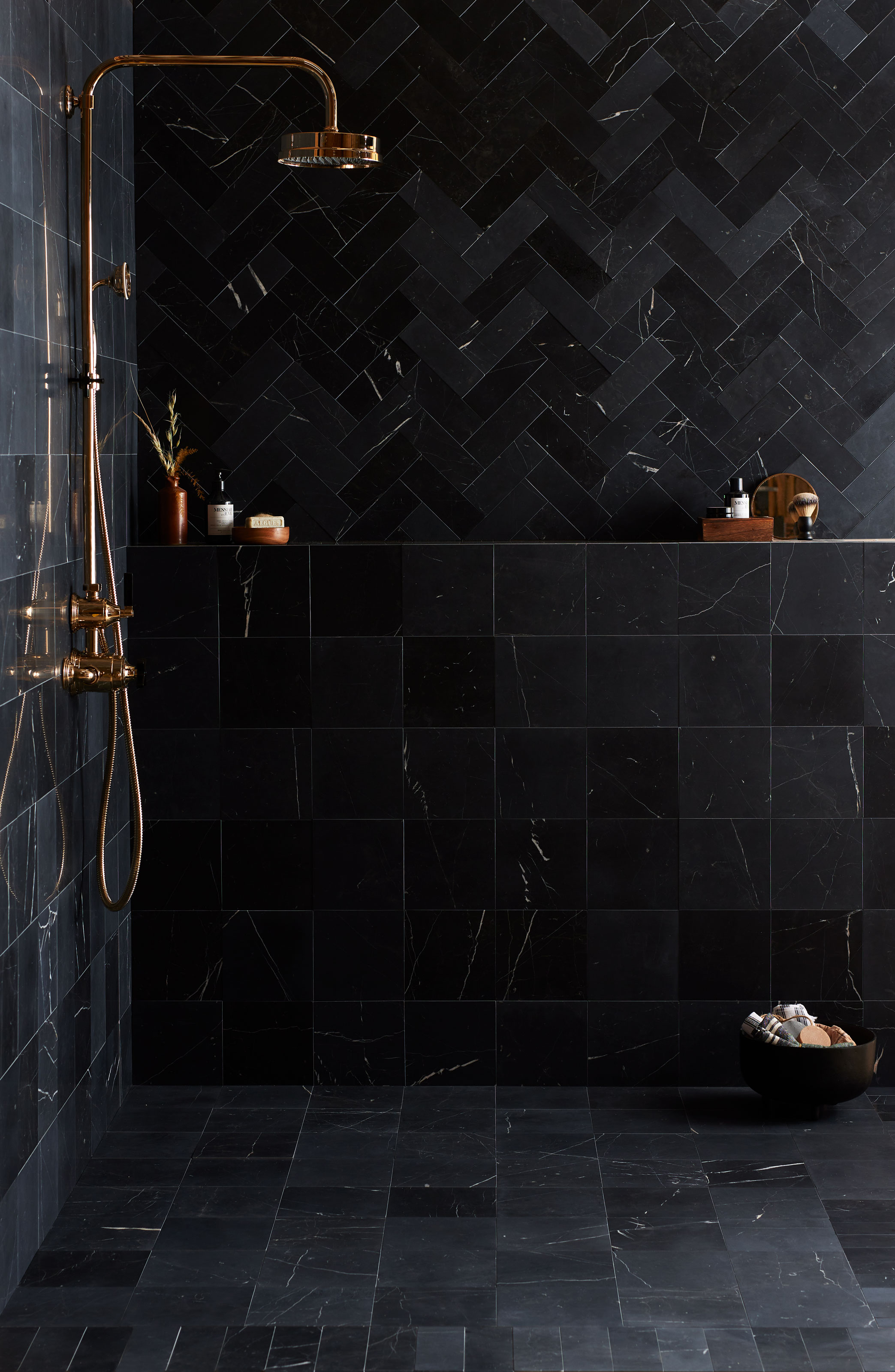
Contrast isn't always the desired effect when it comes to tile and grout color combinations, and using matching colors can be equally as striking in the right application.
'By using a grout with a similar color tone to the tile itself, the focus becomes the beautiful finish of the glaze rather than the appearance of being individually fitted pieces,' continues Rob. 'The sense of a wall continuously clad in one stunning material is created, which draws the eye across and around the space.'
Dark-on-dark tile and grout color combinations are particularly effective, especially using colors such as blue and black.
'Pairing black tiles with black grout is a sophisticated and modern pairing that will certainly make a statement for a dark bathroom idea,' says Lee Thornley, founder of Bert & May.
While black grout, as with any colored grout, has a tendency to fade over time, Lee doesn't see this as a reason to shirk away from experimenting with dark styles. 'We like to think that the natural fading and development of a gradient-like finish adds intrigue, texture and depth,' he says.
3. Choose off-white grout for artisanal-style tiles
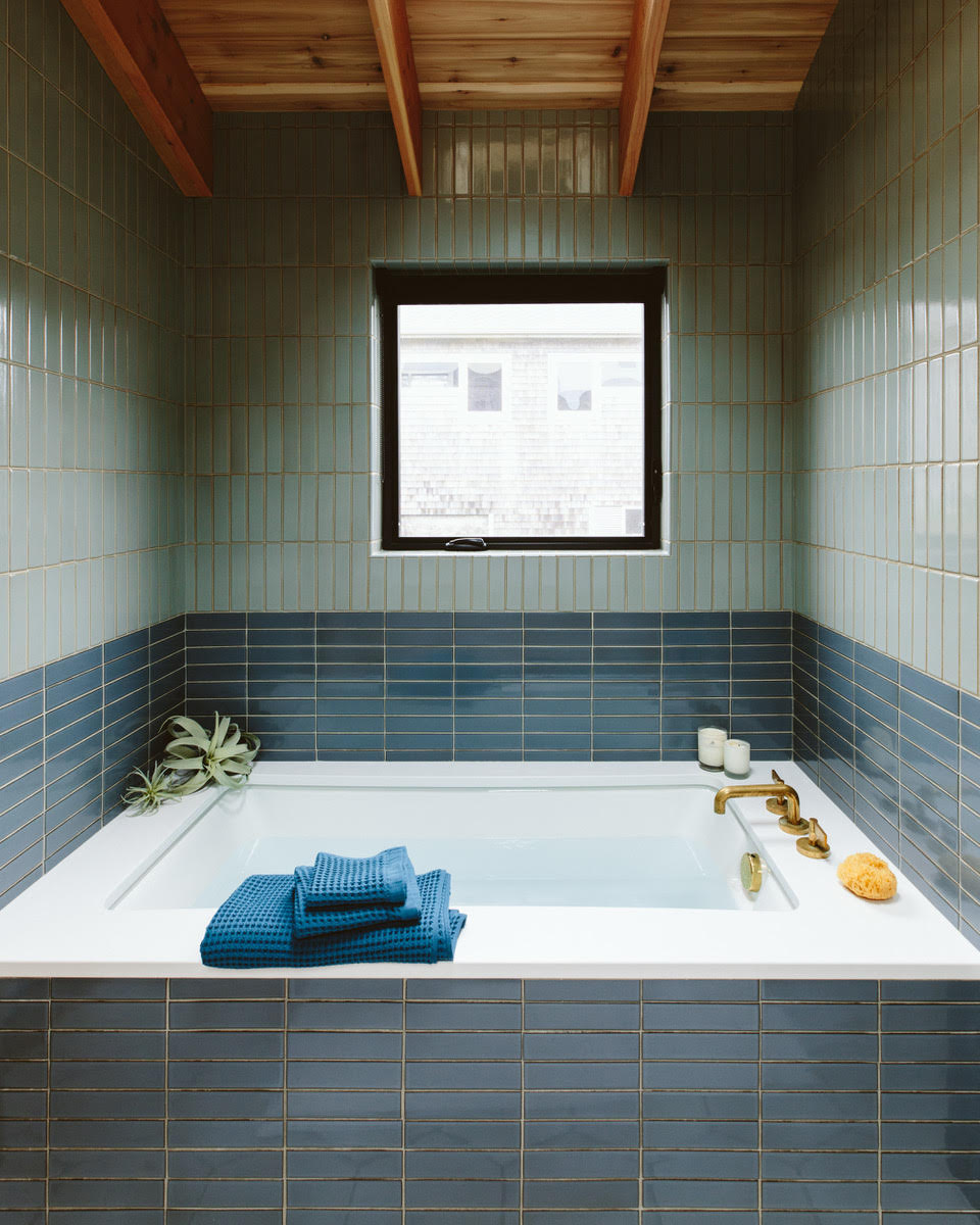
A stark white grout can make for an effective contrast to the right tile, but when combined with tiles, especially ceramic or encaustic styles, with artisanal qualities such as irregular edges or rich glazes that are a popular bathroom trend at present, this color of grout can look particularly artificial.
'By removing a contrasting grout color, the hand of the maker becomes more evident in the surface and design of the tiles as these become the key focal point of the room, rather than drawing attention to the way they were adhered and finished,' says Claybrook's Rob Whitaker. 'The resulting space feels more custom-created rather than completed for efficiency or convenience.'
Off-whites and beiges make an effective choice in these instances, softening the contrast and retaining focus on the craft qualities of the tiles. In this design by Portland-based designer Max Humphrey, with architecture by Beebe Skidmore, a beige grout has been applied to these handmade tiles —both a stylish and practical choice, as this beige color will be much more forgiving when it comes to cleaning this highly-tiled area.
4. Go bold with a complementary color scheme
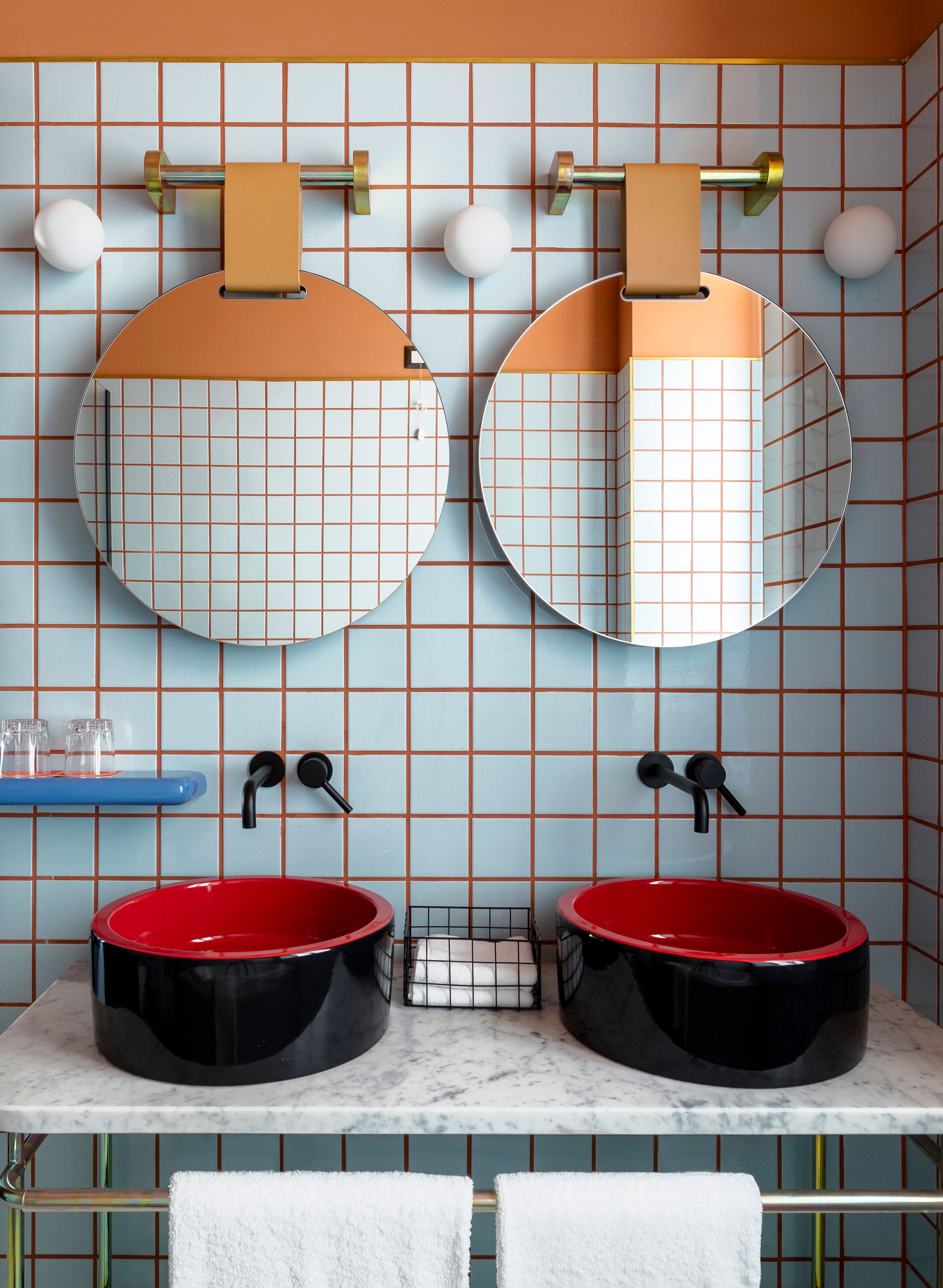
When you hear talk of a complementary color scheme, it's about more than simply colors that work well together. A complementary color relationship is made up of two colors that sit opposite each other on the color wheel.
The use of diametrically opposite colors well in an interior scheme can be hard – some of these color combinations are reminiscent of logos and branding, corporate color palettes and, in the case of red and dark green, Christmas.
However, the right tile and grout color combination in the right space can result in an energetic scheme using bold color in the bathroom. Take for example this bathroom created by multidisciplinary designer Patricia Urquiola for Room Mate Giulia, a boutique hotel in Milan, which uses a vibrant combination of blue tiles and orange grout.
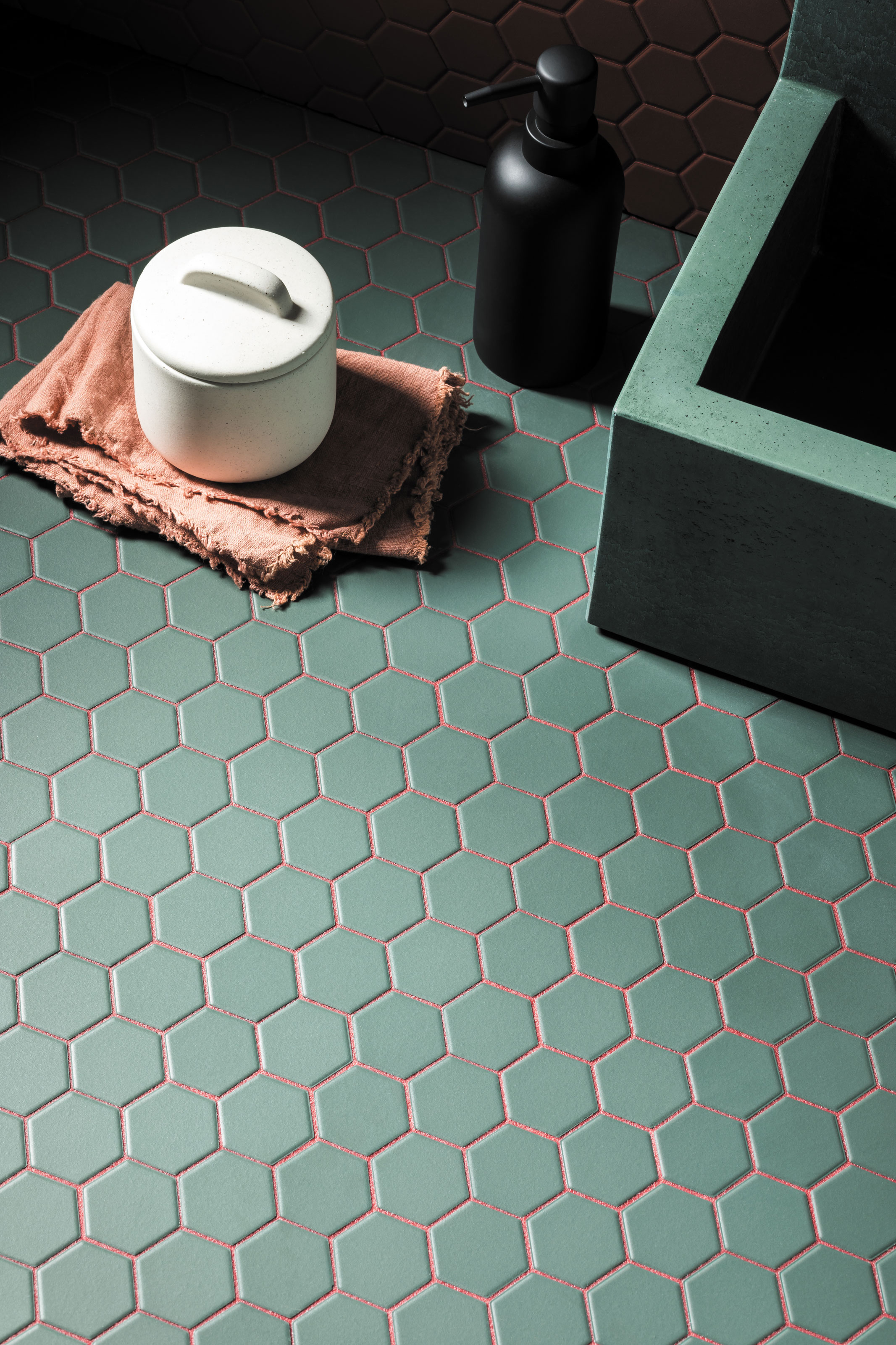
A softer (and for some more palatable) combination is pink and green – a tried and trusted pairing that's regularly used in interiors.
'Green and pink is the color combination of the moment and these deep green mosaics set off with the pink/red grout makes a stylish and eye-catching statement,' says Louisa Morgan, creative director of Mandarin Stone. For a truly complementary pairing of these colors, opt for a green with yellow tones, but deep rich greens can be just as effective in this combination.
5. Experiment with a bold triadic bathroom combination
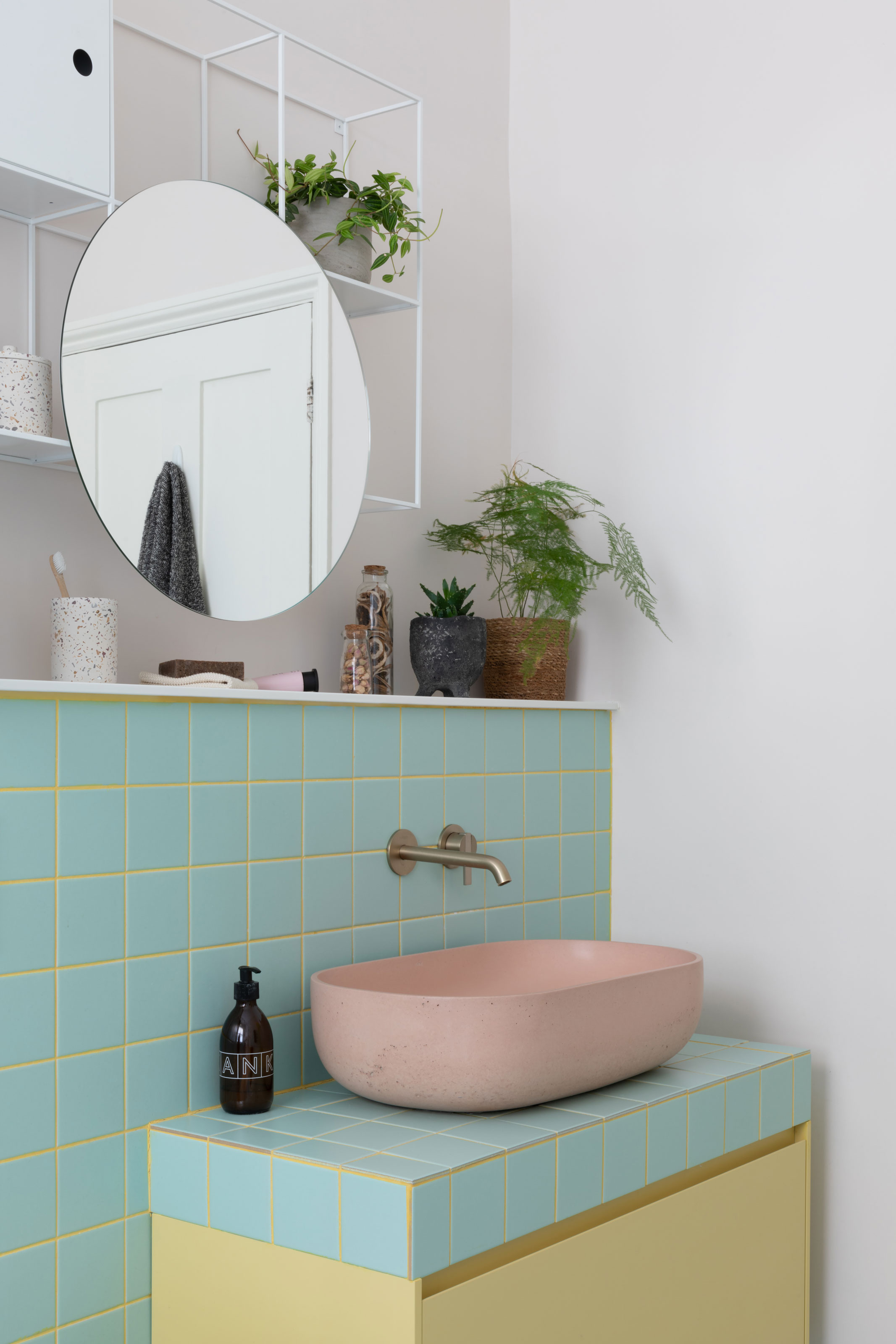
Taking another cue from our color wheel, a triadic combination uses three hues spaced equidistantly around the wheel. While these contrasts are less harsh, they naturally result in a scheme with a courageous color mix.
'In a bright and colorful bathroom such as this, we used yellow as a strong contrast to the turquoise tiles, which also highlighted the square shaped tiles giving a retro vibe to the room,' says West One Bathrooms' Susan Roache, designer of this daring small bathroom idea.
A pink concrete basin finishes the triadic color scheme, adding a warm complement to the yellow and blue tones.
6. Reverse color combinations for a playful tiling design
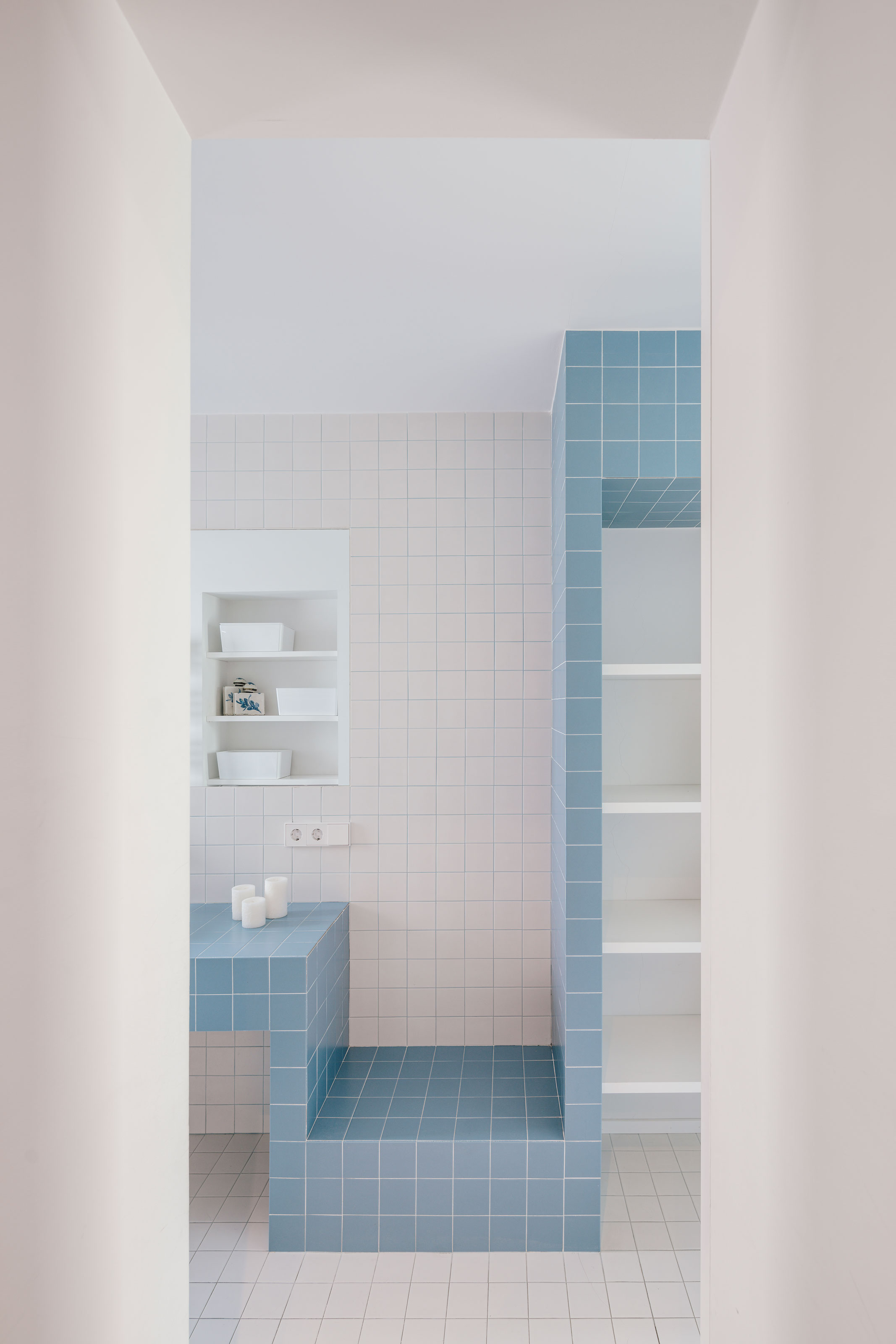
When using two tiles in your bathroom design that are the same, only different colors, reversing your tile and grout color combination for each version is a playful way to approach tiling your space.
If a white grout had been used throughout this design by Spanish architecture firm Zooco, for example, only the blue tile would have benefitted from the contrast created between tile and grout, diminishing the modern, graphic style created in this bathroom. By using a matching light blue grout for the white tile for this bathroom wall tile idea, the gridded design works throughout the space, retaining a contemporary softness by limiting to a two-color contrast.
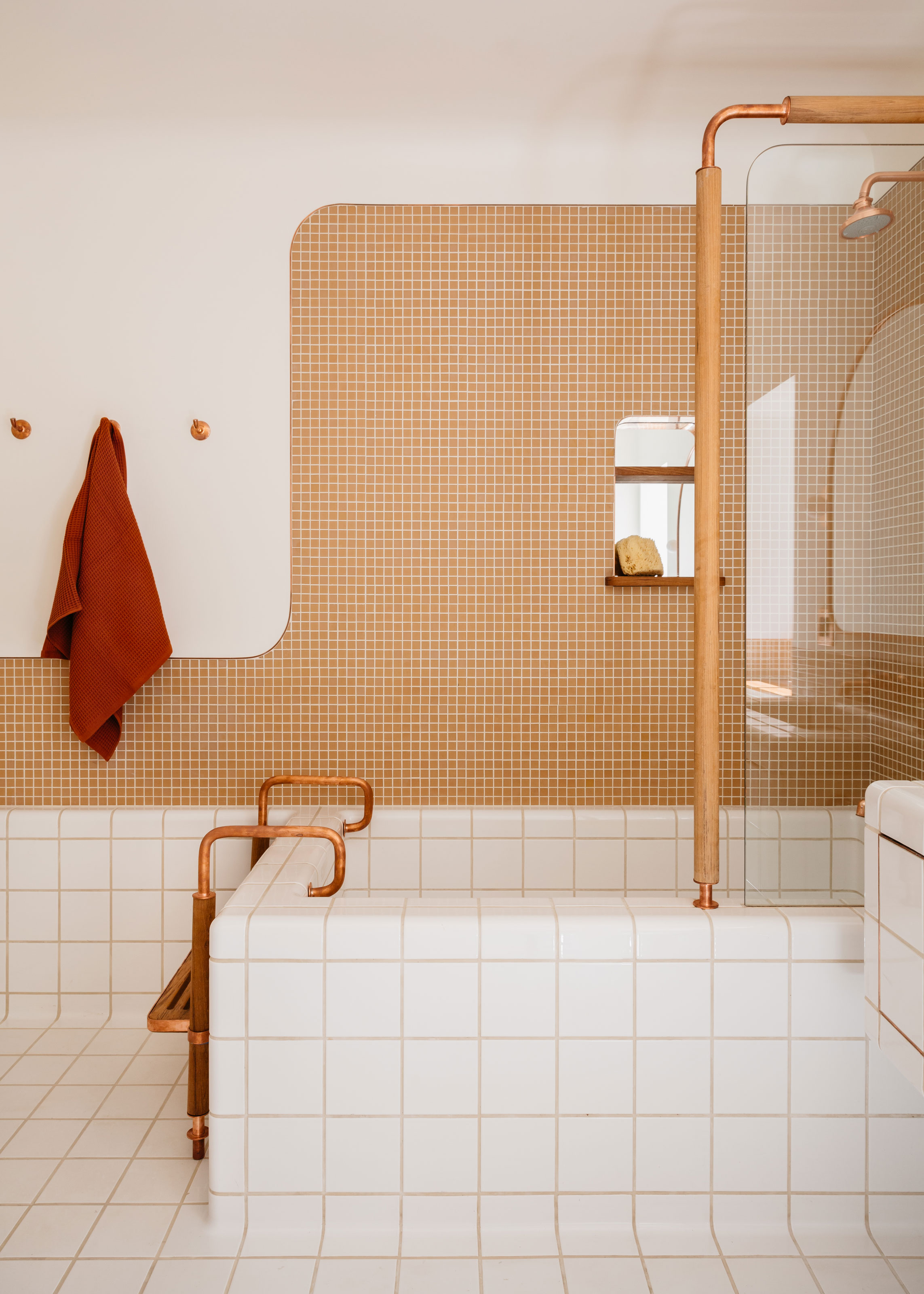
In this design by New York-based Home Studios, a slightly different approach has been used to adapt the same idea, playing with scale in using a square tile with a mosaic. The grout colors used, while not an exact reverse of each other, are a tonal take on the hues used in the bathroom, creating two tiled surfaces that are bridged in color by the use of grout.
7. Complement fixtures with metallic grouting
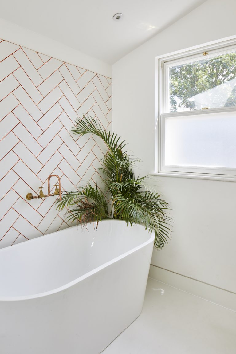
Metallic grout is a bold idea, and undoubtedly not for everyone. However, for the right space, grouting with copper, silver or gold pigments can be a defining feature.
In this design by architect Richard John Andrews, a minimalist all white bathroom is given an industrial edge with raw copper fixtures, highlighted with a copper metallic grouting for a herringbone metro tile wall around the room.
Should grout be lighter or darker than tiles?
Making a decision on whether to go darker or lighter than your tile when specifying grout is largely down to personal preference. The question may hang more on whether you want to highlight the individuality of each tile or downplay this aspect.
'Sometimes we blend the tone of grout in with the tiles, making the lines almost disappear or sometimes we go bold and make a feature,' says Susan Roach, Designer at West One Bathrooms.
'I often use a contrasting grout to highlight a tile layout, like herringbone as we want to make the pattern a feature. Or if the shape of the tile is particularly interesting, like a scallop or hexagon, we want this to stand out rather than blend and would choose an appropriate color.'
It's worth considering the practical differences between choosing dark or light grout. On one hand dark grout is easier to keep looking clean, and will need less treatments for mold, but lighter grouts are less prone to fading, keeping your grouting looking better for longer.
Be The First To Know
The Livingetc newsletters are your inside source for what’s shaping interiors now - and what’s next. Discover trend forecasts, smart style ideas, and curated shopping inspiration that brings design to life. Subscribe today and stay ahead of the curve.

Hugh is Livingetc.com’s editor. With 8 years in the interiors industry under his belt, he has the nose for what people want to know about re-decorating their homes. He prides himself as an expert trend forecaster, visiting design fairs, showrooms and keeping an eye out for emerging designers to hone his eye. He joined Livingetc back in 2022 as a content editor, as a long-time reader of the print magazine, before becoming its online editor. Hugh has previously spent time as an editor for a kitchen and bathroom magazine, and has written for “hands-on” home brands such as Homebuilding & Renovating and Grand Designs magazine, so his knowledge of what it takes to create a home goes beyond the surface, too. Though not a trained interior designer, Hugh has cut his design teeth by managing several major interior design projects to date, each for private clients. He's also a keen DIYer — he's done everything from laying his own patio and building an integrated cooker hood from scratch, to undertaking plenty of creative IKEA hacks to help achieve the luxurious look he loves in design, when his budget doesn't always stretch that far.
-
 Burl Wood Decor Is 2025’s Most Coveted Comeback — Here’s How to Get the Storied Swirls for Less
Irregularity is the ultimate luxury, but you don’t need an antiques dealer to find it
By Julia Demer Published
-
 5 Garden Features That Instantly Add Value to Your Home — While Making Your Outdoor Space More Practical, too
Get to know all the expert tips and tricks for making your backyard a standout selling point for your home.
By Maya Glantz Published