I'm so over white trim! But I love these color combos designers are using to elevate rooms instead
Colored trim is my new favorite way to paint a room. Here are five pairings I'll be trying next
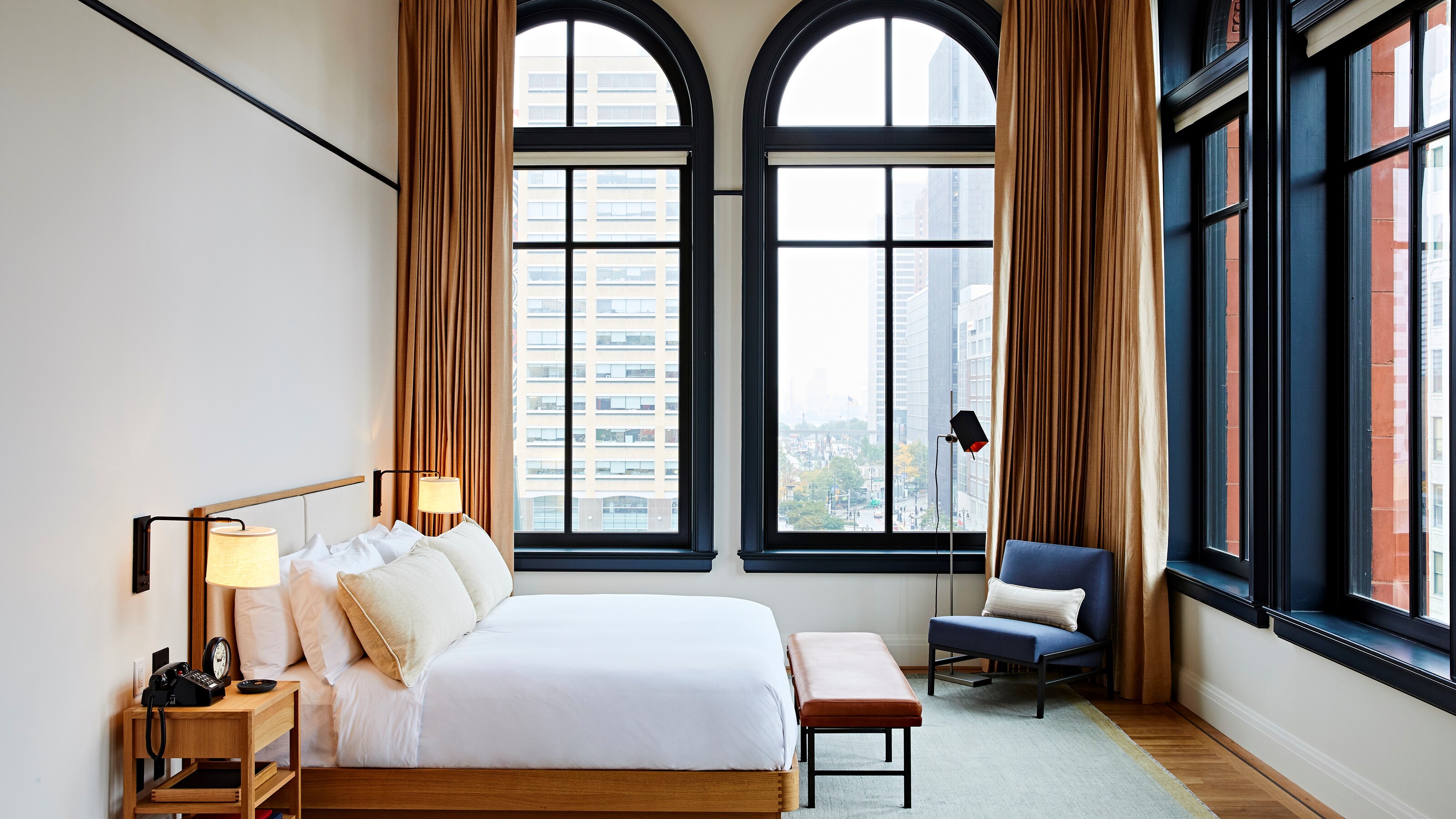

Until recently, I was of the firm belief that white trim was a non-negotiable for any room in the home. I then got swayed by the monochromatic look, with trim, ceilings and doors all in one color creating a design-forward and cohesive look. But I'm starting to see more and more people embracing trim in all sorts of exciting ways.
From marble trim to wood and all sorts of different materials, it's a decorative detail that so often gets overlooked but deserves to be embraced. Paint is where you can really have fun with your trim. It's a quick fix, doesn't require much paint or time, and can be easily updated as trends come and go. Going for joyful colors, brilliant pairings that make your wall color pop, or dark and moody is such a brilliant way to have fun with your interiors. Here are five trim and wall schemes I've seen recently that I love and will hopefully inspire you at home too.
1. Go for a color pop trim against white walls
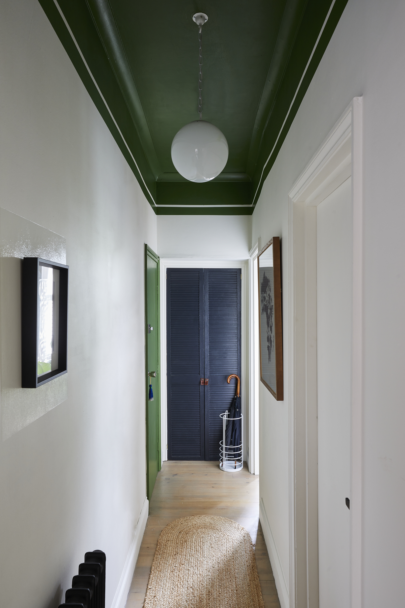
This narrow entryway has been given a new lease of life with a dark, forest green trim paired with crisp, white walls. By painting the door frame in dark green, as well as the ceiling trim and the ceiling itself, it leads the visitor down the corridor and brings a freshness to the white wall paint. A saturated pop of color is one of the best trim colors you can go for - it's fun, fresh and unexpected.
'The use of color in this tall but narrow hallway was planned to play with the proportions of the space. Painting the ceiling in bold green, and bringing that color down onto the walls, has the effect of visually lowering the ceiling to make the space feel more balanced,' says Andrew Griffiths, designer at A New Day.
'With little in the way of architectural detailing, we then used that same color to highlight the front door in contrast to the joinery which is finished in a charcoal blue-grey. It's a simple approach, but serves to make an impact and bring joy to an otherwise featureless space which is the first and last impression of the apartment.'
2. Try one shade darker than your wall color
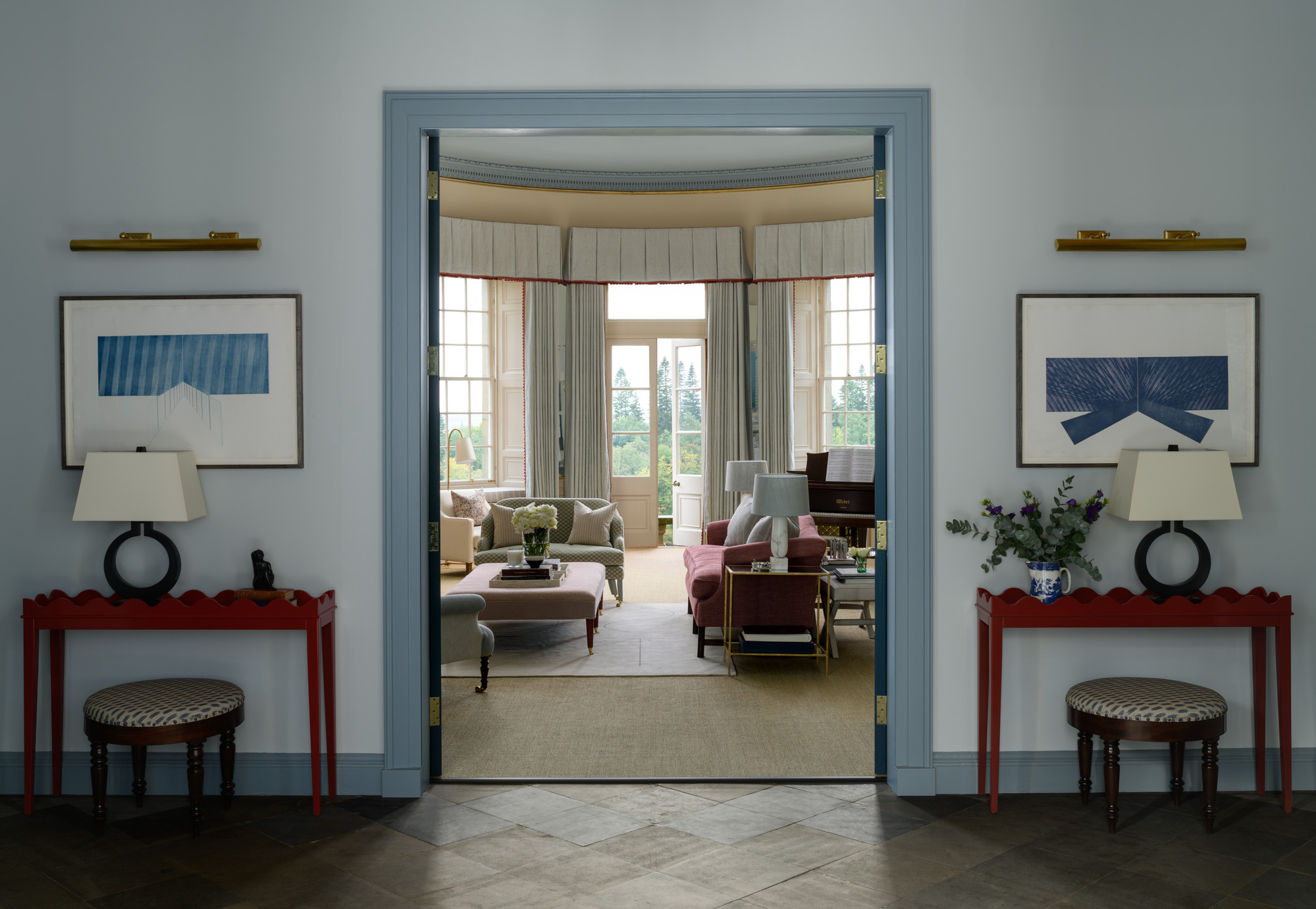
This feels like a natural progression from the popularity of a monochromatic color scheme with the same color walls and trim. Instead of keeping the exact same tone of paint, which often leaves the room feeling flat, those shadows are emphasized with a slight darker tone to the light blue walls, designed by interior designer, Olivia Emery.
'This image is of the main hallway in the house and by using the darker blue trim on the skirting and door frame your eye is drawn into the drawing room and the beautiful landscape beyond,' says Olivia. The paint here is both from Benjamin Moore - the walls in Benjamin Moore's Grey Cashmere and the woodwork in Benjamin Moore's Van Courtland Blue.
3. Select colors from opposite side of the color wheel
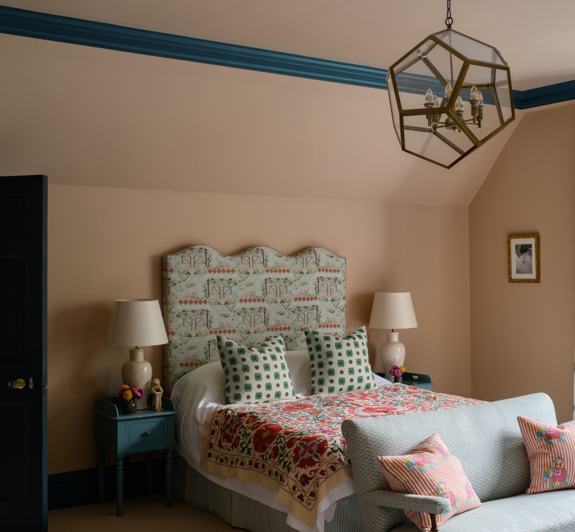
Whenever I'm struggling with color pairing, I always like to look to the color wheel and color rules for inspiration. It's a guide to how to pair and will point out to you what works with what. You need only look at the opposing ends of the spectrum to figure out what works best.
This bedroom from Olivia Emery is a great example of this in action, where peachy walls are complimented by the blue of the trim - with the two shades sitting opposite each other on the wheel. Olivia chose Farrow & Ball's Setting Plaster for the walls and Benjamin Moore's Varsity Blues for the trim, helping both colors to stand out even more.
'This guest bedroom scheme was developed from the client's beautiful antique existing blue side tables and desk, we chose a blue to compliment these but also contrast dramatically with the dusty pink walls which would have felt a bit wishy-washy in a room this size without the impact of the bold woodwork,' says Olivia.
4. Create drama with a jet black trim
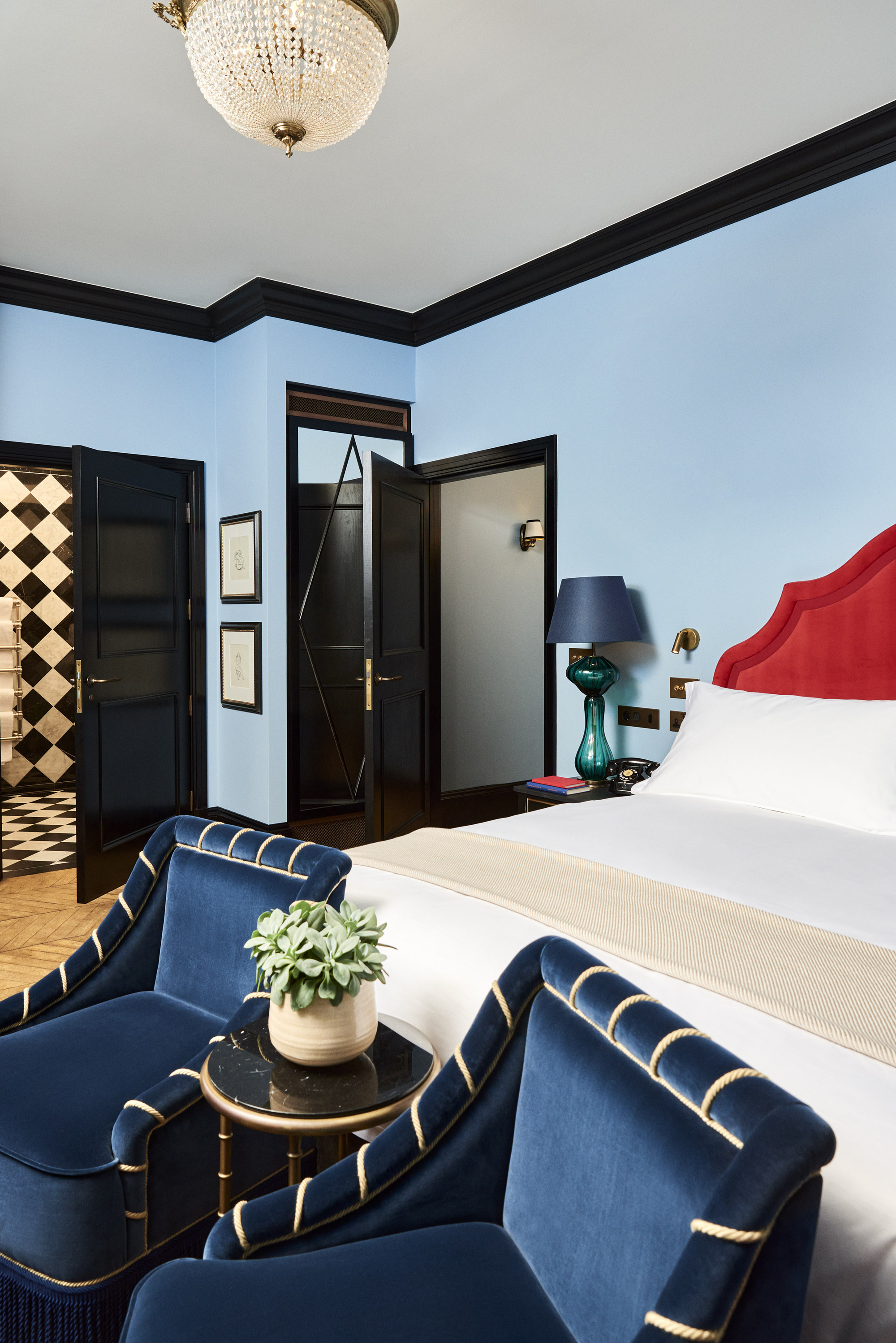
Flip your trim and go seriously dark instead of bright white. A dark color or even jet-black paint can give your room a neat border, highlighting the lines in the space and encouraging you to acknowledge the architecture of the home. International designer, Natalia Miyar designed this bedroom with black trim, bringing an Art Deco design and drama to the room.
For that extra sheen that Natalia has gone for here, think about the quality of the paint too. ‘Contrasting matt emulsions with high glosses is a great way to add different textures with your wall finishes, definitely, one to keep in mind as a design trick,’ adds Angelica Squire of Studio Squire.
5. Pick a bright color from wallpaper
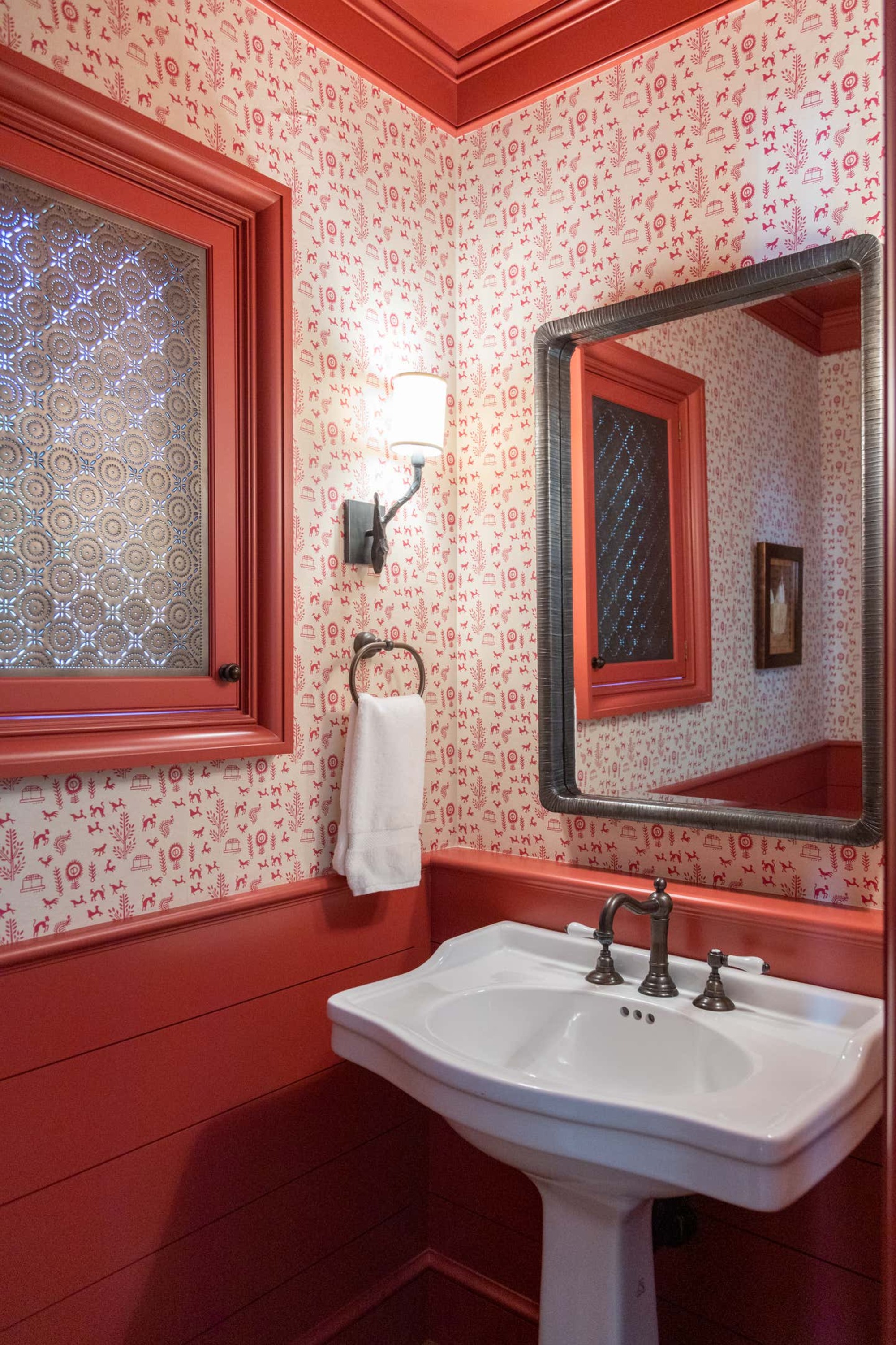
Finally, I love this simple, but bright and joyful trim and wall combination from Tom Stringer. By selecting a dark coral color directly from the wallpaper for the trim of this powder room, it pulls the whole scheme together and creates an unexpected and joyful scheme and a powder room that pops.
3 of my favorite paints for trim
Be The First To Know
The Livingetc newsletters are your inside source for what’s shaping interiors now - and what’s next. Discover trend forecasts, smart style ideas, and curated shopping inspiration that brings design to life. Subscribe today and stay ahead of the curve.

Former content editor at Livingetc.com, Oonagh is an expert at spotting the interior trends that are making waves in the design world. She has written a mix of everything from home tours to news, long-form features to design idea pieces, as well as having frequently been featured in the monthly print magazine. She is the go-to for design advice in the home. Previously, she worked on a London property title, producing long-read interiors features, style pages and conducting interviews with a range of famous faces from the UK interiors scene, from Kit Kemp to Robert Kime. In doing so, she has developed a keen interest in London's historical architecture and the city's distinct tastemakers paving the way in the world of interiors.
-
 7 Pantry Organization Mistakes That Are an Organizer's Worst Nightmare
Get that Pinterest-perfect pantry by avoiding these certified organization faux pas
By Amiya Baratan Published
-
 Burl Wood Decor Is 2025’s Most Coveted Comeback — Here’s How to Get the Storied Swirls for Less
Irregularity is the ultimate luxury, but you don’t need an antiques dealer to find it
By Julia Demer Published


