Two color combinations for bedrooms – expert shortcuts to creating a beautiful palette for your space
Try these expert-approved two color combinations for bedrooms to create a restful, beautiful scheme for your room
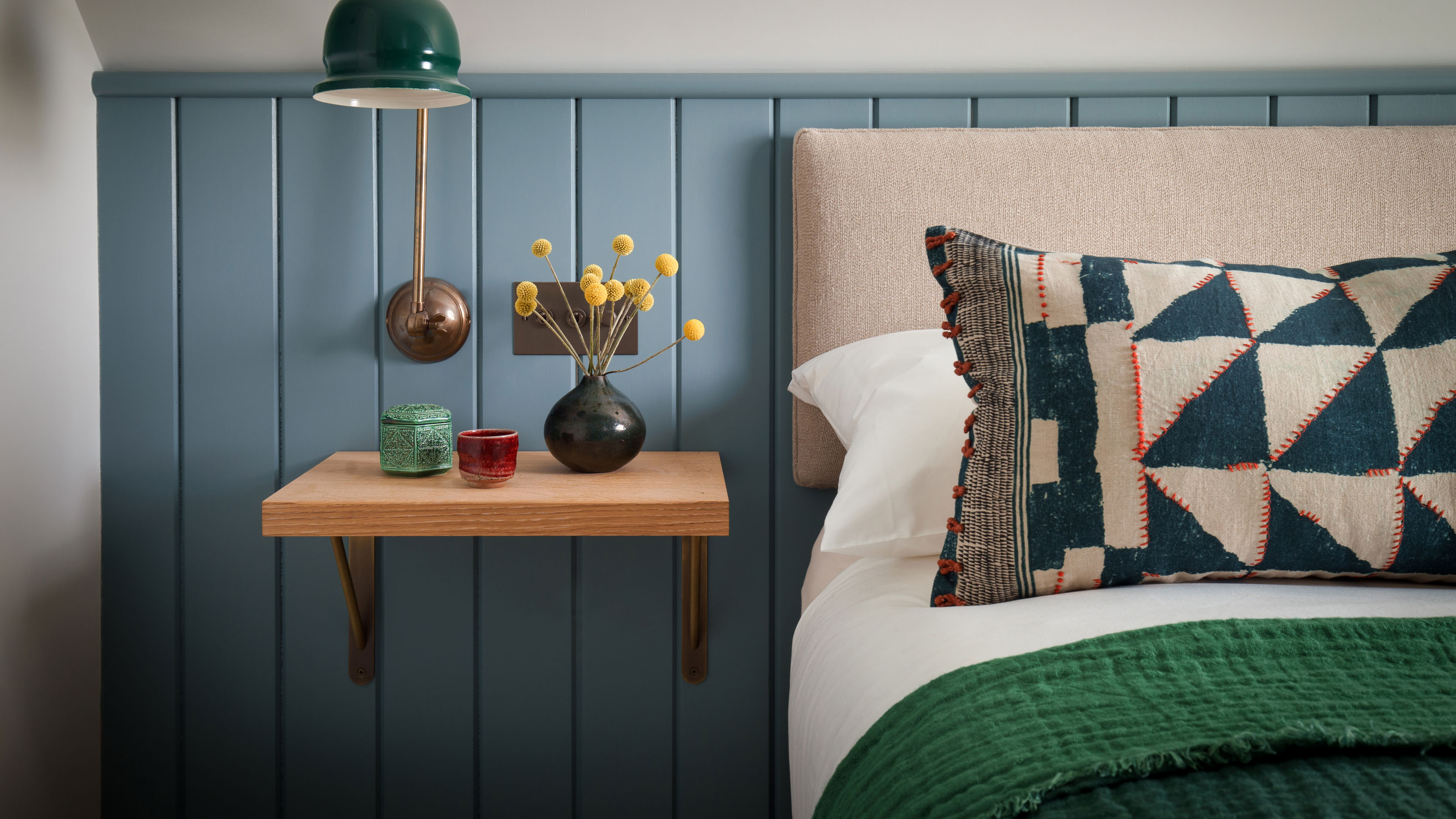

Two-color combinations for bedrooms make building a palette for your scheme easy. But while there are plenty of colors that naturally go together, picking colors for a bedroom is a different story. The colors we choose affect our moods and can either make us feel happy and energized or deeply relaxed. The question is what kind of bedroom you want to create.
When it comes to bedroom color ideas, a two color combination might be all you need. These two main hues can be used to define the design of the entire room, and help create a unified, cohesive color scheme.
There are several ways to play up two tones. You could choose two complementary colors like yellow and orange or red and purple for a striking effect. You could even go for a timeless pairing such as the classic black and white, or the natural tones of green and blue. Even pink and grey can create an eye-catching visual, and so can two tones of the same color.
'Another great color combination is different shades of white,' says architect Jeanne Schultz. 'Depending on how the light moves throughout the day, various tones of white will absorb or reflect light. Choose the right white.'
To bring you some go-to color pairings for your bedroom, we asked designers for their most effective two-tone color scheme for the bedroom.
10 two color combinations for bedrooms you'll want to copy
1. Two tones of pink
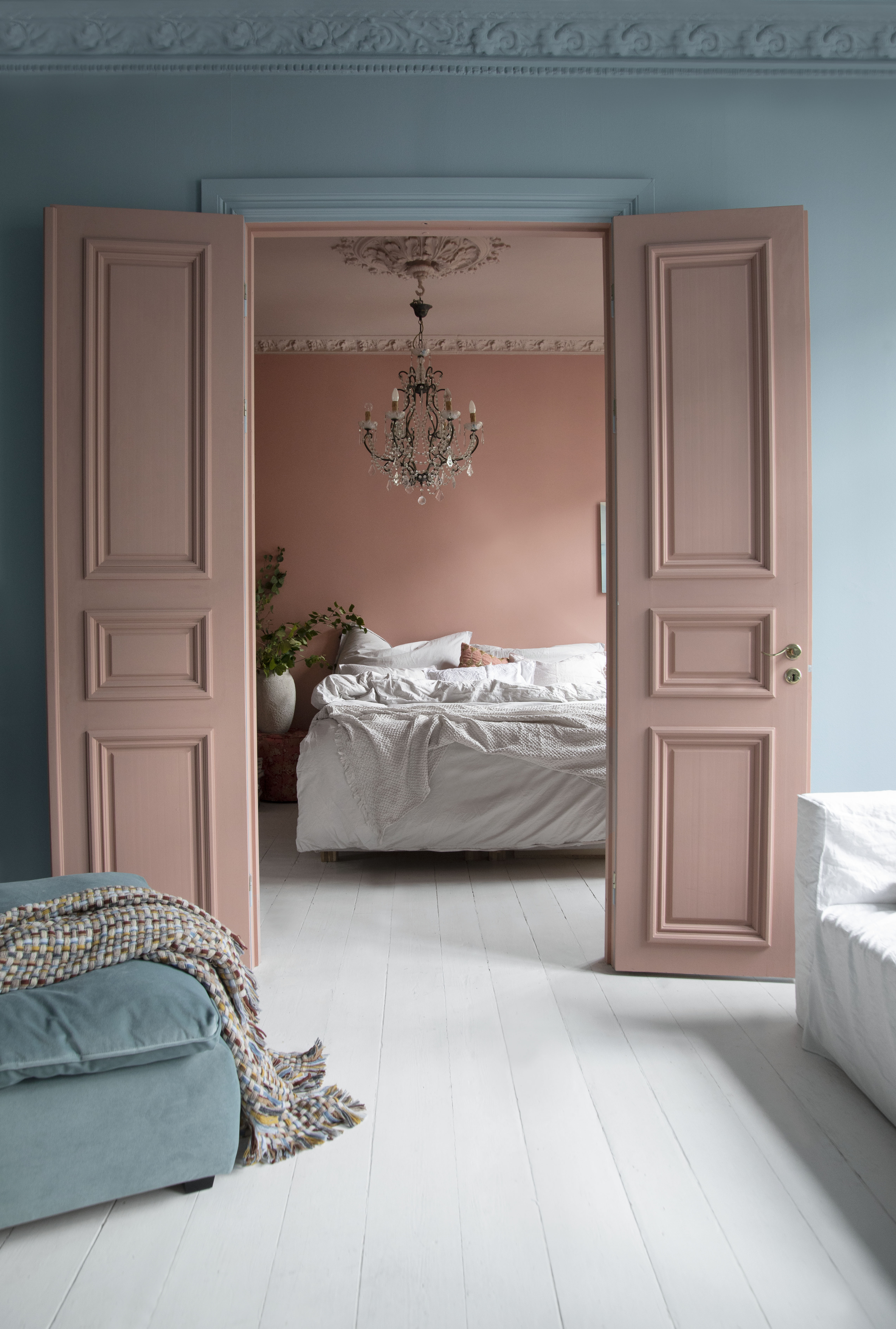
Pink is timeless and serene, plus there’s a pink for every mood and personality.
If you are enchanted by this hue and would love to envelop your modern bedroom in this tone then a two-tone shade of the same color could work. Perhaps choose a pink that has a touch of brown, making it less pastel and more neutral. The two pinks used in this room help separate the walls from the ceiling and woodwork. The colors are soft and inviting, all juxtaposed against the white bedding
'We used Polar Blue on the outside walls and Chalky Coral plus Skin Powder on the inside walls, all from Pure&Original,' says stylist, interior architect, and designer, Tone Kroken.
2. Red and grey

Red is a powerful color, both in its appearance and meaning. It is usually associated with love, passion, and even anger. In our homes, red is just as potent. The color makes an impact and creates a bold interior.
As a bedroom idea, while red walls do look striking, they need to be balanced else the room may become too high energy and distracting, making it difficult to sleep in. One way of doing this is by choosing the more earthy tone of red, say terracotta that has plenty of brown in it. Otherwise, use it only as an accent tone.
Another good consideration is where you plan on using red. In a south-facing room that receives a lot of light, it's best to choose a chalky, matt color of red, that does not shine bright and startle the dwellers. In North-facing rooms, that receive colder light, the best reds are warm burnt umber reds.
One great companion for red is grey, a neutral for all seasons and a wonderfully grounding tone. Here, the headboard and the bedding in grey reduce the bright tones of red and make the scheme warmer. The second wall in wood helps further reduce the strong visuals of red.
3. Black and white
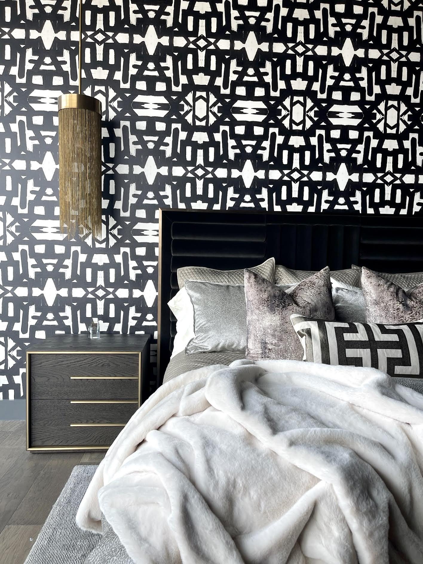
Black and white is a classic color combination; one for all seasons and styles of home. Black and white, whether in the form of a graphic wallpaper pattern, along with bedding, can help create a glam bedroom.
Ideally, black serves as an anchor, heightening any decorating composition, and white stands in as the light feature, driving black to stand out even more. This two-color bedroom combination is powerful, and lately, it has been a popular trend in interior design.
In this bedroom, the black and white wallpaper in a graphic print is complemented by the deep black headboard and side table. Injecting relief to the scheme is the white bedding. A great punch of hue to a monotone scheme is gold, which is always uplifted against the deep tones.
'Another way with black and white is by embracing a clean white color scheme to open up a space, then using accents of black on paneling, trim or a linear divider to make a real statement,' says Helen Shaw, director at Benjamin Moore UK. 'Alternatively, for a more industrial feel, consider a layered scheme with black brassware and darker grey accents to create a sleek look.'
4. Pink and blue
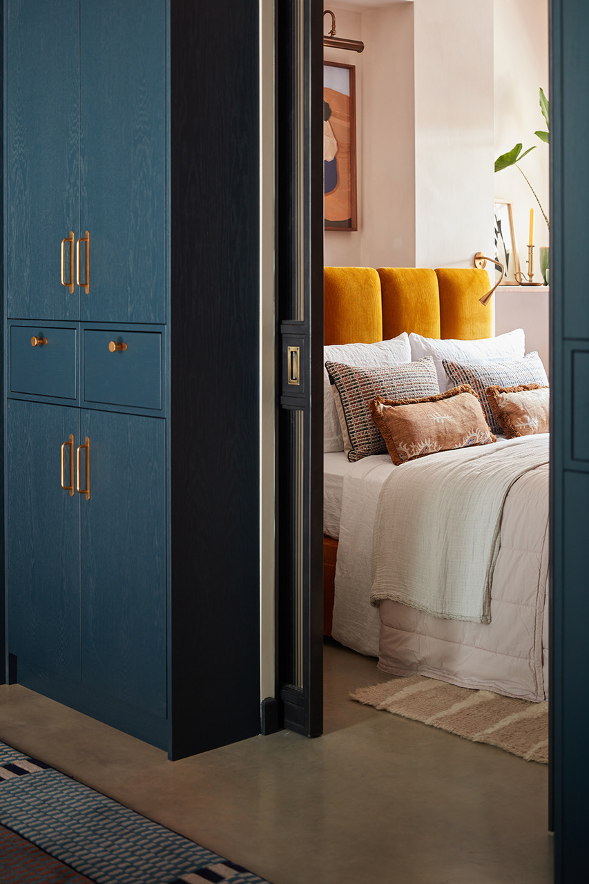
Pink and blue as a combination look striking. That's because the two sit on opposite ends of the color wheel and make for a great contrast. Think peacock blue with bright pink for an impactful, pretty bedroom. Or a turquoise blue and powder pink. All delicious and visually sumptuous.
Helen says, 'Pink and a blue, although very different hues, can appear complementary together providing that a cool shade of pink which leans more towards the lilac family is chosen. Following this technique is a foolproof way to create unusual and eye-catching color pairings without forming an accidental color clash.'
In this bedroom, the anchoring blue and pink are punctuated with yellow for another interesting color layering.
'We love this combo for bedrooms,' says Anna Burles, principal designer at Run For The Hills. 'Sitting somewhere between bright turmeric and a more earthy golden brown, we use hints of ochre to bring life to the bedroom’s soft furnishings and upholstery. The trick is to counter-balance this with something darker and a little more subdued. So we used Farrow & Ball’s Hague Blue on the dressing room joinery for this boutique basement bedroom to act as a frame as you look into the room and as a contrast to the zingy ochre headboard upholstery. The antique brass handles on the joinery connect to the warmth of the velvet. It’s all about contrast but making it feel fun but grown-up and sophisticated.'
5. Green and blue
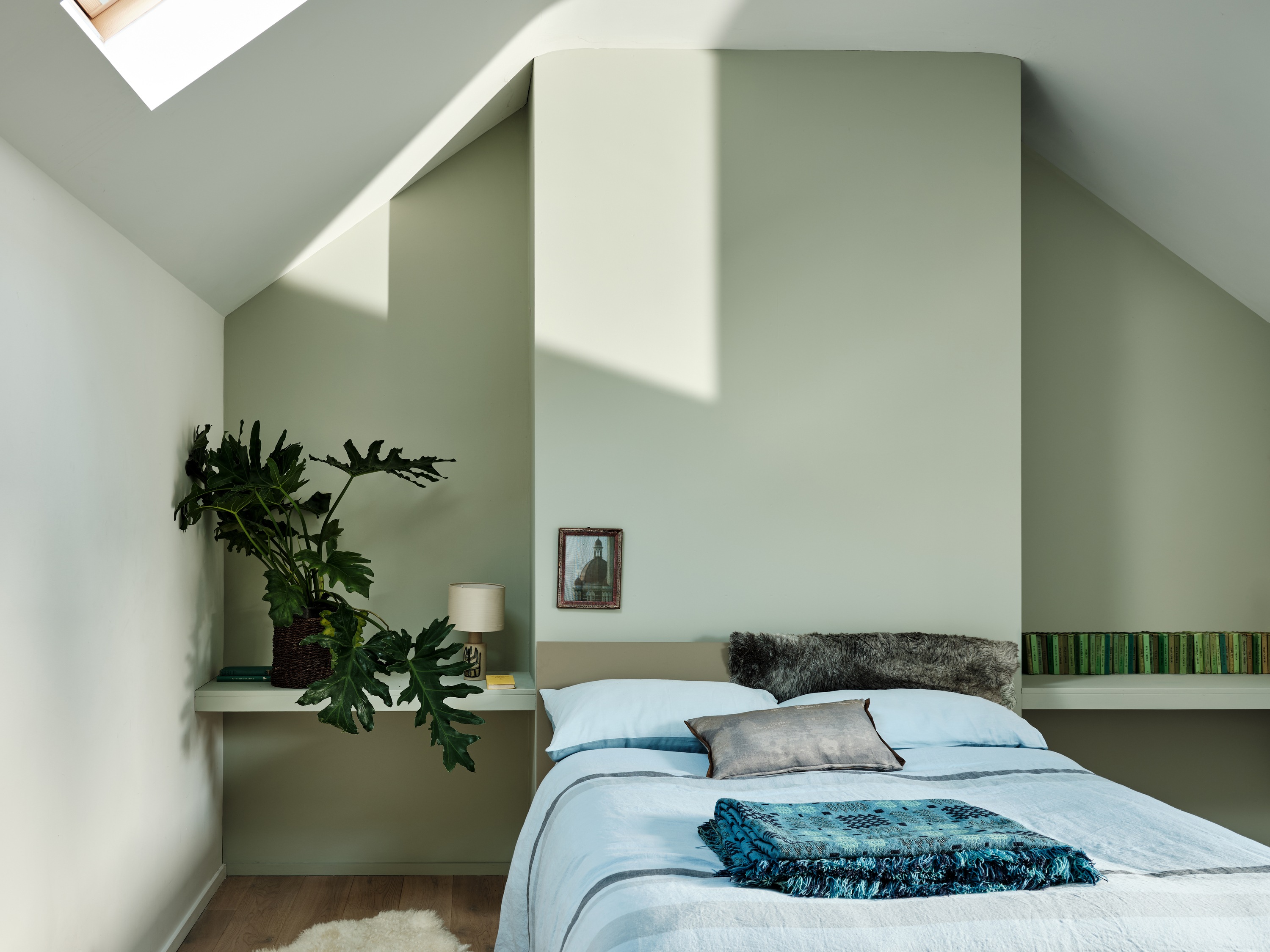
A pure nature palette, green and blue will evoke the visuals of the forest and the sea, the horizon where the sky meets the earth, and the bright fruits and vegetables in your backyard patch. The two colors sit next to each other in the color wheel and create a beautiful, complementary scheme.
These colors work together surprisingly well in super pale shades, so you don't always have to resort to bright tones. Just be sure to select a shade that has a good bit of grey for a more minimalist bedroom scheme. Interestingly, soft shades of green and blue, both can be great alternatives to white and can make a room feel light, bright, and open.
'In regards to color combinations for bedrooms, a green-blue can work well to create a relaxing room,' says Rachel Brimacombe of MW Architects. 'Keeping to one main color with perhaps small accents of further color helps keep the environment uncluttered, increasing the calming mood.'
6. Lavender and white
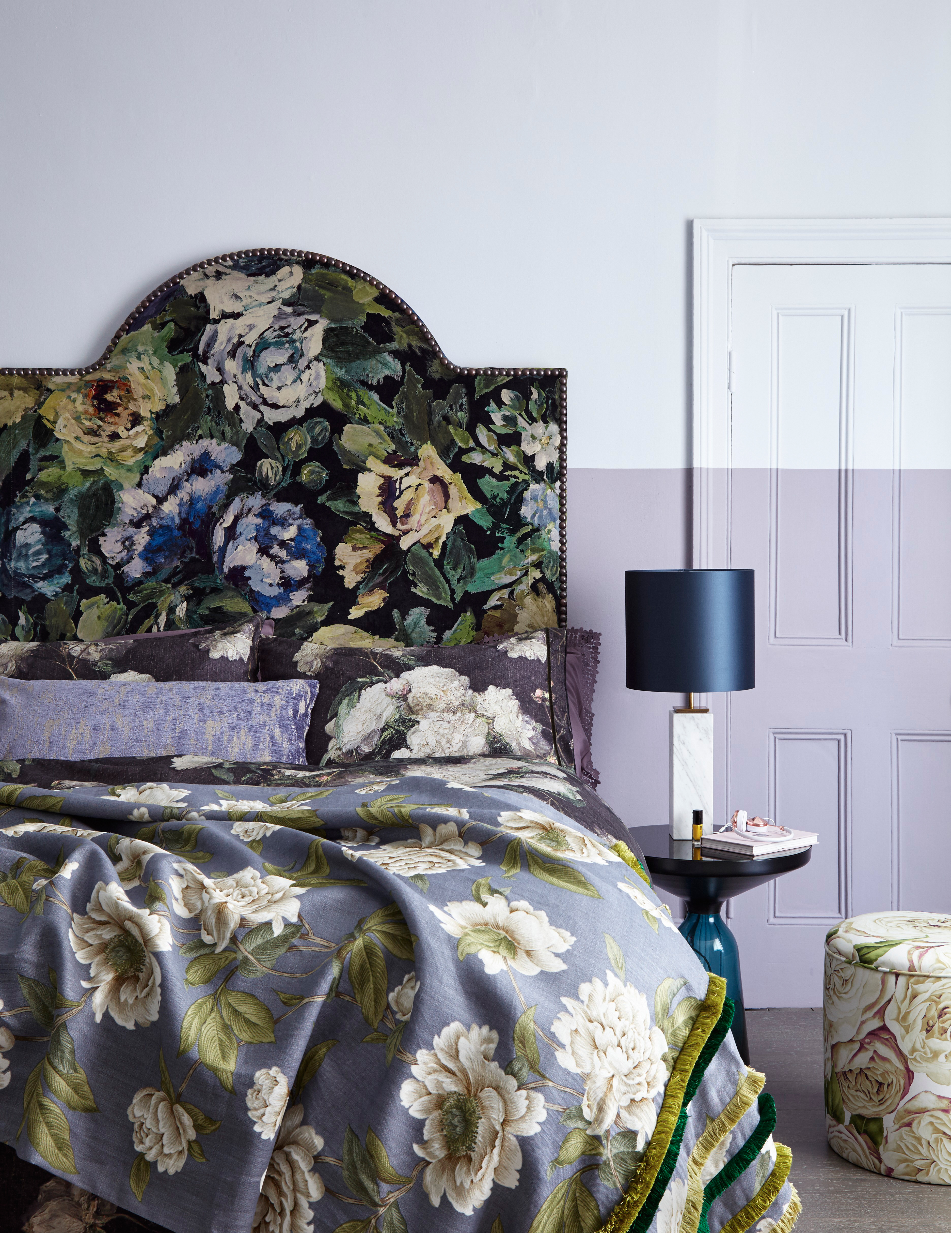
This spring-like color has a dewy freshness to it. A sophisticated, varied, and versatile color, lavender can work in any room of the house.
The hue is a mix of violet and white, and incorporates within it an immense spectrum of colors, from light purples to pale pinks, to blues and greys. People usually prefer the purple and pink versions of it that look more neutral, elegant, and grown-up. In fact, world's best interior designers are all picking this shade as the smartest new trend in relaxing bedrooms.
Largely, every variation of lavender looks crisp and bright with white. The muted second color lifts the look and presence of lavender and makes it look modern.
Interestingly, lavender is the perfect backdrop for glamorous hues such as gold as well.
7. Navy and light blue
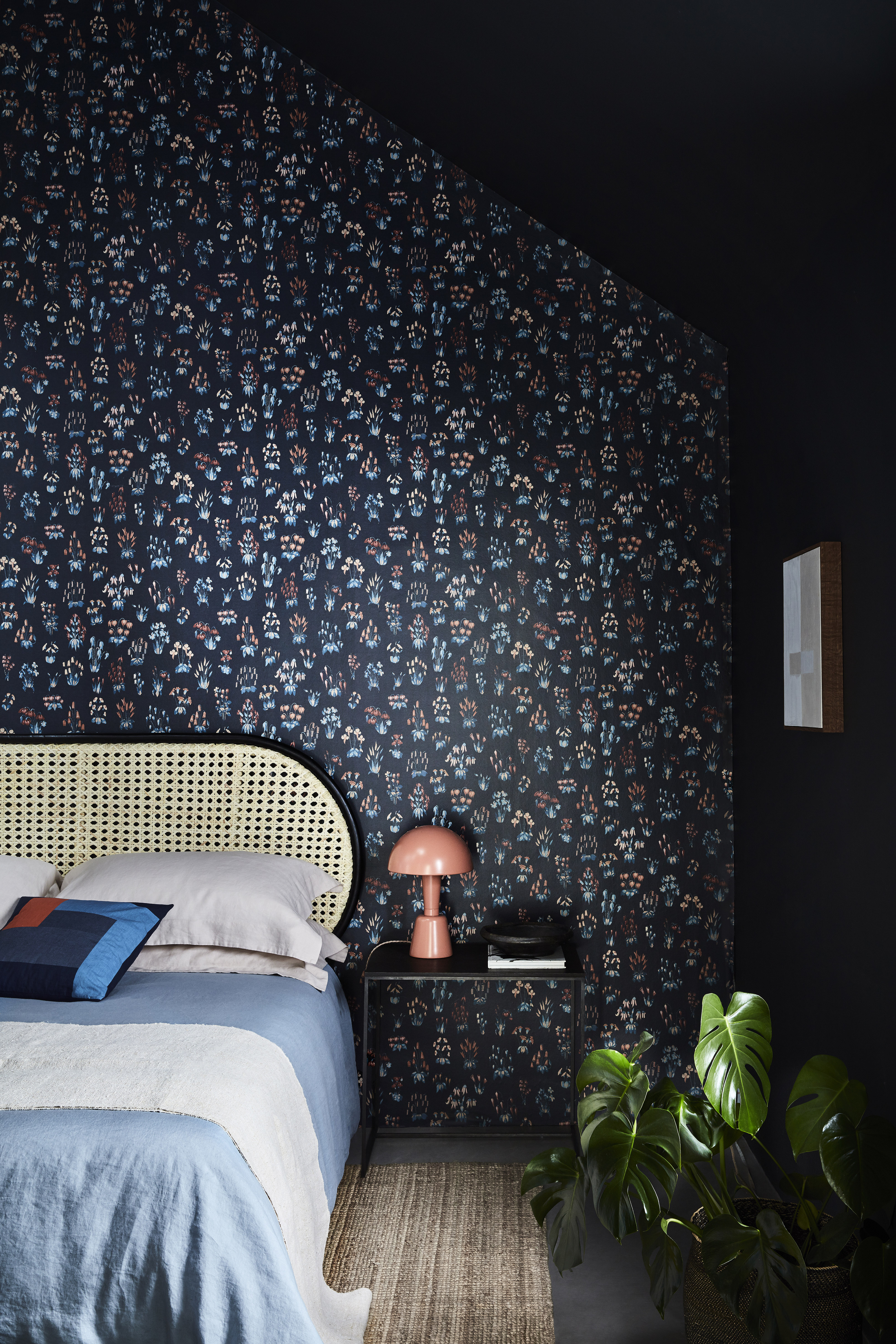
'I love navy and have it in almost every room. I never tire of the bold but soothing feel it gives me,' says Jennifer Morris, interior designer and founder of JMorris Design. 'It’s classic like black but is just a touch softer and richer.'
Blue is considered a great go-to color for bedrooms since it is said to be stress-reducing color, can help you sleep better, and on its own can be used in concert with many other hues. It makes a great pairing with other tones of blue.
Since darker shades are usually tricky to work with as they tend to suck all the light from a room, the use of lighter tones to soften the palette becomes necessary. The light blue bedding in this image works as neutral, and cuts the intensity of the blue wall and the wallpaper. The result is a brilliantly modern sleeping space.
'Navy is one of the few rich, bold colors that are calming and adds an instant feeling of coziness while still feeling fresh year after year,' say Alice Arterberry and Barrett Cooke, interior designers at the design studio Arterberry Cooke. 'Make sure you're choosing a navy with green/grey undertones instead of red/violet undertones.'
8. Yellow and grey
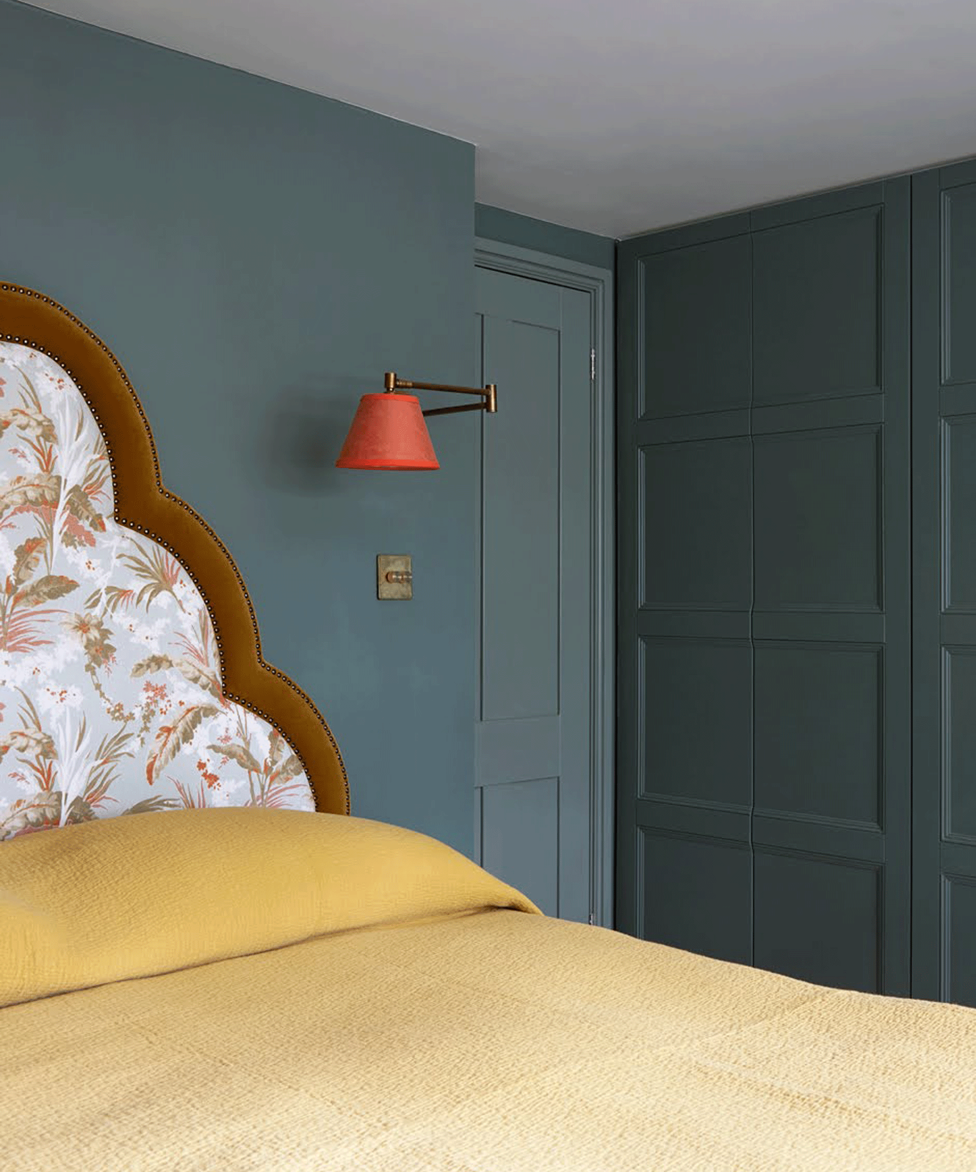
Grey is a popular choice for every room in the room, and there are lots of colors that go with grey. While complementing or contrasting it with other hues such as cream, brown or darker grey may make for an effective color theme, pairing grey with an electric color can enliven a space and put a stamp of personal style on it.
Case in point: yellow. This color when paired with grey can cast a warm glow on this space without looking too stark or acidic. Grey can balance a bright hue and make it seem more grounded. This combination works especially well in a modern and contemporary style. If you choose a base wall color as grey and don't want to make a big commitment to accent color, you could add yellow through accessories.
9. Blue and orange
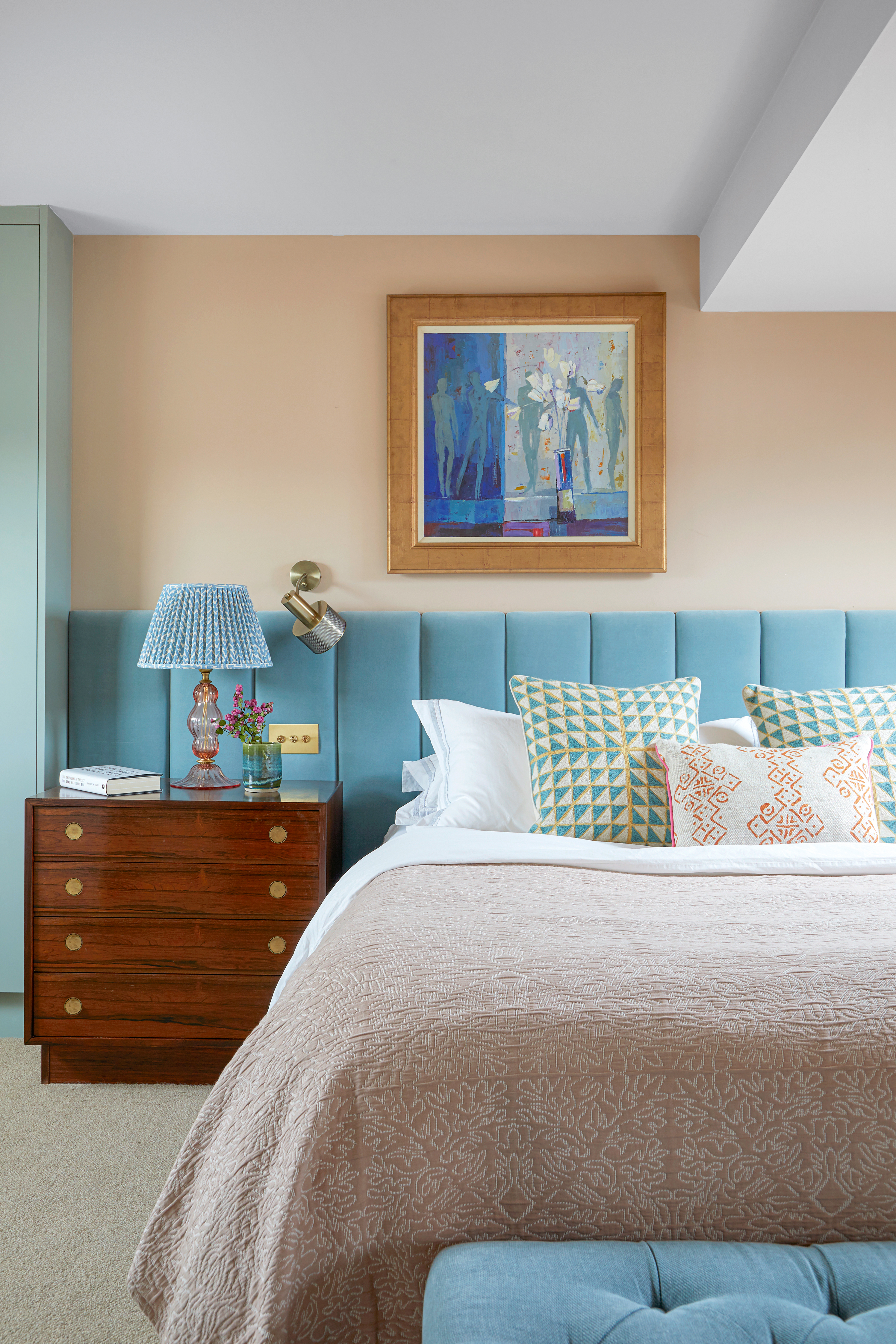
These two hues emit a burst of energy and style, and you'll be surprised at how well orange works as a color that goes with blue. Depending on the particular hues and doses of oranges and blues, this is a very versatile pairing of opposite colors.
Saturated versions of these colors might offer too much contrast for a bedroom, but softer pastel shades of blue and orange can make for a super effective palette that's vibrant yet restful.
10. Pink and grey
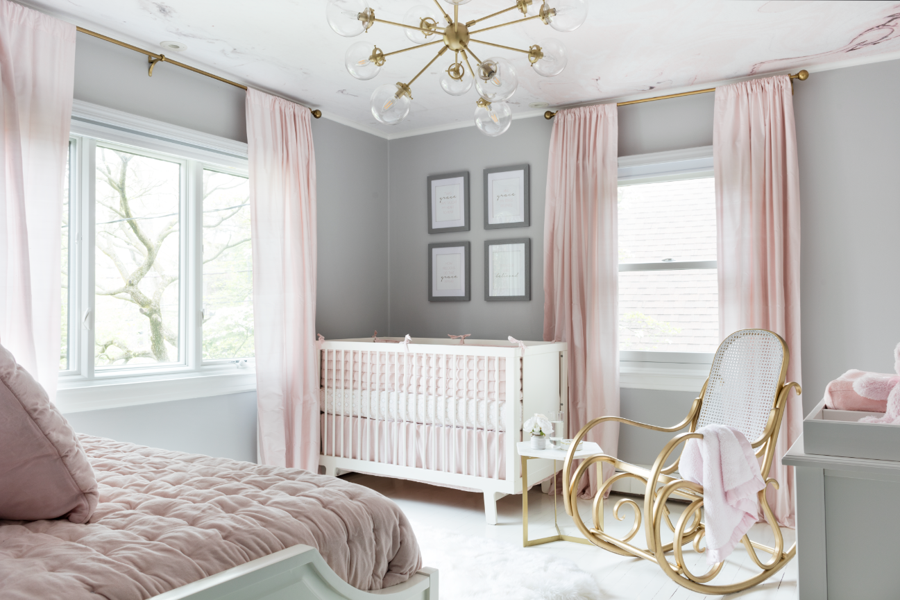
A pink and grey combo can take you back to the '80s if you choose a mauve or metallic shade, but fresh tones of pinks look less Xanadu and more zeitgeist. No matter what shade of pink you choose; think fuchsia, pewter, or bubblegum pink, a good deep-to-medium shade of grey can ground it all.
Consider blush pink walls, grey bedroom curtains, and a wooden side table, that looks nice and refreshing. A blush pink tone wall with a light grey bed particularly looks eye-catching.
While pink is a nice, reflective tone, grey is a deeper color that absorbs light. Together, they make for good light and dark combo. Also, this pairing looks great with natural materials, such as wood.
What two colors go well together in a bedroom?
There is a whole gamut of colors that go well together; it all depends on your personal preferences, and the particular tones and shades you use of the colors of your liking.
Generally, black and white are considered a classic color combination, have stood the test of time, and continue to be a universal favorite. What you should keep in mind while using this palette is to balance the blacks with white in such a way that the room doesn't become too dark. A good way to do this is by using black as an accent color on furnishings and accessories while using the larger surfaces like the walls and ceiling as white.
Another great combination is grey with any other complementary color, as several colors go with grey. Think yellow, red, blue or pink. While the latter are brighter hues that emit light, grey keeps things grounded and balanced.
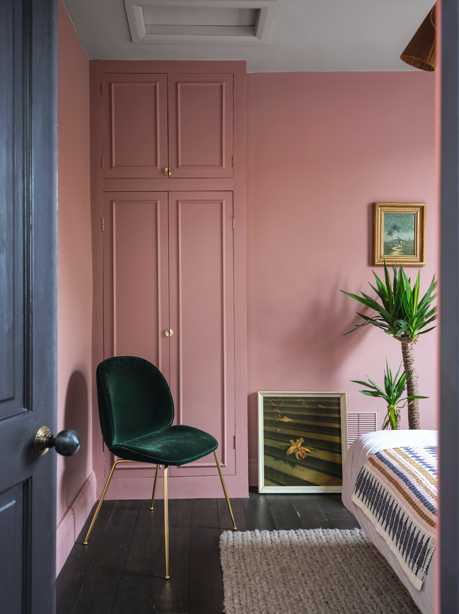
Pink and blue, while sitting a little far apart in the color wheel, make a fantastic pairing, and can lift the look of a room. 'The concept for this guest bedroom was to create a warm and welcoming space that would work along with the dark walnut floors and give the feel of a boutique hotel room,' says Emilie Fournet, founder of Emilie Forunet Interiors. 'The pink doesn't look overly feminine as it is balanced by the deep burgundy and brownish red of the feature wall as well as the mustard velvet curtains. It also works well on its own as a backdrop for the vintage paintings and the green velvet Gubi chair. The feeling of cocooning brought by the color was pushed further by painting the built-in wardrobe the same color.'
Other than that, green and blue, which remind one of the great outdoors are a good pairing for a calming bedroom.
Which colors help you to sleep better?
Largely, it is believed that softer tones, when used all out in the bedroom (on all four walls and ceiling) can create a restful interior. Whether it is blue, pink, yellow, or green, when paints have brown or grey undertones, they tend to create more cocooning, somber interiors.
However, one color triumphs over others when it comes to restful, sleepy interiors. Blue is a stress-reducing hue that can stand on its own or be used as an accent tone, complementing other colors.
'A Travelodge survey of 2,000 U.K. homes looked into how the color of bedrooms impacts quality and duration of sleep,' Jude Stewart, a design writer and author of the book ROY G. BIV: An Exceedingly Surprising Book About Color. 'Blue was the clear winner: blue-drenched sleepers clock in an average of seven hours and 52 minutes of nightly shut-eye. Since the hue is associated with the feeling of calmness, it helps people relax better.'
Be The First To Know
The Livingetc newsletters are your inside source for what’s shaping interiors now - and what’s next. Discover trend forecasts, smart style ideas, and curated shopping inspiration that brings design to life. Subscribe today and stay ahead of the curve.

Aditi Sharma Maheshwari started her career at The Address (The Times of India), a tabloid on interiors and art. She wrote profiles of Indian artists, designers, and architects, and covered inspiring houses and commercial properties. After four years, she moved to ELLE DECOR as a senior features writer, where she contributed to the magazine and website, and also worked alongside the events team on India Design ID — the brand’s 10-day, annual design show. She wrote across topics: from designer interviews, and house tours, to new product launches, shopping pages, and reviews. After three years, she was hired as the senior editor at Houzz. The website content focused on practical advice on decorating the home and making design feel more approachable. She created fresh series on budget buys, design hacks, and DIYs, all backed with expert advice. Equipped with sizable knowledge of the industry and with a good network, she moved to Architectural Digest (Conde Nast) as the digital editor. The publication's focus was on high-end design, and her content highlighted A-listers, starchitects, and high-concept products, all customized for an audience that loves and invests in luxury. After a two-year stint, she moved to the UK and was hired at Livingetc as a design editor. She now freelances for a variety of interiors publications.
-
 These Are the Flower Crowns I’m Wearing This Spring (Spoiler: They’re Actually for My Door)
Coachella confirmed the comeback of flower crowns. At home, they just go by another name: the spring wreath
By Julia Demer
-
 Bunny Ears, Be Gone — 7 Easter Table Styling Mistakes That Will Take Your Setting from Tawdry to Tasteful
From fussy floral displays that disrupt conversation to over-relying on tacky tropes, don't fall victim to these errors when decorating your Easter table
By Lilith Hudson