Two color combinations for living rooms – palette inspiration for tried-and-trusted and experimental pairings
Need inspiration for two color combinations for living rooms? Here are some of our top picks, with advice from the experts on how to make them work
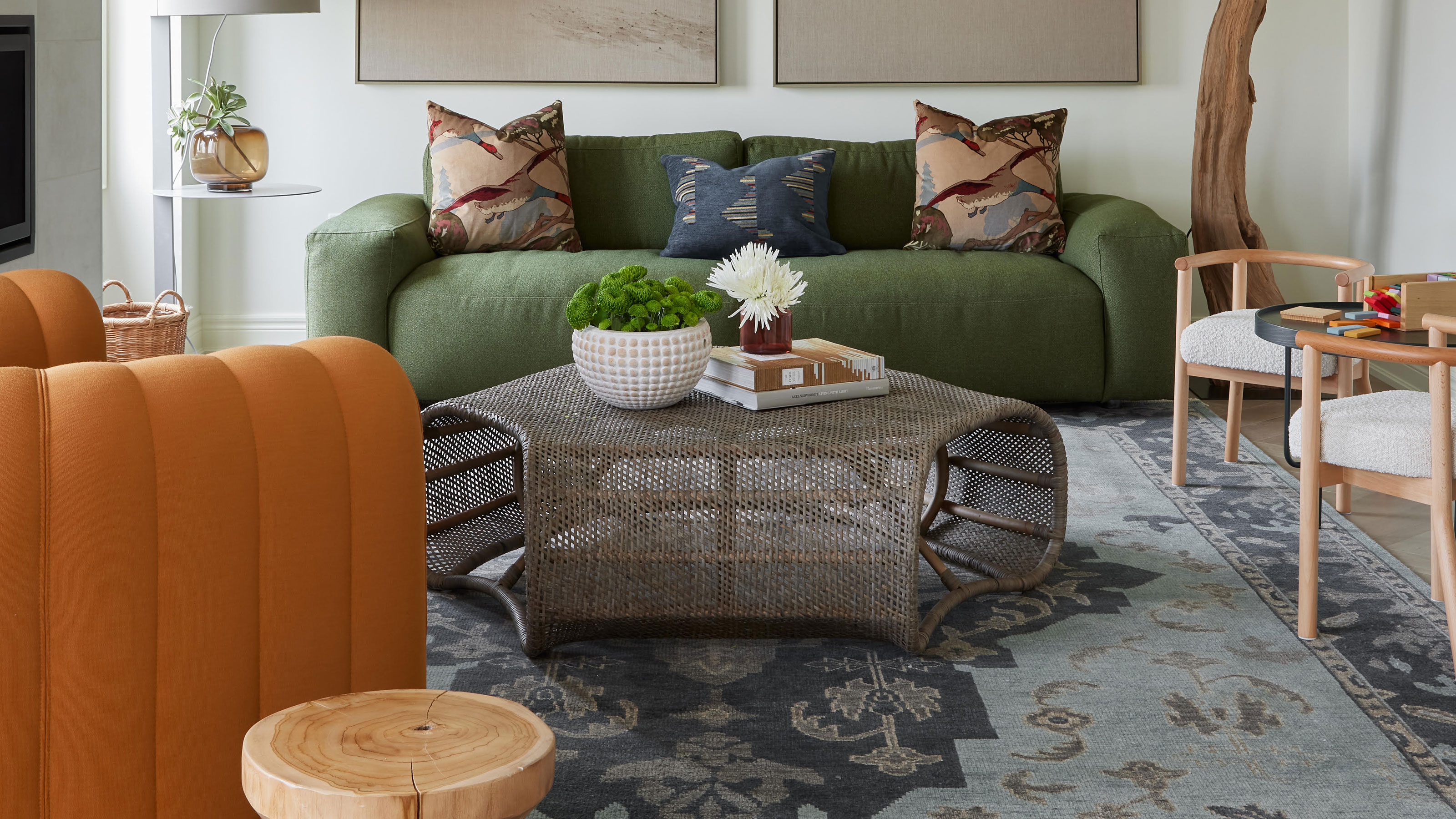

Two color combinations for living rooms can give you a shortcut to a cohesive palette. Choosing a tried-and-trusted (or even slightly experimental) pairing will give you a good base on which to build your scheme.
Of course, you don't have to stay regimented to these two colors strictly when considering living room color ideas, but two dominant shades can be supplemented with smaller pops of other colors for a well-rounded palette.
Whether you have an appetite for classic color combinations, or want to be a little more daring with your color scheme, we've curated some trending two color ideas for living rooms, with expert advice on how to make them work.
10 two color combinations for living rooms, from classic to daring
1. Blue and beige
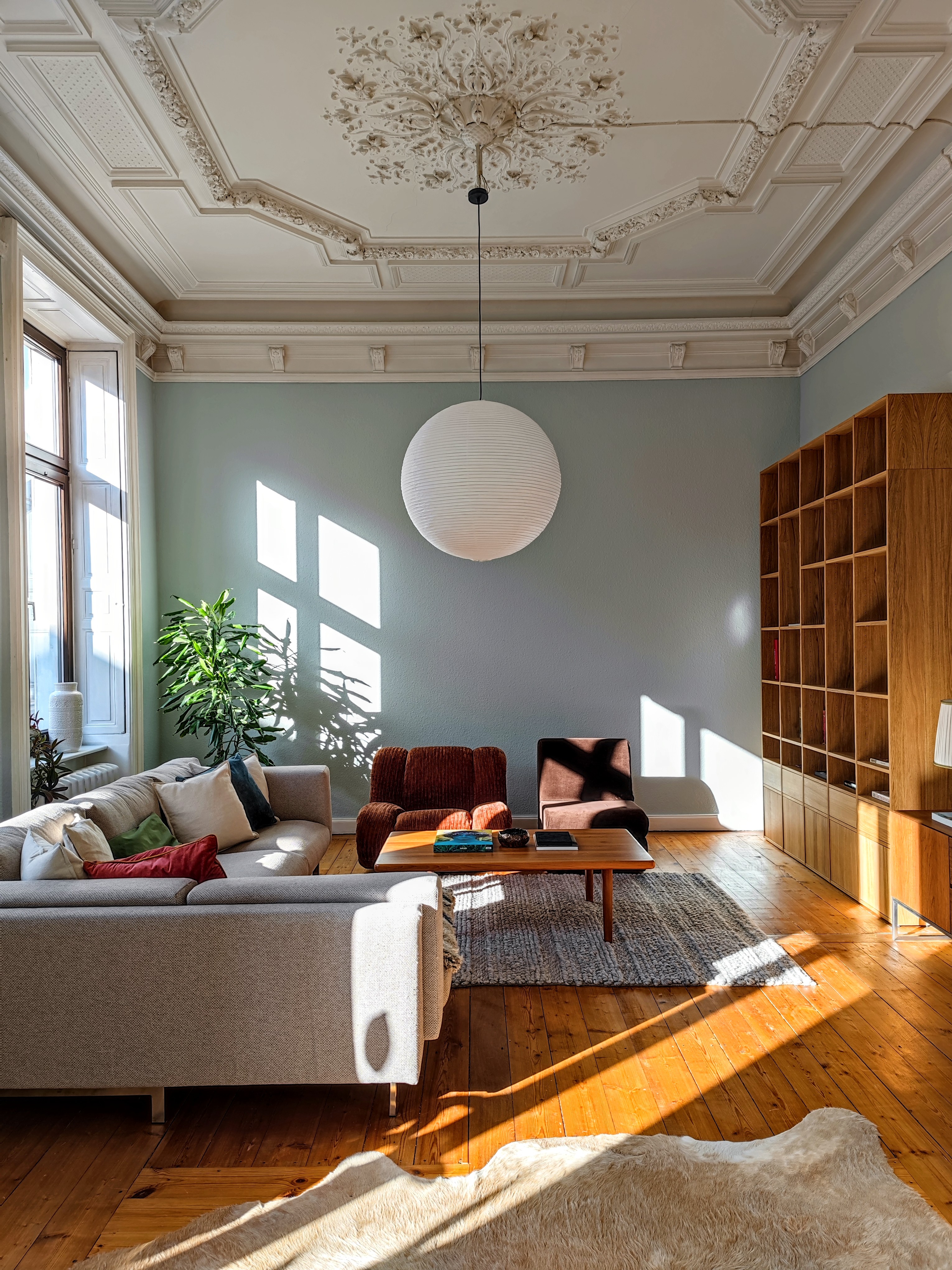
Whether your style leans more toward classic country, coastal, or contemporary, blue and beige always works. This combo looks refreshingly crisp and has a lovely Mediterranean feel to it. Using a shade of blue on the walls and ceiling is easier to pull off when you pair it with a crisp beige trim. You can also bring in this palette with blue and white/beige pottery for your blue living room idea.
The two colors wonderfully offset each other without looking too jarring or even contrasting. In this room designed by Dennis Von Nazareth, the walls look light, and restrained and encourage the dwellers to look up, at the intricately detailed ceiling, painted beige. The neutral color does not take away from the architectural details, and in fact, enhances them, and makes them sharper.
2. Lavender and yellow
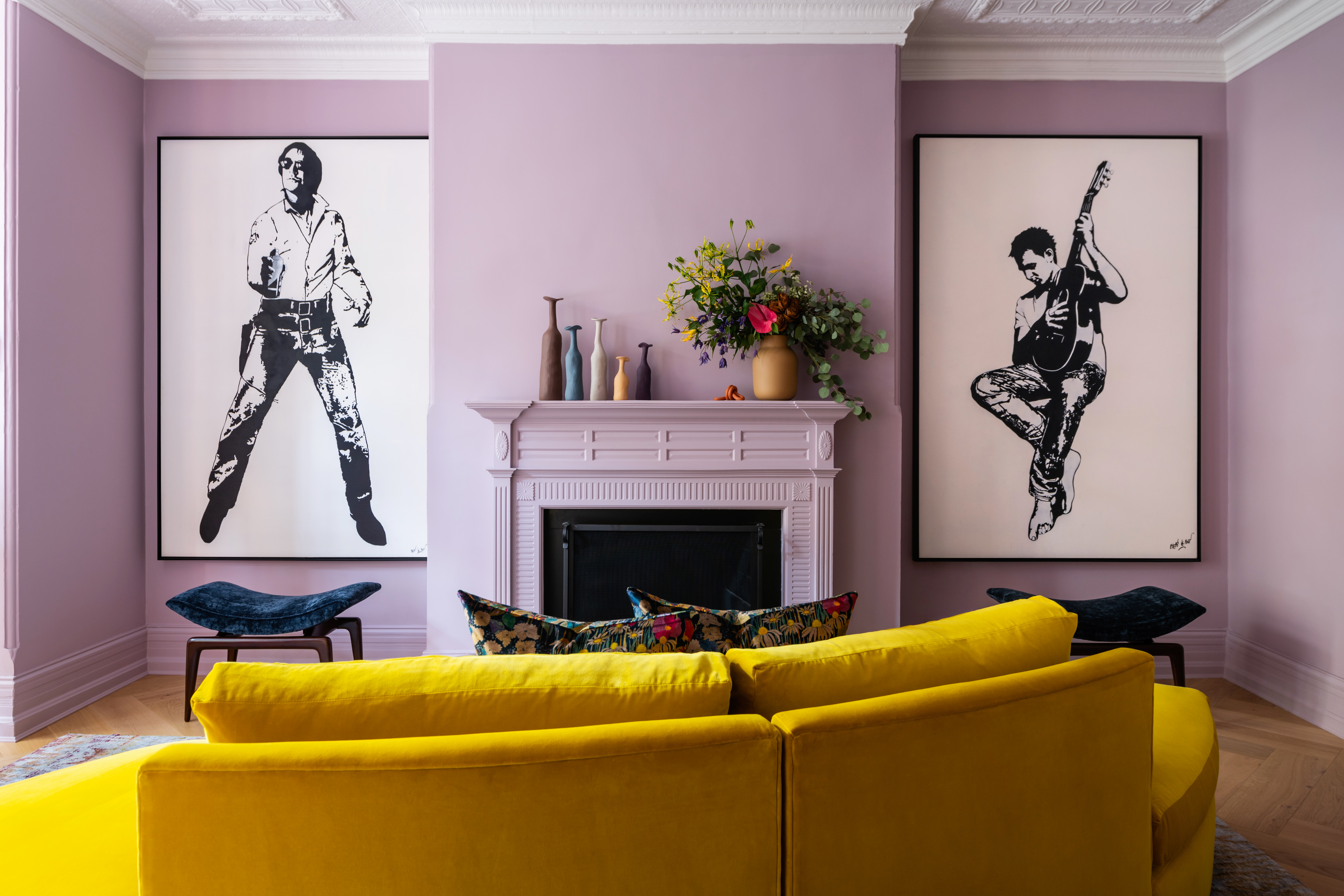
Lately, the world's best interior designers are all picking lavender as the big new color trend in interiors, and looking at this image, we completely understand why. The color is crisp and bright, an looks particularly striking lemon yellow.
In this space, the pairing looks vivid and saves this room from the expected white of so many rooms in this style. Other than the purple shades of lavender, you could also choose lavender with pink or grey undertones for a more earthy look. If you do go with these, a more grounded yellow, perhaps a mustard sofa would work better.
'This home is a very traditional DC, Dupont Circle Row House from the 70s,' says interior designer Kevin Sawyers. 'Of course, it has seen many changes and alterations over the years and we did want to bring it up to date a bit.'
'I never like to do away with beautiful detailing though we leave as much as possible,' Kevin adds. 'We met the clients in San Francisco and did some major remodeling to their homes there. When they moved, they called us to imbibe the same color into their new home. I felt as though we were bringing a bit of California spirit to the east coast.'
3. Black and white
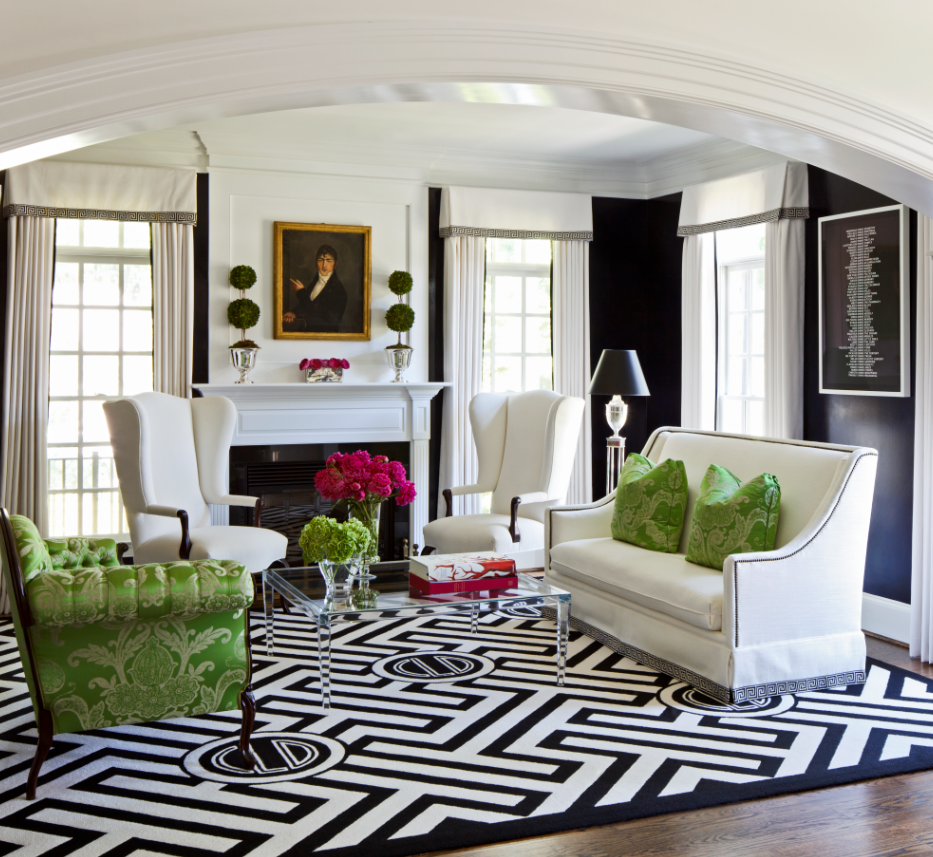
Within the interior design cosmos, black and white is a staple. The beauty of this combination is that it balances beautifully with any decorating style, and welcomes a third accent hue with ease.
A black and white living room also offers up the chance to play with different graphics, forms, and textures. Everything looks richer and more enhanced within this monotone world. If you want to embolden your living room's look further, add metallic accents such as gold, bronze, and silver, which will add glitter and look more enhanced against this daring palette.
'The living room is a great place to be bold,' says Kellie Burke, founder of Kellie Burke Interiors. 'I love black and white. For traditional spaces, painting the trim in the same wall color gives it a modern update. For a lighter transitional feel, a pale grey with super white trim will set the stage for any decor.'
4. Pink and green
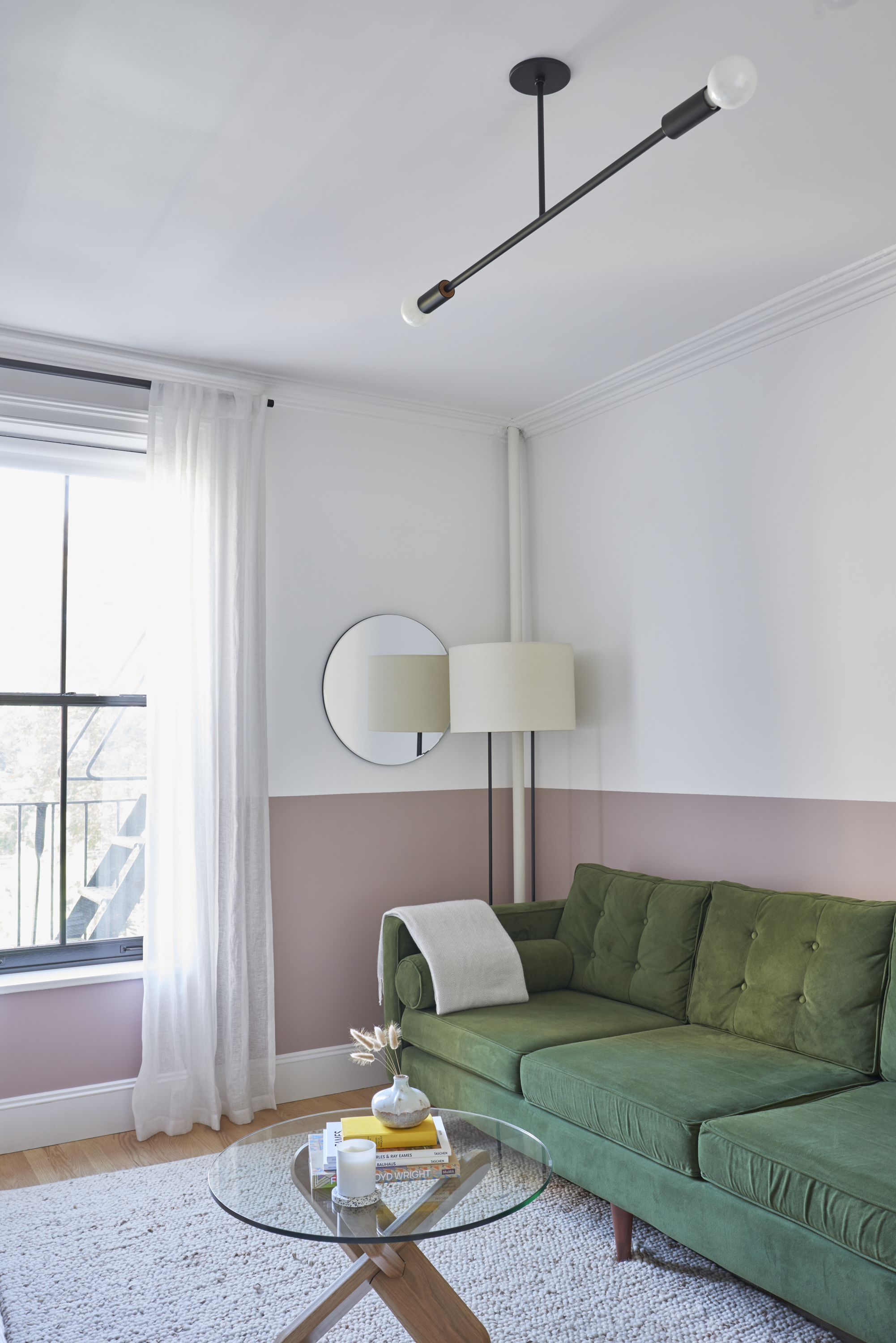
While a pink living room could be considered a cheery, upbeat space, adding green gives the palette a stronger, more rooted appeal. When done right, the two colors can be effective in creating a new mood in the space. Or you could just use these colors as simple touches in a more neutrally designed room.
'In this project, wainscoting is carried into the den and the bedroom with painted blush pink and milky sea glass green colors using the same combo throughout for continuity, lending a nostalgic pastel backdrop that recalls the architecture of the Mediterranean,' says Nathan Cuttle, founder of Studio Nato.
5. Blue and yellow
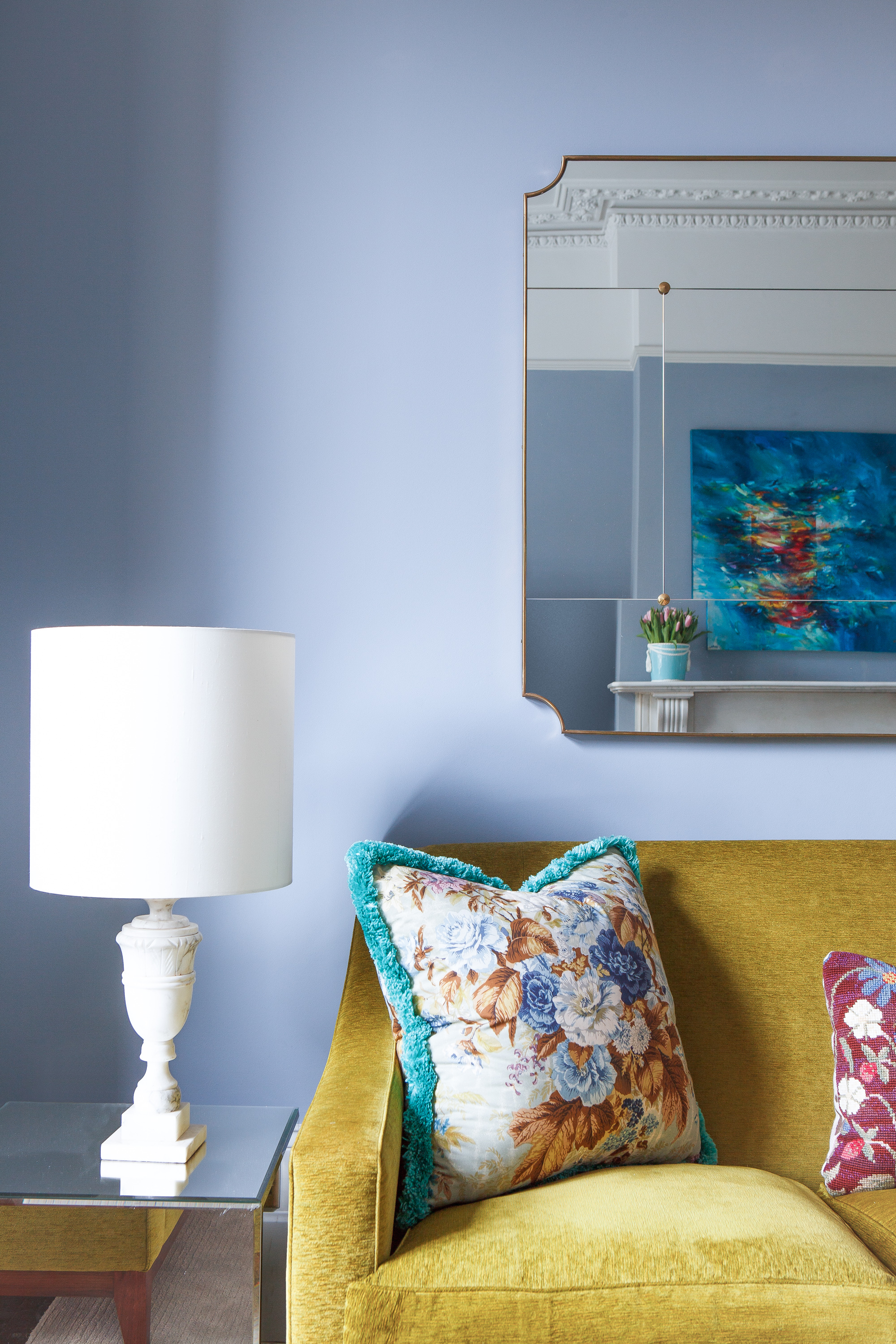
While blues and yellows go hand-in-hand in nature, within interiors, they look nothing short of rich and luminous. Their relationship as near-complements on the color wheel gives them a punchy look.
In a navy living room, an ochre is best placed to pull the scheme together. The beauty of these tones is that they have a way of creating harmony rather than competing.
If you are struggling to bring stronger colors into your home, try introducing them in a small area first, perhaps as a vignette or in an artwork. If you like the effect, you could use it more generously in the room.
'When designing a space I always think about contrasting with complementary hues,' says interior designer, Natalie Tredgett. 'For example in this home in South London, I took the lead from an amazing blue in a cushion, mimicked this on the wall in a soft blue and then contrasted with vibrant yellow in the furniture. Although to the eye these colours stand out against one another, their tones complement one another within a space and therefore make a great pairing.'
6. Pink and grey
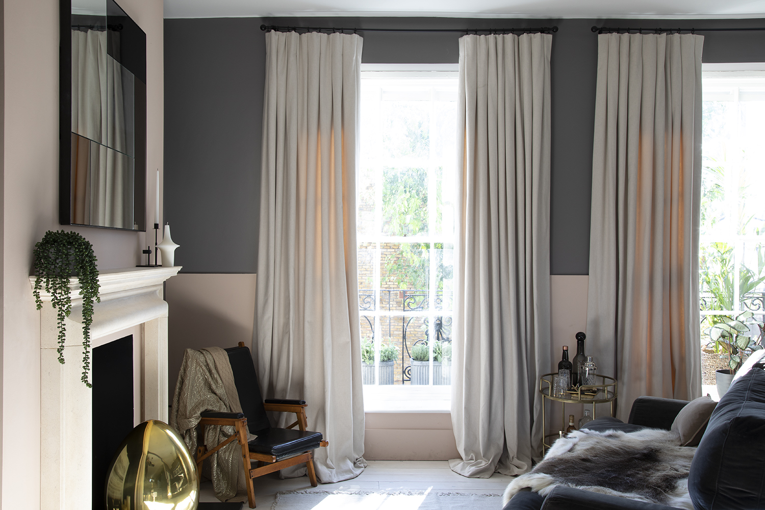
For living room color ideas, think of pink and grey as two sides of a coin – a light and a dark hue. Wonderful partners, they both help hide each other's flaws and bring the best out of each other as well. While the electric pink color prevents the grey from feeling too cavernous, grey on the other hand, stops pink from looking too sugary. For best visuals, choose a pink with a brown or grey undertone.
'The property was blessed with lovely high ceilings so to create a more intimate space for the living room, we broke up the walls by adding a two-tone paint effect using a blush tone and a moodier grey tone, from Paint & Paper Library. We added the contrast to help trick the eye for a cozier space,' says Mimi Pearce, interior designer for Run For The Hills.
7. Two tones of blue
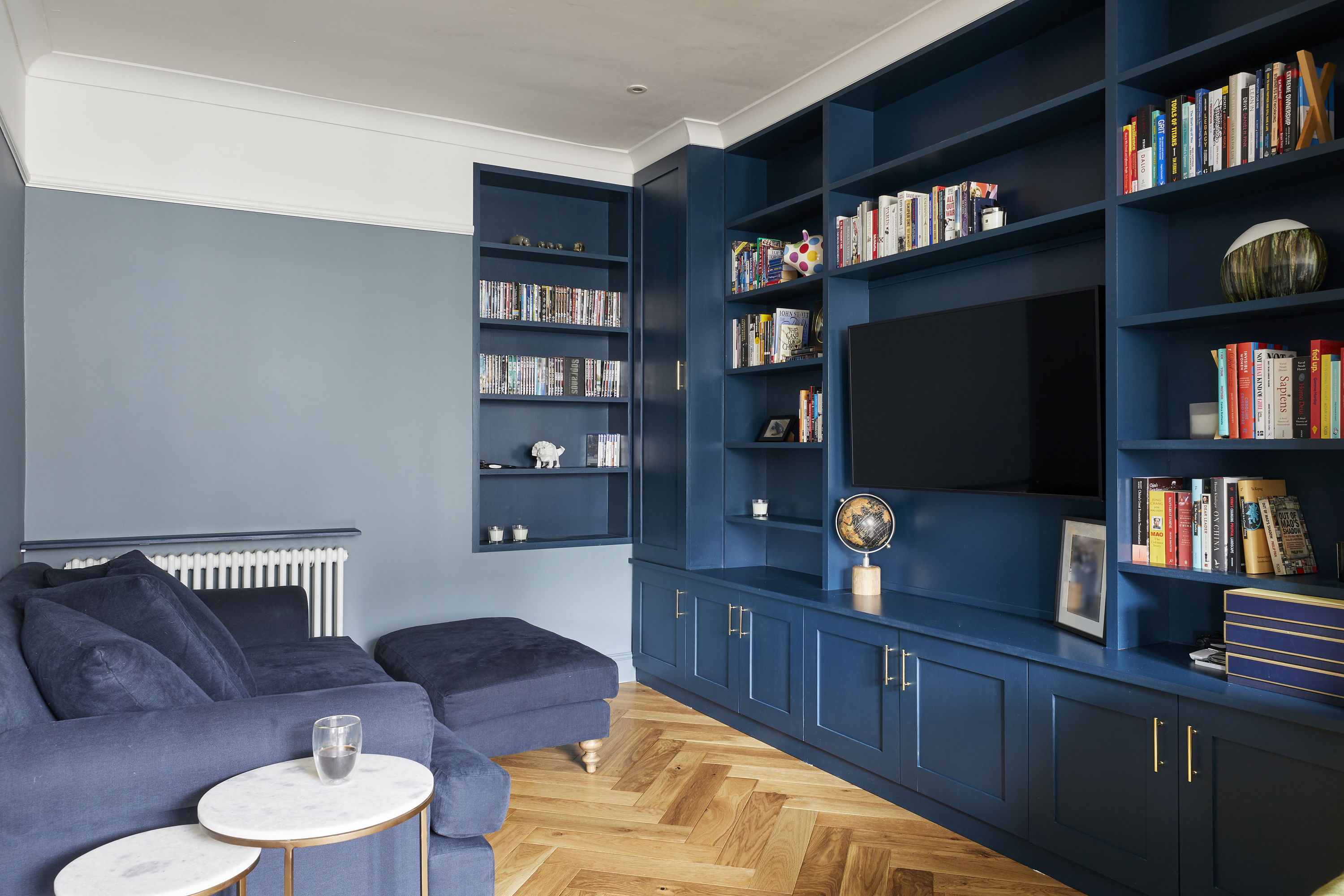
Soft blues with a touch of green or grey undertones remind us of the sea and sky and tend to bring in a tranquil vibe. On the other hand, the bolder blues such as aqua, turquoise, and cobalt have a fun, youthful vibe to them. All in all, this color is a complete success in interiors.
Within the world of blue tones, there's a whole gamut of colors to experiment with. In that sense then, an elegant living room can benefit from two tones of the same color, which may read as one yet don't look one dimensional. Another wonderful advantage to this hue is that it can take dashes of other bolder colors, and yet look together, cohesive and smart.
'The room benefits from a lot of bespoke joinery units, including shelves inside an old door opening that used to lead to the old kitchen,' says Michael Schienke, director at VORBILD Architecture. 'The woodwork has been painted in a rich, but still vivid, Hague Blue by Farrow & Ball, whereas the wall, is a more grey-blue color from De Nimes by Farrow & Ball.' The deep-toned blue sofa further enhances the layering.
8. Green and coral
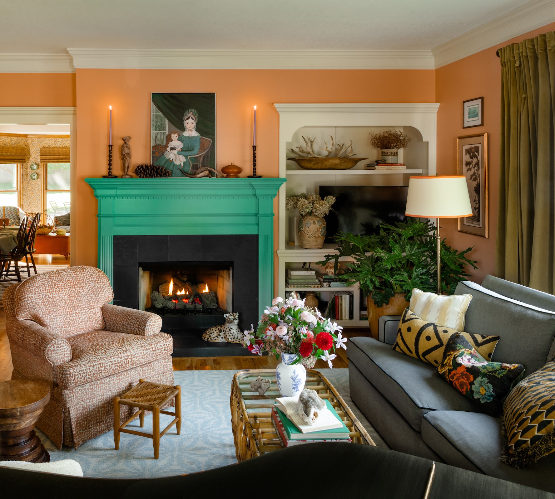
Certain colors evoke happy times. These usually connote summery hues such as sunny yellows, watery blues, citrus greens, and punchy corals. These have a joyful, light-hearted vibe.
To conjure up a tropical vibe, and to evoke visuals of exotic flora and fauna (or even a citrus-infused cocktail!), may we suggest green living rooms with lots of coral.
Ideally, in an coral-toned interior, red or purple accents, that sit adjacent to coral on the color wheel work well. Analogous color schemes such as these have a harmonious feel to them. But for eye-catching contrast, choose a green that sits opposite coral and watch the magic. The combination will add life and vitality to the space.
'Not typically used in a formal living room, the coral and teal combination works here because of their shared intensity,' says Anne Golliher, founder of Storied Interiors. 'Paired with bold art and colorful pillows, the combination keeps this traditional room feeling fresh.'
9. Cream and green
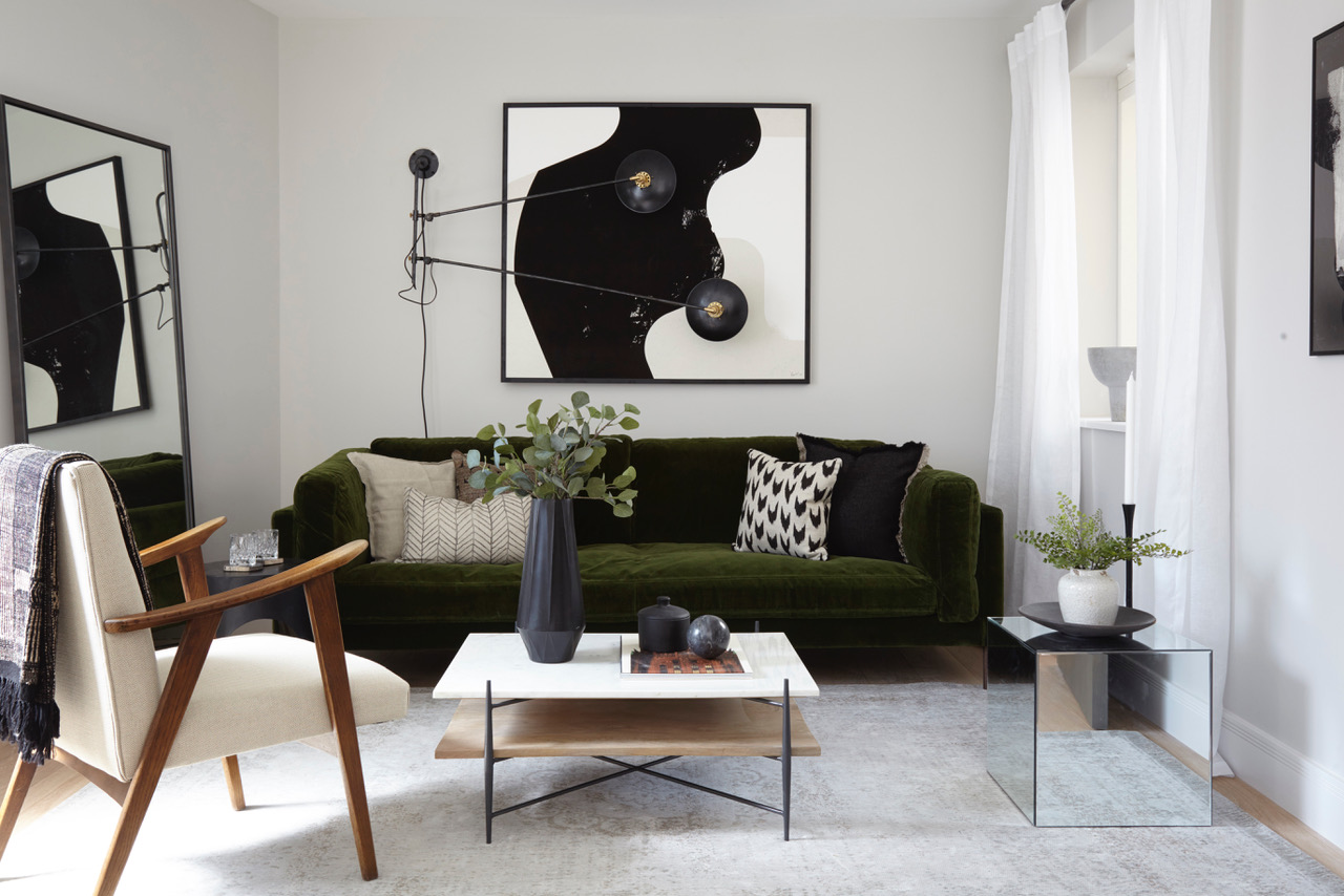
Ideally, the tone of green you choose will help determine the mood of a room. A bright apple green when paired with a cream living room can look fresh and spring-like. Dark mossy green with a neutral can seem somber and elegant. Chartreuse is modern and fresh.
Overall, greens are universally positive and create nature-friendly visuals. It isn't a stark or overly dramatic tone but an uplifting one.
'We persuaded our clients to invest in a green sofa which makes a statement, not just a neutral shade but something more punchy and exciting,' says Anna Burles, interior designer at Run For The Hills. 'This deep green sofa is gorgeous and its color allows the art to be monochrome, placed against a neutral wall.'
10. Brown and red
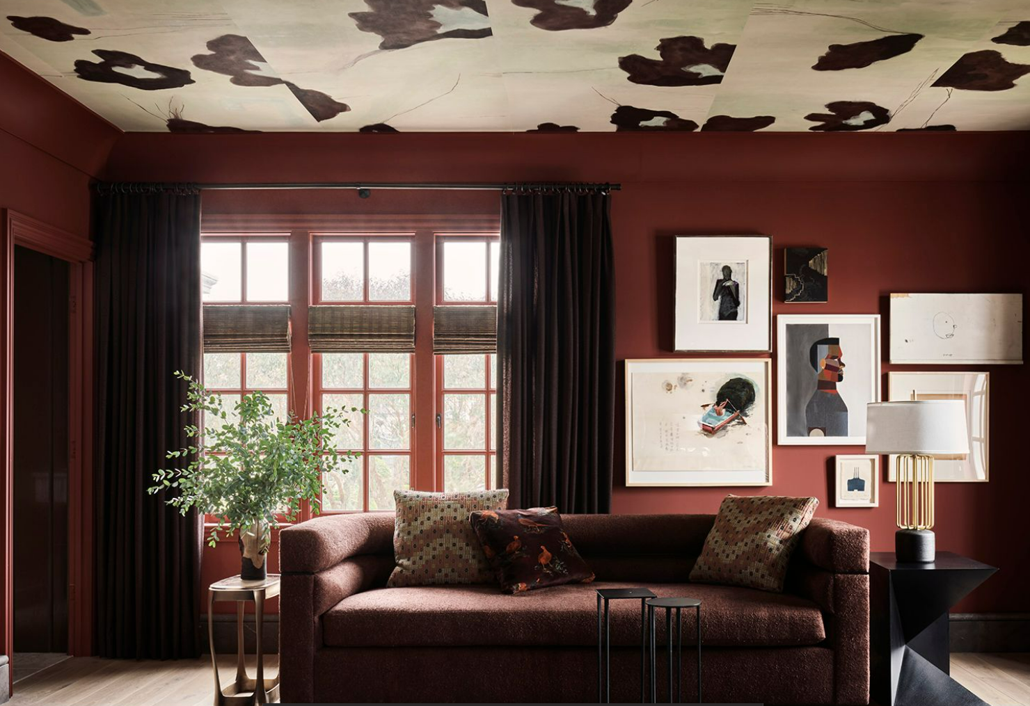
Everyone loves spring but fall can be a sight to behold, where the world turns a new shade of brown, red, and orange. There’s hardly a prettier sight than the changing of the leaves. Induce this palette in your interiors for an earth-tone living room. This will not only warm up your home but will also give a refined personality to the interiors.
Interestingly, both brown and rust/terracotta tones can act as neutrals, allowing more punchy colors to shine bright. Think yellows, pinks, and blues inside a largely brown space. 'I love to use bold tones as a single source of color for a room; it makes the space feel neutral, yet, bold,' says interior designer Chad Dorsey.
'Red can be understated,' says Helen Shaw, Benjamin Moore's UK Director. 'It can swing warmer towards sun-baked brick and cooler towards crimson-kissed violets, providing a muted quality that brings depth and elegance. Incorporating a rich, bold paint color such as maroon is a fool-proof way to create an instant character in the living room.'
What colors go well together in a living room?
Several colors can pair up to make a striking combination in the living room. Ideally, dark living rooms like black and white are a classic scheme, used for decades to give an elegant touch to spaces. More recently, there has been a newfound love for lavender, paired with neutrals such as white, cream, or beige.
Blue and green is a classic pairing too, creating a wonderful indoor-outdoor feel in interiors. For a bold look, you could choose tones that sit opposite on the color wheel such as orange and green.
For a more earthy interior, consider a combination of deep red and brown, or moss green and off-white. These tones have a more grounded and timeless feel.
How many colors should you have in a living room?
Although there is no set standard or rule, most interior designers suggest the 60-30-10 technique. This means, that 60% of the main color should be used across the largest surfaces (walls, ceiling, or floor), 30% as accent color (seen on chairs, curtains, or feature walls), and 10% on furnishings or curios. Also, too many colors can look disorienting and haphazard, so three is an optimum number.
Be The First To Know
The Livingetc newsletters are your inside source for what’s shaping interiors now - and what’s next. Discover trend forecasts, smart style ideas, and curated shopping inspiration that brings design to life. Subscribe today and stay ahead of the curve.

Aditi Sharma Maheshwari started her career at The Address (The Times of India), a tabloid on interiors and art. She wrote profiles of Indian artists, designers, and architects, and covered inspiring houses and commercial properties. After four years, she moved to ELLE DECOR as a senior features writer, where she contributed to the magazine and website, and also worked alongside the events team on India Design ID — the brand’s 10-day, annual design show. She wrote across topics: from designer interviews, and house tours, to new product launches, shopping pages, and reviews. After three years, she was hired as the senior editor at Houzz. The website content focused on practical advice on decorating the home and making design feel more approachable. She created fresh series on budget buys, design hacks, and DIYs, all backed with expert advice. Equipped with sizable knowledge of the industry and with a good network, she moved to Architectural Digest (Conde Nast) as the digital editor. The publication's focus was on high-end design, and her content highlighted A-listers, starchitects, and high-concept products, all customized for an audience that loves and invests in luxury. After a two-year stint, she moved to the UK and was hired at Livingetc as a design editor. She now freelances for a variety of interiors publications.
-
 Turns Out the Coolest New Café is Actually In Your Kitchen — Here's How to Steal the Style of TikTok's Latest Trend
Goodbye, over-priced lattes. Hello, home-brewed coffee with friends. TikTok's 'Home Cafe' trend brings stylish cafe culture into the comfort of your own home
By Devin Toolen Published
-
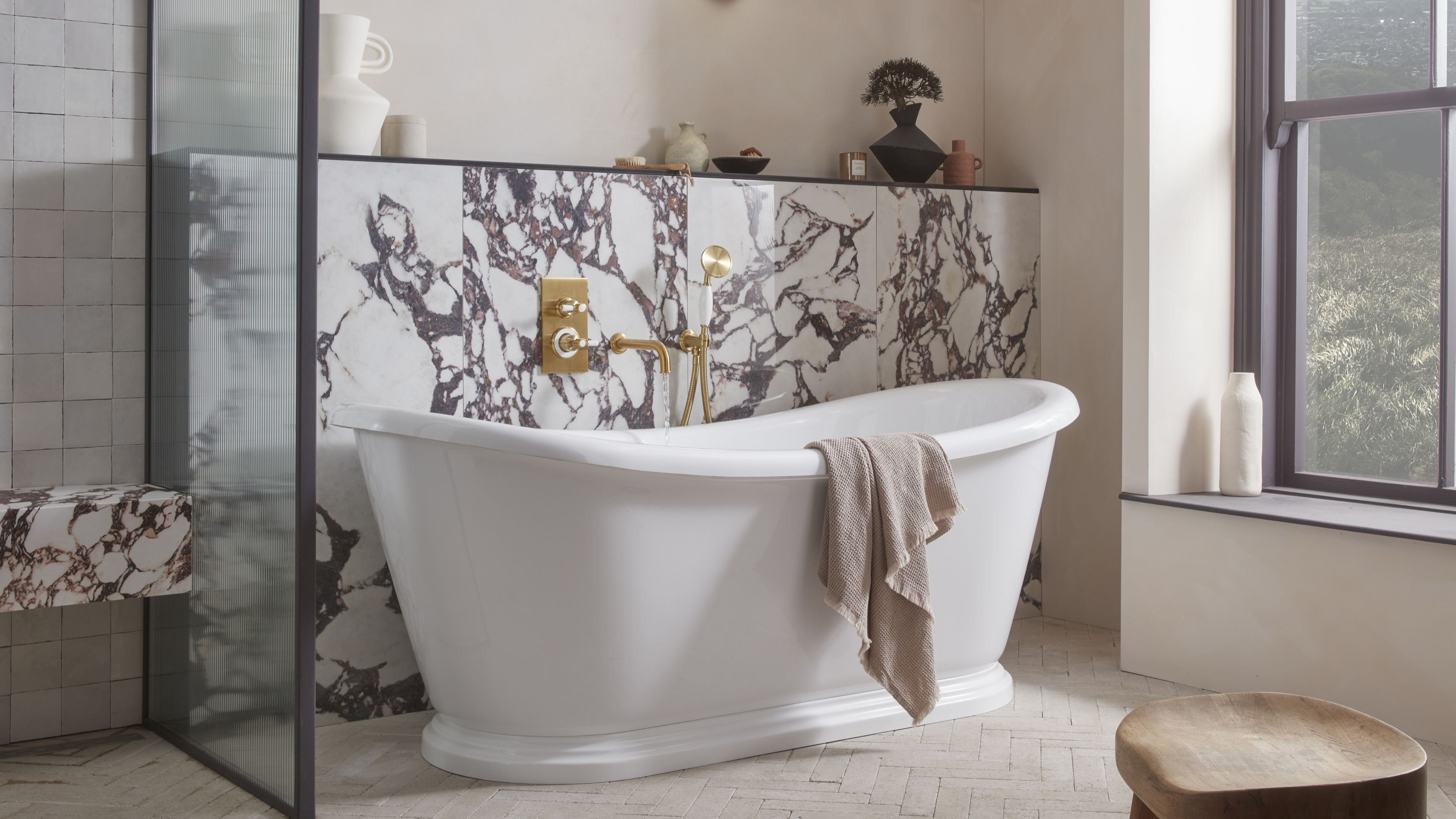 5 Bathroom Layouts That Look Dated in 2025 — Plus the Alternatives Designers Use Instead for a More Contemporary Space
For a bathroom that feels in line with the times, avoid these layouts and be more intentional with the placement and positioning of your features and fixtures
By Lilith Hudson Published