Two Tone Paint Ideas for Walls — 9 Ways to Use This Playful Approach to Color
Two-tone walls are a fun way to experiment with color palettes – and these schemes have given us plenty of ideas to get started

The Livingetc newsletters are your inside source for what’s shaping interiors now - and what’s next. Discover trend forecasts, smart style ideas, and curated shopping inspiration that brings design to life. Subscribe today and stay ahead of the curve.
You are now subscribed
Your newsletter sign-up was successful
We’re stepping outside our decorating comfort zone in 2024, and what better way to do that than with a two-tone wall? This painting trick has been around for some time – color blocking, anyone? – but it remains a great way to experiment with more dynamic palettes, and designers and paint experts alike are finding new and exciting ways to approach the look for a contemporary home.
As far as paint ideas go, the two-tone wall is also really versatile. ‘Two tone walls work great in traditional homes where a picture rail or dado rail is in place,’ says Flora Hogg, interior designer and color consultant at Craig & Rose. ‘They provide definition and highlighting architectural details.’ They’ll also add interest to a box-like new build and everything in between – so why not give it a try? We’ve rounded up our favorite examples to inspire you to get started.
1. Create subtle contrast with pastels
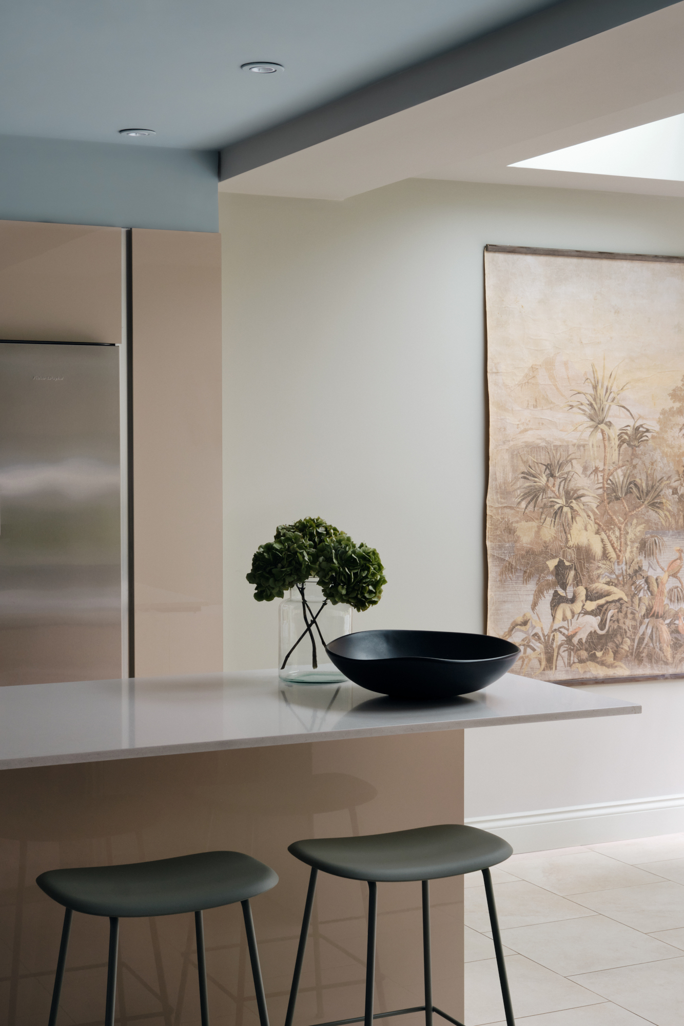
While many examples of two-tone walls are bold and high-contrast, pastels lend themselves well to the look for anyone who wants to start with something a little gentler. In this kitchen, a beige-pink sits alongside baby blue (one of the hottest color trends for 2024) for a softer take on the paint effect that still helps to highlight the architectural features of this contemporary space.
Article continues below2. Make the door the standout feature of a two-tone wall
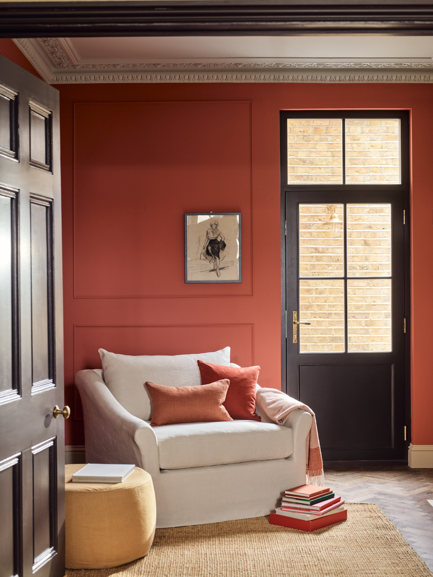
Two-tone walls aren’t strictly about horizontal boundaries: painting doors and windows in a contrasting color is another way to approach the look. ‘Architectural features such as beams, chimney breasts, and door/window casings provide the perfect opportunity to play with paint,’ says Shannon Askinasi, interior designer and founder of New Jersey studio Ash & Pine. ‘By adding dark paint, the eye is immediately drawn to all of the features that make your home special. Don’t forget to embrace your dropped and angled ceilings. They serve as ideal breaking points for your two-tone designs.’
3. Use slatted panels to create a two-tone effect
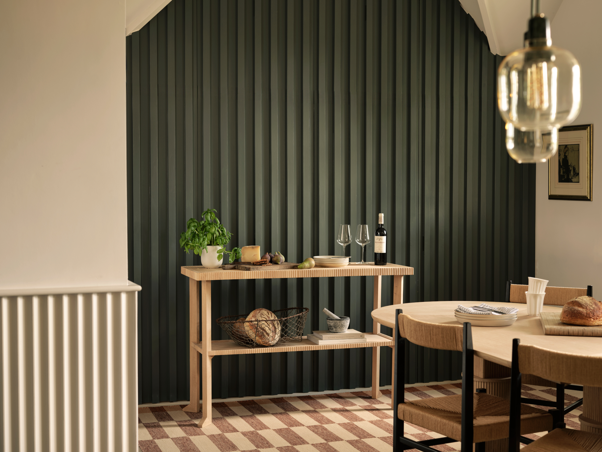
Slatted walls are big news right now, used across interior design and architectural projects because of their ability to add texture to even the most box-like of spaces. In this room from Studio Atkinson, the shadows cast by the ridges create a two-tone effect despite the entire wall being painted in one shade. It’s not technically a two-tone wall, no – but set against a lighter shade as a feature wall, it has a similarly dynamic effect.
4. Experiment with shapes for a playful look
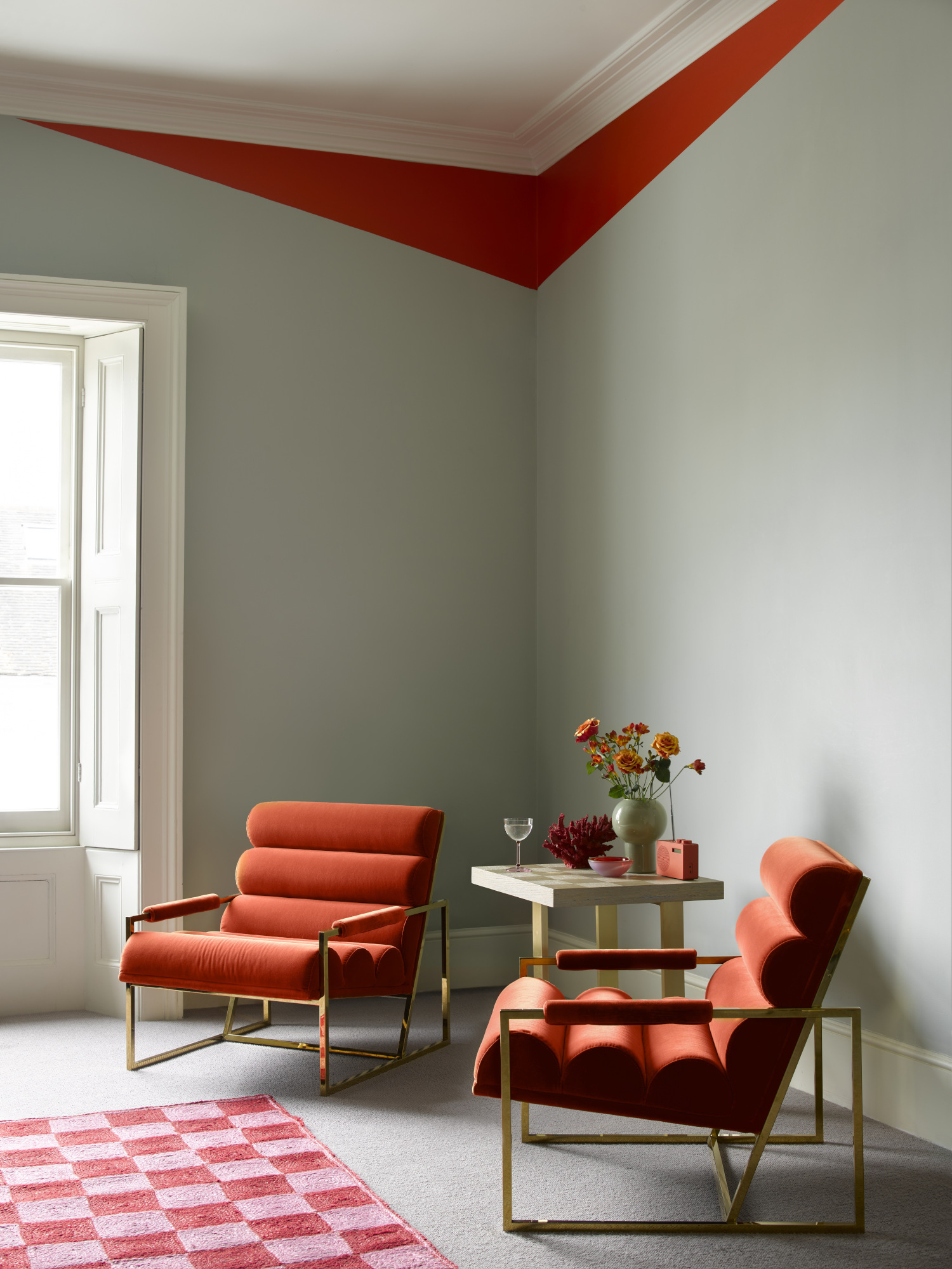
Move away from stripes of color towards more interesting geometric designs to play with shape and proportions – in this space, a red accent highlights the corner of the room and draws focus to this artfully arranged vignette. It makes the case for going bolder with a two-tone design in general. ‘Oranges, blues and pinks always make for fun accent walls and designs,’ says Shannon Askinasi. ‘Bedrooms are also a great place to play with geometric looks.’
5. Use paneling to create a natural break
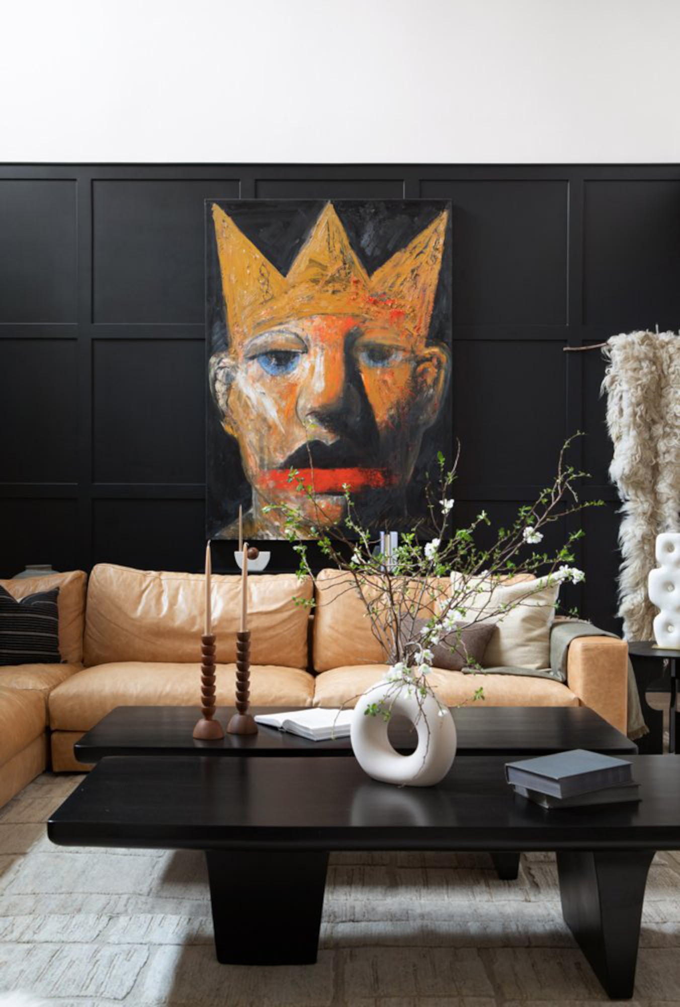
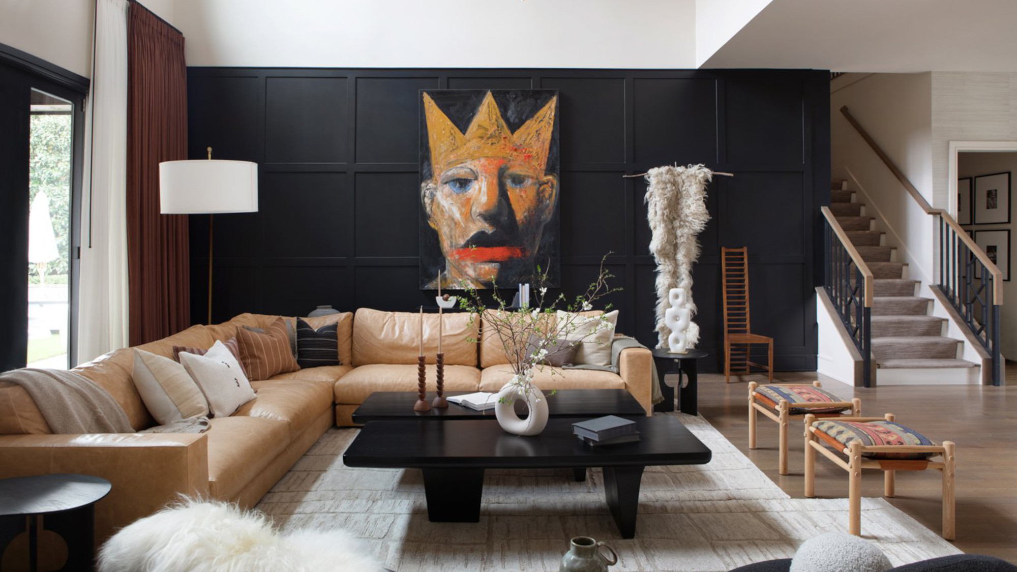
Painting wall paneling a different color to the shade above it is an easy way to introduce a two-tone paint idea to your room – it helps to elevate the look and give it a more dimensional feel. In this space by Dallas, Texas-based Urbanology Designs, black sits against white far more comfortably for this reason. ‘If your home has wainscoting, that is a natural dividing line for the two-tone wall,’ says Shannon Askinasi. ‘For rooms without it, a great rule of thumb is to divide the wall into thirds, painting the bottom two-thirds one color and the top a different shade or color.’
The Livingetc newsletters are your inside source for what’s shaping interiors now - and what’s next. Discover trend forecasts, smart style ideas, and curated shopping inspiration that brings design to life. Subscribe today and stay ahead of the curve.
6. Make use of alcoves and recesses to introduce a second color
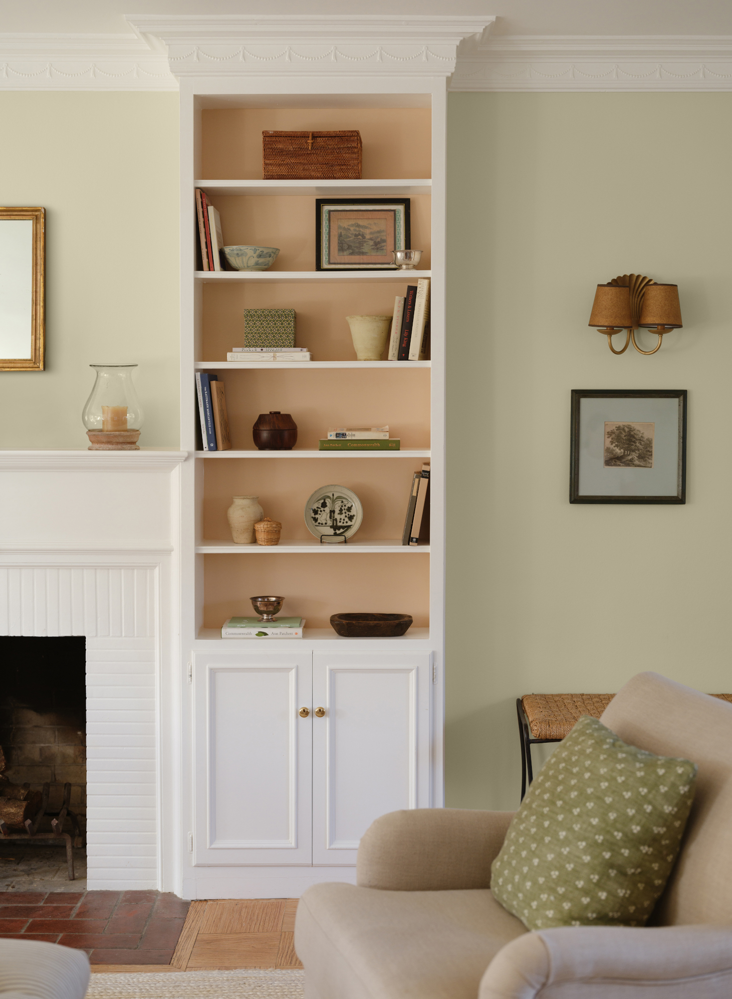
Like architectural features and panelling, alcoves and recesses – like shelving, as seen in this living room by LA studio Alex Yeske Interiors – provide a good opportunity to play with two-tone paint ideas. Having the two colors separated by cabinetry in a neutral shade, like this, makes for a more elegant approach to the look – and in the case of shelving, can help to highlight the precious belongings you want on display.
7. Outline edges with paint (or wallpaper) borders
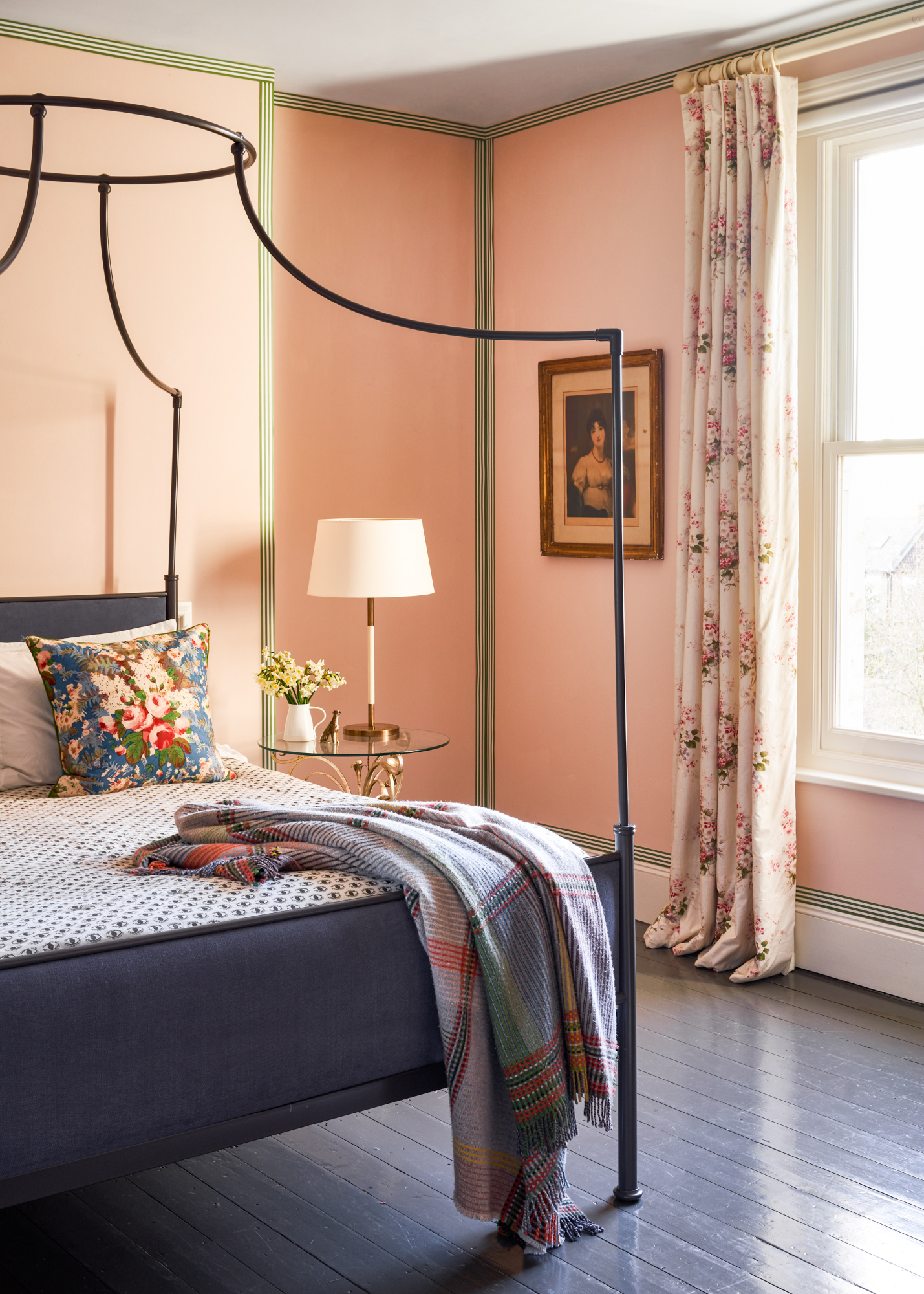
We’ll admit we’ve cheated a little here – this pink bedroom actually features Studio Atkinson’s wallpaper borders. But the idea of highlighting the contours of a room is a great one, and something you can easily replicate with paint for an interesting take on a two-tone scheme. Elsewhere, we’ve seen this look recreated with pink plaster in the middle and coral paint around the outside, throwing a layer of texture into the mix – it’s a design feature we’re into.
8. Bring the ceiling down onto the wall
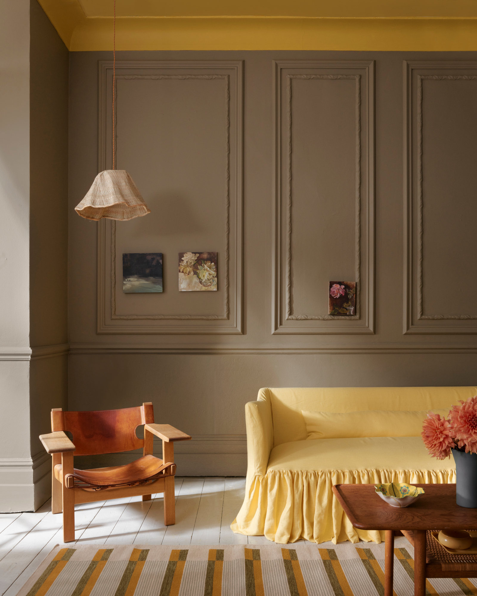
It’s a classic painted ceiling idea, but this trick also doubles up as a two-tone wall hack. ‘To create a holistic look that enwraps you in a room, I recommend painting the ceiling in the same color as the walls, but in a lower saturation,’ says Ksenya Malina, founder of New York-based interior design studio Time & Place Interiors. ‘This also helps create a sensation of height.’ Alternatively, opt for a contrasting hue for more of a statement, as this scheme does – it’s balanced out by the yellow sofa at the bottom of the frame.
9. Keep your palette within the same color family
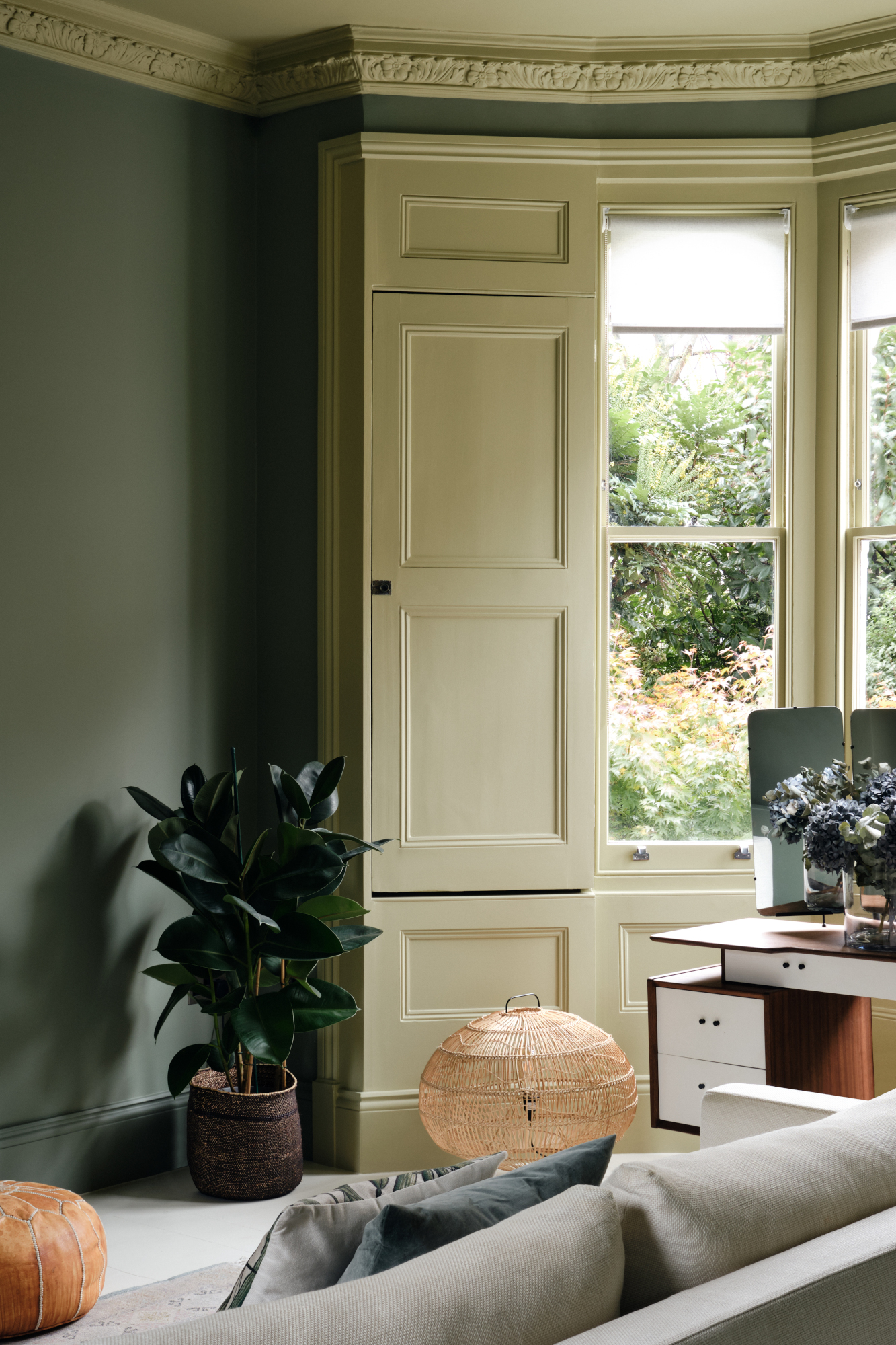
Though many of the examples in this article feature two-tone walls in contrasting colors, it’s just as effective to adopt a literal tonal approach to this look – opting for a shade lighter or darker than the base paint for your second color. This is particularly effective in older properties, where a more contradictory palette can sometimes feel jarring against elegant architectural features. ‘Crown moldings in Victorian-era homes are great to highlight with classy tones of white paint that are different from the white on the walls,’ says Ksenya Malina.

Ellen is deputy editor of Livingetc magazine. She works with our fabulous art and production teams to publish the monthly print title, which features the most inspiring homes around the globe, interviews with leading designers, reporting on the hottest trends, and shopping edits of the best new pieces to refresh your space. Before Livingetc she was deputy editor at Real Homes, and has also written for titles including Homes & Gardens and Gardeningetc. Being surrounded by so much inspiration makes it tricky to decide what to do first in her own flat – a pretty nice problem to have, really. In her spare time, Ellen can be found pottering around in her balcony garden, reading her way through her overstacked bookshelf or planning her next holiday.