U-shaped kitchen ideas – 10 ways to optimize this classic kitchen layout
Practical and designed for effortless prep, our U-shaped kitchen ideas provide the ultimate efficiency
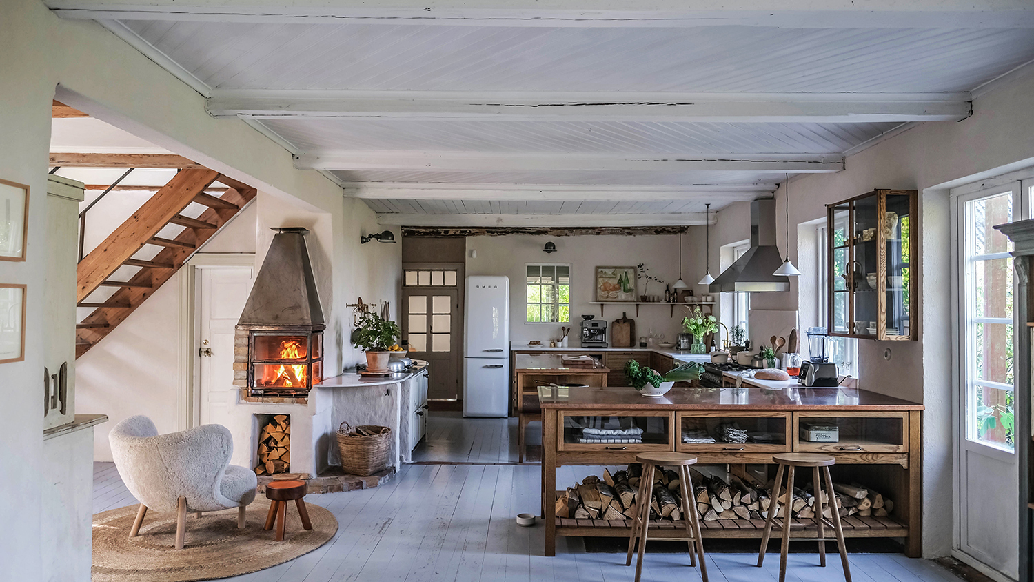

Cocooned on almost all sides by beautiful and practical cabinetry and tons of worksurface, classic U-shaped kitchen ideas are highly coveted layouts for homeowners as they offer so much space.
A U-shaped kitchen layout contains an arrangement of different kitchen units positioned on three adjacent walls that form the shape of the letter u - leaving the top of the layout open for a doorway or an open plan living room.
Practical and designed for effortless prep, cooking a meal should be a well-choreographed dance with everything you need to hand and a U-shaped kitchen will ensure this. From comforting hues to trendy two-tone designs, take a look at our U-shaped kitchen ideas that provide the ultimate in efficiency and style.
1. Warm up a large space with textiles
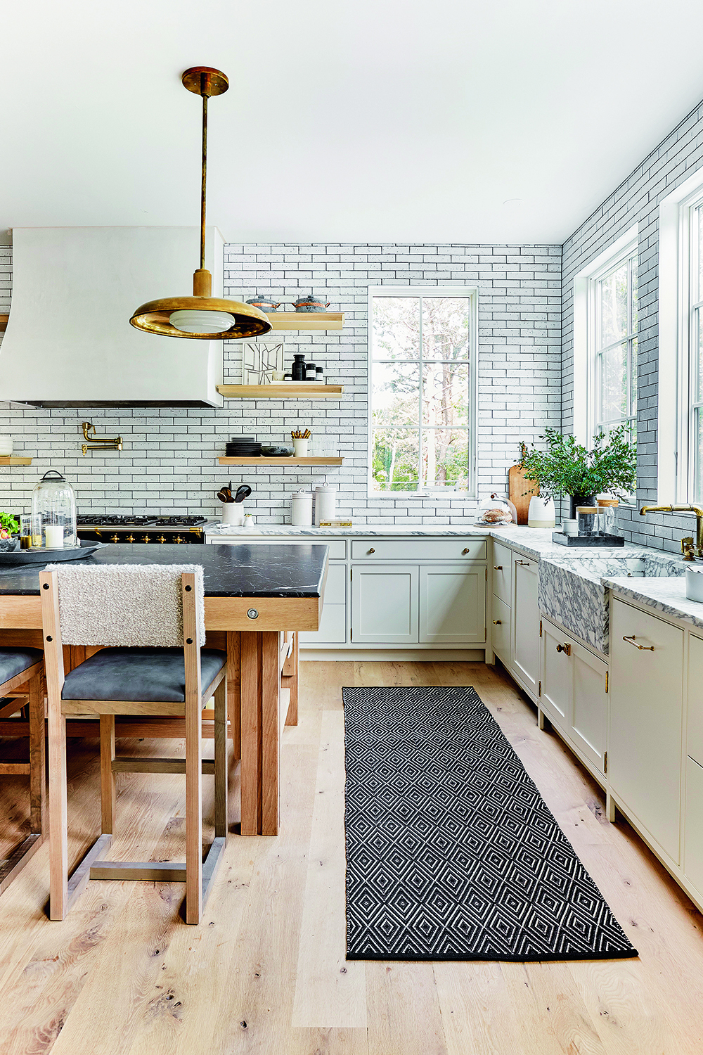
If you're lucky enough to have a large home where your U-shaped kitchen takes center stage – you may want to think about softening all that cabinetry, tiling, and work surface with textiles. A large kitchen with a lot of storage is a dream but a room full of cabinets might come off feeling too functional so it's essential to introduce textiles and upholstery.
This huge home in The Hamptons designed by Tamara Magel features a grand American kitchen with cream cabinets and is softened with plushly upholstered bar chairs with boucle backrests and runners all along the walkways – the perfect layout to weave in textiles.
2. Sneak in subtle practicalities
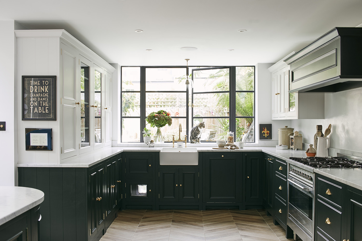
Including space for your pets in the kitchen is important! Whether it’s a pet bed, a cat flap, or a place for your four-legged friends to eat and drink. Accommodating them without impacting your design aesthetic isn’t always an easy task. This U-shaped kitchen without an island works in a spot right in the heart of the action.
'In this particular kitchen, we wanted to include a cat-flap without impacting the aesthetic of the Crittall windows,' says George Miller, Home Designer at Neptune Fulham. 'We decided to conceal it in the back of a cabinet, and incorporate a pet bed in order to keep the floor space clear and create a cozy kitchen corner for our customer’s cat.'
3. Be space savvy with awkward nooks
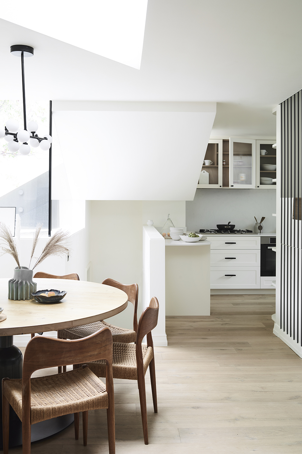
We often get asked 'how do you design a kitchen that's better to cook in?' Well, this layout is a little offbeat but we love the character it brings to this open plan kitchen. The kitchen has been savvily slotted into an awkward nook but the U-shaped formation allows for some structure with a peninsula that works as a practical part of the U. It also doubles up as a divider to the open plan small kitchen layout and acts as a useful part of the dining area to keep items of food close to hand.
The monochrome palette paired with natural furniture makes the space feel larger and draws the eye away from the irregular architecture.
4. Skip the wall cabinets to create space
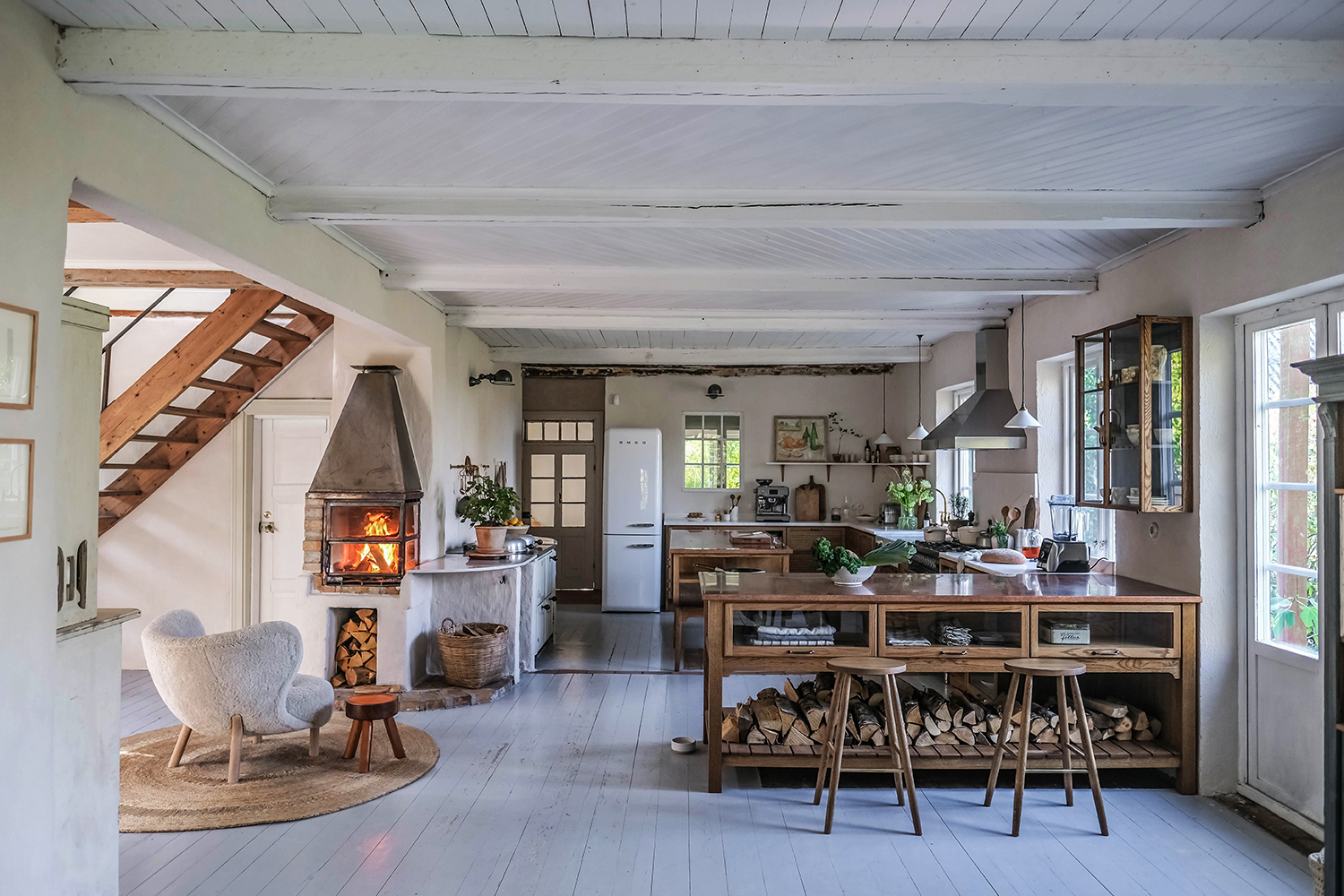
The kitchen is the center of this airy Scandinavian home, with ubiquitous whitewashed floorboards and ceilings, features an eclectic mix of vintage and mid-century furniture all brought together with deVOL's Haberdasher's kitchen cabinets which form a characterful and practical U.
The slim glazed panels on the island, drawers, and wall cupboard give light, reflection and create beautiful vignettes. Making the most of the kitchen storage from the U-shape on lower cabinets there are hardly any cabinets on the wall - giving the whole room a sense of space that may have been lost with wall-to-wall upper cupboards.
'If your aim is to make your kitchen look bigger then the best way to achieve this is by not filling the room full of cupboards and leaving plenty of light and space around windows, so avoid wall cupboards.' advises Helen Parker, Creative Director at deVOL Kitchens. 'It is also a good idea to keep the colors and materials similar, so soft light woods and flooring and similar color walls and cupboards. This will have more of an impact than just painting your walls in a light color.'
5. Opt for a natural color palette
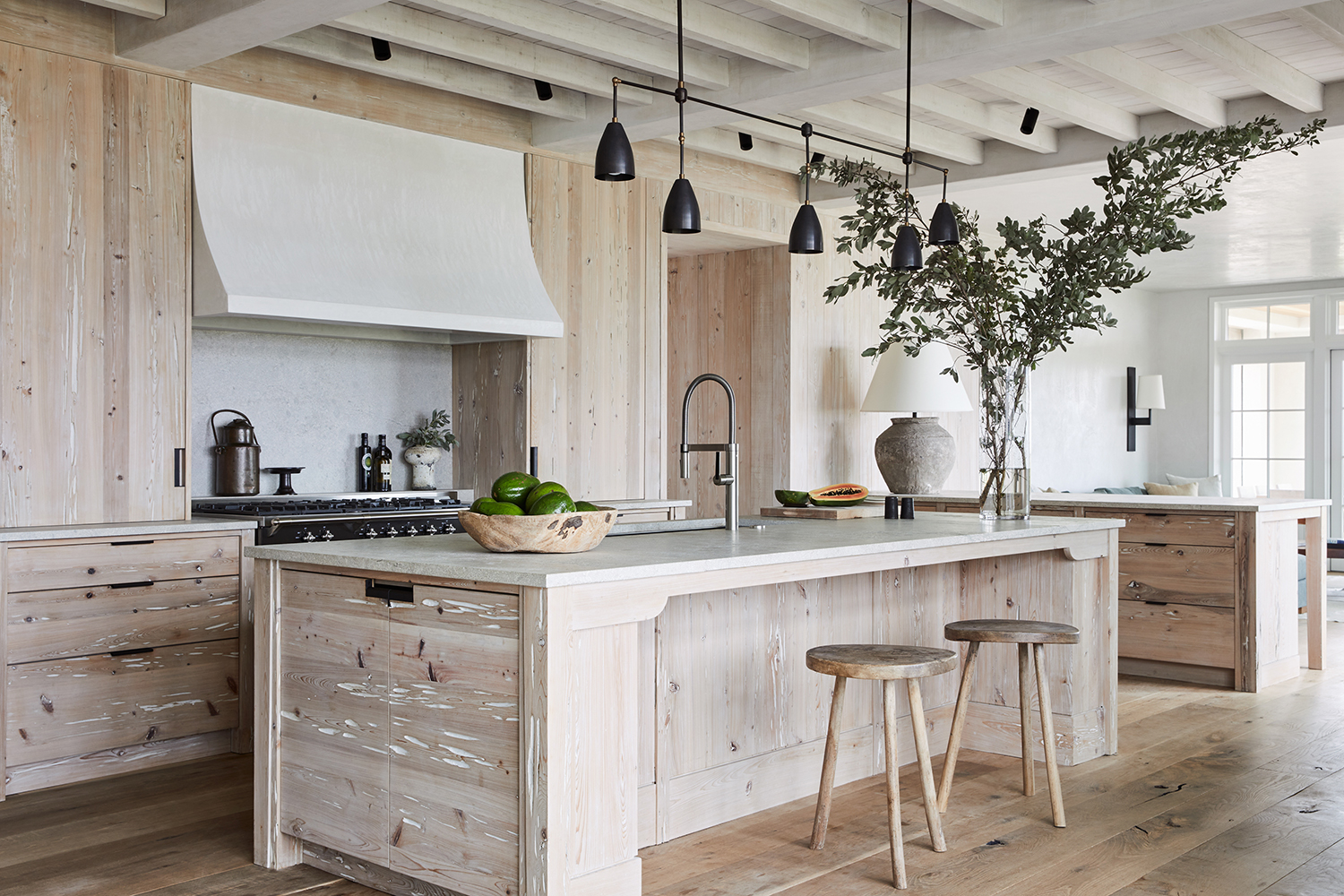
With all that space and storage and cabinetry that can be on offer from this layout a room could end up feeling a little constricting. This airy wooden kitchen by American designer Betsy Brown uses beautiful lime-washed Florida Cypress wood to clad the generous kitchen making the cabinetry feel light and delicate. The U layout offers up plenty of space in its center in this case for a matching generously-sized wooden island topped with white marble.
Inspired by a wabi-sabi lifestyle, the rest of the house similarly embraces a play of light and shadow combining a material palette of white plaster, local shell stone, limed plaster, and organic fabrics.
'A U-shaped kitchen is perfect for factoring a kitchen island into your design,' says 'Stephanie Nix, Kitchen designer Neptune. 'Providing a flexible space with plenty of storage, an island will help free up workspace and keep your surfaces clear. You’ll also have plenty of wraparound space to zone your kitchen for added organization when prepping food and entertaining.’
6. Combine traditional and industrial
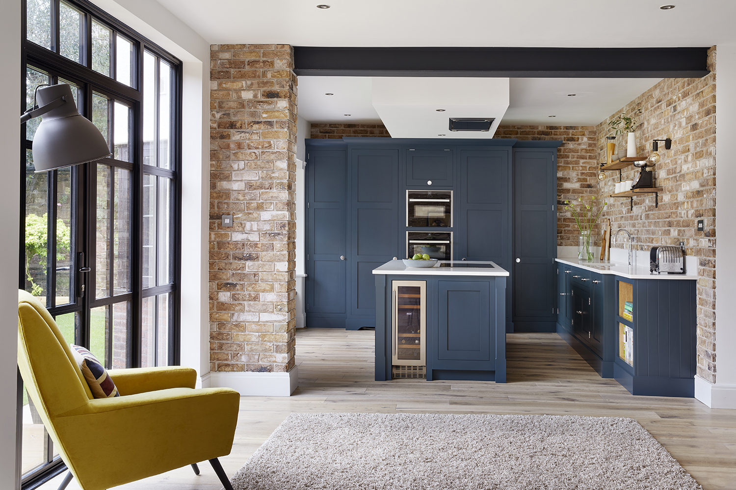
This tactile space cleverly combines an elegant traditional vibe within an industrial kitchen feel. Dusky blue cabinetry is paired with exposed brick walls and lightly worn wooden floors creating a playful contrast of aesthetics – elevating the classic navy kitchen with the edginess of the warehouse-style space.
'A U-shaped kitchen allows the space to feel more open-plan,' explains Tom Howley, Design Director of Tom Howley. 'Strategically divide the kitchen into zones for optimal functionality. To add more space consider adding an island with the hob positioned overlooking so you can socialize whilst preparing dinner for friends and family.'
7. Play with duo tones
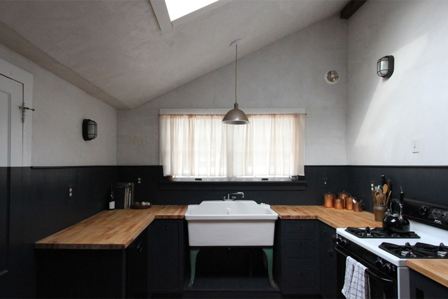
A U-shaped kitchen has the perfect symmetry for the two-tone kitchen trend we're all loving. This modern farmhouse kitchen by American interior studio Jersey Ice Cream Co uses one bold stroke of black to divide the walls in half using a bright white and charcoal palette.
'Kitchens are a great space to experiment with color and color combinations,' says Ruth Mottershead Creative Director at Little Greene. 'You should consider the entire space and the overall atmosphere that you’re trying to create: whether it’s fun and energetic with pops of color, paired back and elegant or perhaps moody and sophisticated.'
8. Streamline with handleless cabinets
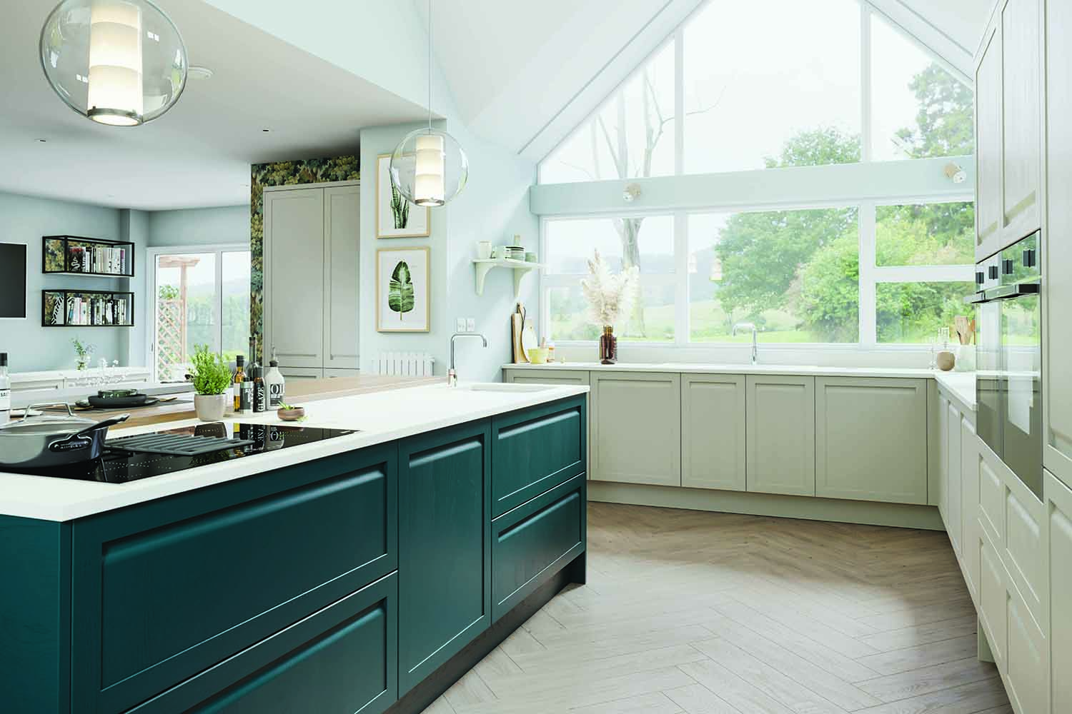
A handleless kitchen offers up a dynamic style entirely different to a kitchen with cupboard door handles and drawer handles. The look is clean, uncluttered, and streamlined- especially easy on the eye if you have a U-shaped kitchen with a lot of cabinetry.
If you have an open plan house like this one with your living room or dining room flowing into the kitchen, handleless kitchen doors in a kitchen with a lot of cabinetry will offer fluid movement throughout the house, giving some excellent feng shui.
9. Mix up materials to keep it interesting
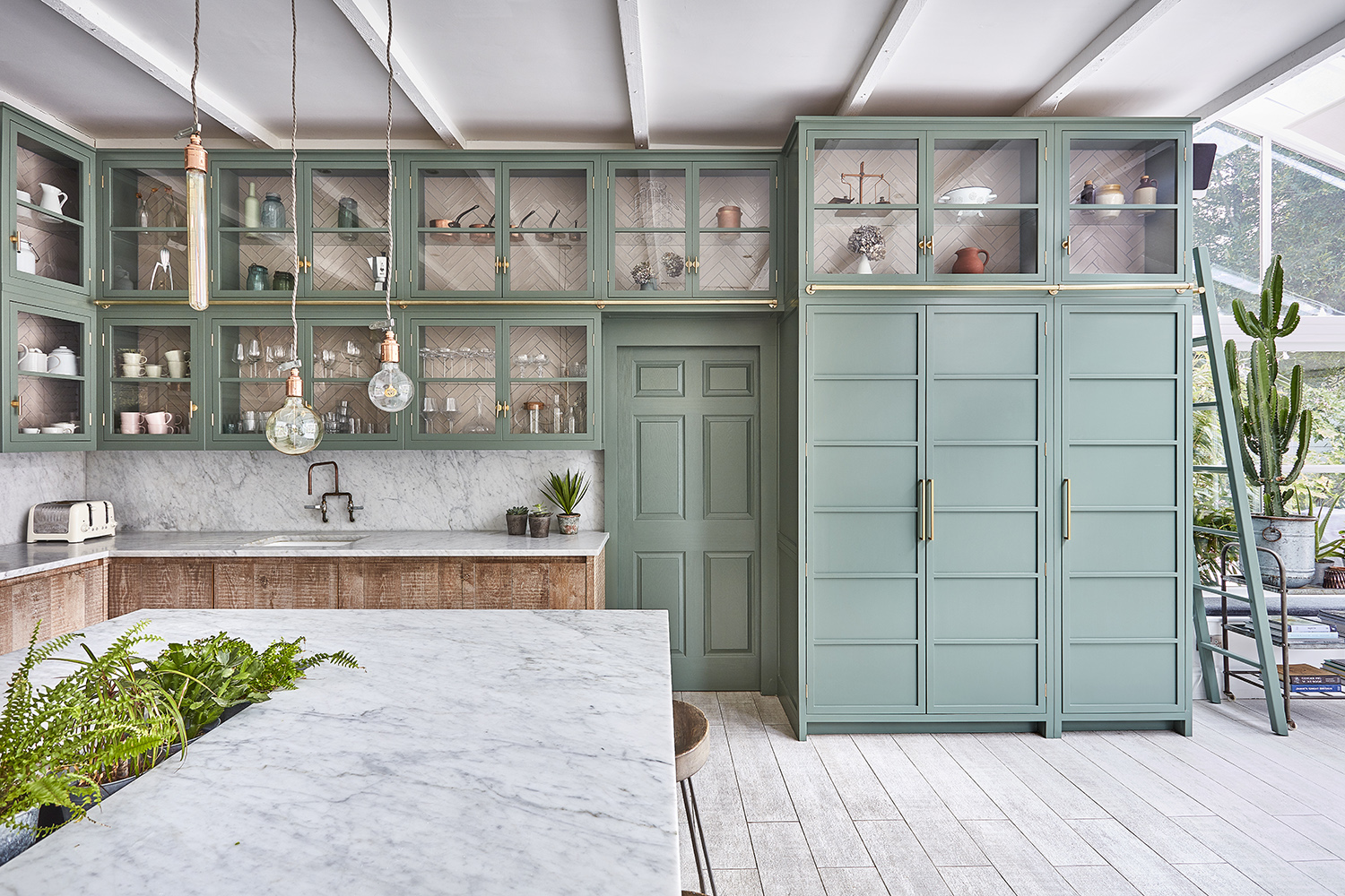
U-shaped kitchens offer plenty of bang for their buck and if you have high ceilings like this space you will find yourself with a lot of cabinetry and storage, so it's essential to mix up materials and draw the eye around the space.
This space combines painted units with raw textures and glass cabinetry. The generously sized modern Shaker kitchen features mint blue painted upper cabinets with brass details and beautifully crafted lower cabinets in unpainted rustic wood.
'Painted, real wood kitchens are growing in demand,' says Sinead Trainor, Kitchen Category Manager at Lochanna Kitchens. 'The trend for natural textures as well as mixing textures and materials, even across door ranges in the kitchen, continues.'
10. Optimize on storage
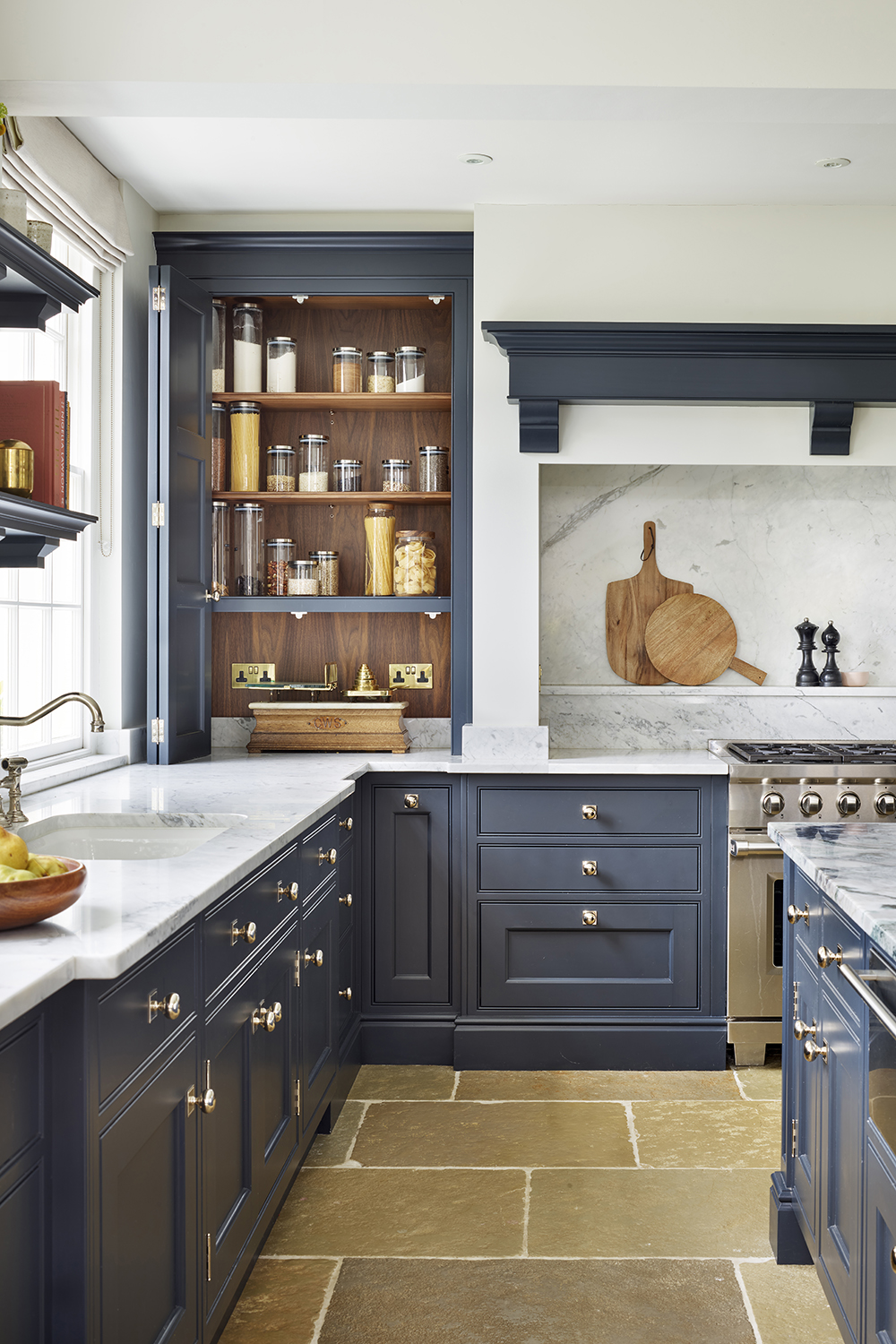
U-shaped kitchens are an optimum layout for providing storage on every possible area. Consider incorporating pantry ideas onto your worktops and making use of awkward niches. When drawing up plans for a new kitchen designers try to place a pantry in the handiest location within steps of the primary kitchen work zones, particularly the areas around the fridge, sink, oven, and cooktop. Similarly in this U-shaped kitchen, the small pantry sits between the cooker and the sink and handily right behind the prep island.
'Storage on a worktop allows you to take full advantage of every inch of available space – particularly height wise,' says Richard Moore Design Director at Martin Moore. 'If you have high ceilings, storage can easily be built upwards in the form of purpose-built, bespoke cabinetry. Similarly, worktop storage also makes good use of awkward or unusual architectural spaces and can keep essential items/appliances close to the cooking and prepping zones.'
What are the major advantages of a U-shaped kitchen?
A U-shaped layout gives you a large amount of worktop space which is very practical for food preparation, cooking, and baking. It also provided plenty of storage space from the cabinets positioned around the room. You also have the option of adding a seating area in the center, depending on the size of the kitchen.
Another major benefit is that two or more cooks can operate at the same time - great for when you're entertaining or simply have a big family to feed. It's a practical layout that keeps the center of the room free for traffic flow, particularly between the fridge, sink, and the oven, the three key points of the kitchen.
How wide should a U-shaped kitchen be?
U-Shape Kitchens have widths that range from 2.7-3.7 meters and depths that vary as desired. Ideally, you should have at least 1.5 meters of floor space between the opposing units, so the kitchen doesn’t feel too cramped, but you may be able to get away with less.
If one of your opposing units is longer than the other, it’s recommended to put your cooker on this side. This provides you with extra food prep space close to where you’ll be cooking, and allows space to put down hot trays without having to cross the kitchen.
Be The First To Know
The Livingetc newsletters are your inside source for what’s shaping interiors now - and what’s next. Discover trend forecasts, smart style ideas, and curated shopping inspiration that brings design to life. Subscribe today and stay ahead of the curve.

Rohini Wahi is Content Editor for Livingetc Online. With a decade-long career in the interiors and design industry working as a journalist for premium lifestyle publications then delving deeper into the business as a trend forecaster, Rohini has amassed a wealth of global design knowledge that informs her work. She loves a period drama and keeps a tidy home.
-
 7 Pantry Organization Mistakes That Are an Organizer's Worst Nightmare
Get that Pinterest-perfect pantry by avoiding these certified organization faux pas
By Amiya Baratan Published
-
 Burl Wood Decor Is 2025’s Most Coveted Comeback — Here’s How to Get the Storied Swirls for Less
Irregularity is the ultimate luxury, but you don’t need an antiques dealer to find it
By Julia Demer Published