Designers Are in Love With "Unexpected Ceilings" — This Creative Trend is Elevating Modern Spaces
More often than not, the ceiling is ignored in the design process, but by taking this space to do something surprising can be a gamechanger


If you're looking to take your aesthetics a step further, then consider eye-catching, unique ceiling treatments that become conversation starters. After all, the fifth wall can add dimension, character, and a sense of completeness to your space. Since this surface isn't at an eye level, it's easy to take its look a notch up, and choose designs that surprise and awe. Think luxury, bespoke, and bold.
To offer you inspiration, we reached out to designers. Here are some of the most unexpected ceiling decorating ideas — from super luxe to subtly decorative.
1. Eye-catching fabric and beads
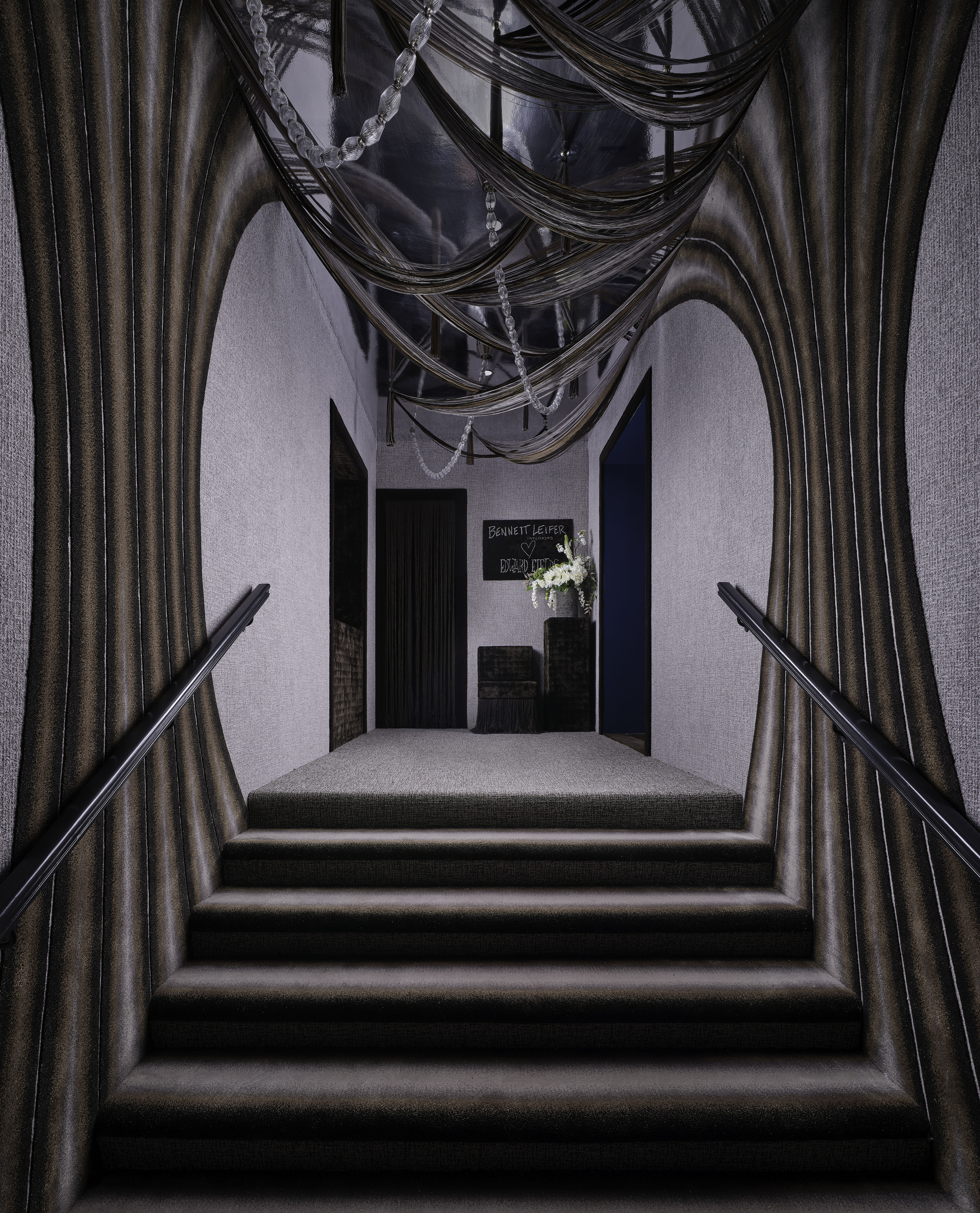
This idea may seem a bit out there, especially for those living in apartments. But those who own larger homes and want to add a decorative touch to the entryway can take a leaf out of this design.
'We wanted to do something that would push design boundaries,' says Bennett Leifer, founder of Bennett Leifer Interiors. 'The space is essentially a love letter to the brand and the art of carpet making. Over an intimate dinner in Paris, I pitched the idea of a completely carpeted room to the Edward Fields team, and immediately a creative spark was ignited. I was instantly entranced by Edward Fields’ quote referencing the floor as “The Fifth Wall,” an indication that the floor decoration is just as important as the rest of the envelope—therefore, inspiring the fully-carpeted concept. As the idea developed, favorite archive patterns and techniques were selected to outfit every facet of the space: floor, stairs, walls, niche, furniture, as well as accent the ceiling. The trick was unifying patterns and materials in a thoughtful and seamless manner that made a unique statement. Within the recessed niche, an overall gridded pattern flows into a pixelated mirror frame. The design also transitions into a beautiful curvilinear pattern on the walls to the floor and ceiling that draws the eye to where the lighting is swagged in unison with the fringe.'
'There’s a restrained elegance with details that unfold and that aren’t in your face,' he further mentions. 'And there’s also a certain tone-setting levity to this quietly surreal entryway. You want to follow where it leads.'
2. A modern coffered look
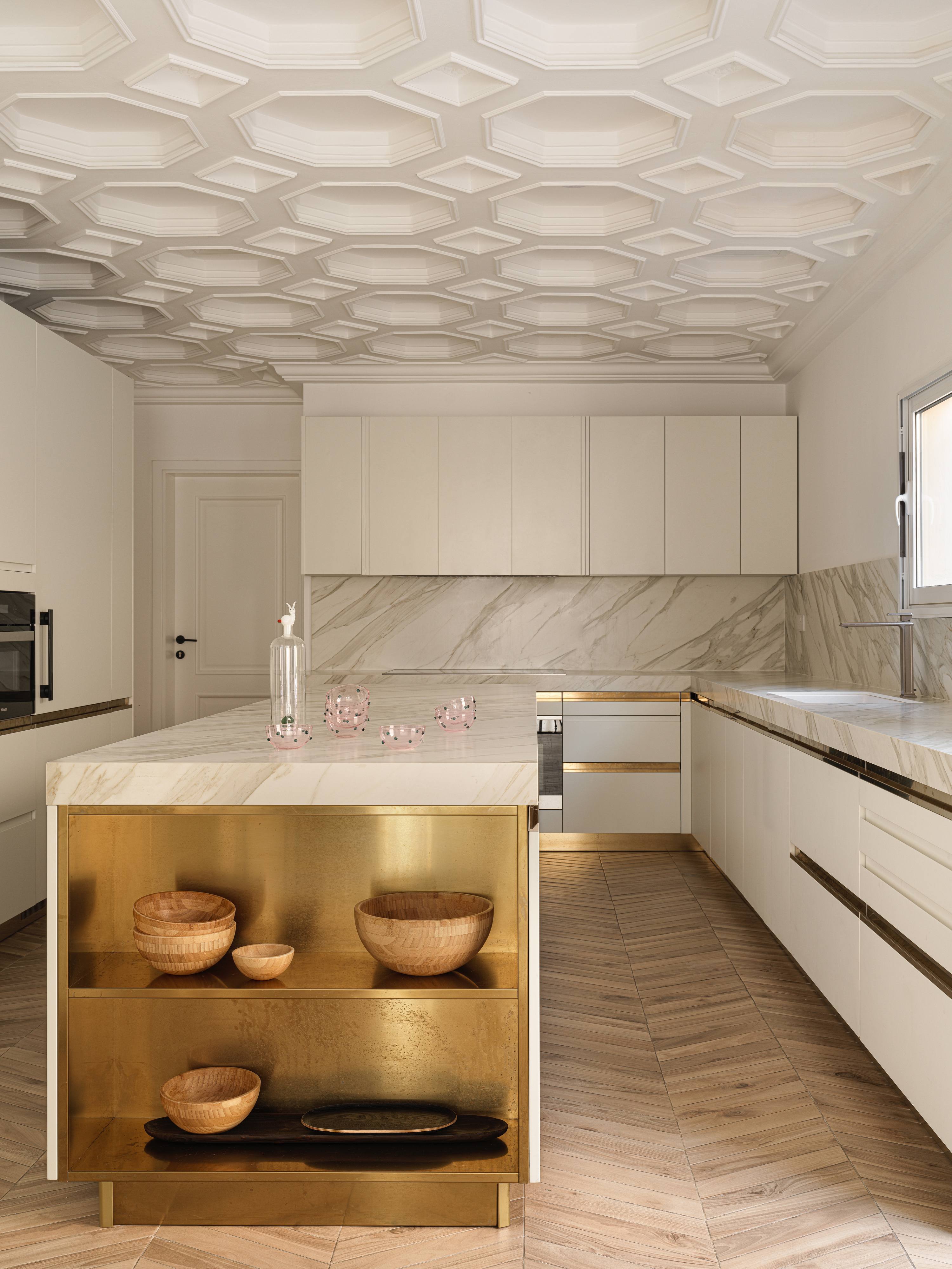
The coffered look has been around for a while but this particular one is a modern version, great for a kitchen or living room ceiling idea. It not only gives spaces character but also encourages people to look up, thereby taking in the entire dimensions of the space.
'The rhythmical shapes in the design of the floors and ceilings give some dynamic energy to the calm and relaxed atmosphere of the house,' says interior designer Marina Braginskaya. 'Some of the ideas were there before the house was purchased but we loved the idea and decided to implement such techniques in the final interior and play more with these structures and patterns.'
3. Textural wallpapers

Textured wallpapers are a big living room ceiling trend, and gone are the days of flat, one-dimensional single tones. Today wallpapers look like bespoke pieces of art, and add color and tactility to areas. In a space like this, the wallpaper breaks the monotony of wood, and injects an unexpected dose of hue and material.
'The room is surrounded by beautiful paneling, and I wanted to give the eye a place to rest from the wood tones,' says Anne Barger, founder of Anne Barger Designs. 'The slight shimmer and of course, the beautiful emerald color of the Omexo covering brings such a moment of unexpectedness to the space.'
4. Custom painted ceilings
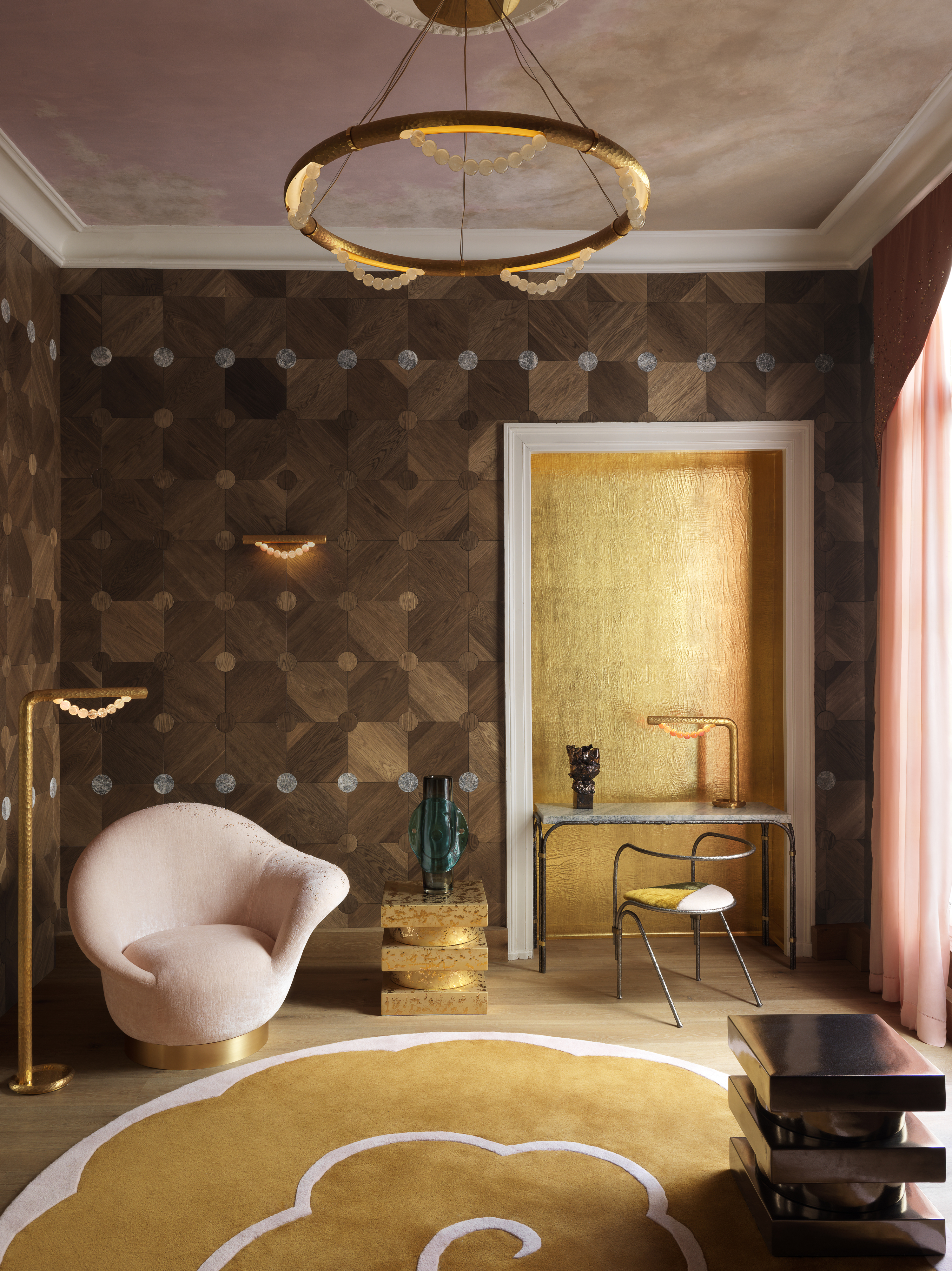
Who doesn't love a good painted ceiling idea? While it's common to see color on walls, it's another to see it splashed across the top. In this project, the use of color is so considered and delicate, that it makes the ceiling feel like a tapestry.
'Conceived as a jewel box, the living room features parquet, wood panelling, painted ceiling, bronze chandelier and curtains with valances designed and produced by artisans of excellence,' says Pierre Gonalons. Fuelled by the decorative arts of past centuries, and modern pop culture, the space defines the contours of luxurious materials, graphic forms, a mix of genres, and a sense of showmanship.
5. Organic arches
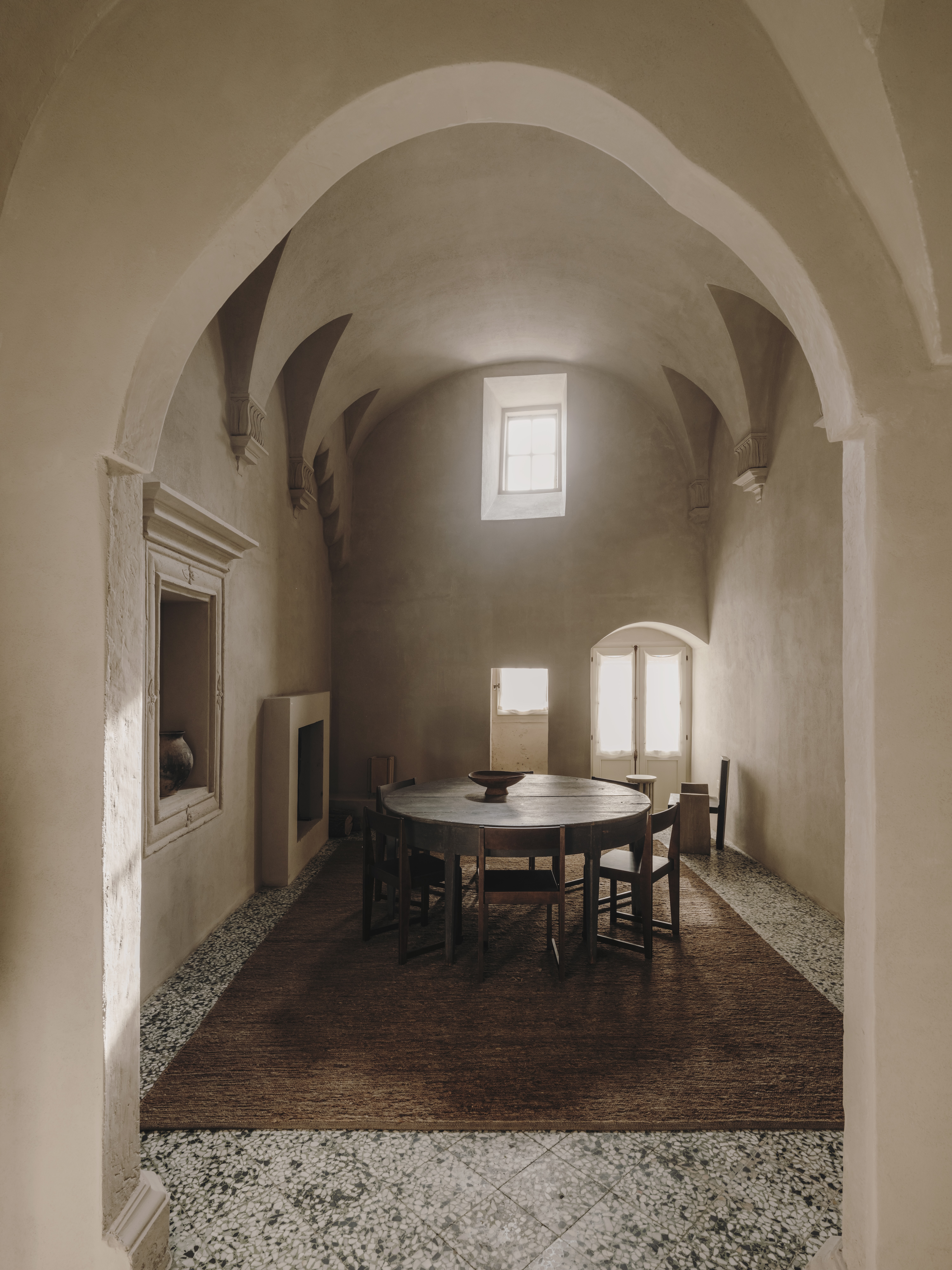
Indoor arches have made a big comeback this year, and experts have tried several ideas to make this architectural feature pop. From painted arches to tiled ones, there are many great ways to incorporate one into your home. This particular project by Andrew Trotter and Marcelo Martínez of Studio Andrew Trotter is all about the beauty of irregular arches that break the monotony of straight lines and symmetrical architecture.
Arches add character to a space and create a smoother transition between two areas of the house. This double-height space gets a sense of coziness with the arches too, and the textural wall finish ensures that the room has a natural warmth to it.
Be The First To Know
The Livingetc newsletters are your inside source for what’s shaping interiors now - and what’s next. Discover trend forecasts, smart style ideas, and curated shopping inspiration that brings design to life. Subscribe today and stay ahead of the curve.

Aditi Sharma Maheshwari started her career at The Address (The Times of India), a tabloid on interiors and art. She wrote profiles of Indian artists, designers, and architects, and covered inspiring houses and commercial properties. After four years, she moved to ELLE DECOR as a senior features writer, where she contributed to the magazine and website, and also worked alongside the events team on India Design ID — the brand’s 10-day, annual design show. She wrote across topics: from designer interviews, and house tours, to new product launches, shopping pages, and reviews. After three years, she was hired as the senior editor at Houzz. The website content focused on practical advice on decorating the home and making design feel more approachable. She created fresh series on budget buys, design hacks, and DIYs, all backed with expert advice. Equipped with sizable knowledge of the industry and with a good network, she moved to Architectural Digest (Conde Nast) as the digital editor. The publication's focus was on high-end design, and her content highlighted A-listers, starchitects, and high-concept products, all customized for an audience that loves and invests in luxury. After a two-year stint, she moved to the UK and was hired at Livingetc as a design editor. She now freelances for a variety of interiors publications.
-
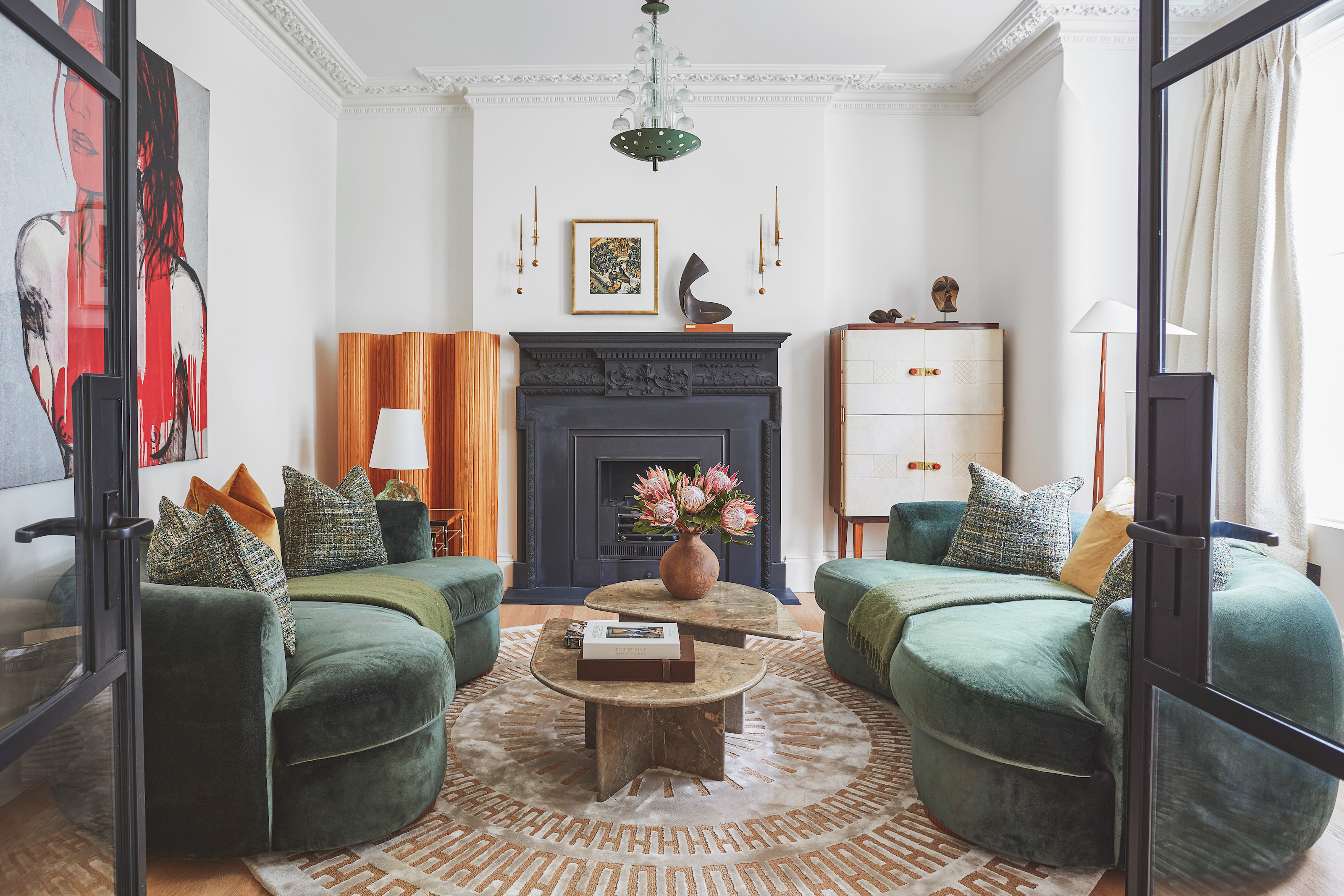 The 'New British' Style? This Victorian London Home Embraces Its Owners' Global Background
Warm timber details, confident color pops, and an uninterrupted connection to the garden are the hallmarks of this relaxed yet design-forward family home
By Emma J Page
-
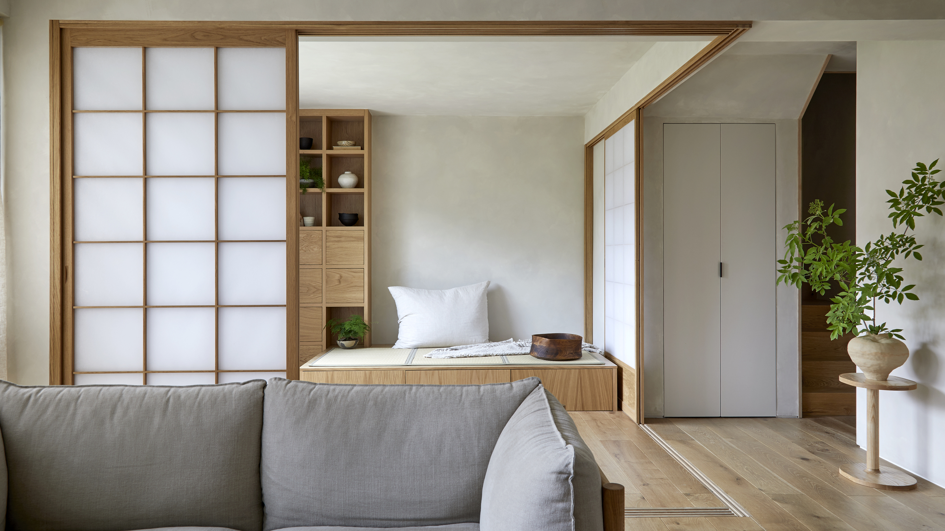 Muji Living Room Ideas — 5 Ways to Harness The Calming Qualities of This Japanese Design Style
Inspired by Japanese "zen" principles, Muji living rooms are all about cultivating a calming, tranquil space that nourishes the soul
By Lilith Hudson
