10 unusual kitchen materials - beautiful new design trends set to level up your counters and cabinets
Unusual kitchen materials, from pigmented concrete to recycled plastic are becoming loved by designers. Here's how to create a space that doesn't look like everyone else.
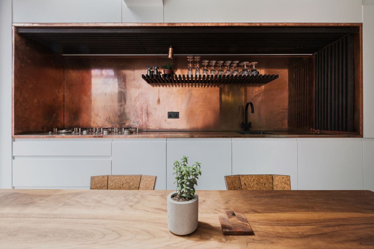
Is there any reno project that induces decision paralysis quite like the kitchen? With plenty of technical boxes to tick (and often the next decade to think about) what should be a joy can swiftly become anything but.
It's all too easy, then, to go for the safe options when remodelling a modern kitchen: old faithfuls like Corian, or the exact same wood veneer you had in your old house.
But the seeming lack of choice is really an illusion. There's a wide range of perfectly hygienic, durable, heat and water-resistant materials for countertops, and it's often convention, rather than cost, that prevents broader adoption. Mat Barnes, the founder of architecture studio CAN, estimates that the recycled plastic countertops he chose for his fun-loving family home (more on that later) topped out around $3000 - generally cheaper than most widely-used materials. "As an architect, your own house offers a chance to test a material before recommending it to a client. The graphic nature of the particular plastic we used really worked with our wider vision for the space."
Remove the need to put down the odd hot pan and the pool becomes wider still. There's now a whole crop of companies producing beautiful cabinet fronts to upcycle standard units, and plenty of designers up for a challenge if you're bold enough to go bespoke.
10 unusual kitchen materials to put on your moodboard now
1. Brass
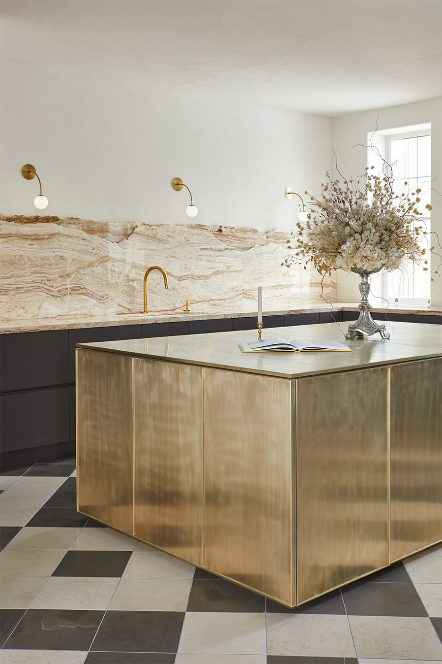
"We knew that we wanted the focus to be on the finishes," explains Jayme Million, the co-founder of Toronto architecture firm Studio Author. She's talking about this luxurious space which utilises panels of brass to create a kitchen island that is guaranteed to age beautifully. "We loved the idea that the brass would begin to tell a story over time as it patinas with use."
There's marble here too, but not as you might know it. "We sought out materials that would add character, depth and a touch of imperfection to the space and then used them in unexpected ways. The backsplash captures this sentiment perfectly; marble, which is typically refined, was broken by hand and layered to create a distinct feature within the kitchen."
It's a lesson in letting the materials do all the talking. "Integrated finger pulls and appliances, the absence of upper cabinets and the monolithic form of the unlacquered brass island allowed the natural, tactile surfaces to really stand out," she adds.
2. Plywood
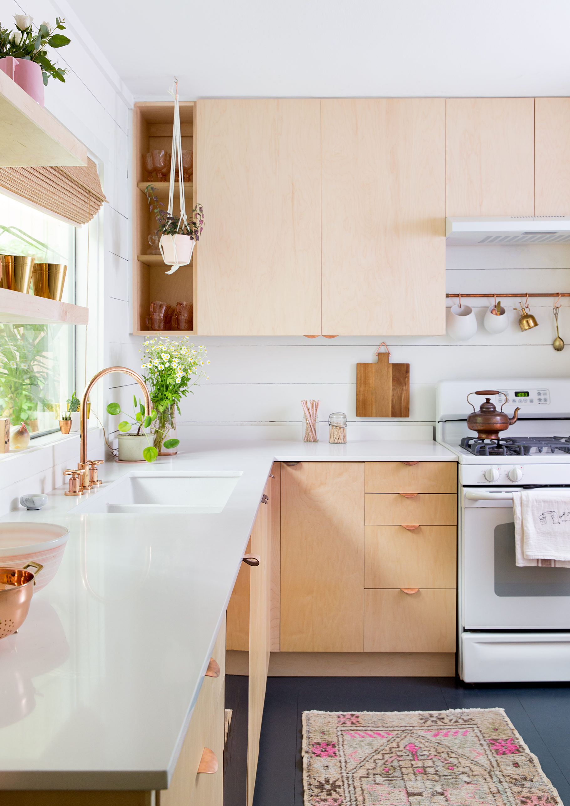
Austin-based interior designer Claire Zinnecker is nothing if not realistic when recounting the thought process behind her own maple ply kitchen. "I chose it because it was the most affordable option I could find. I was on a tight budget, and liked the idea of wooden kitchen cabinets in a non-traditional sense. I love how they turned out."
Topped with white Caesarstone countertops and accented with copper handles, Zinnecker's take is perhaps a little more refined than the raw look that architects love. At turns Scandinavian in feel, this engineered wood veneer seems to be a shapeshifter – and will perform all the better if regularly sealed with something like linseed oil.
Though it's a ply-free zone, it would be remiss not to mention Zinnecker's dishwasher, which has a sleek, high-shine exterior thanks to a piece of copper glued onto a wood panel front.
3. Recycled plastic
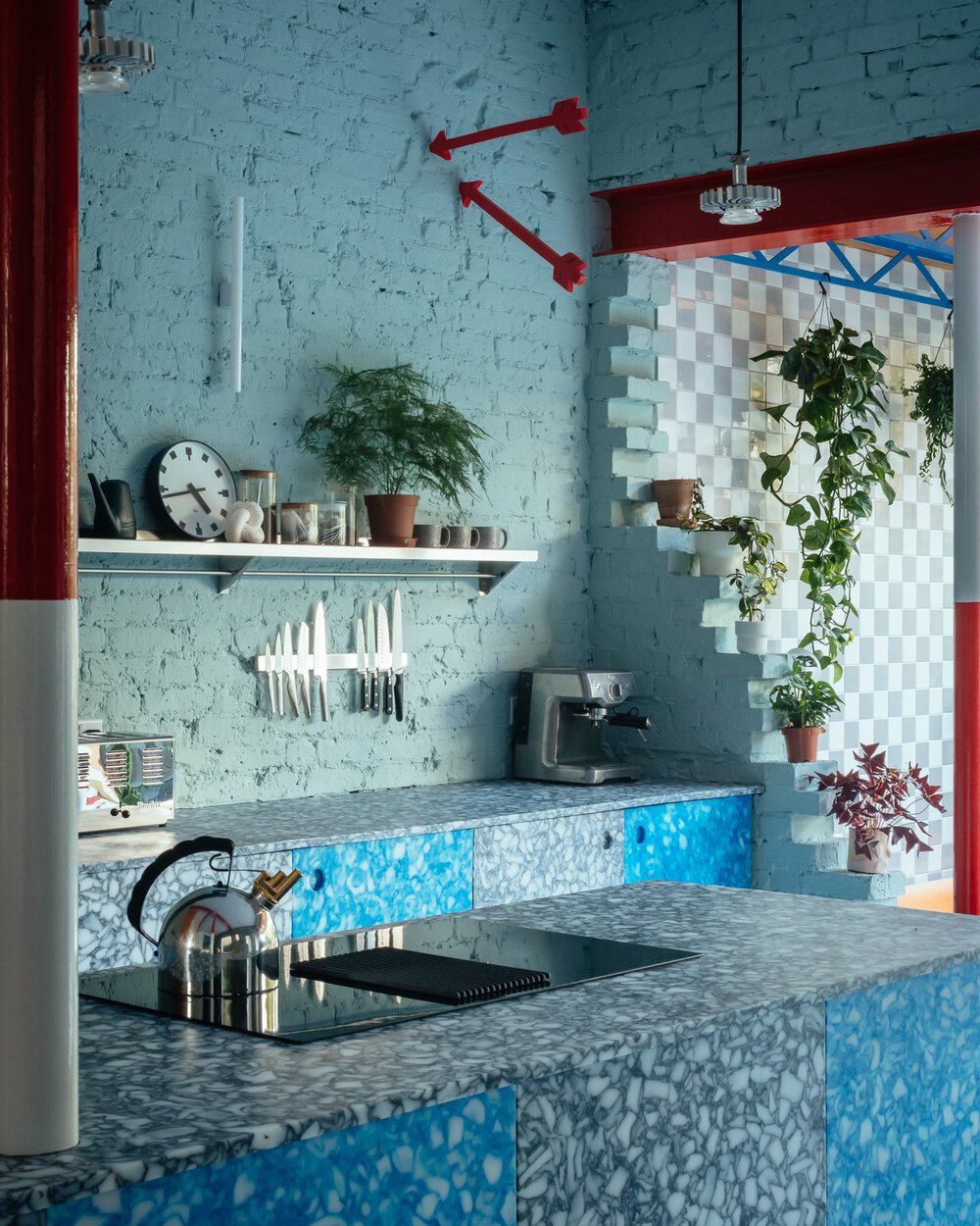
The plastic backlash shows little sign of slowing down, with consumers largely turned off by what they see as an unsustainable (and ubiquitous) material. Recycled plastic, though, is something different altogether – and fans include architect Mat Barnes, the founder of CAN, who chose vibrant, terrazzo-like recycled plastic coutertops for his own home.
"The plastic itself is made out of recycled chopping boards, milk bottle tops and microwave meal trays – all things that you would use in the kitchen. In a tongue-in-cheek kind of way I quite liked the idea of remodelling a kitchen out of these things that have been thrown away there. It's like a closed loop."
He sourced the material from Smile Plastics, a small batch manufacturer of 100% recycled plastic panels, planks and side tables. They can recommend the best options for different uses – including countertops – as thermal setting properties and thicknesses will affect performance. "The graphic pattern is very forgiving, and although it won't have the lifespan of something like quartz, it's so much cheaper."
4. Stainless steel
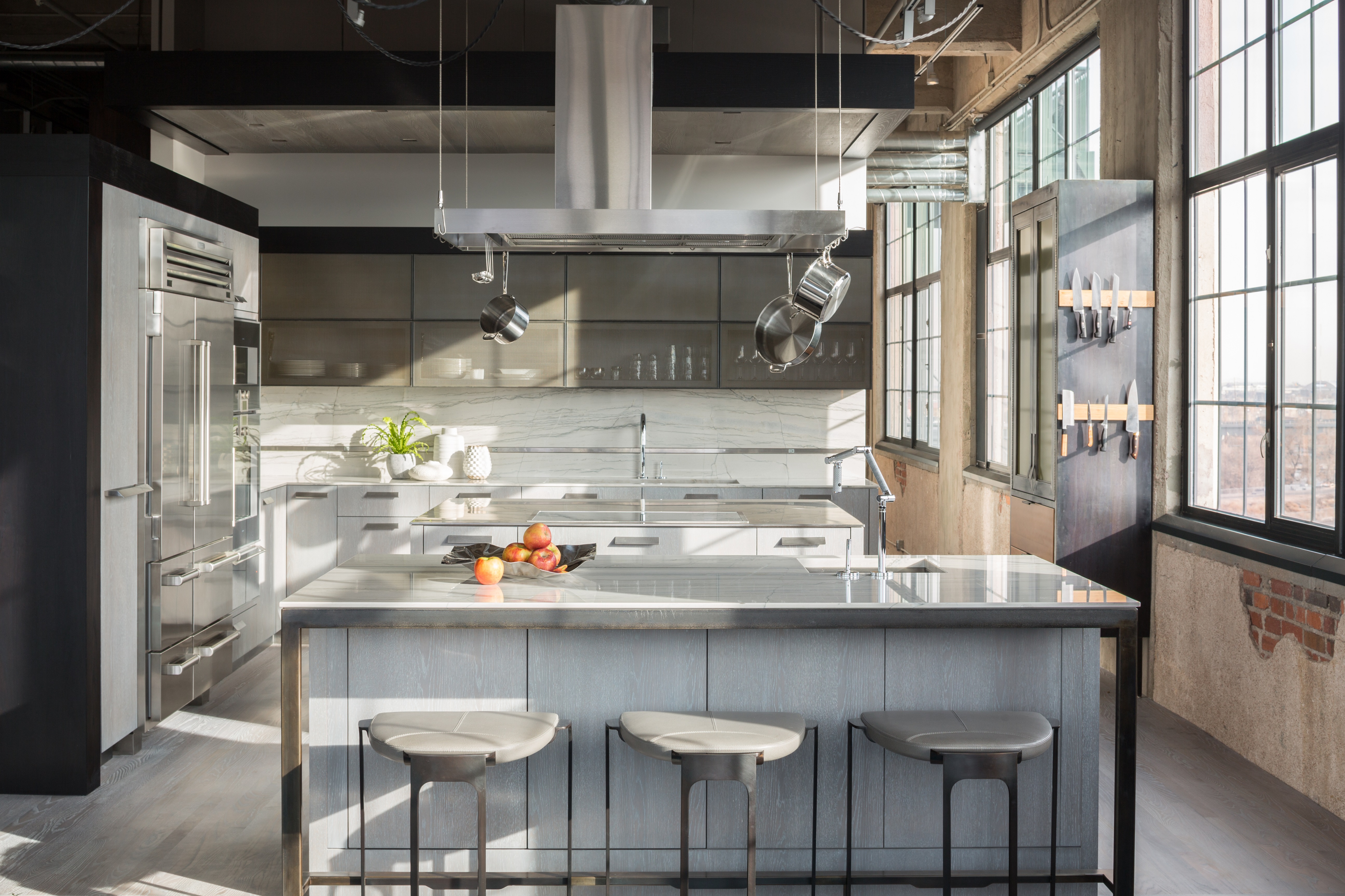
While not exactly niche, stainless steel has long struggled to shrug off its commercial associations. "Steel is an expected material in working kitchens," confirms Jennie Bishop, a principal at Chicago-based interior design studio Studio Gild. In this bells-and-whistles space, designed for a "a fanatic home chef", she knew that using it as a waterfall countertop would stand up to the rigours of a discerning client. "He loves the ease and resistance to water stains and heat. We've previously designed other homes for him and a beautiful, functional cook's kitchen is a staple."
Nearly indestructible – an endless torrent of red wine would be no match for this workhouse material – stainless steel is the best option for those who prize durability above all else. Note that not all is created equal, and the best-performing options might approach marble in terms of cost.
There is no stopping the scratches (though lighter marks can be buffed out with the right product) so make sure you understand how the surface might look with regular use.
5. Reclaimed wood
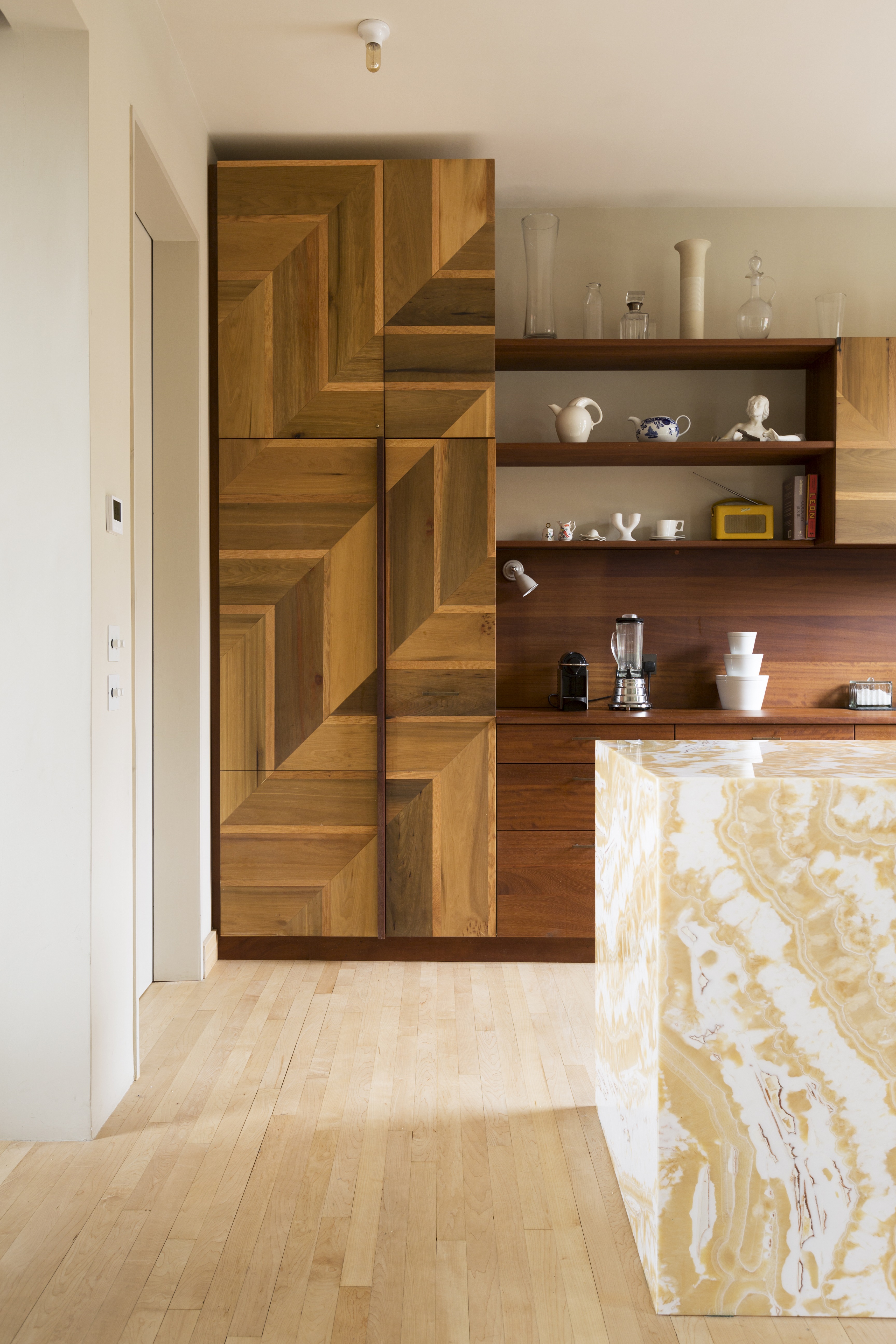
Reclaimed materials might involve a little extra rummaging, but the patient will be well rewarded. While salvage yards are usually open to the public in principal, the very best bits are likely to be saved for industry contacts – so it can pay to confer with a specialist.
Anyone with a remote interest in reclaim will know the name Retrouvius; husband and wife team Adam Hills and Maria Speake have spent two decades magicking up second lives for materials extracted from soon-to-be demolished buildings or overzealous refits (see this striking geometric design, created by combining tulip wood with a thin oak front). "All the materials bring a warmth, texture and patina that new materials often lack".
They advise carefully weighing up the project as a whole before digging in the proverbial skip – and doing your bit to continue the cycle. "Like most salvage, the material cost might be lower than new but it can be more costly to work with, or require cleaning. Our tip is to use it without cutting too much, and – where possible – screw rather than glue, so that it can be considered for future reuse."
6. Aluminium
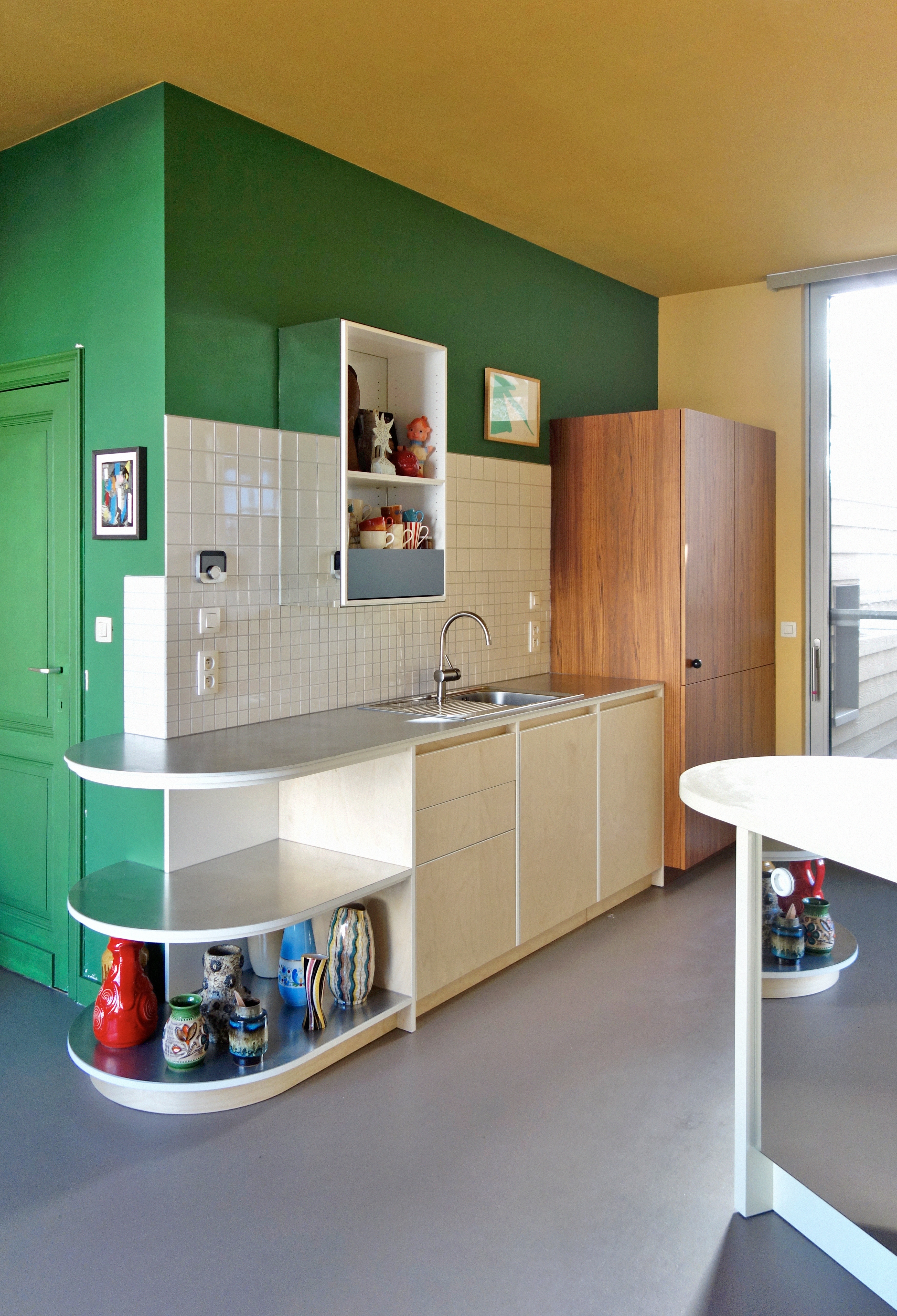
A more affordable sibling to stainless steel, aluminium nevertheless ticks many of the same boxes: it's rustproof and non-porous, hygienic and highly fire-resistant. It's also around a third of the weight, so it wins on the weight-to-strength ratio.
"I like the soft, matte feel of aluminium," says interior architect Dries Otten, who has rightfully earned a reputation as the go-to man for playful, material-led kitchens. "It gets a white oxidation layer, so the worktop is ‘alive’. The patina will be different according on how a specific zone of the counter is used: some parts will get polished due to daily cleaning, while others will become more matte and white."
A thicker panel (Otten uses 0.4" plates) will give the worktop "a tough and sturdy feel", but you'll need to be on board with a bit of artful ageing if you want to embrace this countertop trend. "Aluminium is a rather soft metal so it will get stained when scratched by harder objects," he explains.
7. Tiles
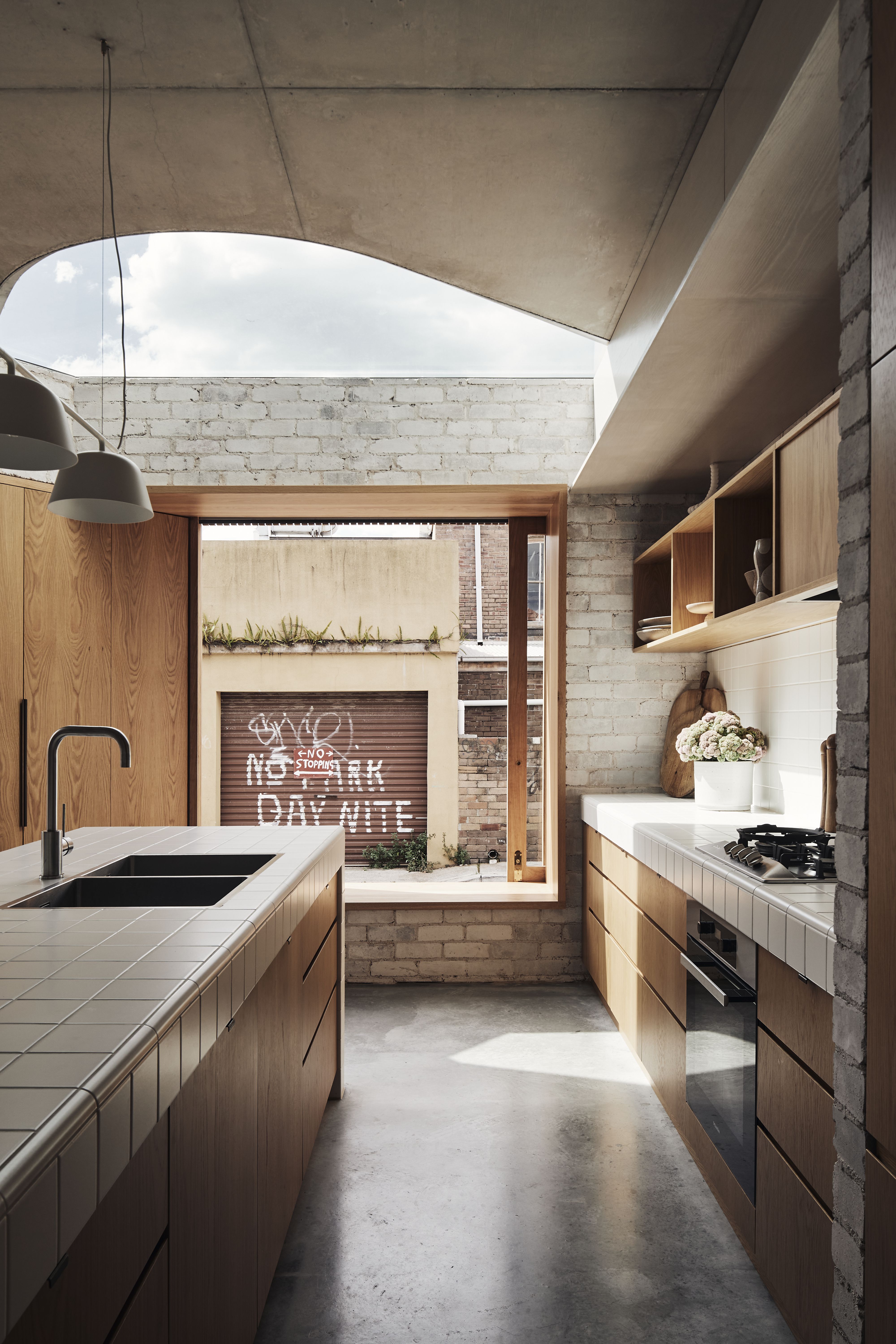
No, not the same old backsplash, but the countertops themselves. Hardworking and impervious to heat and water, a grid kitchen tile will lend an easy uniformity. Just be sure to smooth any edges and transitions, explains Andrew Burges, the founder of ABA Architects. In fact, this is a kitchen without a backsplash, using paint where you'd expect the tiles to be.
"The tile we used in this project comes with a system of coved parts and rounded edges. It allowed us to be free of a single slab dimensional constraint (such as stone or porcelain), and was more in line with the modest atmosphere we were aiming to create.
"Simple white glazed tiles have been used differently in many cultures, and we liked that each person would come to it with their own reference points in mind – Japanese modernism where city buildings are tiled externally, or in British culture where tile claddings signify pubs and food stores such as butchers. In Australia, they might signify unpretentious serviceability." The subway tile may have slipped out of favour, but it's worth considering a slim 'pencil' shape for extra versatility.
8. Pigmented concrete
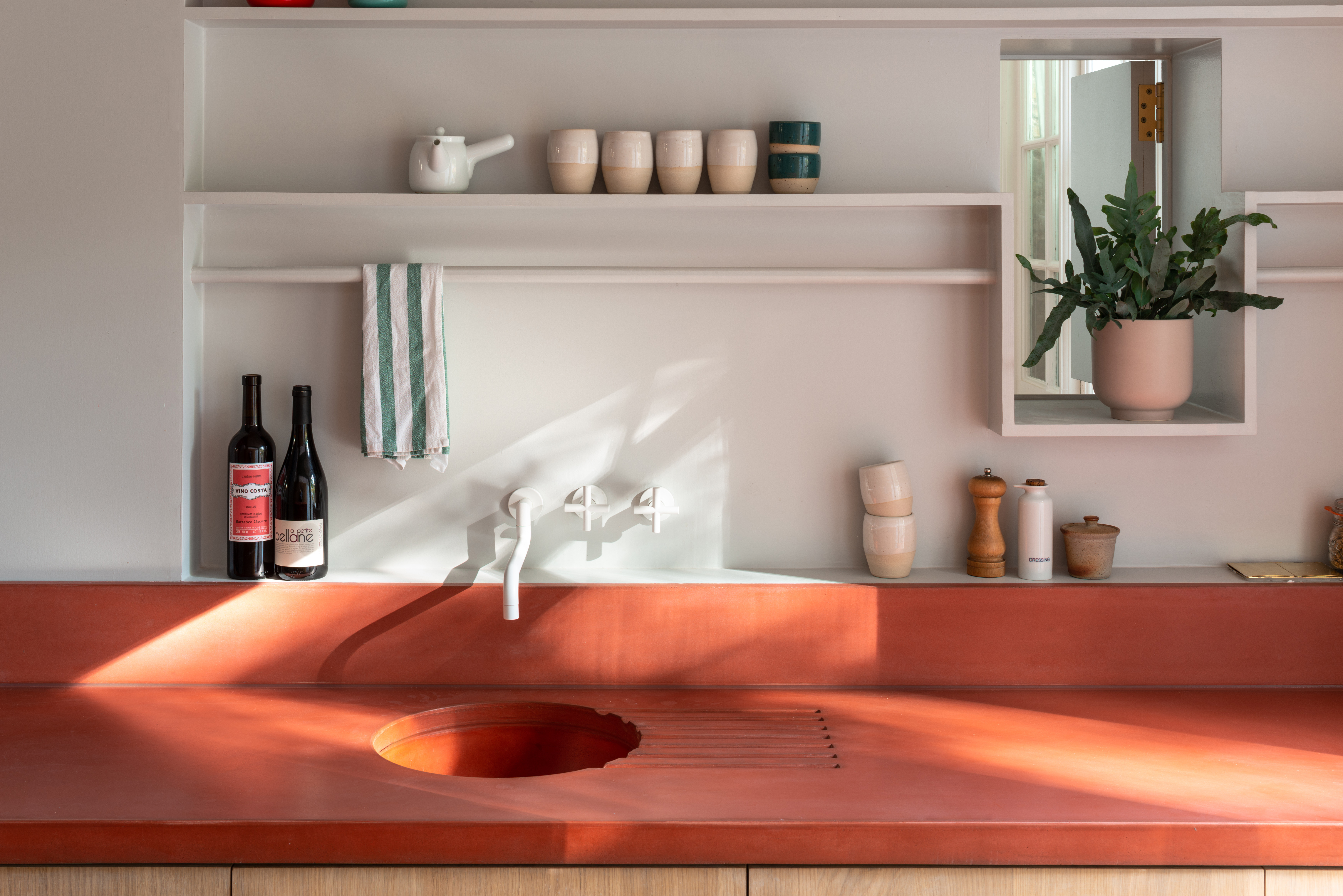
If the raw heft of concrete seems suitably daring, wait until you get a load of the colors available to the most adventurous among us.
Ben Allen, founder of his eponymous architecture and design studio, set something of a bar with his remarkable A House Recast, which made generous use of colored concrete in rust-red and green. "It's similar to natural stone – both are generally durable and patina nicely with age," he says. "Stains tend to come out over time (if not left as part of the patina) or can be removed with cleaning products.
"Wear and tear will depend on the mix and the grinding and treatment of the surface. In the past we have opted for a less heavily-treated surface so that it keeps more of its raw concrete feel. It means it stains a bit more but over time it looks great."
Keen to maintain a clean block color? "In the longer term they can be industrially polished and returned to look as good as new, which is an advantage that more synthetic materials don't have."
9. Zinc
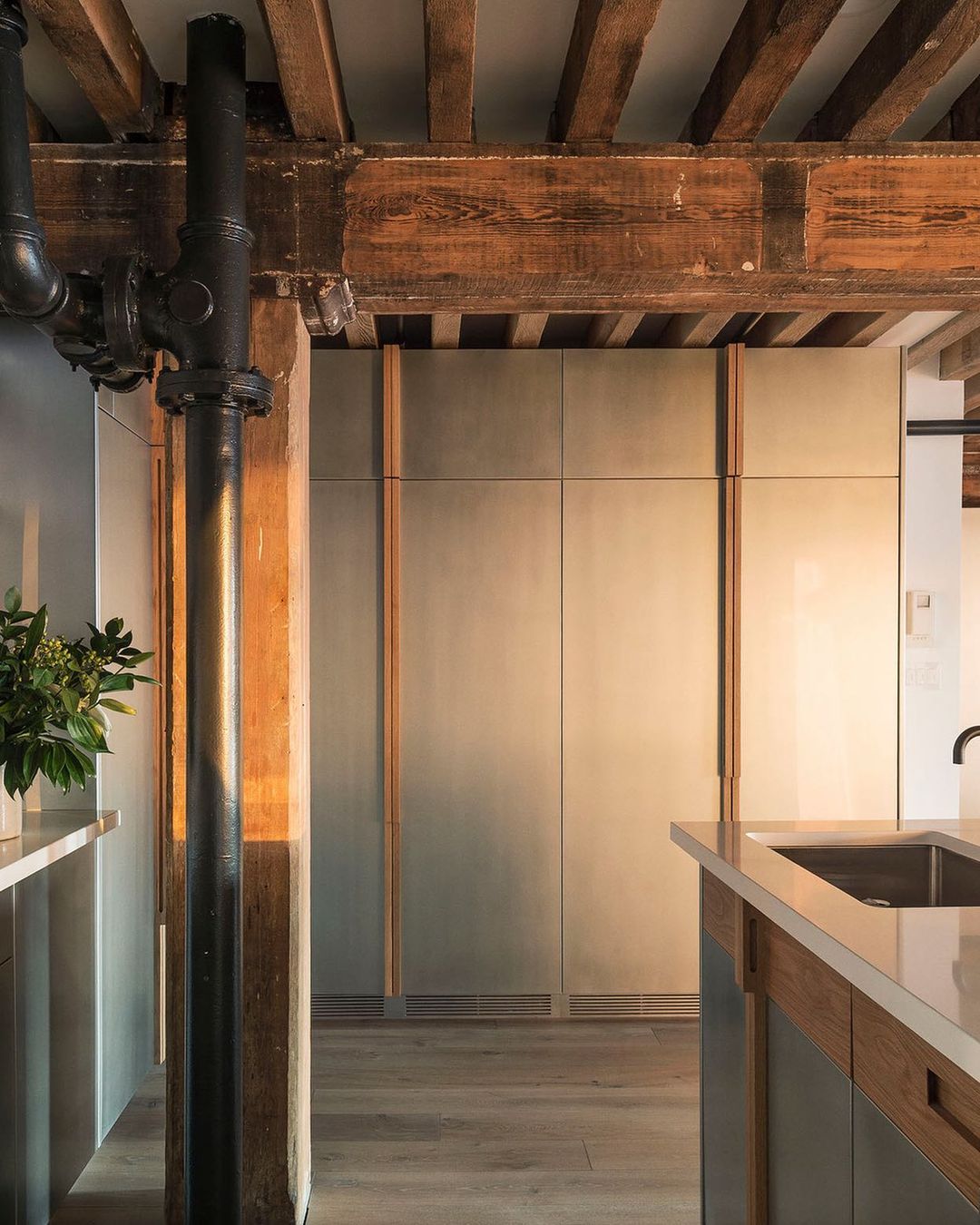
Not entirely convinced by stainless steel, Workstead co-founder Stefanie Brechbuehler arrived at zinc as the best way to get deliver evening light into the depths of this loft in New York's Tribeca neighbourhood.
"Because there were only windows on one side of the apartment, facing west, and the apartment kitchen was on the opposite end almost engulfed by shade, we wanted to find a surface that would illuminate, reflecting not only the light but also the color of the sunlight streaming in. Steel felt too utilitarian – we wanted something unexpected – but we loved zinc because it had this warmth to it. It's not a perfect metal but it's one that will age over time."
The two metals have a similar materiality (and will scratch the same way, too, if used for a worktop) though a subtle shift in tone renders zinc a little less clinical. Eagle eyes will clock the difference. "Here, it helps to spirit the kitchen out of the darkness," adds Brechbuehler.
10. Textured granite
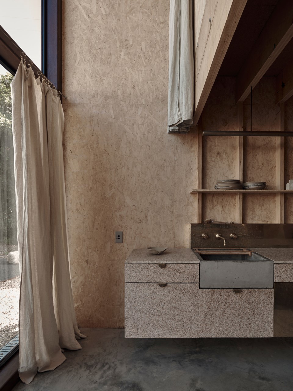
When Studio Moore founder Andrea Moore began converting an old dairy farm into rural retreat Ross Farm, her first instinct was to go out onto the land for inspiration. "It's a beautiful part of Victoria, Australia, and I wanted the spaces to feel anchored to the landscape that we're a part of."
Wanders among the "raw, prehistoric" topography of Wilsons Promontory National Park, famed for its giant granite boulders, proved fruitful. "Granite was introduced into the interior spaces to link back to this special place, and add texture and monolithic form. I used a honed finish on the bench top for ease of cleaning, with a more textured finish on the vertical surfaces."
While the result is a far cry from polished, high-shine counters (a conventional choice by any metric) the logic remains the same. "It's extremely durable," confirms Moore. "So it's also a practical option for a kitchen."
Be The First To Know
The Livingetc newsletters are your inside source for what’s shaping interiors now - and what’s next. Discover trend forecasts, smart style ideas, and curated shopping inspiration that brings design to life. Subscribe today and stay ahead of the curve.
Cat Olley is a British design and lifestyle journalist, editor and copywriter. Formerly on the features team at ELLE Decoration, she has written for The Guardian, The Modern House, Evening Standard Homes & Property, Inigo and John Lewis at Home. She specializes in the latest trends and ideas happening in the design world, and is our go-to for aesthetically-led pieces.
-
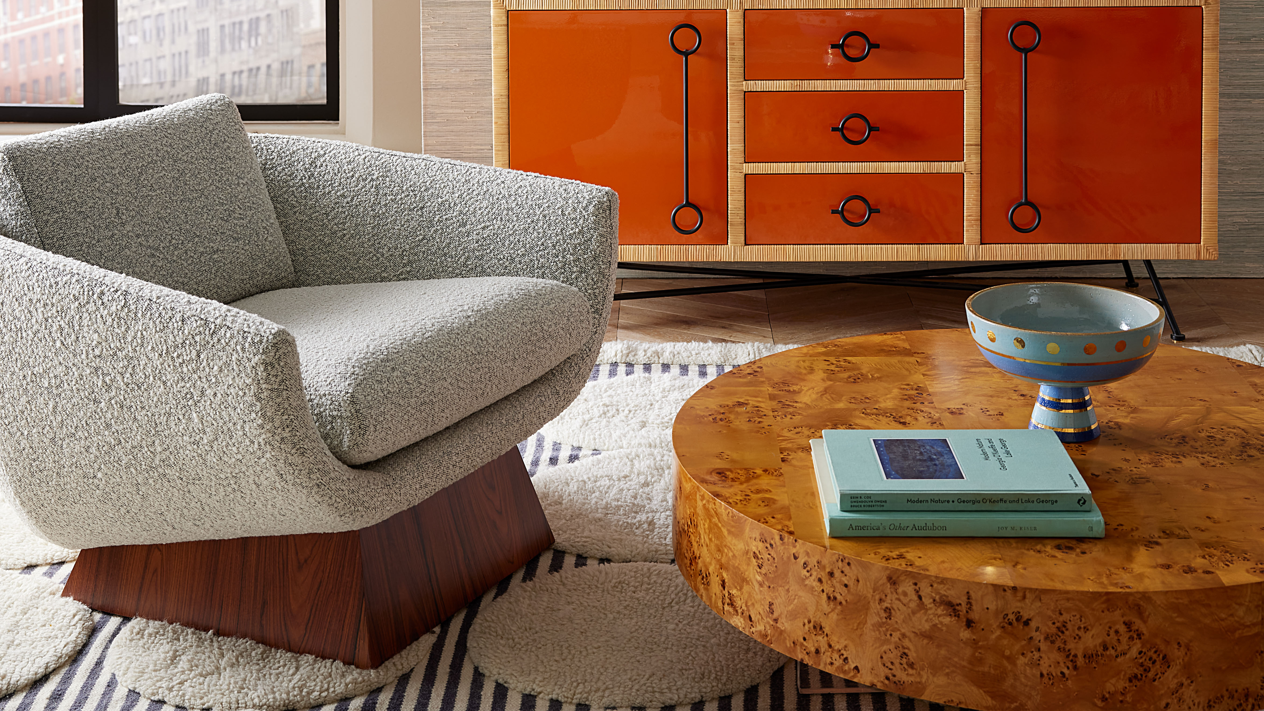 Burl Wood Decor Is 2025’s Most Coveted Comeback — Here’s How to Get the Storied Swirls for Less
Irregularity is the ultimate luxury, but you don’t need an antiques dealer to find it
By Julia Demer Published
-
 5 Garden Features That Instantly Add Value to Your Home — While Making Your Outdoor Space More Practical, too
Get to know all the expert tips and tricks for making your backyard a standout selling point for your home.
By Maya Glantz Published