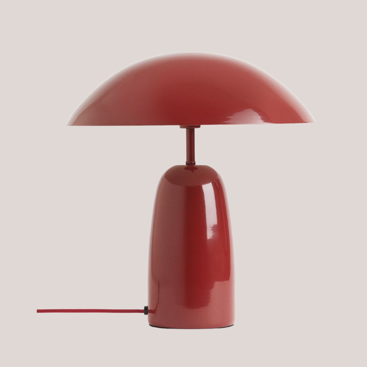
A Trend Forecaster Just Told Me 2025's Most Sophisticated Color Scheme Is Inspired by This Type of Food
From throw pillows to color-drenched rooms, a vegetable-inspired palette is serving up a hearty helping of style for the year to come
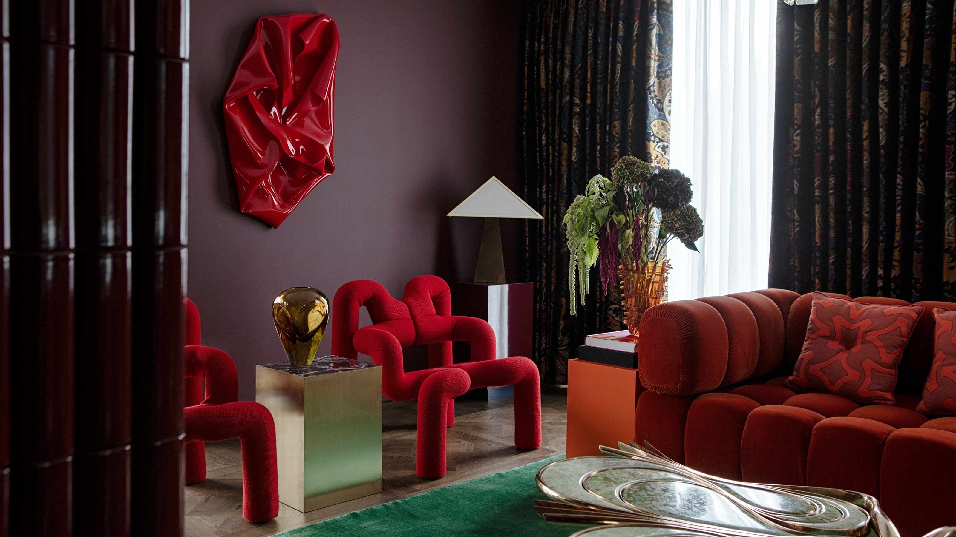

Where overly sweet pastel shades have been booming in popularity in recent years, for 2025, things are getting a little more grounded... Quite literally. Vegetal hues use the rustic, earthy colors of our plates to form a particularly stunning interior palette inspired by root veg, brassicas, and more. Though we might all still be in the cozy comfort food months of winter, this trend forecaster says we should be looking to the colorful shades of our gardens for home inspiration.
"Food's influence on color continues to grow. However, dainty desserts are swapped for hearty sides. Marshmallow pastels like lavender and mint give way to grounded vegetal colors. Lettuces, olives, beans, and onions act as inspiration, creating new interest in muddy yet sophisticated reds and greens," says Rebecca Goesling, trend forecaster and the director of design at Goesling Group.
From oil painting still lives of artichokes and eggplants to major fashion brands releasing tomato candles and baguette-shaped bags; food has always served as delicious inspiration across creative fields. Now the saturated hues of our favorite vegetables have sprouted into our interiors.
Next time you pull out your phone to snap a photo of a perfectly plated asparagus stem or side salad, you might want to consider adding it to your interior design mood board. I talked to color experts, trend forecasters, and designers to get the scoop on how to harvest this latest color trend.
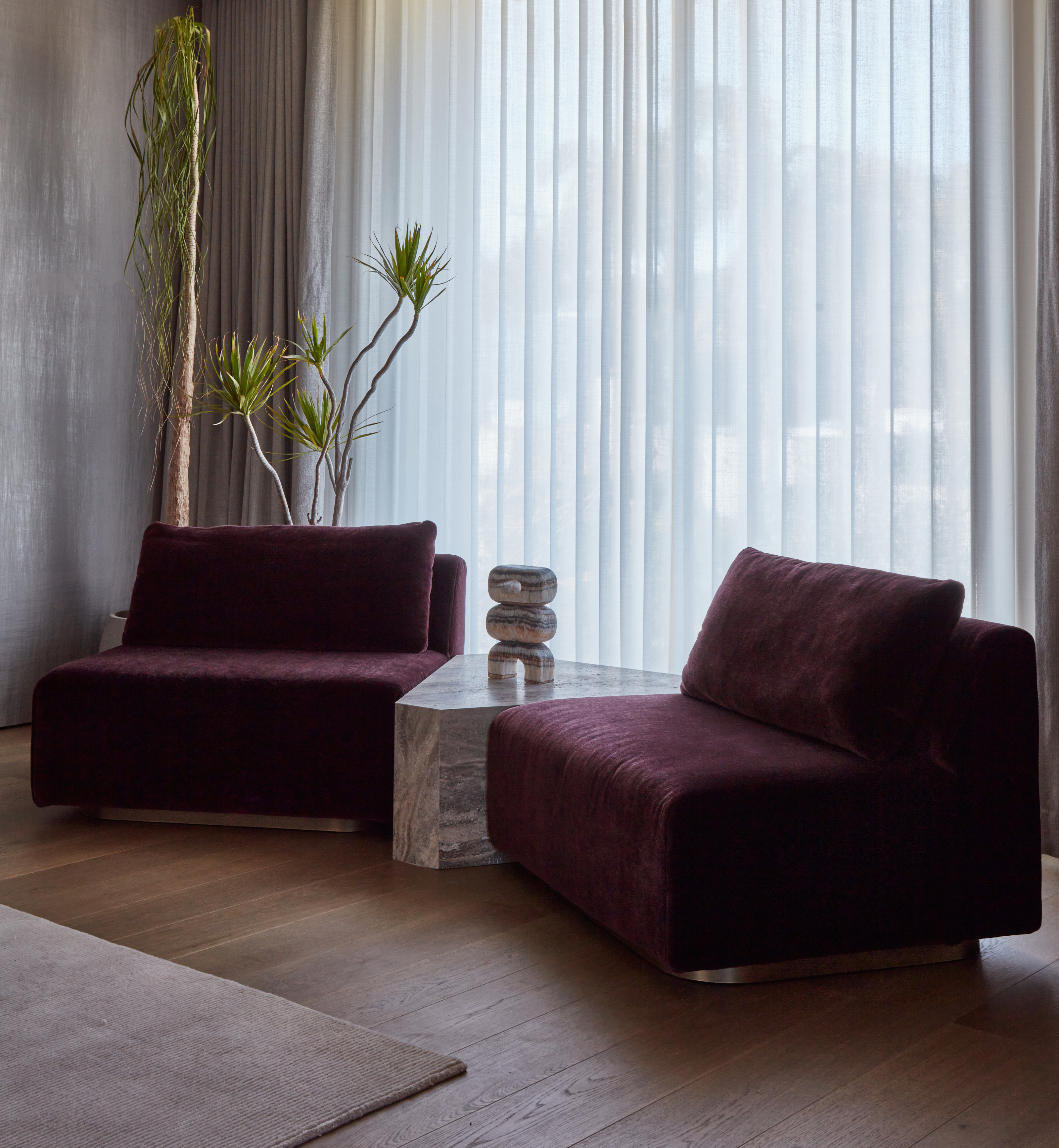
The shift towards the warm shades of a hearty harvest comes from the stylish defiance popular in contemporary design — embracing moments of bold color and unexpected accents that invite character and joy. Think rich oxblood red and Pantone's Mocha Mousse, but with a tasty twist.
Rebecca Goesling explains "What we're seeing currently is disillusionment, excess, and misaligned expectations sparking a new wave of conscious surrealism, drawing inspiration from 1920s Paris — a time when indulgence and the unconventional thrived. Food, central to these cultural conversations, becomes a tool for prolonging joy, redefining taste, and challenging expectations through reverence for "trash" foods, deceptive dishes, and mind-altering ingredients. Humble veggies have become the key ingredient in delivering the unexpected. From a design standpoint, this comes to life in vegetal hues seen in the home—an array of reds, greens, and grays."
Simone Wilson, color and trend expert at Voyage Maison highlights that there has also been a noticeable shift in interior design trends that focus on wellbeing and how our surroundings affect our mood. "We’ve seen this with biophilic design, which focuses on bringing nature into our homes. Lately, the idea of creating a 'healing habitat' at home has also become popular. Aiming to create spaces that support both our mental and physical health and the vegetal hues trend pairs perfectly with this celebration of nature."
Colors to Look For
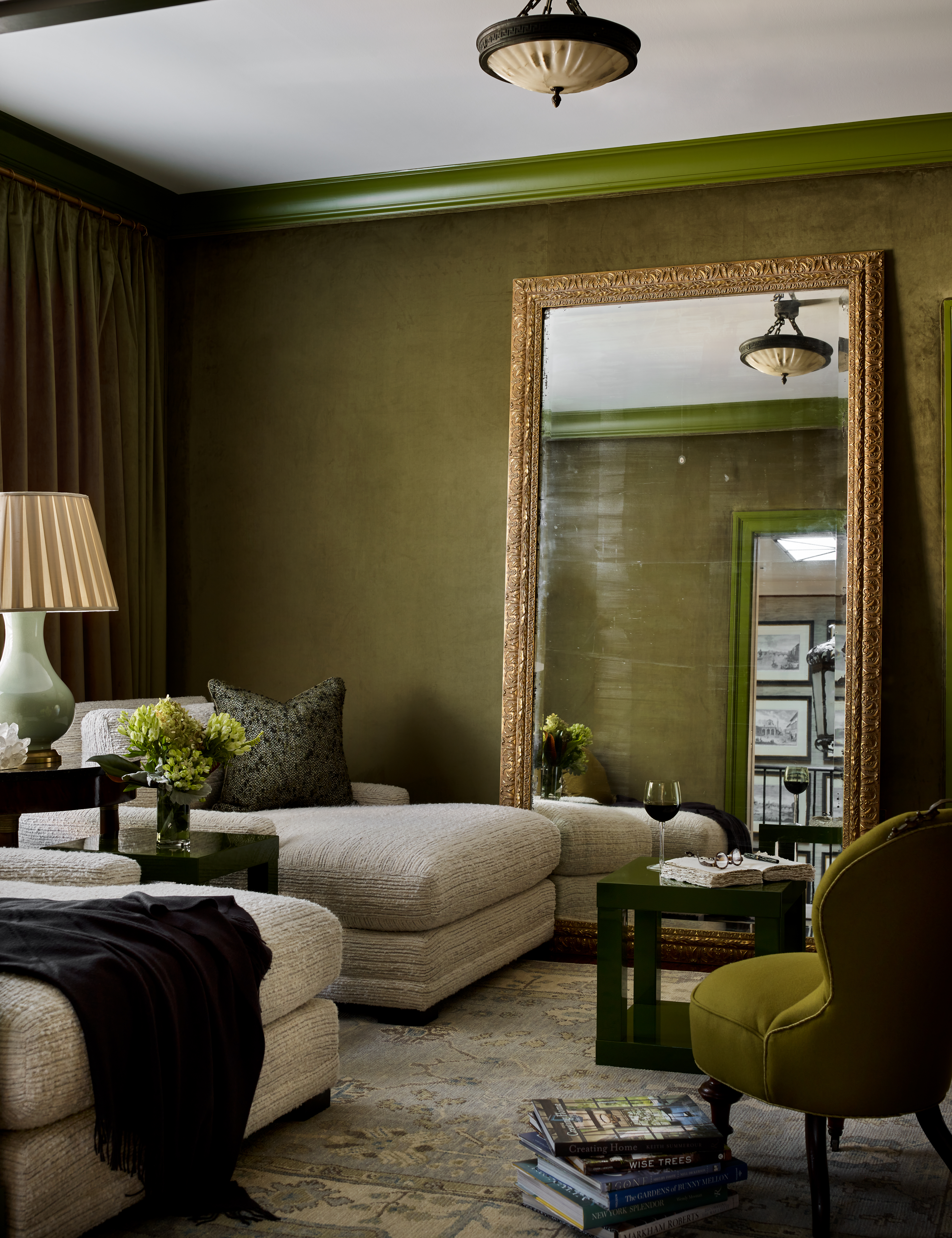
Color specialist and interior director at Lick Paint, Tash Bradley, highlights, "As we gravitate towards natural, timeless colors that have an enduring quality, colors found in nature have an innate ability to create harmony in the home." However, natural in this instance does not mean an all-beige living room design. Greens, purples, reds, and surprisingly greys are all on the table when it comes to vegetal hues.
It is as easy as looking to your favorite sides for inspiration. "The rich, dark purple is like the deep hue of eggplant, exuding warmth and sophistication. The calming green brings to mind dark leafy greens, like lacinato kale, while the deep, vivid orange is a nod to the vibrant tones of carrots and pumpkins," says Simone.
From the jewel tones of hearty cabbage to the zesty vibrance of bell peppers and chartreuse celery, vegetal shades capture the beauty and richness of natural produce while still keeping a calming and sophisticated sense of serenity.
Shop Vegetal Shades
How to Style Vegetal Colors
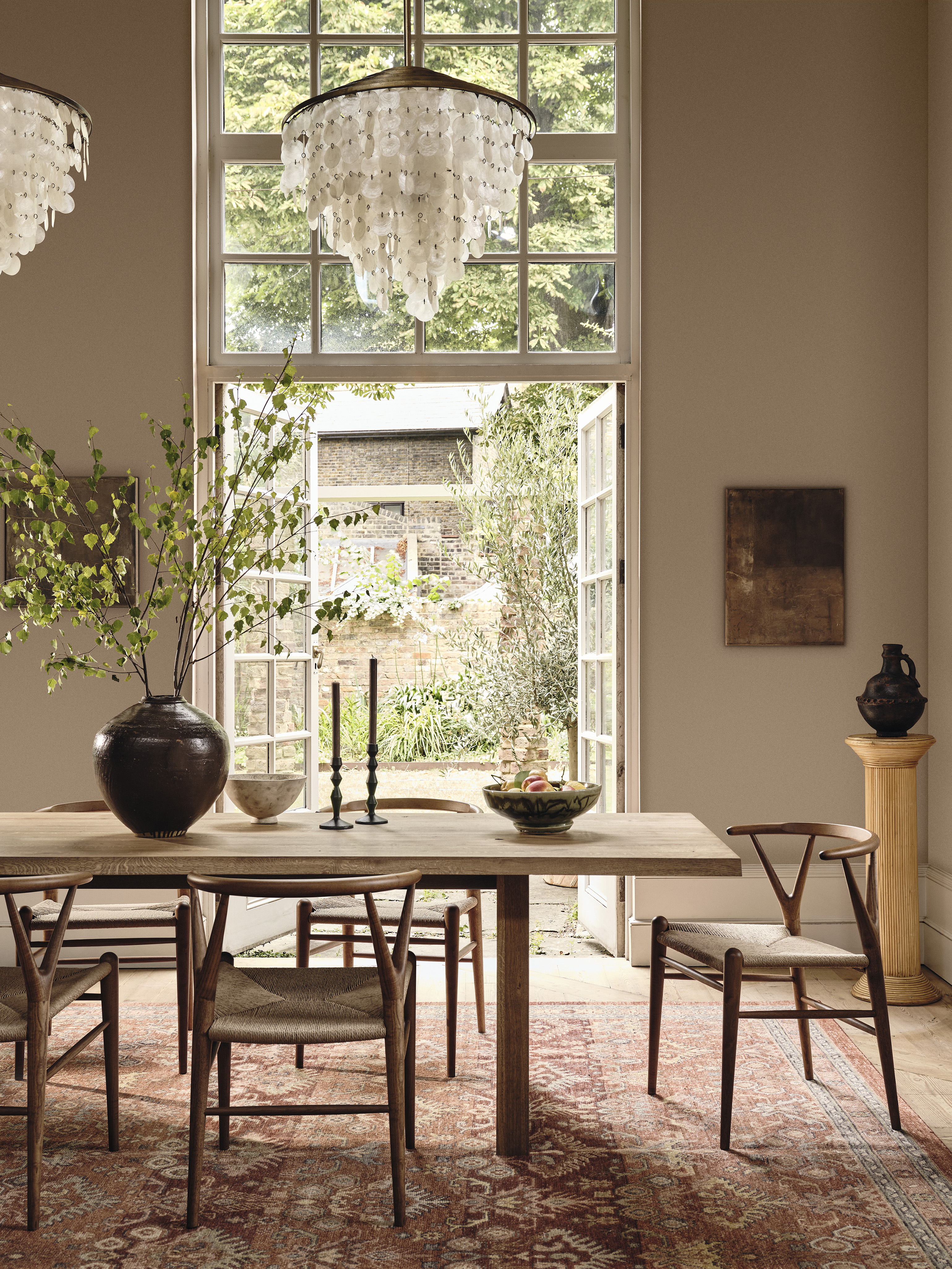
A split complementary palette, or double-drenched space, is a great starting point in styling these shades. For instance, pair a classic red focal point with both yellow-green and blue-green accents. "That could mean a lipstick-red sofa with citron and jade throws or a red-stained dining table studded with olive dishes and teal textiles. Play around and don't be afraid to get funky with it," says Rebecca.
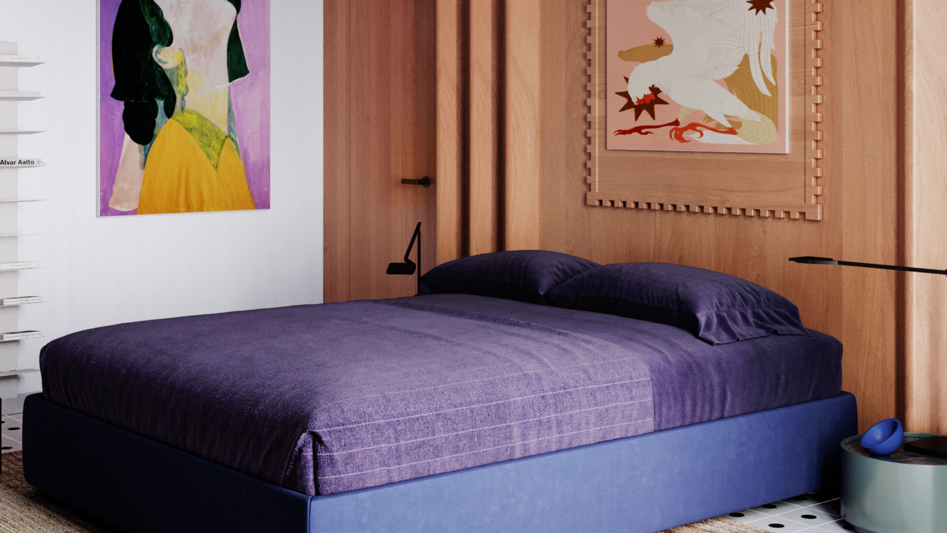
There is no wrong way to try your hand at this trend. Vegetal shades can be incorporated through small, simple nods with soft furnishings or by completely immersing your space with wallpaper and paint. "In the living room, think about layering your sofa with sage green or burnt orange throws and matching cushions for extra warmth. For the bedroom, eggplant hues are a great choice to create a rich cocooning space —bring them in with your bedding, cushions, and a table lamp to create a luxurious look," says Simone.
As for specific color ideas, Tash says to "Embrace the dark, luxurious aubergine and beetroot tones and drench your entire room in it." Or for bursts of bell pepper red, try accents like painted trims and doorframes or painted ceilings for a pop of energy.
If you lean towards minimalist interior design, onion-inspired off-whites, and warm root vegetable tones all lend themselves to being styled with natural woods, marbles, and linens for a timeless and grounding look. Rich, vegetal shades also pair beautifully with metallic finishes creating a harmonious balance between texture and tone.
Shop Vegetal Colored Decor
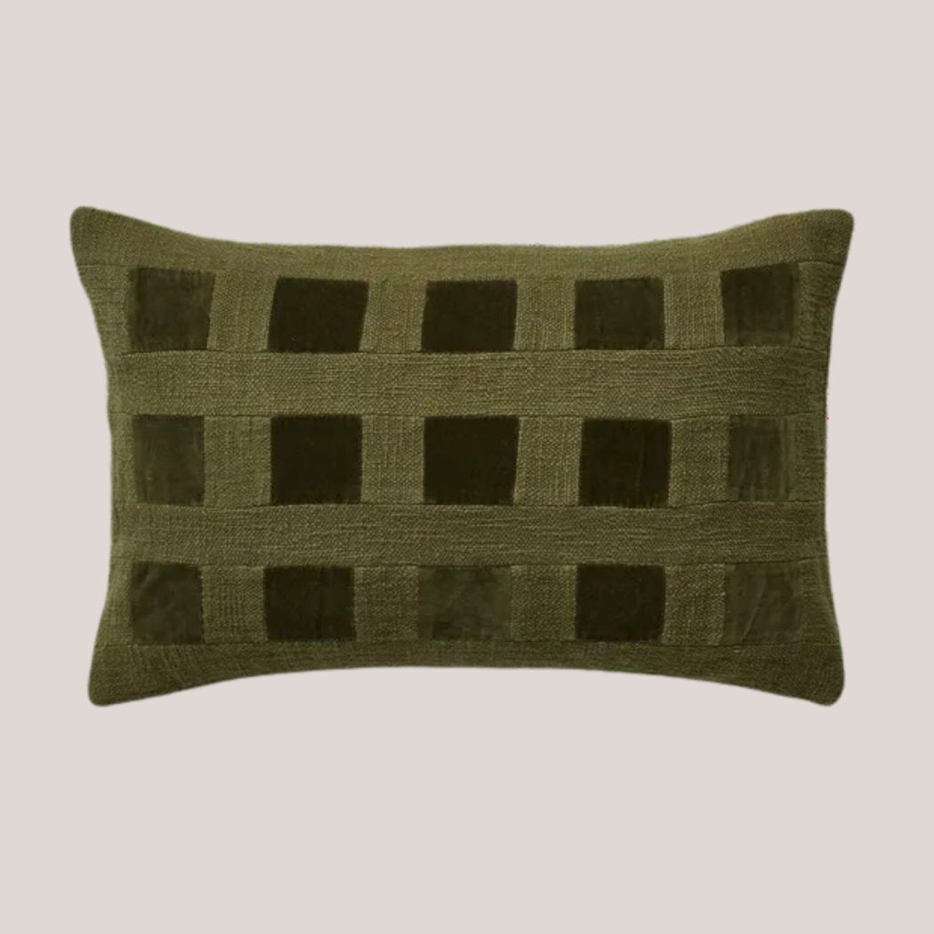
Price: £55
Olive? Kale? This textured velvet cushion is the perfect vegetal green.
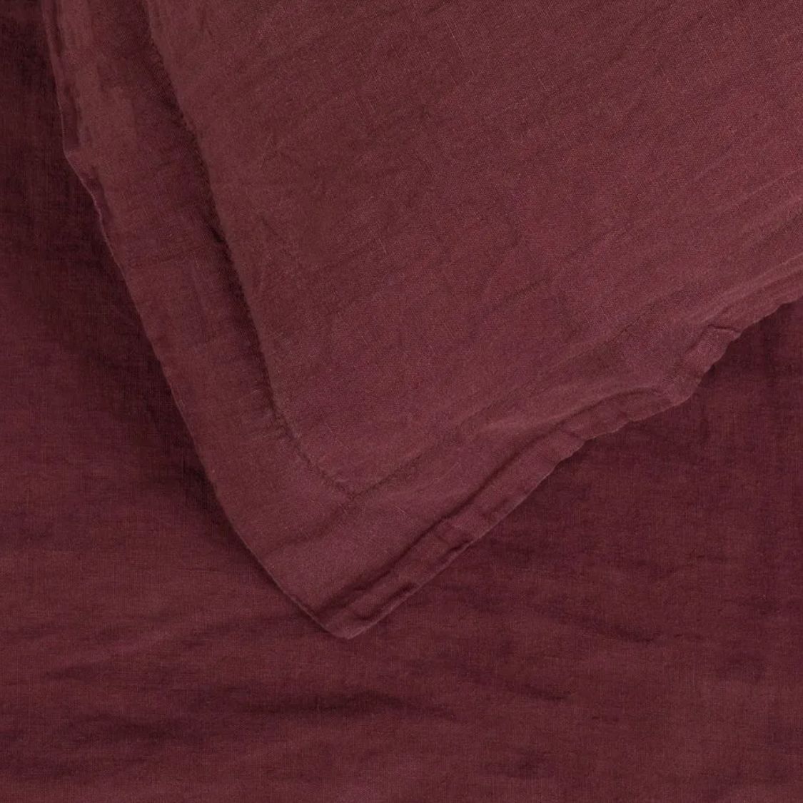
Price: £159
The perfect aubergine color to layer into your bedding color scheme.
Farm to table...to interiors? This color trend is serving up a hearty helping of style.
Be The First To Know
The Livingetc newsletters are your inside source for what’s shaping interiors now - and what’s next. Discover trend forecasts, smart style ideas, and curated shopping inspiration that brings design to life. Subscribe today and stay ahead of the curve.

Olivia Wolfe is a Design Writer at Livingetc. She recently graduated from University of the Arts London, London College of Communication with a Masters Degree in Arts and Lifestyle Journalism. In her previous experience, she has worked with multiple multimedia publications in both London and the United States covering a range of culture-related topics, with an expertise in art and design. At the weekends she can be found working on her oil paintings, reading, or antique shopping at one of London's many vintage markets.
-
 The Weighted Blanket That Doesn’t Make You Sweat (and the Eye Mask to Match)
Luxury has weight. And apparently, volcanic minerals
By Julia Demer
-
 What Is Biophilic Interior Design? I'm an Actual Biophilic Designer, and This Is How to Apply It to Your Home
A biophilic designer explains the core principles of this practice, and the easy ways you can apply it to your home's design
By Marianna Popejoy
-
 What Does the Color Yellow Mean in Interior Design? A Color and Design Psychology Expert Explains
Whether you love or hate it, yellow always seems to elicit a strong reaction from people — here, we explain why
By Karen Haller
-
 6 Cut Flower Trends That Will Bring Lushness, Life, and a Little Bit of Luxe to Your Interiors in 2025
These are the fresh blooms florists and designers are favoring this year, plus how to arrange them for a striking look that fills your home with joy
By Lilith Hudson
-
 I Spy With My Design Eye: This Specific Fabric Print Is Literally Everywhere Right Now — We've IDed It for You
It's whimsical, artistic, and full of character. We've called it already: Dedar's 'Tiger Mountain' is the fabric that will define 2025
By Devin Toolen
-
 Having Mismatched Dining Chairs Is the New Telltale Sign of Serious Style — Here's How to Make It Look Intentional
Once considered a sign of a lack of care, a dining room table with different chairs now screams ultimate curation... if you can do it right, that is
By Olivia Wolfe
-
 There’s a New Shape in the Garden — Why Whimsical Curves Might Be the Outdoor Furniture Silhouette of the Summer
Powder-coated petals, wavy lines, and a hint of surrealism — this microtrend is blooming, and we’re paying attention
By Julia Demer
-
 10 Yellow Bathroom Ideas That Vitalize Your Mornings and Look Unexpectedly Sophisticated While Doing So
Yellow is a color that by its very nature is energetic and full of life, and these designers have proved it's ideal for a bathroom
By Oonagh Turner
-
 I Asked Interior Designers to Share the Worst Decorating Trends They've Seen on Social Media
Just because something is trending, doesn't mean it's tasteful — from dupe-culture to OTT lighting, here's what designers hate seeing in homes
By Devin Toolen
-
 It's a Color Symbolic of Dreams, so These Purple Bedroom Ideas Almost Guarantee a Good Night's Sleep, Right?
Not always an obvious choice for the bedroom, these designs prove that purple has restful and calming qualities, making it perfect for the bedroom
By Oonagh Turner


