Wall art trends – interior designers on the new ideas to watch for in 2023 and beyond
We talk to designers about the latest in wall art trends to elevate your interiors, from the neon sign revival to modern tapestry designs
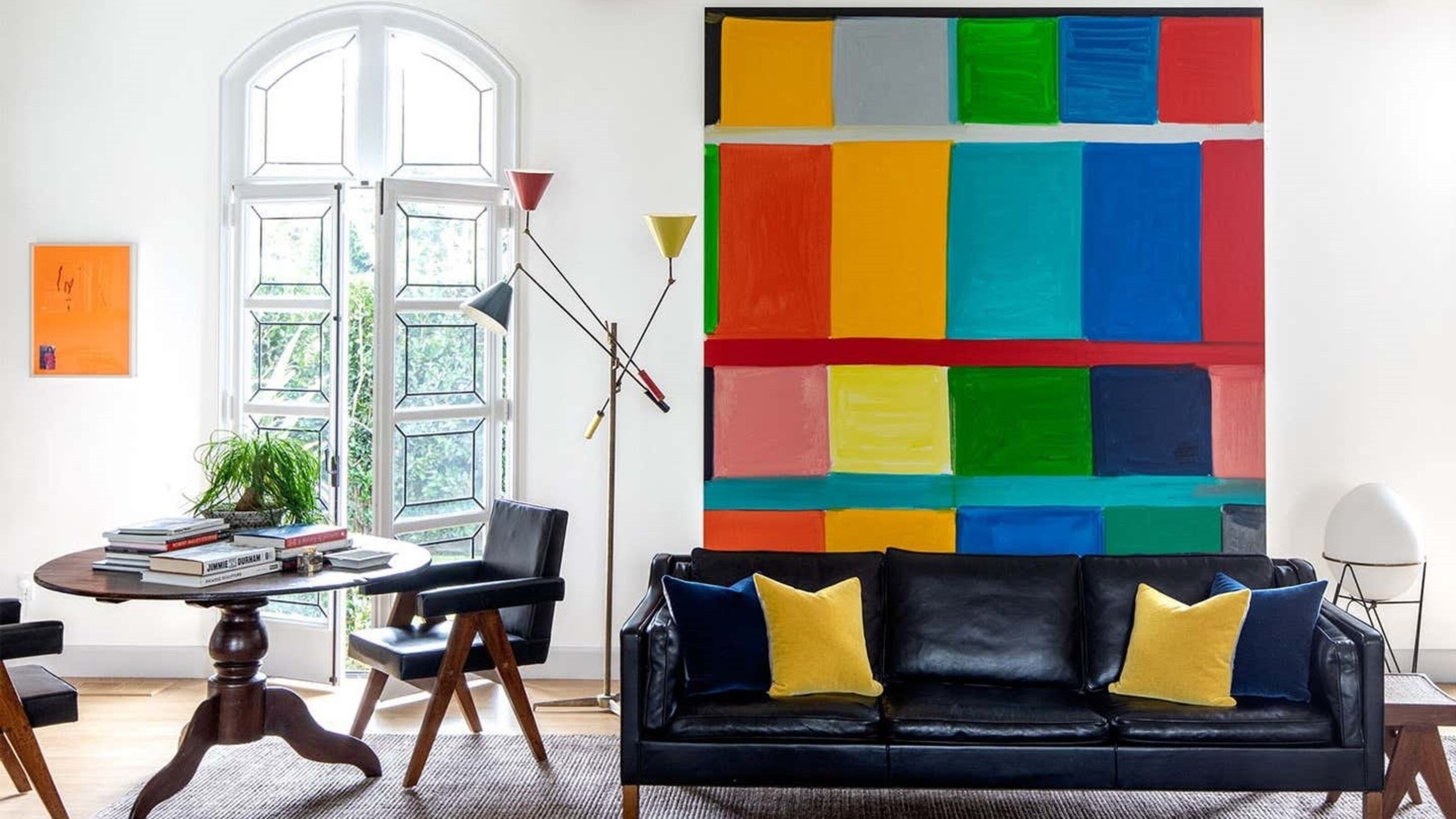

Wall art trends tend not to be a flash in the pan in the way that some interior design trends are – art is often, after all, a significant investment. However, there are still moods and mediums that feel of the moment when it comes to art, as with any part of our home. From textured tapestries, interesting ways of displaying, to an abstract use of color, these trends can take many forms.
Art is a great way to lift your interiors and bring a touch of color, texture, or personality to your home. It can give a contrasting or complementary pop of color to complete a decorating scheme, and really give a flavor of personality of the homeowners. 'Do you have art?' is always my first question when designing interiors,' says designer Amy Lau. 'Then it’s about building the design around the art to hand and building a story.'
Designer Natalia Miyar too uses art in her schemes as a great way of adding color. 'Living surrounded by both color and art is very important to me,' she says, 'as both can make a strong statement in your home.' For the latest interior design trends in the world of art, we've spoke to the designers who use art in all its forms as a fundamental element of their schemes.
Oonagh is a homes writer and editor. Armed with experience in spotting and compiling the latest interiors trends for her articles, and with a real zest for art and how we use fine art from across generations in our homes, she has compiled our definitive guide to the types of wall art that are trending right now.
What are the latest wall art trends?
As interiors continues to embrace color, with a move from beiges and greys to jewel-tones and warm, monochromatic schemes, so to will artwork, finds designer, Natalia Miyar. 'Although a neutral wall is wonderful for art, the juxtaposition of a bold artwork against a wall is incredibly effective,' she says. In terms of specific colors, Natalia is drawn to pink. 'It's always been one of my preferred colors to use, I use pink as a neutral, it's so much more interesting than beige or taupe.
Natalia also finds architectural and abstract styles of art a big part of her recent designs. 'I love the architectural style of Cuban artist Gustavo Acosta, whose artwork I have hanging above my sofa. I also discovered a Los Angeles-based artist called Hiejin Yoo a couple of years ago, whose work I absolutely love and we actually ended up using one of her pieces in an apartment I designed in Battersea Power Station. Her work is defined by abstracted pops of color and bold layered marks.'
1. Vintage neon signs
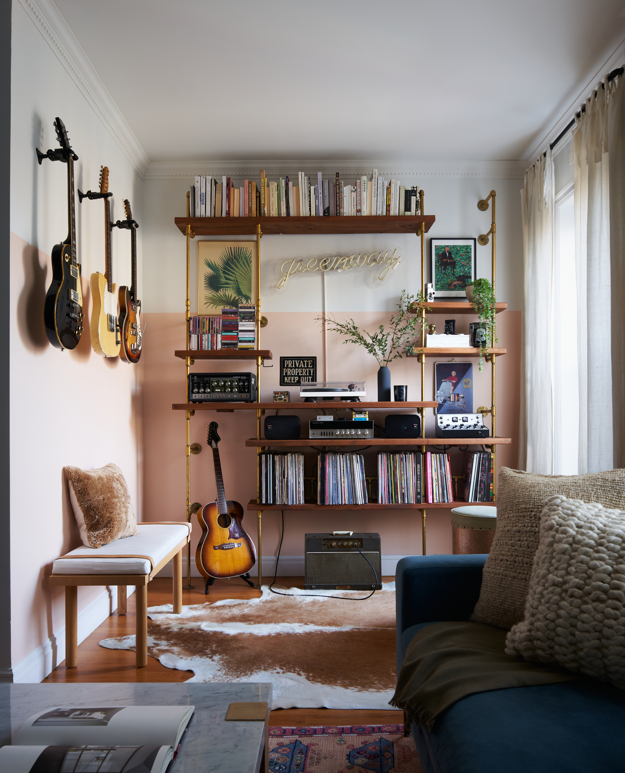
Neon signs and brightly lit artwork have been around since the 60s, originally used as a form of advertisements, with fluorescent lighting typically clad on the outside of buildings or factories across the world. For those mid-century or 70s inspired interiors, neon is just the ticket to adding a bit of character and retro charm to a scheme. It has been around for a while, but goes in and out of interiors fashion. At the moment, when approached cautiously and tastefully, it's definitely seeing a resurgence.
'Neon is such a fun way to create visual interest with a literal pop of color,' explains designer Molly Torres Portnof of Date Interiors, who designed this artistic space in her own home.
'It's true that it's been popular for some time, but it's seen a boom due to the pandemic and most recently, TikTok. This neon sign in this space was custom made seven years ago, designed for my husband, brought to life by the talented Endeavour Neon team. My husband is a big fan of neon, and I knew it would bring an energy to our home.'
2. Textured tapestries

Texture, fabrics, wall hangings and tapestries are also having a moment in the spotlight. While they may usually be associated with the more traditional interior look, from the likes of the late Robert Kime, tapestries are giving a different look altogether in a modern setting.
'Lately, we have been collecting a lot of textiles: patchwork, old Asian textiles, tapestries, and it is our current personal preference for decorating the home,' explains Pablo López Navarro of Casa Josephine.
In this project, the design house opted for textiles as a central theme in the decoration, the impact being warmth, coziness and depth. It is an apartment in central Madrid for a young aeronautical engineer who wanted an elegant sleek chrome and mirror 1970s look. For a unique bedroom wall art idea, the designers chose a Flemish tapestry from the 1600s designed by Jacob Jordaens, who worked with Rubens. This fragment shows Odysseus and Nausicaa, from Homer’s Odyssey.
'It is a combination of the texture, the fact that they are hand made and the fact that they have not been in fashion in residential decoration for a long time what makes tapestries an interesting form of wall art at the moment,' says Pablo.
'We used to see them in country palaces or cottages and in very traditional styles. We wanted to show in this project that tapestries do mix well with modern pieces.'
3. Line drawn frescos
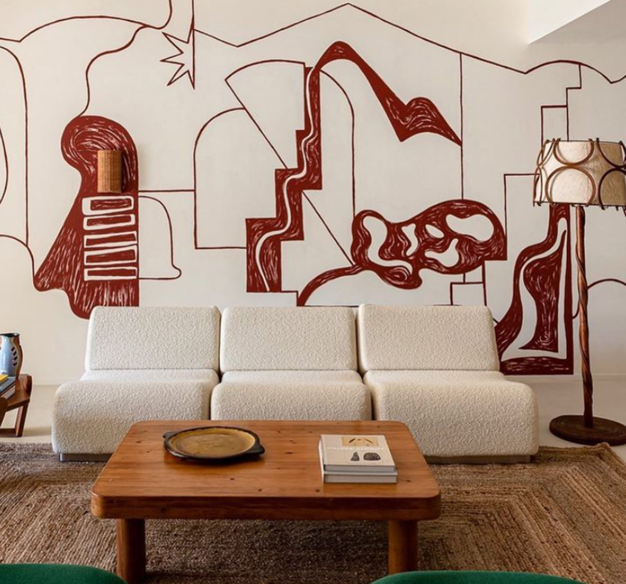
Why not banish the framing altogether and use your wall as a blank canvas for a beautiful and interesting fresco? The artist, Florence Bamberger was commissioned for this tasteful wall mural by art and interior curator, Joséphine Fossey Office. Line drawings are a popular style of art - simple and minimalist, they give an effortless sense of style to a room, and look great in the form of a mural.
'The mural evokes the surroundings of the house - the Alpilles mountains, the village of Les Baux de Provence, the staircases and arcades, the quarry of rocks just nearby, the terracotta of the baked earth of the region, but also the environment of the house: the umbrella pine shadow in the beautiful garden and the chosen furniture.
'Graphically, I wanted to express the lightness of Jean Cocteau's line drawings, who was strongly inspired by the region.'
'I think Fresco line drawings are a way to have a unique artwork in your home. The art becomes architectural. Interior becomes truly artistic, graphic, unique.
4. Abstract and colorful
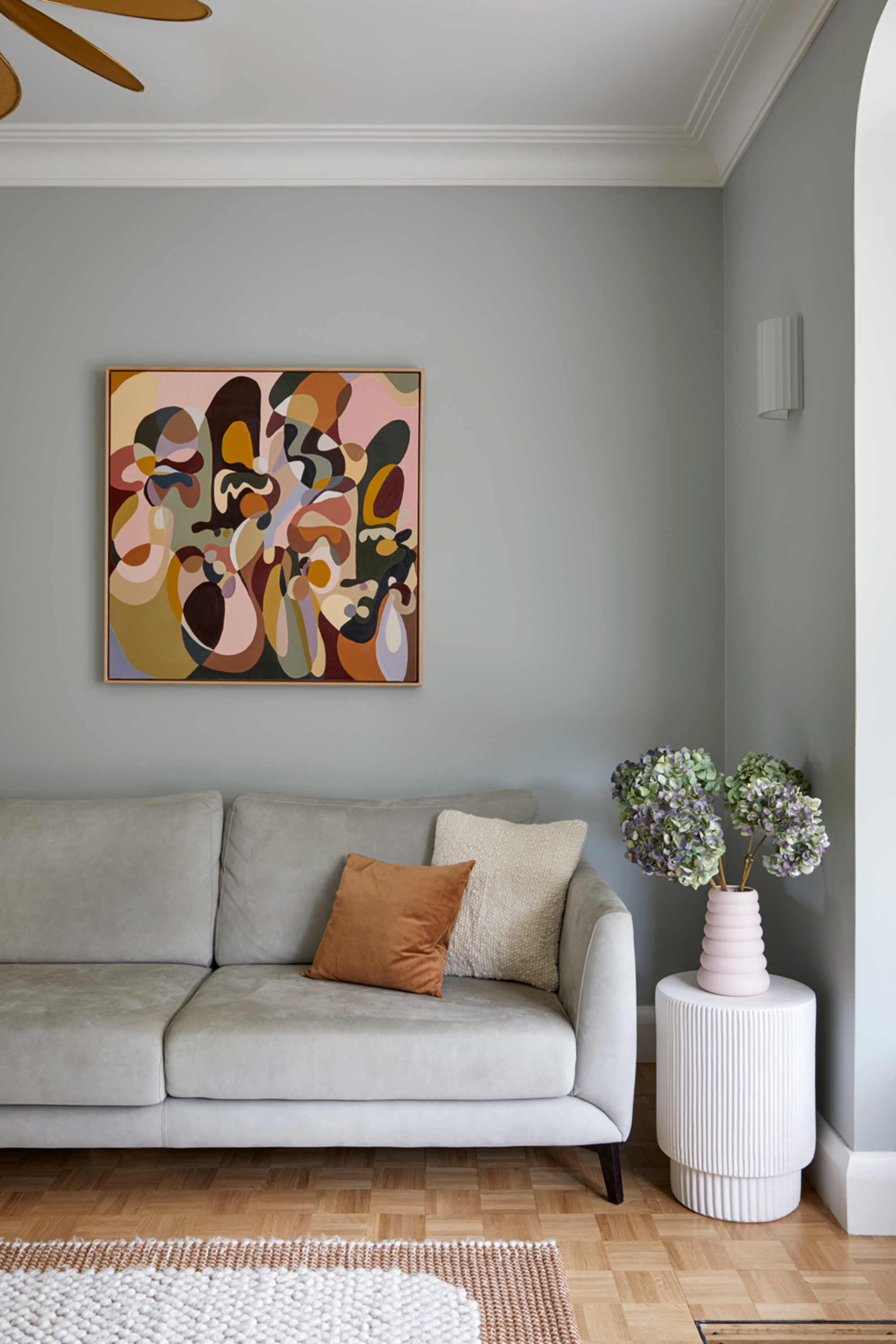
Going for abstract and color is all the rage in the art world, with big, block color prints lightening up a scheme in an instant. For Celine Erlam from Indie & Co, this trend is deep-rooted in psychology, and how our wall art makes us feel.
'We tend to choose art based on the emotional reaction we get from it and the colors within it. Currently, clients are looking for colors to be uplifted,' she explains.
Going for the colorful look isn't just about going random though, think carefully about how color and shape match your room, or build a scheme around the colors in the wall art. 'They need to either work with the color scheme or purposely stand out and create a point of interest,' advises Celine.
This design is from San Francisco-based design firm, ABD STUDIO.
5. Go colorful to brighten an otherwise subdued palette

If you are going for a neutral color scheme, wall art trends dictate that you should balance and contrast a paired backspace with a jolt of color, as seen in this design from Maed Quin, where a Damien Hurst piece brings a white room to life.
'Colorful art is the perfect complement to restrained interiors,' says Mead Quin. 'When keeping the interior palette neutral and timeless, one can enjoy expression through their selection of and investment in art. Whether a renowned artist, or someone who is emerging, the blank canvas walls leave it open to all possibilities of personal meaning and expression through art.'
6. Establishing your own collection
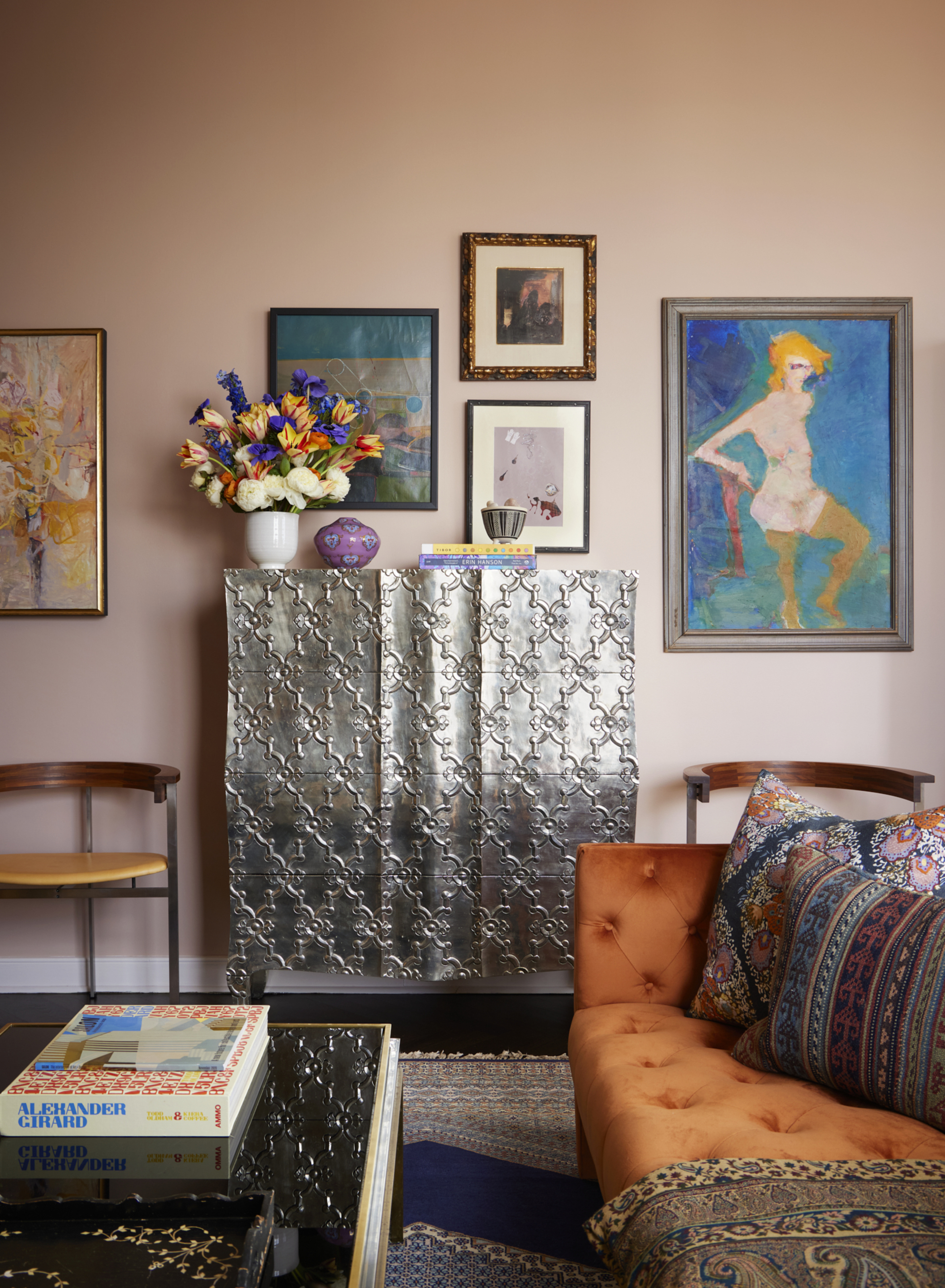
More and more, wall art trends are all about establishing your own art collection, and not conforming to big name pieces that you might have seen in galleries. Instead, think about what speaks to you, don't shy away from picking more affordable art from charity shops and trinket or antique stores - if it's something you like, don't worry that it won't match your interiors and display it confidently. It's about telling your story, where you've been, why you own a specific piece, and confidently telling the world that this is your style.
This is the colorful NYC apartment of Kati Curtis of Kati Curtis Design, who advocates this approach when it comes to art.
'I don’t necessarily have the budget our clients do for collecting art, so all these pieces are ones I’ve collected over the years, and that have meaning to me,' she explains.
'Some are from artists whose studios I’ve visited, and others are pieces I’ve picked up through art dealer friends and antique stores. I chose my own art for diversity and what speaks to me aesthetically, not necessarily what’s going to match my décor, as that changes over time, and I tend to move art around from room to room.'
7. Go for ceramic wall art
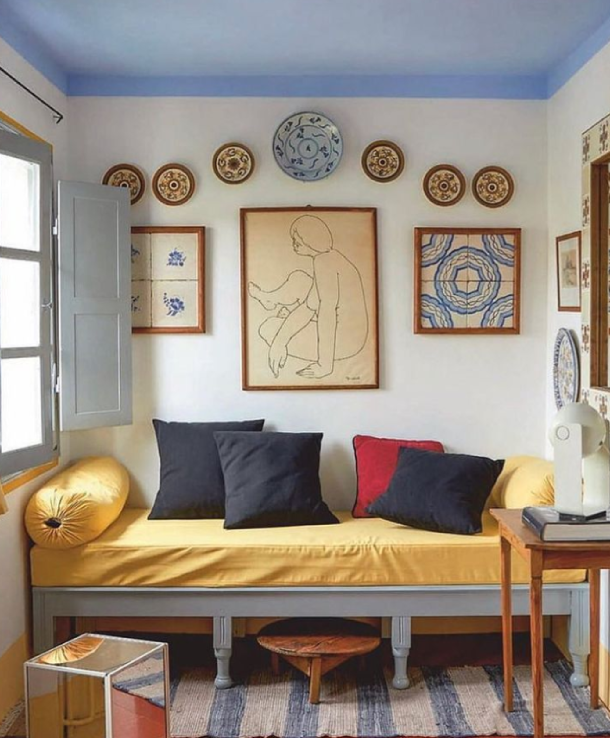
Tastefully hanging ceramics, plates and bowls is precarious business but is a popular look, bringing a touch of a rustic farmhouse aesthetic without going too twee, and giving texture, seen in the likes of Gwyneth Paltrow's Montecito home, where blue and white ceramic plates lined the walls in perfect unison. It's an achievable look in your home too. You may already have a few plates with pretty designs that are wasted on shelves, unseen and forgotten about, so give them a new lease of life on the walls.
'The plates on wall trend is all about bringing back memories of traditional decoration, but keeping it modern,' says Pablo López Navarro of Casa Josephine.
'They transmit a feeling of casualness, of relaxation and of local crafts. The look is relaxed, light and effortless -which is what we like to see now in our homes.'
'We picked those plates because they are local (Mediterranean) and colorful. We love handmade ceramics.'
8. Tongue in cheek wall art
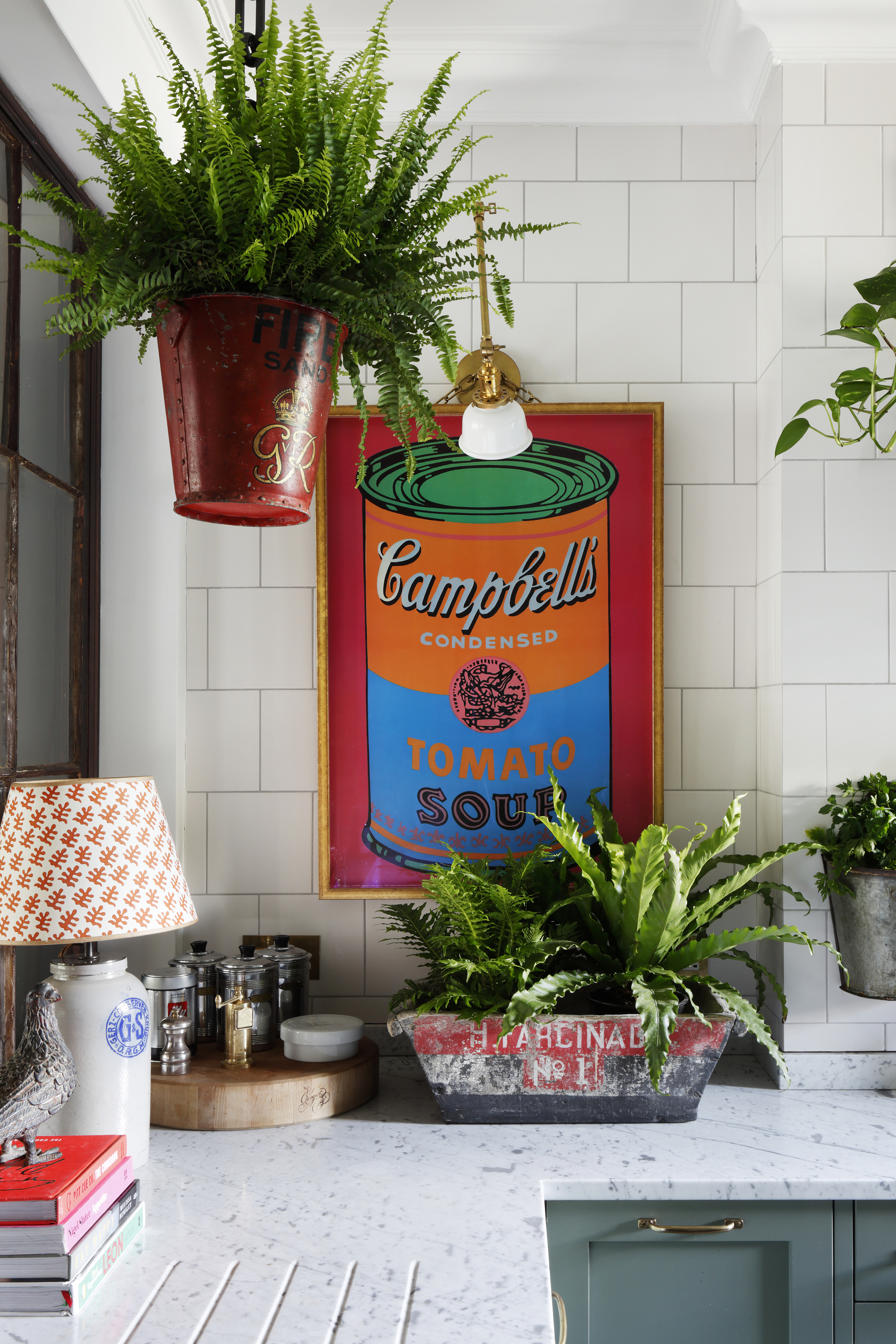
Ultimately, wall art trends are currently all about pieces that are a bit tongue-in-cheek and playful, playing to the wider trend for kitsch, 60s/70s-style furniture, and ultimately providing people with pieces that are humorous and uplifting.
This design is by Studio HÁM, using the iconic Campbell's Soup Andy Warhol look but subverted and full of color for a fun kitchen interior.
'Art has always been a passion,' explains Tom Cox of HÁM interiors. 'I started out buying wooden signs and vintage fishing trophies which has evolved into sourcing art with my sister Kate for our shop. We source works by collectible artists to mix with antique finds like duck decoys and old shop signs.
'We like how this mix of different styles and mediums along with shelves displaying intriguing decorative pieces gives a look that is elegant and eclectic.'
How to frame your wall art in a modern way
The trend for mismatched framing of your favorite art pieces is showing no signs of slowing down. Bringing character, and allowing each of your pieces to truly stand out, frames in all shapes, sizes and colors add real interest. It also demonstrates a true understanding of your art - and you can have fun picking out pops of color that you might want to highlight with the frame. 'The frame is almost an extension to the art itself,' says Kit Kemp.
'Be adventurous with your choice of frames,' encourages Natascha Dartnall, founder and creative director of ND Studios. 'Mixing different frames it will give each piece its own identity.
Also think about the white space between the frame and the image. Sometimes, the white of the mount can take away from the painting. Sometimes, it may require a lot of white spacing to draw more attention to the subject matter - or simply to fit the frame you have to hand. 'By framing a piece of art with a mount, you will have enough white space to allow the pieces to breathe and avoid an overly cluttered display.' This example is from Studio HÁM.
Be The First To Know
The Livingetc newsletters are your inside source for what’s shaping interiors now - and what’s next. Discover trend forecasts, smart style ideas, and curated shopping inspiration that brings design to life. Subscribe today and stay ahead of the curve.

Former content editor at Livingetc.com, Oonagh is an expert at spotting the interior trends that are making waves in the design world. She has written a mix of everything from home tours to news, long-form features to design idea pieces, as well as having frequently been featured in the monthly print magazine. She is the go-to for design advice in the home. Previously, she worked on a London property title, producing long-read interiors features, style pages and conducting interviews with a range of famous faces from the UK interiors scene, from Kit Kemp to Robert Kime. In doing so, she has developed a keen interest in London's historical architecture and the city's distinct tastemakers paving the way in the world of interiors.
-
 The Easiest Way to Turn Your Designer Scarf Into Wall Art — No Frame, No Fuss, No Regrets
Because silk this pretty should never stay in a drawer
By Julia Demer Published
-
 Italian Kitchen Trends — 5 Emerging Ideas From the Chicest Italian Designers That I Predict Will Go Global in 2025
Fresh from Milan Design Week, these are the exciting finishes, styles, and innovative materials I can't wait to see in more kitchens this year
By Faiza Saqib Published