10 perfect waterfall countertops that make a strong case for this being the best kitchen island style
You'll spot sleek waterfall countertops in plenty of designers' own homes, and for good reason. This is kitchen island style done right
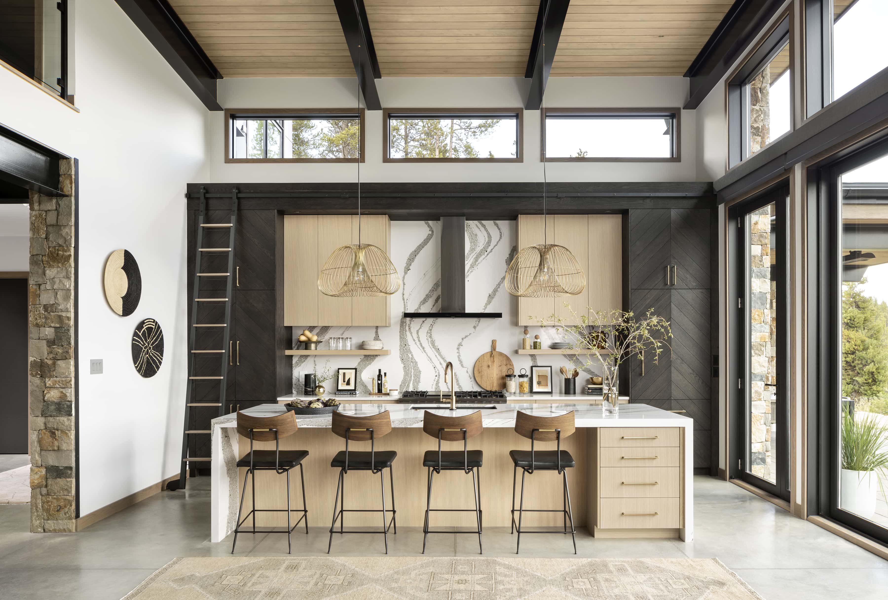
It's one thing for a designer to champion a certain style or technique in a project, but quite another to choose it for their own home. The waterfall countertop, then, has earned a host of ringing endorsements — and what's good enough for Kelly Wearstler and Sarah Sherman Samuel is certainly good enough for us.
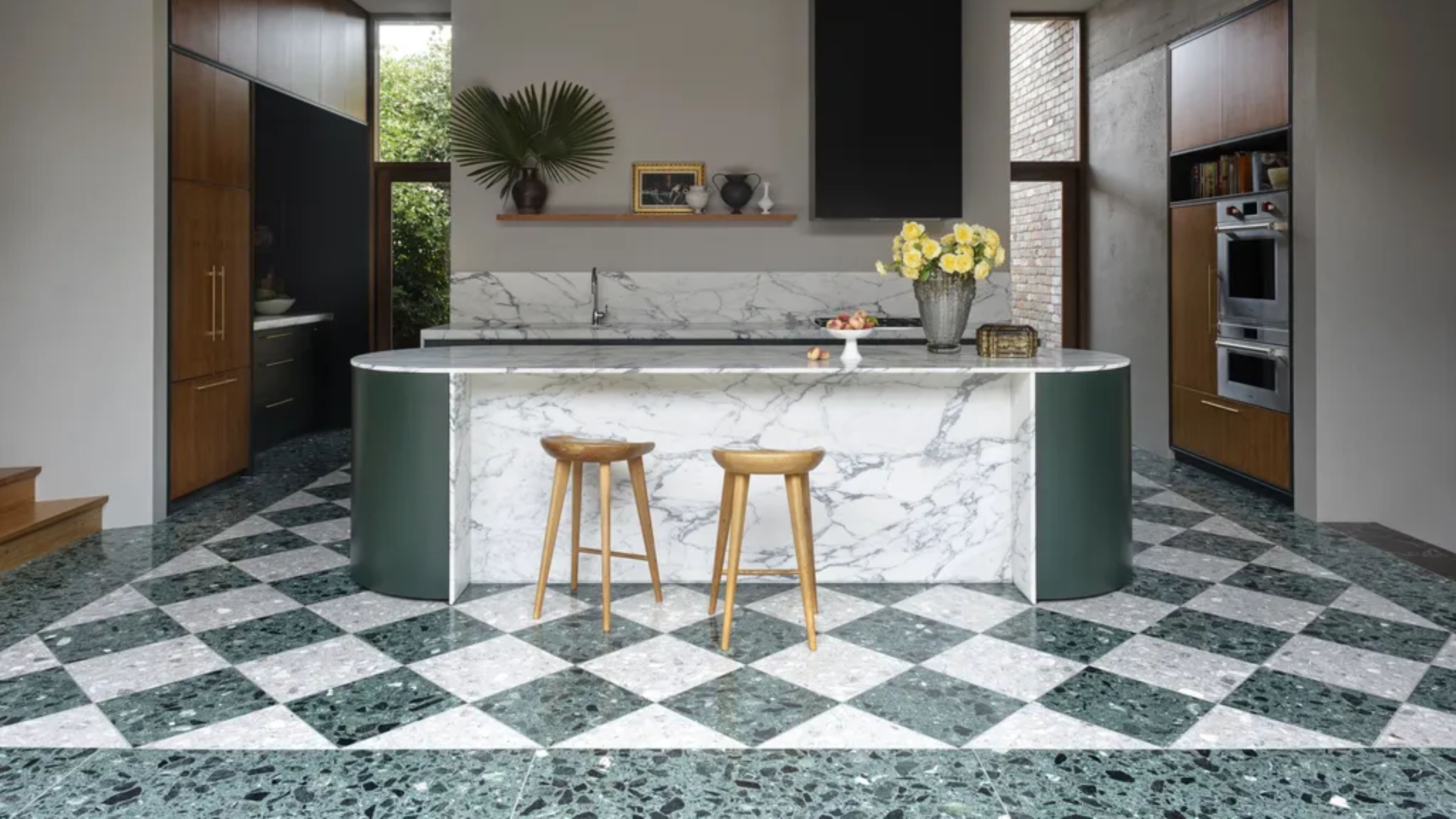
This modish take on kitchen island style sees the surface material dropped vertically at the edge, creating a fluid, seamless transition down to the floor.
It's little surprise that material-minded designers are keen to showcase glorious slabs of stone, quartz and even concrete in this way. "By placing stone, say, vertically and creating this waterfall worktop wrap in the design, you introduce the material as soon as you walk into the room — creating a real statement and wow factor," explains designer Nicki Bamford-Bowes.
Take a look at these ten different ways to do waterfall kitchen countertops — they might just convince you too.
1. Soften a high-impact metallic
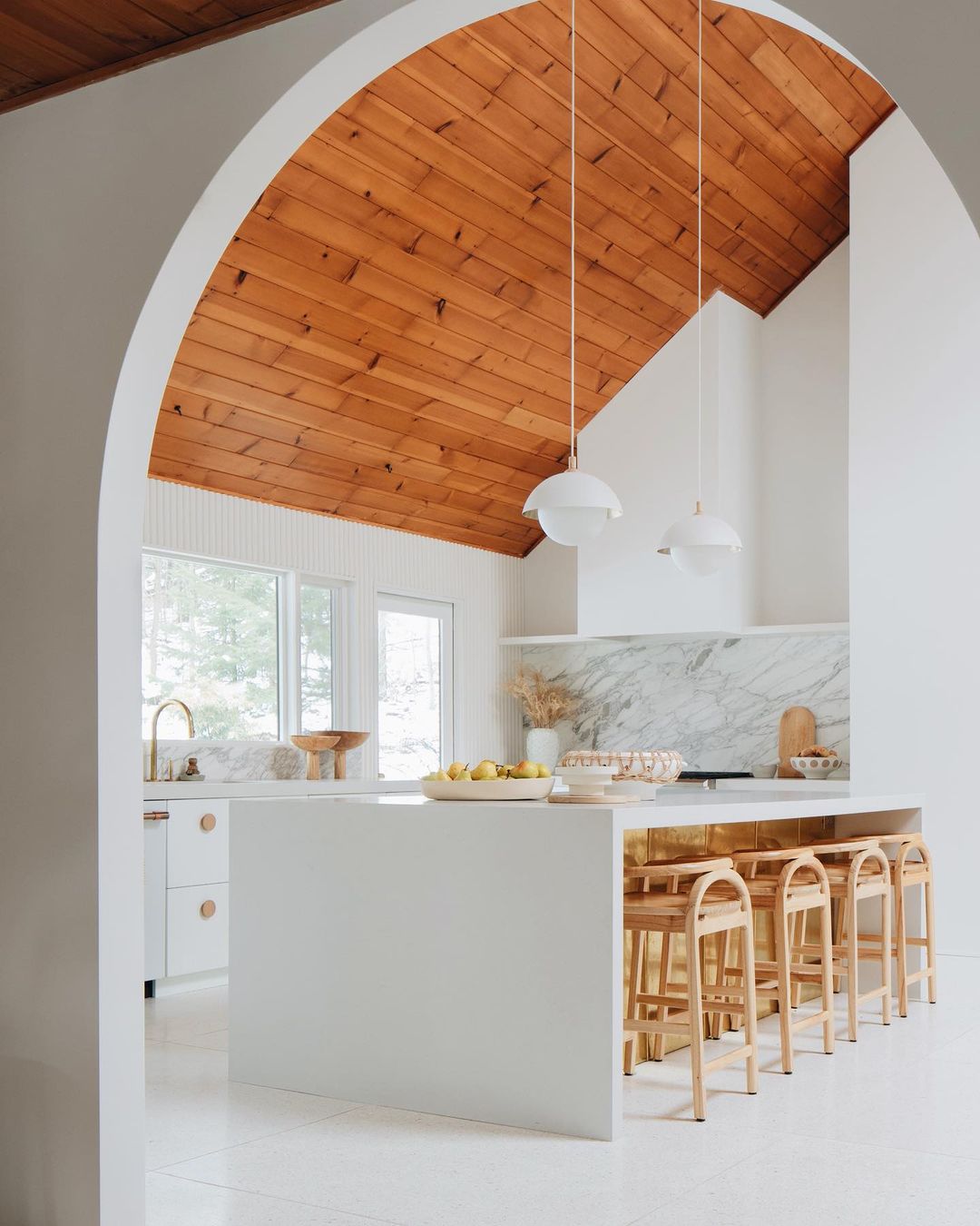
With that sweep of wood-panelled ceiling above and brass sheeting below, this monolithic waterfall island is working brilliantly to balance the room. Not only does it provide a focal point in the centre of the space, but it cleanly frames the shimmering brass that might feel overpowering if there were more of it.
Designer Sarah Sherman Samuel opted for 'Fresh Concrete' quartz by Caesarstone here in her own kitchen, which has a grey base for a cool — but never clinical — feel. 'I like to have at least one unexpected item in every room,' she says. The kitchen island seating fits so snugly at the counter that it's almost a surprise to learn that they were sourced before the space was designed.
2. Allow one material to shine
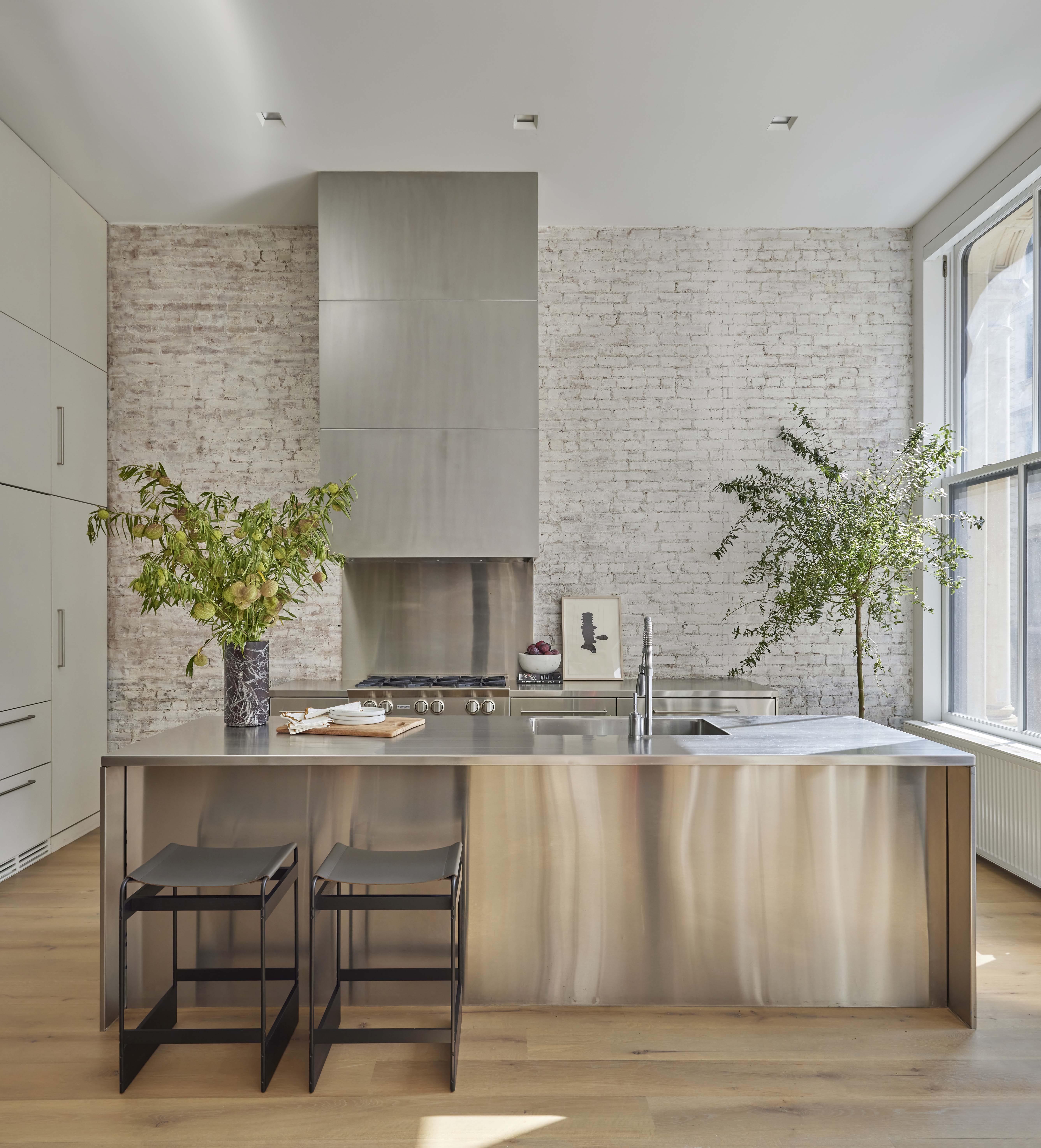
"Waterfall countertops are still in," says principal of Studio Gild Jennie Bishop. "Full height, partial height, inset, overlapping — we love the detail."
Stainless steel is given the space to really sing in the studio's take on a Tribeca loft, which calls on a waterfall countertop for a sense of cohesion on this large kitchen island. "Often, they are used to protect the side of the cabinets or to see more of a beautiful stone, but here it was a way of restraining the kitchen palette. Another benefit of the style is the way it gives definition to bar stool seating areas," adds Bishop.
We'd happily take a perch at this streamlined counter, which deploys its sheet of metal like a sheath. Our guide to what material is best for a waterfall countertop will show you other ways of achieving this look.
3. Play mix and match
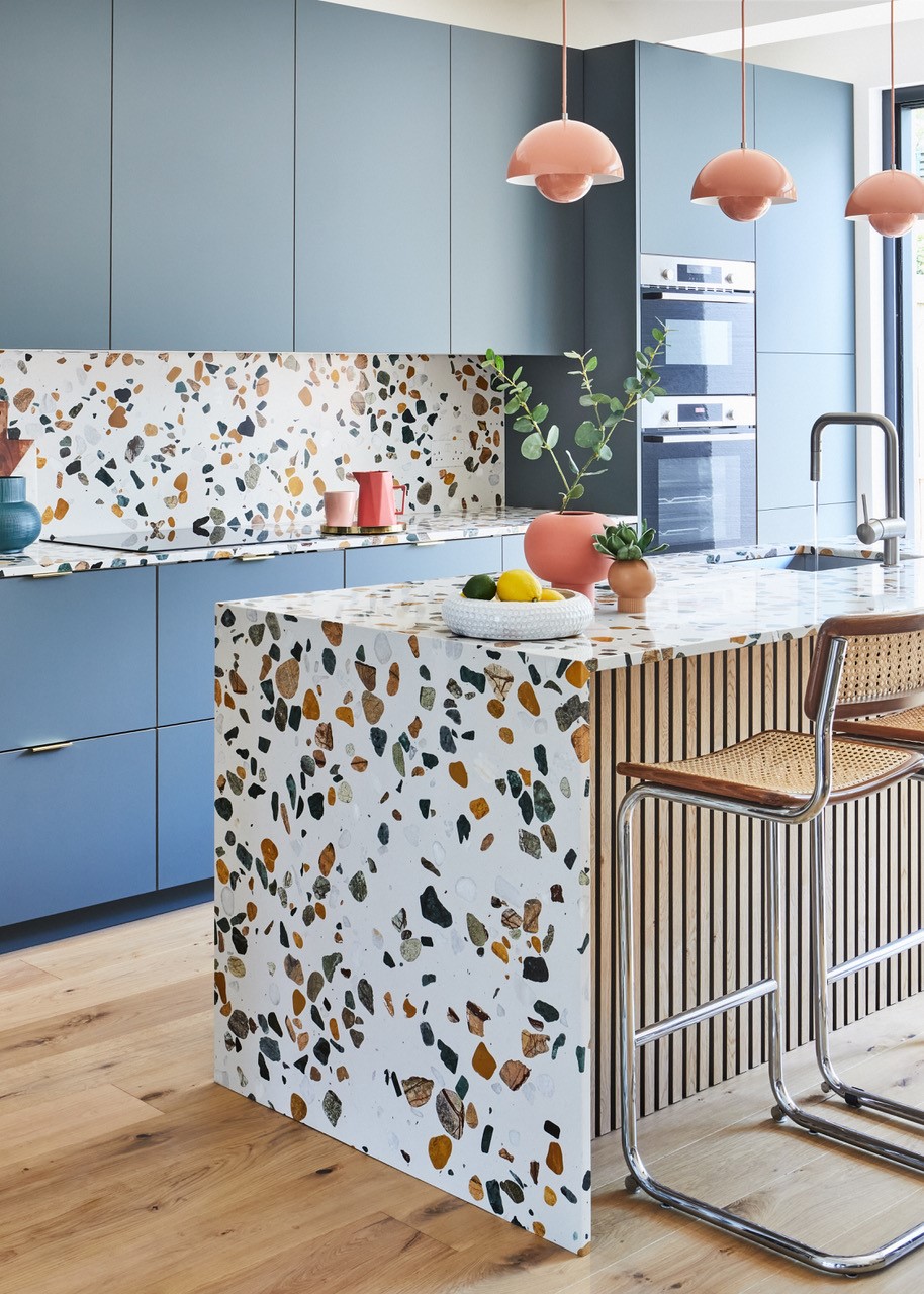
"When designing a transitional-style kitchen with incredible materials such as terrazzo or marble, I like to ensure that it's seen and admired to its full potential," says Nicki Bamford-Bowes, founder of And Then They Went Wild studio.
A worthy aim, we say — and one that's well served by the waterfall approach. "Like a piece of art in its own right, you can see the full detail, colours and beauty in the stone which can sometimes be lost when the worktop is only horizontal." A calming cornflower blue is a clever foil to this high-impact terrazzo, which is smartly mirrored in the splashback. A brilliant kitchen island layout.
4. Subvert expectations
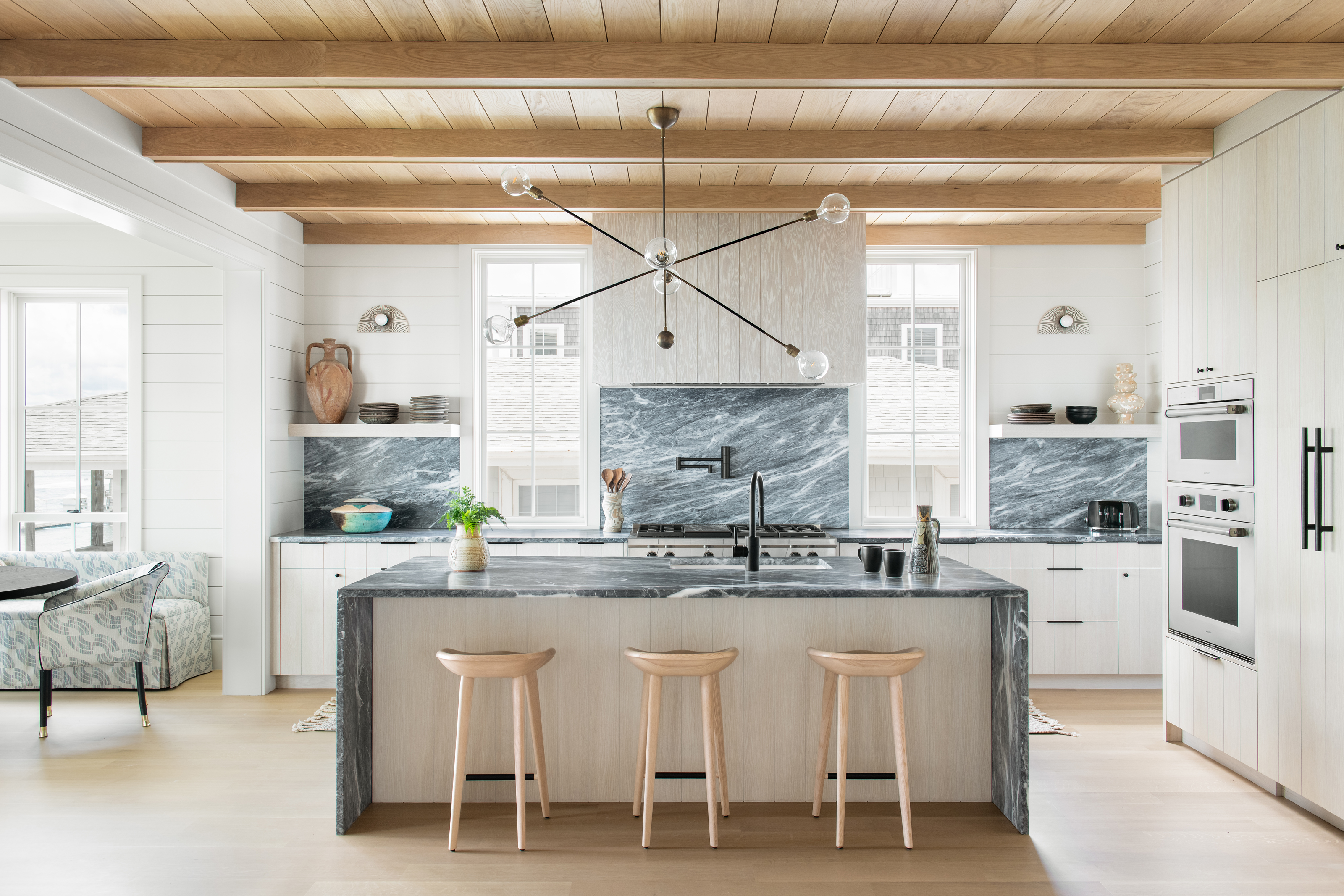
Who decided that kitchen cabinets should always be topped in a material of a lighter shade?
It seems to be something of an unspoken hierarchy within kitchen design, which is perhaps why the inverse — see this coastal project from Cortney Bishop Design — feels so fresh.
Here she's framed shiplap-clad white cabinetry with a grey-green marble, which is also utilised for the far counters and backsplash. It's a clever combination that cuts through the polished heft of the marble, creating a look that feels a little lighter — but no less luxurious.
5. Master the monochromatic look
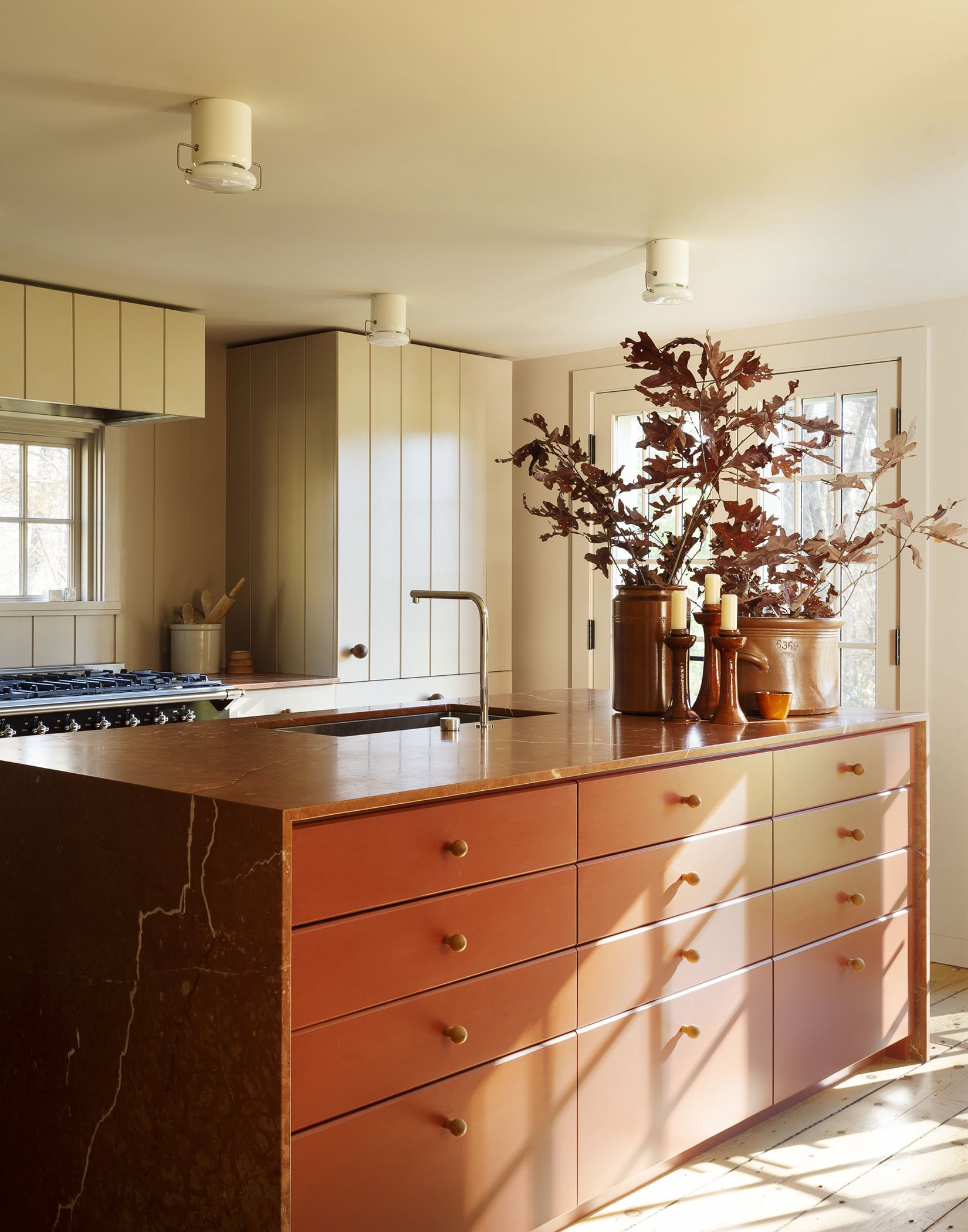
It seems somewhat counterintuitive, but being particular about your palette can help highlight subtleties like texture or strata — as this project by Workstead attests.
"We wrapped the Rojo Alicante marble around the top and sides of the island and then filled the front and back with red painted cabinetry, taking a monochromatic approach to the color scheme," explains partner and director of special projects Stefanie Brechbuehler. "It's also an effective way to display the beautiful veining of a marble or stone, almost like a painting." This fits in perfectly with countertop trends.
"When doing a waterfall-style island it's important to consider the material and what it is we can highlight, as well as how you will approach it," she continues. "In this case, you see the edge upon entering the kitchen and it's a show-stopping moment."
6. Go supersized
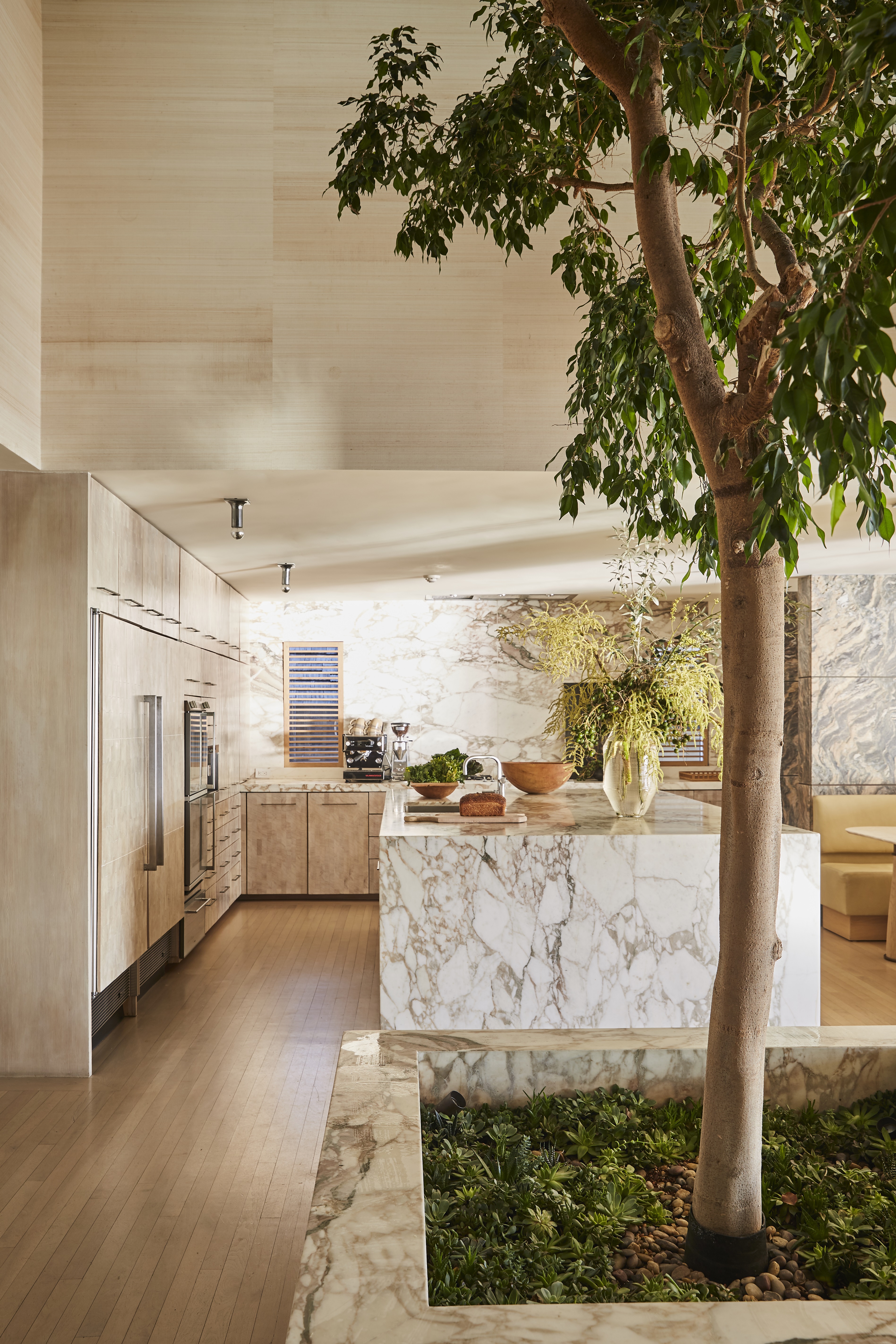
Followers of Kelly Wearstler's eye-candy Instagram feed — and there are more than two million of them — will immediately clock the kitchen she designed for her house in Malibu. The height of current kitchen trends, Kelly describes as "the epicenter of our home".
Sourcing great slabs of gorgeously veined marble might not be realistic for all of us, but there's something to be said for supersizing if you've got the space. Teamed with end cut Douglas fir cabinetry, the effect here is generous and indulgent rather than imposing — and it's partially thanks to Wearstler's instinct to square off the counter with the same marble.
7. Opt for half measures
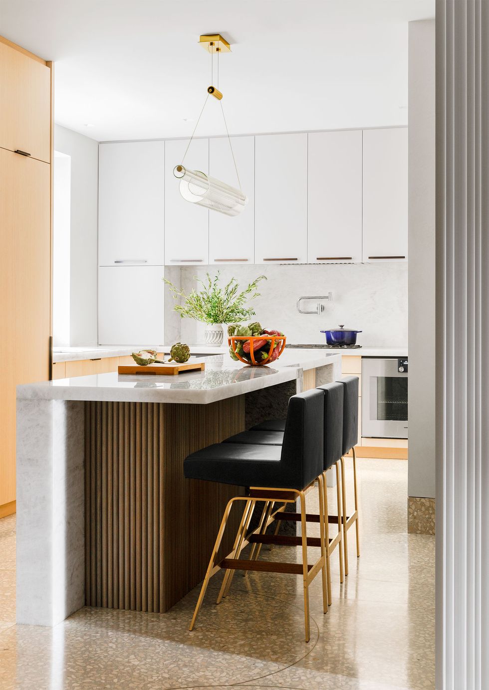
"I always try to give kitchen islands a bit of sculptural form so they’re not just cabinets with a slab of stone propped on top," says architect Michael K Chen.
Here, his offbeat approach to the waterfall look sees a piece of grey stone ("sort of an elephant's leg," he suggests) extend to the floor on one corner, creating an interesting contrast with ribbed walnut. An ideal approach for a relatively small kitchen island.
It's a sophisticated design that obscures a practical win — the 'leg' contains an electrical outlet. "Islands are a focal point in what we all know is often the nerve center of a home. We're always looking to accommodate extra functions as well as extra visual dimensions."
8. Shun symmetry
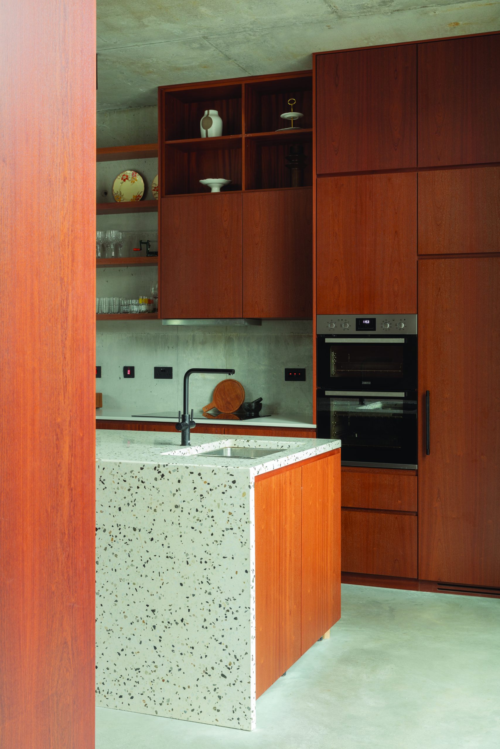
Built on the site of a derelict leather warehouse tucked away on a mews lane, Coal Lane House is equal parts family home, headquarters for design practice Stephanie O'Sullivan Interiors and commercial shoot house for hire.
The kitchen features a wealth of bespoke sapele wood cabinetry, but it's the central island that steals the show here. Rather than wrap both ends in the poured terrazzo, O'Sullivan elected to created an asymmetric design with one length and end left uncovered. The result is a contemporary and creative take on the waterfall idea that the designer said "stopped her in her tracks" when she saw it fitted for the first time.
9. Hide the essentials
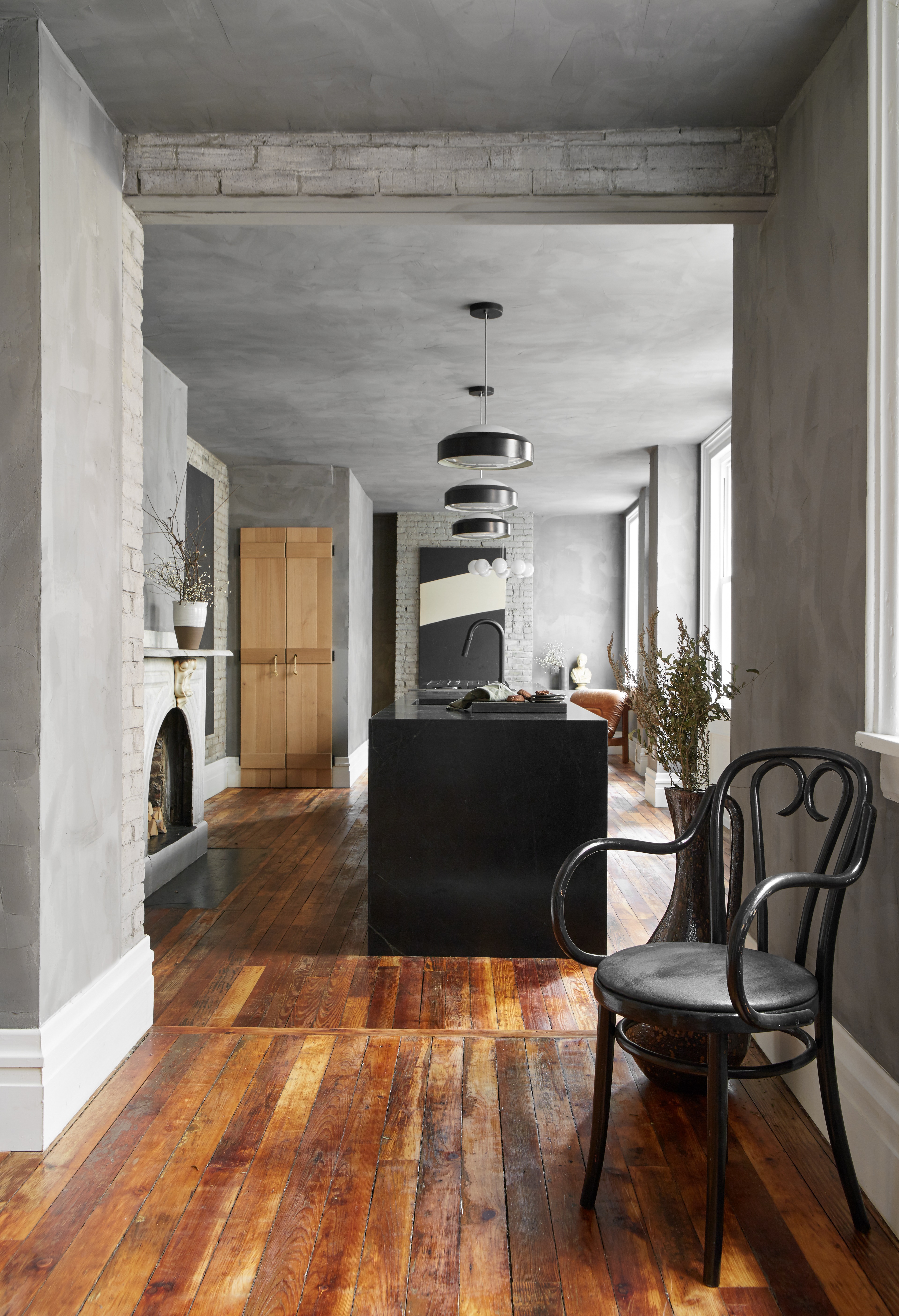
Here's a kitchen that hardly looks like one at all. "This house was separated into a main house and an apartment in the back, and our job was to bring them back together," says designer Leanne Ford. "Because we didn’t want to mess with the incredible marble fireplace and gorgeous windows, we built the entire kitchen down the center of this space. Whatever the opposite of a galley kitchen is, it's this."
The waterfall countertop, then, was partially born out of necessity, as it seals off the edge of the appliances. It's a lesson in how to distil a kitchen down to its core elements, and then present them beautifully.
"We put a warm deep, almost black soapstone on the waterfall counters," continues Ford. "You could say it elevates the space — I say it fancifies it."
10. Keep it simple
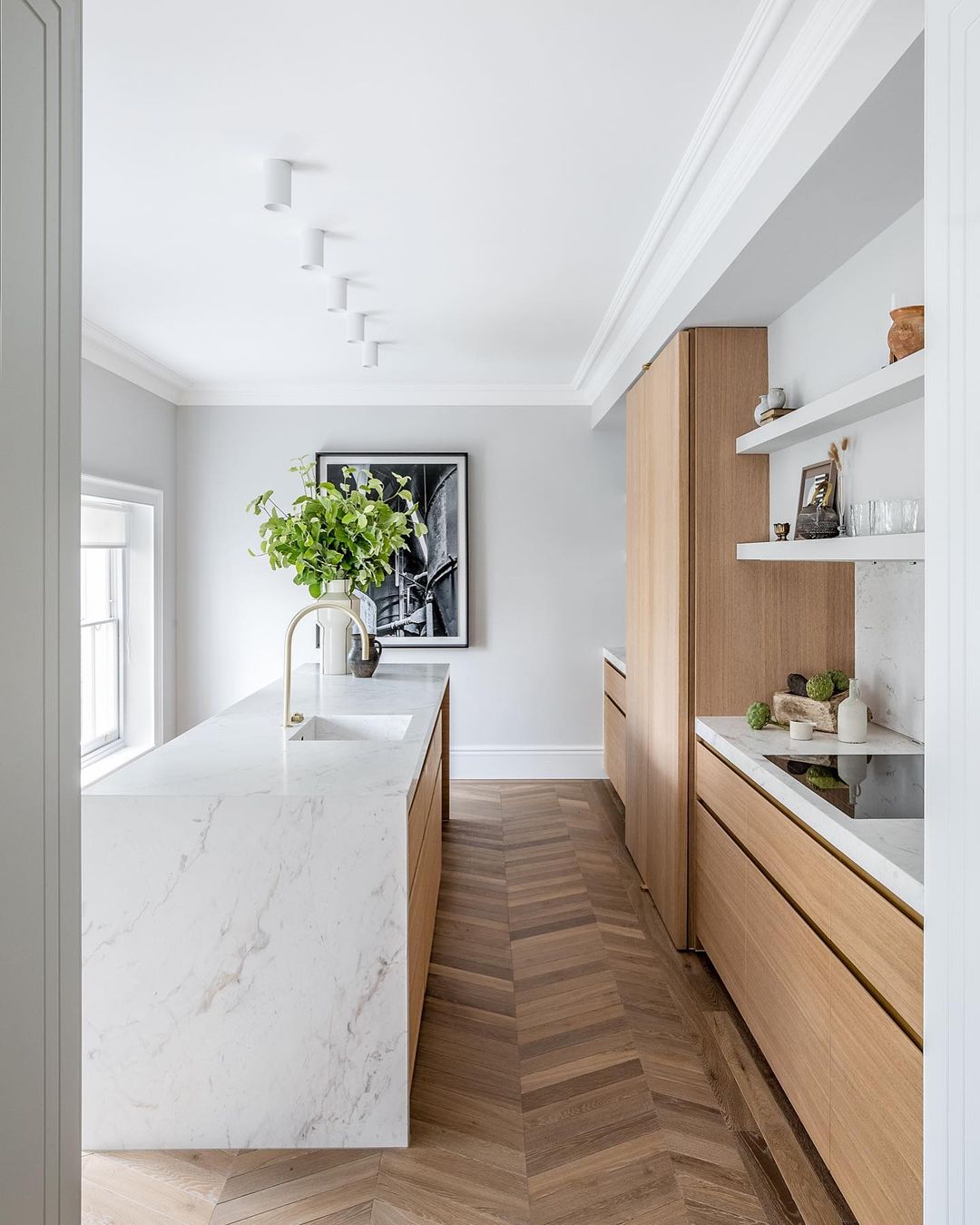
For all our adventures in bold and bonkers design, there's something to be said for a simple idea, exquisitely executed. This project by Banda Property is an exercise in just that, with a well-balanced blend of chevron parquet flooring, wooden cabinetry and white marble.
The natural materials go some way in tempering the opulence of the high-shine stone, and the space is all the better for it — this is a supremely liveable kitchen with almost universal appeal (and just about enough storage).
Be The First To Know
The Livingetc newsletters are your inside source for what’s shaping interiors now - and what’s next. Discover trend forecasts, smart style ideas, and curated shopping inspiration that brings design to life. Subscribe today and stay ahead of the curve.
Cat Olley is a British design and lifestyle journalist, editor and copywriter. Formerly on the features team at ELLE Decoration, she has written for The Guardian, The Modern House, Evening Standard Homes & Property, Inigo and John Lewis at Home. She specializes in the latest trends and ideas happening in the design world, and is our go-to for aesthetically-led pieces.
-
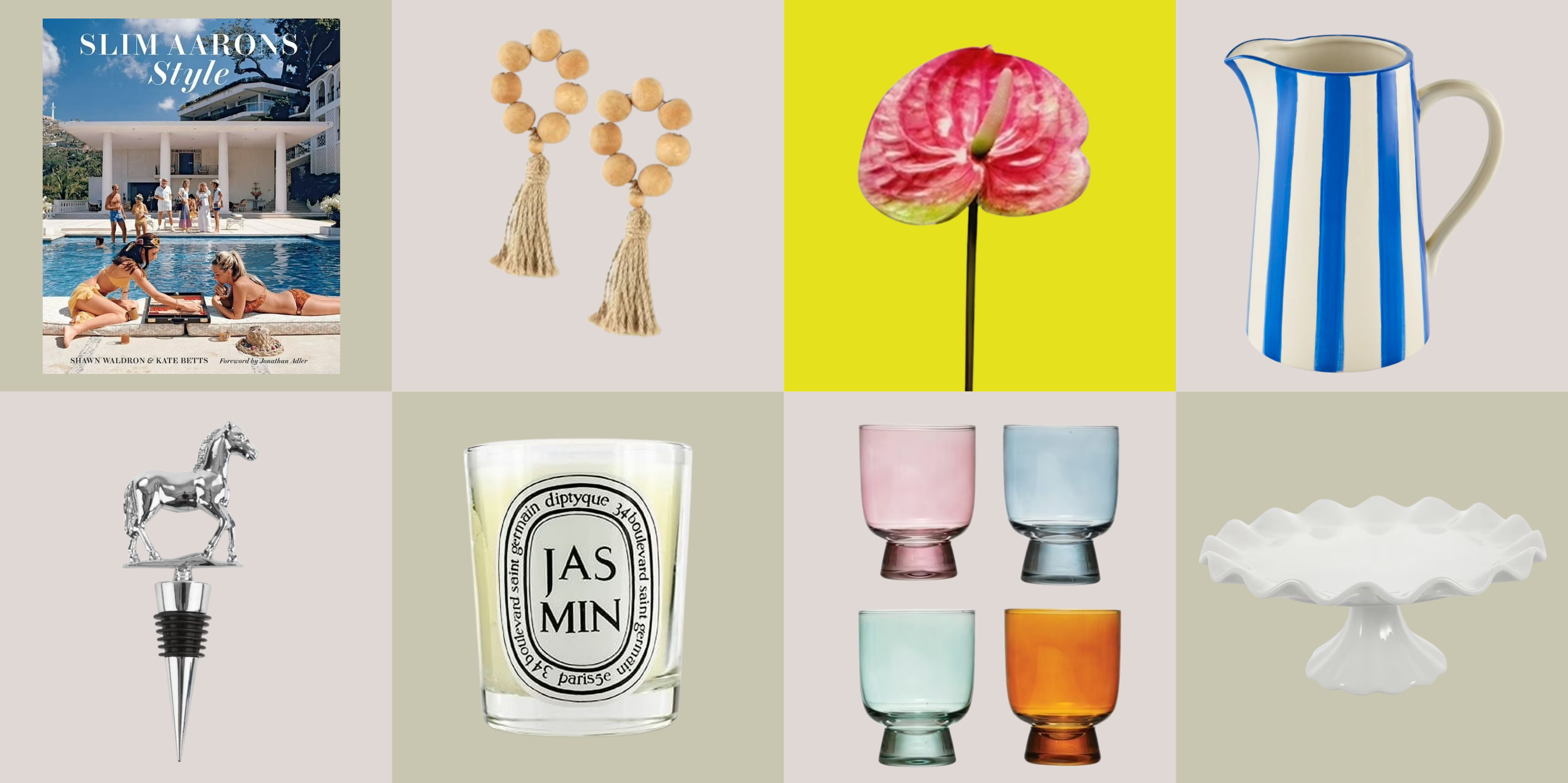 12 Essentials Every Cool, Collected Spring Host Needs — And You’ll Never Guess Where They’re From
Guests will think you thought of everything, you just knew where to shop
By Julia Demer Published
-
 Smeg Says Teal, and We’re Listening — The Kitchen Shade of the Year Is Here
Designers are already using the soft, sea-glass green everywhere from cabinetry to countertops
By Julia Demer Published