5 Ways Parisian Interior Designers Use Color — And It's the Secret to French Homes' Inherent Chicness
A handful of Parisian interior designers share their best-kept secrets on color palettes


Although you could call me biased, French-style interiors are simply irreproachable. Brimming with charm and sophistication, without lacking in bohemian flair and artistic definition, who could blame you for wondering how Parisian interior designers use color?
Color trends, and how we approach them, have changed over the years. Now, we are much more inclined to lean toward longevity and how color makes us feel. But anyone closely following French interior design, to live your best Parisian life, will know that color plays an important part in setting the tone for a space and helping it lean into its function. And from the city that is renowned for its signature elegant approach to interiors, modern-day Parisian interior design is effervescent with uplifting hues. So, if the color palette isn't working in your home, why not take inspiration from some of the most renowned interior designers in Paris? This is how they approach color:
1. They welcome colors with spirit and character
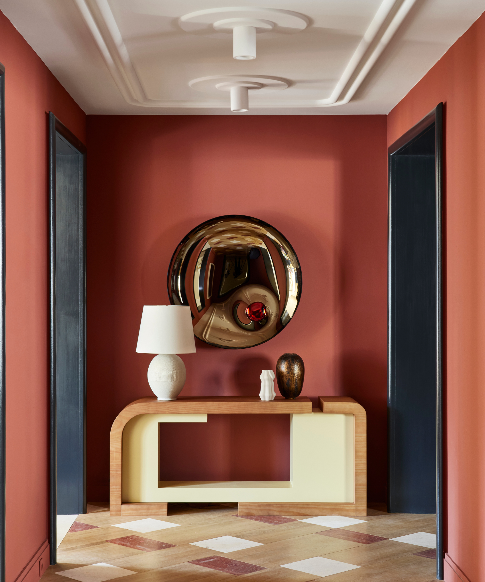
What is refreshing the color palette in your home, if not a moment to be daring? Parisian designer Fabrice Juan employs earthy and full-bodied tones in the warm color scheme of this hallway, giving it dimension and timeless appeal.
'For the Magellan project, we chose to use pops of color with a Latin spirit,' says Fabrice. 'We skilfully fused functionality with bold aesthetic choices, and this is often a go-to approach in our design,
'I often find myself drawn to the allure of deep and vibrant colors, as they possess a remarkable strength of personality. Incorporating such colors into interior design not only adds visual depth but also imbues spacious rooms with a sense of character and warmth.'
2. They balance a space with 'deep and pops colors'
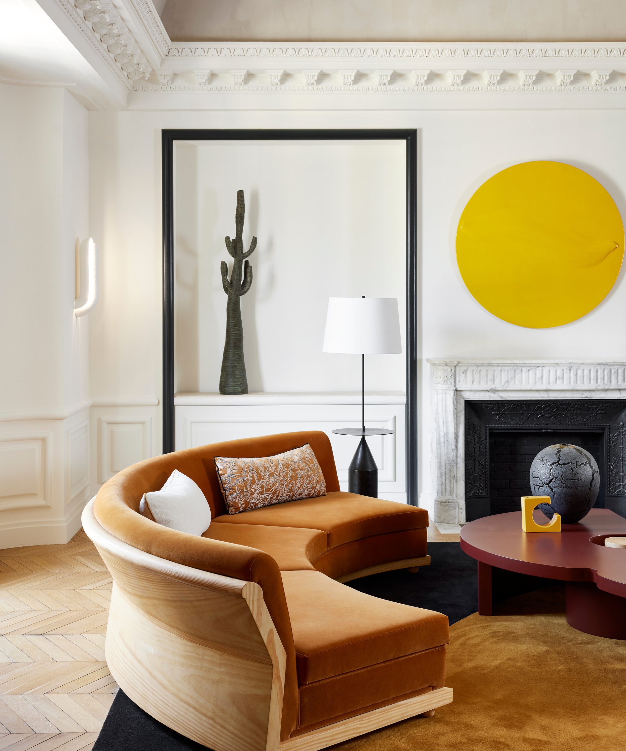
©Francis Amiand for Fabrice Juan - Magellan
A neutral living room doesn't necessarily lack warmth, depth, or bright hues. As we can see in the above space designed by Fabrice, it is not just the paint color ideas that impacts, but energizing artwork, and natural hues from wooden furniture, such as that phenomenally timeless couch, and even the light wooden chevron floor, can balance a space.
'These rich hues have a timeless quality that transcends passing trends and fashions,' continues Fabrice. 'They age with grace, growing in intensity over the years and lending an enduring elegance to the space. By embracing deep and pop colors, I believe we create interiors that stand the test of time, resisting the ephemeral whims of fleeting styles.'
3. They look beyond the shade on the palette
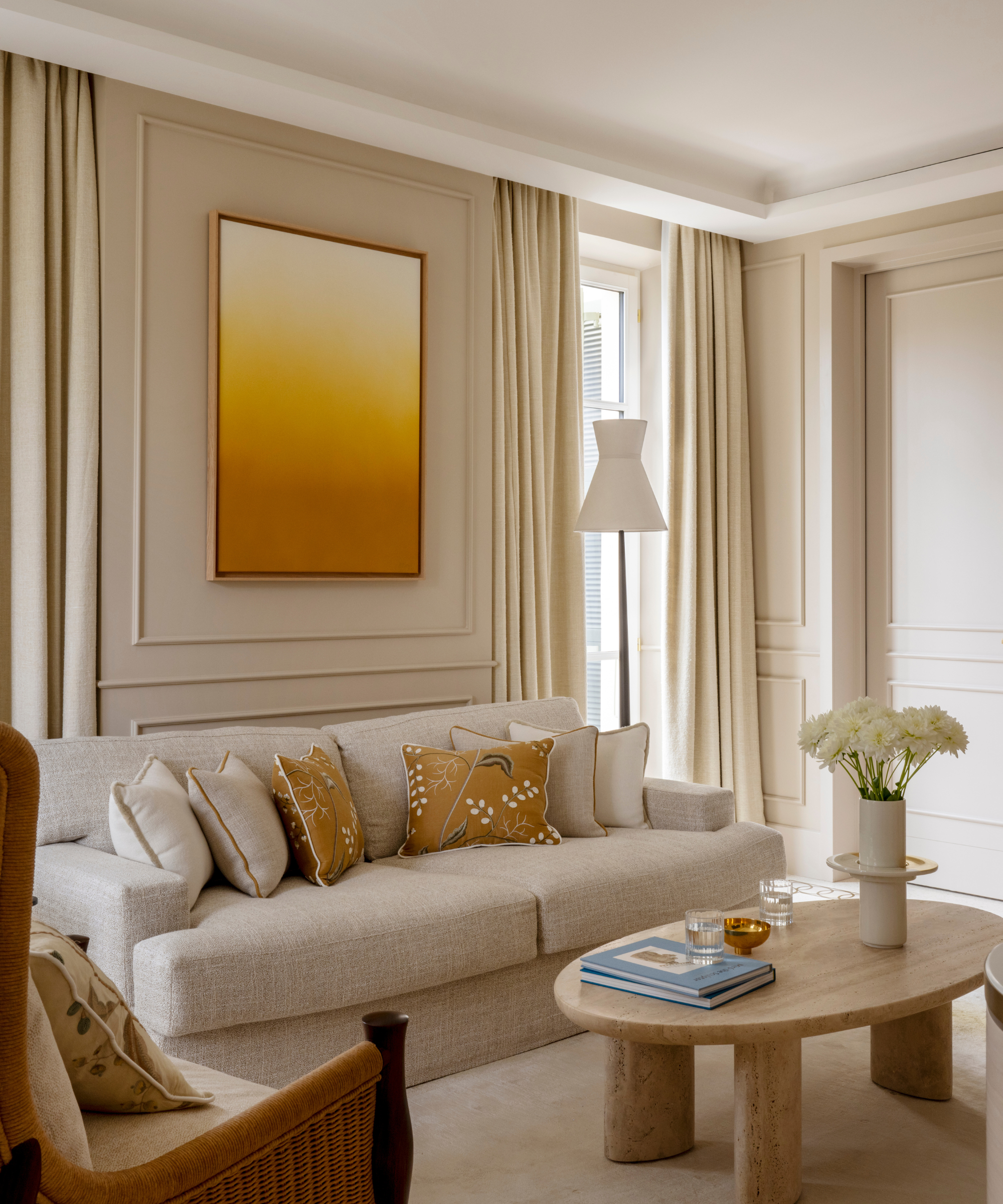
Villa Beauchamp, Grand-Hôtel du Cap-Ferrat, a Four Seasons Hotel Photographed by Ambroise Tézenas
How you use color around the home is personal, and can be a true exploration of life and character. Parisian designer and architect, Sybille De Margerie leans into how color is an opportunity to seek inspiration from your home space, and beyond for a wonderfully personalized palette. 'In my bespoke design approach, I delve deeply into the very essence of each project, seeking to grasp its uniqueness,' says Sybille. 'For me, color is much more than just a shade on a palette.'
Many designers love neutral color schemes, but we can sense Sybille's playful and joyful approach in Villa Beauchamp Cap Ferrat above, for example. 'From the outset of each project, I aim to create a harmony of color in perfect synergy with the environment, local culture, and natural play of light. Sometimes, this involves exploring bold and vibrant hues, defying expected conventions. For example, in mountain chalets, I dared to integrate lively, pure, and bright colors, breaking away from the traditional red and beige.'
4. Color is a canvas for unexpected texture and form
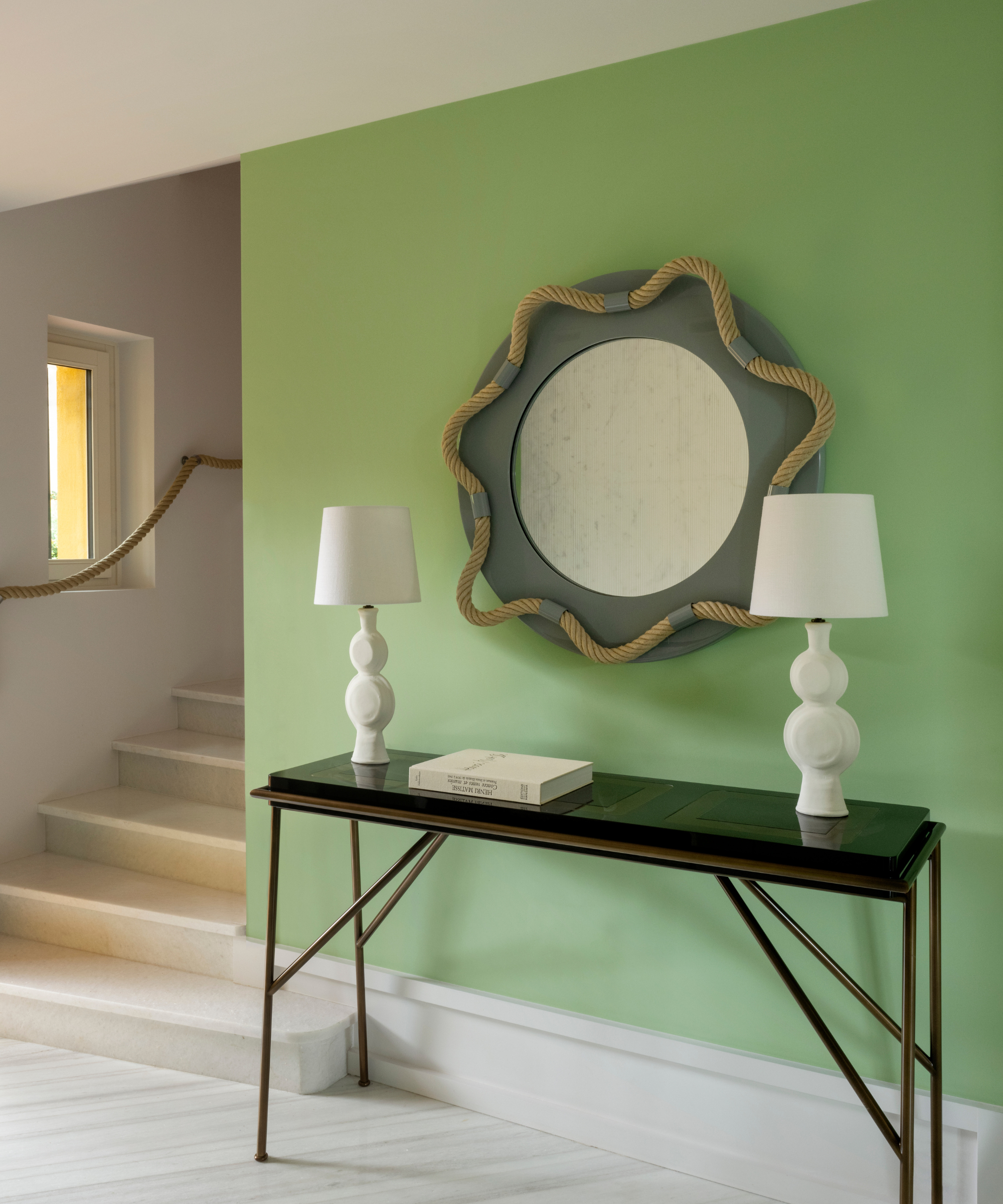
Villa Clair Soleil, Grand-Hôtel du Cap-Ferrat, a Four Seasons Hotel, Photographed by Ambroise Tézenas
You may be beginning to realize that French interior design goes far beyond distressed and romantic neutrals. While this might not be such an unexpected way of decorating with mirrors, layering a lick of fresh mint green paint with rustic texture and more sculptural forms, is an intriguing combination and makes the perfect talking point in an entryway.
'It is essential for me to preserve this authenticity and find the right balance between tradition and contemporary design,' continues Sybille. 'It is from this harmony that color palettes are born, often drawn from carefully selected paints, fabrics, and materials.'
5. They offset rich colors with metallic accents that captivate
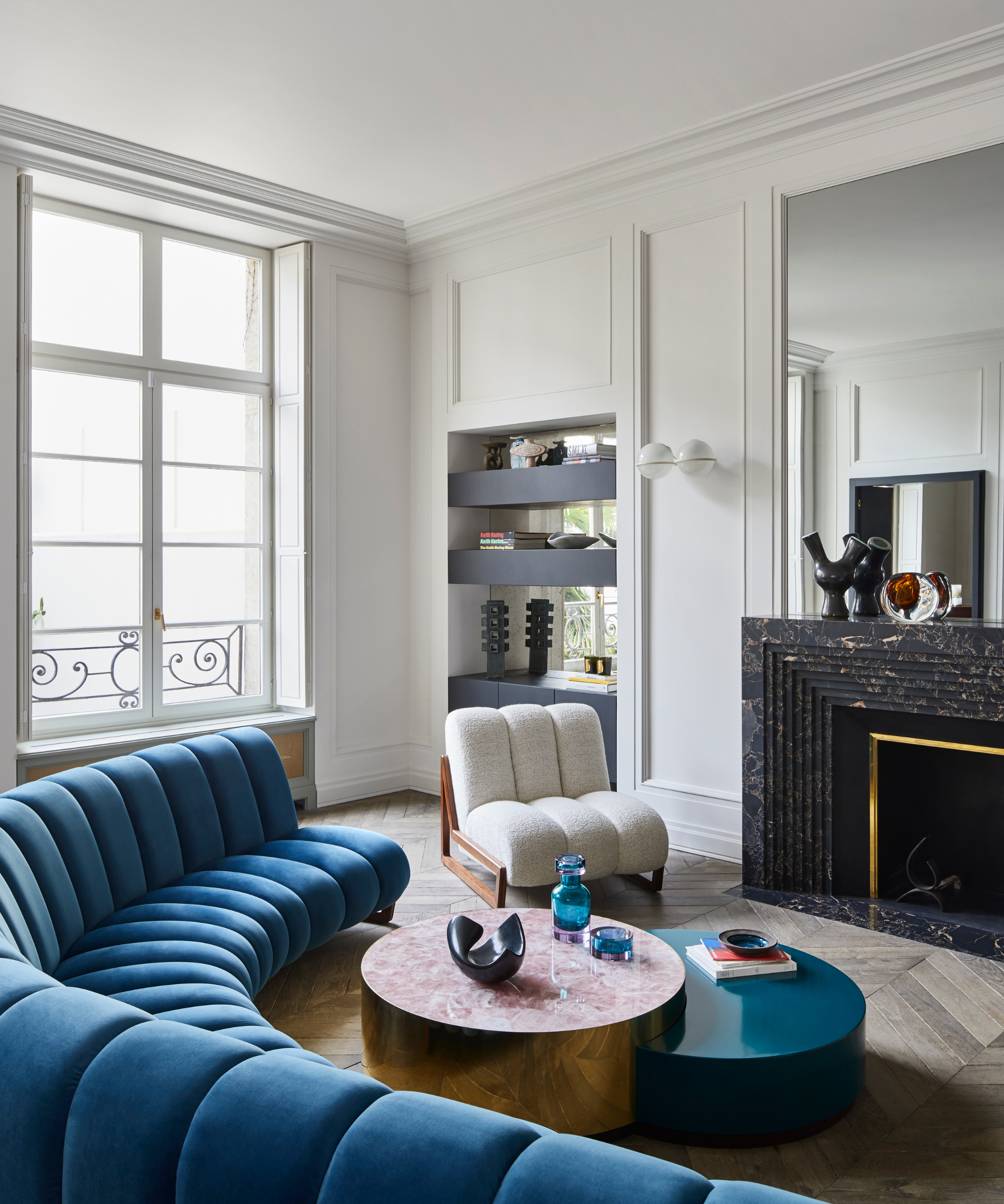
©Francis Amiand Photography for Humbert & Poyet
This luxurious living room was designed by none other than Paris-based Humbert & Poyet and shows how metallic accents can create synergy between modern forms, rich colors, and classic features. Founders Christophe Poyet and Emil Humbert bring even more vibrancy to blue tufted and curved couches, ripe for elegantly lounging on, with sculptural decor that complements the room's architectural definition perfectly.
How to make a color scheme more exciting?
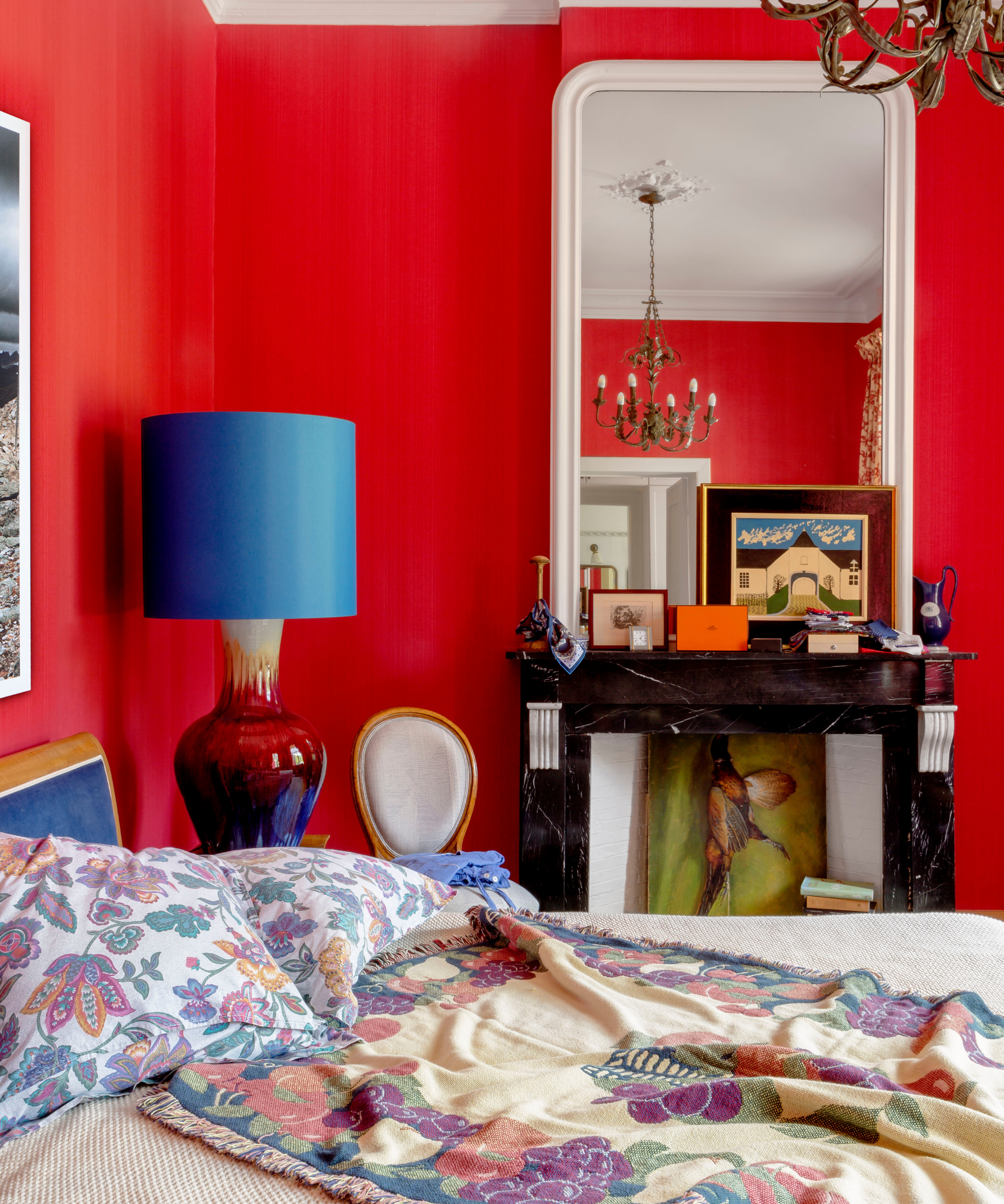
©Belen Imaz & Pedro Bermejo for Victoria Maria, Valentine project
Be daring, and consider how color interacts with other elements around the room for a Parisian-inspired color palette that will resonate with every guest. Victoria-Maria is based in Brussels, and with clients in Paris praising Victoria-Maria's 'eclectic and daring style' this is how the interior architect and designer creates this signature feel: 'I chose color schemes that celebrate earthy tones and rich, deep hues, complemented by bursts of vibrant color,' says Victoria-Maria.
'By juxtaposing different colors with an array of materials, I am able to create a sensory experience that is both tangible and visually captivating.'
Be The First To Know
The Livingetc newsletters are your inside source for what’s shaping interiors now - and what’s next. Discover trend forecasts, smart style ideas, and curated shopping inspiration that brings design to life. Subscribe today and stay ahead of the curve.

Camille is a freelance interiors writer and the former deputy editor of Real Homes where she covered a broad range of topics, including DIY, small space design, and gardens. She studied English language and Italian at the University of Manchester and it was during her year abroad studying in Bologna that she started documenting her adventures and observations in a blog. Camille has a passion for art and beautiful spaces. When not writing or refreshing her home, you will find her gallery hopping, taking photos, painting, and traveling to seek out interiors inspiration.
-
 The 'New British' Style? This Victorian London Home Embraces Its Owners' Global Background
Warm timber details, confident color pops, and an uninterrupted connection to the garden are the hallmarks of this relaxed yet design-forward family home
By Emma J Page
-
 Muji Living Room Ideas — 5 Ways to Harness The Calming Qualities of This Japanese Design Style
Inspired by Japanese "zen" principles, Muji living rooms are all about cultivating a calming, tranquil space that nourishes the soul
By Lilith Hudson
