This light-filled Westhampton beach house shows how nautical style should be done
Step inside this airy beach house, filled with gorgeous textures, quirky vintage finds, and just a touch of those classic Hamptons nautical vibes


The property
When you think of classic Hamptons interiors, your mind probably instantly goes to blue and white striped upholstery, weathered oars mounted on the walls, maybe a Life's better at the beach sign hung above the door. But this gorgeous beach house in Westhampton is far from that. This modern home was designed by Jessica Gething for an American family who reside mostly in London. The vision was to create a summer home that still has that nod to the sea but with a more contemporary twist.
'The homeowners are American and live with their three kids in London, but return to Westhampton Beach NY every summer. The overall look for the home was influenced by their international outlook and travels.' says Gething. 'It is a coastal property but we tried hard to avoid the obvious beach home cliches, instead looking for inspiration from Ibiza, Greece and Morocco.'
Filled with rustic textures, vintage finds and just a touch of those beachy hues of blue and yellow, this home feels fresh and light but has plenty of character too.
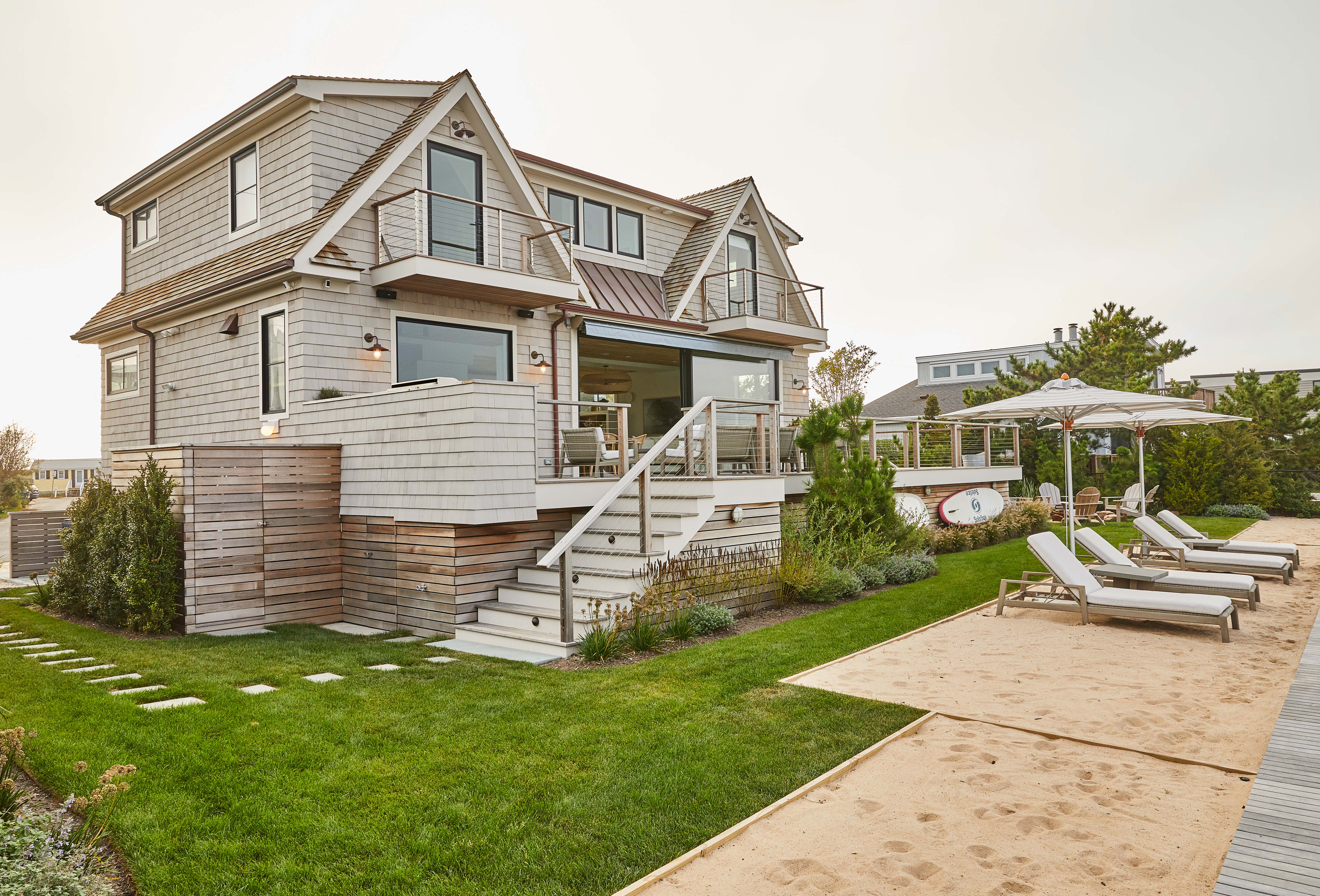
'Because of the smaller footprint, we made use of every nook possible - we managed to get the tiniest full(!) bathroom with a shower in under the stairs, the TV room can be used by kids separately while the adults are in the main living room or can turn into a fourth bedroom, designated areas for work or tutoring were tucked in on both floors, and we managed to give utility, laundry and linens their own closets on the upper stair landing. For all that it has to do and the amount of people it serves, the house really pulls its weight.'
Kitchen
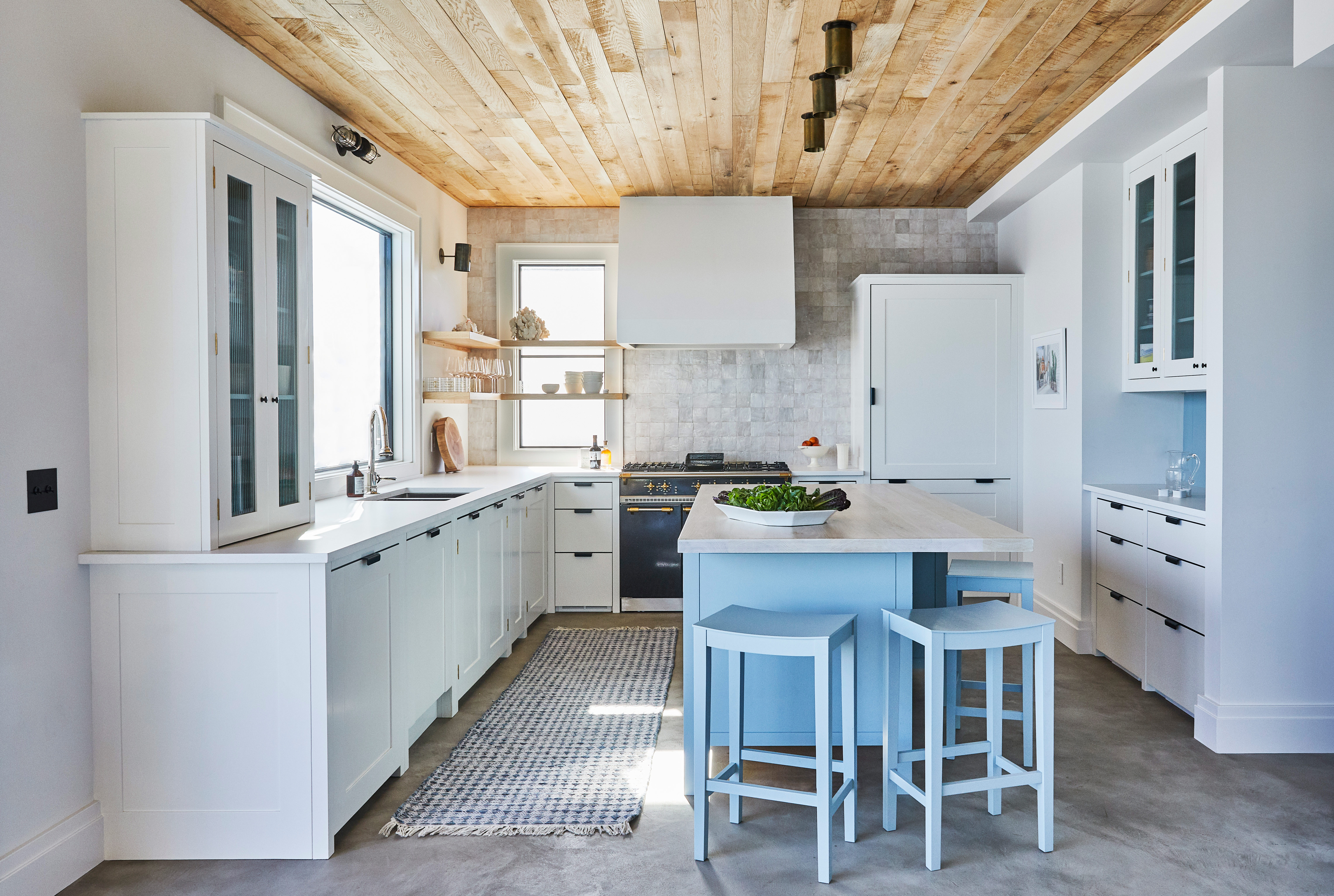
Through-out the downstairs living area is very sleek, practical feeling, concrete floors, which work with beach life and the constant traipsing in of sand but also give the space a slight industrial edge. There's a lovely contrast too with the softness and natural texture of the timber-clad ceilings.
The kitchen itself is very minimalist. It's a custom kitchen from UK kitchen makers Plain English with very light grey cabinetry and a matching worktop. But it's the details that add the subtle texture and beach house feel. Textures tiles cover the back wall, raw wooden shelves fill one corner, displaying glassware and chopping boards for a rustic feel to the modern space. The rug too adds texture to the concrete flooring and gives the kitchen a more laid back feel.
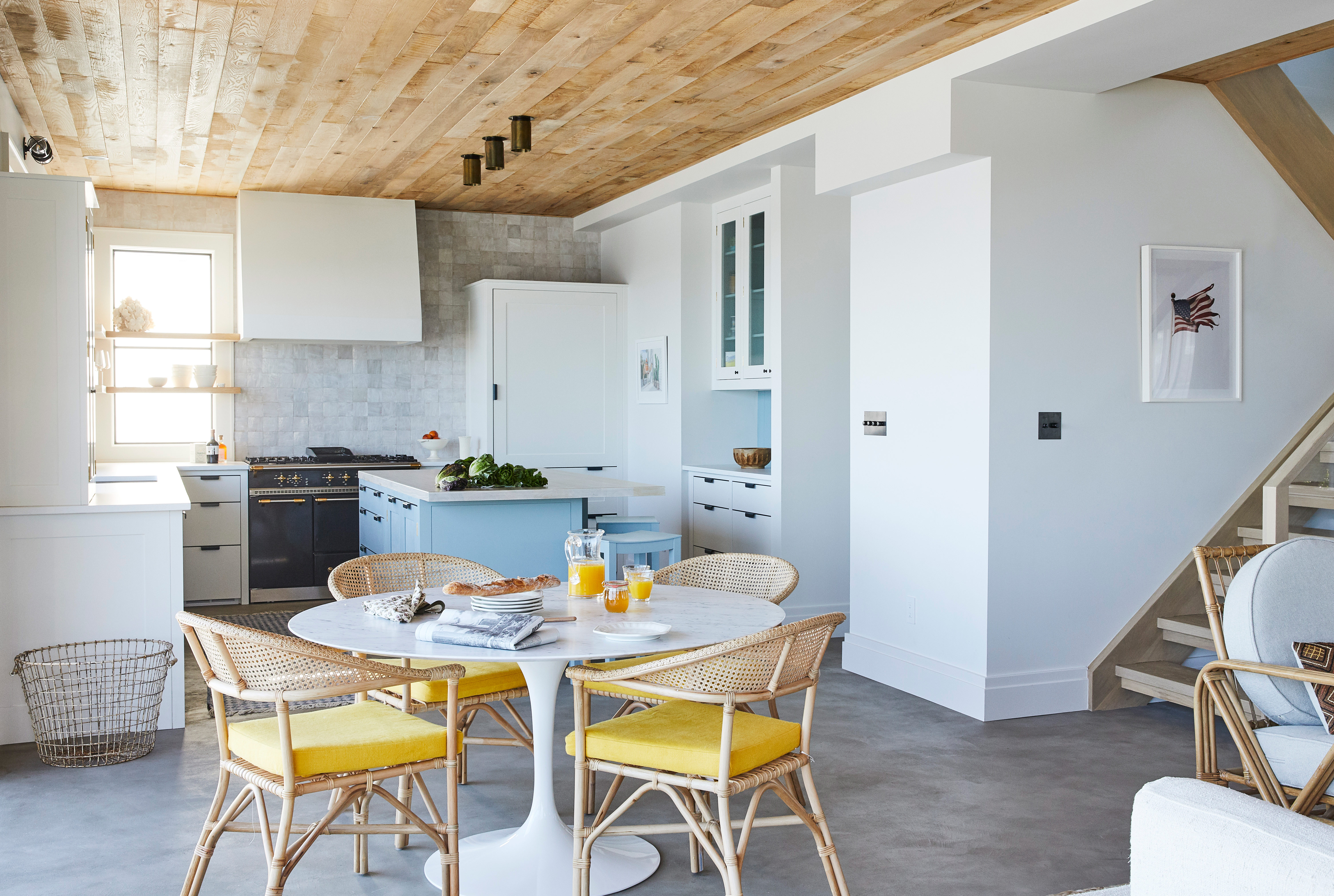
Then there's that gorgeous blue island. The perfect color to bring in just a touch of the nautical. And contrasted with the pop of yellow in the dining room chairs, it gives the space a real lift.
'The home is directly on the ocean and almost every room has a direct ocean view. Because of this, the blues of the ocean cast a hue on everything we introduced and we ultimately treated the ocean as a part of the color scheme for each space.' says Gething. 'To balance the cool blue, we dialed up the warmth in wood tones and chose paint colors that had a touch of warmth. Most of the house is really a study in neutral tones and varying textures with touches of color - and the one room without an ocean view became the bluest room in the house.'
- Find more modern kitchen ideas.
Living area
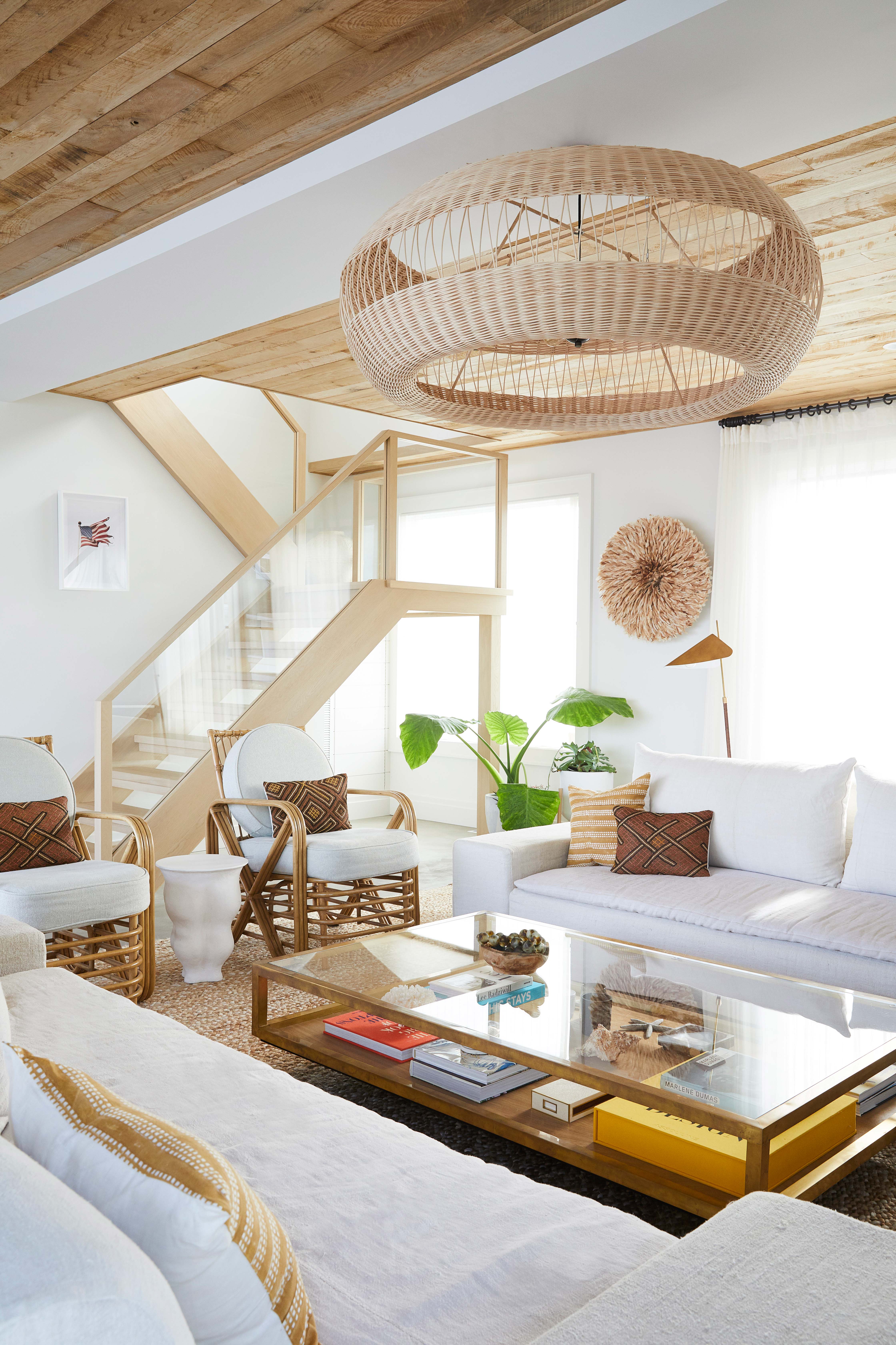
The living area has a slightly softer color palette with all the lovely natural textures being the focus. The sofas have been upholstered in vintage linen to add to the relaxed, laid-back feel of the space. There's definitely a seaside vibe to this room with the rattan furniture, seagrass accessories and touches of decorative coral but it doesn't feel overly themed.
'[The homeowners] had been to Morocco and fell in love with encaustic and Zellige tiles; we took inspiration from Ibiza and some of the more textural and organic elements there so brought that in through the reclaimed timber on the ceiling, jute rugs, vintage linen sofas and textiles for cushions, woven rattan chairs, shaggy grass lampshades, limewash paint and plaster lighting.' says Gething. 'We also used a lot of vintage and European suppliers so it does have a kind of international eclectic aesthetic, but this is a beach home in the Hamptons so wanted to acknowledge this without going too traditional. There are nautical elements in the shiplap and vintage rope mirrors and lighting but I think balanced in a way that isn't expected.'

In a beach house, of course, you want to make the most of those gorgeous views and indoor/outdoor living is very much a part of this home. 20'' sliding glass doors open up the living room to that gorgeous bay view and create a seamless flow between the living area and the outdoor dining space.
- See also: 24 living room ideas and decor tricks to inspire.
Master bedroom
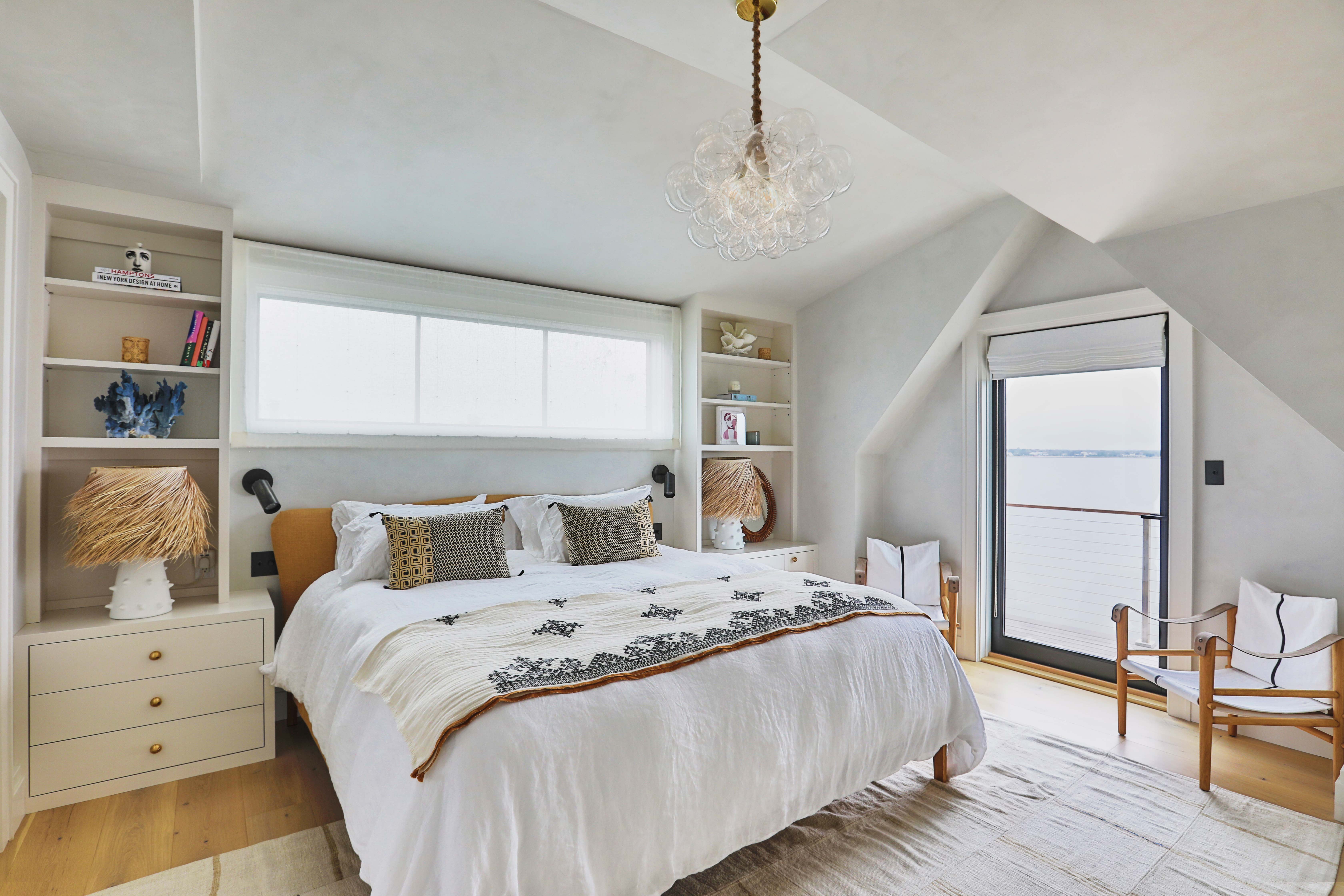
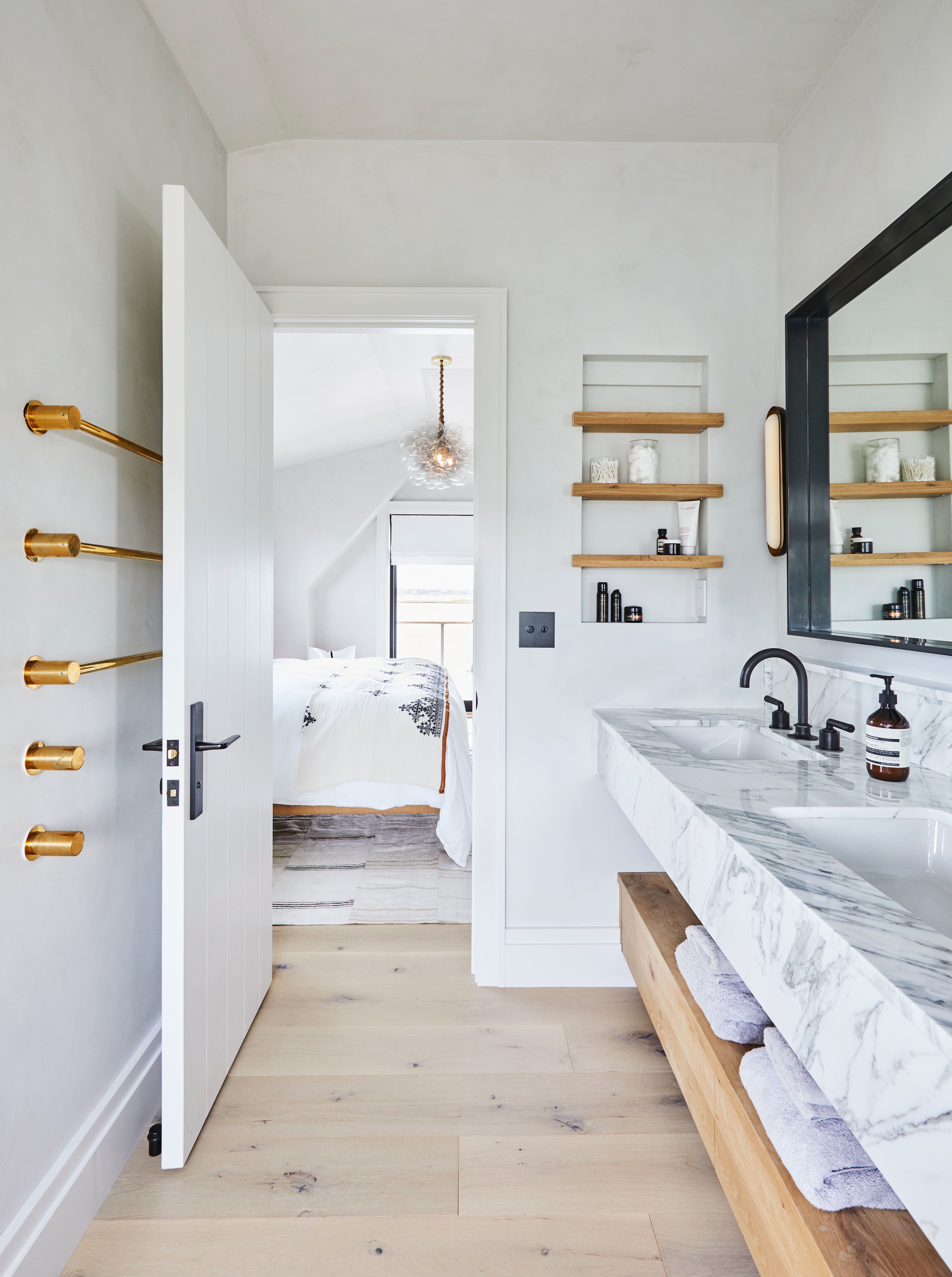
The neutral, beachy vibes continue into the master bedroom. The same slubby textures can be seen here too, with the linen bedspread and vintage textiles. The coral is again a stylish nod to the sea and even the striking light with its bubble-like structure has something of the ocean about it.
Kid's bedroom
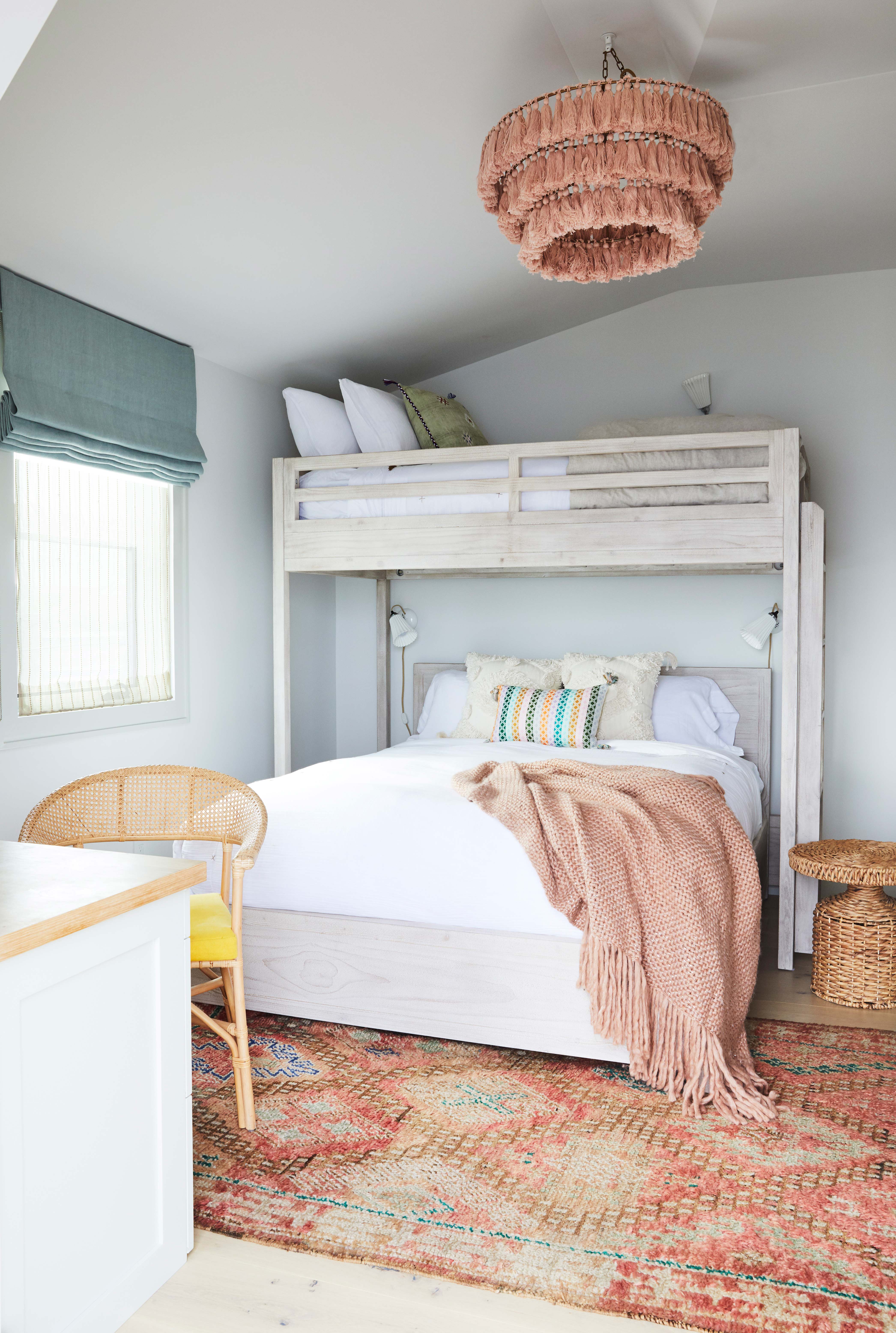
This is a family summer home, after all, so bunk beds are a must. But these are as stylish as bunk beds come, made from white washed wood to match the rest of the home and featuring both a double and single bed. The blush pink is the perfect color – it feels fun and whimsical but still sits well with the muted colors used throughout the rest of the home.
- See also: 45 ideas for a modern yet whimsical kids bedroom
Bathroom
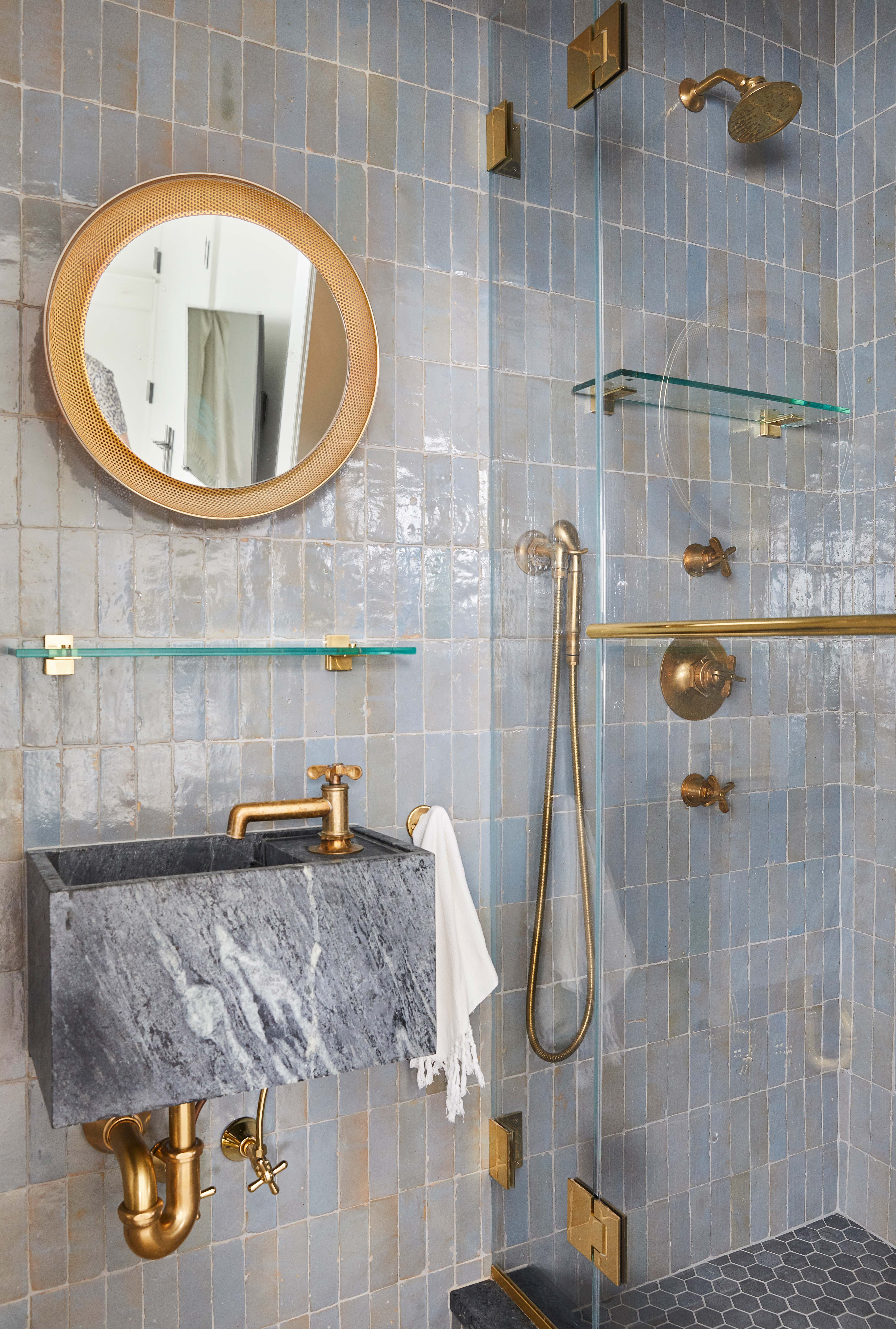
In the main bathroom, you see those stunning textured tiles again, mirroring the ones used downstairs in the kitchen. They are from Zellige a company that handcrafts clay tiles in Morroco. The ever so slight blue tinge is warmed by all the gold accents, and contrasts beautifully with the dark marble of the sink. And of course, there had to be a whisper of a porthole mirror too.
- Find more modern bathroom ideas.
Office area
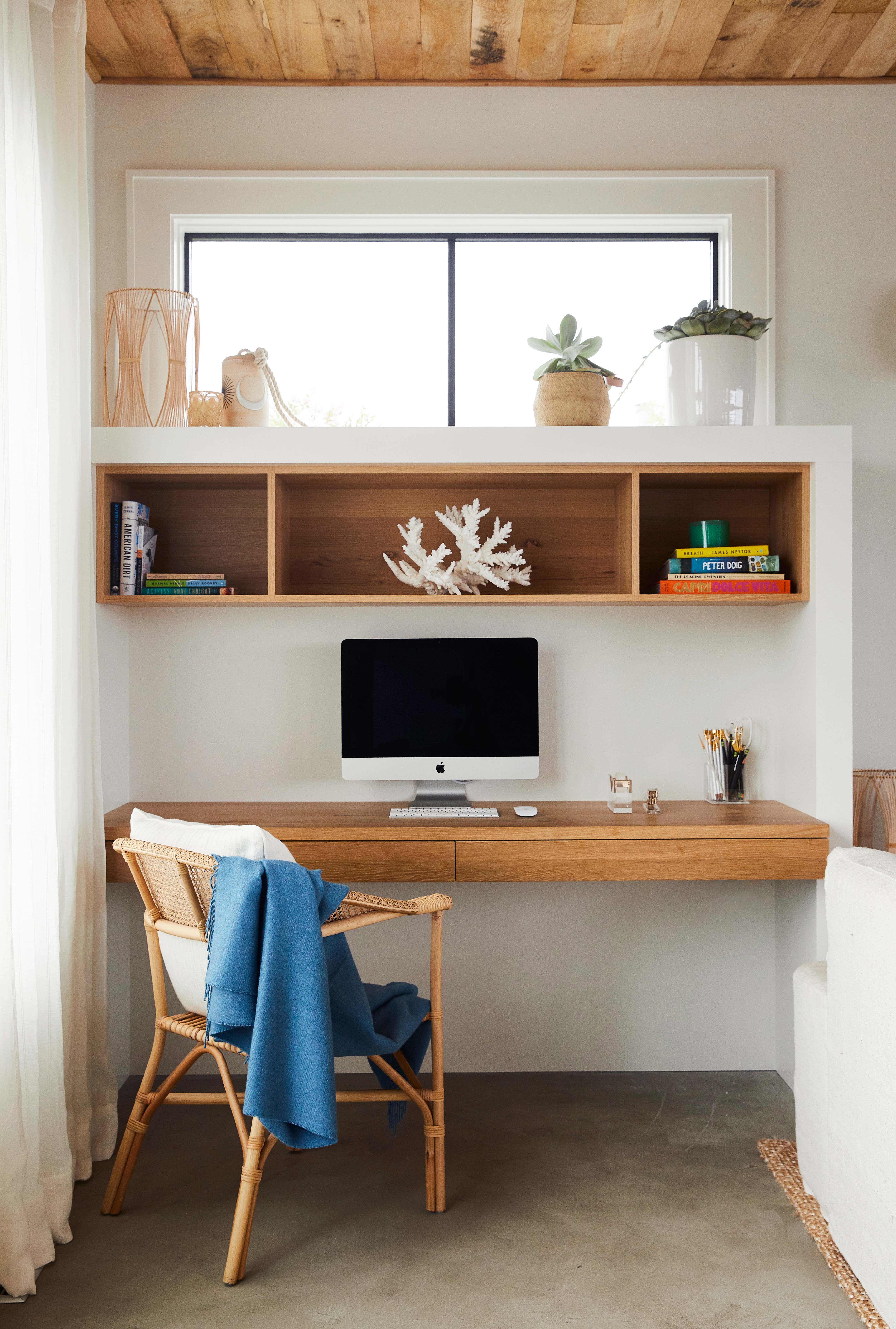
This project started just before lockdown last March, so with that in mind, a place to work and study was essential. The space sits between the bedrooms and is used by all the family. It's is kept free of clutter, with only minimal decorative accessories and the branch of coral taking center stage.
- See also: striking home office ideas.
Be The First To Know
The Livingetc newsletters are your inside source for what’s shaping interiors now - and what’s next. Discover trend forecasts, smart style ideas, and curated shopping inspiration that brings design to life. Subscribe today and stay ahead of the curve.

Formerly the Digital Editor of Livingetc, Hebe is currently the Head of Interiors at sister site Homes & Gardens; she has a background in lifestyle and interior journalism and a passion for renovating small spaces. You'll usually find her attempting DIY, whether it's spray painting her whole kitchen, don't try that at home, or ever-changing the wallpaper in her entryway. She loves being able to help others make decisions when decorating their own homes. A couple of years ago she moved from renting to owning her first teeny tiny Edwardian flat in London with her whippet Willow (who yes she chose to match her interiors...) and is already on the lookout for her next project.
-
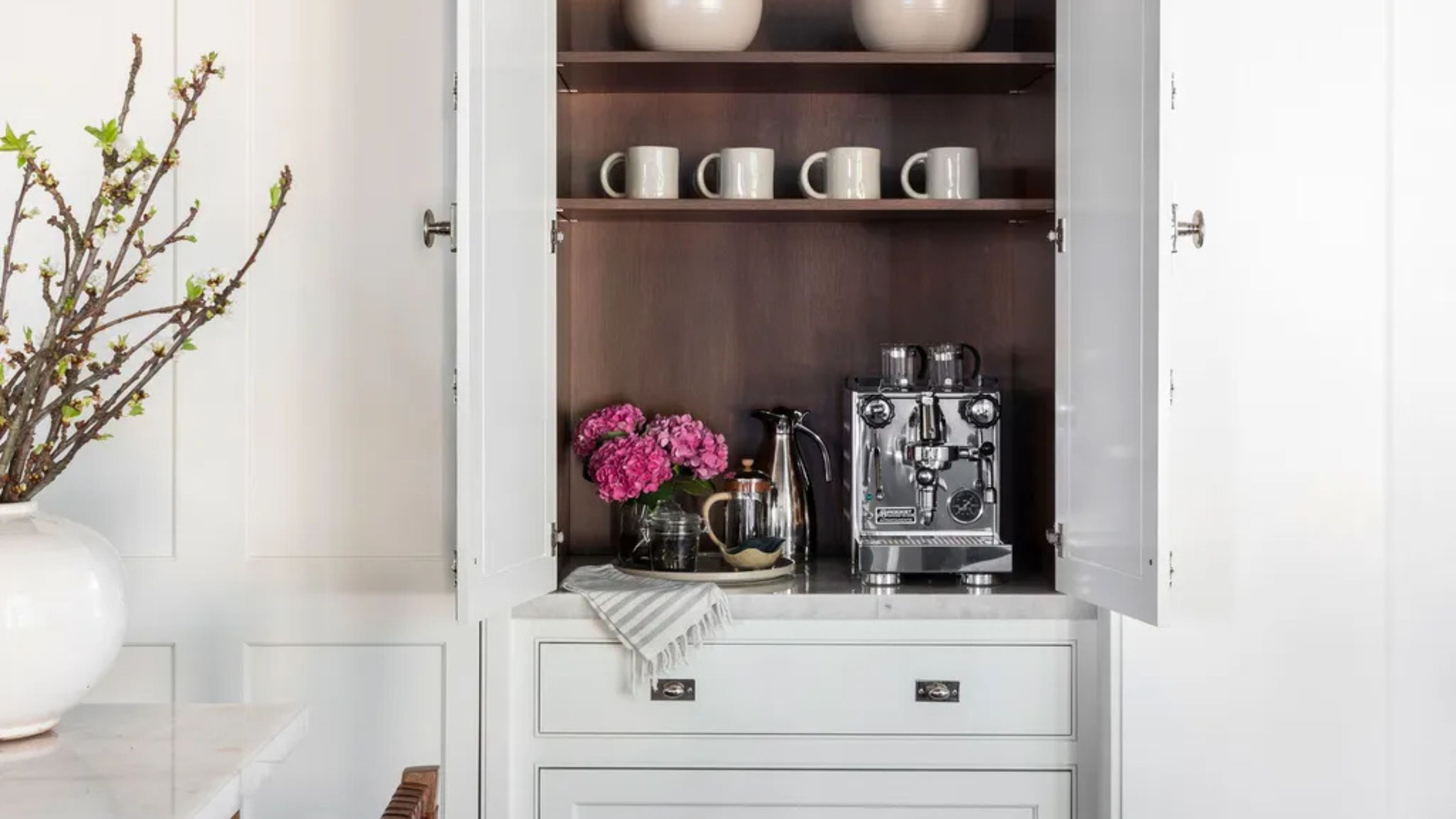 Turns Out the Coolest New Café is Actually In Your Kitchen — Here's How to Steal the Style of TikTok's Latest Trend
Goodbye, over-priced lattes. Hello, home-brewed coffee with friends. TikTok's 'Home Cafe' trend brings stylish cafe culture into the comfort of your own home
By Devin Toolen Published
-
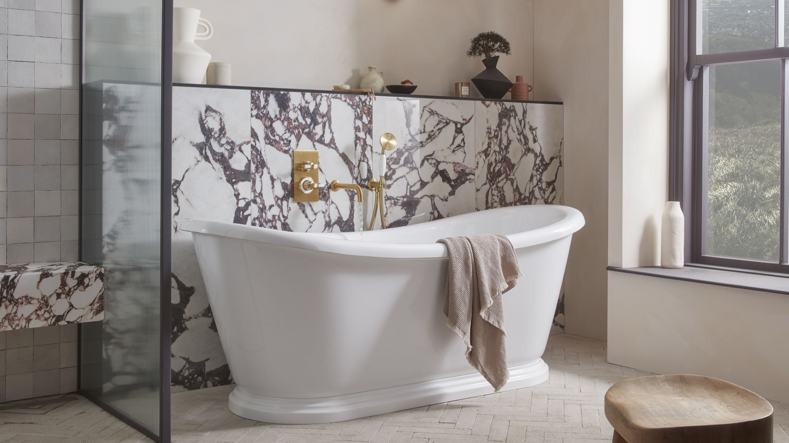 5 Bathroom Layouts That Look Dated in 2025 — Plus the Alternatives Designers Use Instead for a More Contemporary Space
For a bathroom that feels in line with the times, avoid these layouts and be more intentional with the placement and positioning of your features and fixtures
By Lilith Hudson Published